
ITS DONE. I low-key wasn’t sure I was going to get the room buttoned-up and to shoot before Reveal Day but I freaking did it. I had just enough left on my To Do list that it was an intense couple days to get it all done before my photographer Whitney Dianne (also my sister-in-law!) left for vacation on Monday, I’m so happy I pushed myself because now we can enjoy the room and get our house back in order! So on that note, let’s go through each part of the room! I mentally broke the space into 3 zones: The seating area, the fireplace/bookcase, and the entry hall.
Seating Area
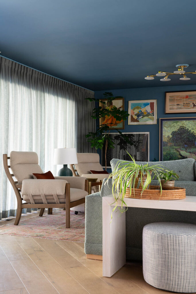
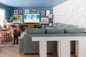
Let’s begin where the project started: the family room seating area. Somehow not a lot changed, but yet everything is different?
What changed? The major things:
- We upgraded to a new sectional from Happy Hour Design Collective
- Added 2 new armchairs
- Installed new drapery
- Put a media credenza under the FrameTV
- Replaced all the light fixtures
- New sofa table with kid zone seating
- Updated gallery wall
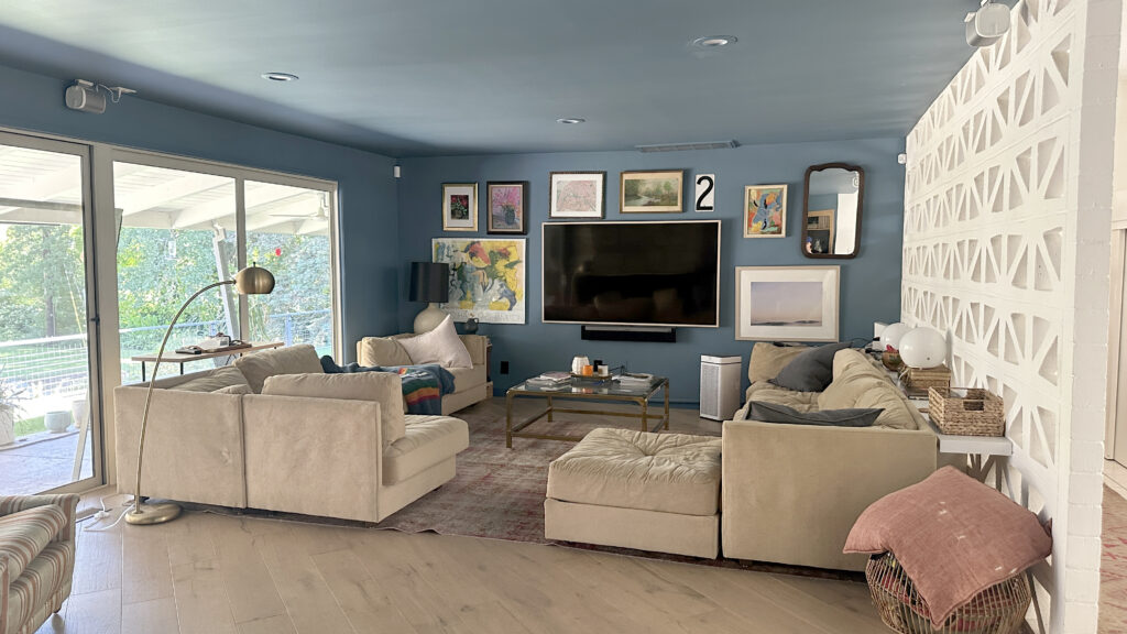
Before
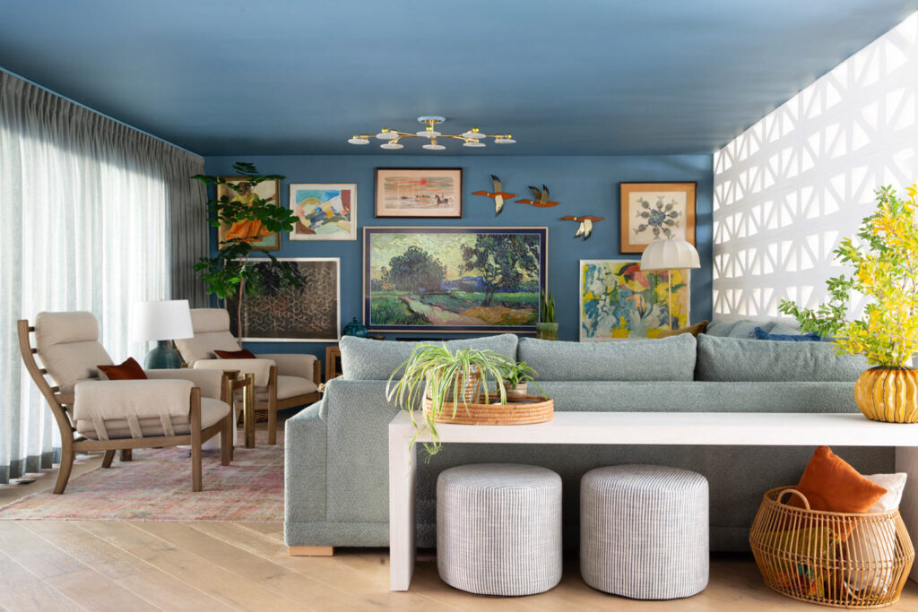
After
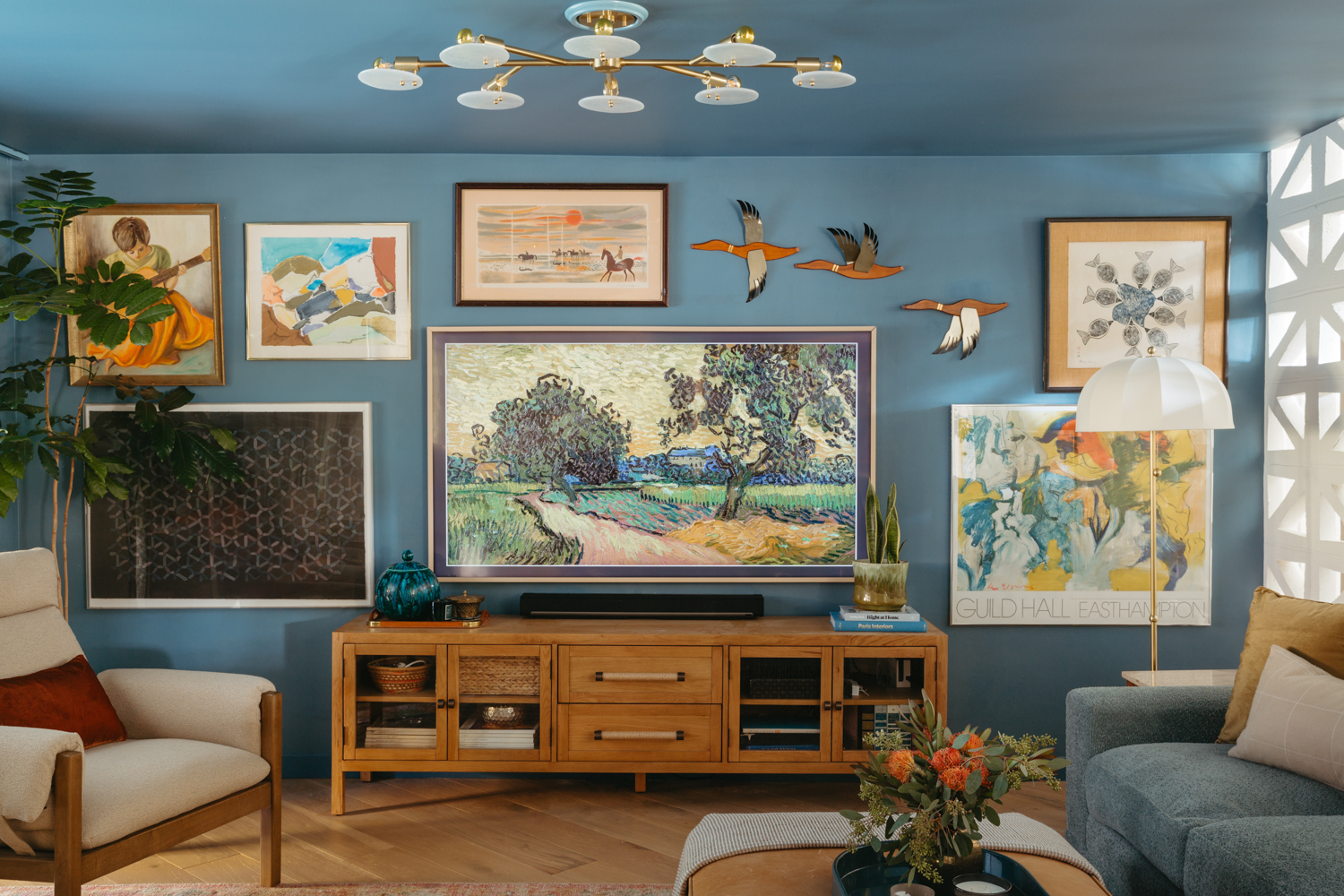
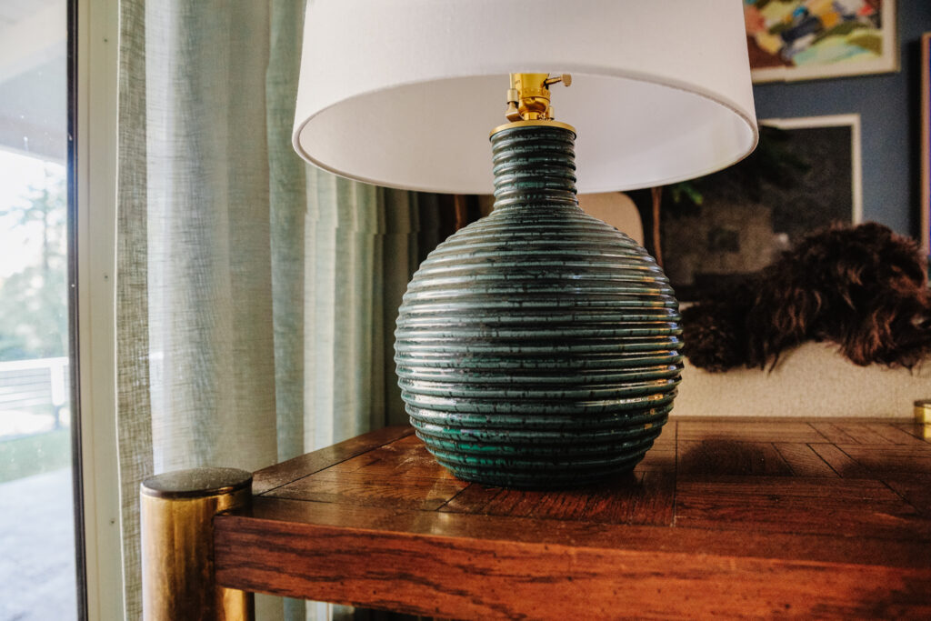
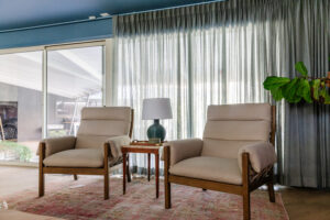
Giselle Semi Flush Light* | Meshelle Floor Lamp* | Sara Table Lamp* | Frame TV | TV Bezel | Arm Chairs | Sectional | Rug, vintage (similar) | Striped Poufs* | Sofa Console Table | Drapery | Art, vintage | Media console
I can’t tell you how happy this view makes me! The room finally feels balanced and super cozy. A couple people who’ve seen it in person said it feels smaller, but in a good way and I couldn’t agree more. Before the 3 spaces bled into eachother without a clear focus and now they live separately, but harmoniously.
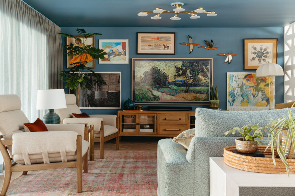
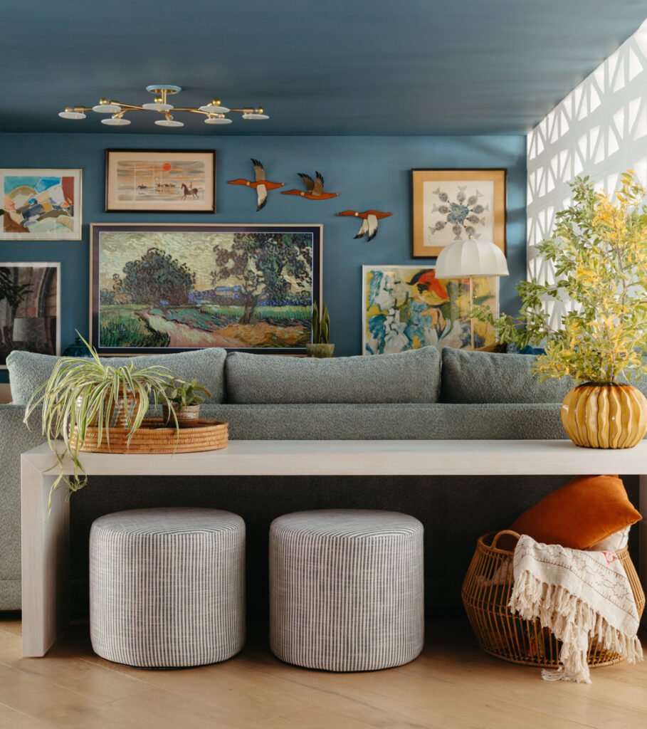
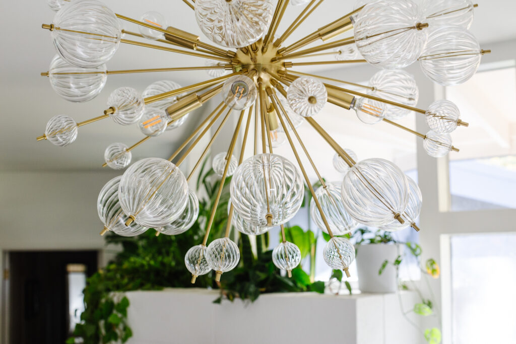
If you saw on Stories I spent time replenishing my art to revamp the gallery wall. Most of the room palette is oceany blues and greens combined with warm organic neutrals (wood, leather). I decided it was time for a media console under the TV and looked for months to find one low and long enough. I love this one, with wrapped raffia handles and a mix of open and closed storage. See more details in this post. I wanted the gallery wall to be more colorful and filled with vintage art to bring some soul back into the room full of new furniture. I love where it ended up, and the new ceiling fixture feels like a sculptural extension of the wall now.
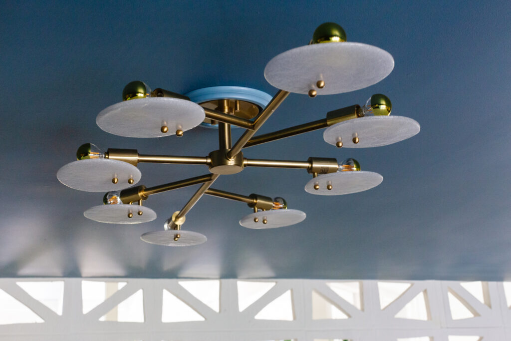
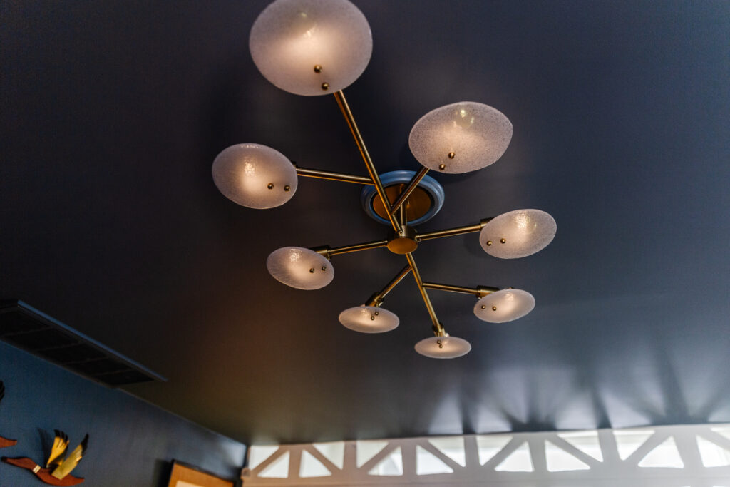
Speaking of lighting, the new fixtures gifted by Mitzi are everything!! This room doesn’t get direct light despite the large windows because we have a deep patio cover. I love turning on all the lamps and having moody puddles of light around the room. I wanted to add a large overhead fixture (this one is 48″ wide!) to replace an existing can light to give another visual anchor to the large room, but also to have a softer downlight in the evenings if we need it. I still need to get the electrician back to put it on its own dimmer (currently, all the can lights and flush mount are on one switch). I love the Giselle because you’re not looking at bare bulbs from below. The glass discs (they call them “candy glass”) have such a pretty texture and they are imperfect shapes to bring in some organic lines. I added the gold-tipped bulbs to also diminish any harsh light when looking at it. All the light shines into the center of the fixture and never in your eyes.
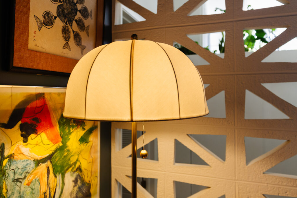
The table and floor lamps are from a collaboration with Mitzi by my internet friend Natalie Papier of Home Ec. She and I share a big love for vintage, art and color so I was thrilled to get a couple of the pieces she collaborated with Mitzi on. The Sara Table Lamp has such a cute round shape with a vintage texture. The Meshelle Floor Lamp is also reminiscent of a vintage umbrella lamp and is just so pretty in person. The shade is a soft fabric that illuminates beautifully, and that oversized ball pull chain is so satisfying to use.
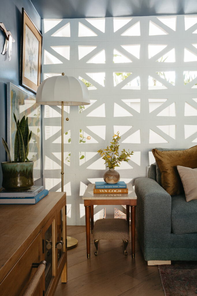
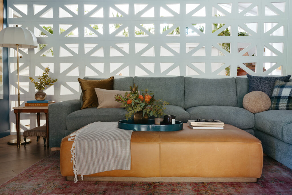
Meshelle Floor Lamp* | Sectional | Rug, vintage (similar) | Leather Cocktail Ottoman | Sofa Console Table | Drapery | Velvet Pillow (similar) | Ball Pillow (similar) | Tray (unavailable) | Side table, vintage
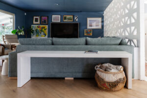
The sectional is exactly what I was hoping for (more about it here). Its deep so I can be comfortable with a child and dog draped over me, and I upgraded the cushions to be super squishy but they still hold their shape. The fabric is Crypton, and so far seems to be holding up to Desmonds evening zoomie sessions and overall dogness. We swapped out our glass coffee table for the leather ottoman and it once again adds to the ultimate coze spot. It’s huge, almost 6′ long so everyone gets a soft place to put their feet up if they don’t have the coveted corner spot. The warm cognac leather color balances out all the cool tones in the room and I’m embracing all the scratches and letting it patina with life. I found most of the pillows at Home Goods, so i can’t link them, but I kept the color palette tight and relatively simple.
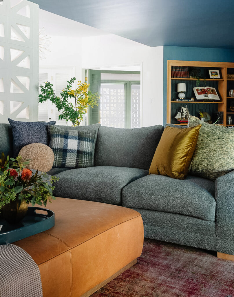
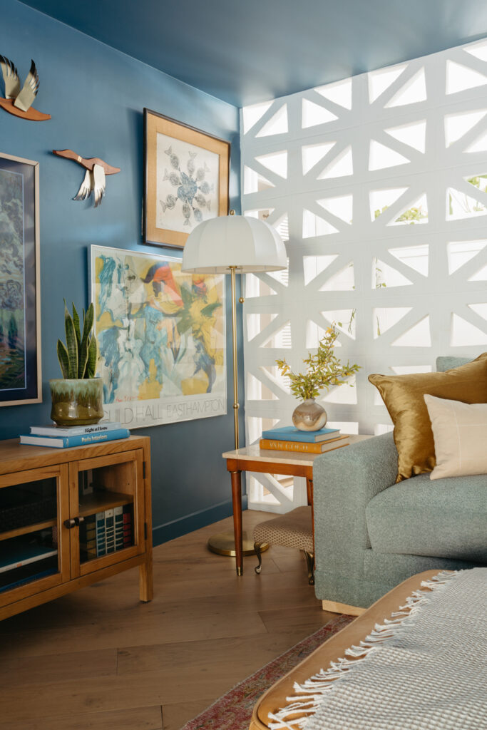
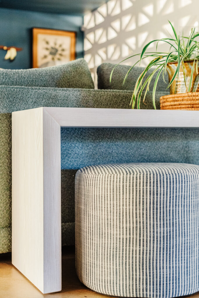
The one problem with removing the coffee table is that Cecily used it every day to eat snacks and do art projects. I added the sofa console table behind the sectional as a place to set drinks for us, but also to give her safe place to do her thing. I found this long, low console table, which is the perfect height to make a little desk spot. Wovenbyrd gifted the stripey ottoman poufs and they are perfect under the table. They’re wide and cushiony, so comfortable even for an adult to sit on, and lightweight enough to move over the the armchairs when needed. It also extended the room a little closer to the fireplace which helped close up the awkward open area in front of the fireplace.
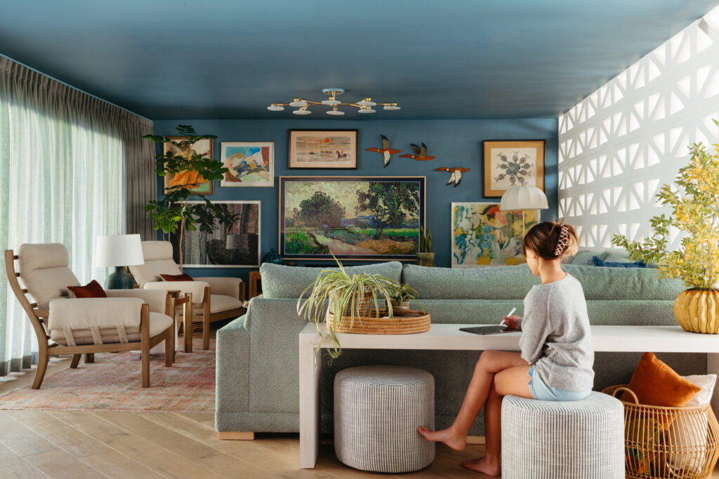
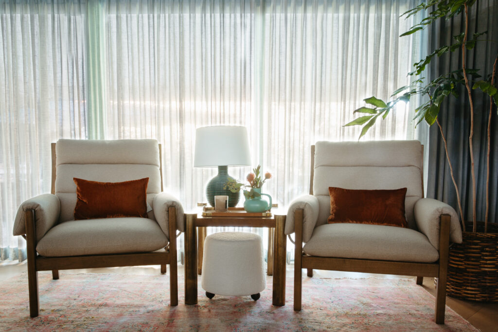
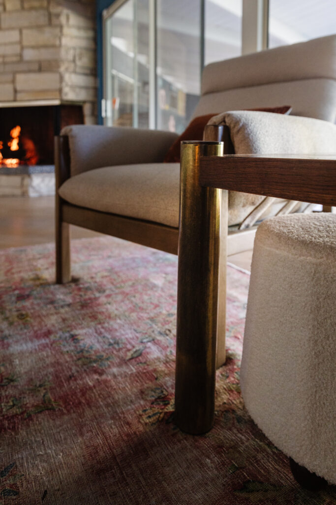
I wrote a lot about the drapery process in this post, and they add so much to making the room feel complete. It feels warmer (like, actually), and I’m so much more relaxed at night. These chairs were a bit of a debate to land on. I tried a couple vintage options but the shape and scale wasn’t right so I opted for these new ones that fit the room really well. Honestly they’re a firm sit, but I love how wide and deep they are and I think the foam will relax over time. They’re also a good option for my parents when they come over since they sit a little higher than the sofa.
The end table was a last minute score I found the afternoon before the shoot at Midway Antiques in Sacramento. Its a vintage Lane table from the 70s or 80s and I love the unlaquered brass legs and parquet wood top.
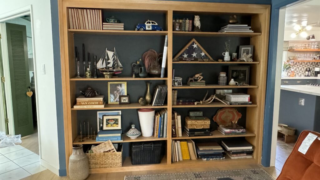
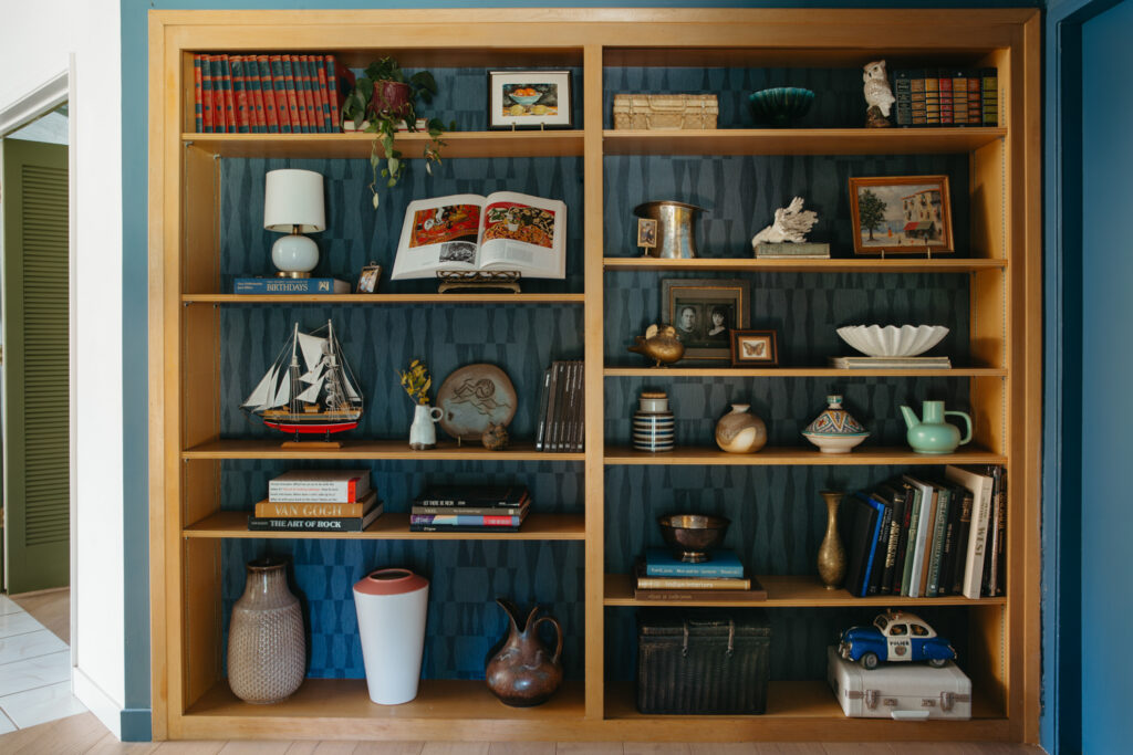
FIREPLACE / BOOKCASE
Before
After
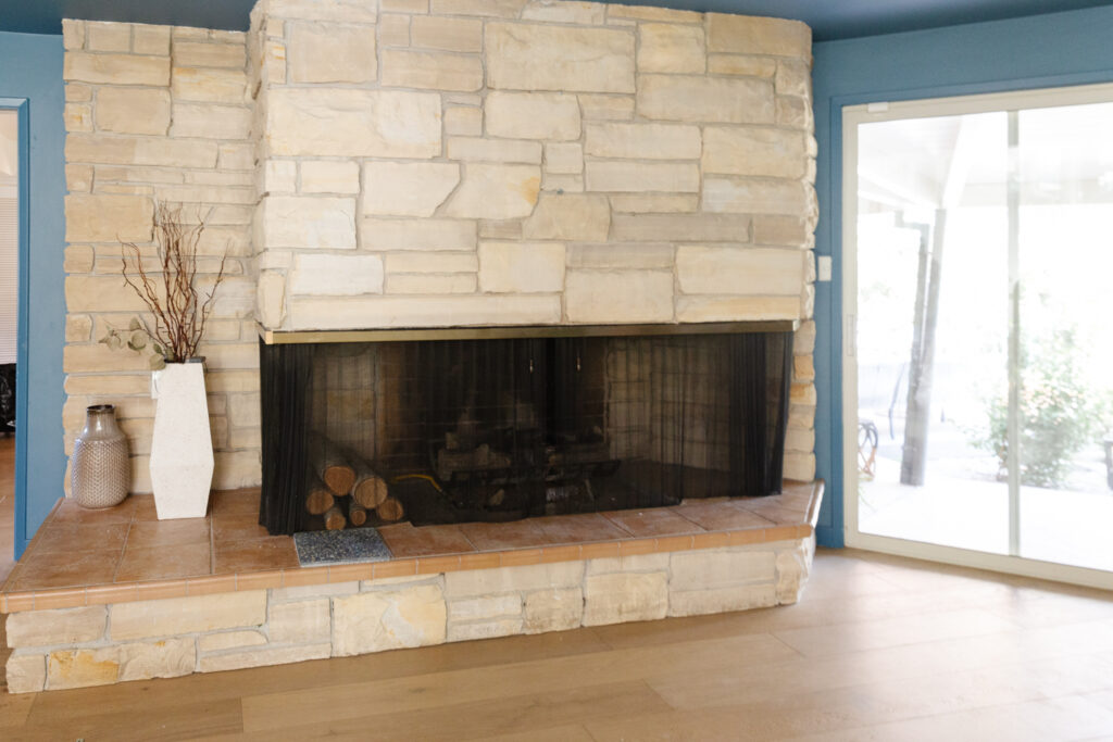
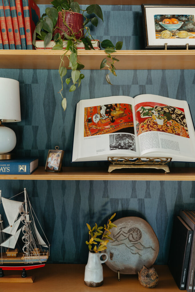
Terrazzo Tile* | Art, vintage | Runner | Kitchen pendants
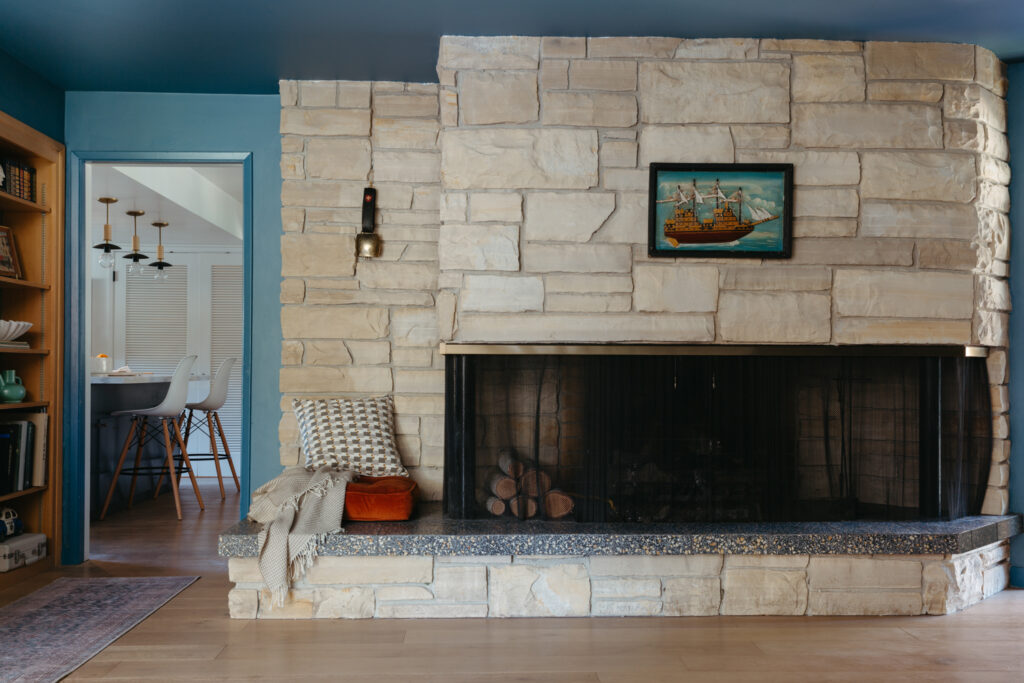
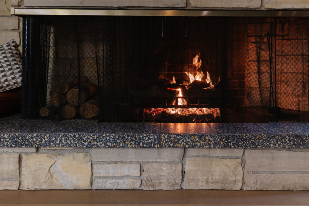
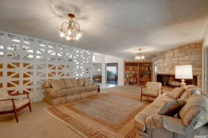
Behind the seating area we have this huge, original stone fireplace. I love the stone, but I did not love the 90s bull-nose tile situation on the hearth. It wasn’t period-appropriate to the house and just made it all look “blah.” I’ve been staring at it for years trying to decide what to do, and when I remembered Villa Lagoon’s terrazzo tile, I knew it was my solution. The Monarch color has a charcoal color field with coral and beige flecks in it that pick up the stone color PERFECTLY. We used a dark grout color to match the background of the tile and it looks so cool and sleek.
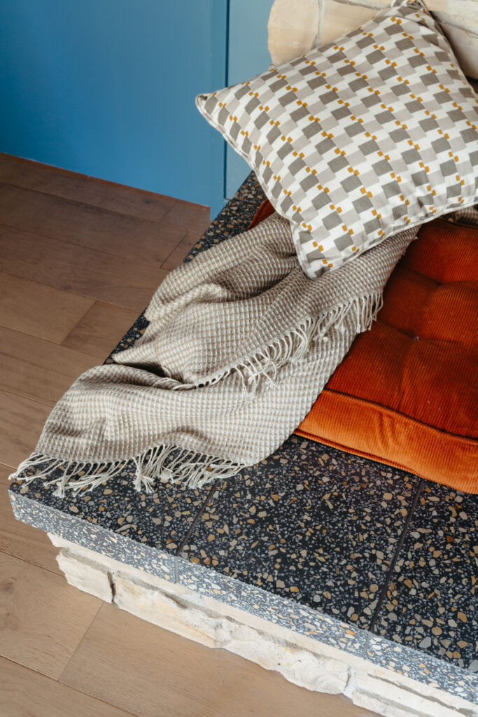
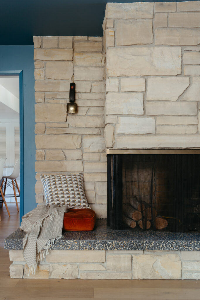
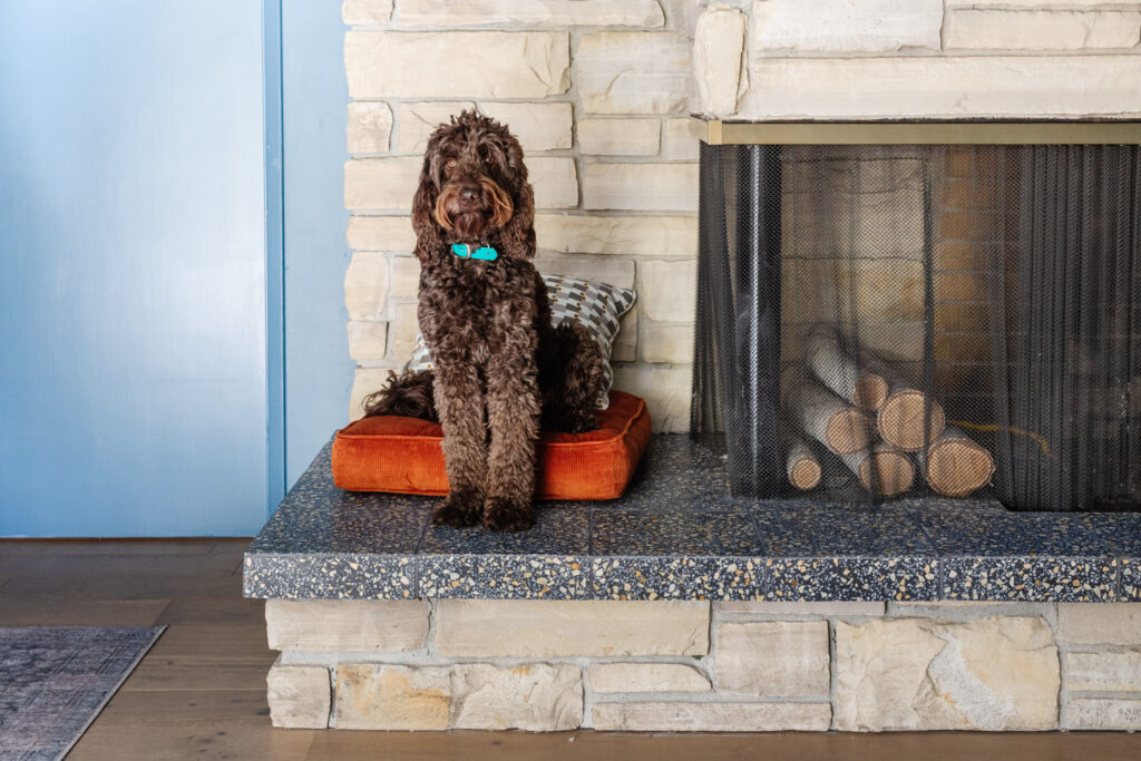
I added a cushion to this corner because it needed something, and Cecily and Desmond actually use it. There’s an outlet behind the pillow so she uses it to sit and charge her ipad sometimes. And Desmond thinks its his little dog throne, so bonus I guess.
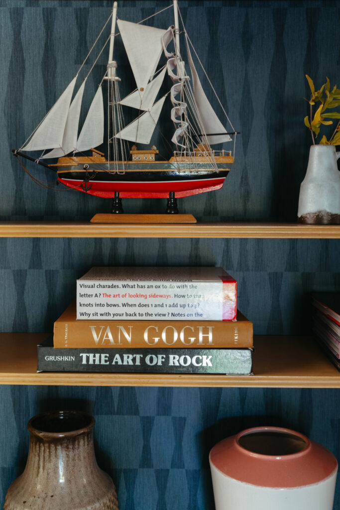
Just to the left of the fireplace is a built-in bookcase that needed a spruce up. The styling needed a reset but I’ve also been wanting to add a wallpaper over the black paint. When Tempaper offered to collaborate with me, I jumped at the chance. I’ve never installed removable wallpaper, and knew this was perfect opportunity to try it for myself. Read more about the installation process in Week 7.
Before
After
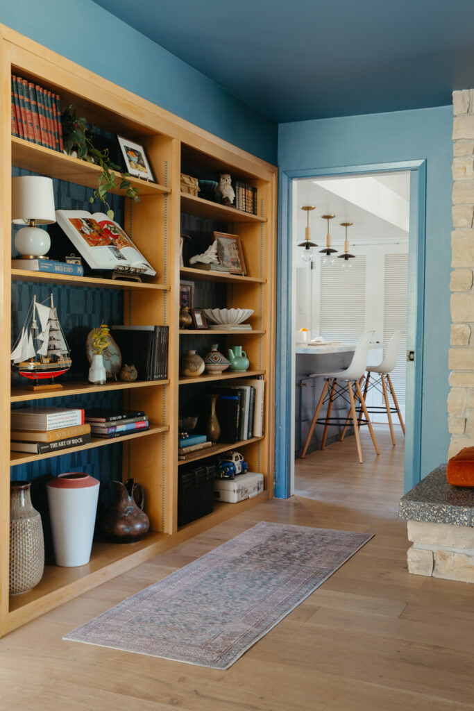
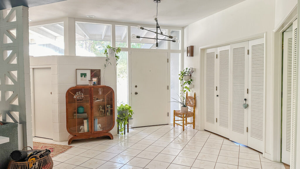
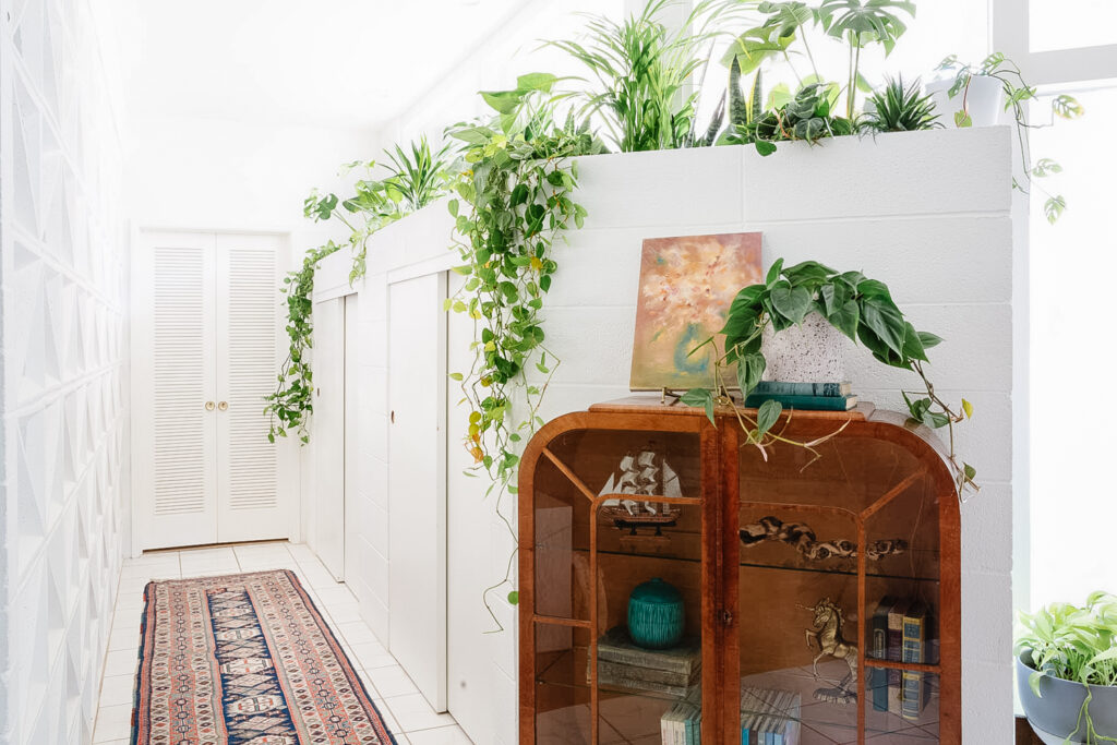
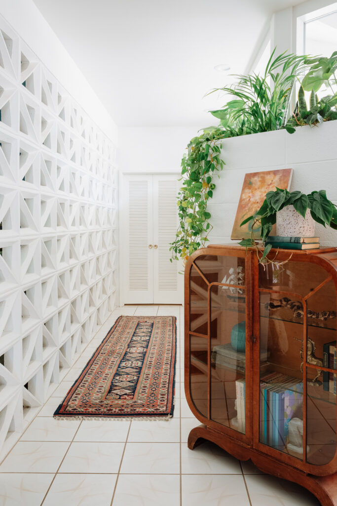
Entry hall
If you’re still with me, we’re close to the finish line! The entry gets the best natural light in the house, but its always felt lackluster to say the least. The light fixture wan’t expressing the drama the space wants, and I was ignoring one of the coolest original features of the house.
Before
After
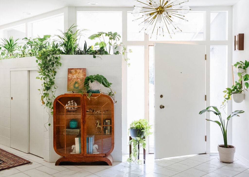
Linnea Chandelier* | Wall planters | Cabinet, rugs & accessories vintage
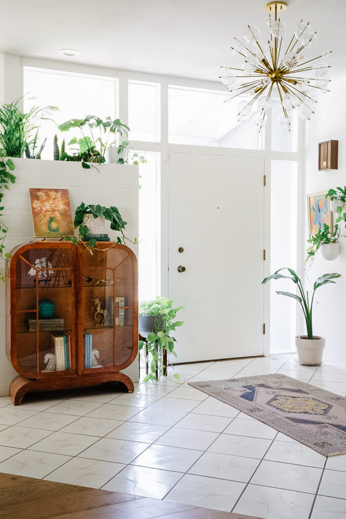
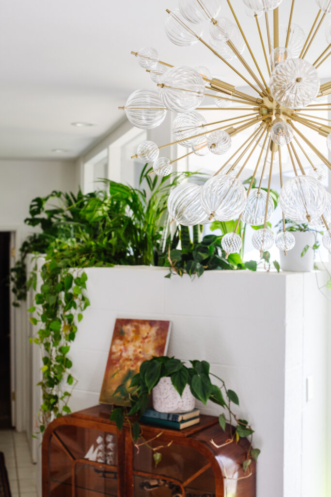
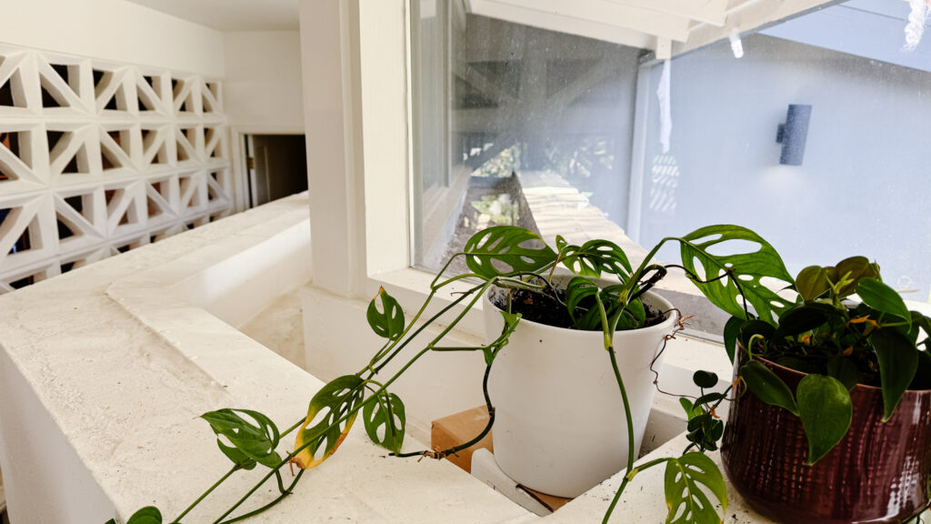
As a reminder, here is what the planter looks like. Its a long trough that I’ve been avoiding putting more plants in until we had a solid watering plan in place. I had hoped to bring in a drip system, but it (long story) didn’t work. Since the trough is slow draining (there’s a drain that runs under the house), we can fill it up in one spot and the plants will soak it up from the bottom. We kept the plants in their nursery pots so we didn’t have to deal with a bunch of soil either. Note: there’s another one on the exterior side of window, but that’s another project for another day.
It looks so lush and gorgeous from the inside and the outside of the house walking up. I love the pops of greenery we see from the seating area and it just feels more complete.
That’s a wrap! Thank you for following along and let me know if you have questions! Thank you to all my sponsors, my dad for building our hidden console table, Aynsley for helping me with the planter and wallpaper, my husband for always supporting these projects against his better judgment, and Linda at One Room Challenge for giving us the gift of these events. Hugest thank you
All “After” photos by Whitney Dianne except where noted (her photos are way better than mine).
* Gifted or discounted by our generous sponsors in exchange for promotion. May contain affiliate links, all opinions are my own.
FAMILY Room
- New sectional
- Order drapery
- Install drapery
- New media console
- Install light fixtures
- Build skinny sofa table
- Source accent tables
- Hang art
- Source accent chairs
- Style!
FIREPLACe / ENTRY
- Demo existing tile hearth
- Install tile hearth
- Wallpaper bookcase
- Restyle bookcase
- Select plants for planter box
- Replace entry chandelier
If you're new here, I'm Rebecca designer and founder of Studio Plumb. In January 2017 we became the second owners of the #plumbmidmod, a one-of-a-kind 1960 midcentury ranch on .8 of an acre outside of Sacramento, California. It has cool original architectural details, a creek running through the yard, and a perfect floorplan. It also needs a sh!#t ton of work. Bit by bit with the help of my dear old dad we're bringing it back to its former glory with a modern spin.
For more updates follow along on Instagram and all you design entrepreneurs check out our new podcast the Hot Young Designers Club.
CATCH UP ON THE PROCESS

I’ve found so much inspiration from fellow participants. Be sure to read all the posts from all the rooms here! Thank you to Linda and the One Room Challenge team for all their hard work making this event run smoothly. And more thanks to Apartment Therapy, this season’s media partner, who are covering the event.