Hi! I’m Rebecca designer and founder of Studio Plumb. In January 2017 we became the second owners of the #plumbmidmod, a one-of-a-kind 1960 midcentury ranch on .8 of an acre outside of Sacramento, California. It has unique original architectural details, a creek running through the yard, and a perfect floorplan. It also needs a sh!#t ton of work. Bit by bit with the help of my dear old dad we’re bringing it back to its former glory with a modern spin.
Catch up on LAST week
This week I’m sharing the design plan and getting a bit more in-depth about what I’ll be accomplishing in the coming weeks of the One Room Challenge. It may seem quiet around this project, but in typical Week 2 fashion there is a LOT going on behind the scenes.
Last week I walked you through the history of the room and what I hoped to accomplish during this challenge. My original plan was to complete the seating area portion of the family room and had a fantasy of updating the fireplace and the bookcase area. Welp! Its all happening!! And, I found out I have a wonderful brand sponsoring the lighting, so I’m updating the entry area too. My design bestie Shaun, told me that’s like Girl Math for design, which is 100% accurate. All these rooms are connected, and I’m already dealing with one area so might as well do them all? 🤷🏽♀️
THE Design PLan
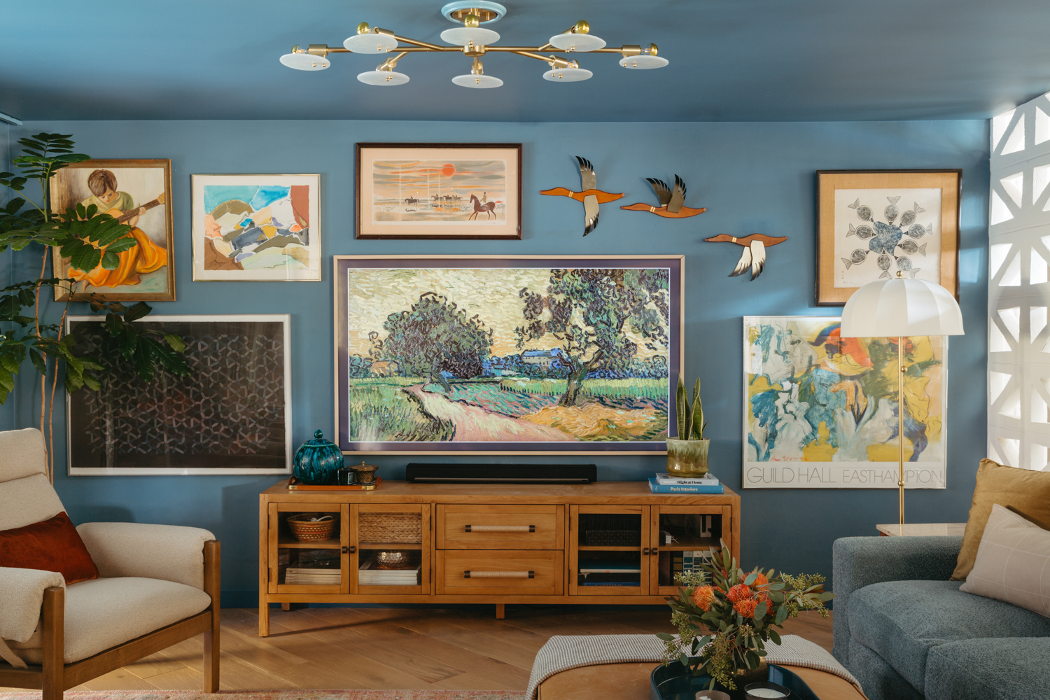
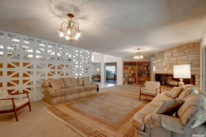
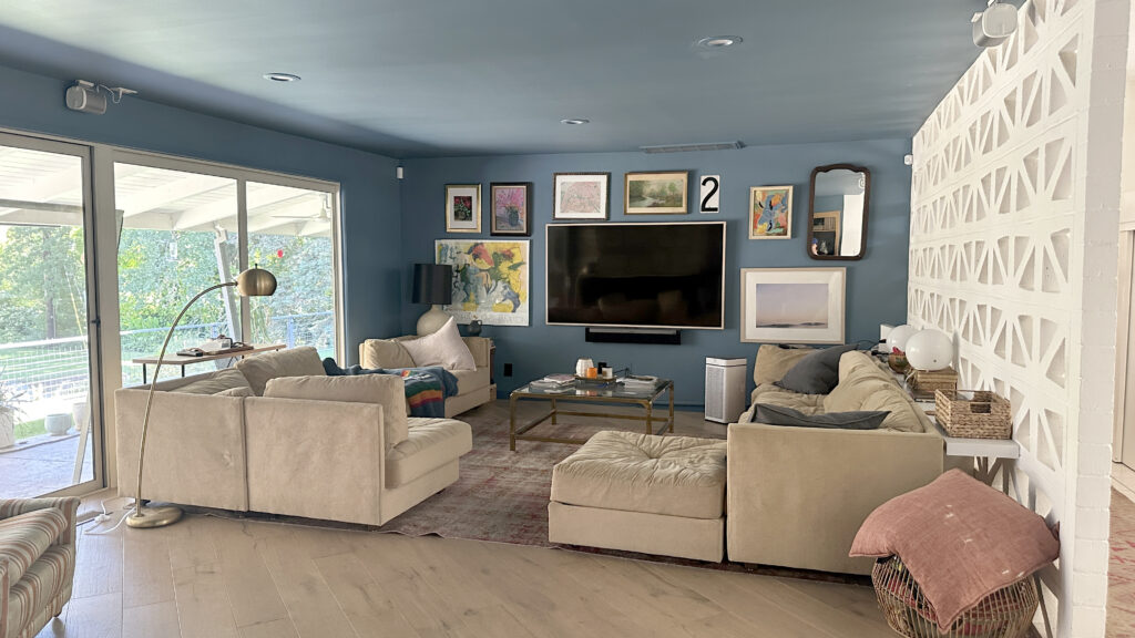
As a refresher, here’s where we started. The room is oddly shaped and is connected to the entry, dining room, formal living room, backyard and kitchen. The walls and ceiling were painted Behr’s Blueprint a couple years ago and we have 75″ Frame TV living large on the far wall. The only way I let my husband get a TV that big was if it was a Frame so that was the compromise. I do love it, it feels appropriate for the size of the room but we are not going any bigger.
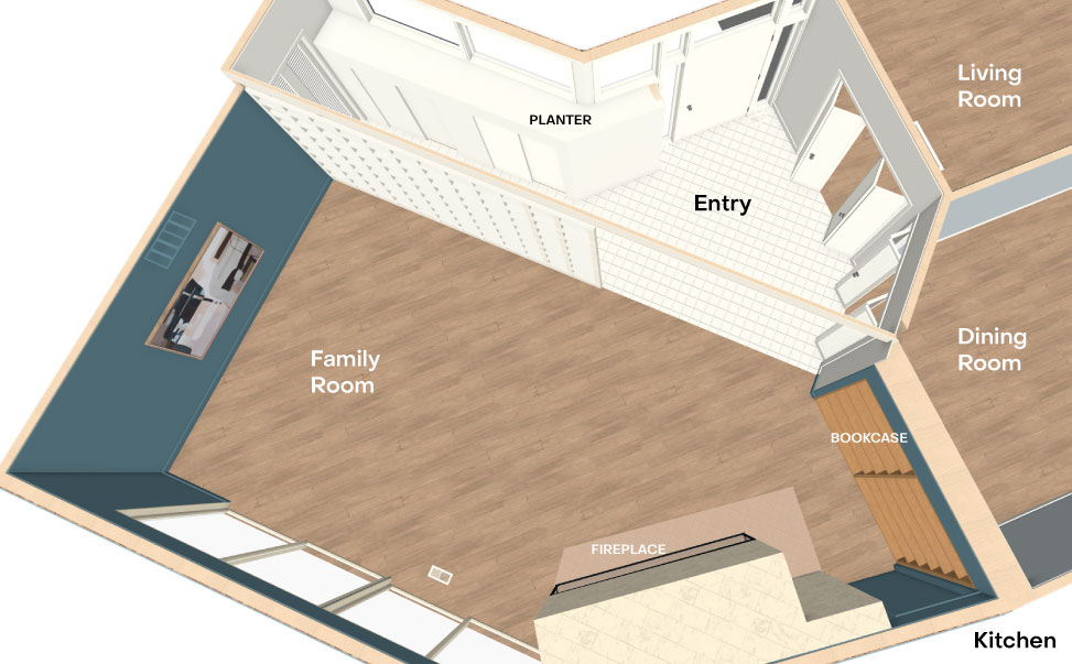
The first step in my design process, whether its for my own home or a client’s is to draw the room in scale and layout the floorplan. I include all the furniture, lighting and major accessories to get a sense of the room’s flow and balance.
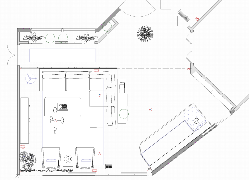
The cool thing about the software I use is that it builds a 3D model at the same time I’m drawing in 2D so with a click of a button, I can “walk” the room to see how it feels.
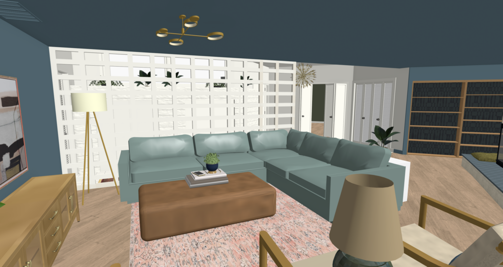
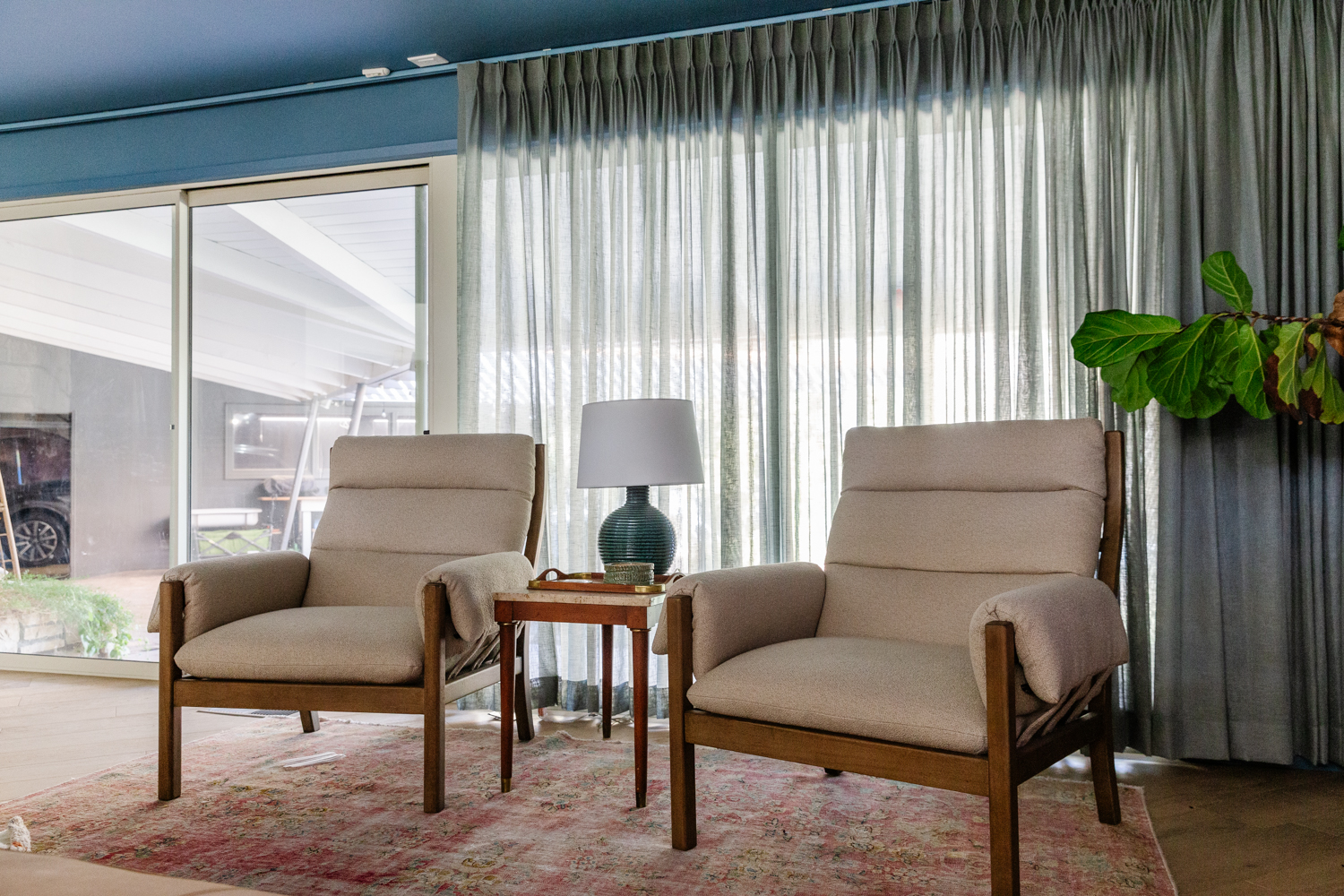
We don’t usually sit in here, we lounge so a deep, comfy sectional was a must. We’re counterbalancing that with a couple of arm chairs that will round out a conversation circle and leave more of the view visible through the windows.
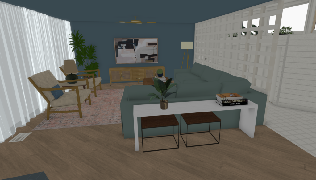
We’re also adding a large media console under the TV. We’ve never had any storage in here, and now that our daughter is into Nintendo, its time to hide some of these components. In lieu of a coffee table, we decided on a big ol’ leather ottoman so everyone sitting on the sofa can put their feet up comfortably. When you’re fully reclined in a deep sofa, I think its easier to reach a drink behind you so I’m adding a couple sofa tables behind the sectional. A prettier one that floats in the room will double as an accent piece as well as a safe place for kid snacks and art projects. Along the breeze block wall my dad is making us a skinny (4″) ledge that has a couple outlets and can be a place to set down a drink.
I’m keeping the same vintage rug, will redo the gallery wall around the TV, and one of the things I’m REALLY excited about is drapery panels across the windows. We’ve never had window coverings in here and its technically been fine–we have tons of privacy and no direct sun light– but I’m craving the softness and texture that window treatments bring. Everytime I look at the rendering than look at my existing windows, they just feel naked.
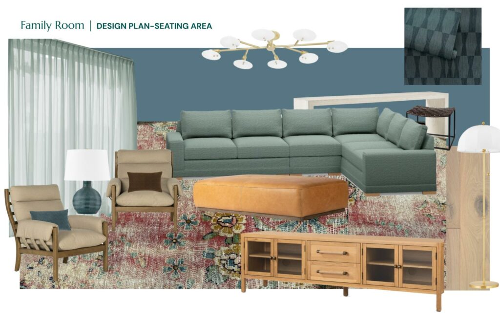
My color palette is mostly warm tones that compliment the blue-gray that dominates the room. I’m adding in blue-greens that are also in the rug, and varying warm neutrals like oak, tobacco leather, and khaki. The big color pop moments will come from art and textiles.
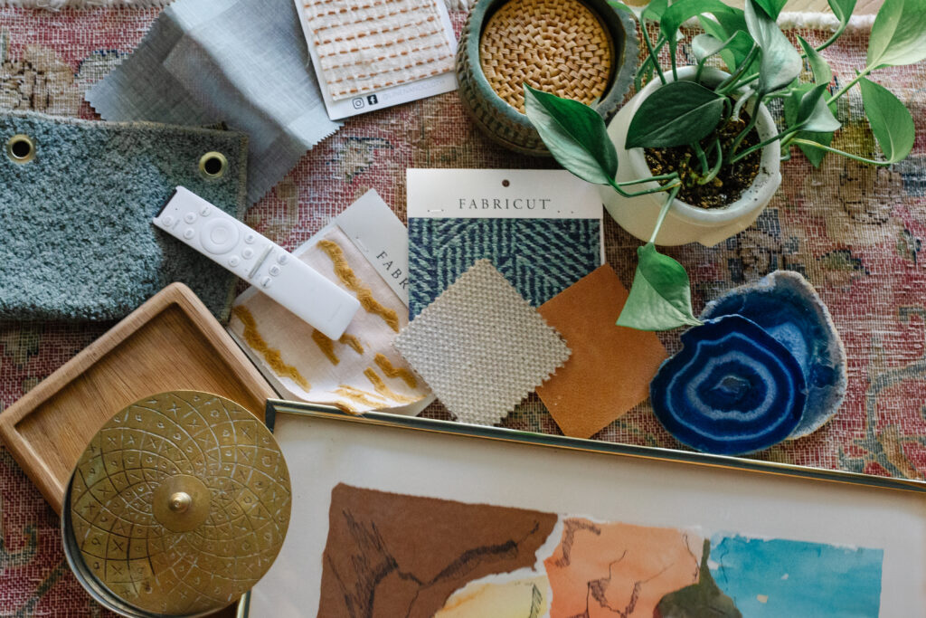
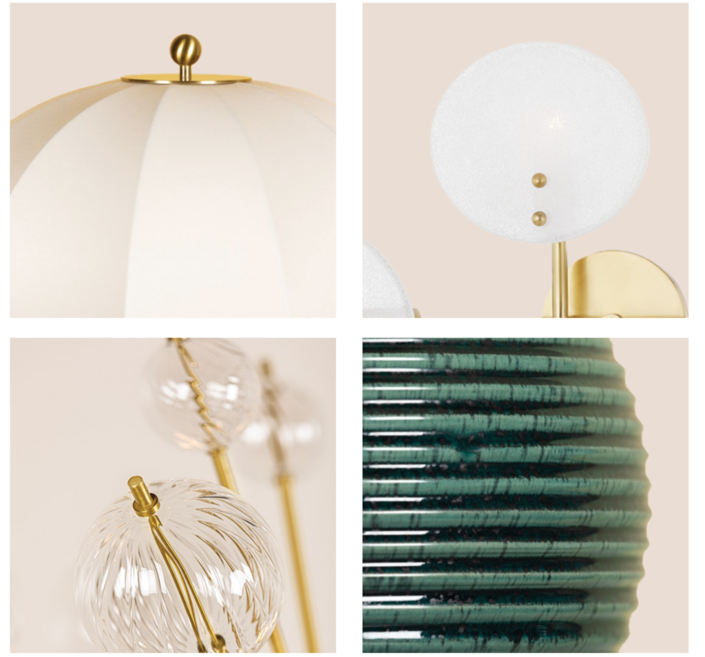
Let’s not forget about good lighting. Currently we have recessed overhead lighting which is ok, but its not adding anything visually to the room. Since the space is large with multiple zones, I want a big fixture over the seating area to visually anchor the space. Plus, a couple of portable fixtures that will give us some mood at night and spread light around at a lower level. See some sneak peeks below, Mitzi is sponsoring all the lighting in here and I can’t wait to osee how it changes the room!
THE FIREPLACE & ENTRY
I’ve had a love/hate feeling about this fireplace since the beginning. Its massive, continues outside and is the first thing you see when you walk in the front door. I know many folks would probably want to update the stone but I actually really love it. The color is warm but still fairly neutral, and its real stone, not a faux veneer. The asymmetry is hard to design around and yes, I wish it wasn’t mere inches from the opening of the sliding door, but I’ve embraced most of her idiosyncrasies.
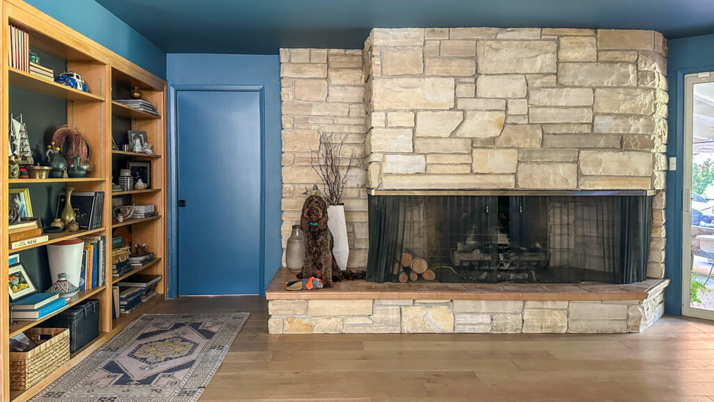
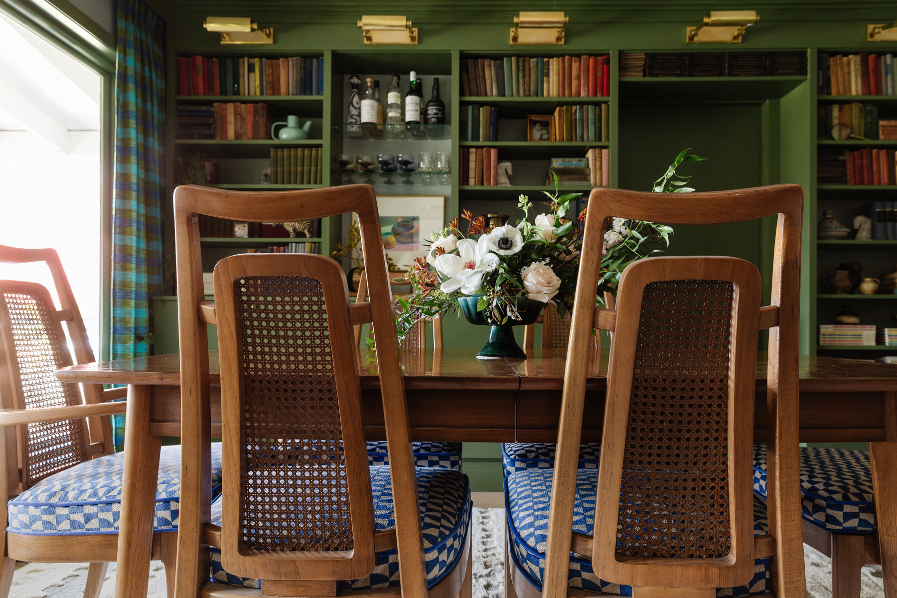
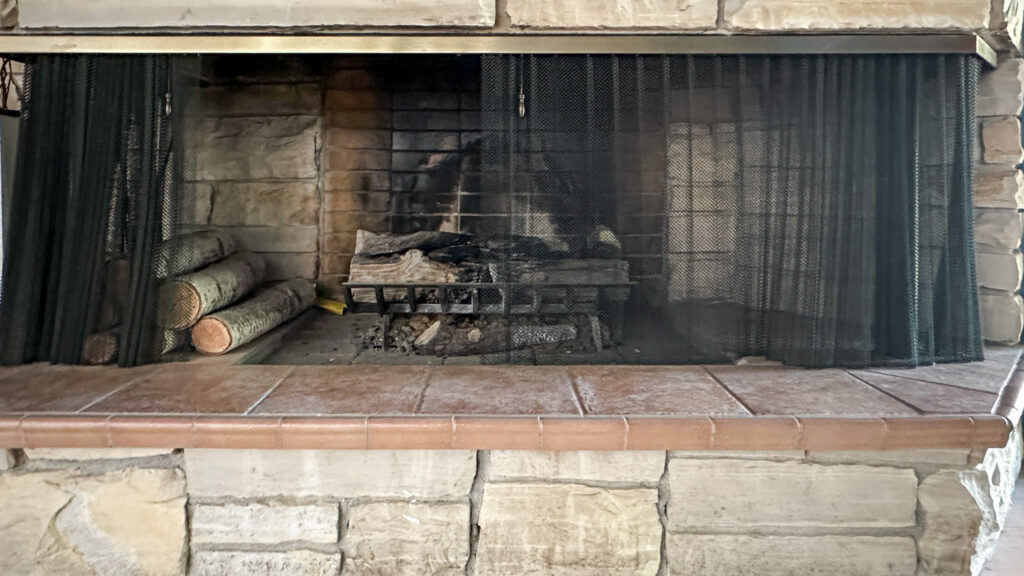
What I can’t stand is the hearth tile. The band-aid color does the stone zero favors, and the chunky bullnose is not serving mid-century chic. I’ve gone round and round with what to do, and I’m SO excited with where it landed. More to come soon, but she’s getting a glow up! While I’m at it, I’m adding wallpaper to the back of the bookcase and restyling everything to look more intentional.
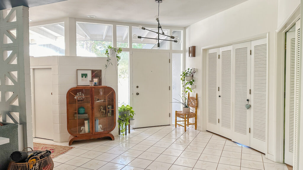
Last but not least, the entry is getting an upgrade too! I’m not going full-on in here, but I do think the changes will make a big difference. First up is the chandelier. I’ve had the current one for like 10 years, which is several lifetimes for a designer. Its from our last house and the new one coming from Mitzi is going to add so much sparkle. As I’m typing this looking at the photo I might actually paint the inside of the front door. I wish I could update the whole thing but every time I look into it I get a headache and quit.
Cliff Notes version: Its original and custom, the weather stripping is fabricated into the frame which also holds the windows and I can’t update the hardware because the backset of the deadbolt is a weird size. The worst part? You can see the outline of the original starburst eschushion imprinted in the wood on the front but it was removed at some point. 😭
The other update I want to do is finally add plants to the built-in planter box. What planter box? There is a metal trough running along the top of the cinder block wall against the windows. It even has a drainage pipe that runs to the outside! We’ve been talking about this for years, but I haven’t wanted to add plants until I knew we had a reliable watering sitch (not me). I think my husband has agreed to help get a drip system pulled in so it might be jungalicious in no time!
FAMILY Room
- New sectional
- Order drapery
- New media console
- Install light fixtures
- Build skinny sofa table
- Source accent tables
- Hang art
- Source accent chairs
- Style!
FIREPLACe / ENTRY
- Demo existing tile hearth
- Install tile hearth
- Wallpaper bookcase
- Restyle bookcase
- Select plants for planter box
- Replace entry chandelier

I’ve found so much inspiration from fellow participants. Be sure to read all the posts from all the rooms here! Thank you to Linda and the One Room Challenge team for all their hard work making this event run smoothly. And more thanks to Apartment Therapy, this season’s media partner, who are covering the event.
I’ll be updating the blog weekly, but follow along on Instagram for more behind-the-scenes progress!