Can you believe its finally done!!? The problem with renovating 3 spaces at once (besides the obvious) is that I don’t know which one to reveal first!!
So I’m going to go in order of the name I came up with for this Challenge, the MudBathLaundry, with a bonus Hallway section, since it deserves its own spotlight. And of course, walk you through all the Befores and Afters with links to sources at the end. Let’s go!
Mudroom
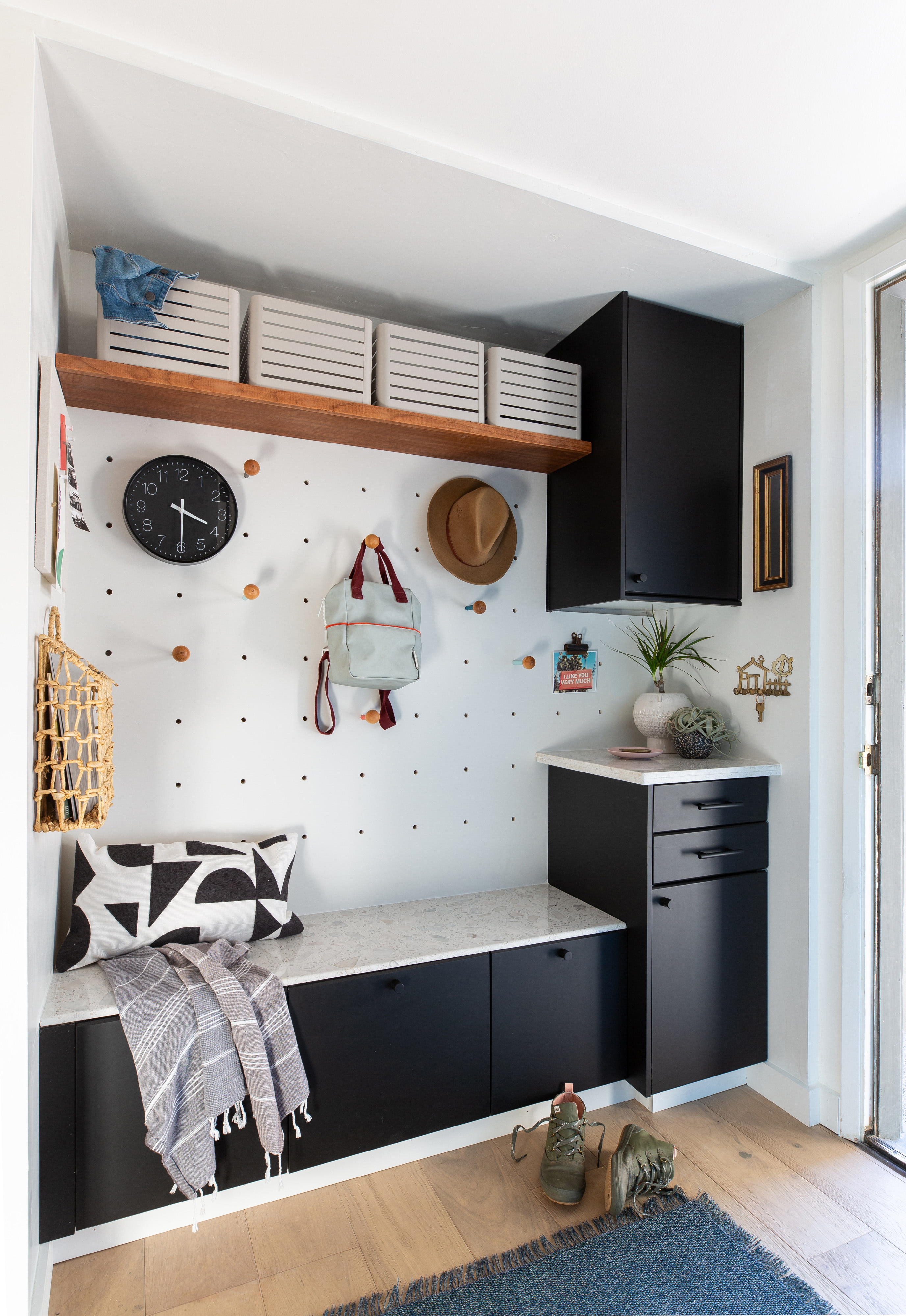
Ahhh, I never knew that 14 square feet could be life changing, but this little alcove already is. A place to drop groceries, bags, shoes and backpacks that is not our kitchen island is just so, so gratifying.
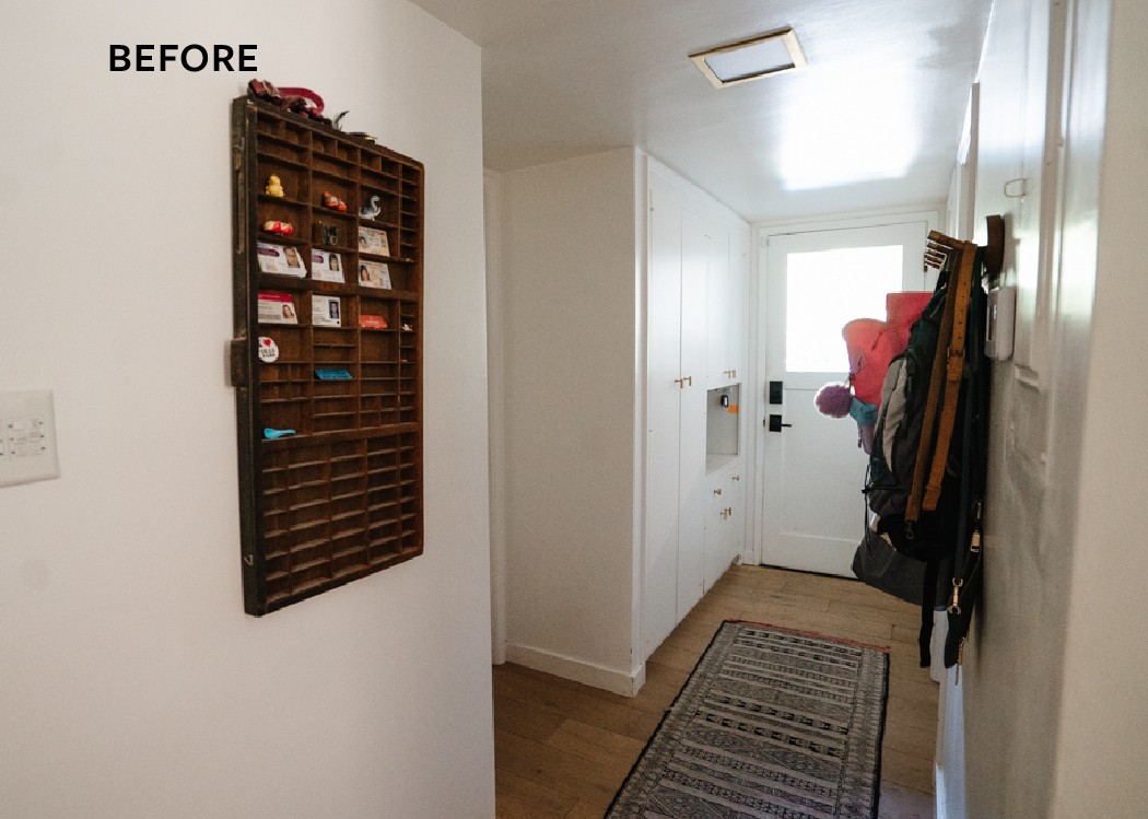
Like I’ve mentioned in previous posts we primarily use this back door as it leads to our driveway. The original built-in cabinets seemed like they’d be functional storage but this hallway isn’t wide and there was no way we were going to open a door and put a coat on a hanger when we came home. We are not those people. Opening the doors also was annoying in such a narrow space.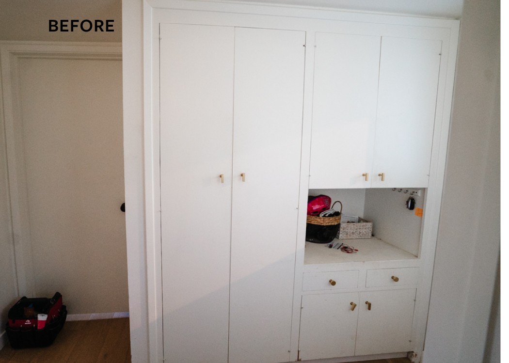
I always seem to have full hands and too many bags so I dreamed about one day having elbow room and landing zones here. I had added hooks on the opposing wall which helped keep things off the floor but encroached even more on the narrow walkway.
 And now we have it! We’ve only gained about 8 inches of walk way and incredibly it makes a huge difference. I’ll talk more about the hallway updates later but the overhead sconce from Lumens is such a beautiful upgrade. I love its simple shape and the profile is visible through many parts of the house. We also received this Chilewich runner from Lumens (yes, they have such good home accessories!). Its woven vinyl so will stand up to high traffic but I love the softness the fringe brings.
 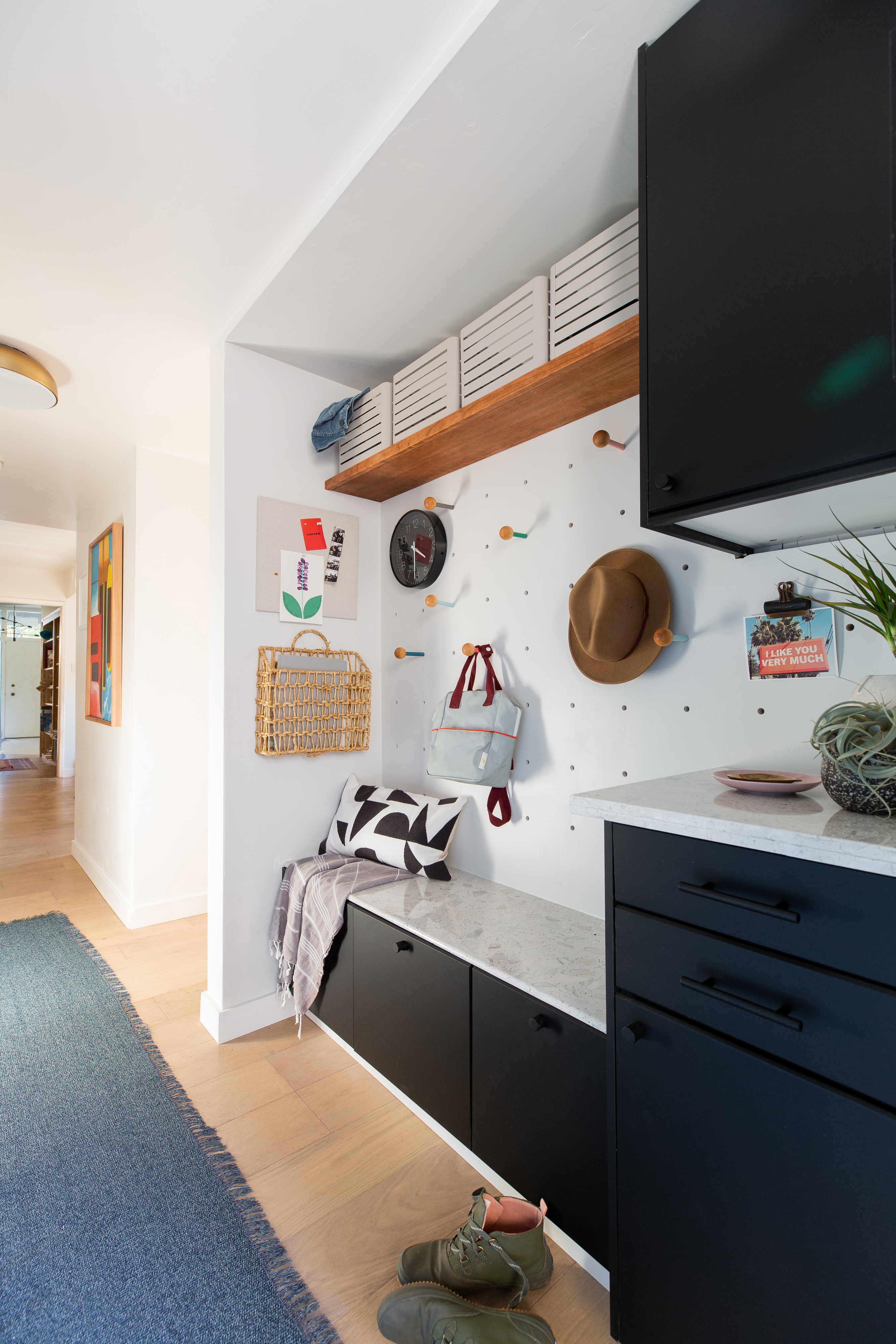 I’ve always loved the graphic simplicity of an oversized pegboard and knew this would be the space to make it happen. Its functional, interesting, modern, and just cute! I know a lot of you have asked me about it so I’m going to put a post together dedicated to how we did it. We made the pegs too and I painted them different colors to bring in the color I was craving without competing with everything else happening in the adjoining spaces.
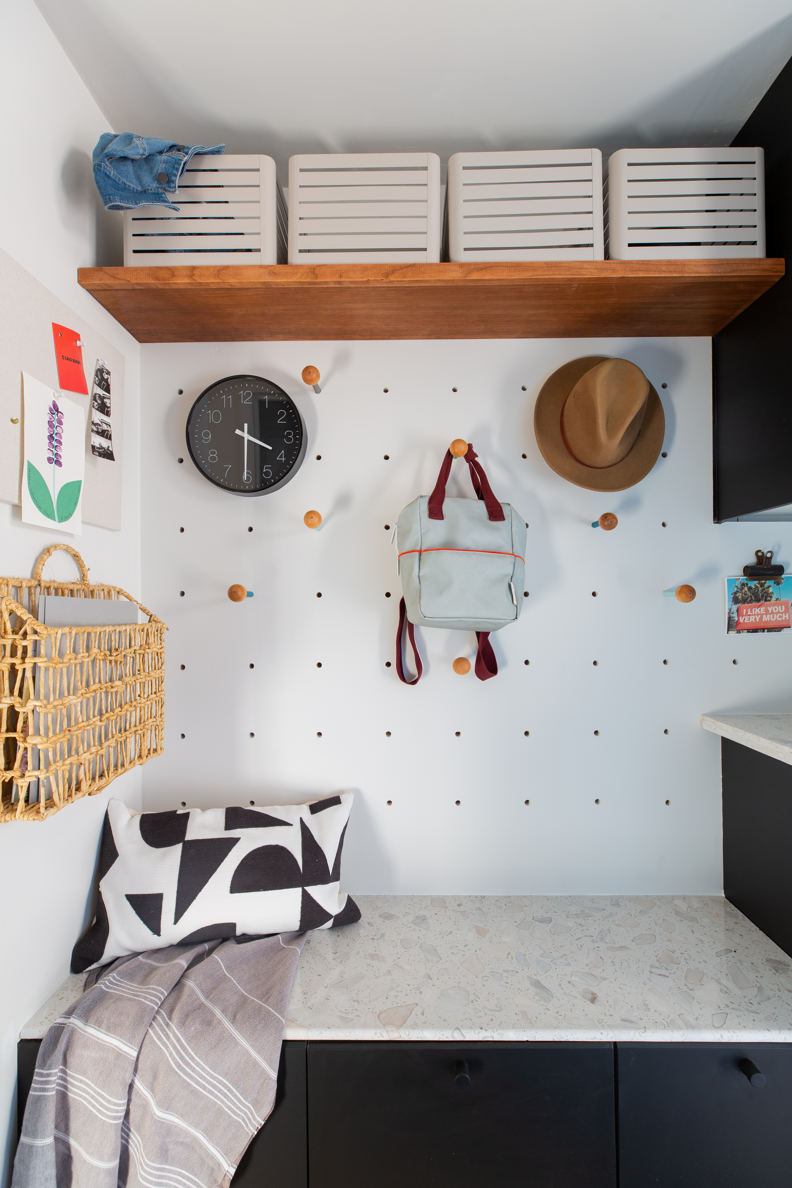 If you’ve been following along you know I originally hoped for a light aqua cabinet facings for our Ikea cabinets. After some frustrating false starts I made a big design pivot and went with these black doors and drawers directly from Ikea. I really love them! They’re a soft, velvety off-black with a subtle bevel detail on the tops and bottoms of drawers.
I almost went with brass cabinet hardware but fell in love with this black on black idea. I knew the whole area would be full of color pops and am so happy with how quiet it looks. I think it also brings a little sophistication in.
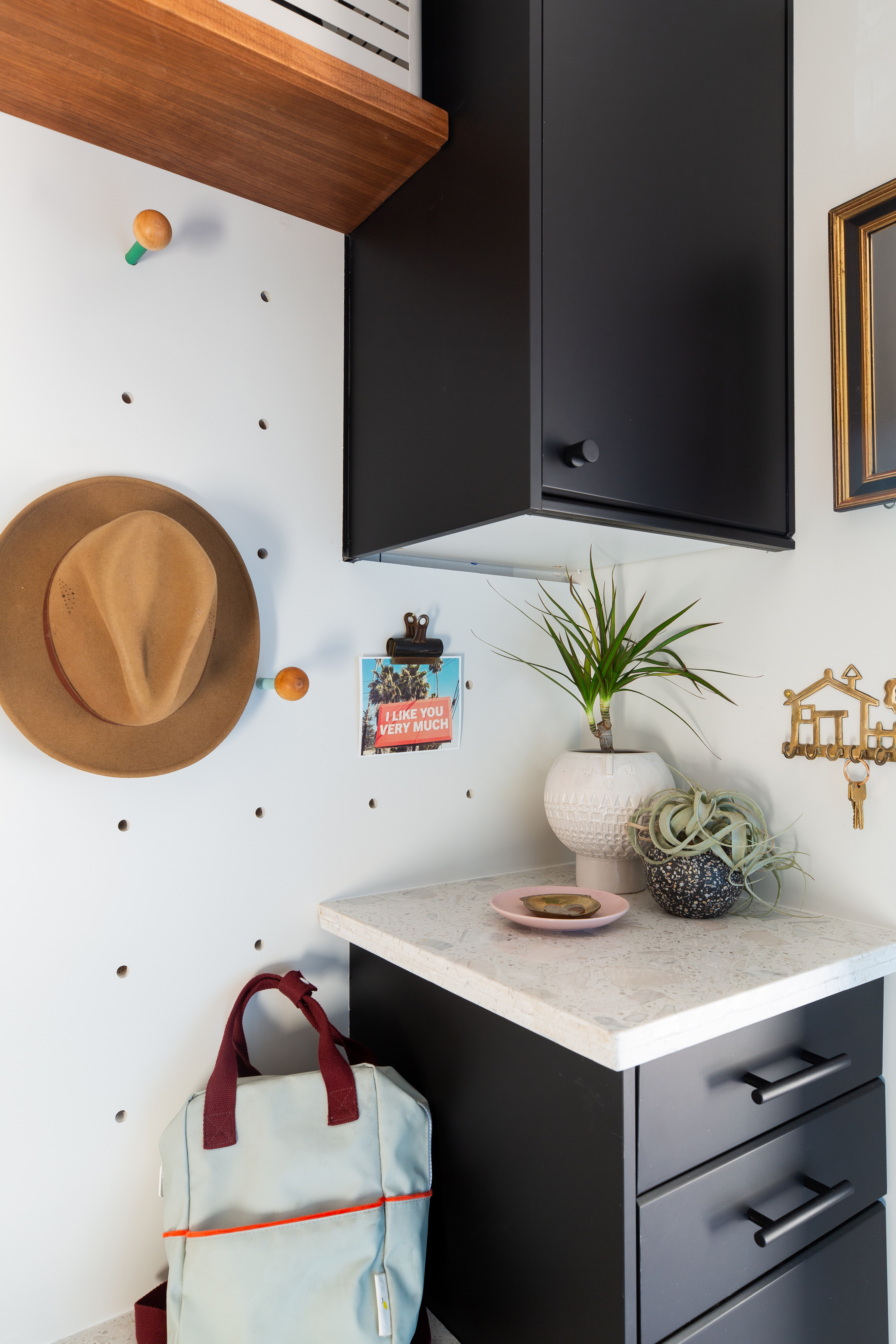
You may have heard about our $25 countertop slabs, there’s a whole bunch of Stories on it in my Instagram highlights, but basically we found these chipped quartz pre-fab bath surrounds that my dad figured out how to fabricate himself. They’re not perfect, but the price was right, we got all of our counters out of 2 pieces, so $50. We left the bullnose on the bench top and I really love how it sits and meets the drawer bevels.
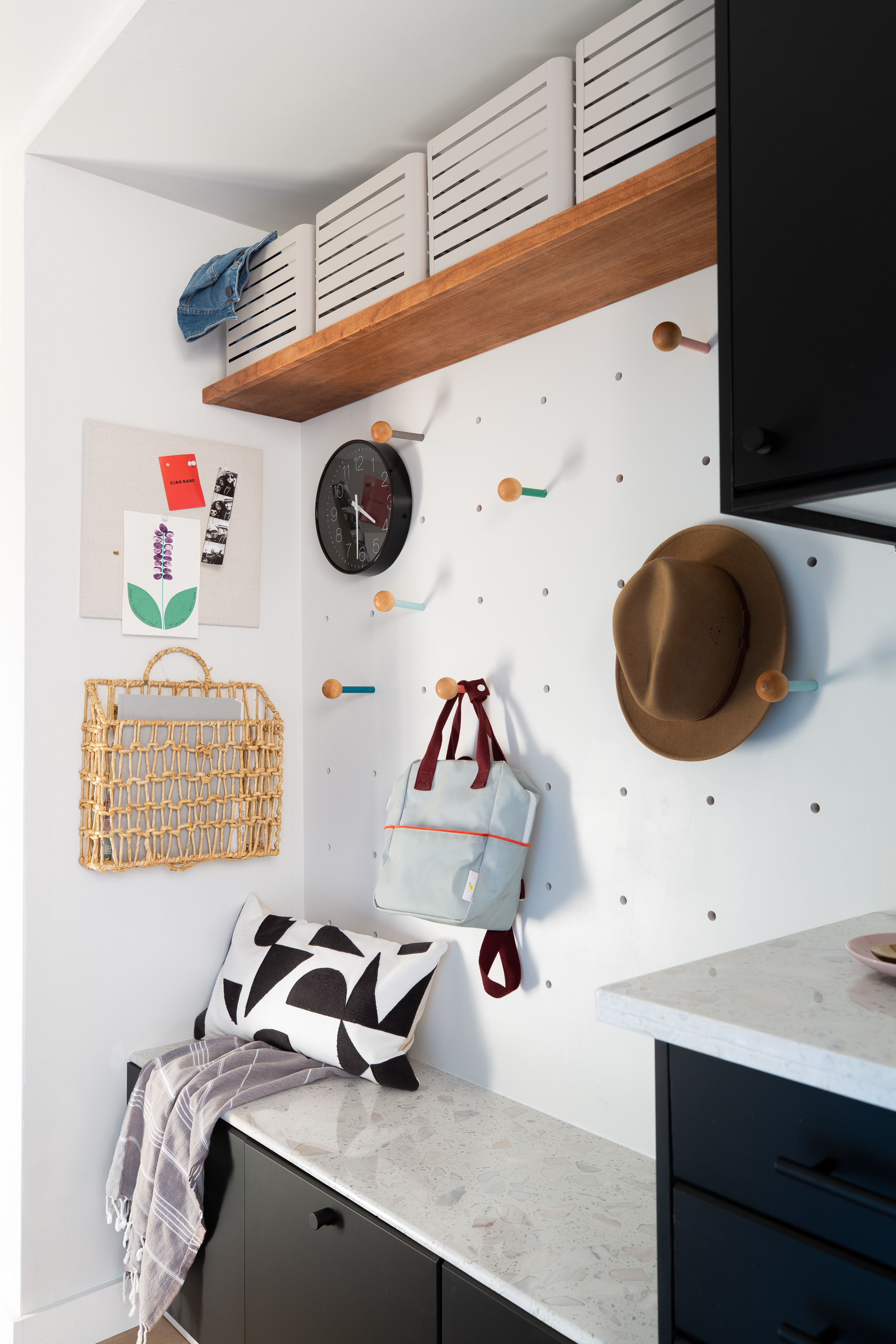
Even though we technically lost storage space this is just so much more useful. I’ll be working with Carly from Tidy Revival in the coming weeks (she did our pantry organization last year) tohelp us organize this spot to maximize efficiency and give us a strong family launch pad.

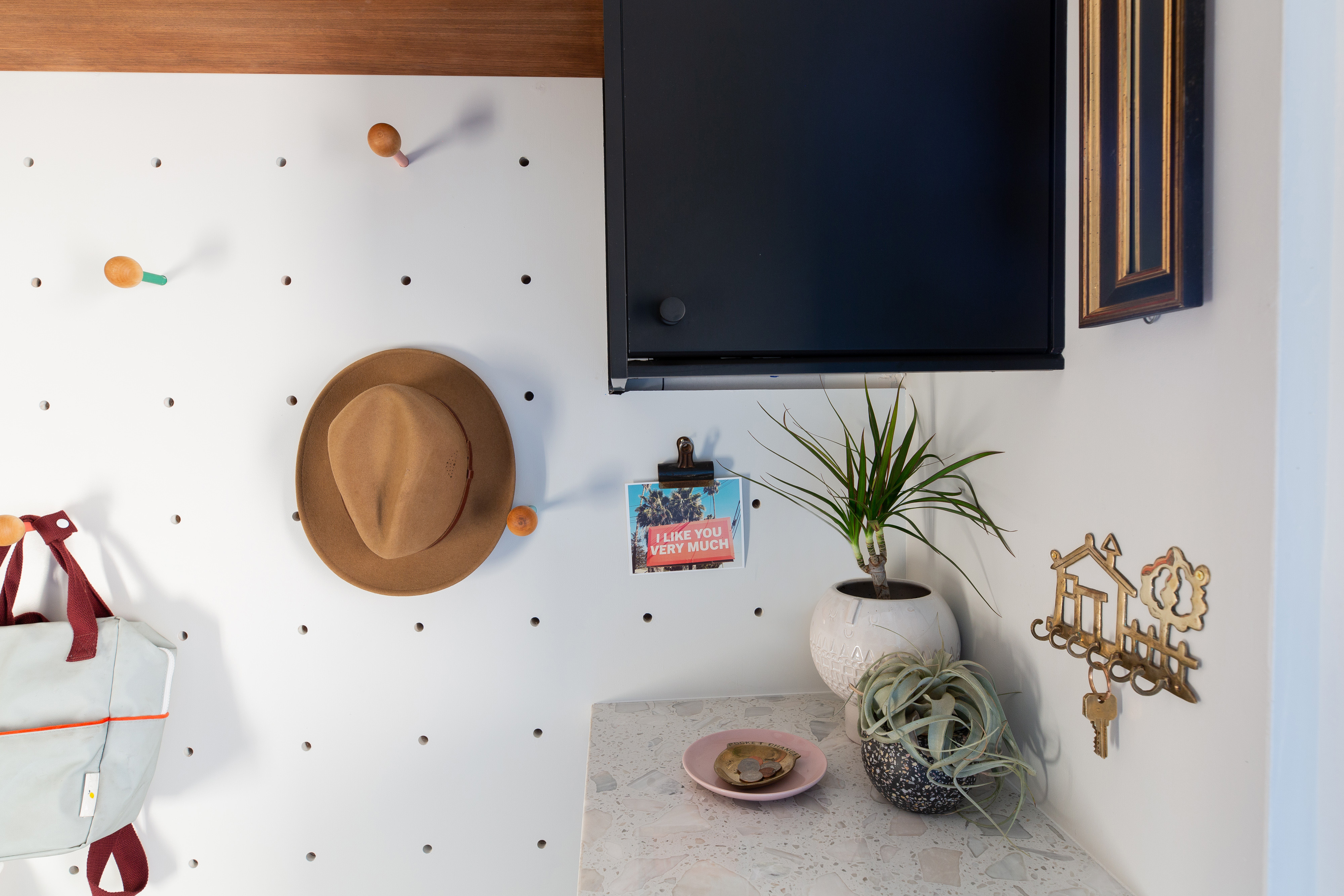
Lastly, I included a few accessories to start our days on the right foot. This little print from Juniper Print Shop* is a happy reminder before we walk out the door, the narrow vintage mirror is big enough to check your teeth, and a clock and spot for pocket change and keys keep us organized.
Bathroom
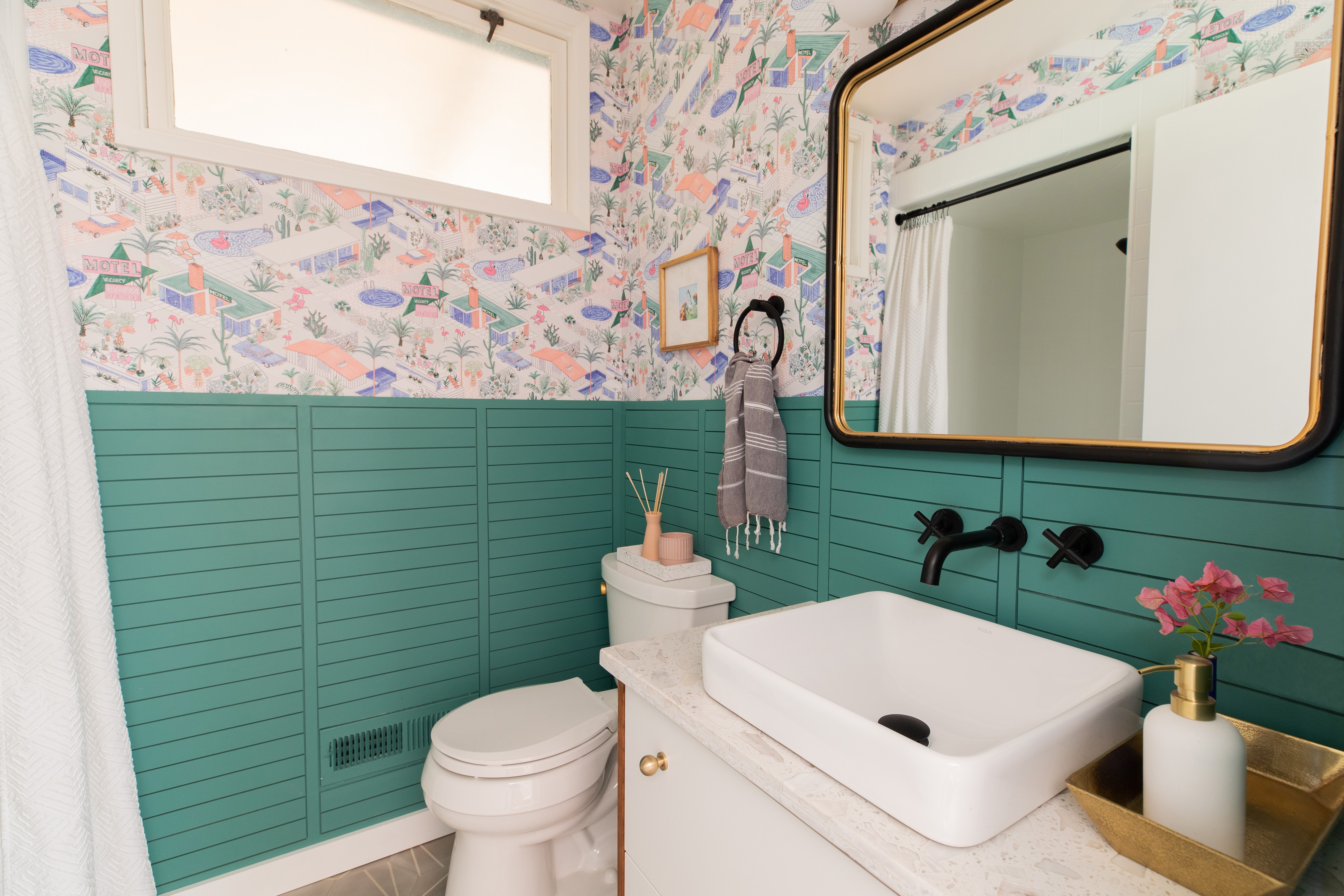
Ok, are you ready for this!!?? Behold, our new guest bathroom!
Here’s the creepy Before that I rarely went in but would make our guests use. Sorry, guests! It was beige everywhere, the toilet seat didn’t stay up when it hit the banjo countertop, had bad sheet vinyl flooring, and everything was just aged and gross.
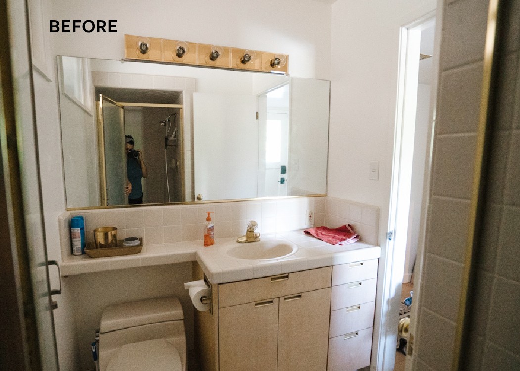
Here’s an even older photo from before we moved in. 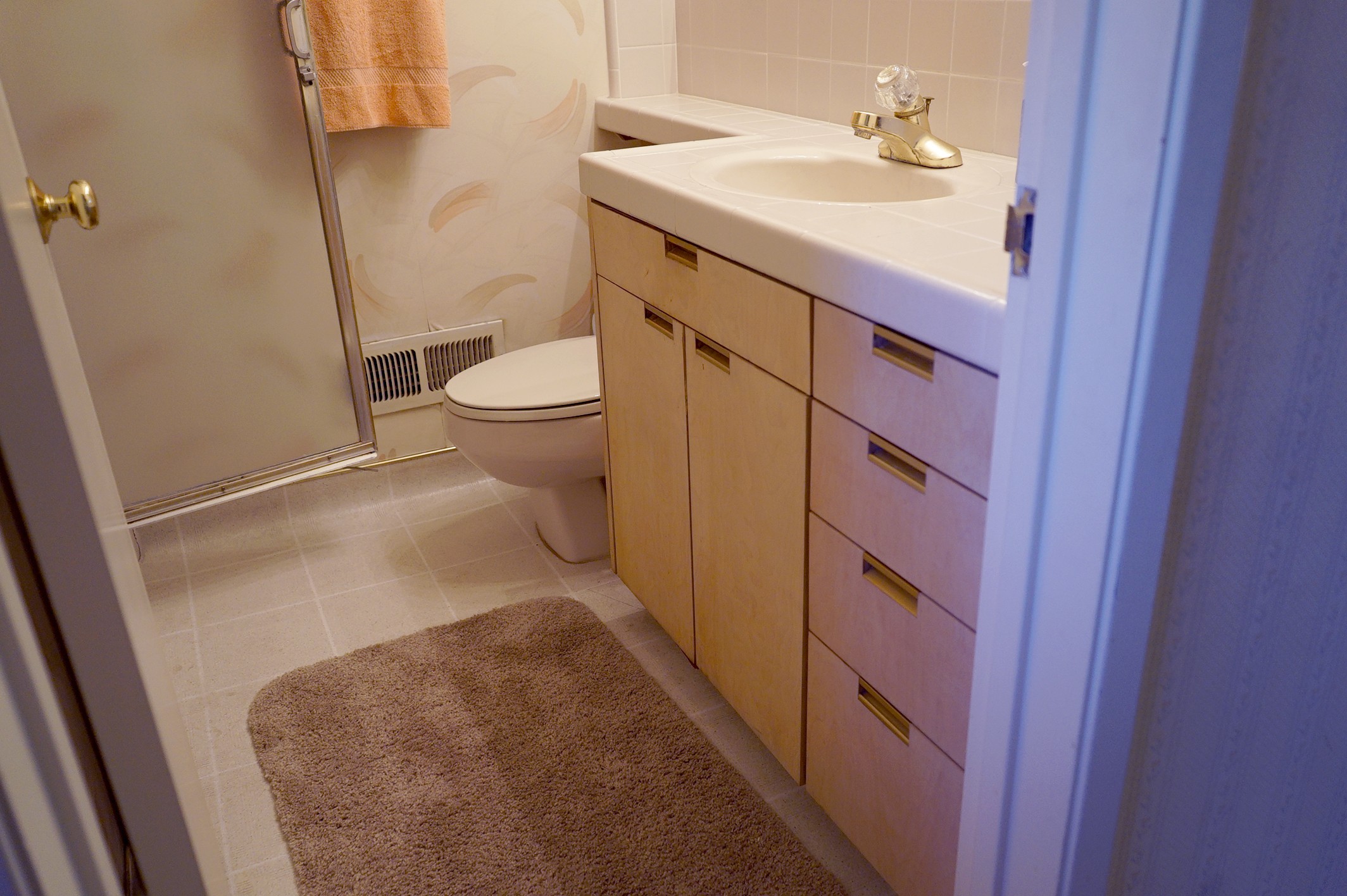
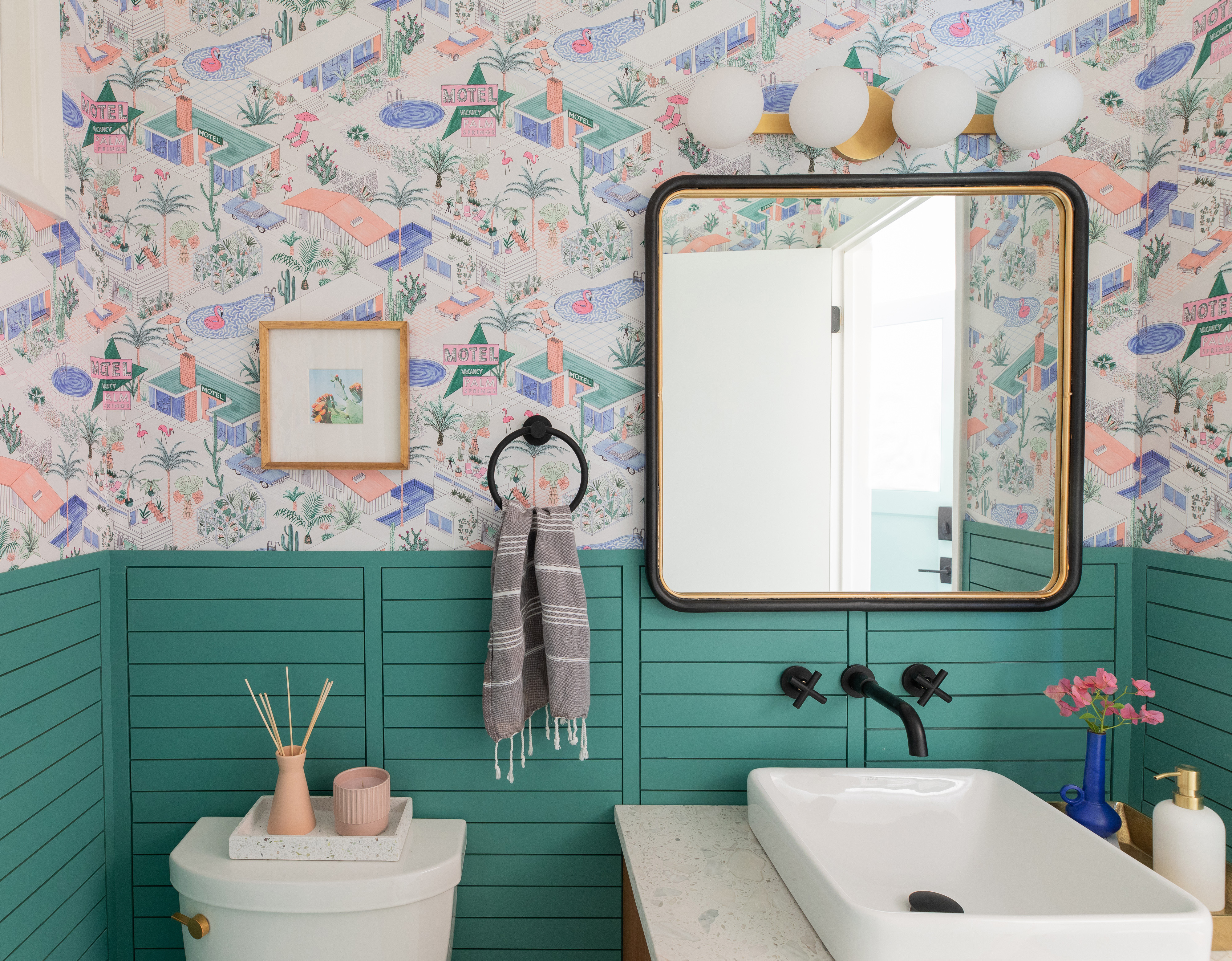
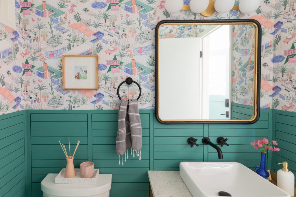
And now! My vision was to have this bathroom be bold, clean and fun. Since it’s a small space, I wanted it to surprise and delight and I pushed myself to not play it safe). The Palm Springs wallpaper* gifted from Milton & King hit the mark, bringing that midcentury story to our 1960 home and defining the color palette.
The illustration adds the perfect amount of whimsy and makes me smile every time I see it. Milton & King has an incredible website full of statement wallpapers and fabrics and it was so easy to order through them. This was the first time I installed wallpaper in any of my homes (ok, my mom actually did the work), you can read more about the installation process here.
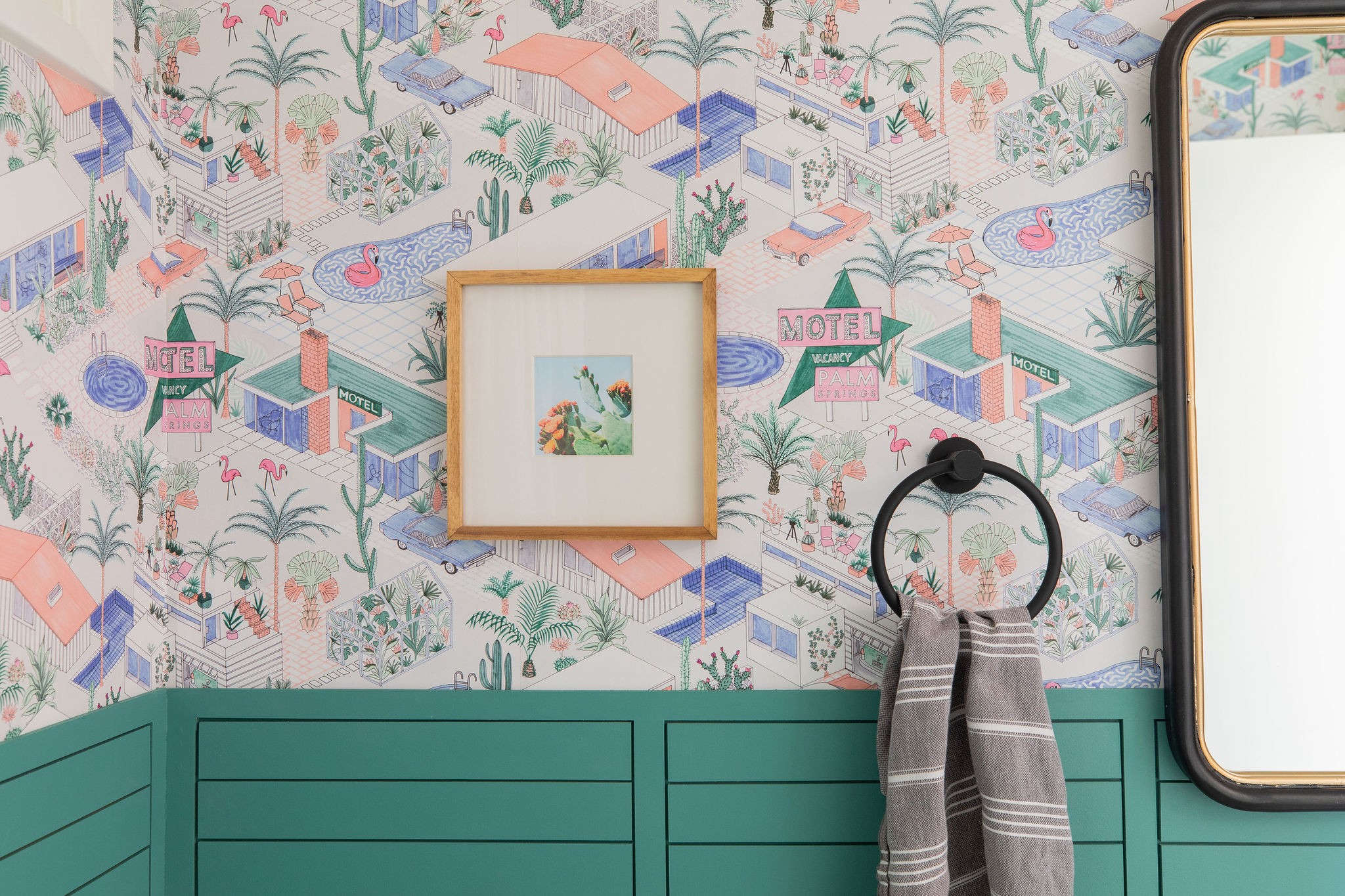
I LOVE how this wainscoting we designed turned out. Its simple but interesting and remains modern. This green is really saturated but I couldn’t resist how it interacts with the wallpaper and really love it.
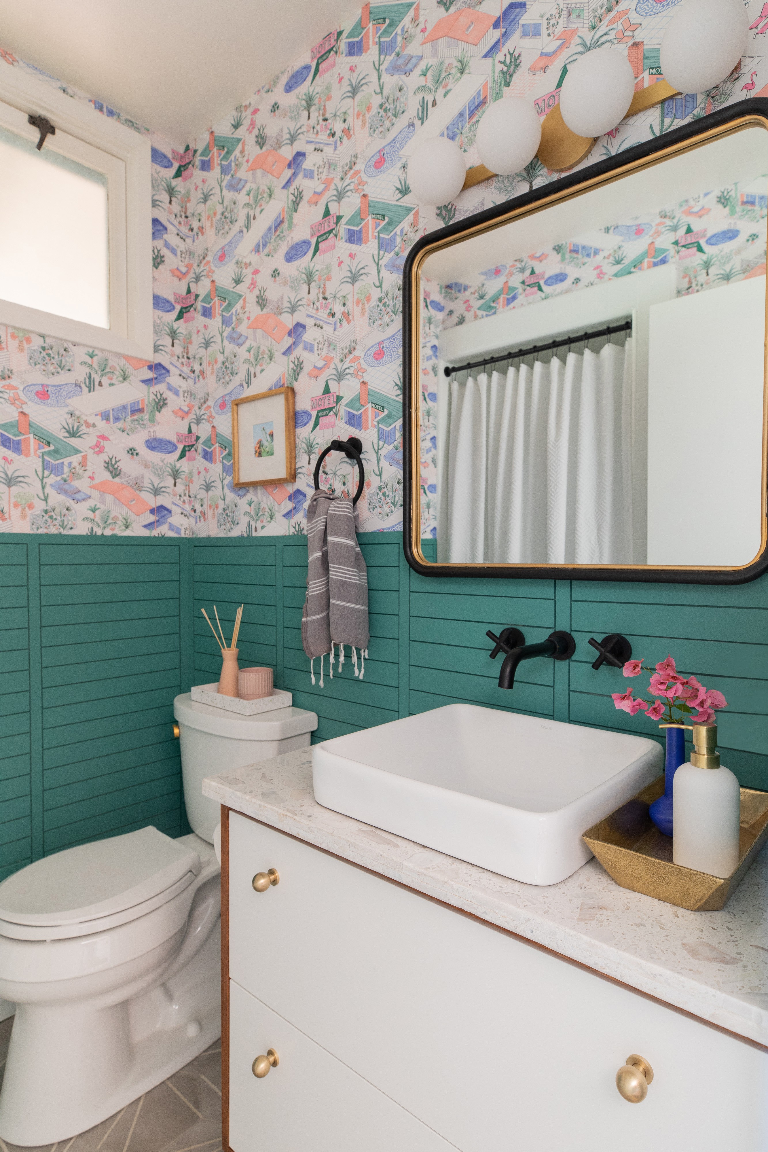
This cement floor tile! We worked with Villa Lagoon Tile* who sponsored these tiles and I couldn’t be happier with how they work with the rest of the elements. Keeping the floor a neutral gray helps ground the other colors and the cement brings in a subtle organic texture that I just love. The “Crows Feet” pattern is just the right amount of atomic and the larger scale works with the wallpaper pattern.
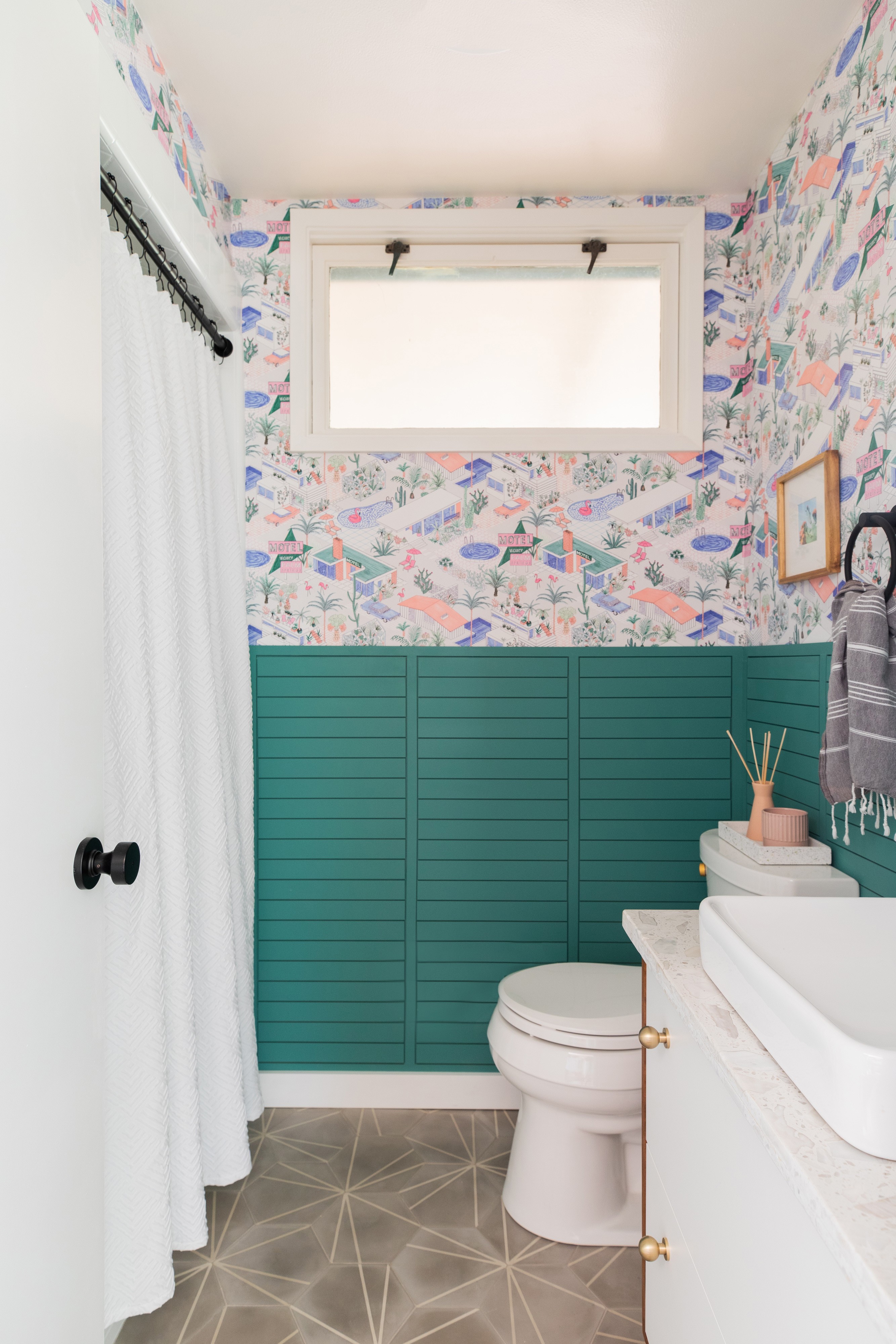
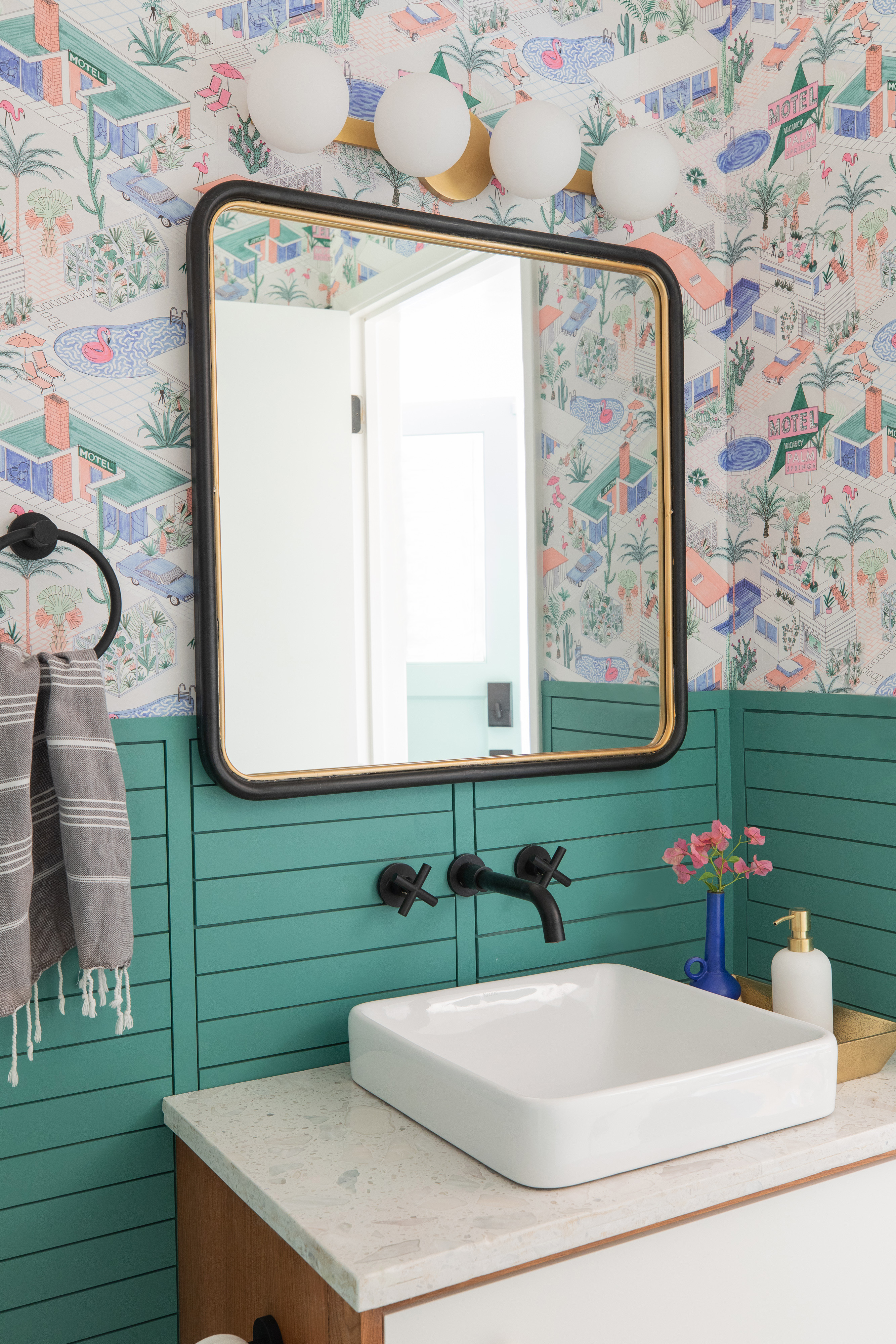
The vanity lighting needed to stand out against the wallpaper but not compete. I am obsessed with this take on a traditional bath bar fixture from Lumens*. The mouth-blown frosted globes are so soft and pretty in person, they’re heavy and cast the perfect diffused light even thought they’re LED. The repeating round shapes are still geometric but break up all the straight lines. The brushed brass was a perfect match to this mirror I picked up at HomeGoods (sorry, I can’t find it anywhere!).
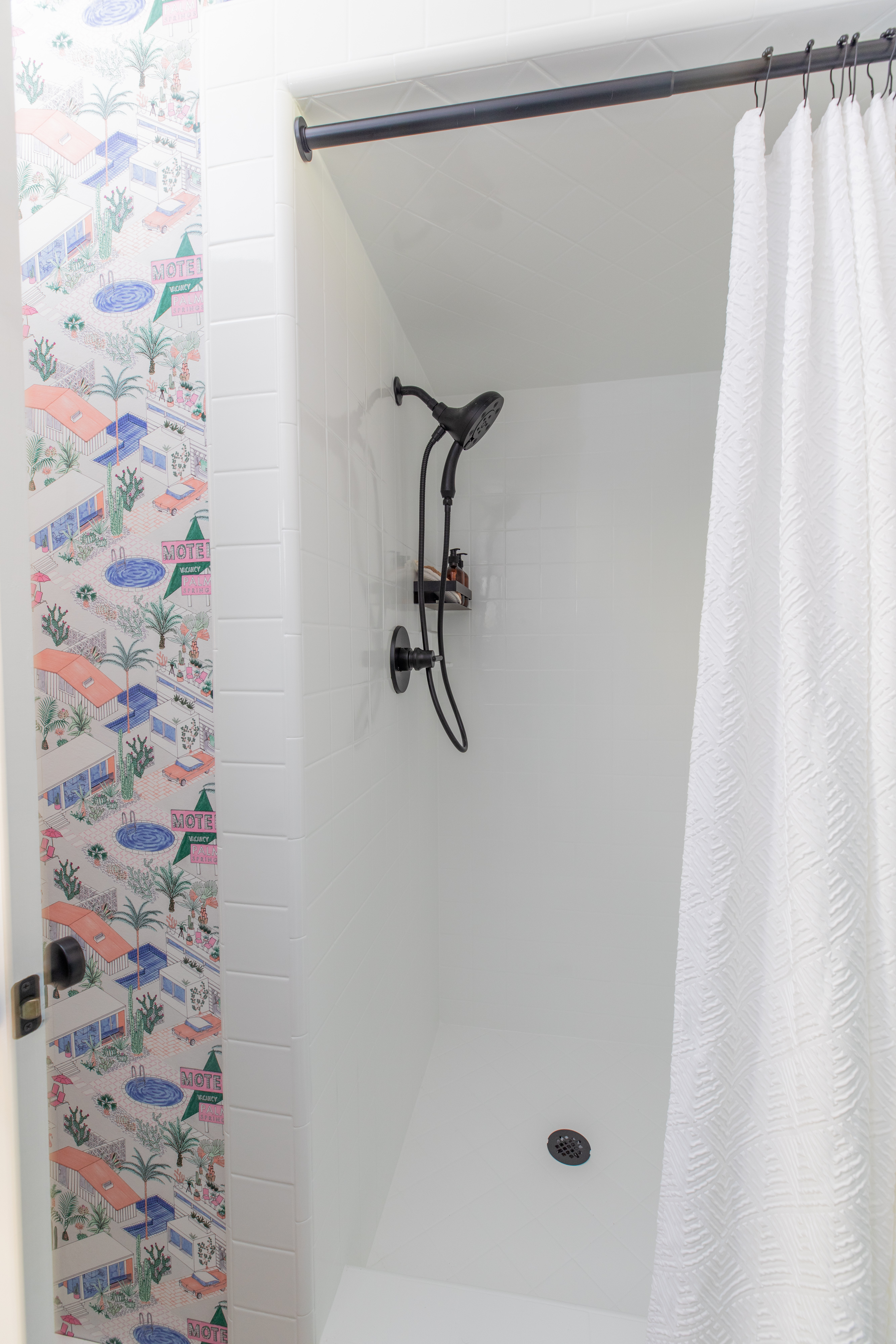
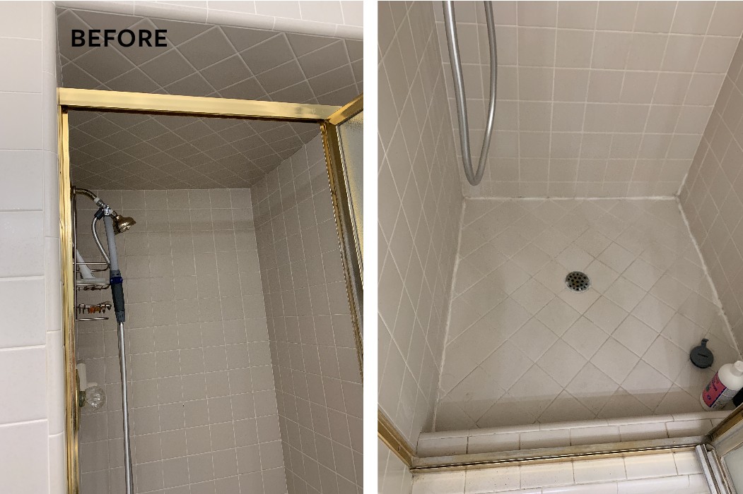
Ok the shower situation. Its brand new! But its not, because its the same tile we had before it was just refinished by Miracle Method Sacramento. Miracle Method* repaired and refinished our tile right in place without the mess and expense of demolition. In 2 sessions and a few days of curing, they gave us a beautiful shower that looks and feels new.
Here’s what we were dealing with: old grout, stained caulking and a dated shower door. There is no niche so we needed a hanging shower caddy for our shampoos and bottles. Together with the tacked on handheld spray wand it was just a little much.
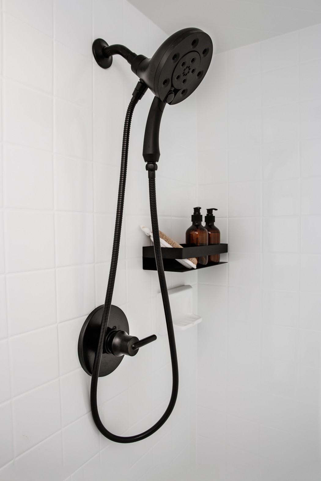
Since we use this shower mostly for cleaning the dog it was a must to have a handheld showerhead. We also wanted to minimize construction in here so finding an all-in-one was surprisingly difficult but I’m happy with how this all worked out. I found a little matte black shower shelf that attached directly to the tile and its so much more attractive.
Look how clean and pretty the tile is now! Miracle Method repaired and filled in the grout so the lines are more shallow and sealed which means super easy to clean.
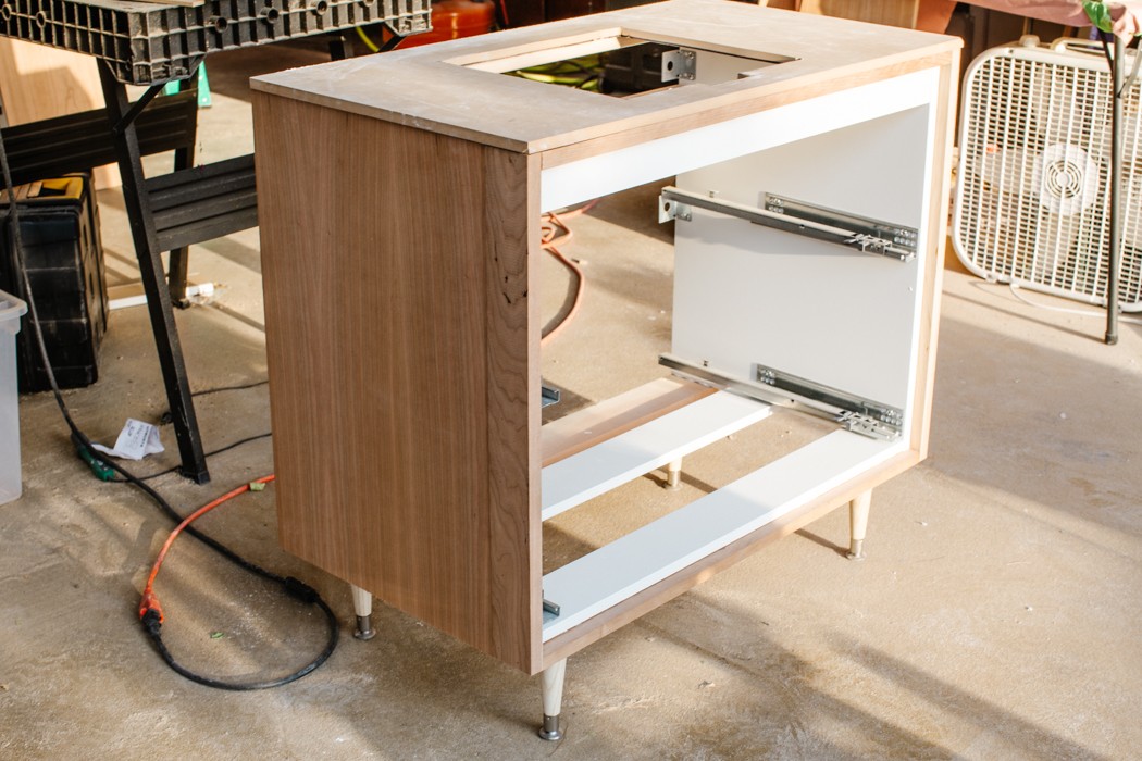
I’m pretty proud of this vanity situation. I wanted it to look like a piece of vintage furniture but didn’t have the time to hunt. I couldn’t find anything new that fit our budget so that’s when I came up with this Ikea hack. We started with the standard 2-drawer Godmorgon and my dad built a cabinet facade around it.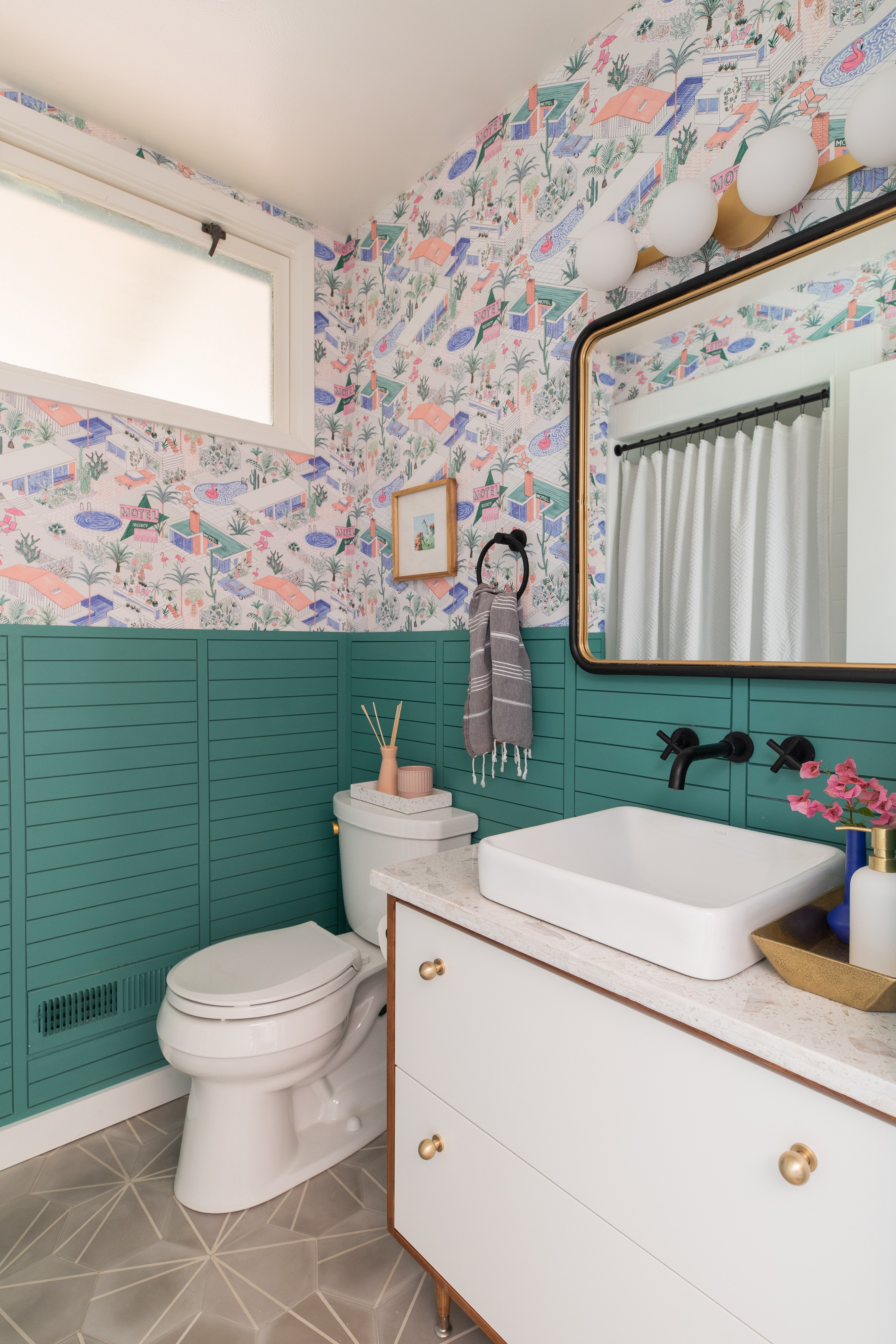
Here’s a peek of the build in process. These tapered legs are from Home Depot!
Adding quality hardware elevated the whole thing and I’m super happy with the results.
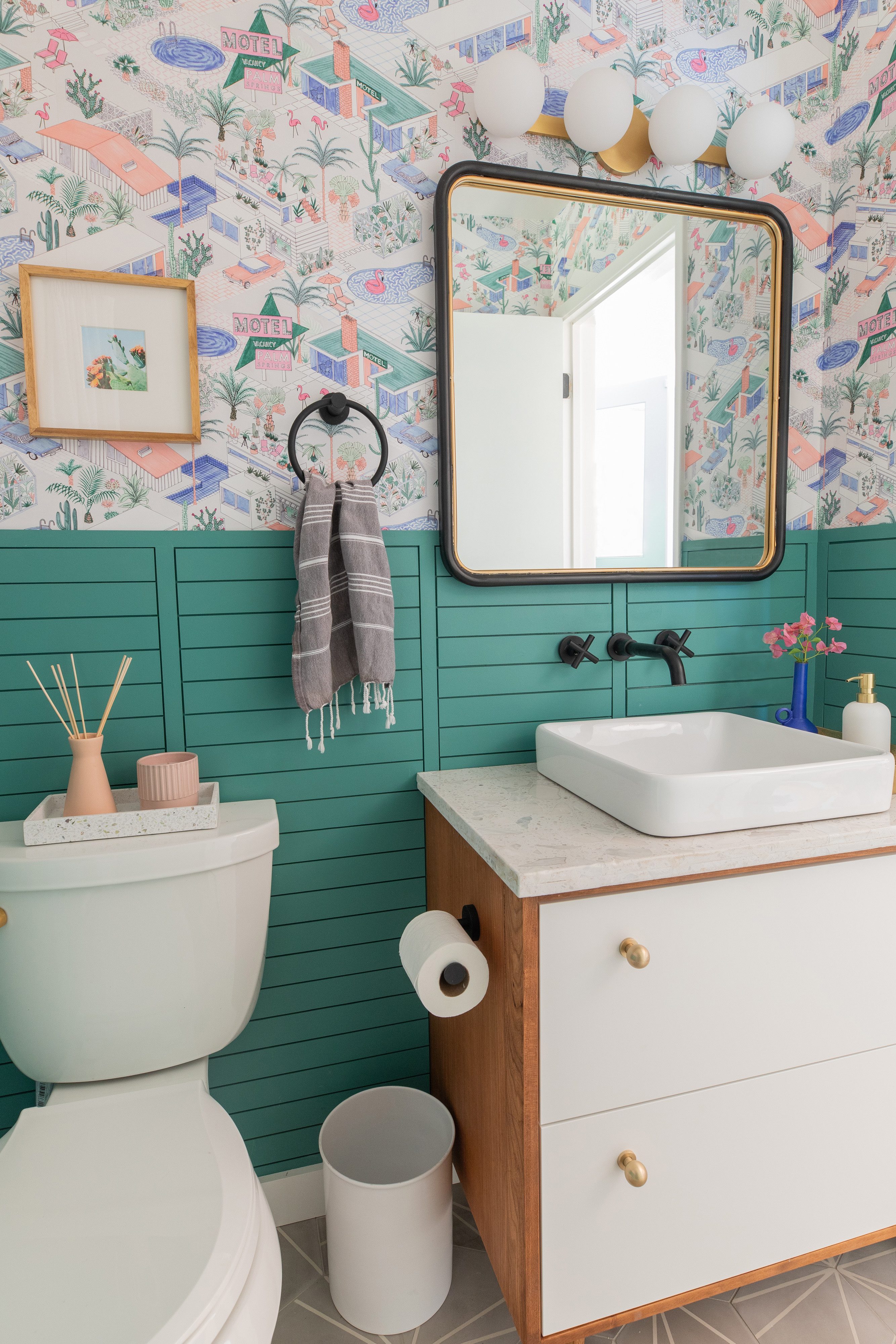
Ikea vanities are made to use with their own sinks and hardware but I wanted to customize it more. So rest of the hack includes cutting into the back of the top drawer to fit plumbing, and of course making our own counter top. To keep that top drawer functional we needed a vessel sink so I found this semi-recessed version (for a steal!) that has a lower profile than most vessels. 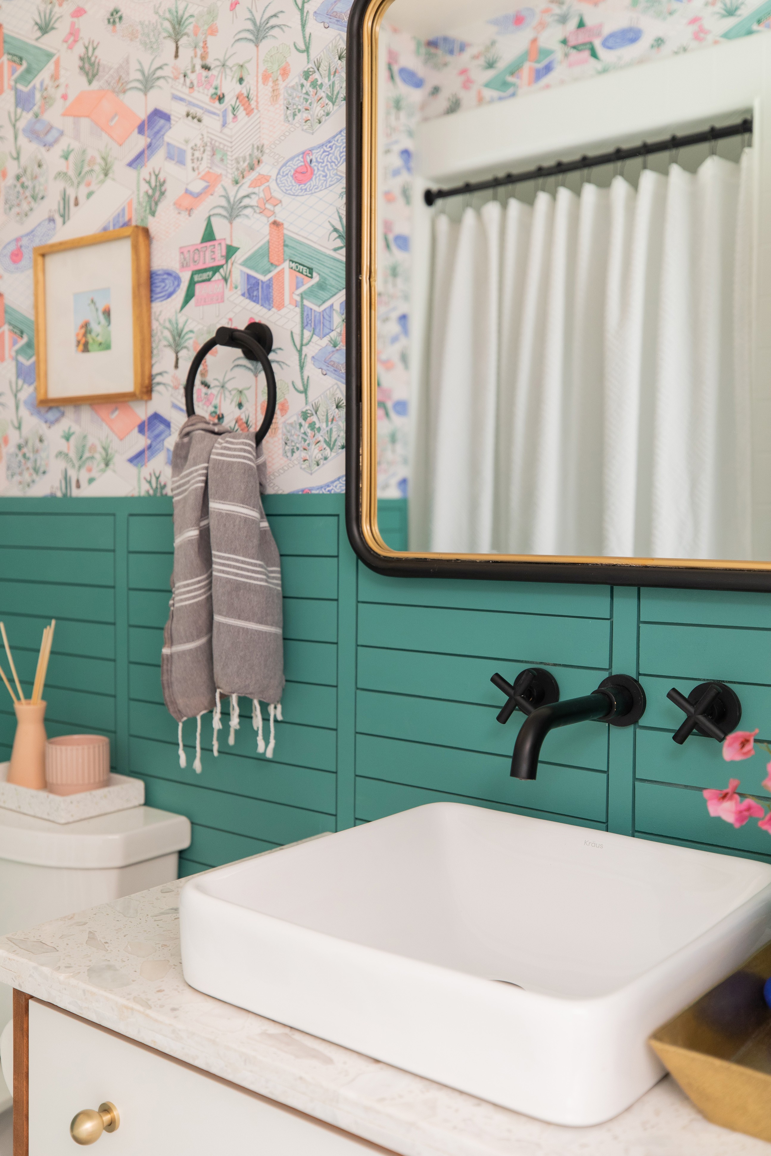 We had to open the wall above the sink to work on the laundry plumbing behind it so I talked my dad into installing a wall mounted faucet which I’ve always wanted. It was also one less thing to drill into the counter.
 And let’s not forget the smallest detail, but probably my favorite thing. The brass toilet lever! I know its ridiculous but I don’t care and I chose this toilet because it had the cutest flusher. Sue me!
This blooming cactus was a photo I took earlier this year in my neighbor’s front yard.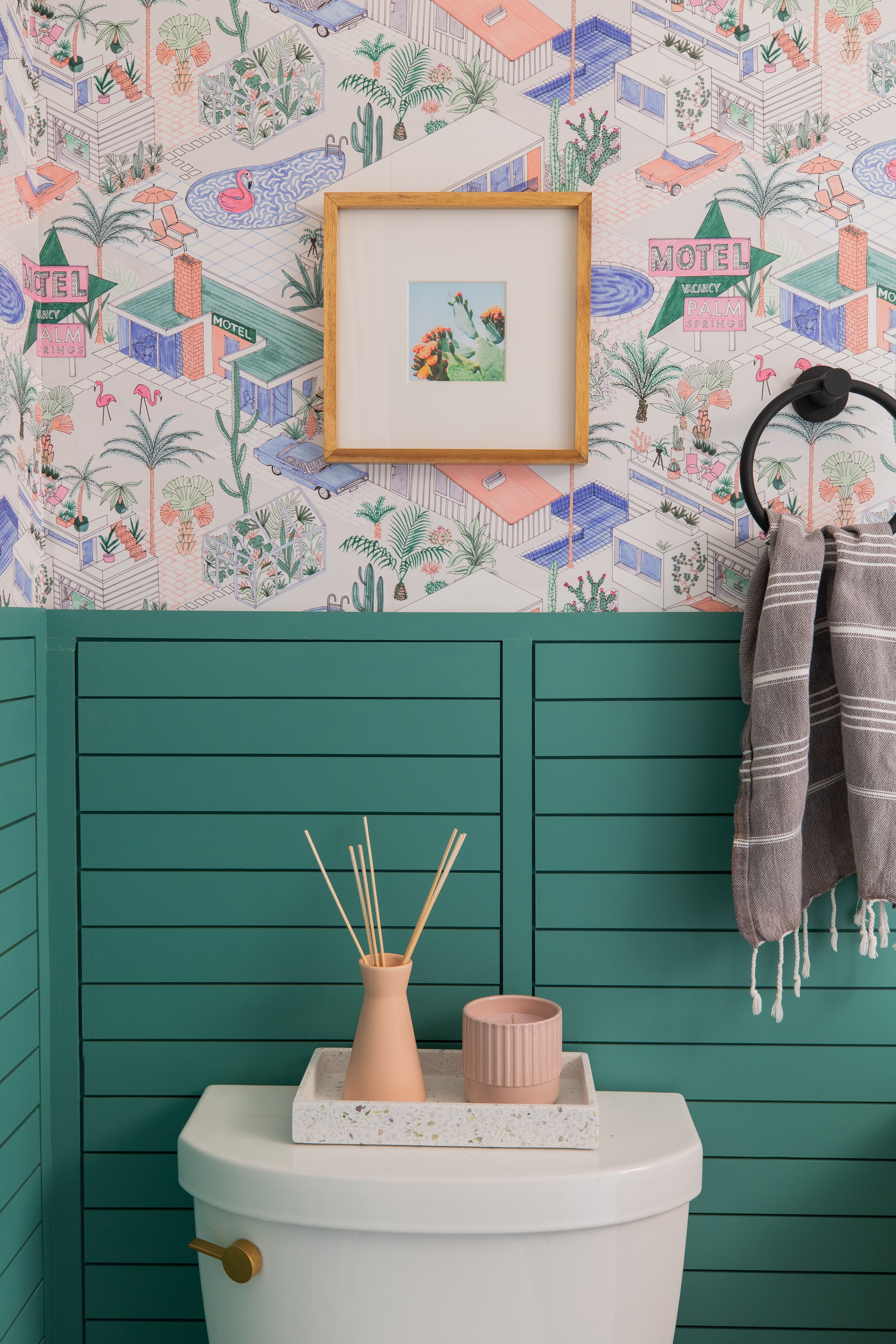
Laundry
In our house, my husband is the laundry expert but this update has me encouraged to be better at it. From a design-perspective the goal was to keep this space simple and not draw any extra attention. All materials followed what was used in the mudroom without the extra color pops. We used the same flushmount here and it does so much to elevate this tiny hall.
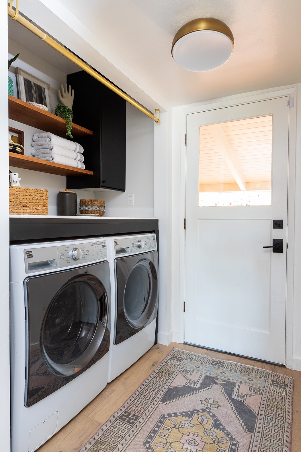
The first major change here was removing these obnoxious doors that when open, block the access to the patio door. There was some internal debate since the doors also hide the mess and noise but I decided that if we actually designed this utilitarian space we could do it. It was a pain to remove the door casing and clean up the frame but those details make this feel intentional and not like we just took doors off a closet.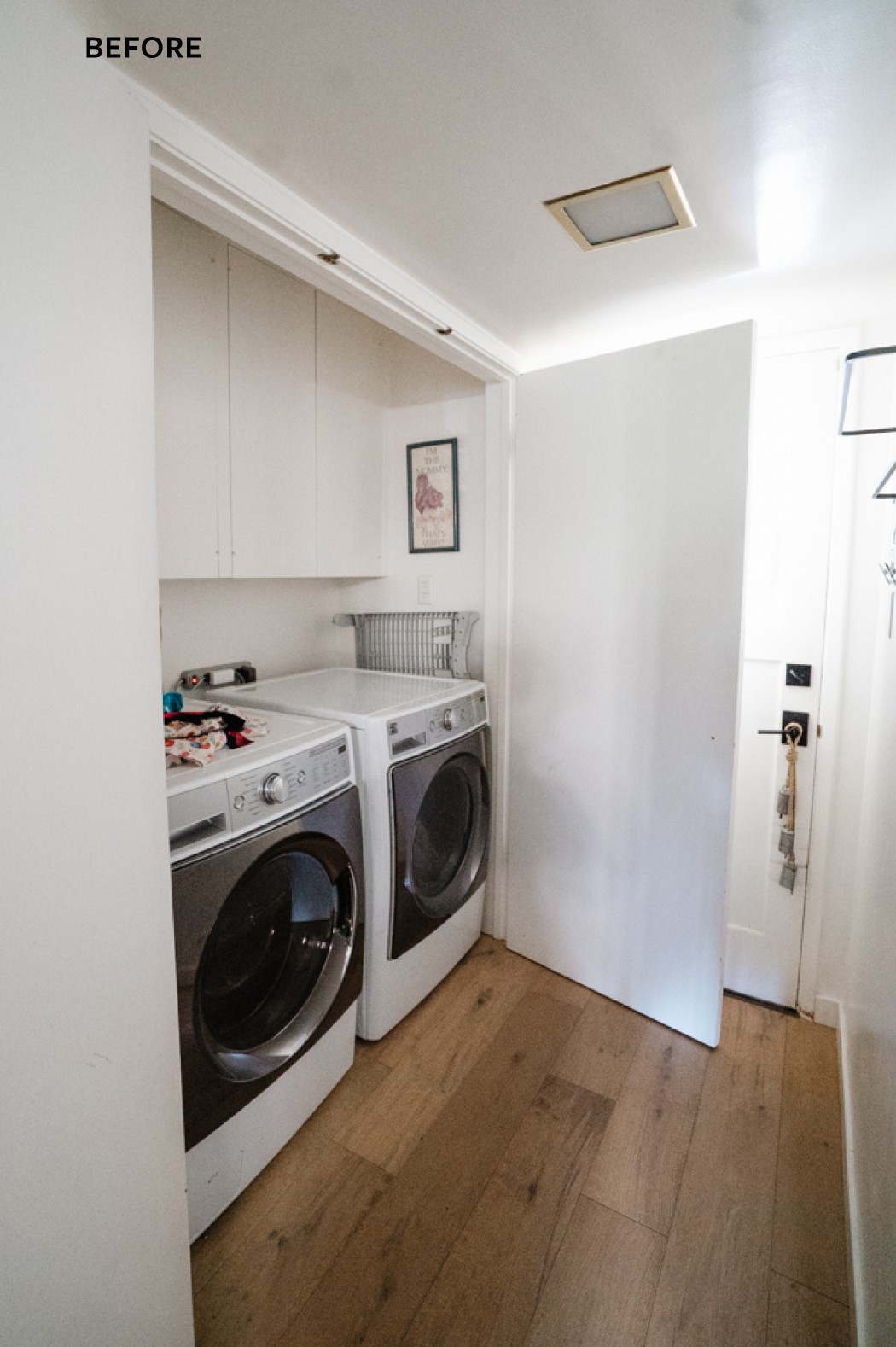
Adding the quartz counter (the fifth and final piece of our $50 investment), added SO much needed function. It had to be mounted pretty high to clear the machines and electrical, but its still so useful. No more socks falling between or behind the dryer, and a nice, smooth service to fold and stack clothes.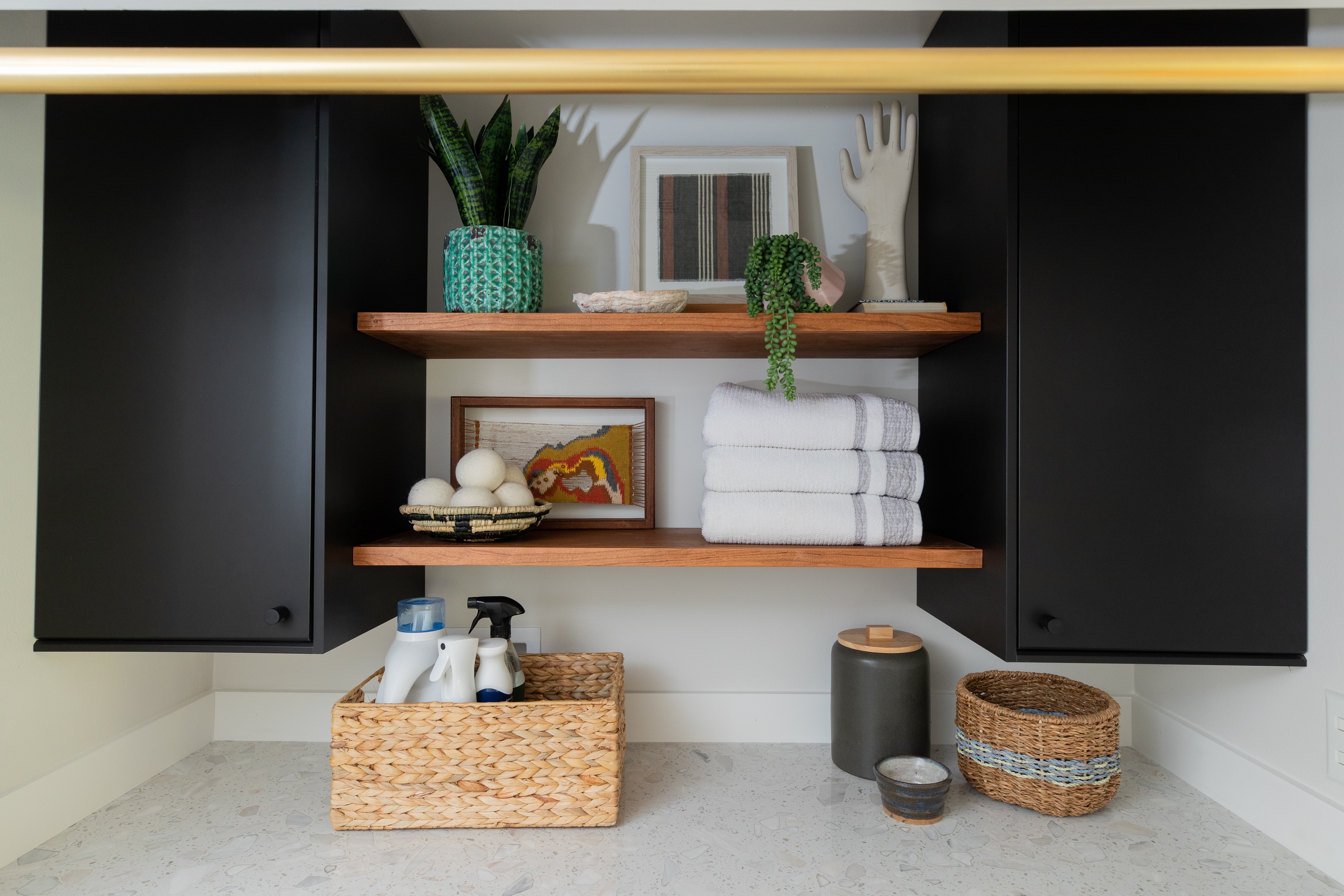
This is exactly how it looked 6 weeks ago. Definitely needed doors to close off the utilitarian jumble of plumbing, electrical and laundry stuff. Also, that print was in my childhood home in the 80’s, my mom passed it down to me when I was pregnant. Haha!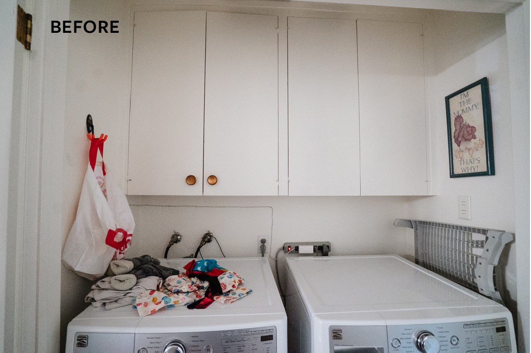 I did some shelf styling and had fun telling a laundry ‘story.’ The vintage glove mold alludes to hand-washing, and the art is made of textiles and thrifted fiber art. The wool dryer balls are on display and I corralled our daily washing supplies in one basket.
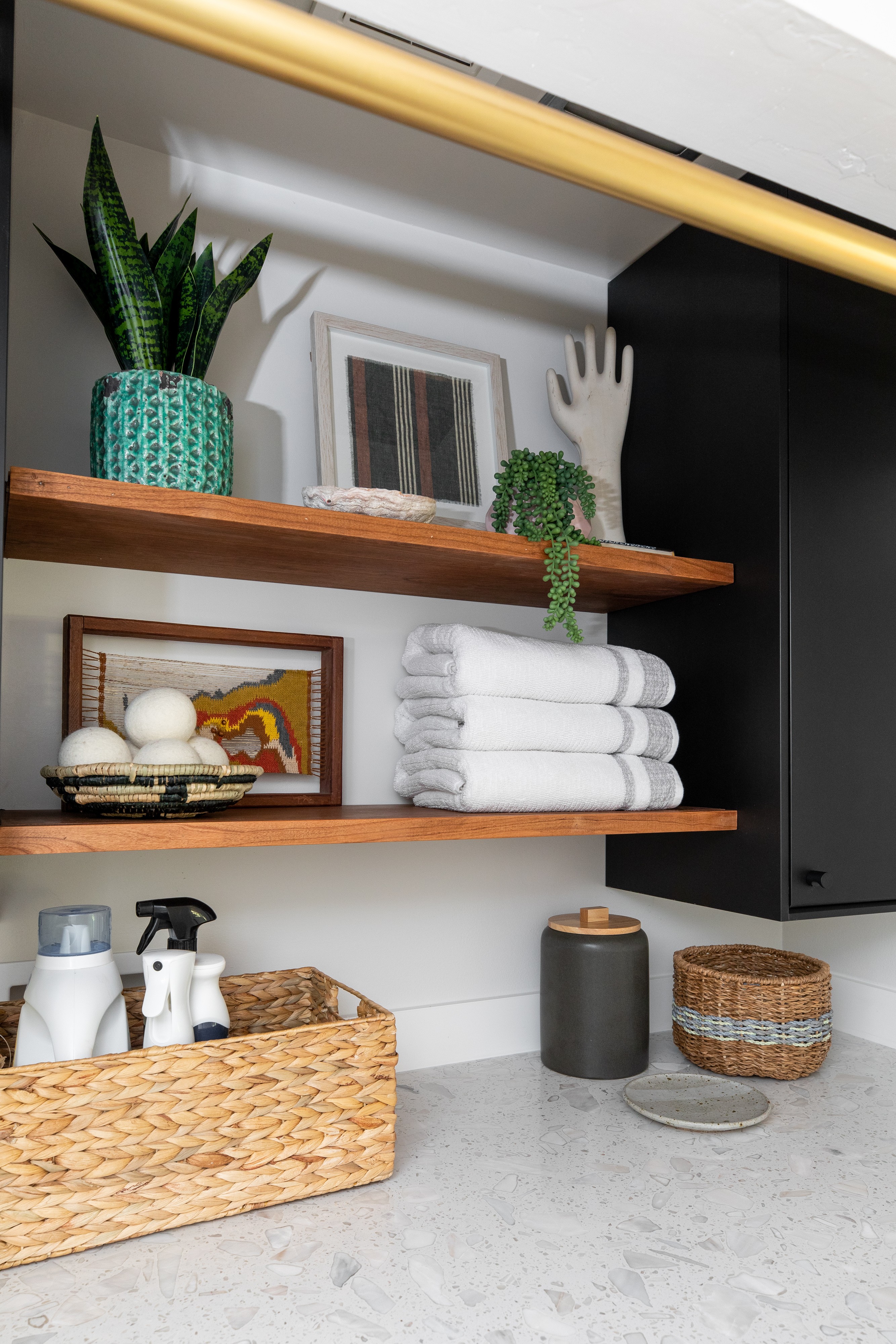 Let me preface by saying Nicole Dianne did not take the following photo but I wanted to show you the last-minute detail of the clothes hanging rod. I had planned on putting a rod inside the door opening but it didn’t clear the cabinet doors. I found this gorgeous curtain rod from West Elm and love the details of the hardware allowing it to hide in plain site.
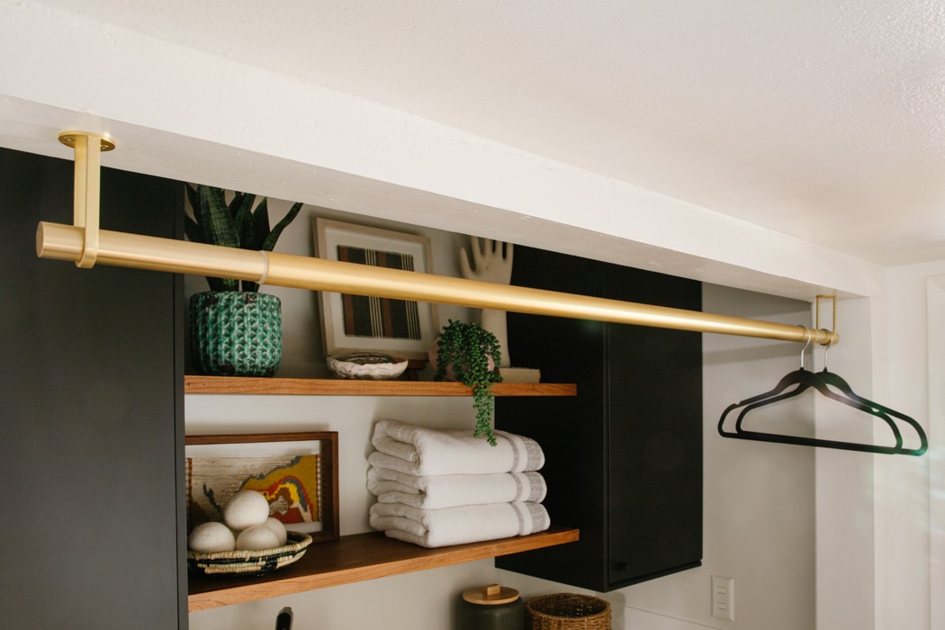
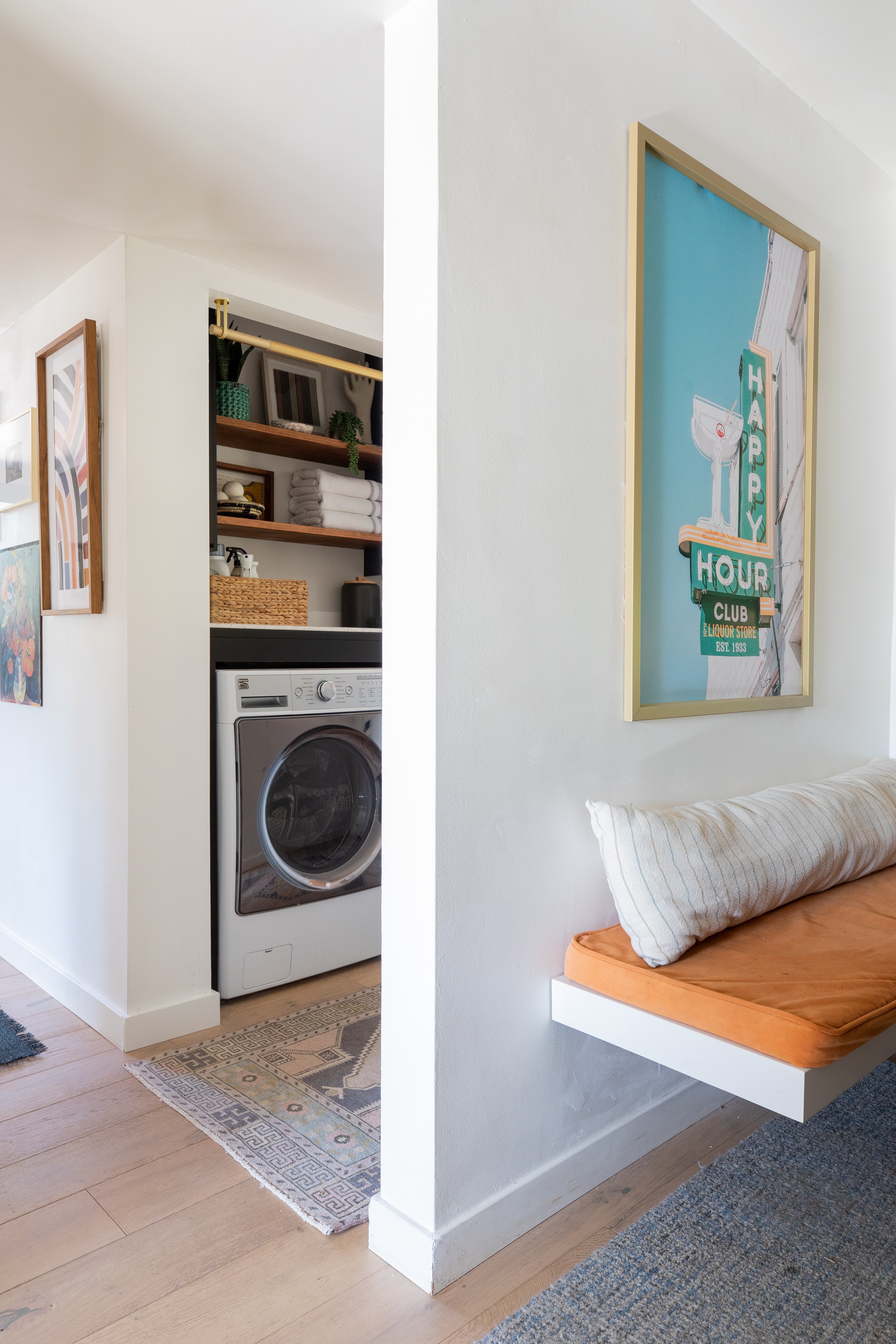
Now when I catch a glimpse of the laundry area from the kitchen, its no longer cringe worthy and just so pretty!
Hallway
Which brings me to the bonus space, the hallway! This is the area that connects all the others and it holds its own now!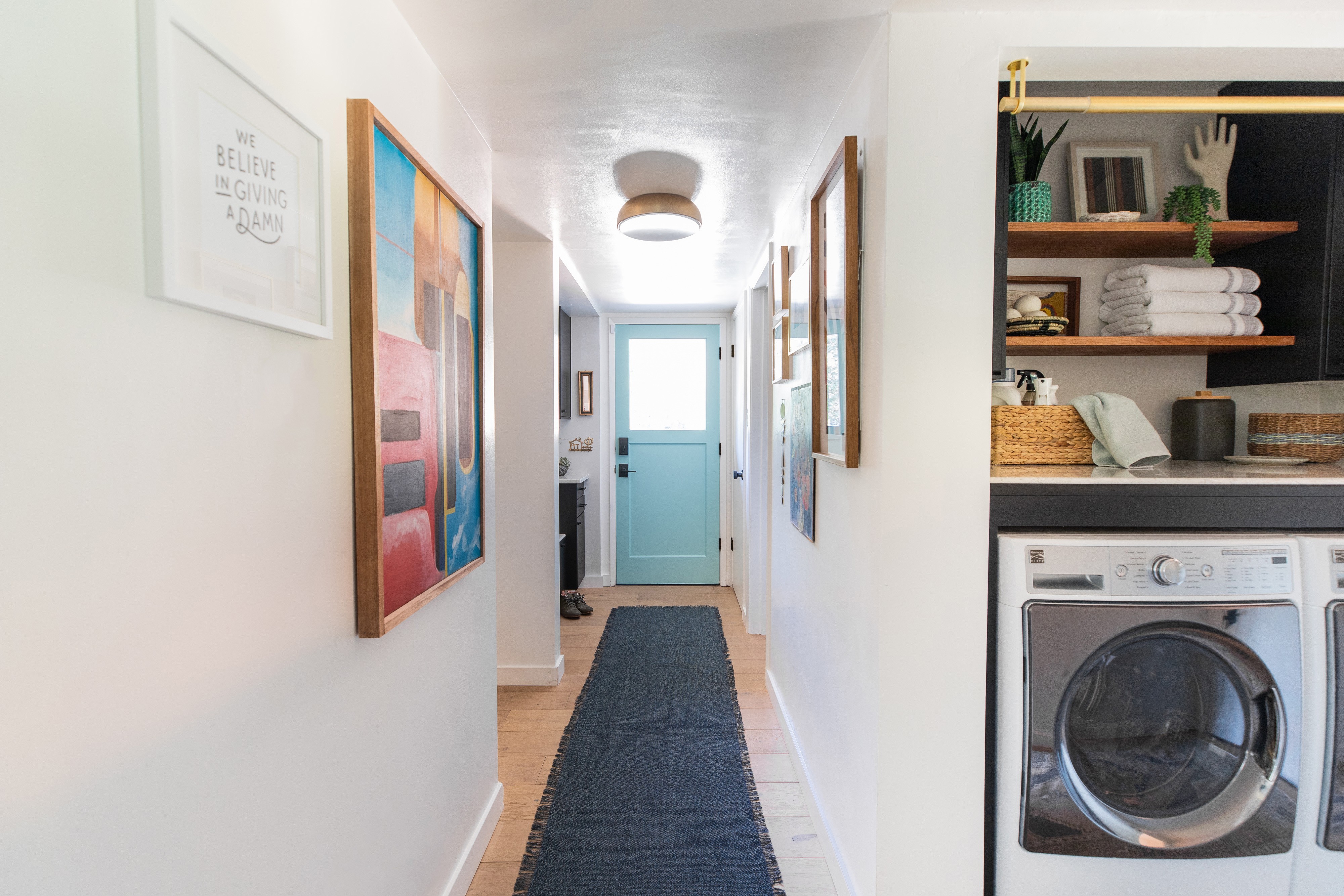
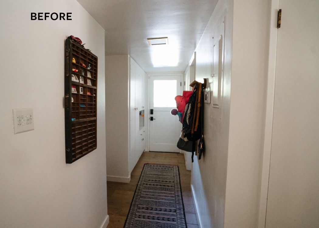
Let me remind you of this sad, sad view. It was just a hall that you tried to get through as fast as you could.
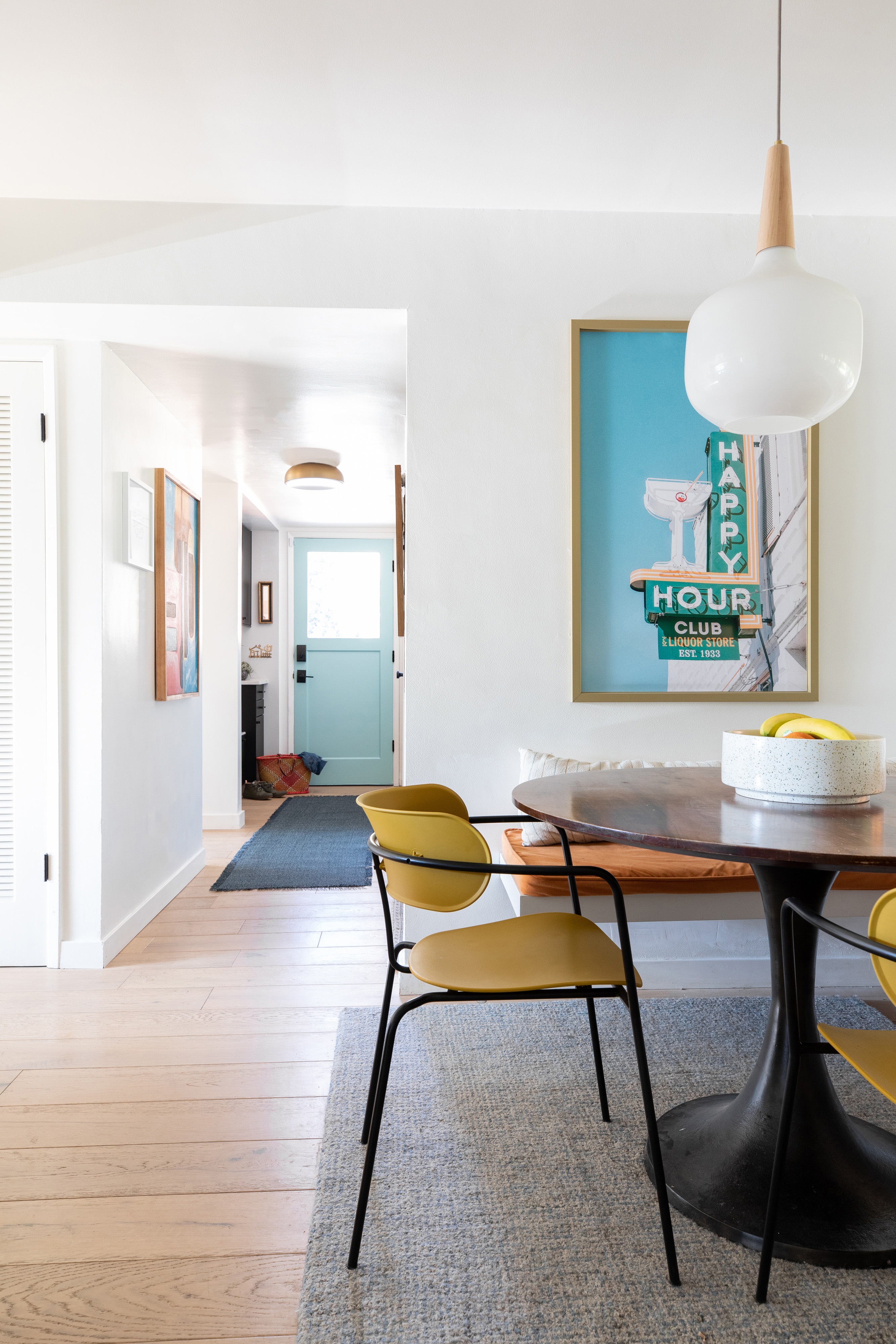
 Now it feels like part of the kitchen and so much more open.
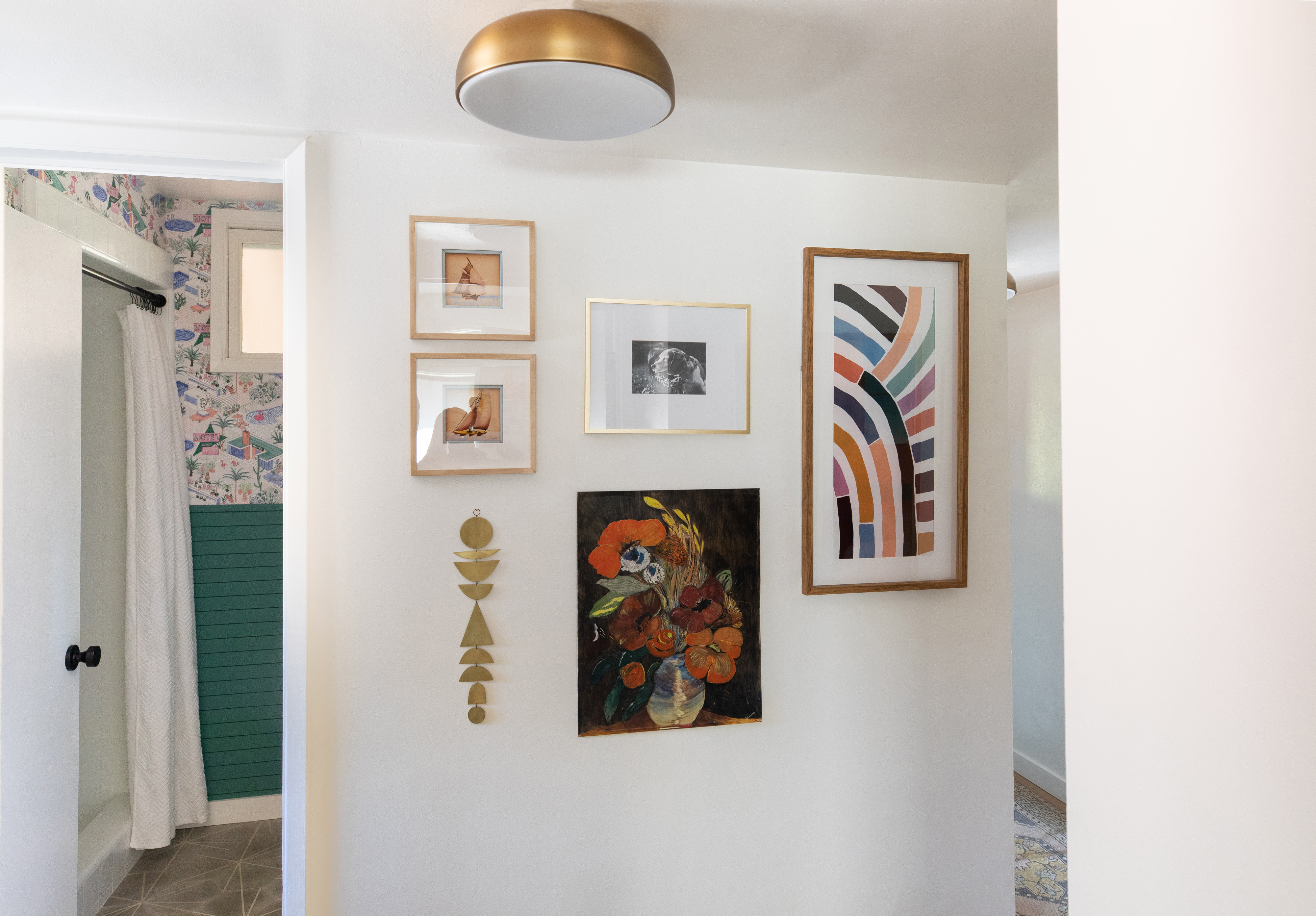
Substituting the hooks of shame with a collection of new and vintage art makes me so happy when I walk out of my home office. The vertical PRISM downloadable print was gifted by Juniper Print Shop and its a perfect fit to cover the unsightly electrical panel. I’ve been a mega fan of JPS and Jenny Komenda for years and their collection of art is super accessible and perfectly curated. 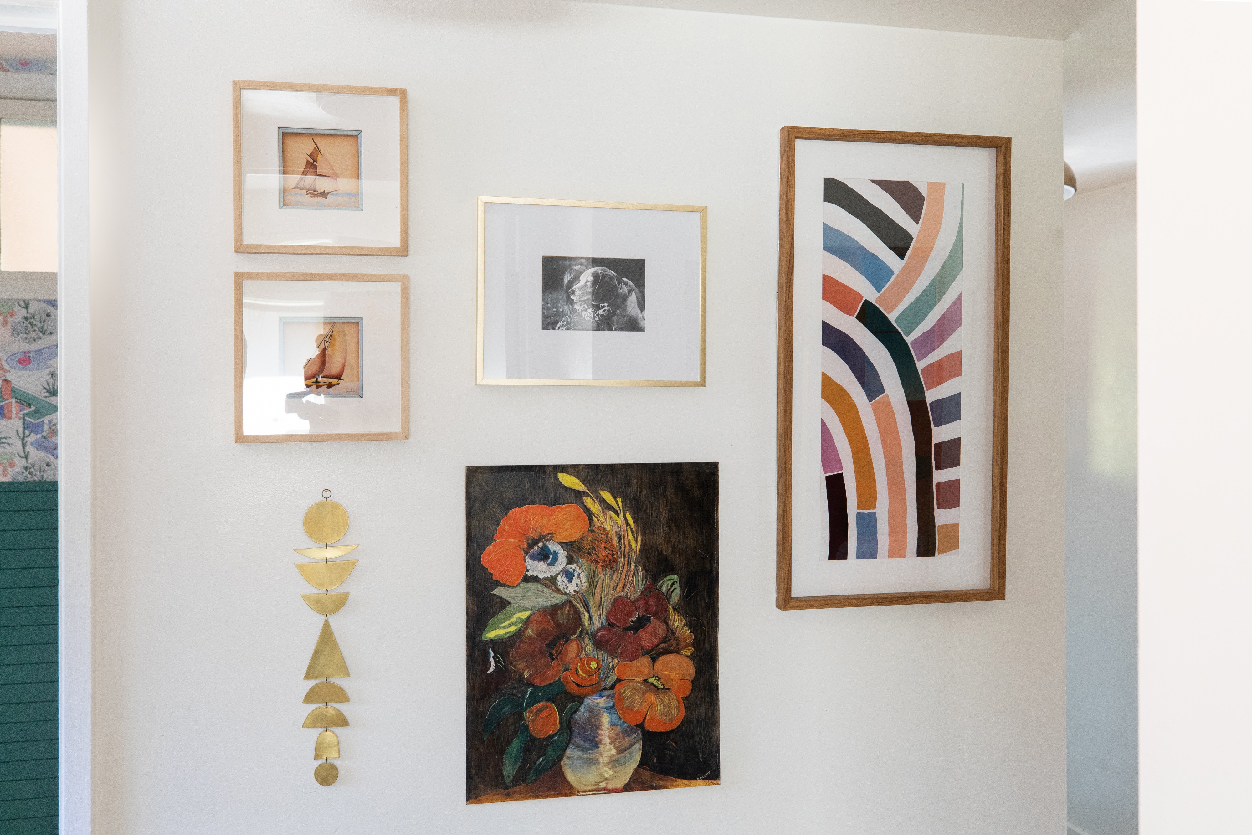
Again, these flushmount lights from Lumens* make me so happy. Our ceilings are really low in here but these only have a 4″ profile and unless we invite some MBA players over, we should be good.
What really kills me is that I didn’t think of painting the inside of this door sooner. Its the perfect color pop that brings it all together. I love how it ties into my Happy Hour photo in the kitchen nook.
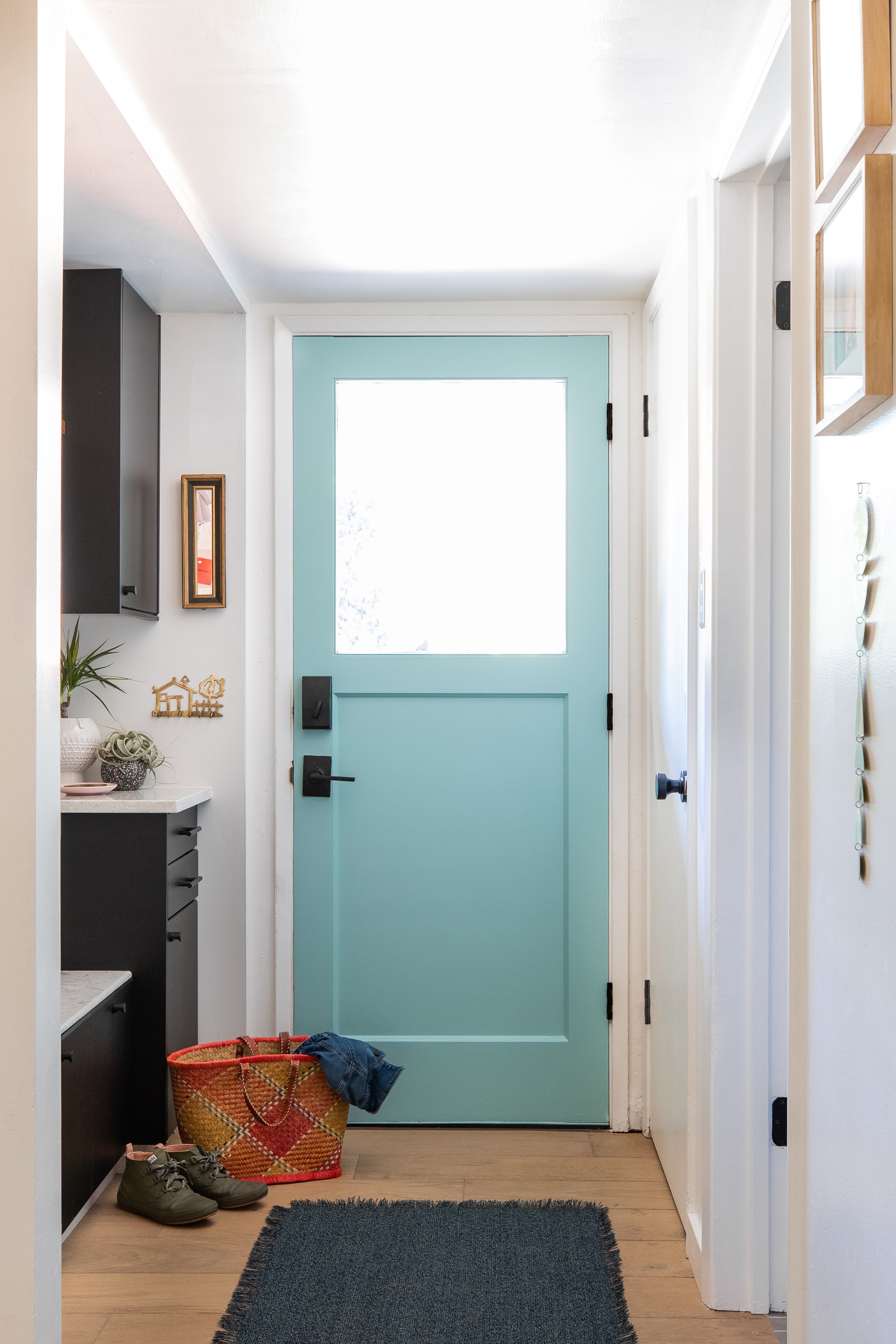
The We Believe in Giving a Damn print was lettered by my friend Grady Fike and then letterpressed by Ray Sensenbach. Its a favorite quote from the CreativeMornings manifesto and is a good reminder. The painting next to it is one painted by my grandpa and I finally feel like it found its rightful home here.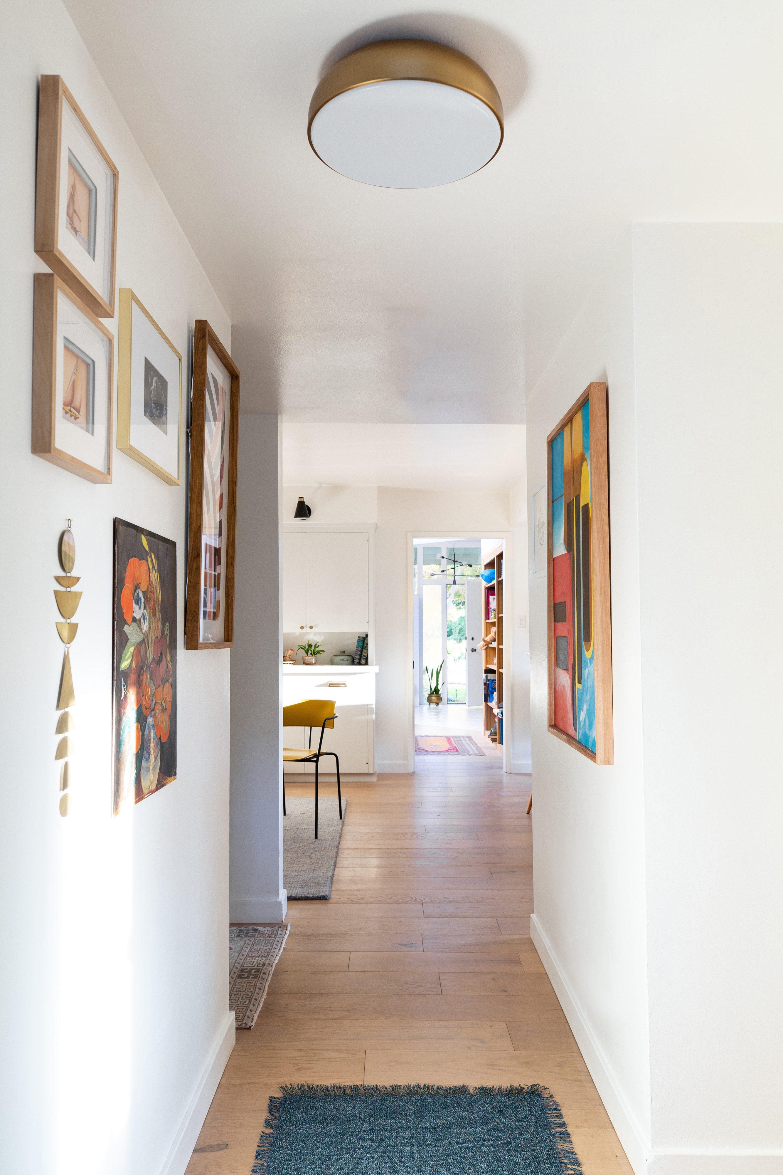
So, that’s it!! I can’t even begin to thank everyone for their constant support and interest in our projects. Major thanks to our generous sponsors who elevated all of my ideas and made my design dreams come true. Thank you friends and family for giving me space to do this, and keeping my kid occupied when necessary. Thank you mom for all of your wallpapering expertise and spending hours cleaning up after us.
Thank you to Linda, the founder and host of the One Room Challenge twice a year. She brings us all together and has always been such a warm support system to me behind-the-scenes.
Major judos to the super talented Nicole Dianne who shot the spaces and made our crazy deadlin. These spots are technically difficult: low light and really tight spaces but she nailed it.
The biggest shout out of the decade goes out to the ORC MVP, my dad. He basically did all of the construction work single-handedly with some well-timed assists from a floor tile installer and my husband. He took on all my crazy design ideas, never batted an eye and engineered them into reality. He’s always up for a good challenge so we make a good team and I am so so grateful for his expertise. Thanks dad, you’re the best.

Sources
Contains affiliate links which may earn us a small commission on the sales of products we link to at no additional cost to you.
Bathroom
Palm Springs Wallpaper* | Cement floor tile* | Vanity light* | Shower Resurfacing* | Showerhead | Shower trim | Shower shelf | Shower curtain | Shower curtain rings | Toilet | Toilet Lever | Accessory hardware | Hand towel (similar) | Sink faucet | Sink | Sink drain | Vanity (customized) | Vanity legs | Drawer knobs | Soap dispenser | Reed diffuser | Pink candle | Terrazzo tray | Brass Tray (similar)
Paint Color: Panelling
Laundry
Ceiling light* | Brass Hanging rod | Rug (vintage) | Cabinets | Cabinet doors/trim | Cabinet knobs | Striped basket | Faux snake plant | Large basket | Gray canister | Framed fabric
Paint Colors: Inside Walls | Outside Walls
Mudroom
Ceiling light* | Runner* | I Like You print* | Cabinets | Cabinet doors/drawers/trim | Cabinet knobs | Drawer pulls | Storage bins | Clock | Pillow | Linen bulletin board | Entry Smart Lock | Keyrack (thrifted) | Mirror (thrifted) | Pegboard/Pegs (DIY)
Paint Colors: Inside Walls/Pegboard | Outside Walls
Hallway
Ceiling light* | Prism striped print* | Brass mobile | Dining chair
Paint Colors: Walls | Back Door
My One Room Challenge Sponsors

Milton & King // Lumens // Villa Lagoon Tile // Miracle Method // Tidy Revival // Juniper Print Shop
Other One Room Challenge Posts
Catch up on the whole project
Week 1 // Week 2 // Week 3 // Week 4 // Week 5 // Week 6 (You’re here!)
Links to my previous One Room Challenges
Fall 2018: Kitchen Refresh | Spring 2019: Midmod Patio Reveal
I’ve been head down writng this post and I can’t wait to see what all the other Guest Participants and Featured Designers pulled off. There have been a lot of close calls but I think everyone made it!





45 thoughts on “ORC Fall 2019 Reveal!”
Beautiful job. Every detail is so well planned. You should be very proud!
Holy crap lady. You really pulled off some serious magic in the space. As you can probably imagine, the laundry room is my favorite! So clean and crisp. And that powder bath is boutique hotel worthy!! Congrats. You really killed it.
Everything turne out so so good!! I love the addition of the curtain rod in your laundry room, I need to sneak one in mine like today! haha Again love all the magic you sprinked in our home looks so good!
Is your dad in need of another daughter? Haha. I have been so looking forward to this reveal! So gorgeous. Love everything and loved following your stories. Congrats on a beautiful and functional space.
Fabulous job, Rebecca. The makeover aesthetic couldn’t be more perfect for the mid-century vibe of your house. LOVE the wallpaper and that pegboard….stop it, girl. I have to work one of those in somewhere upstairs. Super congrats! Enjoy your new space.
HOLY MOLY! that bathroom is AMAZING! love the color and the paper so much!
Just keeping up with you, your Dad and Mom as so entertaining! The finished project is amazing, no detail left out. Congratulations on another remodel and whats next I wonder????
Your bathroom really looks great, to see the before pictures shows all the hard work you put in. Such an amazing design for your spaces.
This turned out so good! I love how you tackled so many space. The bathroom maybe small but you truly killed it with all the extra details. Love love love!
Danielle
clarkandaldine.com
Holy moly! You accomplished so much in such a short time. Love the name that you came up with! And kudos to your dad and his hard work. We love it when a family pulls together to make a vision come to life. Way to go on your gorgeous spaces.
This is incredible! So much inspiration here! I’m definitely casting my vote for you as featured designer on the next round!!
REBECCA! It’s so good, my friend. I love all of the intentional details and your use of color and pattern is always spot-on.
Wow! Amazing job! That bathroom especially gives me all the heart eyes!
What a massive amount of work you’ve accomplished! Love the pops of color throughout and that peg wall is genius!
I have been looking forward to this reveal the most! I am in love with your Mudroom pegboard and may have to incorporate that into my mudroom. And your bathroom is stunning! i love the colors and the wallpaper and the hardware! Great job!
Rebecca,
Your attention to smallest detail always amazes me. Even the hanging clothes rod you added just elevates such an ordinary piece. You are magic my friend. Congratulations!
It’s beautiful! And I love the teal in the bathroom and your pale blue door. I used aqua in my ORC bathroom makeover too – and I LOVE seeing other people using my favorite colors. I feel so inspired by your makeovers! Fabulous job!
Love that your dad was the MVP and your mom installed the wallpaper! Lucky!! Your home looks so cute, bright and happy!
What an awesome job! That laundry room is soo chic. I loved the photo and paragraph about your Dad. So touching.
OMG1 Just OMG! Cannot pick which room I like best. You killed it!
Love love love. Everything you chose turned out amazing. You seriously killed it.
The results are gorgeous! All your hard work is very obvious. Congrats on a job fantastically done!
i love everything about your space and that wallpaper is super fun. Great work my friend.
This is absolutely gorgeous! I love every little detail! The wallpaper, the peg board, the art selections… it is fantastic! Cheers to a wonderful challenge!
WOW! You did a fantastic job! That bathroom is seriously to die for!
Hands down, one of my favourite transformations of this ORC! I can’t believe you managed to do three+ areas, all great!
If You Want to Buy something New faucetskycom2019 For your Beautiful Bathroom,Our Company Is Your Best Choice.We Can Provide Bathroom Faucets,Bathroom Sink Faucets,Sinks,Sink Faucets,Bathroom Sinks,Farmhouse Sink,Pedestal Sink,Shower Faucet,Shower Heads,Best Shower Head,Rain Shower Heads,Shower Caddy,Walk in Shower.
[url=http://www.faucetsky.com/c/kitchen-sinks_0373]kitchen sinks[/url]
When I originally left a comment I appear to have clicked the -Notify me when new comments are added-
checkbox and now whenever a comment is added I get four emails with the exact
same comment. Is there an easy method you are able to remove me
from that service? Cheers!
You made some good points there. I checked on the net for
more info about the issue and found most individuals will go along with your views on this site.
I have been browsing online greater than 3 hours nowadays, but I never found any attention-grabbing article like yours.
It is beautiful value sufficient for me. Personally,
if all site owners and bloggers made good content material as you probably did, the
internet can be much more helpful than ever before.
Hello, i feel that i noticed you visited my blog so i got
here to return the choose?.I am trying to in finding things to improve my website!I suppose its adequate to make use of
a few of your ideas!!
hi!,I love your writing so so much! percentage
we communicate more approximately your post on AOL? I require a specialist in this area to solve my problem.
Maybe that’s you! Taking a look forward to
look you.
Women’s Elevator Shoes | Get Taller & Gain Confidence,Elevator shoes are just like any other shoes you have in your closet. If you happen to own a nice pair of biker boots that was passed on by men in your family, just know that elevator shoes also have designs sold by other leading shoe brands. Are you looking for sneakers? They have it but with extra three inches in height!
Hidden Heel Women Shoes
If you would like to take much from this paragraph then you have to apply such techniques to your won website.
I know this if off topic but I’m looking into starting my own weblog and was curious what
all is needed to get setup? I’m assuming having a blog like
yours would cost a pretty penny? I’m not very internet
savvy so I’m not 100% sure. Any recommendations or advice would be greatly appreciated.
Thanks
The Book American Dirt Thus Spoke Zarathustra Best Translation
My web-site :: library
Gravity Falls Journal 3 Notes I Too Had A Love Story Full Book
my webpage – best books (5summerwalkerplayinggames.blogspot.com)
As the admin of this web page is working, no uncertainty very
quickly it will be well-known, due to its feature contents.
Aw, this was an exceptionally nice post. Taking
the time and actual effort to create a top notch article… but what can I say… I hesitate
a whole lot and don’t manage to get nearly anything done.
It’s remarkable to pay a quick visit this website and reading the views of all mates regarding
this piece of writing, while I am also eager of getting knowledge.
Best you can see in the morning !
It’s awesome for me to have a web page, which is beneficial for my experience.
thanks admin
Everything is very open with a precise explanation of the challenges.
It was definitely informative. Your site is useful. Thanks for sharing!
Oh my goodness! Awesome article dude! Thank you, However I am encountering troubles with your RSS. I don’t understand the reason why I cannot join it. Is there anyone else getting similar RSS issues? Anybody who knows the solution can you kindly respond? Thanks!!
Best view i have ever seen !