

Hi! I’m Rebecca designer and founder of Studio Plumb. In January 2017 we became the second owners of the #plumbmidmod, a one-of-a-kind 1960 midcentury ranch on .8 of an acre outside of Sacramento, California. It has unique original architectural details, a creek running through the yard, and a perfect floorplan. It also needs a sh!#t ton of work. Bit by bit with the help of my dear old dad we’re bringing it back to its former glory with a modern spin.
Catchup on the past 2 weeks
Today I’m going to talk about color, in particular, paint. Technically some of my progress was made in Week 4, but for narrative purposes I’m grouping all the paint talk here. My last home project, our Spring One Room Challenge involved the most complicated paint scheme I’ve ever done in a room. I freaking love it, but I want something a little more monochromatic for our dining room. We have a lot of color on our walls in the house, so for a minute I thought I would go for a more neutral look in this room. But then I came to my senses! Today I’ll be talking about how I came up with the palette and my process for selecting the actual paint color. Like I mentioned in Week 1, I’m going for an analogous color scheme, which means its pulling from a range of colors next to each other on the color wheel. Here’s my materials moodboard again as a reminder:
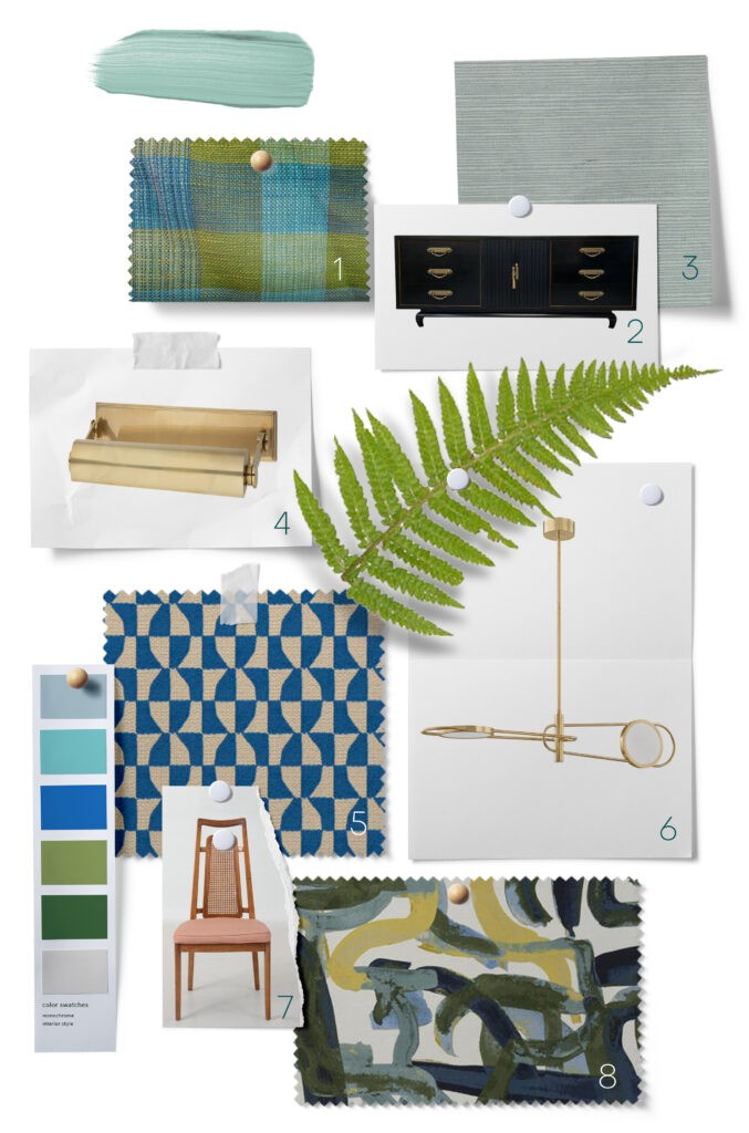
As you can see, I’m leaning into the blues, teals and greens and bringing in warmth with wood finishes, brass and art (not shown). I love learning about color theory and it was my favorite college course. If you didn’t get to take it though, here’s a look and some Analogous sets and how you may use them in decor. I referenced this article before, but its pretty great and does a much better job than I would on the topic. This graphic goes through all the combos though and is fun to imagine a room in each set.
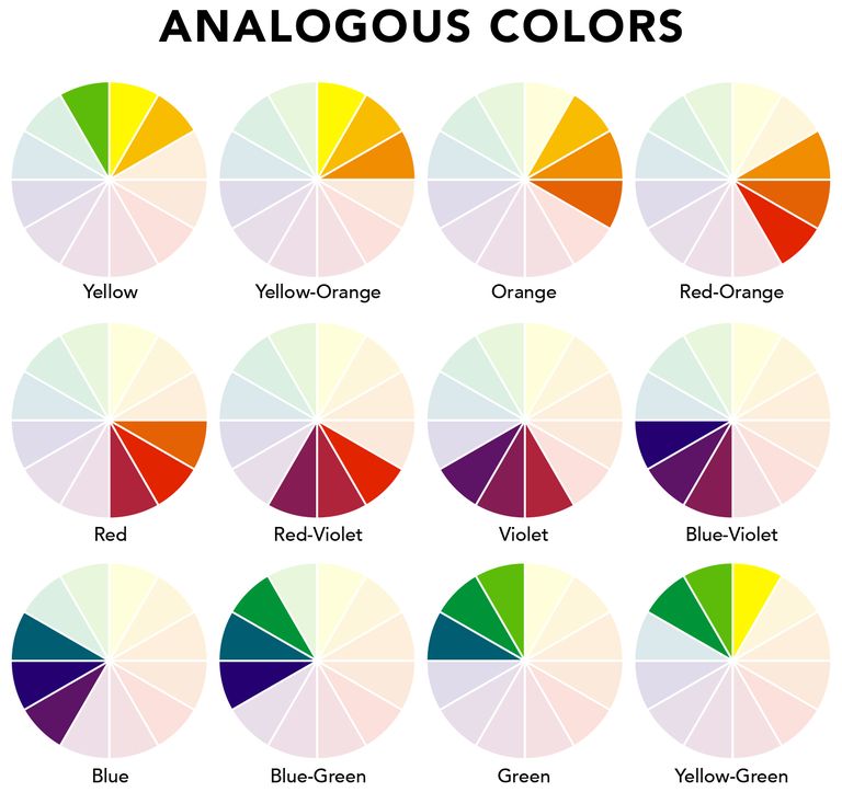
I like my colors a little less saturated than the example above but based on my moodboard you can see that I’m working in the blue-green and green zone.
Once I knew the basic color palette I wanted to go with I started considering how it would interact with the rest of our home. The dining room is right off of our front entry and the wall of bookshelves we’re building are what you’ll see when you walk in the house. I knew I wanted them to be a color, and set a mood. But not too much of a mood, ya know?
So I did something I’ve been wanting to do for years and put together a visual list of all the paint colors we’ve used in the house and made a House Palette. I did this in Illustrator, but you could just go analogue and collect the physical paint swatches and paste them onto a page.
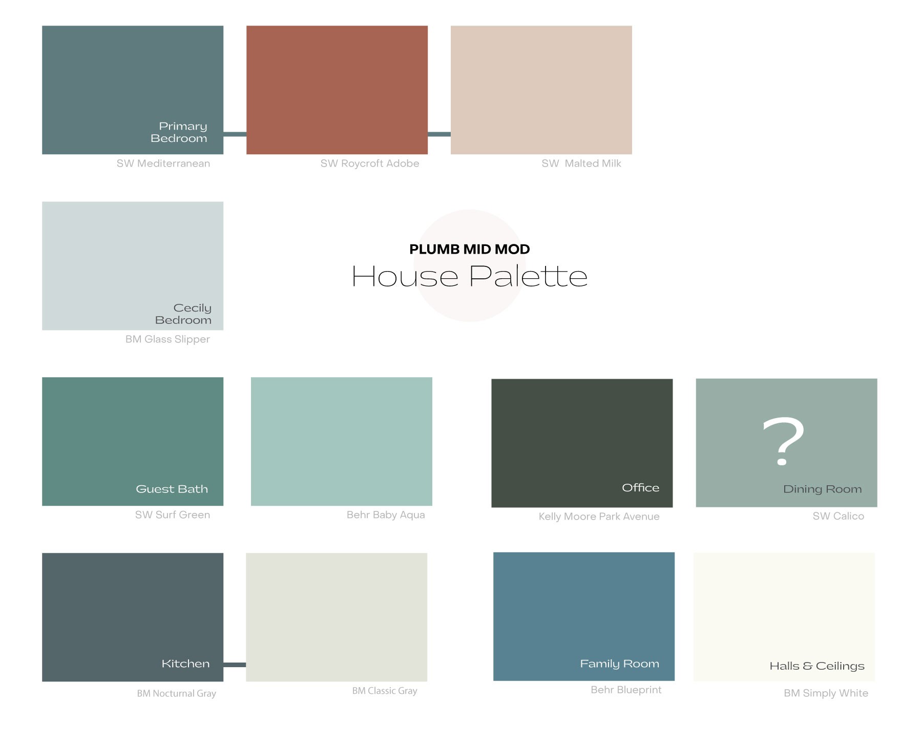
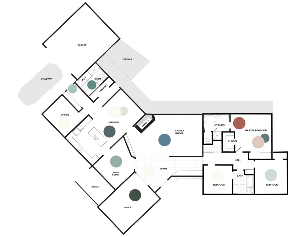
This digital representation isn’t 100% accurate of course but it gave me a good idea of the overall tones in my house. I am clearly drawn to blues and aqua colors with my paint choices. I prefer my blues to have a bit of yellow to them so they lean more peacock than true-blue or violet. Overall I like how everything is working together, its not matchy but definitely feels related. Here’s how the colors are spread through the floor plan.
Although the colors are mostly on the cool side, this is just the paint, and the final layers add so much to how a room looks. I like to decorate with warm colors (oranges, pinks, corals) in textiles and accessories, and this also doesn’t account for all the wood tones in my flooring and furniture.
I’m focused mainly on the quadrant of colors on the bottom right. The office, family room and dining room are visible at once from the entry, which is painted white with the original white tile. I’m not married to my office color (although I still like it), so i’m mainly concerned with the Family Room pairing with the new Dining Room.
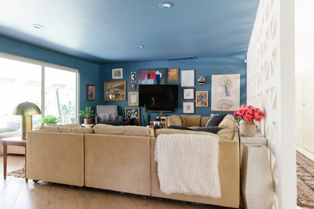
As you can see here, the Family Room is an all-over, cozy moment and needs to visually flow into the dining room even thought they’re separate rooms with a door between them.
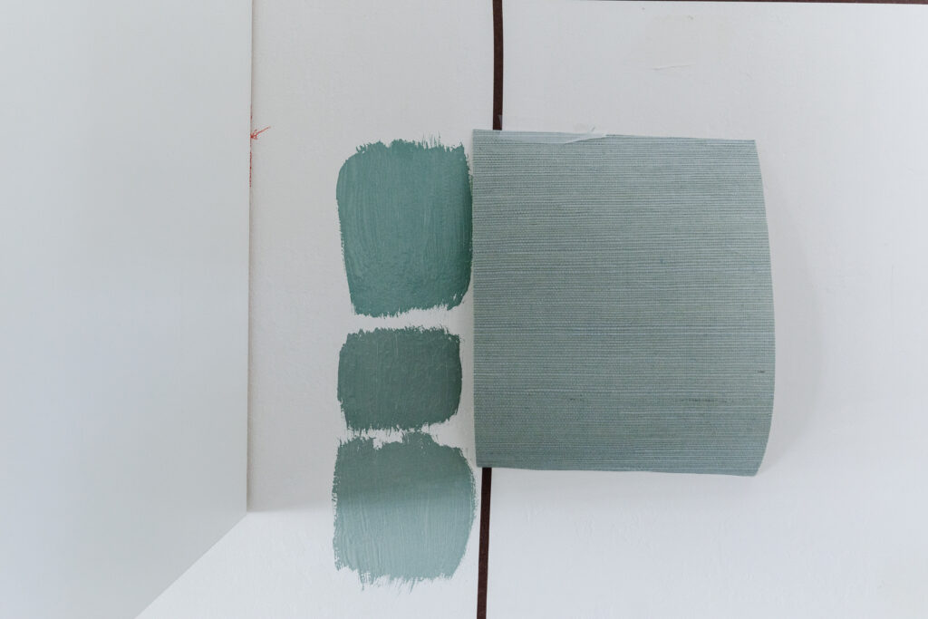
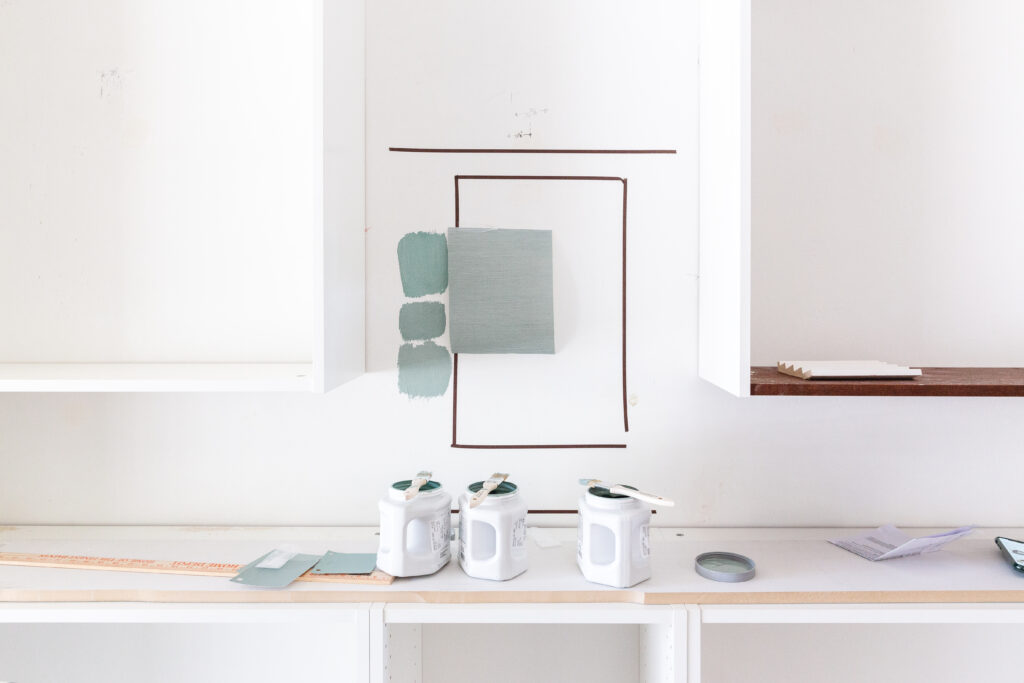
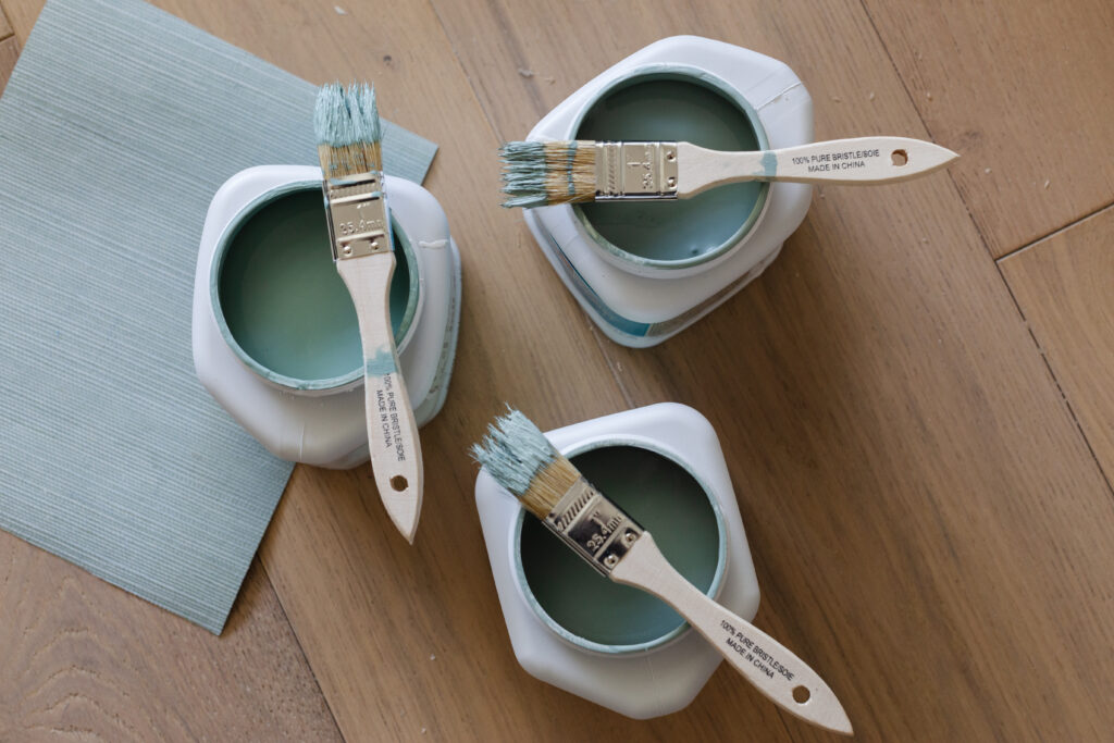
Here is my first round of swatching next to the grasscloth. I am painting all the bookcases, cabinets, doors and trim the same color and walls will be the grass, so its going to be a lot of it and I want to get it right. In my mind I want it to be a little unexpected and playful, but not childlike. I also need it too look amazing with my brass picture lights gifted from Hudson Valley Lighting.
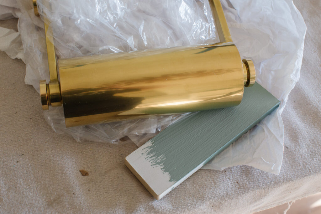
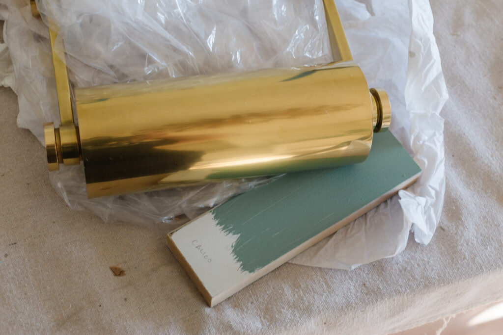
Honestly I’m not sure if I’m there yet. I’m going to keep looking at everything at different times of day and make the call soon. Like, real soon since I’m obviously running out of time.
For all you atrium enthusiasts I’ll be focusing my post on it next week! For now here’s a non-comprehensive checklist of all that still needs to happen. Yes there are only 2 check marks but don’t freak out, everything is fine. Totally fine. 
Dining Room
- Install bookcases
- Choose paint
- Paint everything
- Caulk everything
- Install crown and base
- Install bookcase trim
- Move some electrical
- Install lighting
- Hang grasscloth
- Hang art
- Rework drapery panels
- Recover dining chairs
- Recover piano bench
- Style!
Atrium
- Install atrium lighting
- Clear atrium
- Select plants
- Plant atrium
- Fix/replace pond pump
- Add gravel rocks
- Add river rocks to pond bed
- Remove bamboo hedges
Now please go follow the Featured Designers to see what they’re doing with Highpoint and all my fellow Guest Participants. There are so many doing cool things this round!!
A huge thank you to my generous sponsors:


2 thoughts on “ORC Fall 2020 :: Week 3”
I love the idea of keeping all your house paint colors in one place. I am finally just beginning to understand how important it is to pay attention to the flow from one room to the next.
I love the colors you have chosen Rebecca! I can’t wait to see it all come together 😉