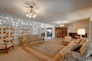
Hi! I’m Rebecca designer and founder of Studio Plumb. In January 2017 we became the second owners of the #plumbmidmod, a one-of-a-kind 1960 midcentury ranch on .8 of an acre outside of Sacramento, California. It has unique original architectural details, a creek running through the yard, and a perfect floorplan. It also needs a sh!#t ton of work. Bit by bit with the help of my dear old dad we’re bringing it back to its former glory with a modern spin.
Catch up on the past few weeks

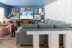
Things are really happening in Week 6! Especially a few installation jobs (electrical work, drapery install and fireplace tile) that I’ve been worried about because we can’t DIY them. But I think I’ve gotten over the big hurdles and its all happening! Keep reading to see the progress!
Lighting
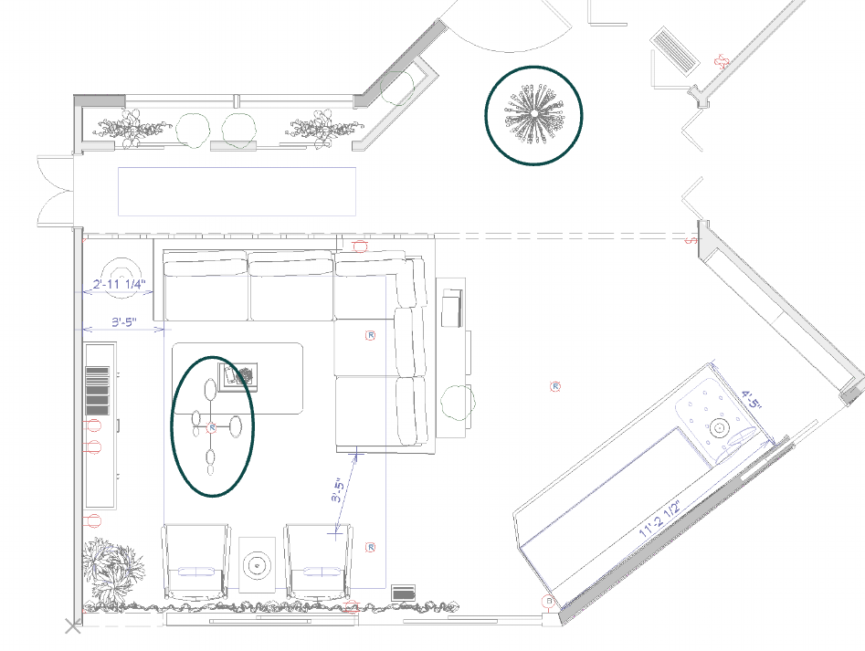
As you can see in the plan above, we have recessed lighting in the family room but I wanted a large decorative fixture to help give a visual anchor to the seating area. The circled area on the left is where we had a can light and I wanted it to convert to a large flushmount fixture. I was so so excited with Mitzi agreed to sponsor the lighting. I use them a lot in my client projects because their fixtures always have a modern playfulness that I love and bring such impact to a space.
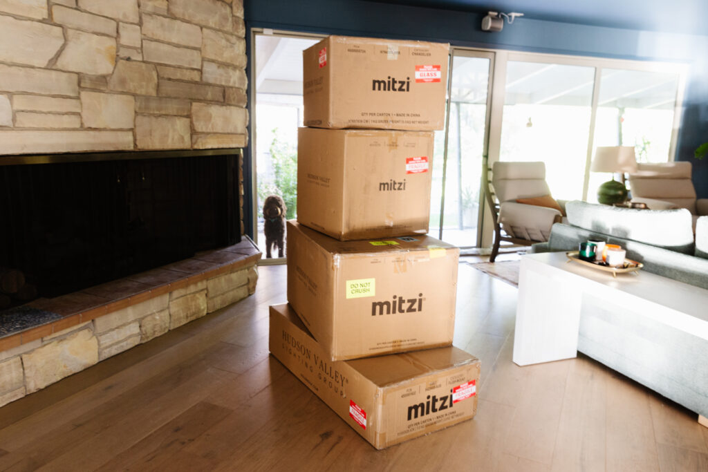
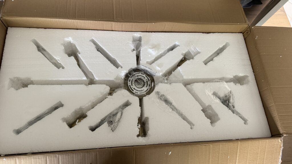
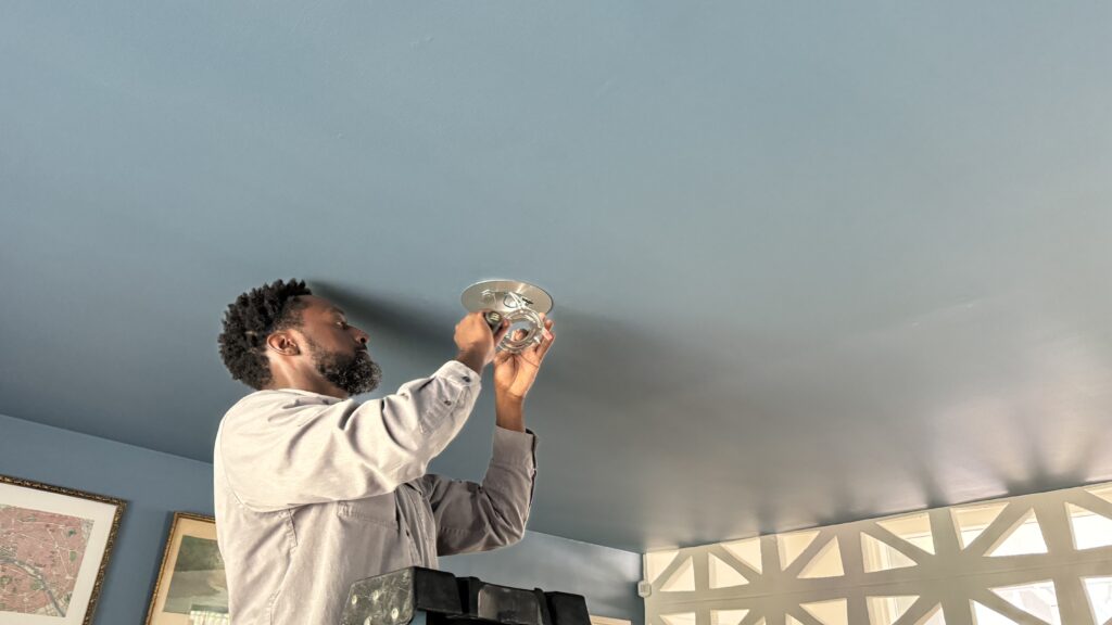
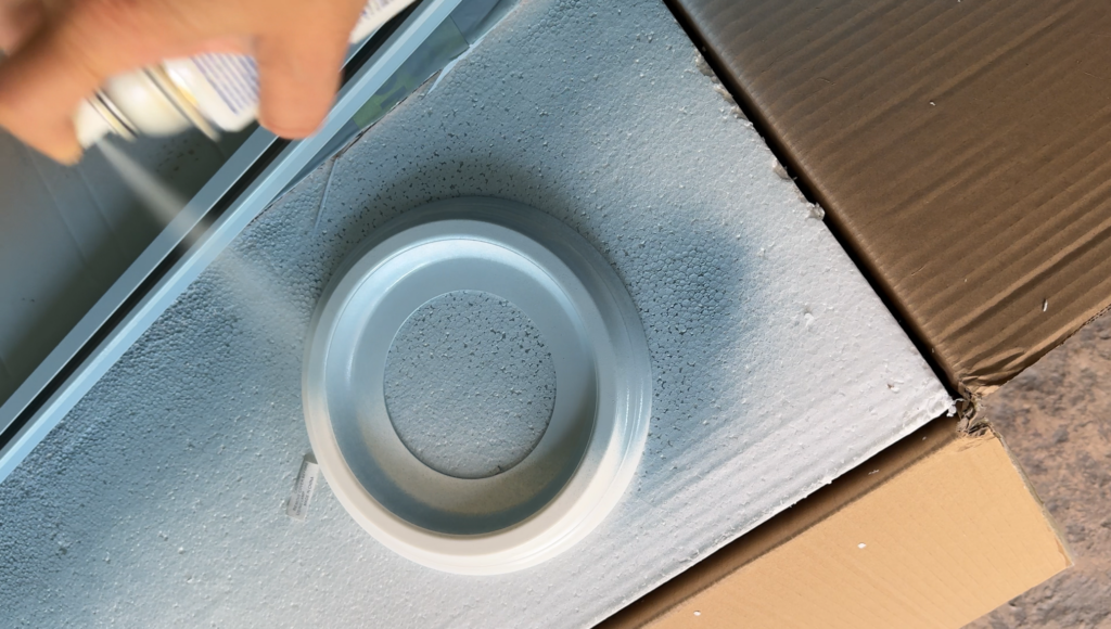
To conver the recessed light the electrician needed a conversion kit so the new fixture had something to be attached to. About 30 seconds before he needed to add the bright white plastic medallion to cover the plate I quickly spray painted it. I had some paint that I’m spraying the drapery hardware with that’s a semi-close match so it was a ‘make it work’ moment.
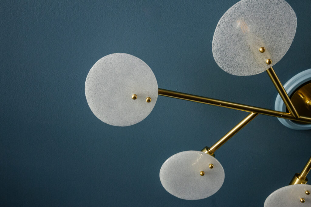
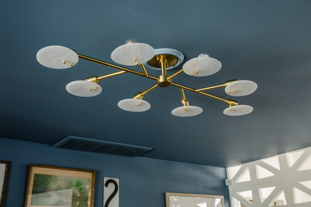
And here it is all installed! This is the Mitzi Giselle Semi-Flushmount which is 48″ wide. I love how the candy glass keeps the down-cast light soft and a little sparkly, and the wide width makes a statement without limiting headroom. Also, this is why you paint your ceilings, folks. 🙂
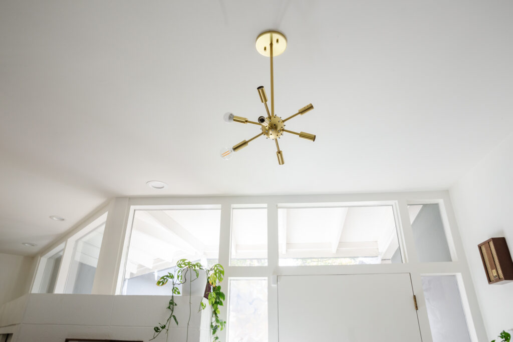
We also have a sparkly new chandelier going in the entry. Here it is “installed” but its missing all the magical parts. I didn’t want to pay the electrician’s rates to put together all the pieces, plus I want to stretch out content.😜
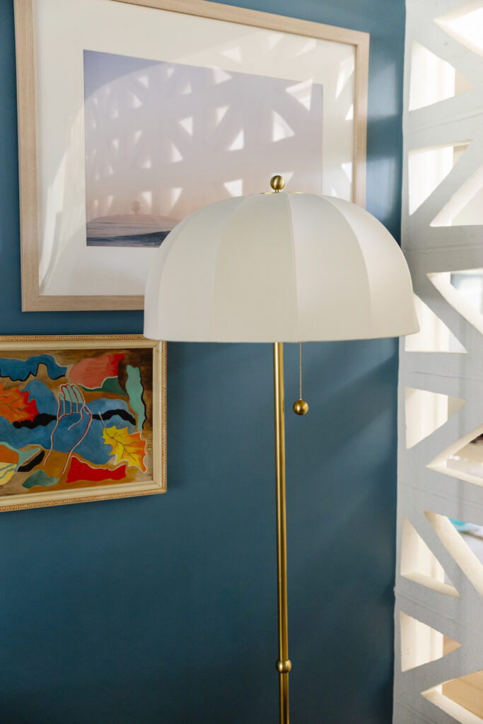
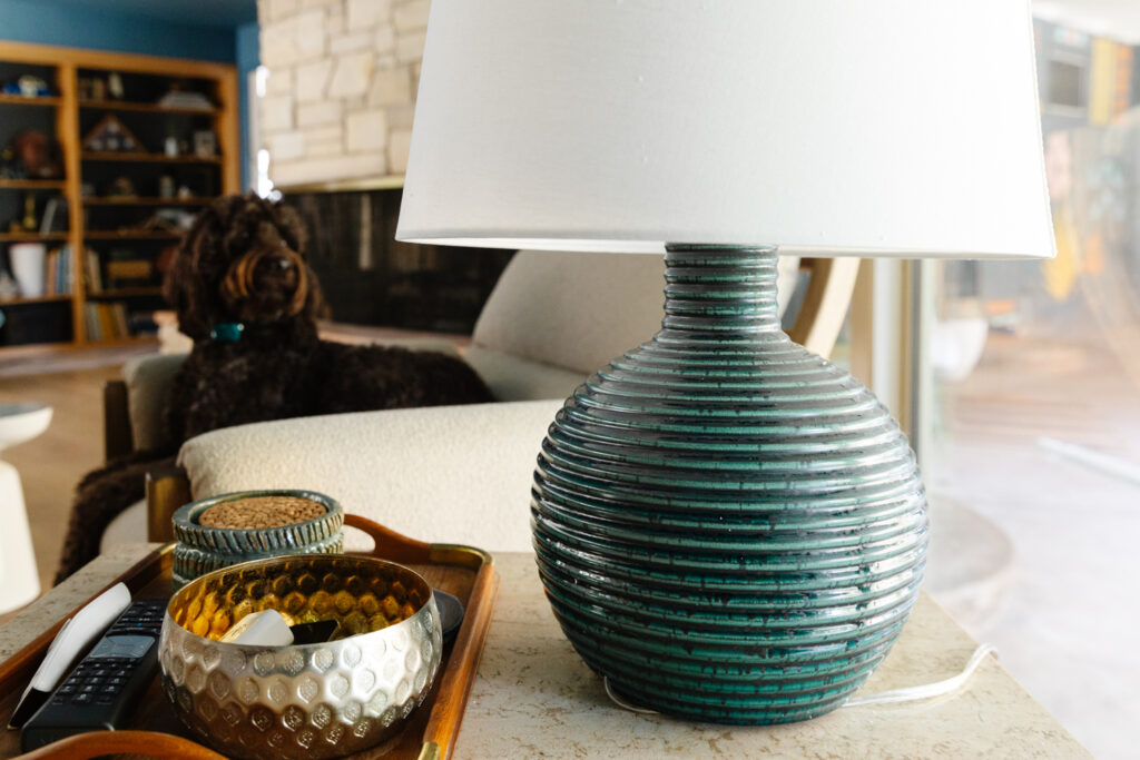
Mitzi also gifted us a floor lamp and table lamp from Home Ec. x Mitzi Tastemakers collection! I’ve been Instagram friends with Natalie the last couple years and have been coveting some of her pieces so this is extra special. The Mishelle floor lamp is so dang cute in the corner, and its oversized ball pull chain is the most satisfying switch ever. The Sara table lamp is sitting between our arm chairs for now and its round silhouette makes me so happy.
FURNITURE
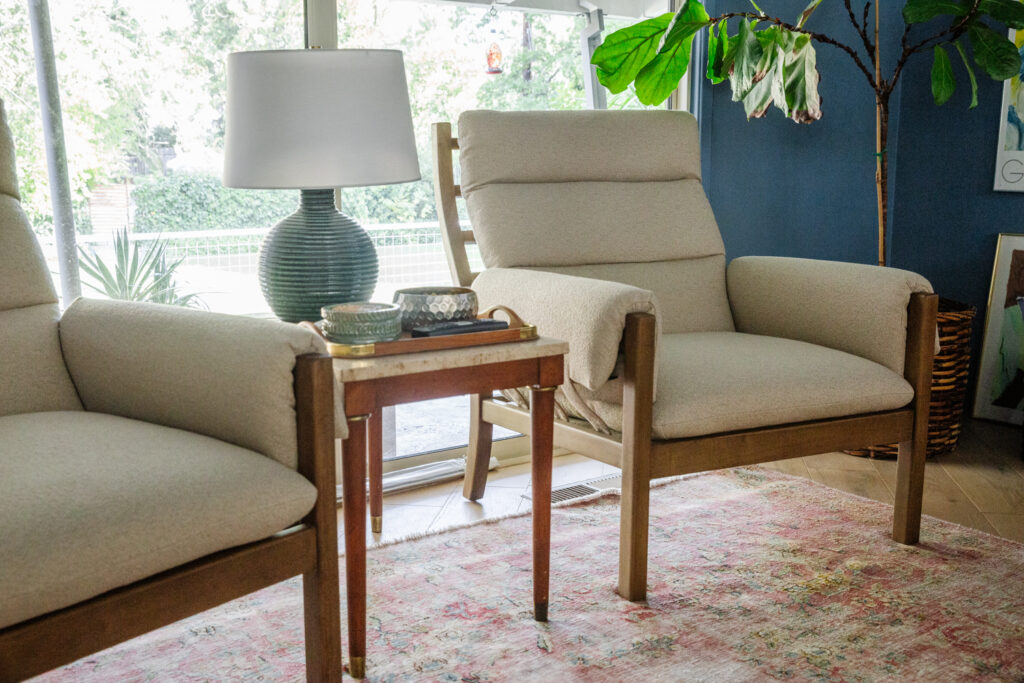
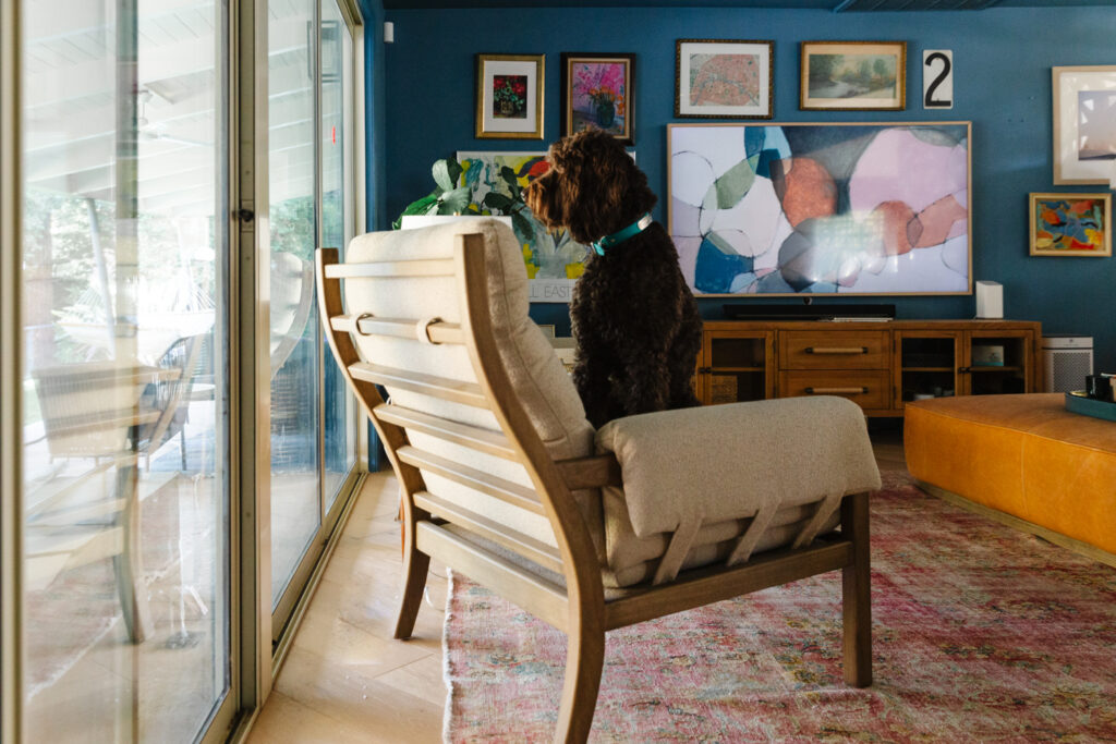
I didn’t get updated photos in time for last week’s update so here are the new arm chairs and ottoman! The chairs are from one of my wholesale vendors and they’re funky lines and wrapped arms are a nice counterbalance to the sectional. I also love the way their exposed frame looks from the back when you’re outside looking in. I have different side tables in storage so I think I’m going to swap that marble number out below. It looks “ok” but we’re not going for that here.
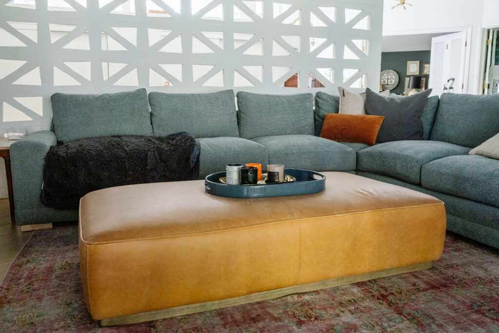
I can’t tell you how much we love the ottoman. Its sturdy enough to sit on, and six grown adults can sit around it with their feet up and there’s still room for Desmond to get comfortable. It does scratch (ahem, Desmond), but I’m not going to worry about it and let it age naturally.
FIREPLACE
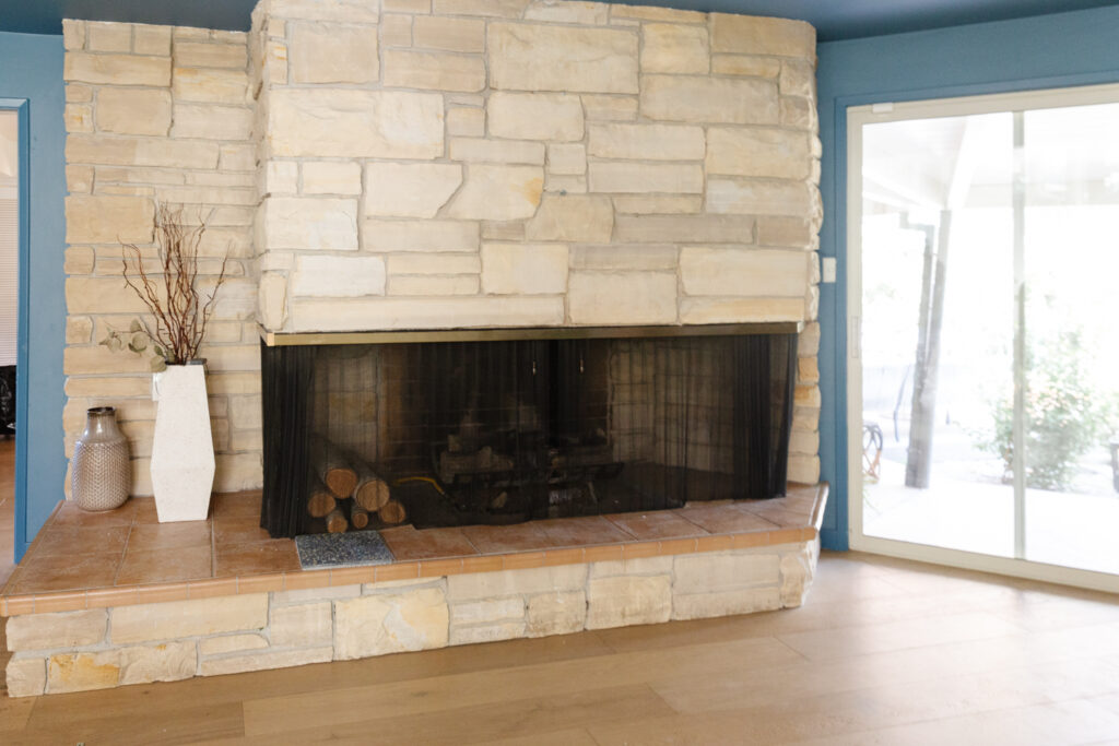
I don’t think I can accurately discribe how much I despise the hearth on the fireplace. Its the last untouched part of the house from its early 90’s “refresh” and I’ve been desperate to redo it. I just haven’t figured out what I wanted to do until this challenge kind of forced me to figure it out. I knew I wanted to keep the vertical stone, I actually love it, but the peachy-flesh colored tile ruins it. I decided on a neutral terrazzo tile, and was over the moon when Villa Lagoon Tile agreed to gift their Large Monarch Terrazzo for this project. I’ve worked with their cement tile in our Hall Bath, and a few client projects (ex 1, 2) and they’ve always been lovely to work with.
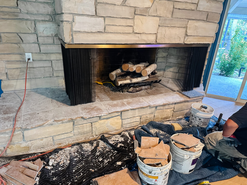
I struggled to find a tile installer for a couple weeks but finally found one who was able to meeet the deadline and work over the weekend. I was out of town when the demo and beginning of the install started but OMG I LOVE IT SO MUCH!! The only little snafu is that the new tile is thicker than the old so our screen is a touch too long. We’re going to see what some wire cutters will do and go from there. Full reveal will happen at the end but here are some sneak peeks!
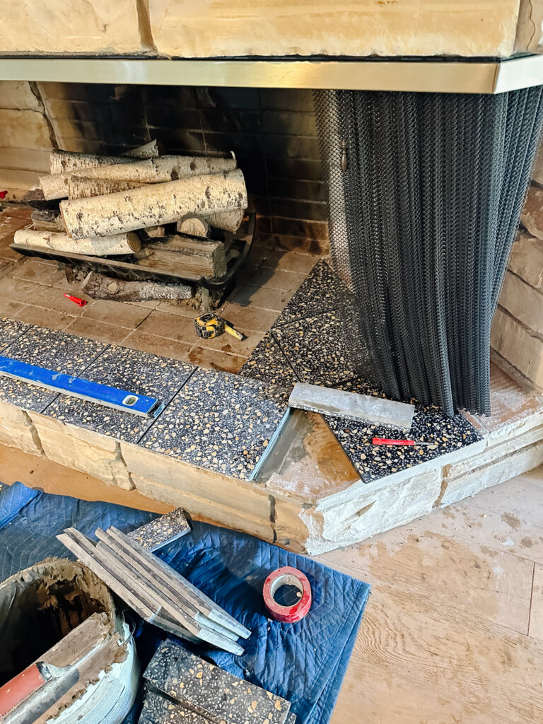
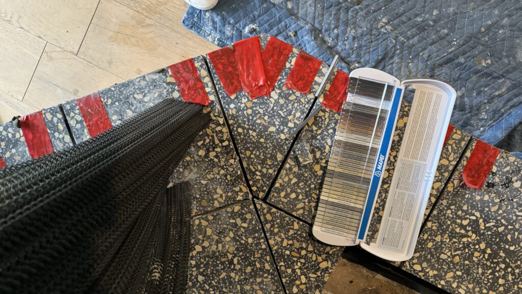
I needed him to miter the front edge on and he did a great job making it work. I love how chunky it looks. Since the tiles are extra-heavy, he applied the red tape while the thin set was setting. Dark grout helps it look clean without extra business. I think he did a great job with all the tricky angles of this thing.
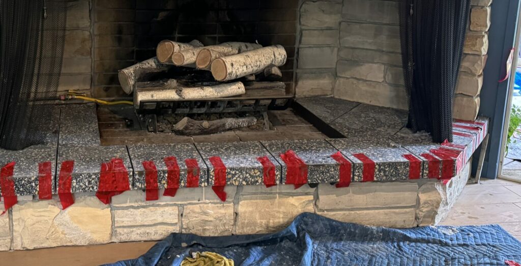
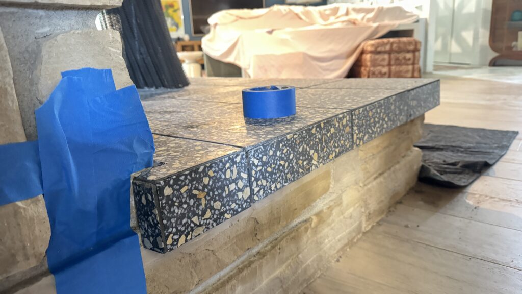
That’s it for this week, we’re so close to the finish line. I have drapery installing Tuesday, I need to wallpaper the bookcase, and then its all just styling (I think).
FAMILY Room
- New sectional
- Order drapery
- Install drapery
- New media console
- Install light fixtures
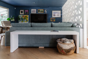
- Build skinny sofa table
- Source accent tables
- Hang art
- Source accent chairs
- Style!
FIREPLACe / ENTRY
- Demo existing tile hearth
- Install tile hearth
- Wallpaper bookcase
- Restyle bookcase
- Select plants for planter box
- Replace entry chandelier
I’ve found so much inspiration from fellow participants. Be sure to read all the posts from all the rooms here! Thank you to Linda and the One Room Challenge team for all their hard work making this event run smoothly. And more thanks to Apartment Therapy, this season’s media partner, who are covering the event.
I’ll be updating the blog weekly, but follow along on Instagram for more behind-the-scenes progress!


