I have a new project reveal to share! This one was lingering from last year as we waited for a few furniture pieces and custom cabinetry to be completed but its done and can’t wait to show you.
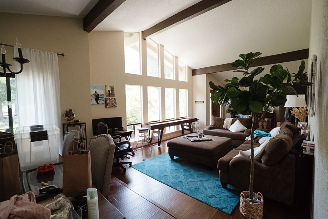
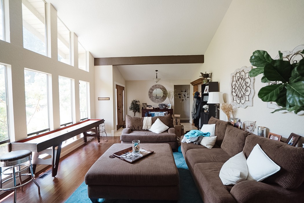
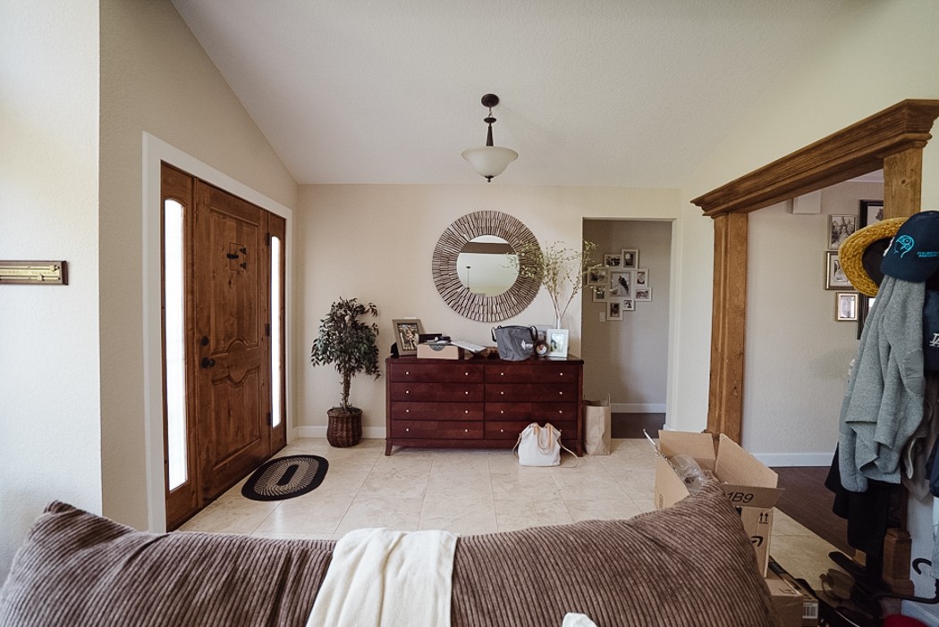
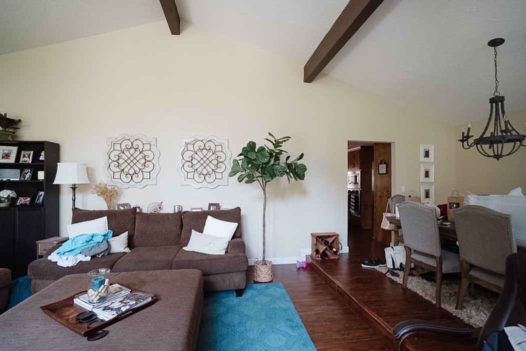
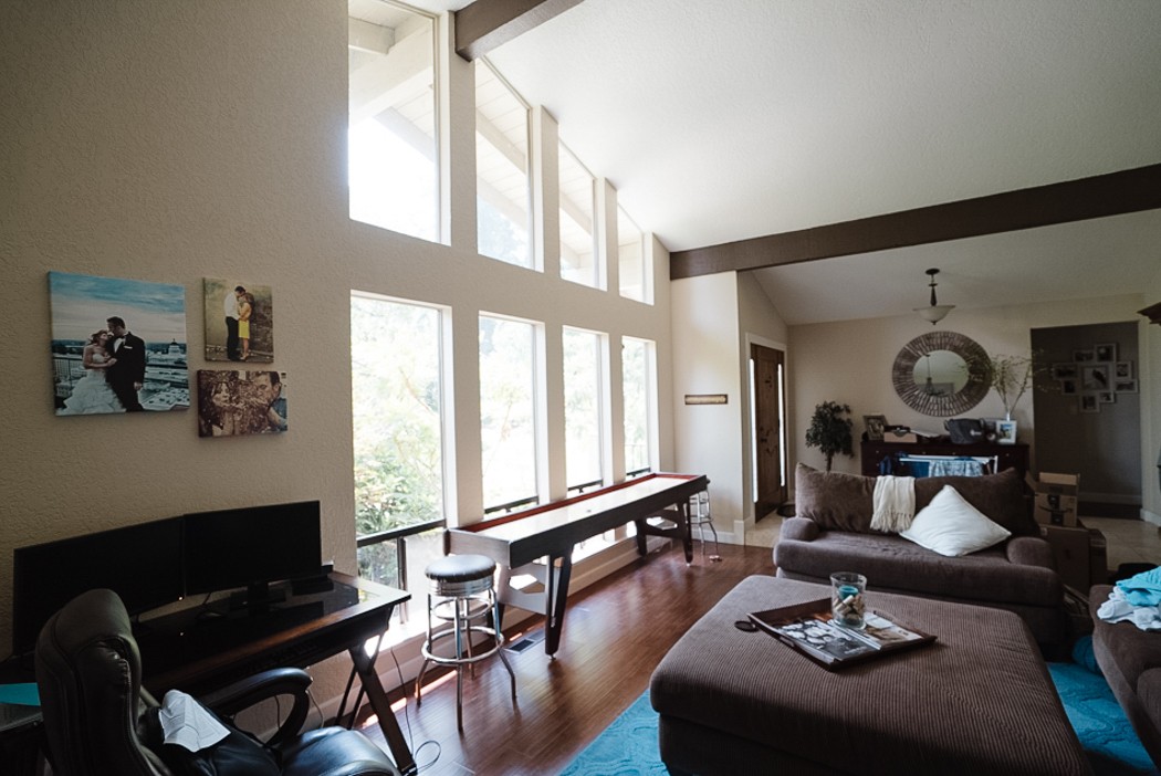
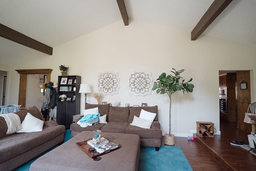
Before
I’ll admit I feel guilty doing this sometimes- client’s aren’t always ready to have their homes photographed when I take my Before photos. But I also think it adds to the drama, its real life and makes the Afters that much better so..
They moved into this home a few years ago and found themselves with that extra formal living room that know one knows what to do with anymore. They’ve been in the thick of having little kids so their old furniture set was a placeholder until they were ready to deal with it. Overall they’re drawn to a mix of traditional with modern farmhouse details, monochromatic palette with a variety of textures.
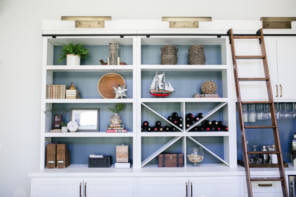
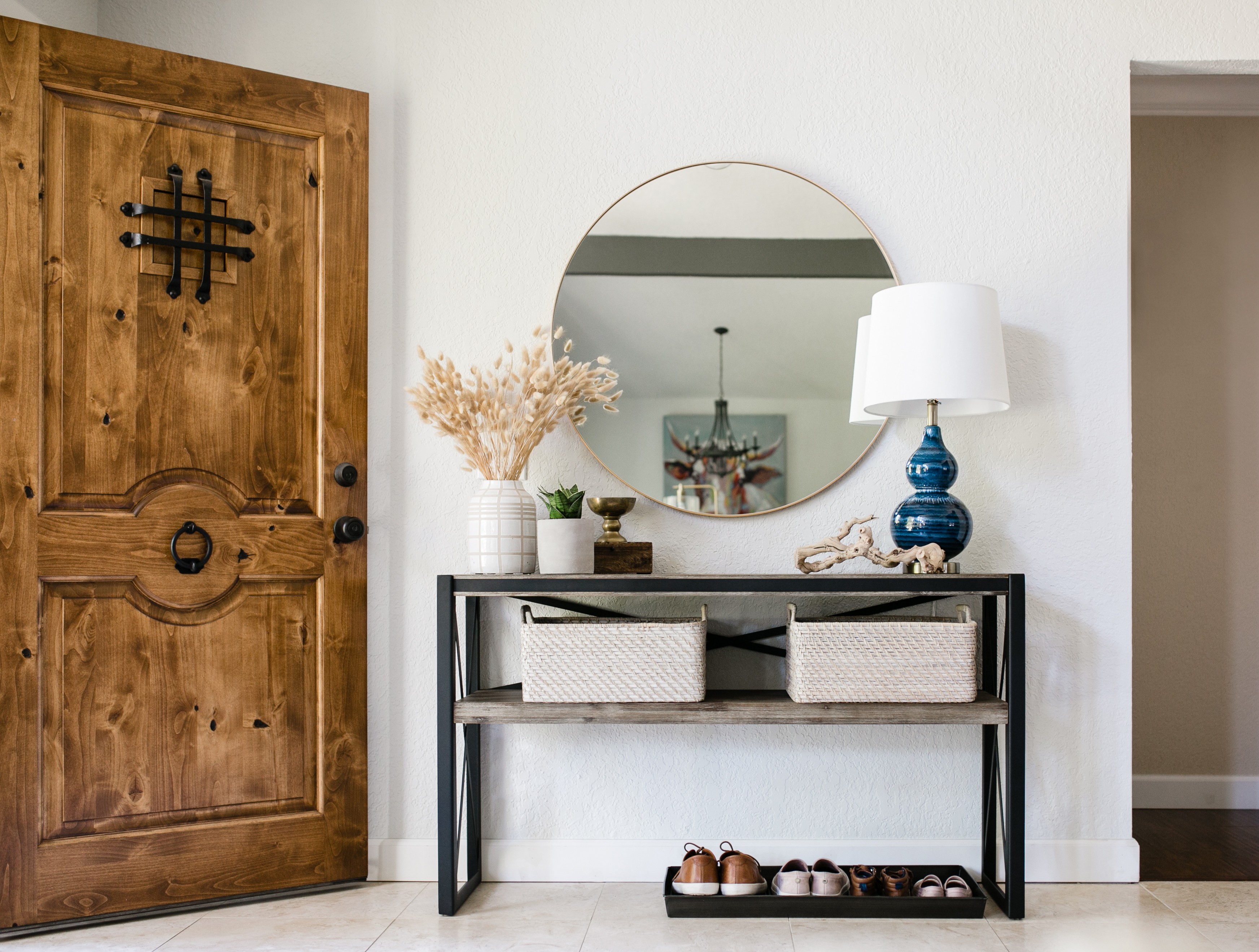
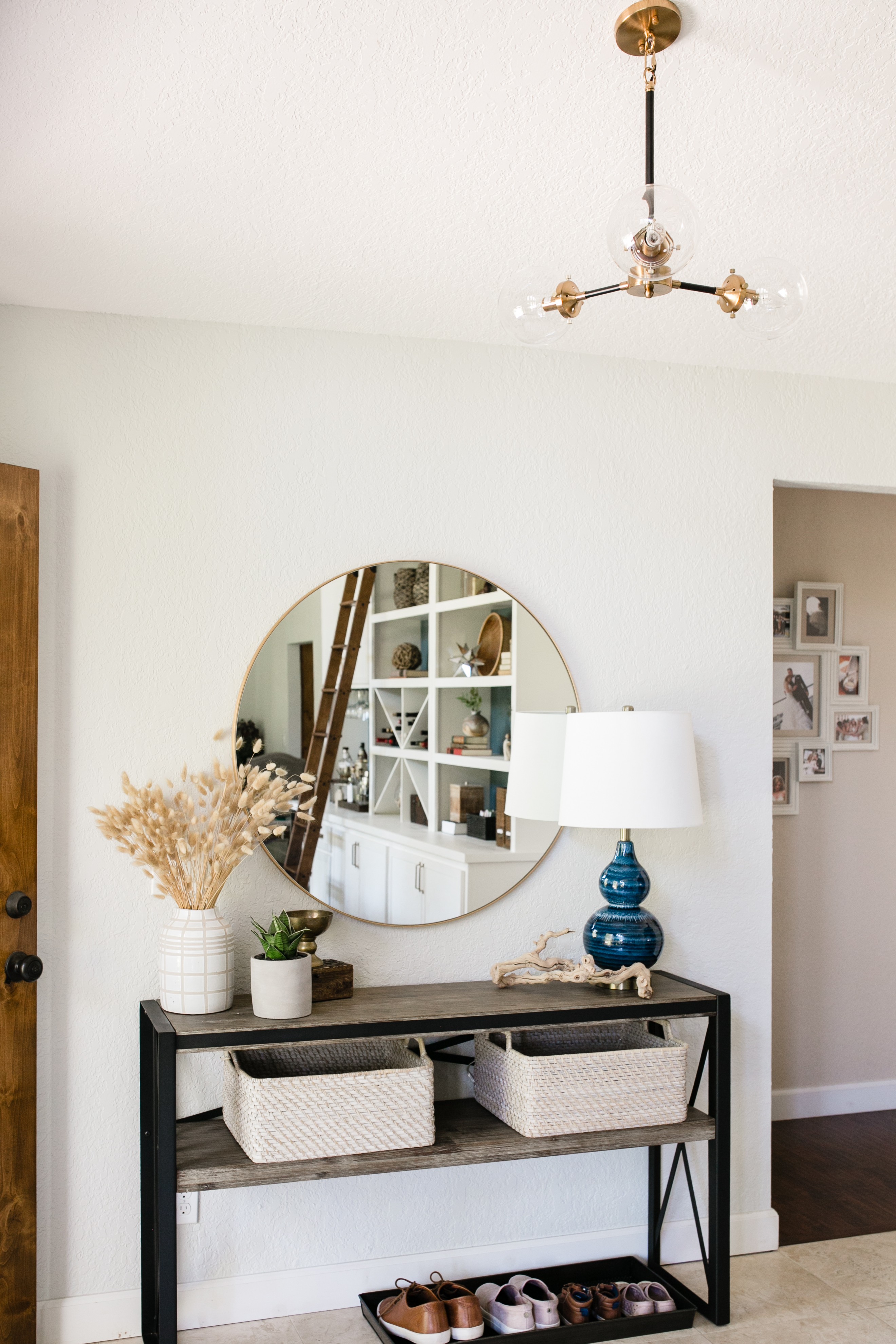
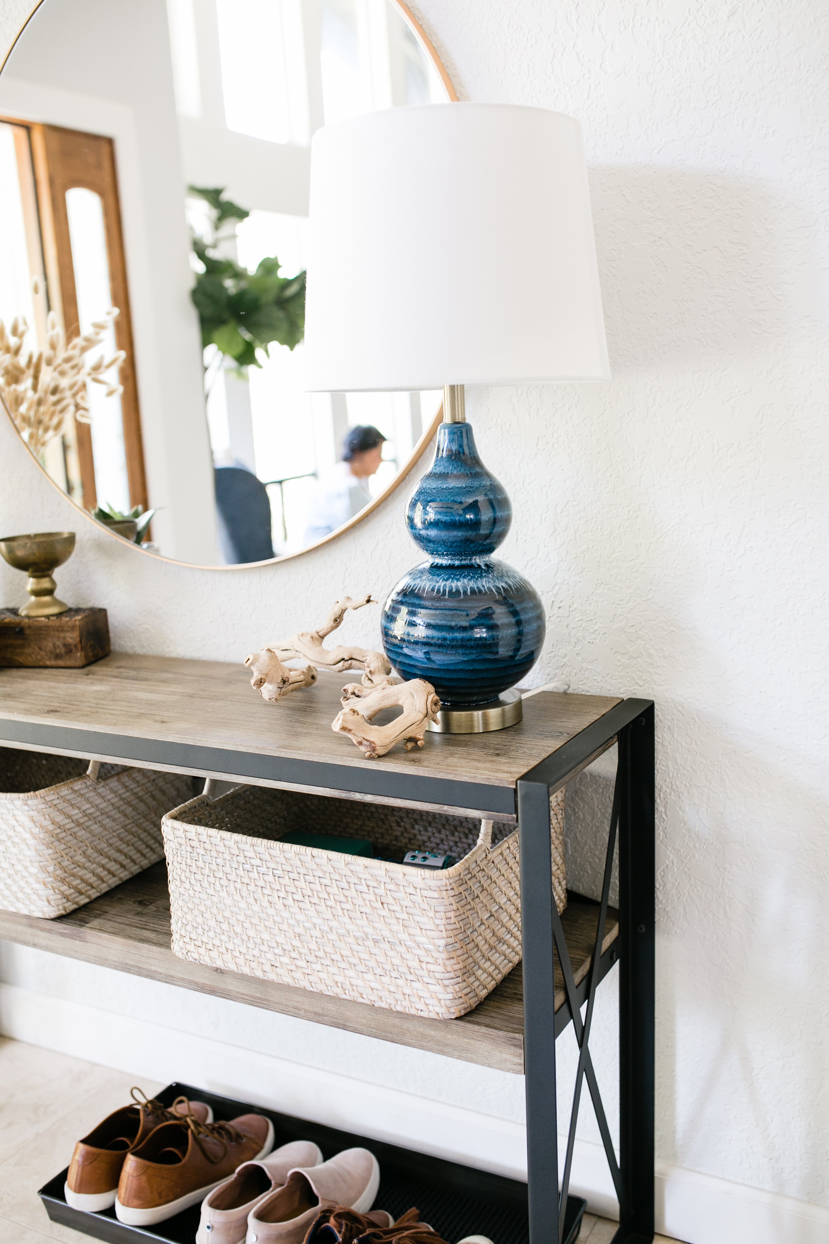
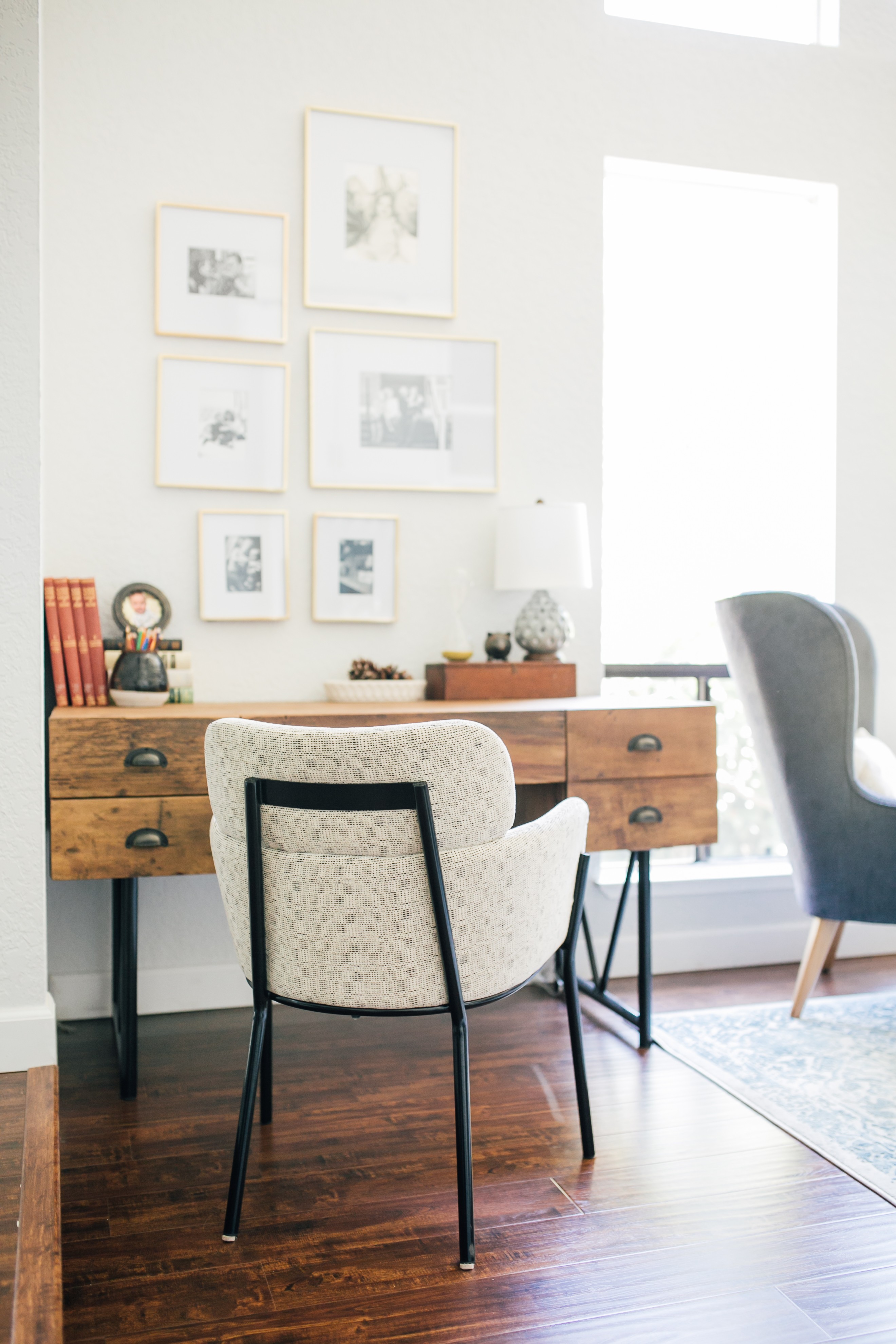
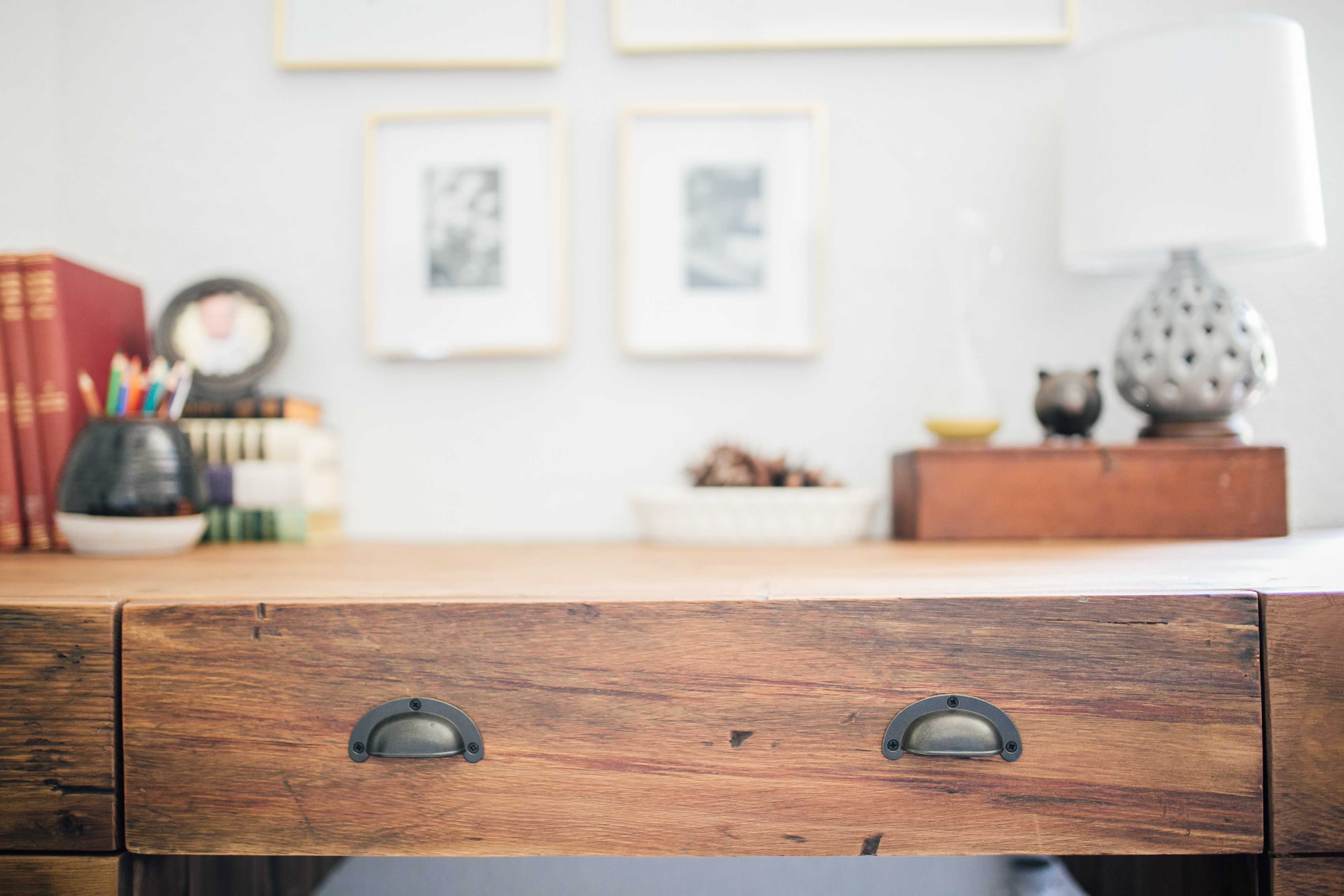
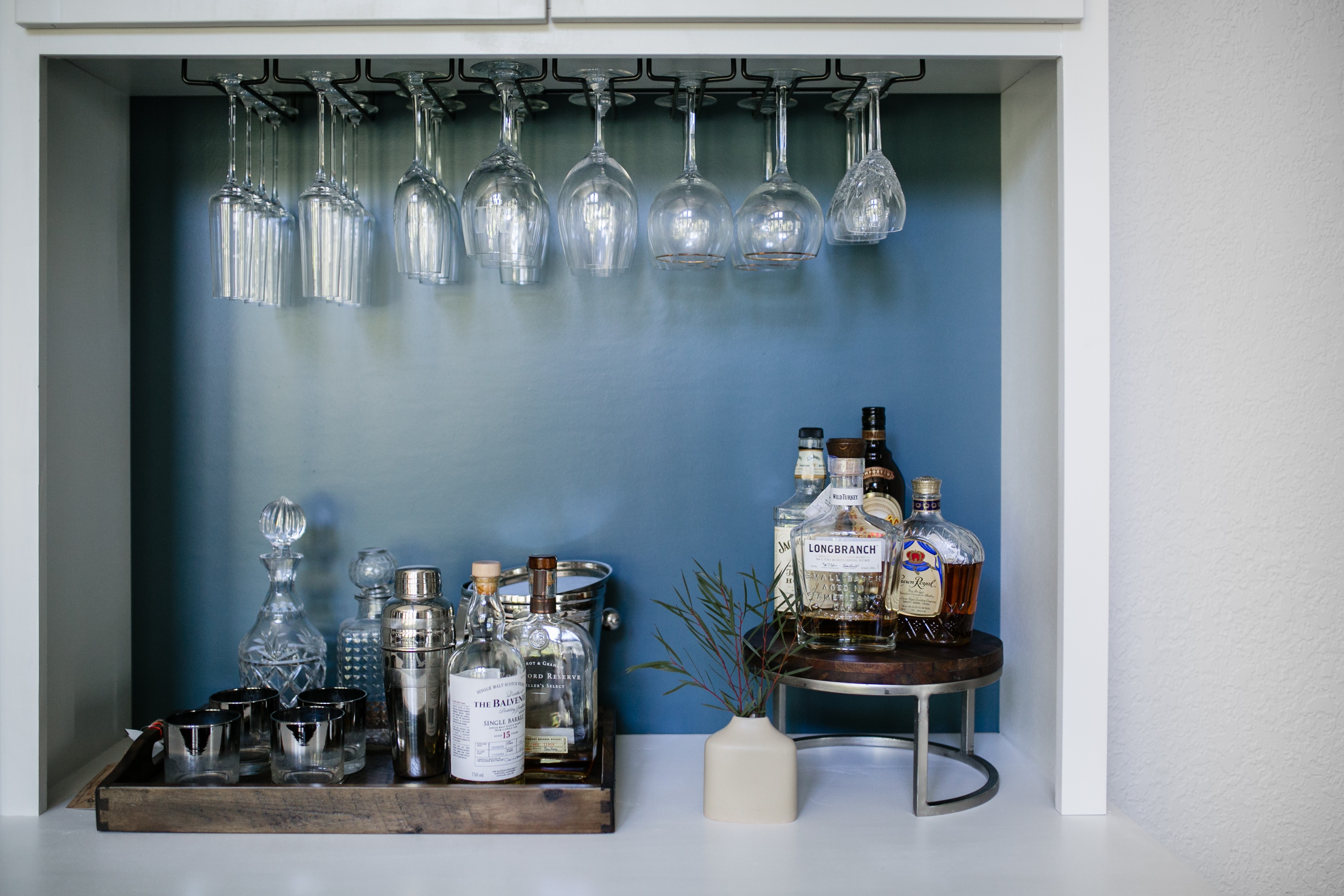
They needed a functional entry, furniture pieces scaled better for the room, storage, a desk for occasional work-from-home, and a bar (natch). They also needed this to hold up to 2 kids under 5 which is turning into my specialty.
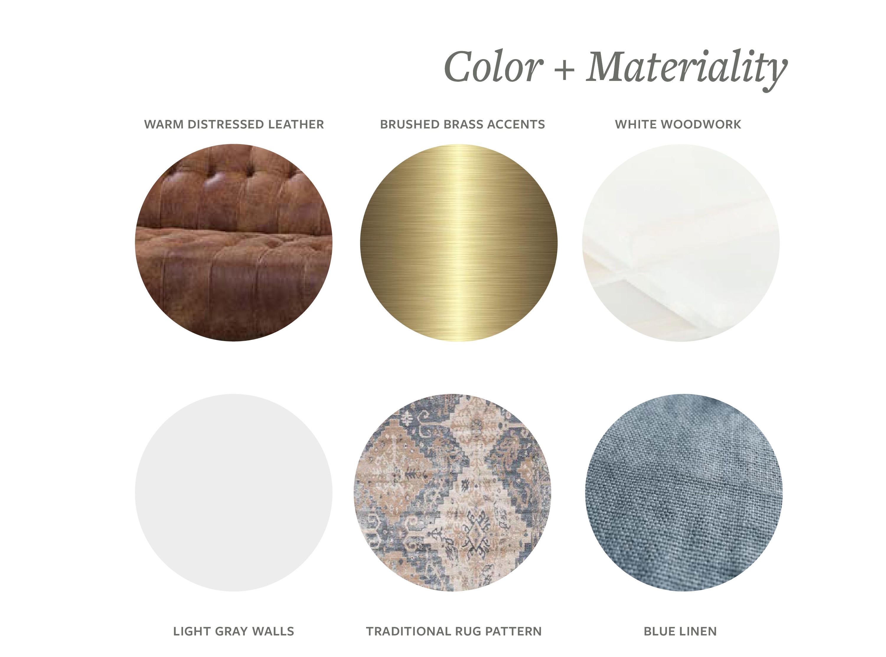
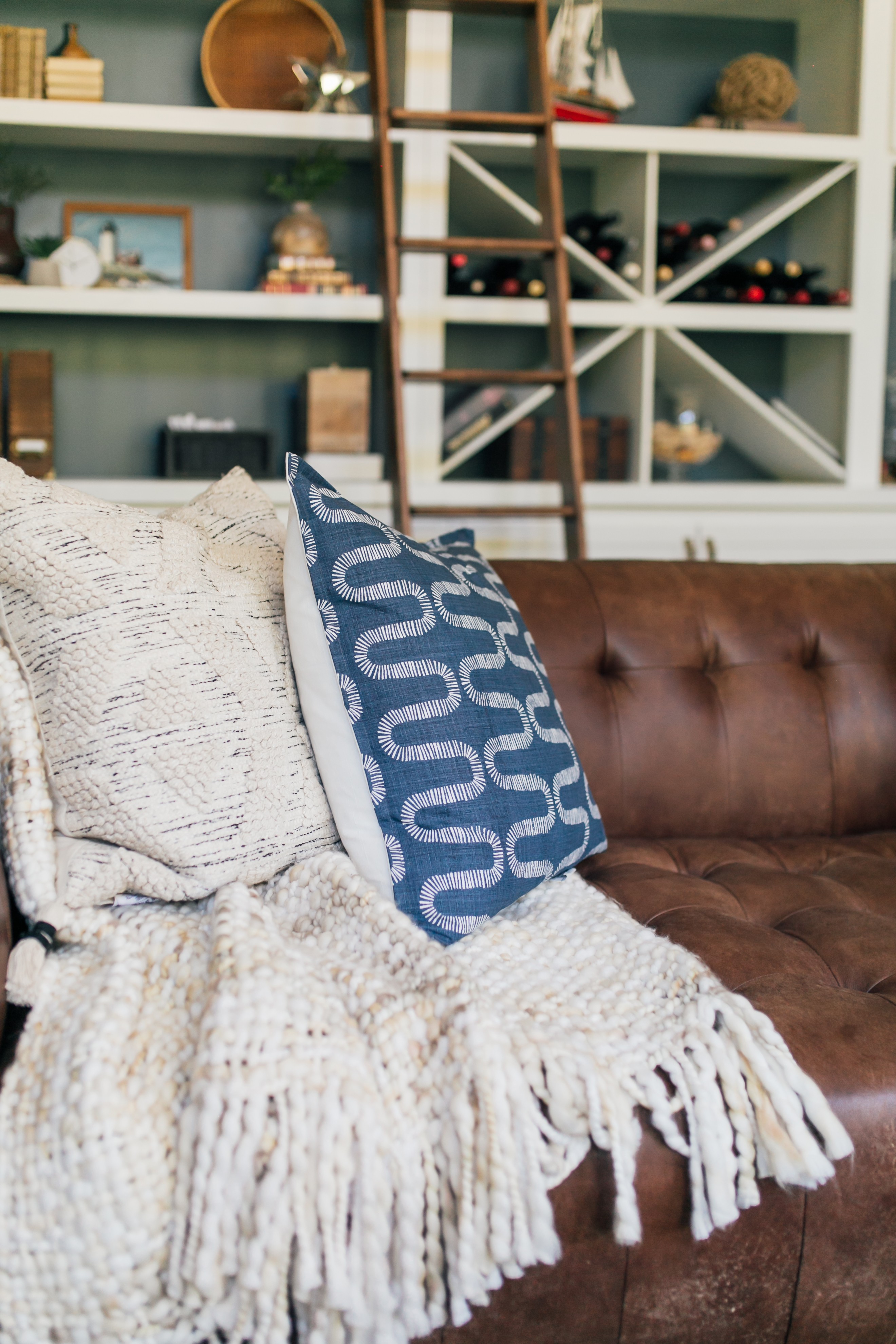
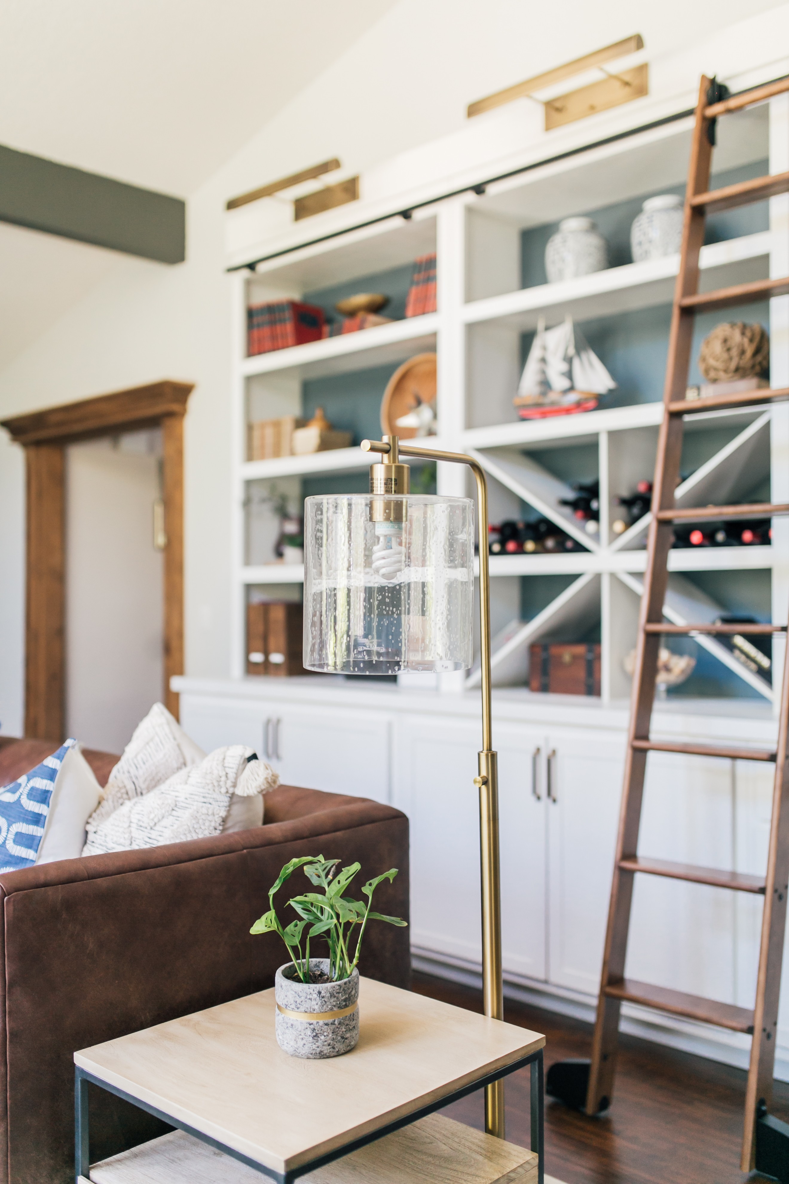
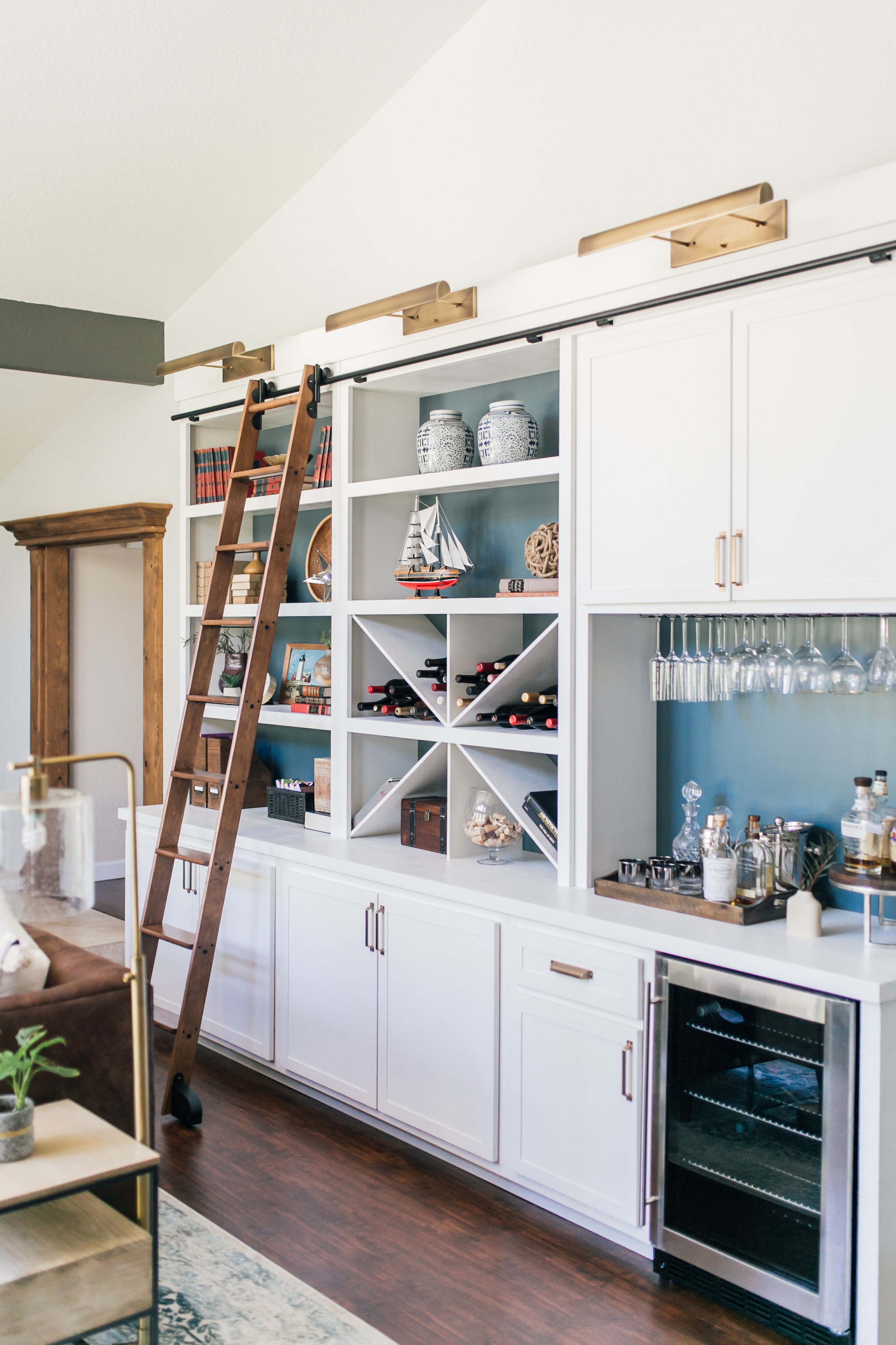
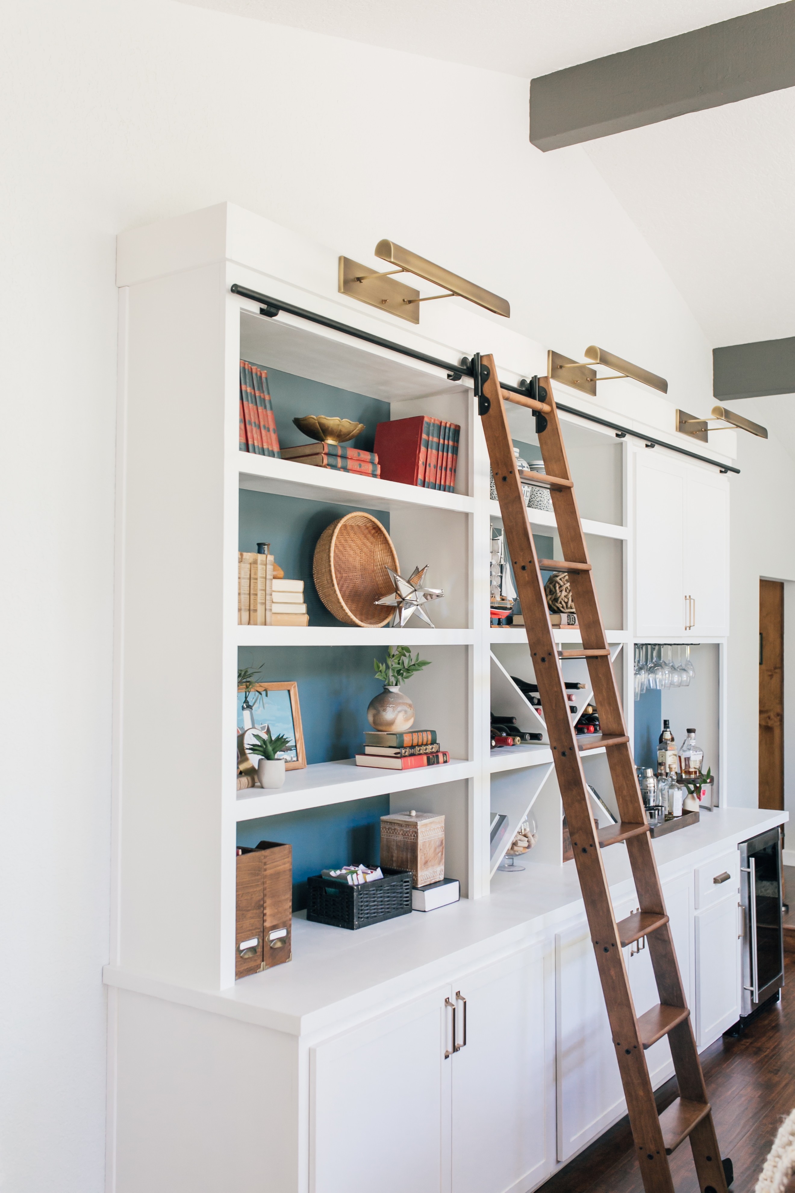
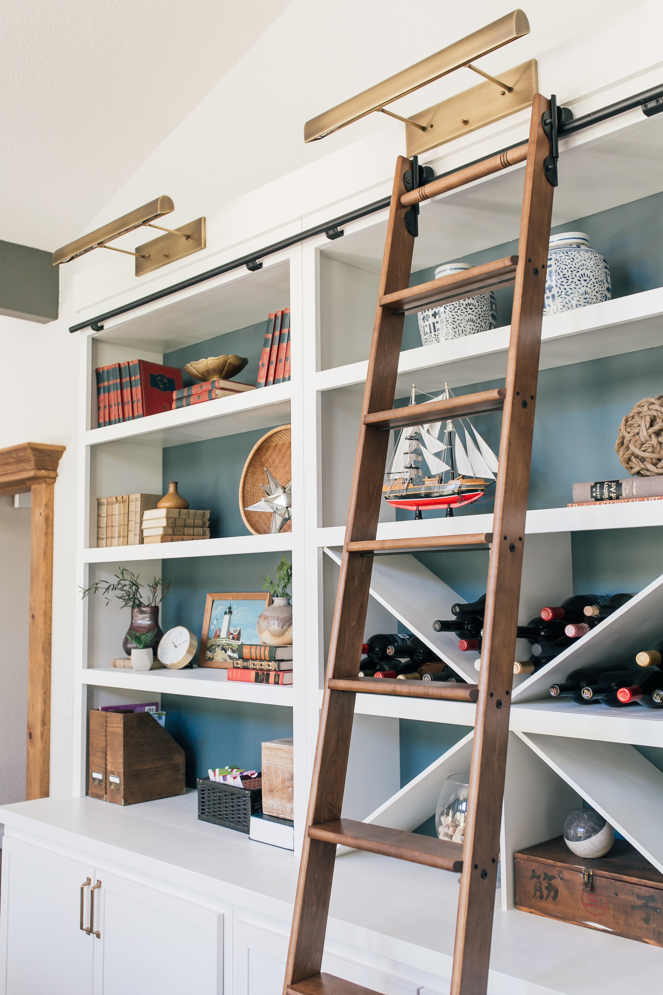
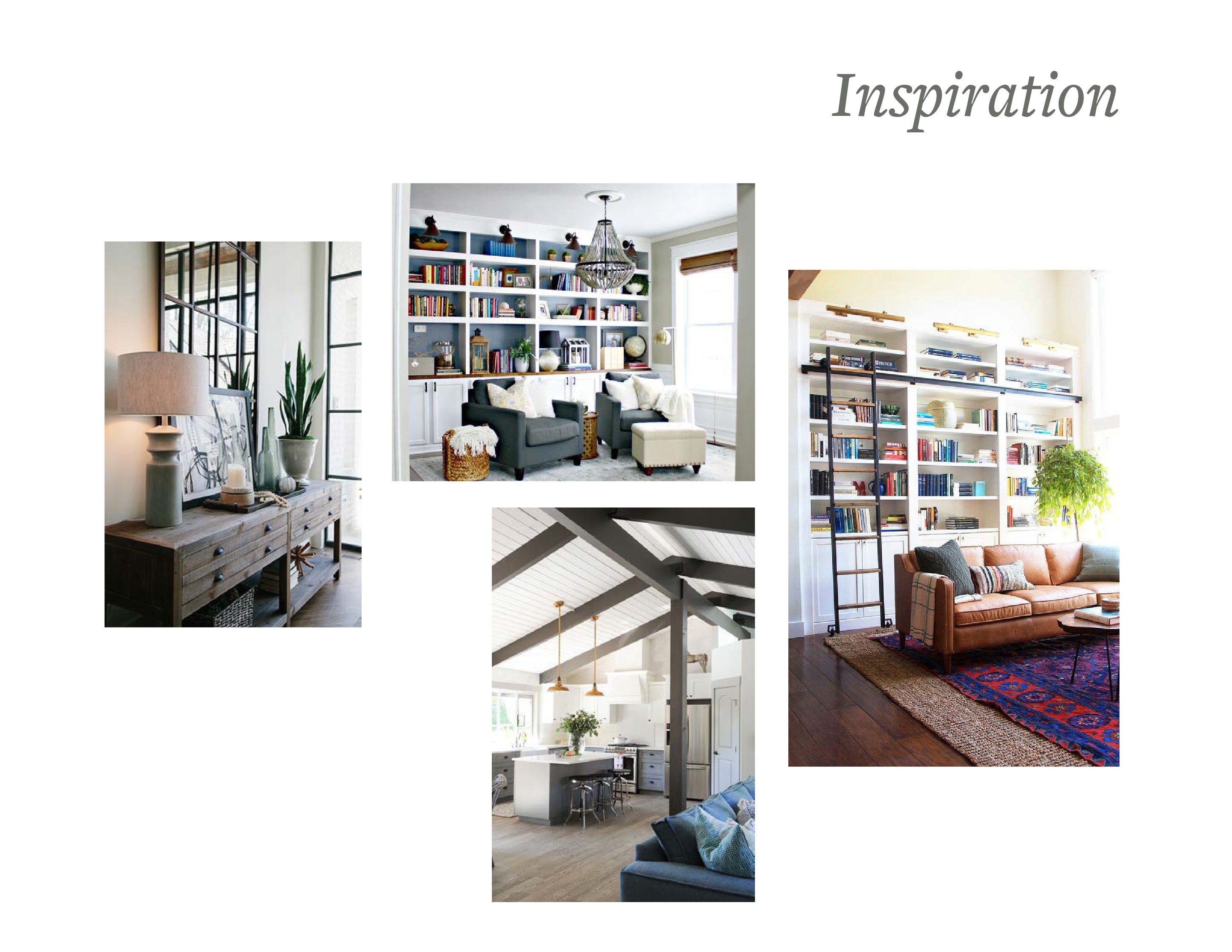 They have tall, cathedral ceilings with beams painted a chocolate brown, and beige walls that were a little darker and reading yellow with all the wood tones in the room. We decided to paint the room a light, bright gray and the beams in charcoal to modernize things. Since they desperately needed storage and they had this huge wall to fill, we decided on building large, custom cabinetry. I wanted to make sure it didn’t feel like a media unit so our inspiration was to make the room feel like a family-friendly library study.
After
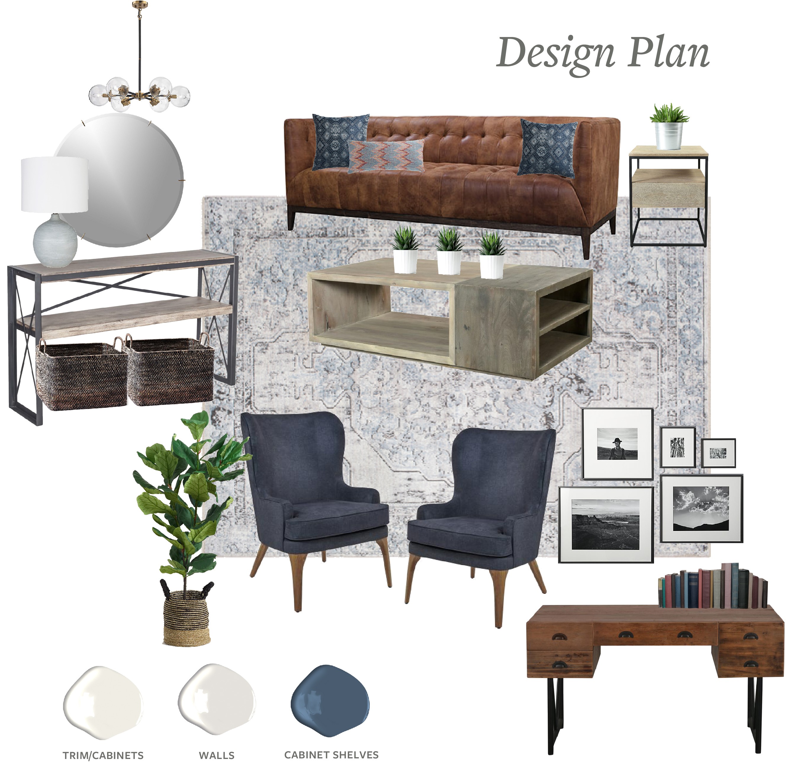
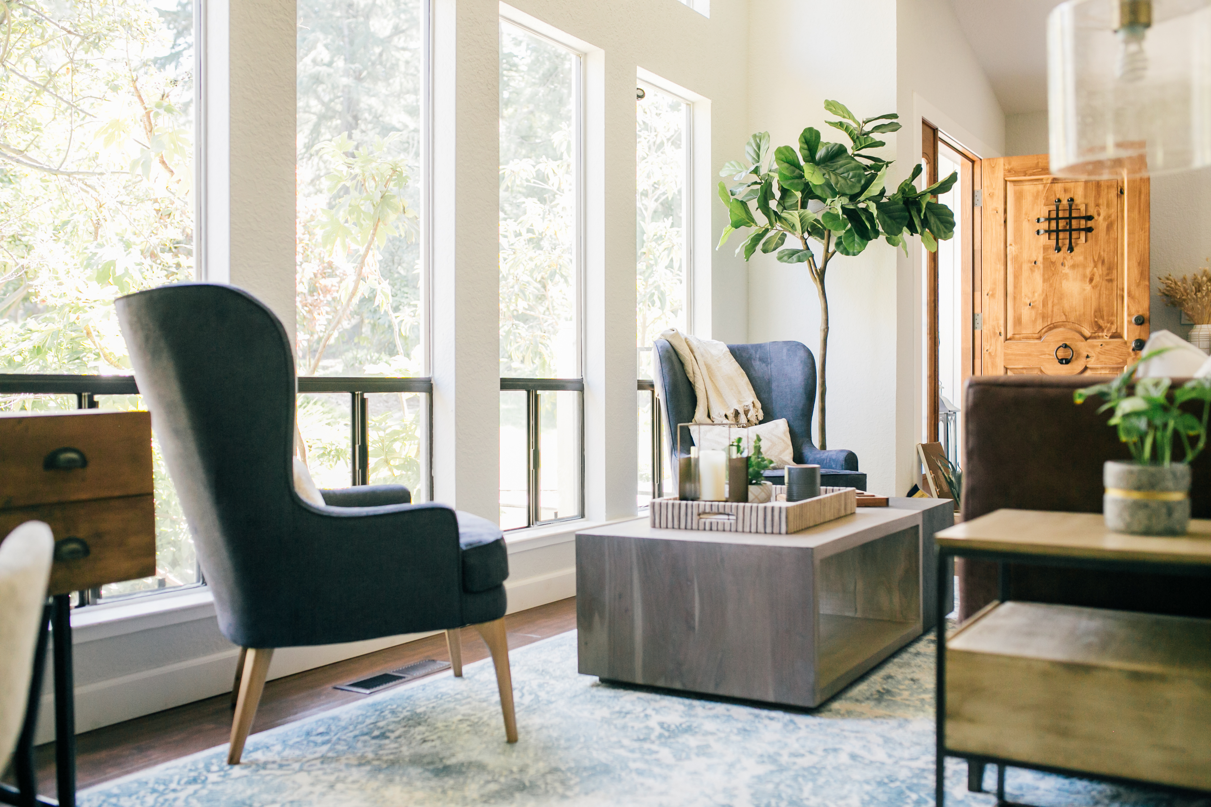
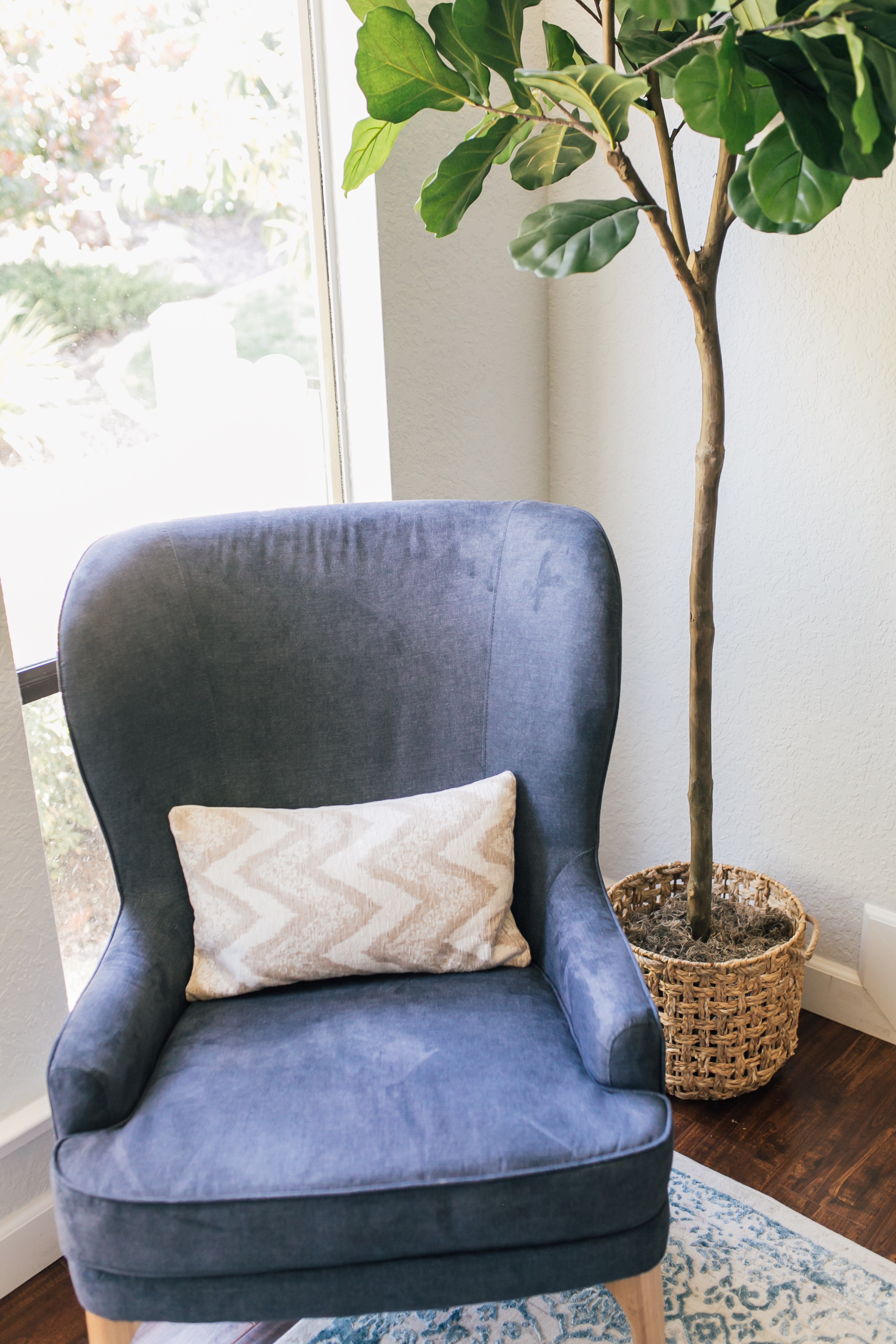
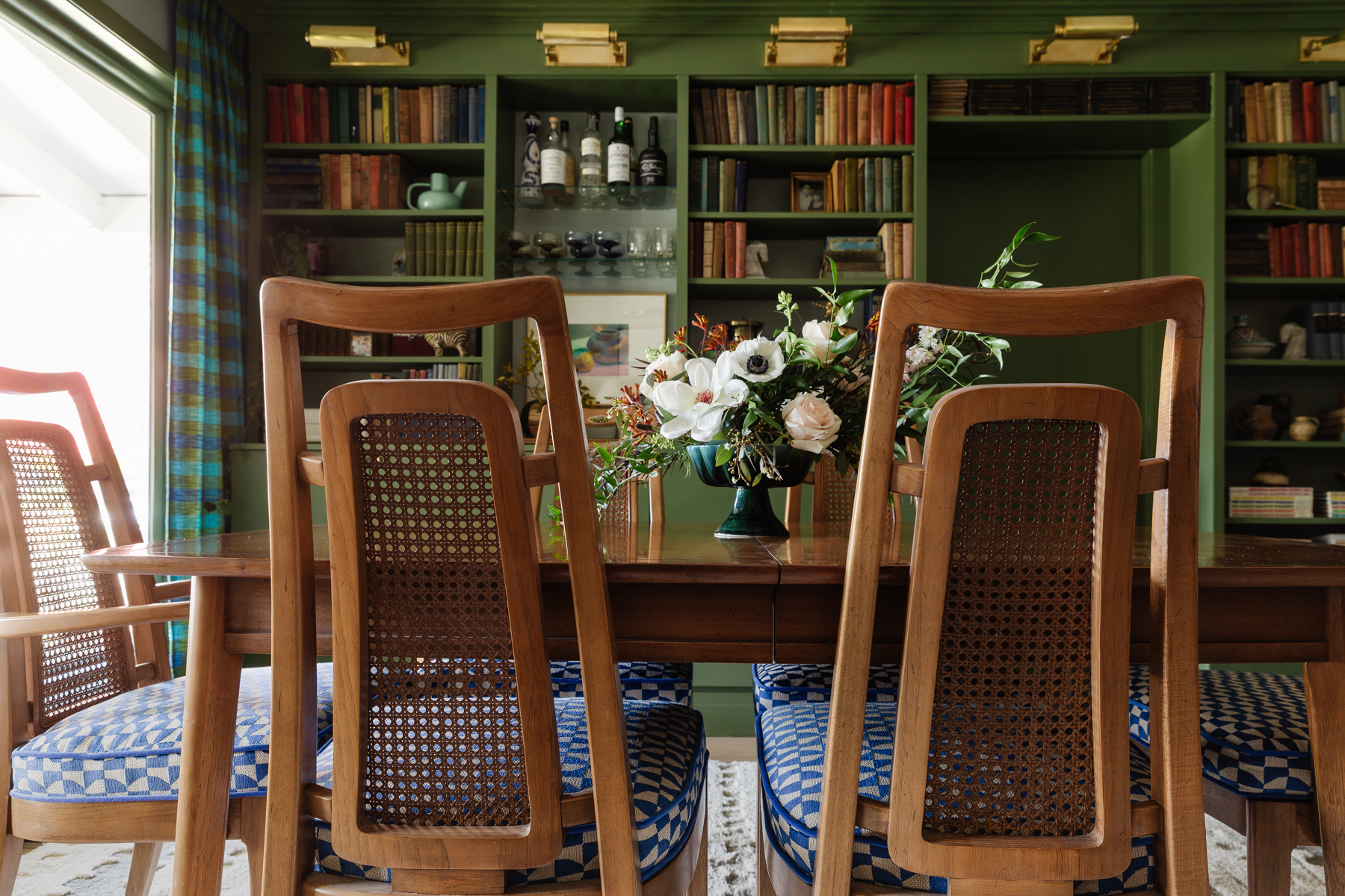
I love looking back and seeing how close the final room looks to the plan. There are always adjustments that happen along the way as things shift around but usually for the better! Since this is a large, open room but we carved out 4 distinct areas, 5 counting the dining room which was already complete.
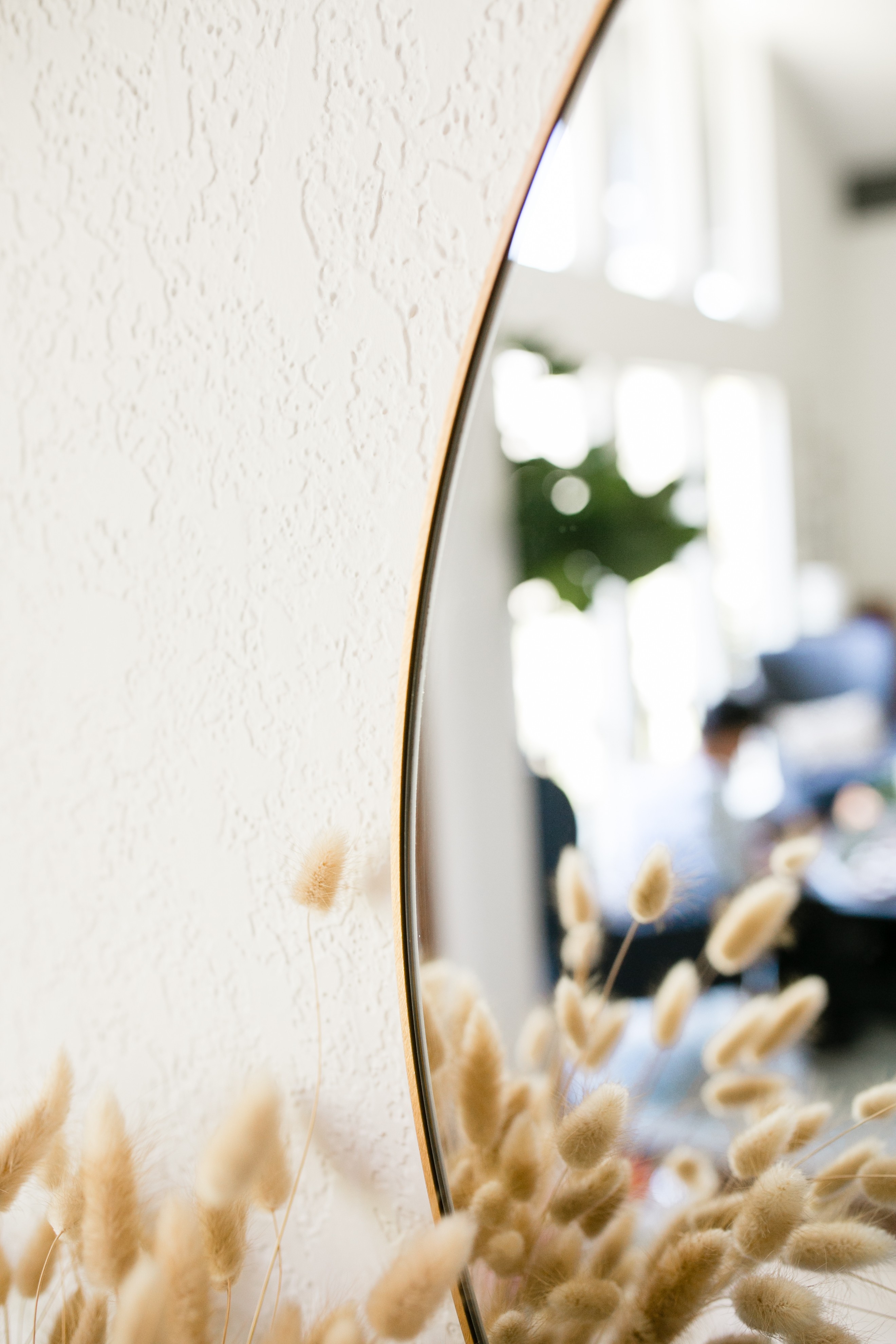
- Entry foyer
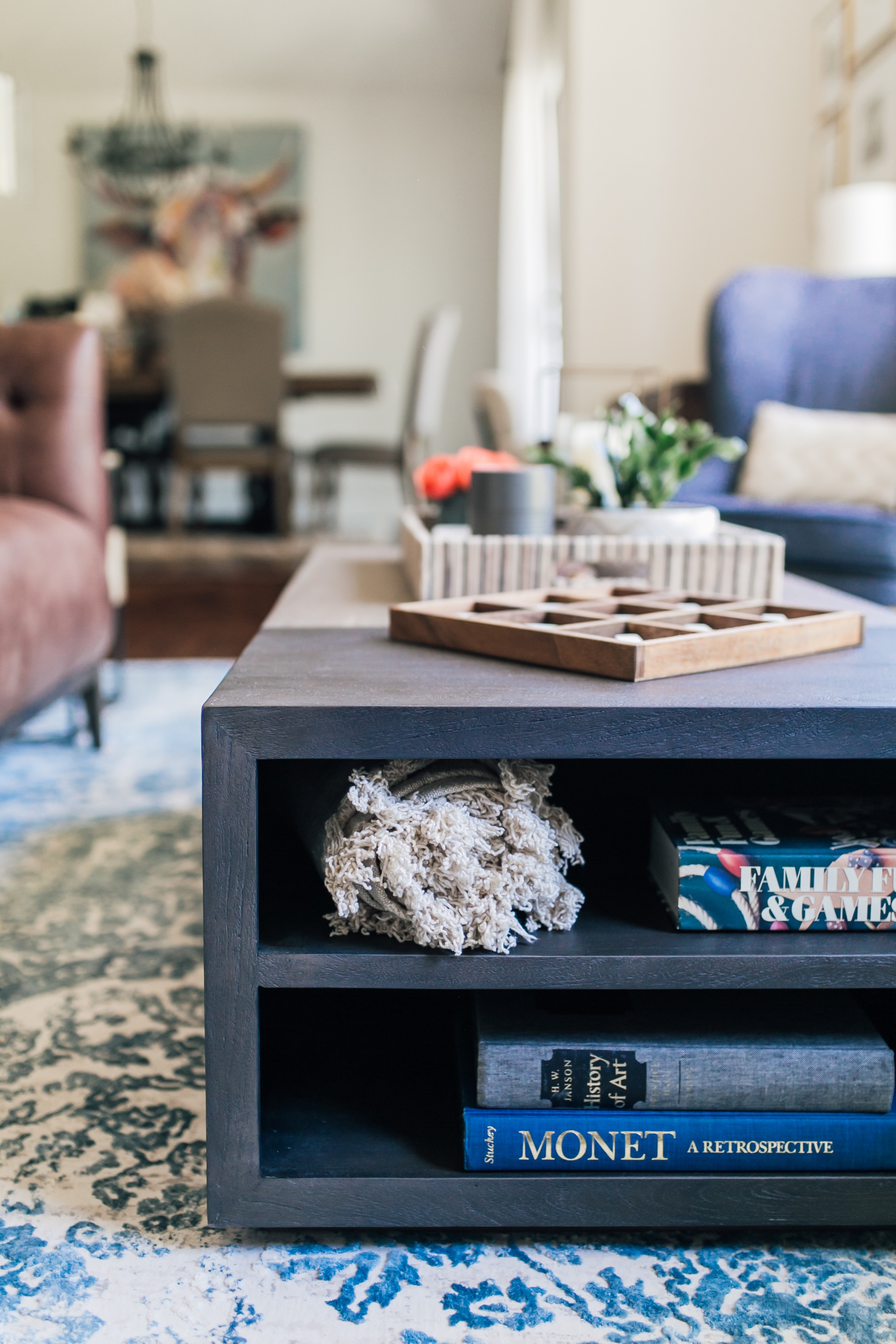
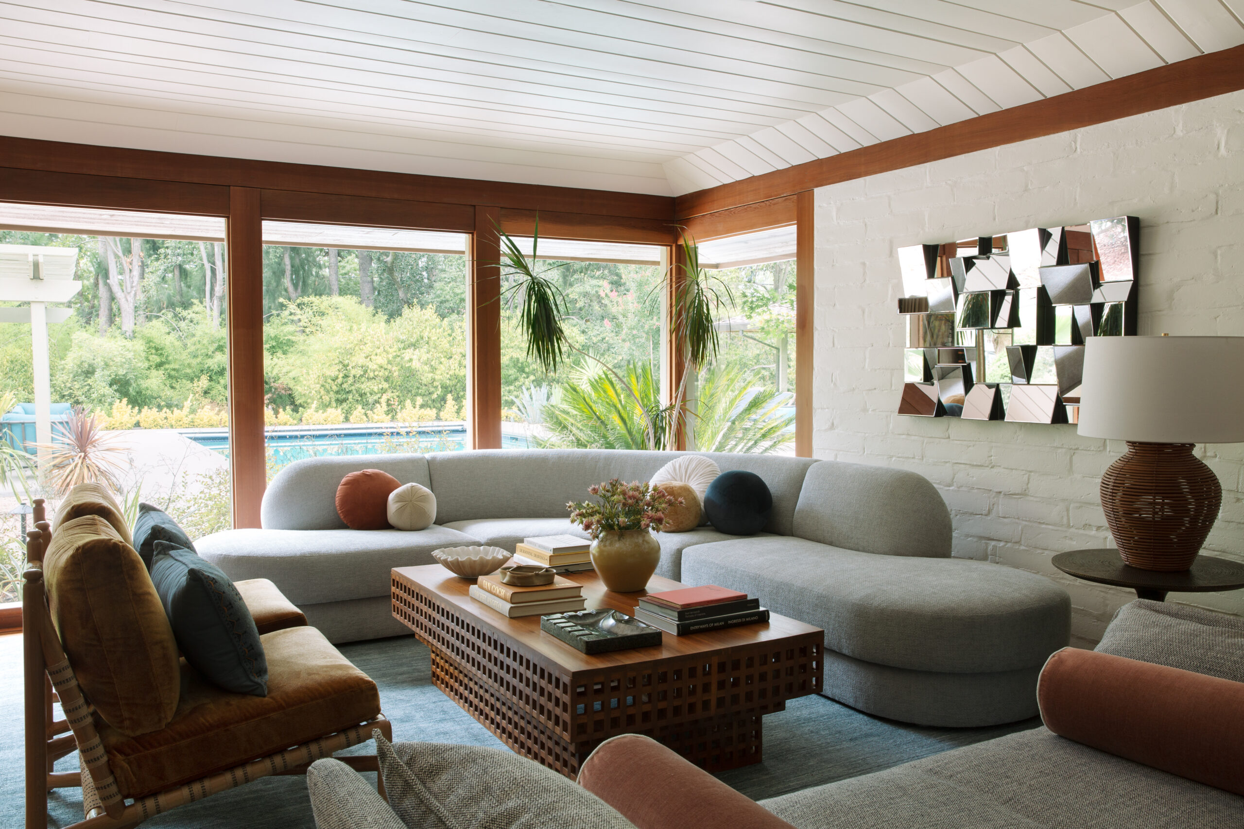
- Sitting area
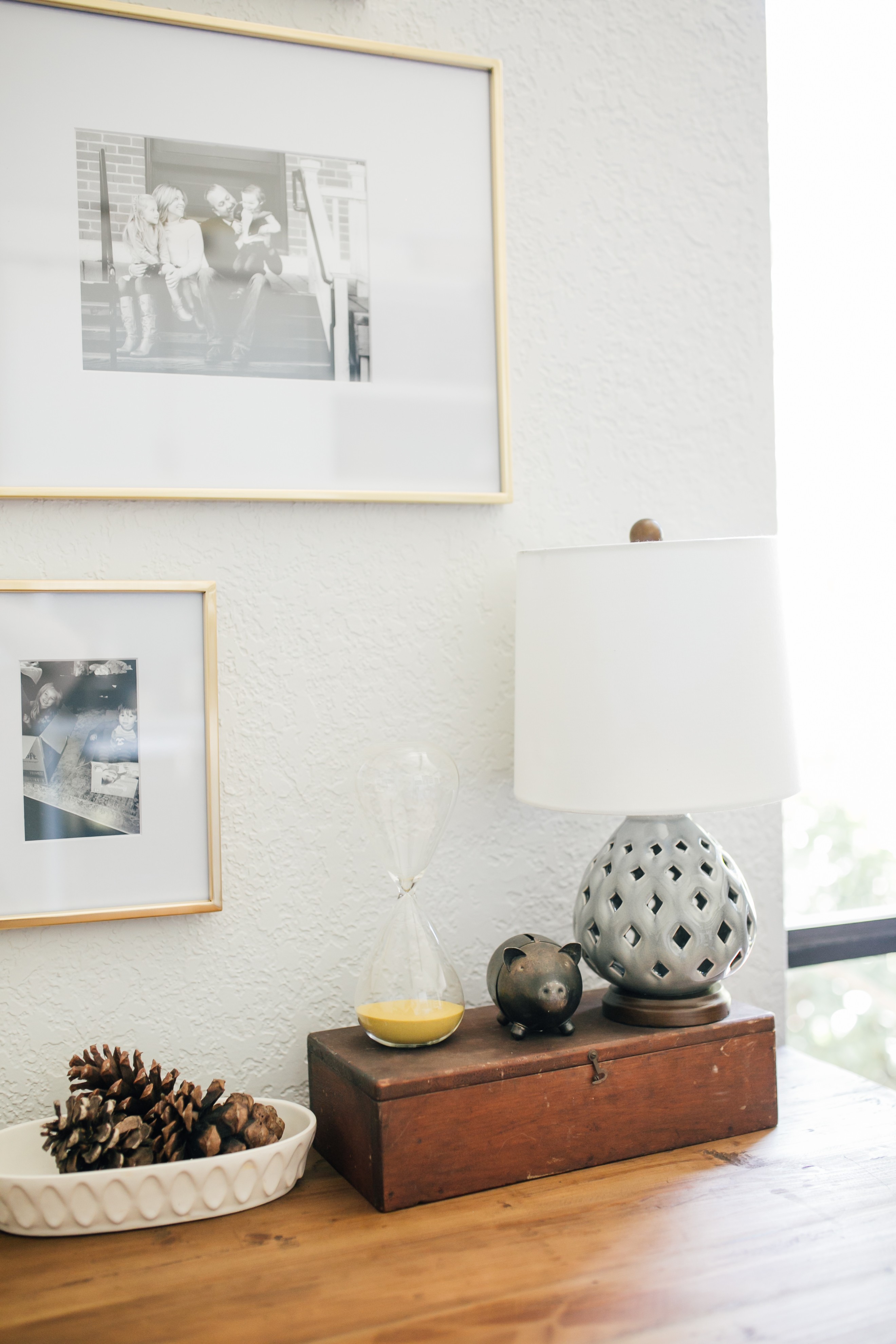
- Desk area
- Storage cabinet and bar
Photos by Christina Best Photography
Cabinetry by Arthur Millworks












2 thoughts on “Client Reveal: GraniteBae Living Room”
We stumbled over here by a different page and thought I might as well check things out.
I like what I see so i am just following you. Look forward to looking
into your web page again.
I’m truly enjoying the design and layout of your
site. It’s a very easy on the eyes which makes it much more enjoyable for me to
come here and visit more often. Did you hire out a developer to create your theme?
Exceptional work!