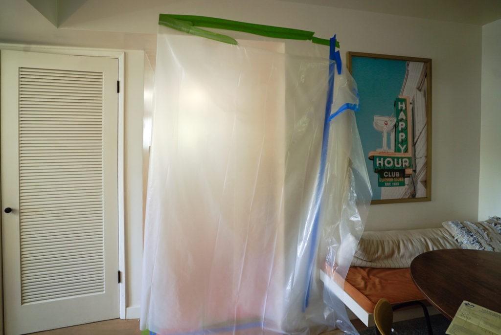
What’s behind curtain number 1? Its here, its here, my third One Room Challenge! And to celebrate we’re redoing three rooms! Not really, but kinda…keep reading…I think I have the hang of it this time and am doing everything I can to keep things on track in the home, work, and health departments (read about my Self Care Strategies here) The One Room Challenge happens twice a year and brings together 20 Featured Designers and many Guest Participants (me!) who spend 6 weeks renovating a room and writing weekly tell alls. Big thank yous are due to Linda, the founder and organizer who makes all this magic happen. She’s the best.
If you’ve been following me on Instagram you know I keep almost working on our master bedroom but functionality wins out. So, surprise! This ORC we’re doing the utility area of our home which includes 3 spaces: a Mudroom, Half Bath, and a Laundry Closet. I can’t think of an all-encompassing word for it so I’m calling it the MudBathLaundry Room. It may sound like a lot but its all the same back entry area of our house. We use these ‘rooms’ the most and they’ve been gross and annoying for too long so we’re bringing form and function. My dad is taking the lead on the engineering and build out, and I’m of course in charge of design and finishes. My husband has said from the beginning he’s not getting involved but I think we can handle it. There are a lot of details but everything is physically small (not like our crazy yard remodel) so its doable. I’m so excited!
Background
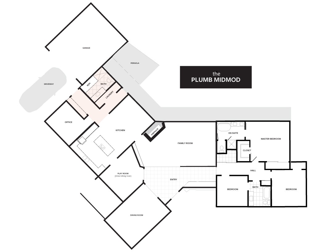
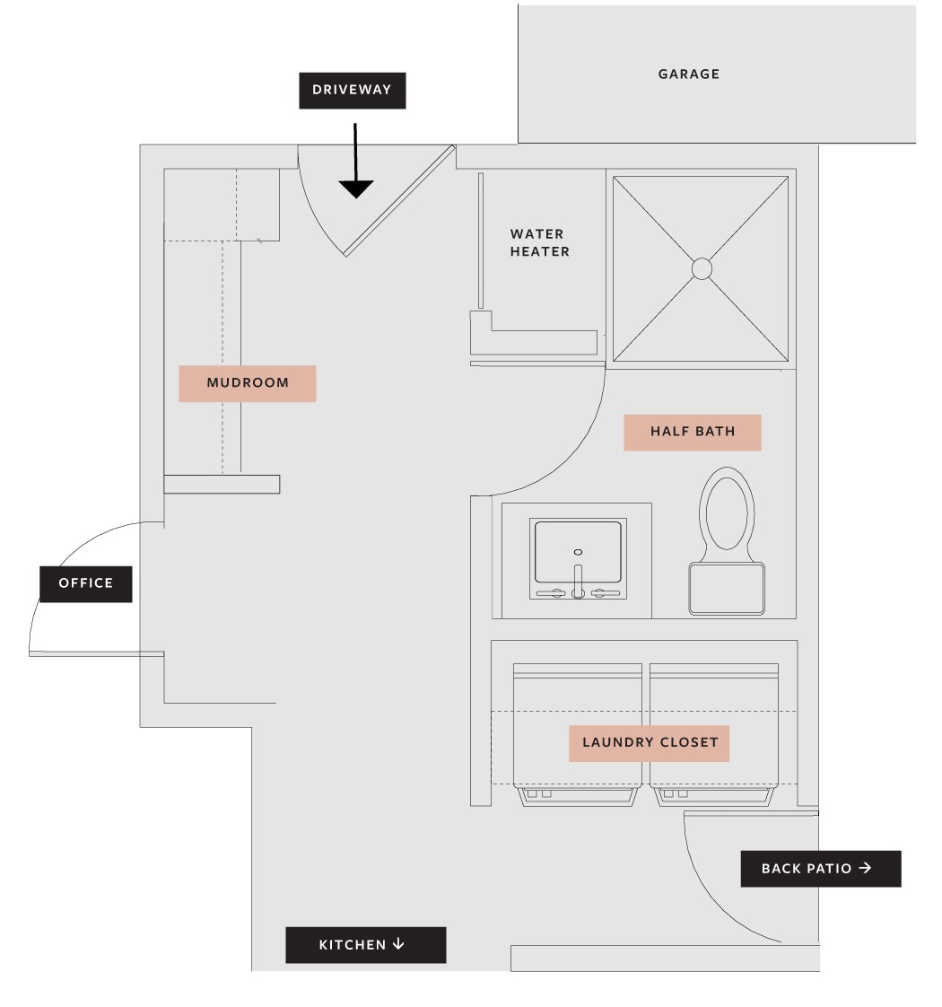
We enter our home through the back door off the driveway 99.9% of the time. Its a long narrow hallway which had built-in cabinets (mudroom), a bathroom with a shower, my office, and the laundry closet.
Here’s a look at the entire floor plan of the house (not to scale) so you can see the area we’re working on (shaded pink).
Zooming in, this is the area we’re tackling for the Fall season. The areas labeled in pink are the focus. Its our utility area, drop zone, guest bathroom, laundry hub, and patio dining traffic zone. This part of our home works super hard but its such a tight bottle neck. I have fantasies about moving the laundry across the house and opening things up, but that’s major construction and not happening any time soon. If ever.
Mudroom
This door leads to our driveway and is the door we use most in the house. You walk in with your arms full and there’s nowhere to drop anything and you scrape your body on the cabinet pulls. That tiny cubby in the built-in is low and not a place to dump a purse, backpack, shoes, etc. We switched out the hardware and painted the cabinets when we moved in, but the space is too narrow to useful and frankly feels claustrophobic.
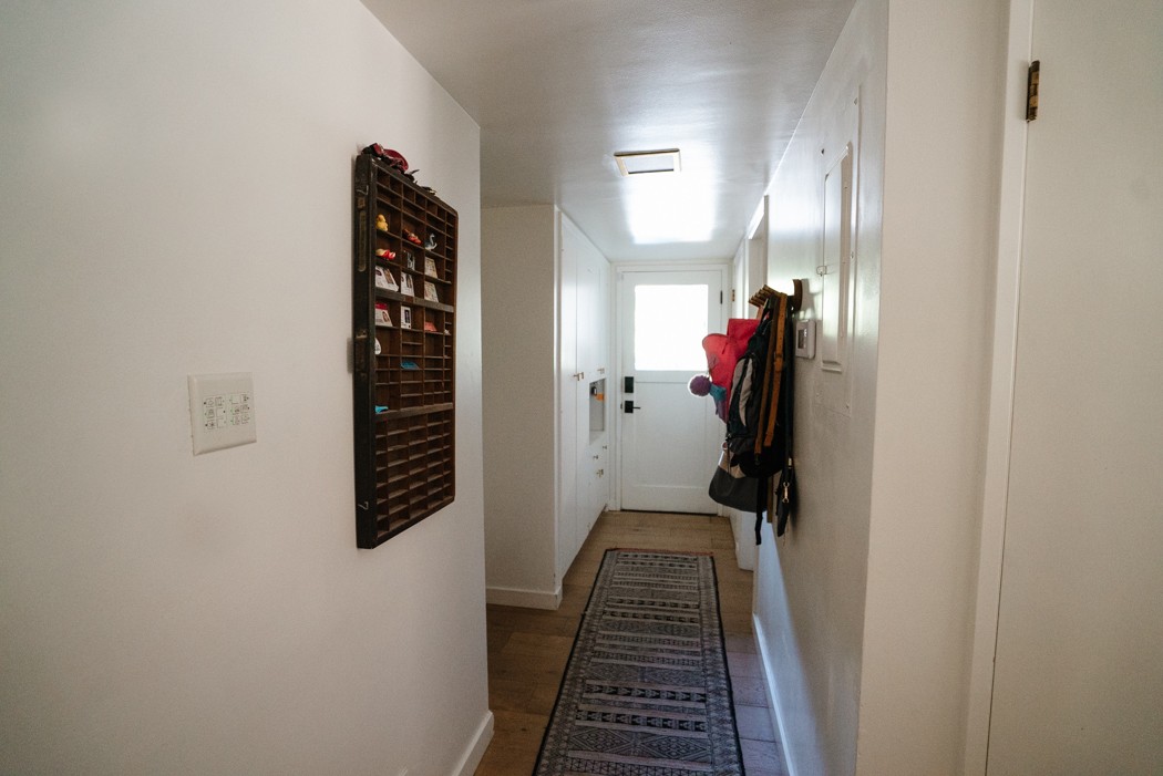
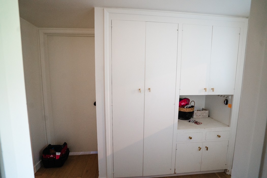
We added wall hooks which are nice for hanging stuff up but actually make the hallway narrower than it already is.
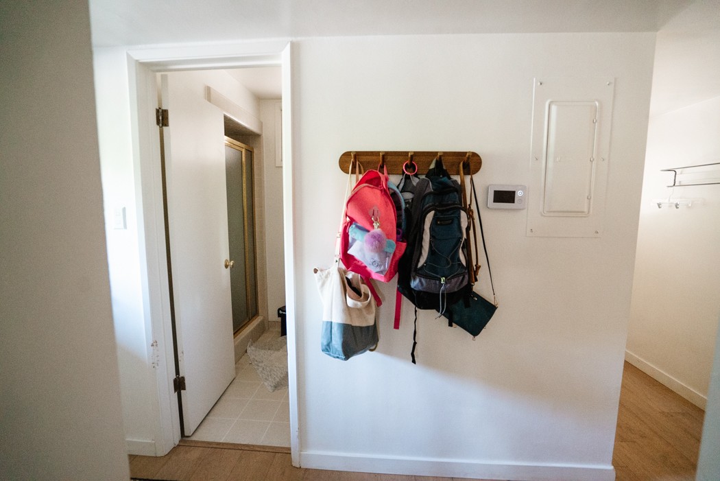
The Plan
Make this a functioning mudroom.
- Rip out all the cabinets
- New overhead lighting
- Add a recessed area for coat and bag hooks
- Build a bench with cubbies for shoes/misc
- Small cabinets and counter for closed storage
- Organize our family!!
Bathroom
Holy moly, I can’t tell you how excited I am to rip this bathroom to shreds.
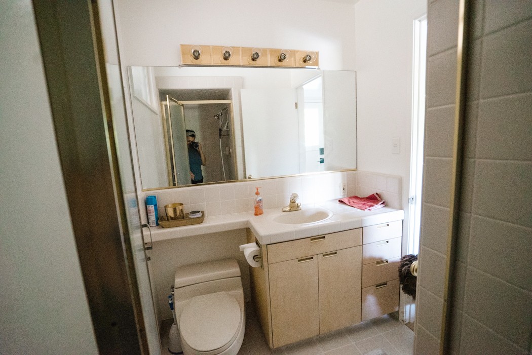
At first glance maybe it doesn’t look so bad-I think it was updated in the 90’s. The vanity is actually a cute design, I really like the brass inset pulls and slab doors. But on closer inspection its all just bad. The cabinetry has tons of water damage, the sink is terrible, the plumbing fixtures are cruddy and the toilet is awful. Basically everyone who’s used this bathroom is giving me a standing ovation for replacing this toilet. It always looks filthy, the lid doesn’t stay up (I guess this is a big problem for dudes), and its low to the ground. Obviously I haven’t made any attempts to improve on the aesthetics because there’s just not enough lipstick for this pig.
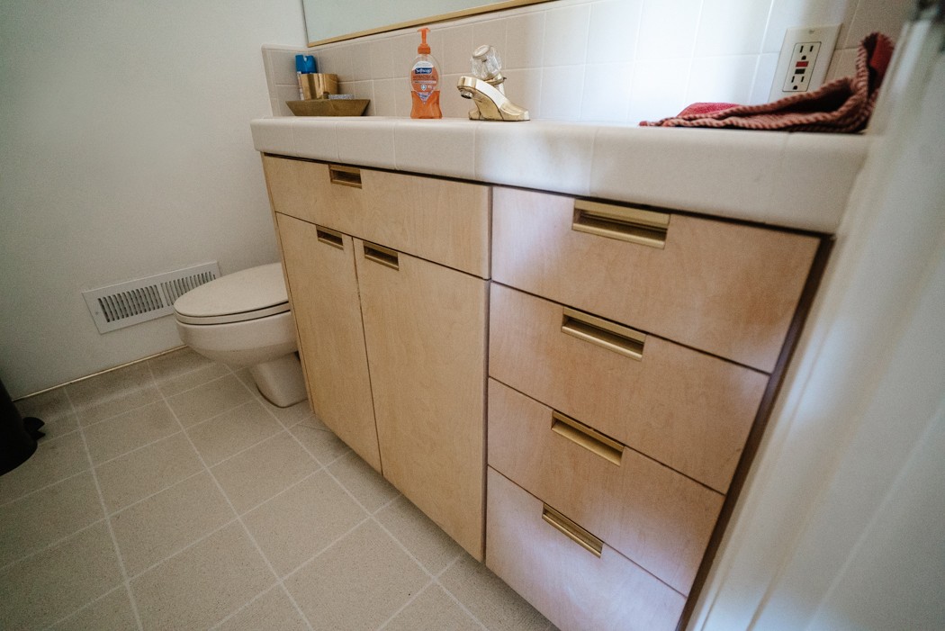
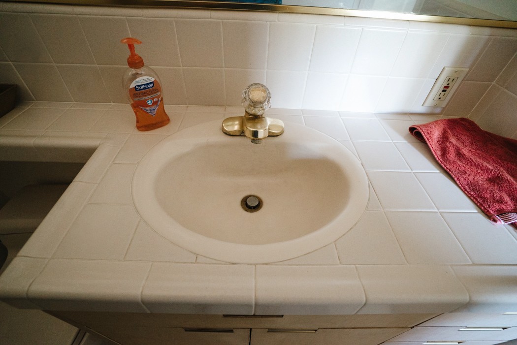
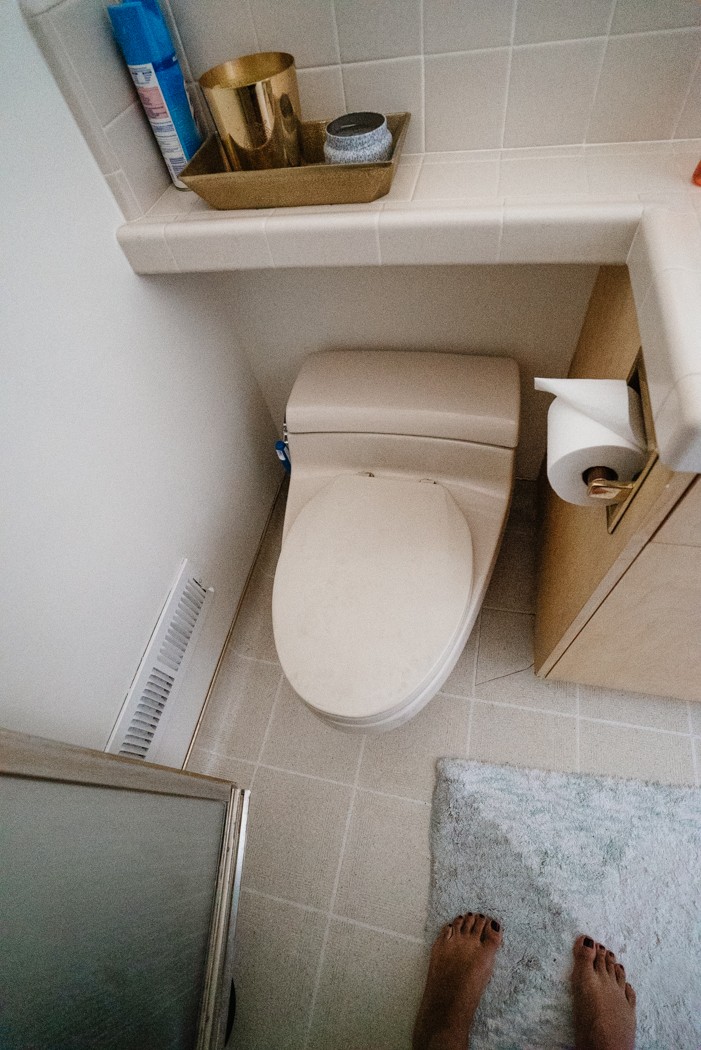
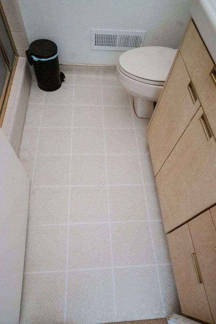
Then there’s the beige sheet vinyl flooring with cove base (whyyyyy). I guess it matches the beige 4×4 tile counter and shiny yellow brass accents. I say this every project but I’m on a mission to kill the bandaid-colored everything in this house. 😑 Also the trashcan is there because there’s no room to put it anywhere else.
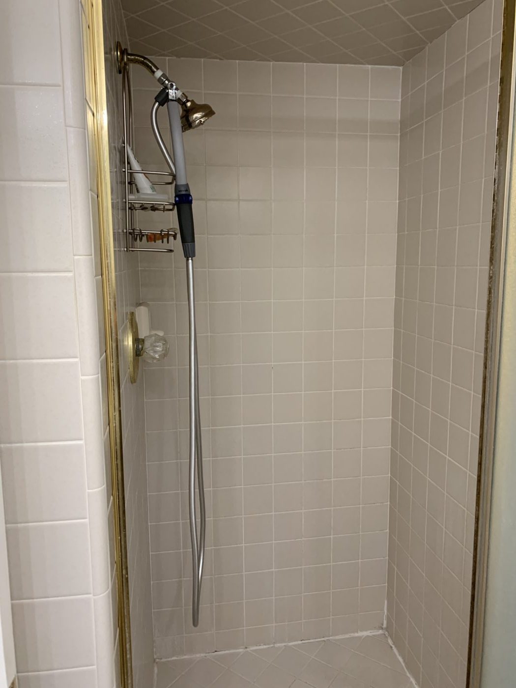
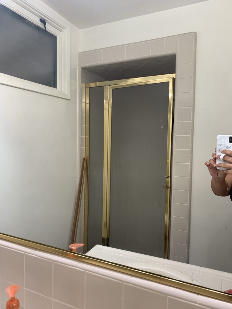
Onto the shower. Keep in mind this is a seldom-used shower. It serves as a dog wash mostly and my mother-in-law uses it when she visits since its easier than the step-over tub in our other guest bathroom. Since we only have 6 weeks and minimal budget we aren’t going to retile here. Showers are one of the more expensive places in your home to tile–demo, water sealing, and all the materials add up. And as far as stall showers go, this one is a decent size and the tiles aren’t cracked. It can’t stay as-is however so we have plans to spruce it all up!
The Plan
Make this a beautiful and updated guest bathroom.
- Demo everything but the shower
- New vanity, countertop, mirror, light fixture
- Statement walls
- Add a ventilation fan
- New tile flooring
- New toilet
- New plumbing fixtures
- Resurface shower
Laundry Closet
Ugh, this laundry ‘room’ is the only part of the house floorplan that I hate. The original owners/architect were very generous with square footage in every part of the house except for here. Perhaps men in the early 1960’s weren’t that concerned with laundry??? 🙄 Anyway, it is what it is, and without demoing 3 other rooms in our house and relocating the furnace we can’t move it.
This little hallway off the back hall leads to our patio and garage from the kitchen and is in constant use. You can see the door with bells on it being covered by these oversized closet doors. This is beyond a bottleneck, its a full-blown blockade. Needless to say, its an uninviting place to do a household chore I hate doing already.
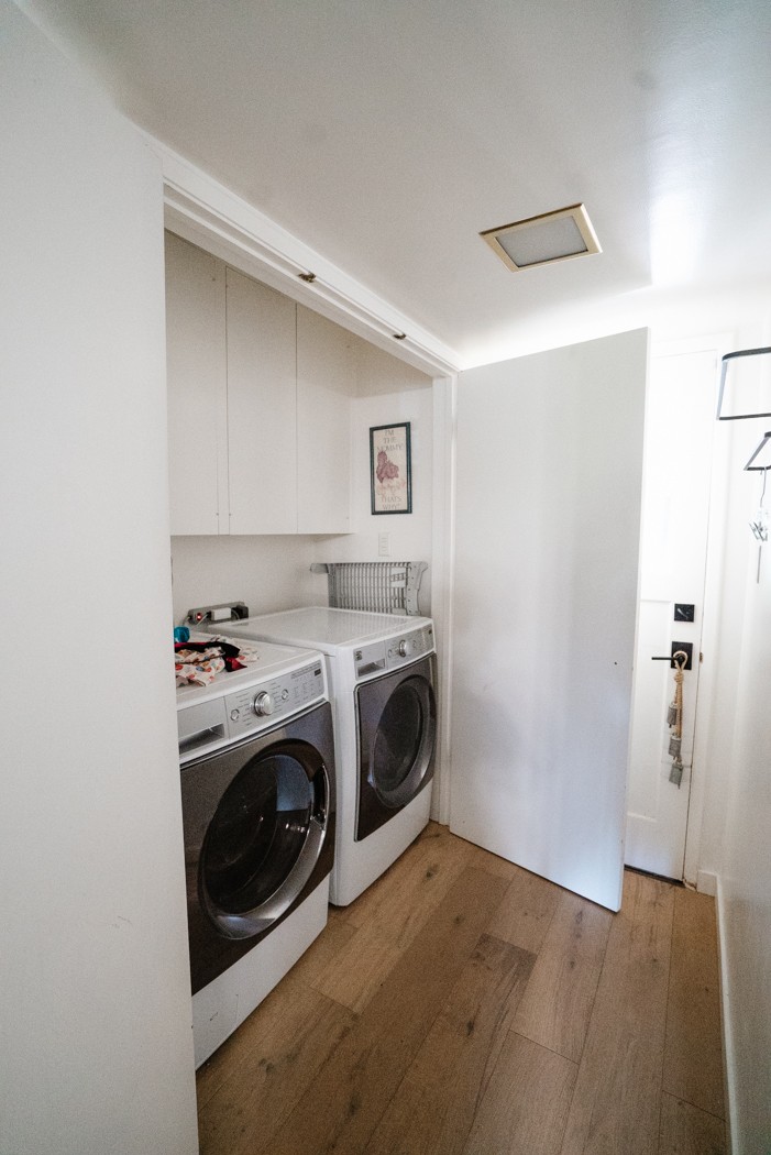
Above the washer and dryer, we have very narrow cabinets that are really hard to reach and barely fit anything. Also, a clear lack of folding space.
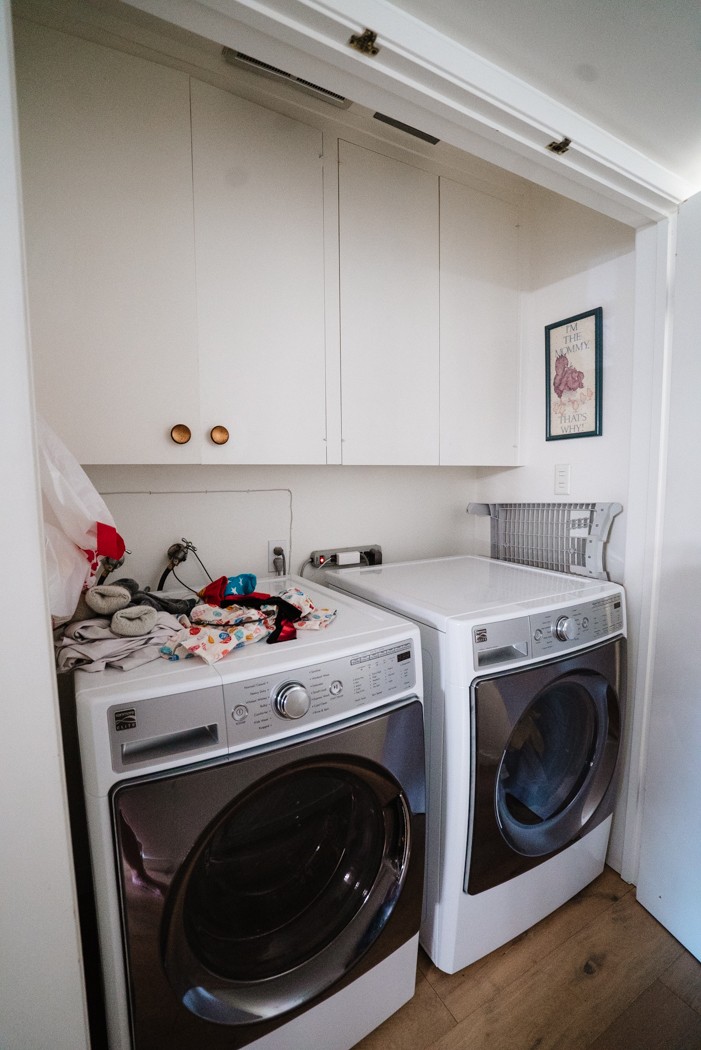
That chicken artwork was hanging in my childhood laundry room my whole life (hello, 1980s!). At my baby shower my mom passed it onto me so its kind of a family joke, but I’ll figure out something to do with it. Ha!
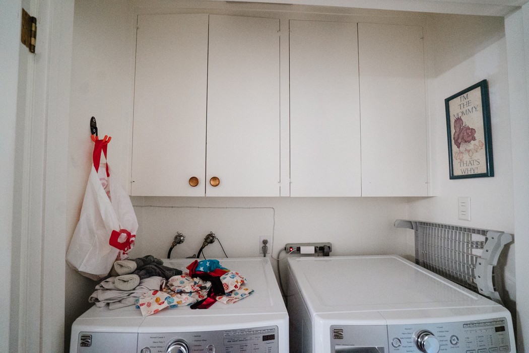
The Plan
Create a laundry area that is enjoyable to look at and work in.
- Demo cabinets
- Remove closet doors and finish opening
- Add a countertop
- New ventilation fan
- New cabinetry
- Add a place for hanging clothes
- Clean up plumbing and electrical
Currently
Now that you see where we’ve been, here’s a peek at where we are after the first week! I’ll be sharing some videos I took before we demoed on Instagram Stories as well.
View from the kitchen: Yes, it looks like Dexter was here.

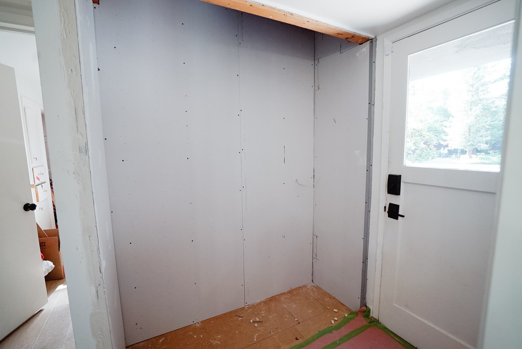
Mudroom situation: We were really hoping those cabinets were built into finished walls and a ceiling but we lost that round. Right now its exposed to the attic so I’m grateful the weather isn’t too hot or too cold right now. My dad has drywall in and we have a plan to insulate and seal the top. The bright side: its easier access to the bathroom and laundry attic areas which is a big deal with our low profile roof.
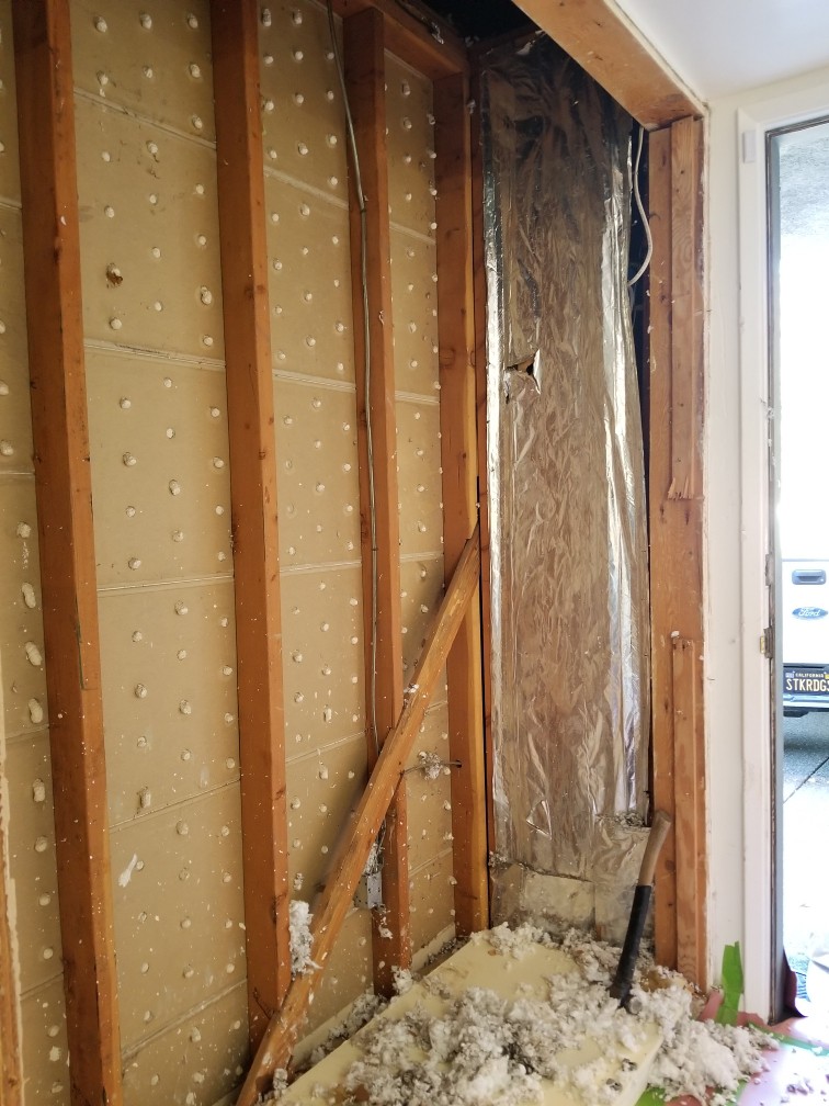
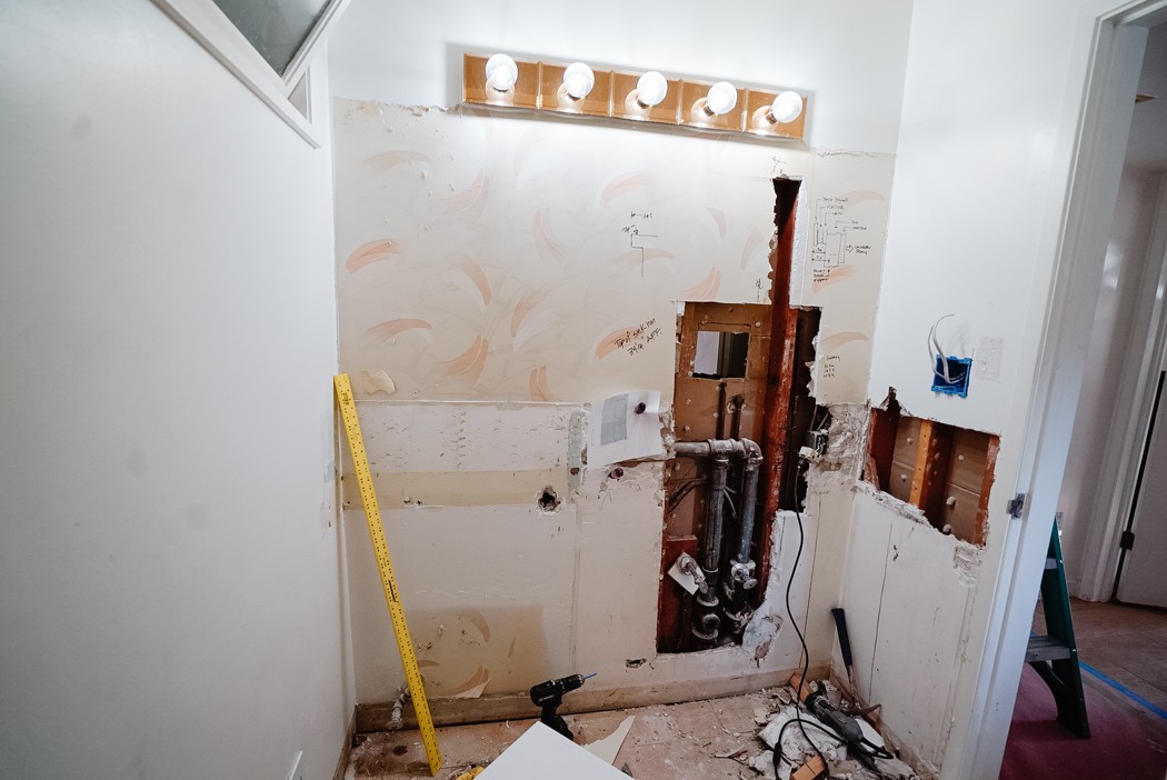
Bathroom: Its completely demoed except for the light, because we need the light. And look at that gorgeous wallpaper found behind the mirror! Ha. But my dad has his work cut out for him with the plumbing. There’s a lot going on right there between the sink and the washing machine but we have a plan.
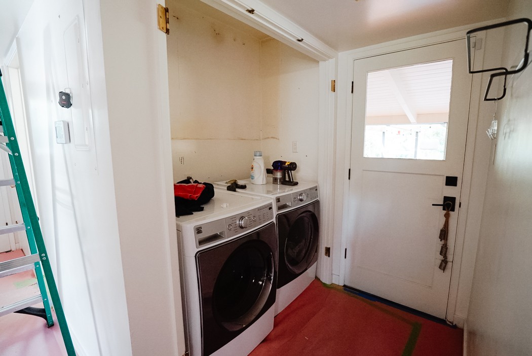
Laundry: Doors are off and it already feels better. Even in its sad state.
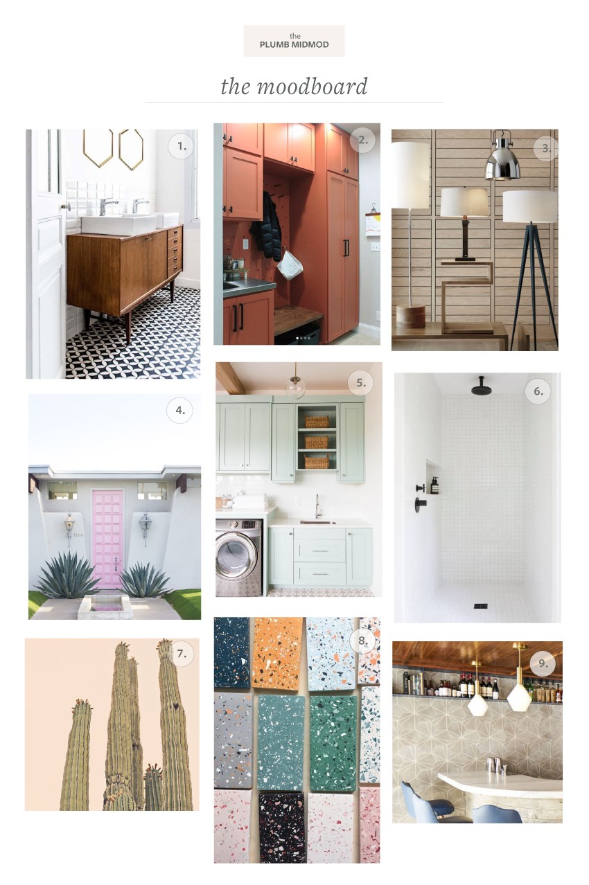
And since I can’t leave you completely hanging without any prettiness, here is the moodboard for the design without explanation. Ha!
Sources
- Royal Roulotte
- Our Humble Abode
- Crate & Barrel
- Studio DIY
- Ashley Winn Design
- Via Domino
- Juniper Print Shop
- Via Pinterest
- Via Villa Lagoon Tile
Alright, so that’s where we started, where we are now, and next week I’ll be back with the design plan and introduce you to my sponsors (they’re so good!!!). Items are starting to trickle in and I literally can’t wait to show you what I’ve got planned!

Other One Room Challenge Posts
Catch up on my previous One Room Challenges!
Fall 2018: Kitchen Refresh | Spring 2019: Midmod Patio Reveal







16 thoughts on “ORC: Week 1 (Meet the MudBathLaundry Room)”
Save the light for meeee! I will happily buy any of the square lights you are taking out!
So excited to see this space take shape!
Already planning on it. I’ll have atleast 2! 🙂
Wow that is a multi functional room. I can’t wait to see what you do with it, and that cabinet color is awesome.
Rebecca!!! LOVE LOVE LOVE the tile choice. I cannot wait to see how it turns out in the space.
It’s going to look so good and honestly seems easier than your last ORC (and you killed it) I have no doubt this will be anything short of amazing ❤️
Wow! What a great space for a redo. The new layout will add so much function, it will be amazing. SO excited to follow.
Wow…this sounds big and exciting. We can’t wait to follow along!
I am so excited about this! Your outdoor space was one of my faves last round! The colors and finishes on your mood board are right up my alley!
This is going to make a HUGE difference — both aesthetically and functionally! Good for you!!
Wow I can’t wait to see this all come together! And isn’t it the best when you can get a space to be more functional as well as beautiful?!
You are really gutting the place. I love your designs and its going to look fab,