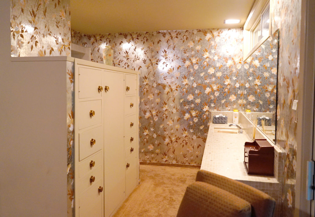
 Meet our master bathroom before its big makeover! This is the only room that made me second guess the house. It was a deal breaker, and unless we could afford to remodel it, there was no way it would work for us. We were very, very lucky to make it all work the way I envisioned.


The master suite itself is very spacious and has an incredible view through a large sliding glass door, which is a dream to wake up to. But the entire bathroom was covered in metallic orange floral wallpaper, with thick orange carpet throughout (including under the toilet). There was a neat storage cabinet original to the house that served as a partial privacy wall, but there was no door to the bedroom so essentially the toilet was open to the entire room. No thank you, we’re not quite that close of a family.
The sink and vanity were amazing from a midcentury detail standpoint. With small mosaic tiles and a deep apron it was actually pretty cool looking. But the shallow cabinetry was basically at ankle level and not practical at all. And don’t get me started on the 10 foot countertop with one tiny sink.
The room isn’t huge, but its a decent size. With only the one high window and a covered patio outside, we don’t get great light in here. I was craving a room that was clean, bright, and could function as a little mini escape for us.

My Wishlist:
- Walk-in closet
- Separate enclosed toilet room
- Deep soaking bathtub
- 2 sinks
- Separate shower
My inspiration:
- MCM inspired but not a restoration
- Global influences
- Clean and bright
- Natural wood tones to bring the outdoors in
- Bold ( and affordable) tile

After we survived the buying and selling process (another story for another day) we established a budget and got to work reconfiguring the space. The room is large, but with the location of the slider and utility closet in the hallway behind it (where the water heater and furnace live), we had some limitations. With a lot of my dad’s help (he has a background in building houses and drawing plans,) we tried many configurations until we found one that worked.
The solid blocks are where we added new walls/drywall. Since we were doing framing and all that jazz, it seemed like bumping up my closet was a must-have. T has his own long closet on the other side of the room, so by moving the wall closer to the main entrance door and enclosing the bathroom I got a walk-in closet.
Before photos were tricky to get so here’s a little video. Pardon my annoying voice. 🙂
SaveSave
Thank you for joining me on this trip down memory lane. The after will be up as soon as I can get it photographed!
SaveSave
SaveSave
SaveSave
SaveSave
SaveSaveSaveSave
SaveSave
SaveSave


