Here we go!!! I’m so excited to share that I’m doing my very first One Room Challenge have you heard of them?? I’ve been a voyeur on the sidelines for years, but never had the time or resources to jump in to the mix. One could argue I still don’t, but we’re doing it anyway and of course I started with the most complicated room in the house. I’m participating as a guest (not a ‘featured’ design blogger), but we needed a challenging deadline to keep the process moving and actually finish the room. There’s also something about doing it with folks all over the country for that built-in comradery.
Hi! If you’re new here, I’m Rebecca, a designer located in Sacramento, CA. I’m currently renovating the kitchen in my 1960 ranch also known as the #plumbmidmod.
I live with my husband, 4 year old daughter and 1 year old labradoodle, and we purchased our home almost 2 years ago from the original owners who built it in 1960. Before we moved in we stripped wallpaper, tore out shag carpeting, put in new flooring and renovated the master bathroom. We are on .8 of an acre with a creek, wild turkey, and deer running through the backyard, which is not an everyday occurance in the suburbs of California. The layout of the house and the property are what drew us here, but its been a labor of love to get it to a place we’re proud of (emphasis on labor). Here are a few posts on some of our previous updates in other parts of the house. There is a lot more to do, but I’m learning to be patient. Master Bath Before // Master Bath After // Kitchen “Before” 2017
FLOOR PLAN
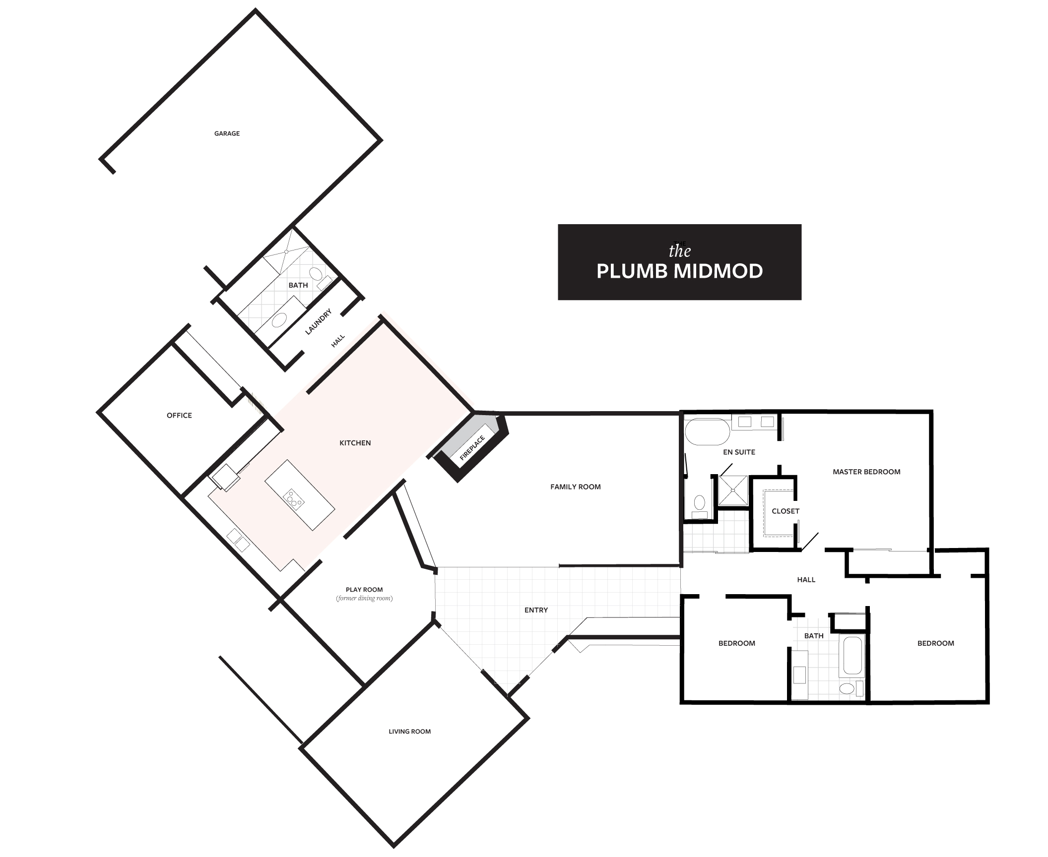 Above is the floor plan of our home–as you can see its full of quirky angles that allows backyard views from all rooms of the house. BUT for the next 5 weeks we’re focused on the kitchen. Off to one side of the house, the kitchen is not open to the other rooms which I actually really like. It has pocket doors at the entry points which keeps kids, dogs and noise contained. The kitchen is large and roomy with tons of storage (a first for me!) but has been a thorn in our side since we bought it. Last year we upgraded appliances, and reconfigured a few things to make the space livable but it hasn’t been an enjoyable place to spend time in. First of all EVERYTHING is beige and yellow-y wood tones, and even in the best of circumstances I can’t live long in a neutral world. I’ve been fantasy planning this kitchen for 2 years, plus 3 before that in our old house so I am READY!!
BEFORE 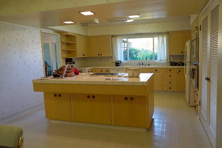
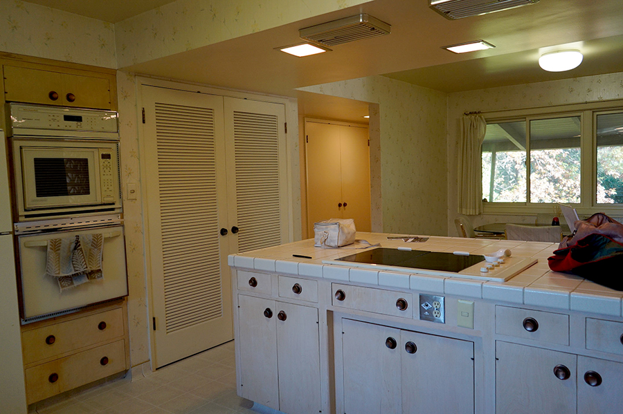
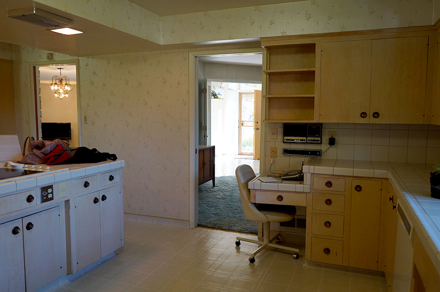
Here’s how it looked when we were buying the house. Lots of wallpaper, original cabinets, blah linoleum floors, and a large island that didn’t accommodate stools and old fixtures. (Why would they put that drop under the counter so legs don’t fit under it??!) The counters and appliances were updated at some point in the early 90’s and not really touched since. 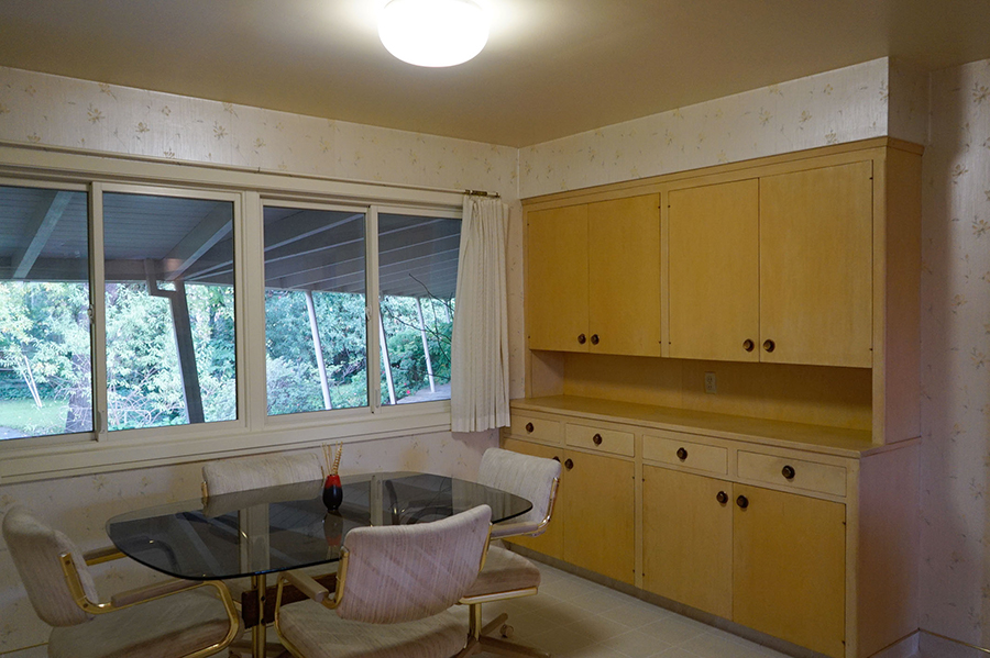 I love this little built-in buffet area…in theory.
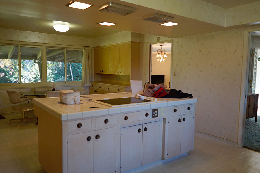
 Below you’ll see a plan for the “Phase 1.1” refresh we did last year.
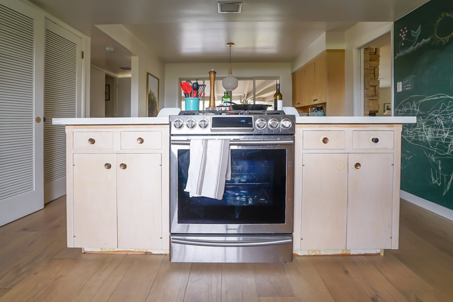
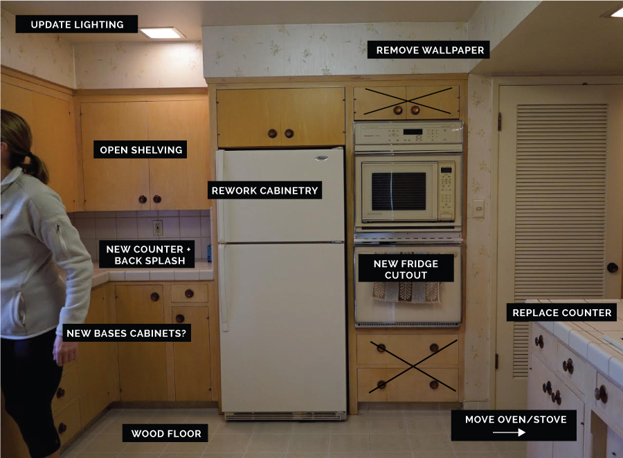 With the help of my dad we reconfigured the cabinetry around the refrigerator to accommodate our 2018 version and moved the oven into the island. With the leftover space we added a pullout trash can and shelves for microwaves and small appliances. When we moved the oven we had to cut into the island and replace the counter so we also fixed the other side to fit counter stools. And that’s how its been since. Unfinished plywood, missing hardware everywhere, and beige, beige, beige. Here’s how its looked for the past year or so…
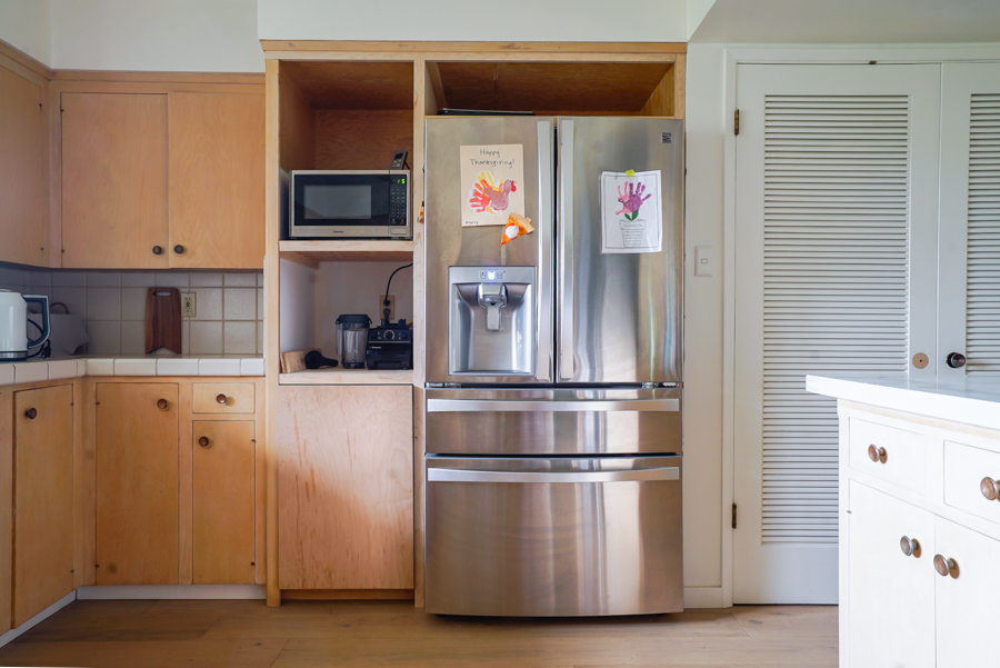 I added a chalkboard wall because I needed to do SOMETHING but its probably going to go…
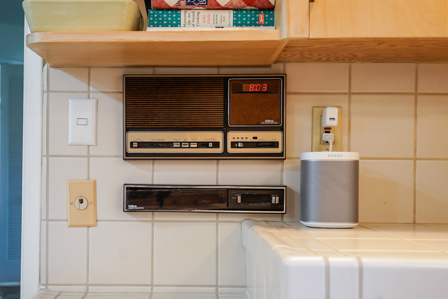
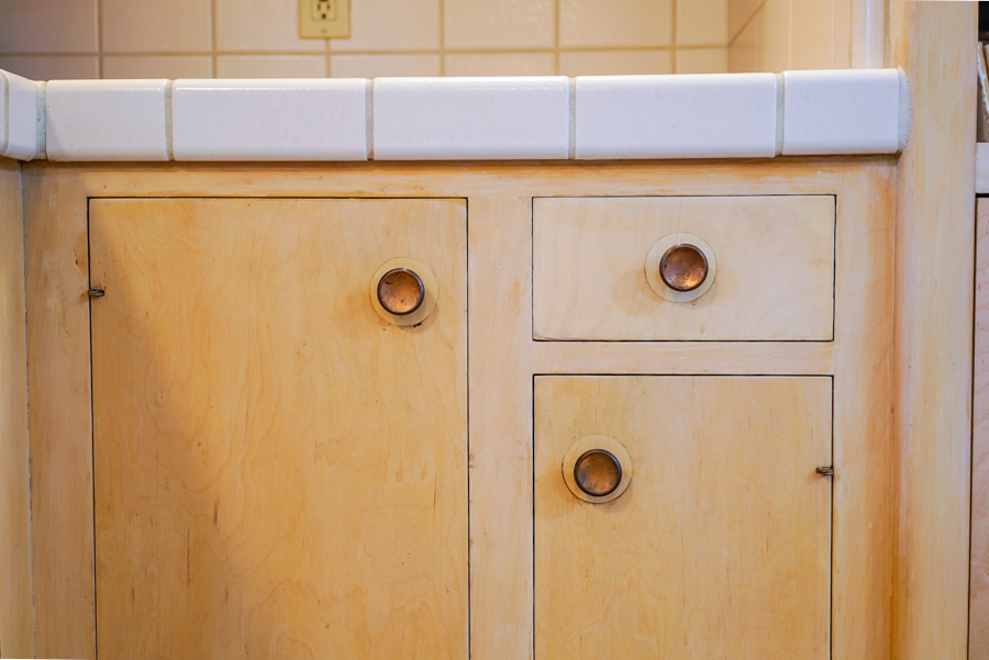 I love this side-by-side state-of-the-art technology. 😂
 Now on to the fun part. The design details!
INSPIRATION
I love a two-tone kitchen with a mix of painted and natural materials. I want it to be 50% modern, 20% midcentury, 15% classic, 15% 1970s bohemian. Yes, I’m crazy but it makes perfect sense to me.
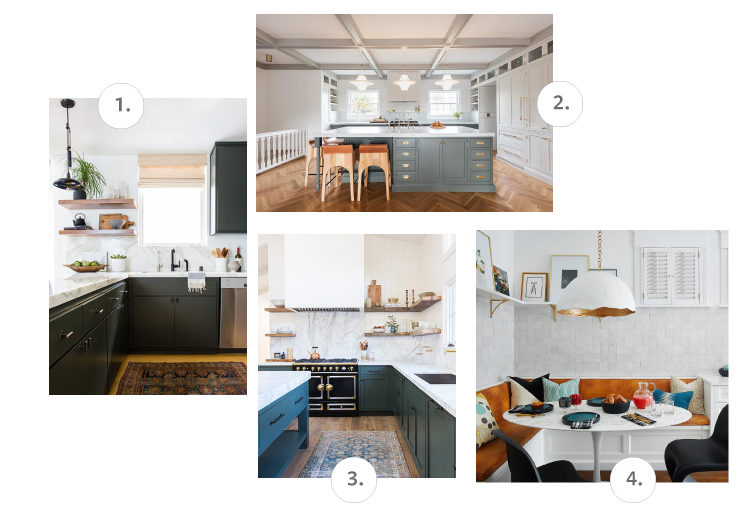 Sources: 1. Amber Interiors / 2. Box Street Design / 3. Amber Interior / 4. Susan Kleitzen Design
DESIGN PLAN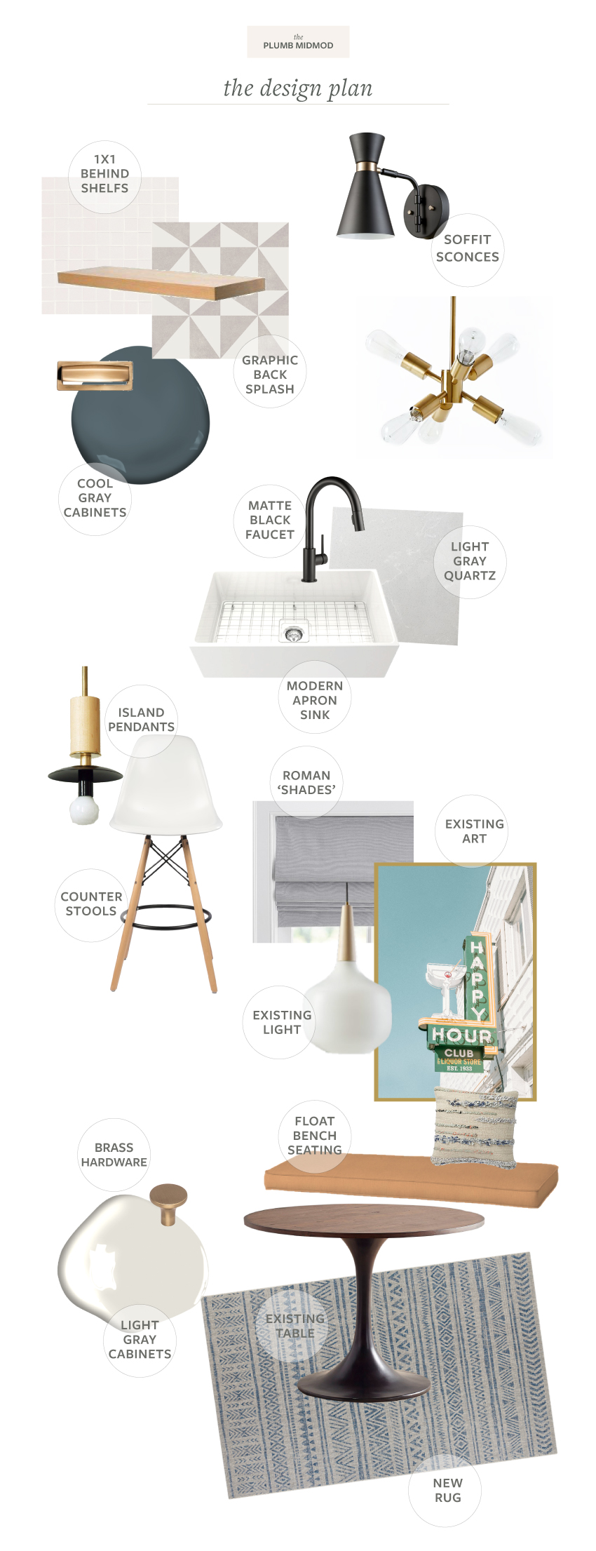
SCOPE OF WORK
We are getting this all accomplished with a mix of DIY and help from a few subs on things like electrical, counter fabrication and tiling. Otherwise between me, my husband, my mom and my super helpful dad its going to be a family affair. I’ll probably rope some other friends into the mix as well!
Paint cabinetry The cabinetry is original 1960 wood veneered flat-paneled inset doors. I love the style of the cabinets, but after decades of sun damage, repairs and heavy use they are super worn, filthy-looking and discolored. Refinishing the veneer will be a tricky and expensive process so we’re going to paint them. The lowers will be a dark moody gray, and the tall cabinets will be a light, barely-there gray. I’m getting help having the doors and drawers sprayed by a pro, and I’ll be tackling the frames.
Keep the floors Luckily, we had brought the white oak hardwood into the kitchen when we moved in as you can see above. I love the way it flows through the house, but up until now its just contributing to the drab color scheme. They are staying though, and can’t wait to see them finally pop in here.
Replace countertops and backsplash Light gray counters around the sink and a fun, graphic cement-like ceramic tile. I basically designed the whole kitchen around this tile. I’ve been fantasizing and designing this kitchen in my head for years, but could never quite figure out what I wanted the backsplash to be. My requirements: something other than subway, not too dark, not too plain, midcentury-friendly but not retro, earthy but modern. For ORC I’m sooooo excited to be partnering with Natural Stone Design Gallery on the tile, and when I told them my impossible list they showed me a brand new line that just came in and I’m using 2 different tiles. It was meant to be! Can’t wait to tell you more about it.
Remove upper cabinets, add open shelving We have plenty of storage in the rest of the kitchen so taking down the uppers will lighten up the room a ton. We’re going to add open shelving to display our everyday dishes and glassware, but of course now I want to buy all new stuff.
Update hardware I found the perfect modern-meets-midcentury hardware that I’m doing in a warm honey bronze to more closely match our existing hinges.
Replace light fixtures So many new fixtures! The lighting is a huge part of the problem currently and I’m going with a mix of brushed brass and matte black finishes. We’re getting rid of all the utilitarian square overheads, patching the ceilings and putting sconces on the soffit over the shelves and counter. I’m repurposing a few fixtures I already have in some of the overheads and ordered custom pendants to hang over the island. I am OBSESSED with these lights and can’t wait to see them!!
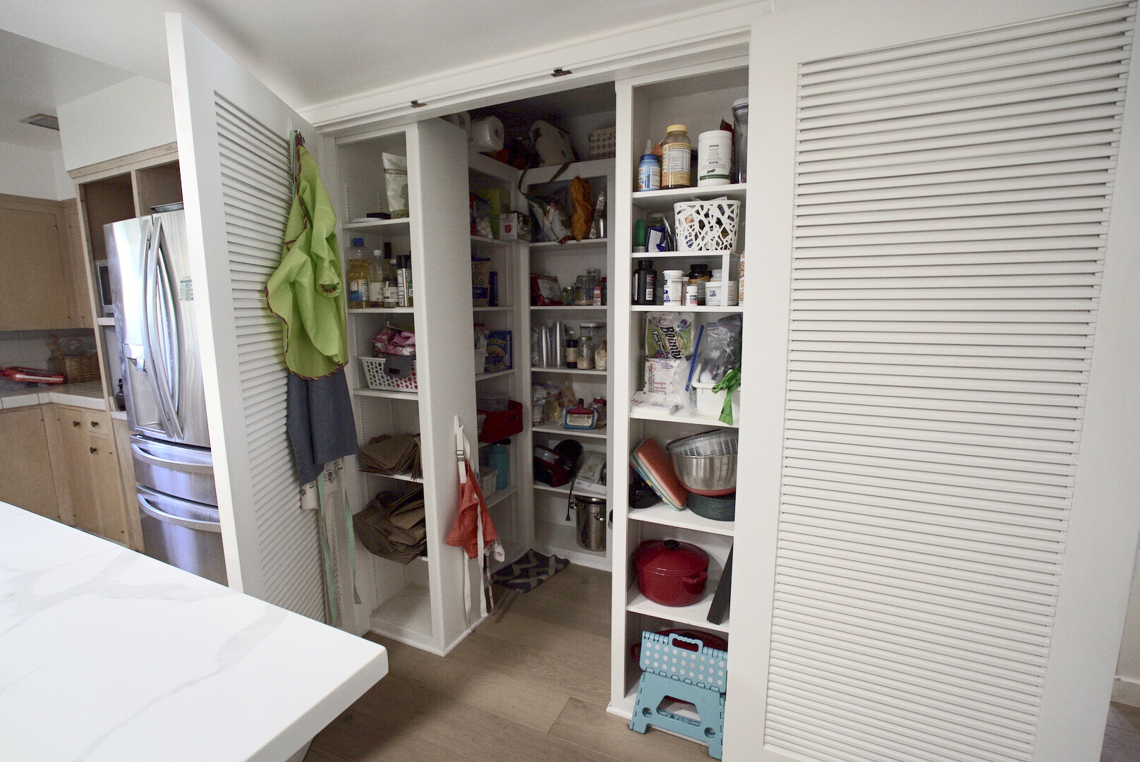
Organize pantry I don’t know if I’ve ever lived in a house with a proper pantry. Like maybe my whole life? This pantry is pretty epic, but we have been super irresponsible with it. We moved in and kind of just threw stuff in it and have never taken the time to properly organize it. And now… its a total ridiculous disaster. I have big plans for it though and another area that I can. not.wait for.
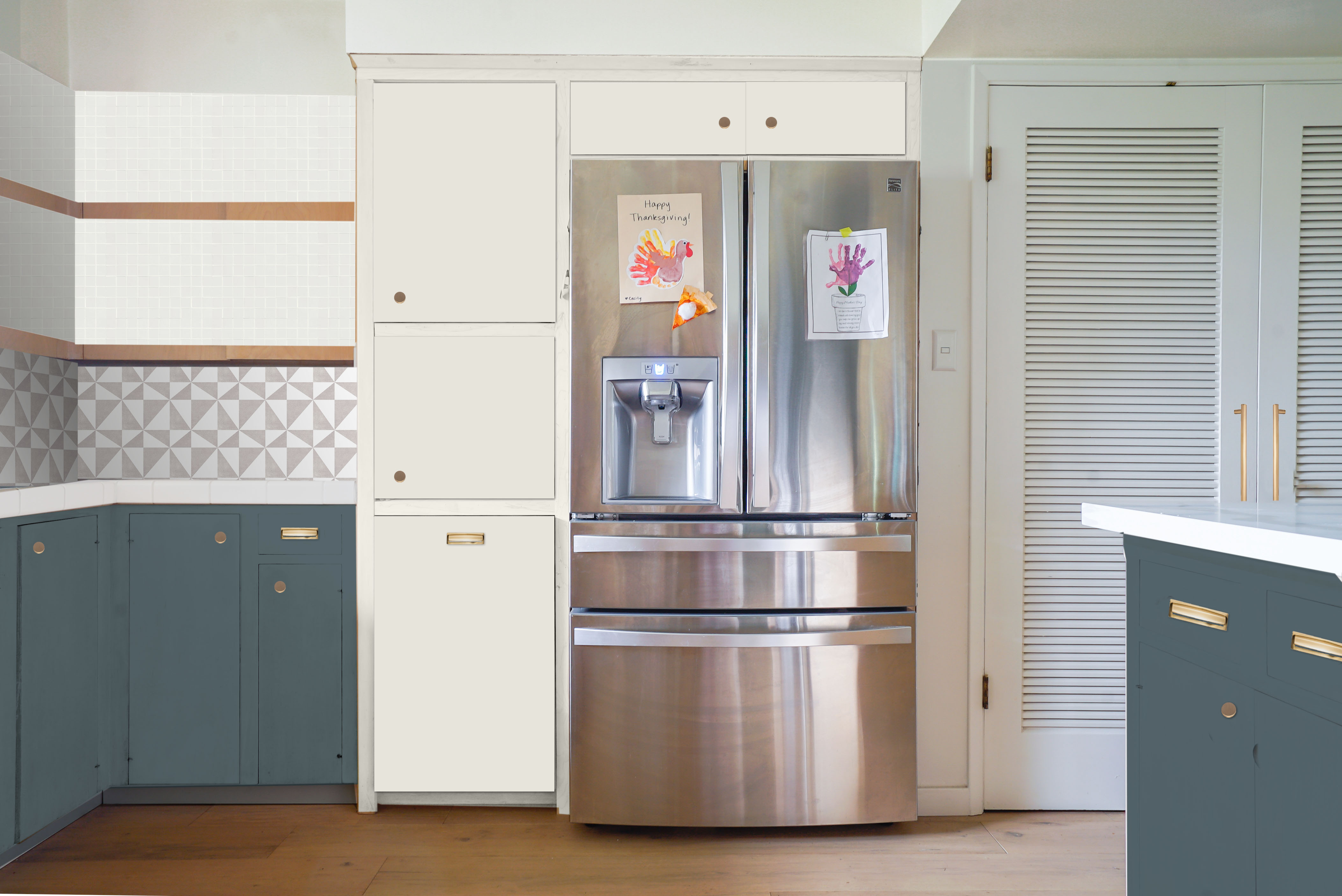
Here’s an elevation and rendering to give a better idea of how its going to look on this side of the space. The cabinet plan has changed a bit since the rendering but its close enough!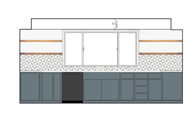
Progress Report
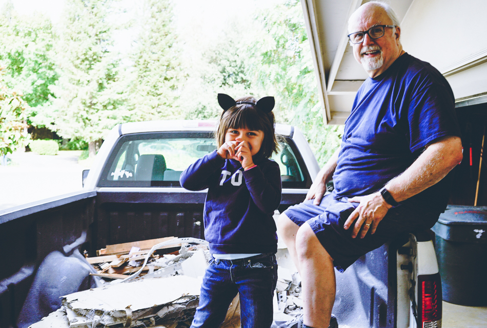
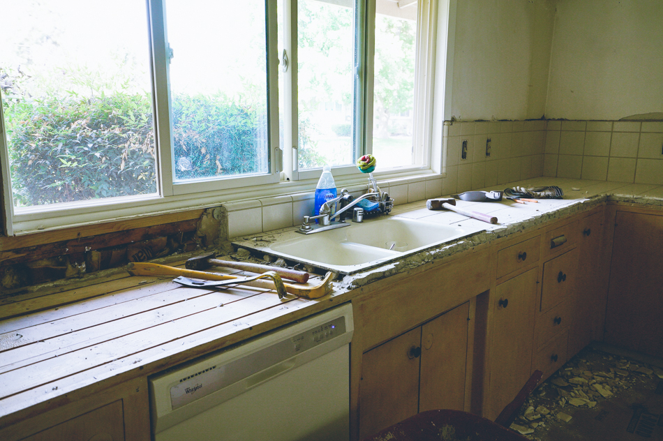
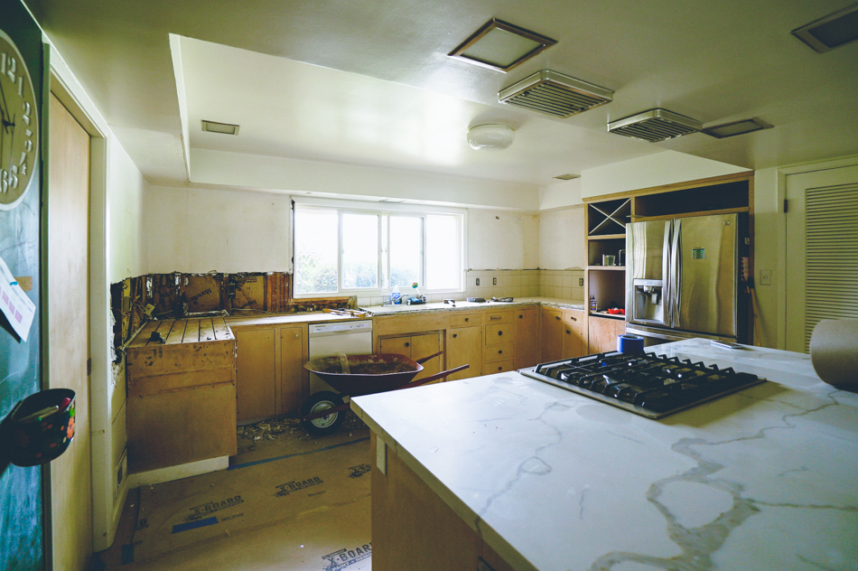
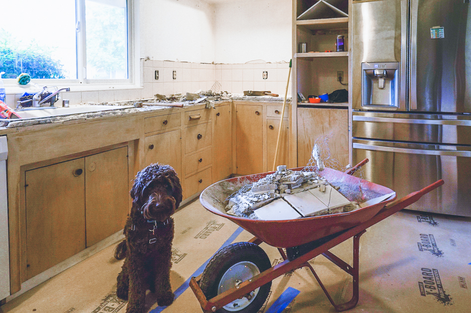
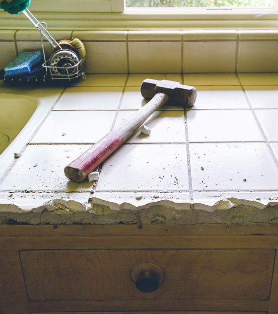
This past week we’ve been in demo mode and now officially live in a construction zone. We said ‘bye’ to the old intercom and wall-mounted tape deck, demoed the tiny little desk underneath it, broke out the tile counters and backsplash, and are reworking the electrical. Of course I keep finding new little projects to do and will likely make tweaks to my plan but for the most part everything is ordered, en route and on schedule!! Here’s the current state of things… 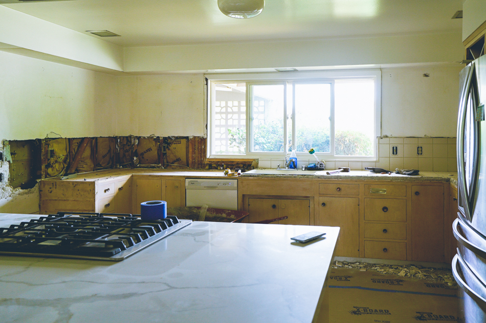 And this is how I feel about getting rid of that old tile…

 Phew, that post was massive. Thank you for following along, I’ll be posting a ton behind the scenes on Instagram! See you next week!! Don’t forget to see what the Featured Designers and other Guest Participants did this week!

Catch up with our entire One Room Challenge kitchen reno
Week 1 // Week 2 // Week 3 // Week 4 // Week 5 // Week 6






44 thoughts on “Kitchen | One Room Challenge :: Week 1”
Hey fellow kitchen renovator!! Feel ya on the living in a construction zone. Love the design plans and look forward to watching this come together 🙂
Thank you!! We must be crazy for doing this but I’m just happy to get to the end faster. I’ll scoot over and see what you’re up to!
Very very very VERY excited for you my friend! I’m so happy you’re participating and I can’t wait to see this space transform. It’s going to be amazing. I
LOOOVE that you’re working with the original cabinetry. It’s legit so good and I’m dying over that tile. I hope you’ll have me over to dinner after!!
Thank you! So happy to be doing this along side you friend! And yes, I’d love to have you over! 😘
I’m so excited to see how this turns out. I love it already, so I know it’s going to be great.
Thank you so much!!!
Wow this is a huge project and I love the inspiration board so I know it will be amazing. You gotta love demo day, get that old stuff outta there right? Wishing you all the best!
Thank you! Yes, demo day is the best and the worst of times. I’m super impatient, so I’m so glad it will be done soon!!
Wow, this looks like major project to undertake! I love all the styles you want to combine here! Looking forward to following along!
Thank you! It all makes sense in my head, so here’s hoping it does in reality!
WOW! Those before shots are…special…You are going to kill this!
Special is a nice way to put it. 😂 Thank you!!
wow huge transformation coming up! this will be a good one!
It can only get better! Ha!
I’m exhausted just reading about it!
Ha!
Woo hoo! No turning back now. Looking forward to seeing more progress. The design plan is awesome. Pinned it! xo
You’re the best! 😘
Oh Rebecca, you are a brave girl 🙂 I like your sketch and love the tile you have chosen. I’ll be watching your progress. Good luck!
I have a lot of help but yes, there are tons of moving parts. Thank you!
Wow! You’ve got your work cut out for you. But I can see your vision coming to life. I’m so excited for you right now! By the way, that pantry is killer! This is DEFINITELY one project that I will be following from beginning to end.
The pantry has so much potential!! I can’t wait to make it functional!! Thank you!
Oh Wow! This is going to be a huge undertaking! It’s going to be amazing too though.
Yes and yes! We’re outsourcing as much as we can but living through this is no joke. Ha!
Oh goodness- we had tile counters in our kitchen when we first moved in too— it’s no fun!! Your plans look beautiful! Can’t wait to see it all come together 🙂
Thank you! I hope the new counters are in Tuesday which will make me sooooo happy. 🙂
You’ve got your work cut out for you!! Absolutely love the mood board, especially the paint colors. It’s going to look amazing at the end!
Thank you so much! Everything is still in tear down, I can’t wait to get over the hump and into ‘put it back together’ mode!!
I feel like you scored big time with those cabinets! Maybe instead of painting, perhaps you could lightly sand and stain them to bring out the wood grains? A lighter, dove grey-toned stain would look fantastic! Either way, I can’t wait to see how this room evolves! It’s a real gem!
We totally scored with them and I love the look of them so much. Honestly that was my original plan but I had a few contractors talk me out of it because the plywood veneer is so thin and inconsistently discolored. We also are retrofitting some areas and its too hard to make it match. PLUS I’m just craving color in here at this point. Thank you!!
Wowzers! This is going to be one super special makeover. Your room has great bones and the inspo is amazing. Love the floor plan of the house, too. Looking forward to following along. ~~ Susie from The Chelsea Project
Thank you! That’s why we took the leap on this house, all the rooms are great size and layout (except for the laundry area but that’s another ORC, ha!). And thanks for noticing the floorplan, it wasn’t easy to draw with all the odd angles! 🙂
That kitchen is going to be AMAZING…I love all the space! And your pup is too cute! Side note: I grew up in Sacramento…my family is still there!
Rebecca,
I think you are FEARLESS to take on a kitchen and I will be following to see how it all comes together (beautifully, I’m sure)
🙂
Loving all your design details!
Wow, you’ve made such a great start already! I love your design plan, can’t wait to follow along on your progress.
I have been exploring for a little for any high-quality articles or weblog posts on this sort of area .
Exploring in Yahoo I eventually stumbled upon this
website. Reading this information So i’m satisfied to convey that I’ve
an incredibly just right uncanny feeling I came upon just what I needed.
I such a lot without a doubt will make sure to don?t omit this website and give it a glance
on a continuing basis.
My family all the time say that I am killing my
time here at net, except I know I am getting
know-how daily by reading thes good articles.