One Room Challenge Week 2! We made a lot of progress but mostly the unexciting kind: getting the shower rough-in installed without disturbing the tile, patching the wood floor under the old cabinets and buttoning up the plumbing behind the sink wall. All very important but honestly kind of boring. Let’s move on to the pretty stuff because I can’t WAIT to start showing you the materials coming in. Are you ready to see the Design Plan!!??
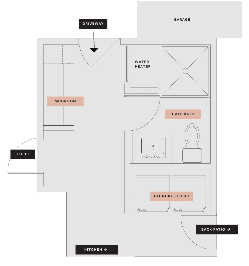
To do a quick recap, here is the area we’re working on in our back entry. All spots labeled in pink are our focus spaces.
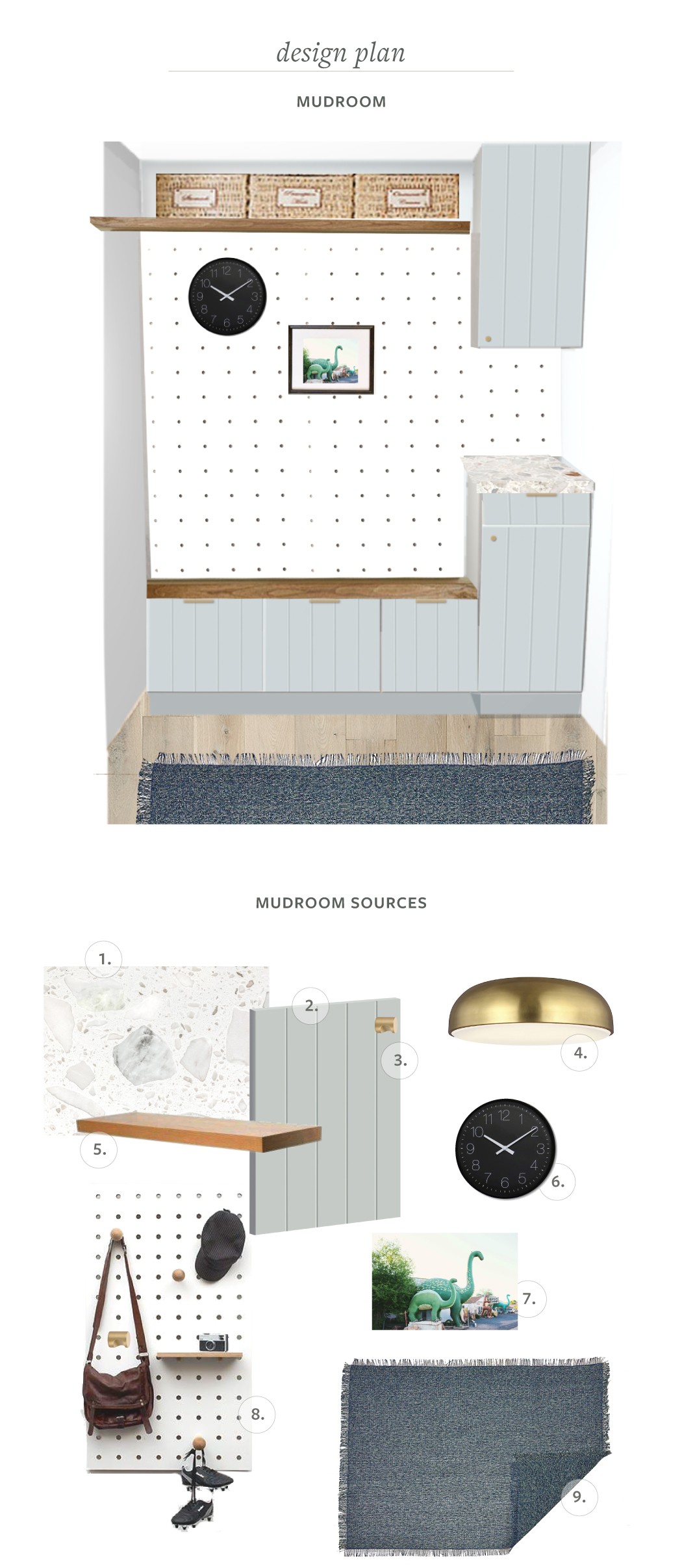
Now on to the specifics! Note that all details are subject to change in case a pivot must occur but I’m feeling pretty good about where we’re at with everything. First up, the mudroom! This little nook in our back entry needs to work really hard and efficiently for us. I’m excited to be working with Carly from Tidy Revival again to get these areas organized!
*Indicates an item that was gifted in exchange for promotion during One Room Challenge. All opinions are my own!
- Quartz Countertop
My dad and I found these terrazzo-like quartz countertops at a local granite warehouse for an absolute STEAL. Its actually a prefab bathtub surround that had some chips so they sold us two 3×6 slabs for $25 each. Seriously. Similar. - Cabinet knobs
I wanted to keep the hardware simple but modern. Finger pull knobs | Drawer edge pulls - Cabinet Door Fronts
We used Semihandmade drawer fronts in our master bathroom and love them. If you’re not familiar the company makes doors and drawer fronts only to fit on Ikea standard kitchen and bathroom frames. - Ceiling Flushmount Lighting*
For some reason they dropped the ceilings an extra foot in the hallways so we needed something super low profile to replace the original square recessed lighting. Lumens is sending these beauties and they hang less than 4″ from the ceiling. And they’re sexy as hell. - Open shelving
Being built by my dad and stained in a walnut finish. - Clock
Every mudroom needs a clock, right? - Art Print*
Since this is the family zone I want to make sure it feels kid-friendly too. I love this playful print from Juniper Print Shop. - Oversized peg board
I was really inspired by this mudroom from Our Humble Abode. Attempting our own DIY version-wish us luck! - Runner*
Since this entry gets the most dirt dragged in we need a hard-working rug. So excited to bring this Market Fringe runner in. Did you know Lumens also sells really cool home accessories?
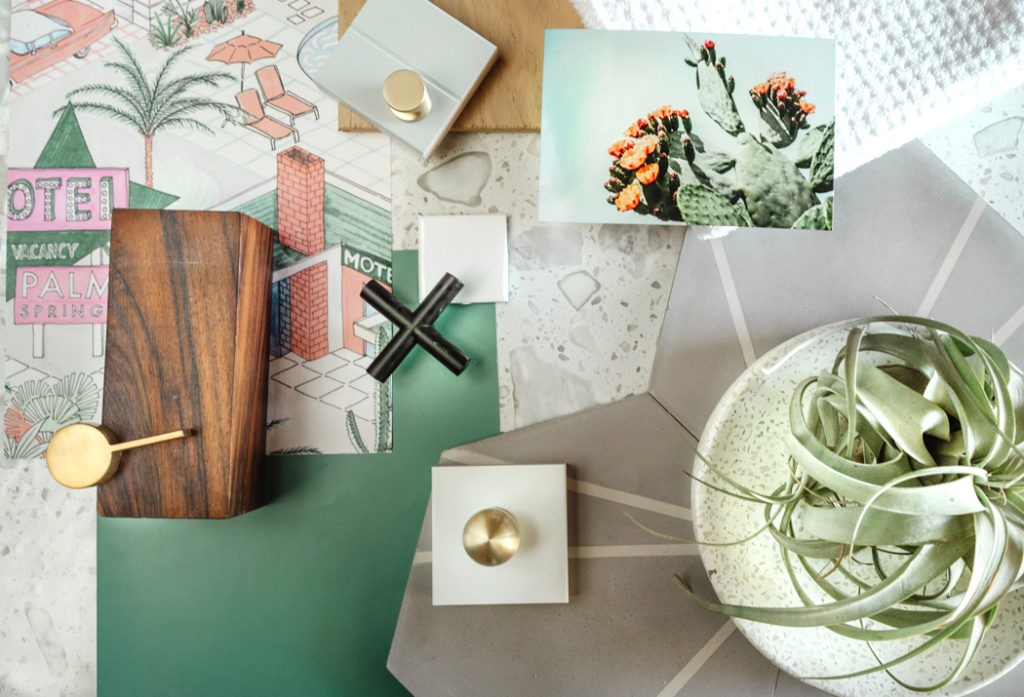
Ok, its been my dream to make this small bathroom bold and impactful, which can only mean…wallpaper!! I searched high and low for the perfect bold wallpaper pattern in here and then I stumbled on this vintage Palm Springs-inspired design by Milton & King.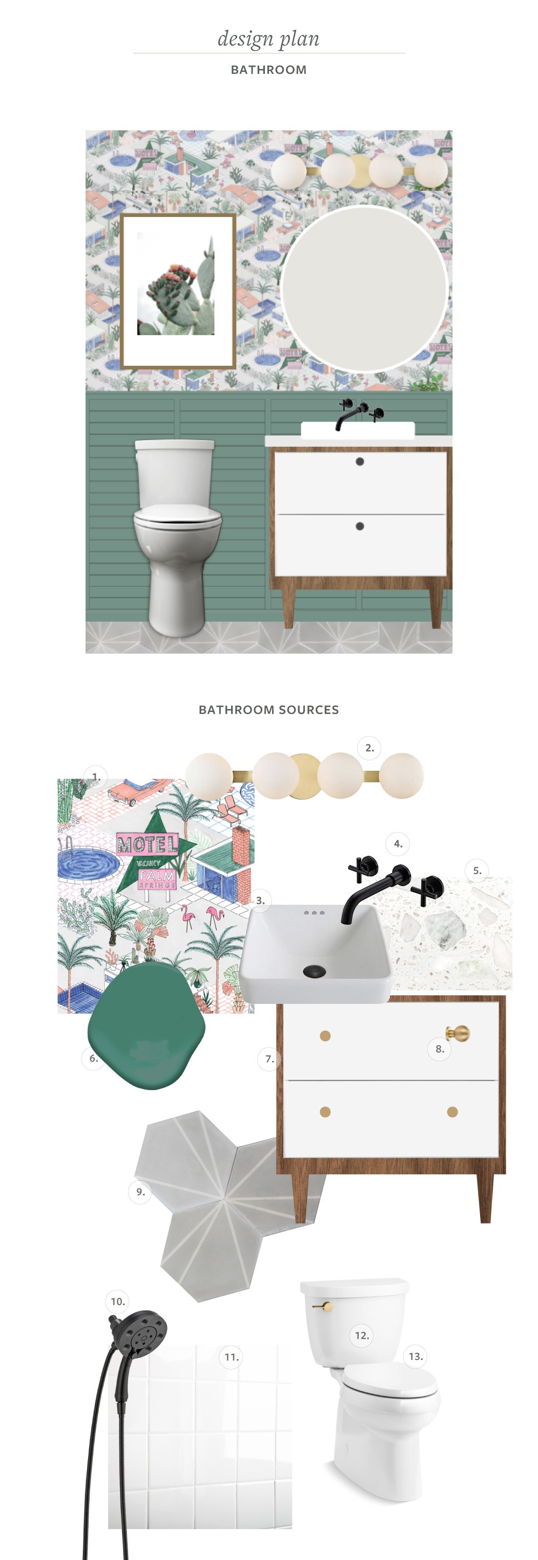
- Palm Springs Wallpaper*
Of course I designed this entire room around the wallpaper. How could I not? Its so, so perfect and I absolutely love it, thank you Milton & King! - Vanity Light*
I had something else specified originally here and then I saw this beautiful bath bar on Lumens.com and I was smitten. I love how simple it is and and brings in some geometric curves. - Sink
We’re attempting to DIY the countertop fabrication so I wanted a vessel sink that would hide any imperfections. I love that this one is semi-recessed so it stays snug to the counter. - Faucet
I’ve always wanted a wall-mounted faucet and since we had to tear so much of the wall between bathroom and laundry we made it happen. - Counter
Same slab as above - Wall paneling
I’m pretty excited about our plan here. We’re designing a modern beadboard treatment to bring some texture in but keep it clean and not farmhousey. I debated quite a bit on the color but decided to go for deep and saturated. - Vanity
We’re taking the Ikea Godmorgon and giving it a good old hack. I love the one we have in our master but I want it to feel a little bit more like a piece of furniture. Stay tuned. - Drawer knobs
I’m a sucker for round shapes and am loving how they tie into the light fixture. - Cement tile*
I knew I wanted a tile with a little pattern but not a lot of contrast so when Villa Lagoon offered to partner with me I jumped at the chance. Much more to come about this tile–its so good! - Showerhead
We often use this shower as a dog wash so having a handheld fixture was key. This design has it all built in to keep things as simple as possible. - Shower Surface Refinishing*
Instead of replacing we decided to refinish our tiles to look brand new. Since the shower tiles were in ok shape we are partnering with our local Miracle Method showroom to make them fresh and clean! - Toilet Lever
I definitely chose this toilet for the ability to swap out the lever and I’m not going to apologize for it. - Toilet
Our old one was just so so terrible, all I want is new and clean. We went with a round seat so we can leave room for a shower door at some point.
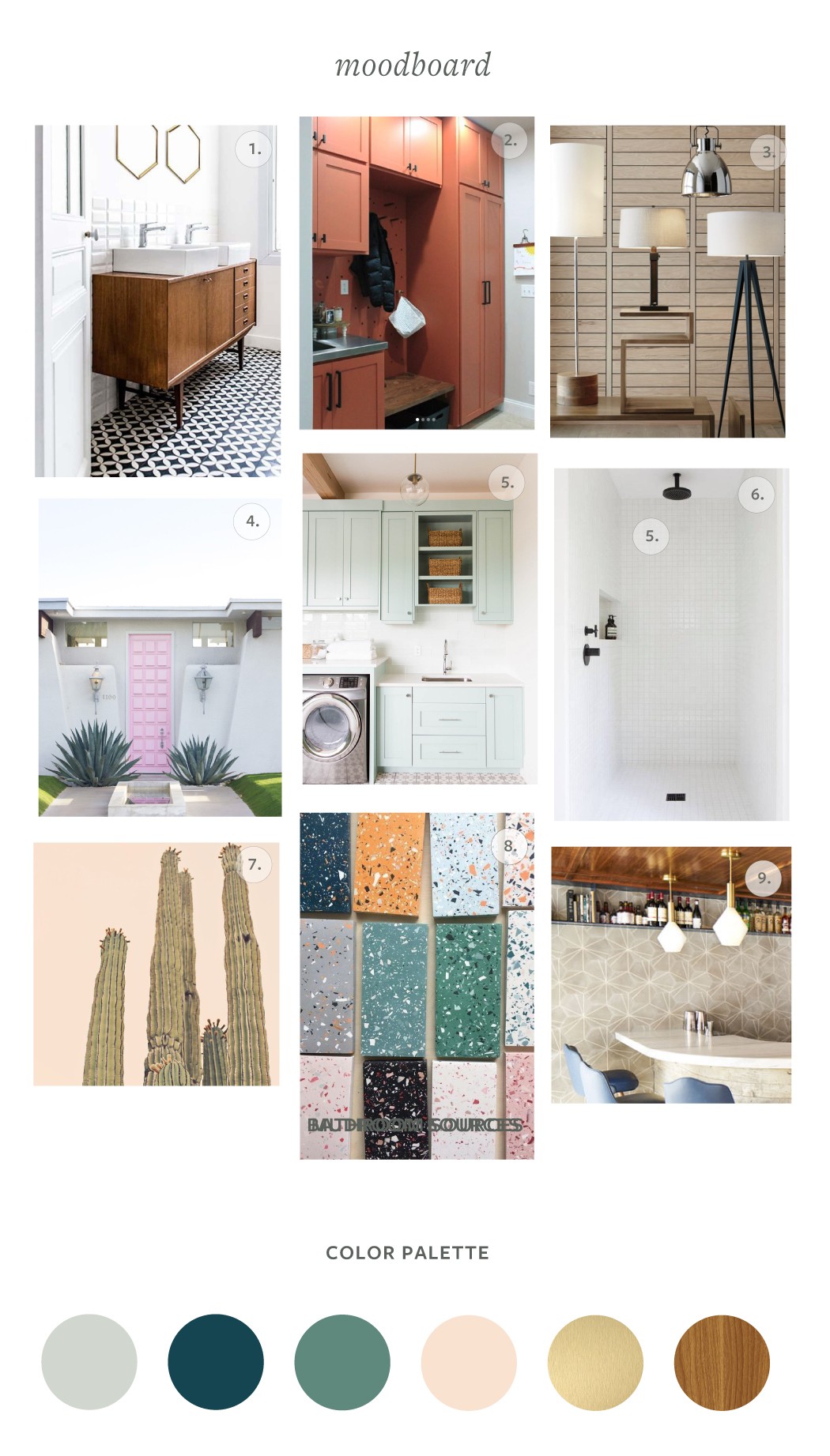
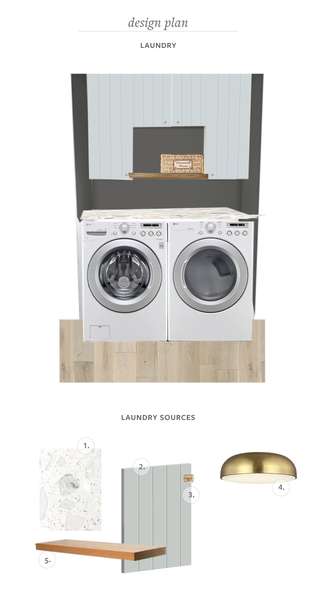 All materials are repeated from the Mudroom for consistency but here’s a recap. I’m still debating the wall color, but thinking about going dark.
- Quartz Countertop Similar.
- Cabinet knobs
- Cabinet Door Fronts
- Ceiling Flushmount Lighting*
- Open shelving (DIY)
The last week has been all about me securing materials, working with sponsors and finalizing the design while my dad has been buttoning up plumbing and electrical which doesn’t make for beautiful imagery. But its coming, folks! Thank you for following along, we’ll be back next week with some clear progress (fingers crossed) but follow along on Instagram for daily updates!
My One Room Challenge Sponsors

Milton & King // Lumens // Villa Lagoon Tile // Miracle Method // Tidy Revival
Other One Room Challenge Posts
Catch up on the whole project
Week 1 // Week 2 (you’re here!) // Week 3 // Week 4 // Week 5 // Week 6
Links to my previous One Room Challenges
Fall 2018: Kitchen Refresh | Spring 2019: Midmod Patio Reveal
Don’t forget to see what all the other Guest Participants and Featured Designers are up to this week!






16 thoughts on “ORC: Week 2 (MudBathLaundry Room Design Plan )”
This is going to be so so so good!
It’s so fabulous! Can’t wait to see you knock another one out of the park.
Love the quartz and the bathroom wallpaper! This is going to be so beautiful Rebecca! I can’t wait to see it all come together
You are speaking my MCM language!! ❤️
Wow this is gorgeous! I love the inpsiration, and that paper!!!
Oh em gee. That wallpaper slays! It’s so perfect for a 1960’s California home. LOVE IT and the color palette, too. You are making such great use of the space.
Now I am wanting to update my mudroom and laundry room (which are only 2 years old!) I just installed the finger pulls like you picked for the mudroom/laundry in our guest bath and love the look! You are one of my faves to follow!
You’re so sweet! Ha, well since these haven’t been updated in 30-50 years I’d say they were due.
Love your entire plan, that color palette is gorgeous!
Thank you so much!! Can’t wait to see some finishes install. 😂
I am loving those cement tiles how pretty. Your plan looks great and loads of color for visual interest.
Wow. I love how detailed your plans are! Nice job.
This is going to be great! I love the whimsy ❤️
I’m loving all your designs and ideas for this area. Beautiful choices.
I have read so many articles or reviews regarding the blogger lovers but this piece of writing is really a nice piece of writing, keep it
up.
I’m amazed, I have to admit. Rarely do I come across a blog that’s equally educative and engaging, and let me tell you, you have
hit the nail on the head. The issue is something
that not enough folks are speaking intelligently about.
I’m very happy that I came across this during my hunt for something relating to this.