Let’s start by talking about doors this week. From the very beginning, my main inspiration for our bedroom design started with the doors. We have 5 different door openings in my sight line from my perch in bed so I’d just stare at them annoyed every night. We had double bypass sliding closet doors, our room entry door, my closet barn door, the bathroom barn door, and a big sliding glass door. Let’s just say I’ve thought a lot about doors in the past 3 years. So when it came time to get going on a real plan I knew that I wanted to de-emphasize most of them and just needed to figure out how.
If you’re new here, I’m Rebecca designer and founder of Studio Plumb. In January 2017 we became the second owners of the #plumbmidmod, a one-of-a-kind 1960 midcentury ranch on .8 of an acre outside of Sacramento, California. It has cool original architectural details, a creek running through the yard, and a perfect floorplan. It also needs a sh!#t ton of work. Bit by bit with the help of my dear old dad we’re bringing it back to its former glory with a modern spin.
For more updates follow along on Instagram and all you design entrepreneurs check out our new podcast the Hot Young Designers Club.
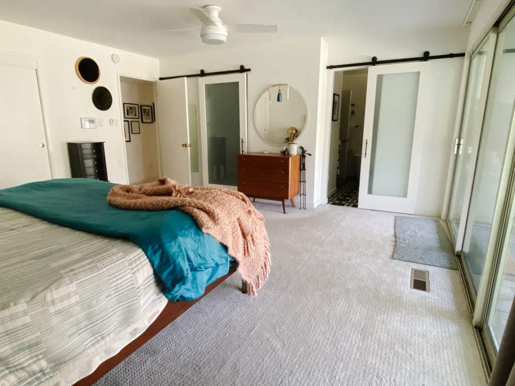
Here you can see all the offending doors in one wide-angle shot. 😬 This is partly my fault since the original bathroom didn’t even have any doors, and I made the hasty decision to add barn doors which just never felt right in this home. Combined with the original bypass closet doors its just felt very hodgepodge.
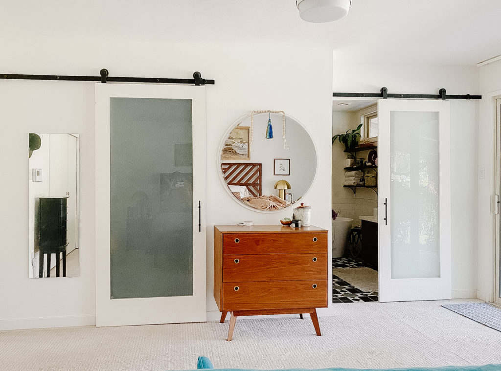
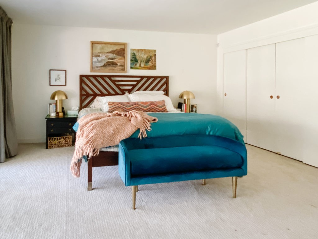
All these openings still need doors so what do I do? Enter my door-spiration, the Nomad Hotel Las Vegas. As an aside, I am not a Vegas person but have been there frequently for industry market events the last couple years. At the end of the work day I honestly have barely left my hotel once I started staying at the Nomad. Its pretty, eclectic, modern, quiet, and there’s an Eataly downstairs. What more do I need!?
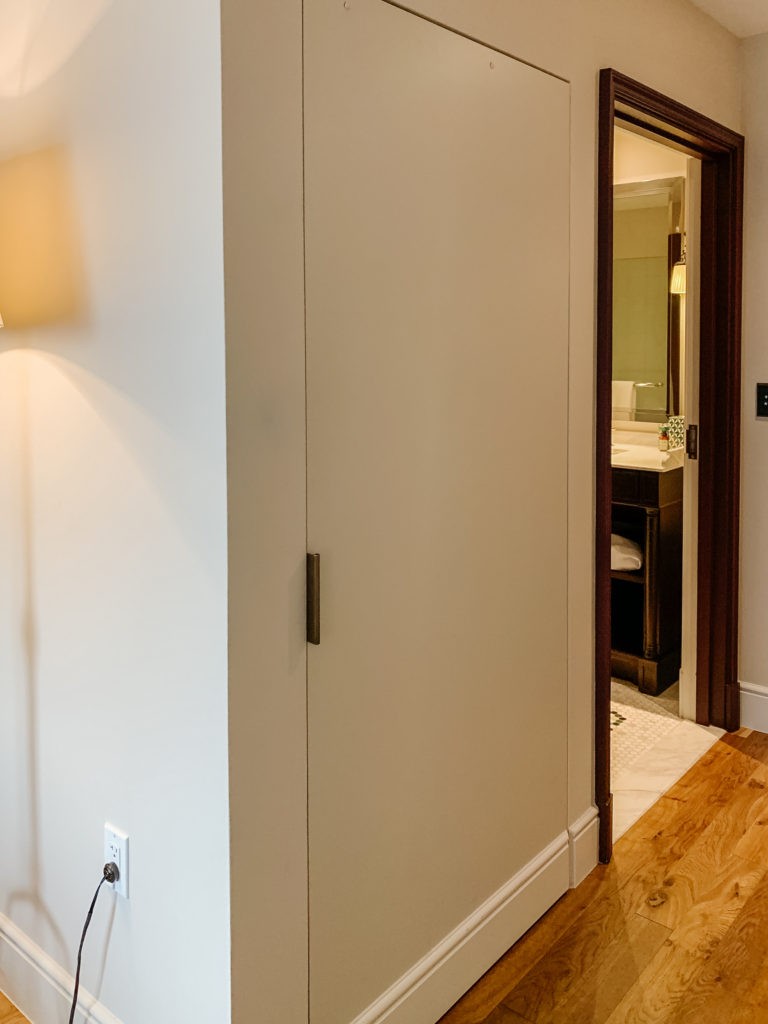
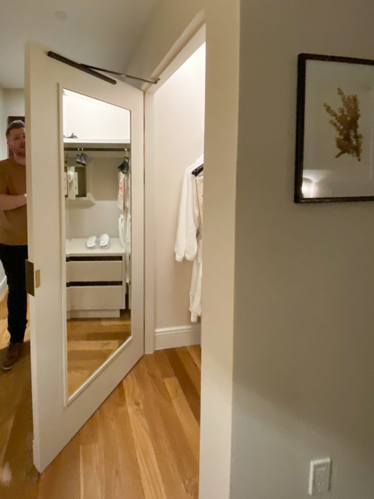
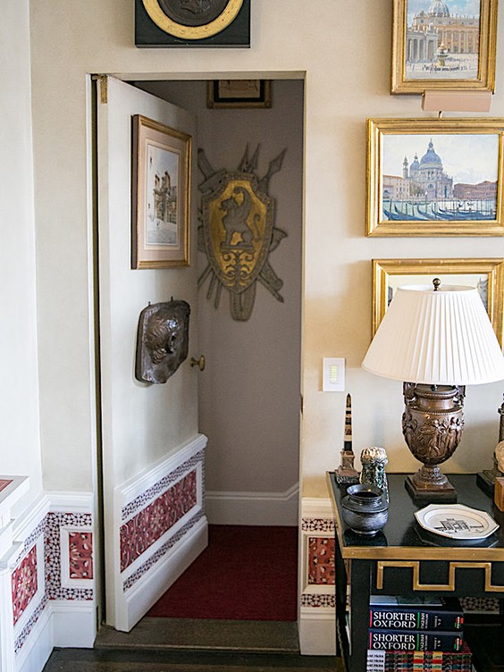
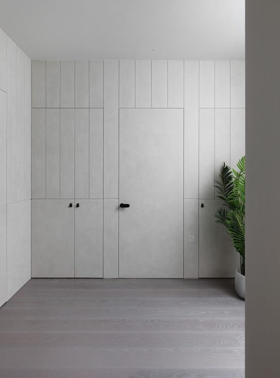
ANYWAY, I fell in love with the closet doors in my hotel room and haven’t stopped thinking about them. These are doors from two different trips (Hi Shaun! 👋🏽) but I’m obsessed with how they are both subtle and intentional. There’s no trim around the door, the hardware is minimal, and the hinges are hidden. Plus continuing the base moulding across the bottom doesn’t interrupt the eye and let’s the focus be on the bathroom entry which is more important (remember this detail, I’m coming back to it!). This particular door uses a magnetic catch to hold it closed which I’m into.
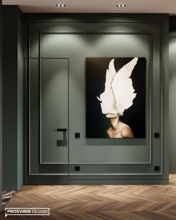
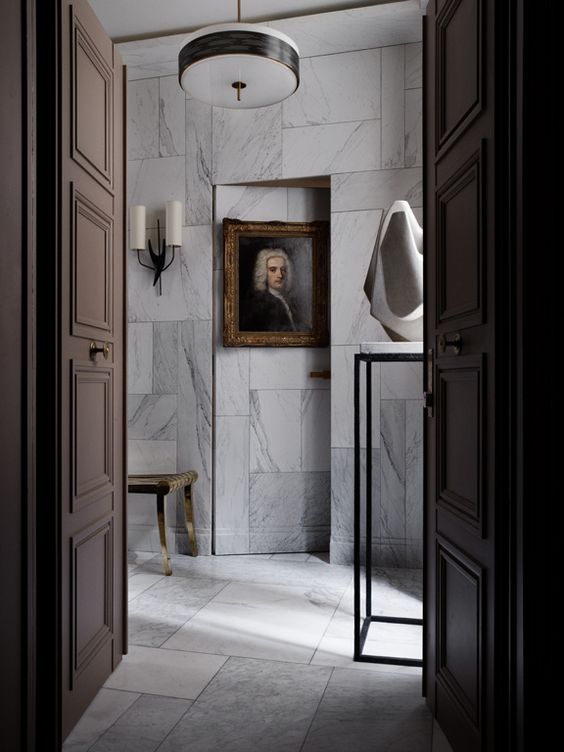
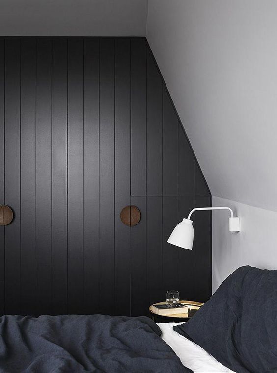
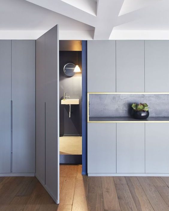
The official technical term for this is a jib door and their purpose is to blend into the wall and be hidden. There of course are all kinds on the internet, some really clever and invisible, some just slick and minimal.
Jib door: a door made flush with a wall without dressings or moldings and often disguised by continuing the finishings or decorations of the wall across its surface.
-Merriam-Webster
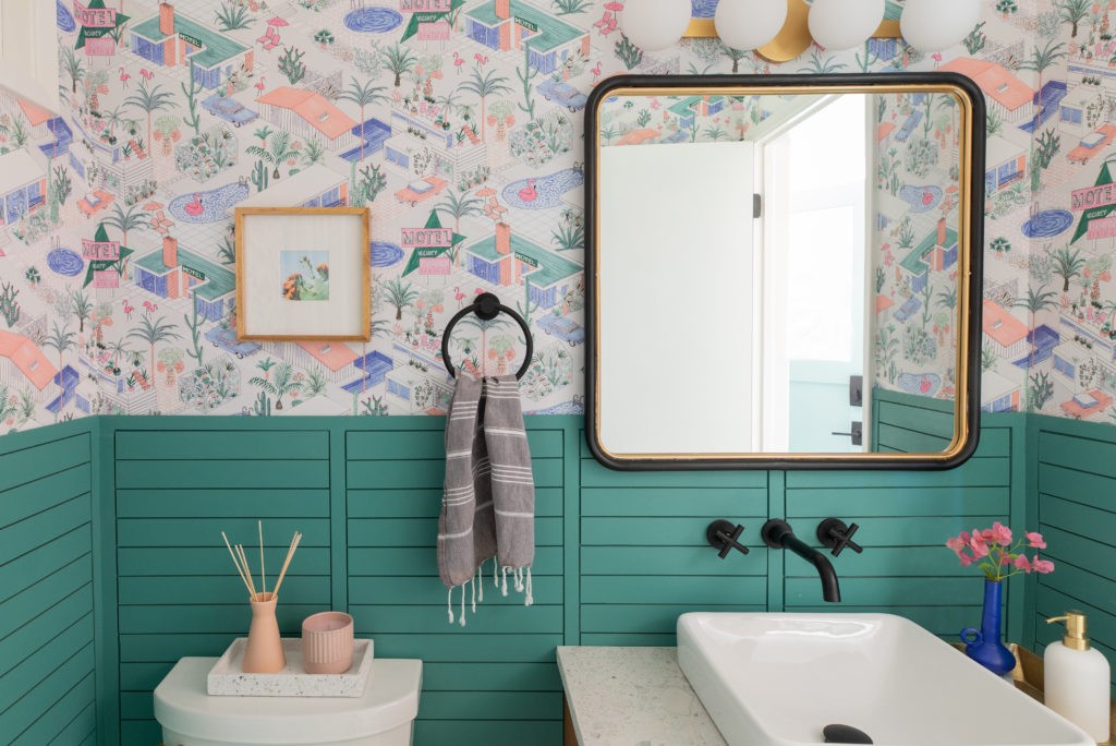
I’m going for a minimal option since it doesn’t make sense in my midcentury modern home to go crazy with panelling and applied moulding but I was so inspired by the variety of applications. Here’s a fun trip down inspiration lane…
And if you’re into these (aren’t they fun to look at!?) I have a whole slew collected on Pinterest.
Since my budget doesn’t allow for high-end carpentry we’re going to DIY our solution. My budget allows for “what can my dad figure out how to do.” 😂
Here’s our plan is for the doors:
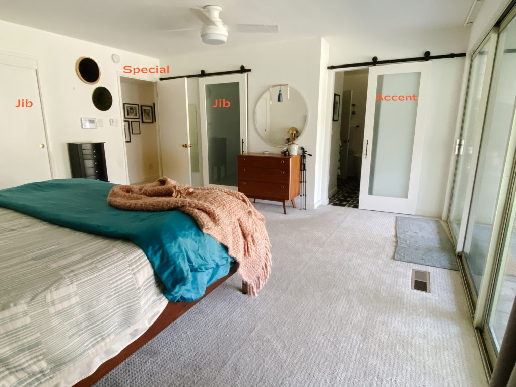
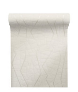
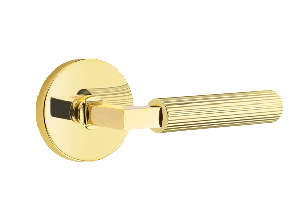
This will make more sense at some point (promise!) but in order to keep the room interesting I’m mixing up the door styles but just in the finish and trim. They will all be simple flush doors, without face panels like the rest of the house. The two closets will be jib doors without framing trim and visible hinges, and to add to the illusion we are continuing the textured cream wallpaper from Pacific Designs Int’l (below) right onto those doors themselves. The main entry door I want to be “Special” door and stand out from the rest. I’m not exactly sure how, but we’re going to build up the trim, paint it a contrasting color and it will have this gorgeous unlaquered brass lever handleset from Emtek.
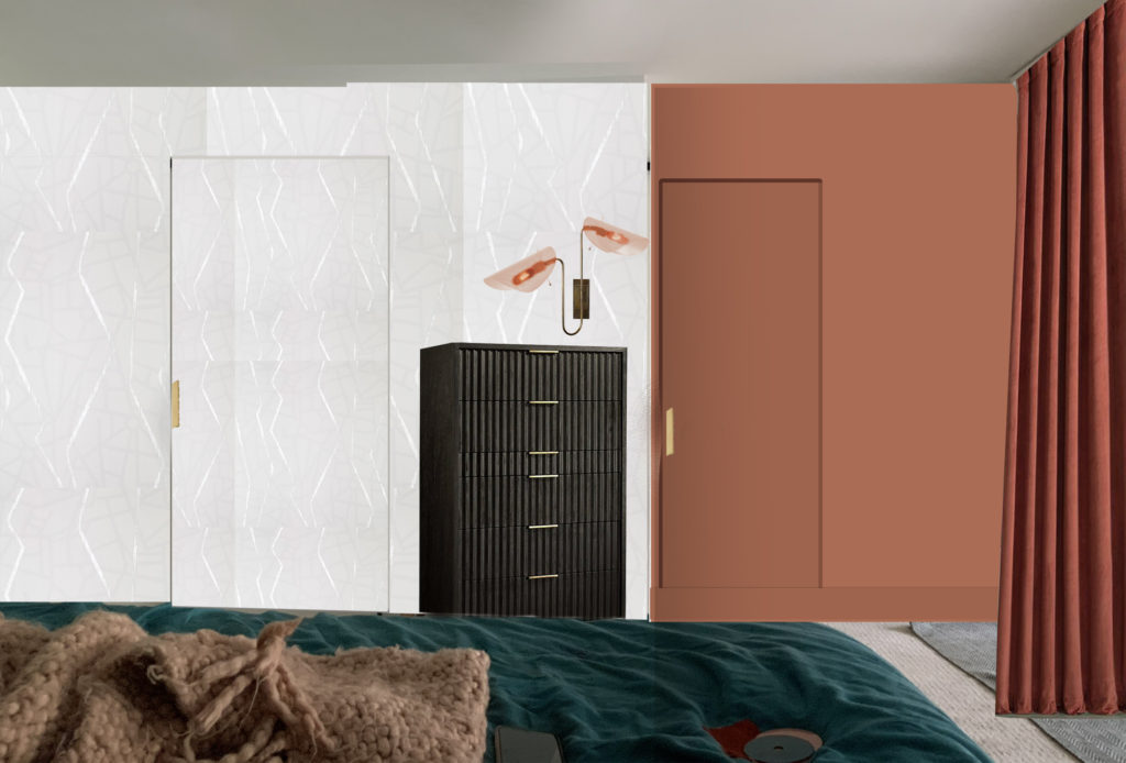
The entrance into the bathroom steps back like a foot and I’m going to paint it a similar color to the rusty velvet drapes. I’m not sure if we’re going to make it a frameless jib door or if we’re going to try something a little tricky. Stay tuned… But I already love how much more interesting this view from the bed will look. The sconce from Blueprint Lighting is SOOOO good and will be mounted over the gorgeous dresser from Apt2B. I really can’t wait to lie in bed and contemplate how pretty all my doors are. Ha!
Speaking of lighting, Blueprint is offering my readers 35% off your order!. It can be used for any purchase–no minimums or maximums–just 35% off at checkout. Use code: PLUMB35 In addition they’re offering FREE SHIPPING on all online purchases for the entire month of May!
Progress
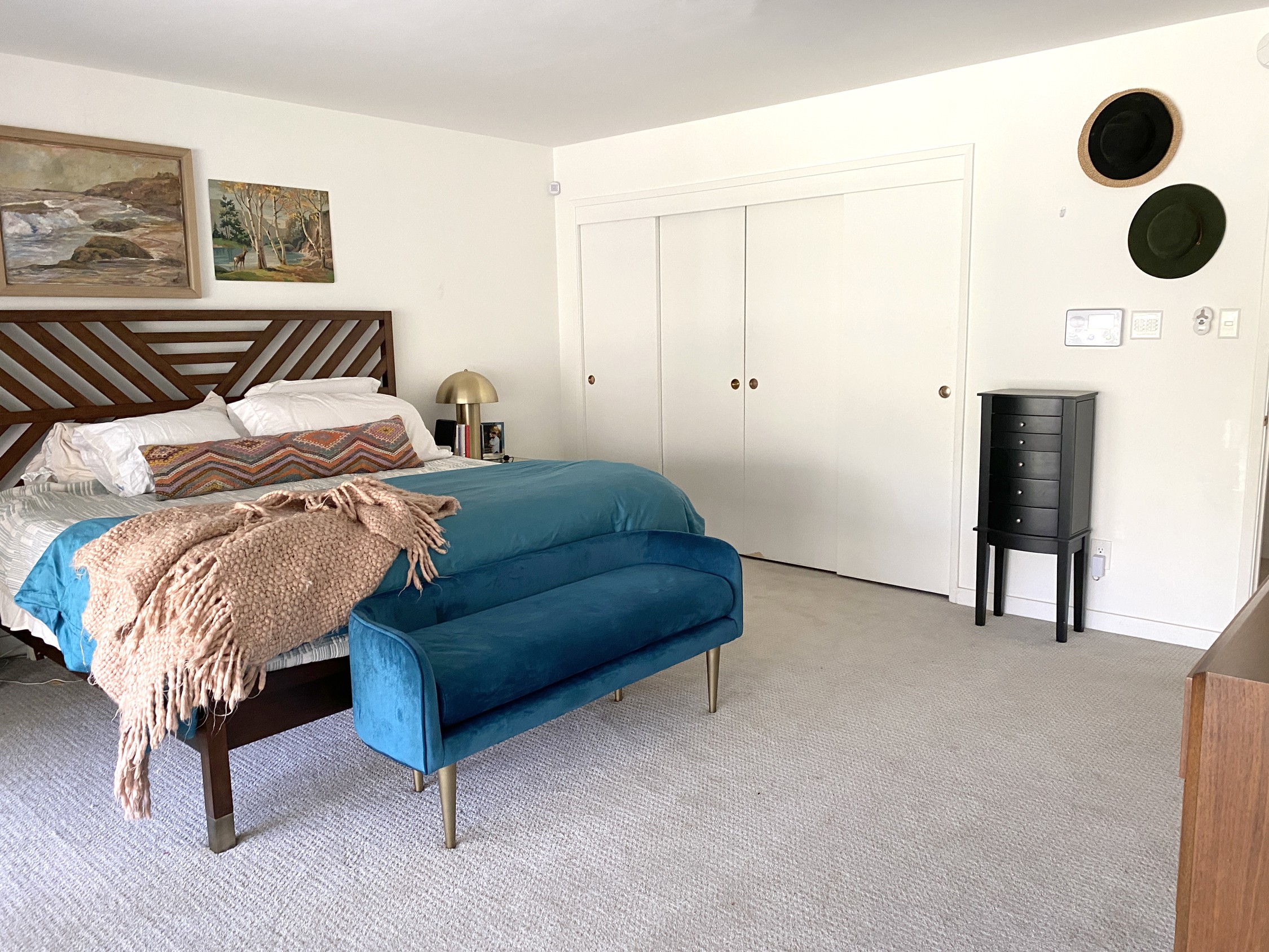
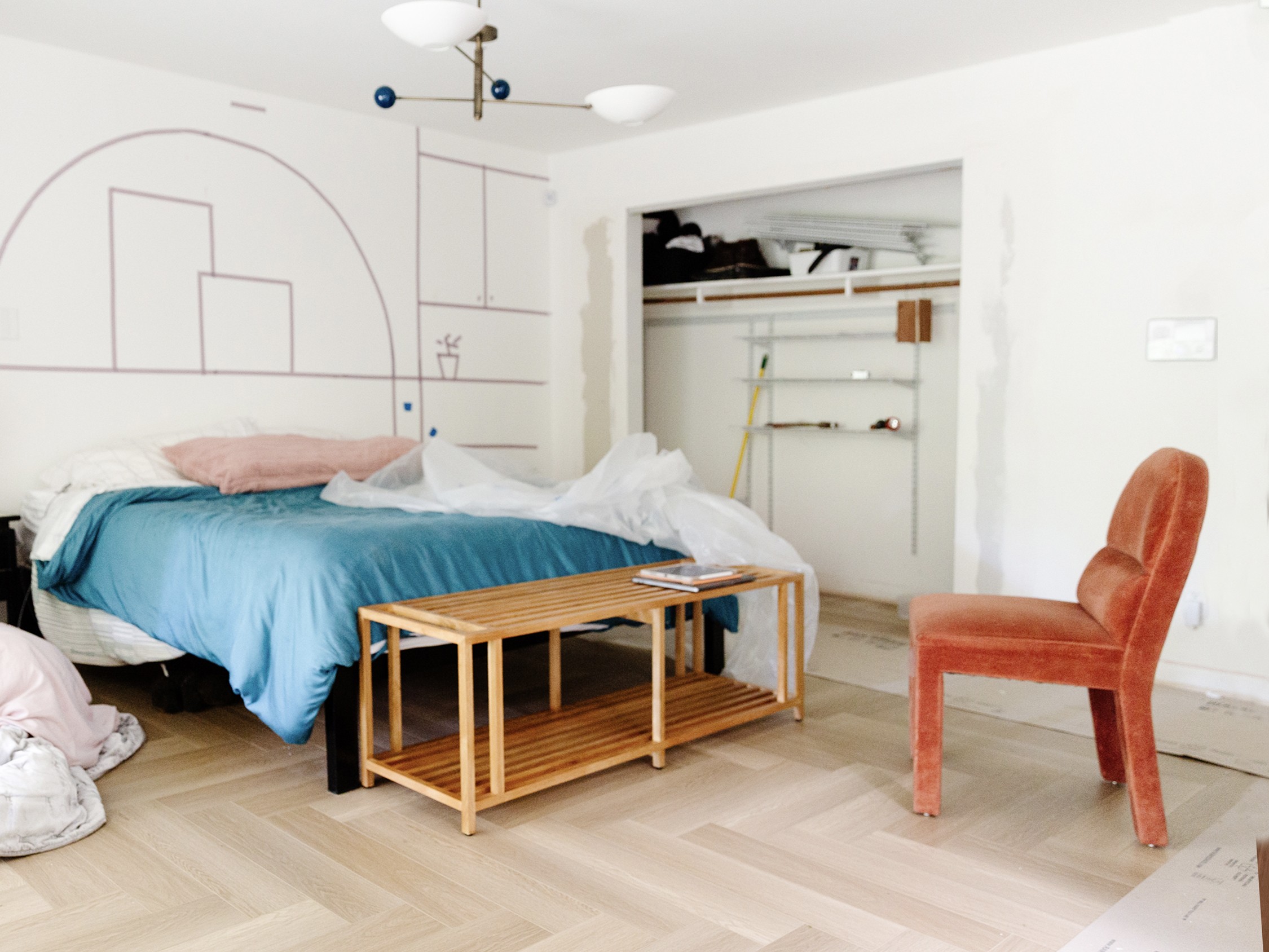
This week we focused on Terry’s closet which was the most complicated (I think). You can see in this fancy slider above for the Then and Now of the area. We closed the closet opening to be 6′ wide so we could use a standard bifold track and doors. We also need to allow room for the cabinets that will be going next to the bed. Plus, check out the cute bench I got for the end of the bed! Its from a trade-only site but it was on closeout and I couldn’t resist since wide benches are hard to come by.
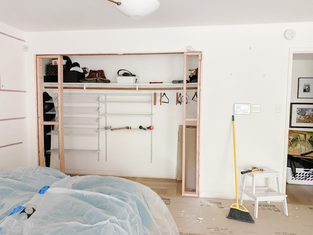
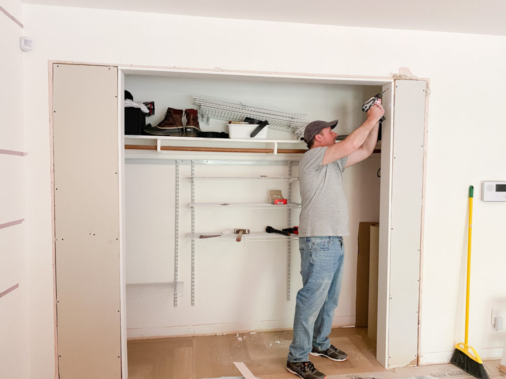
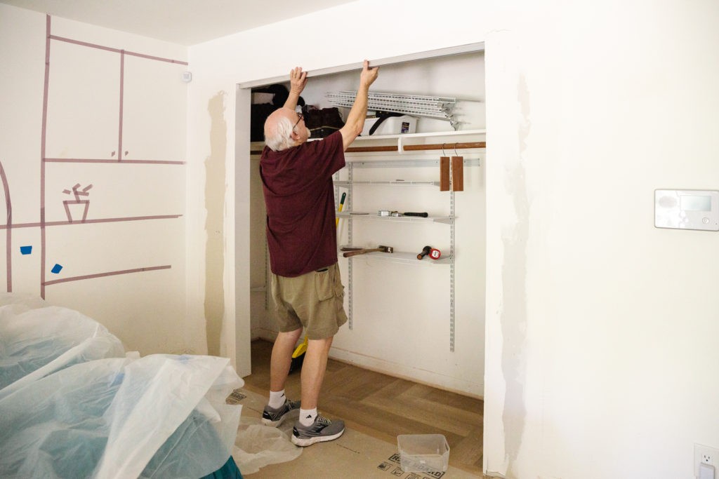
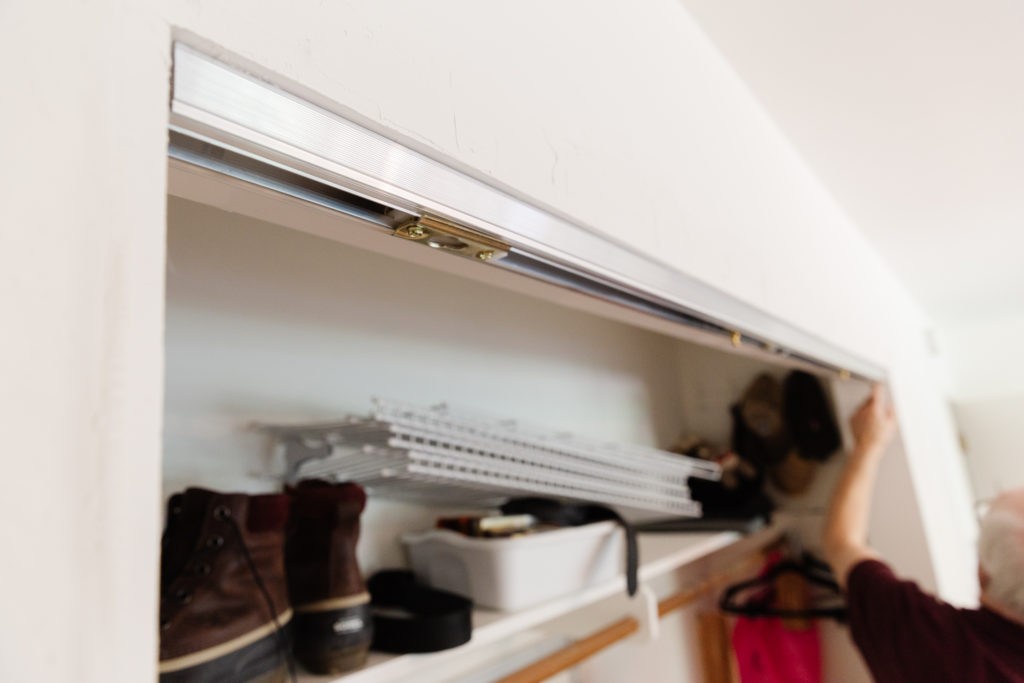
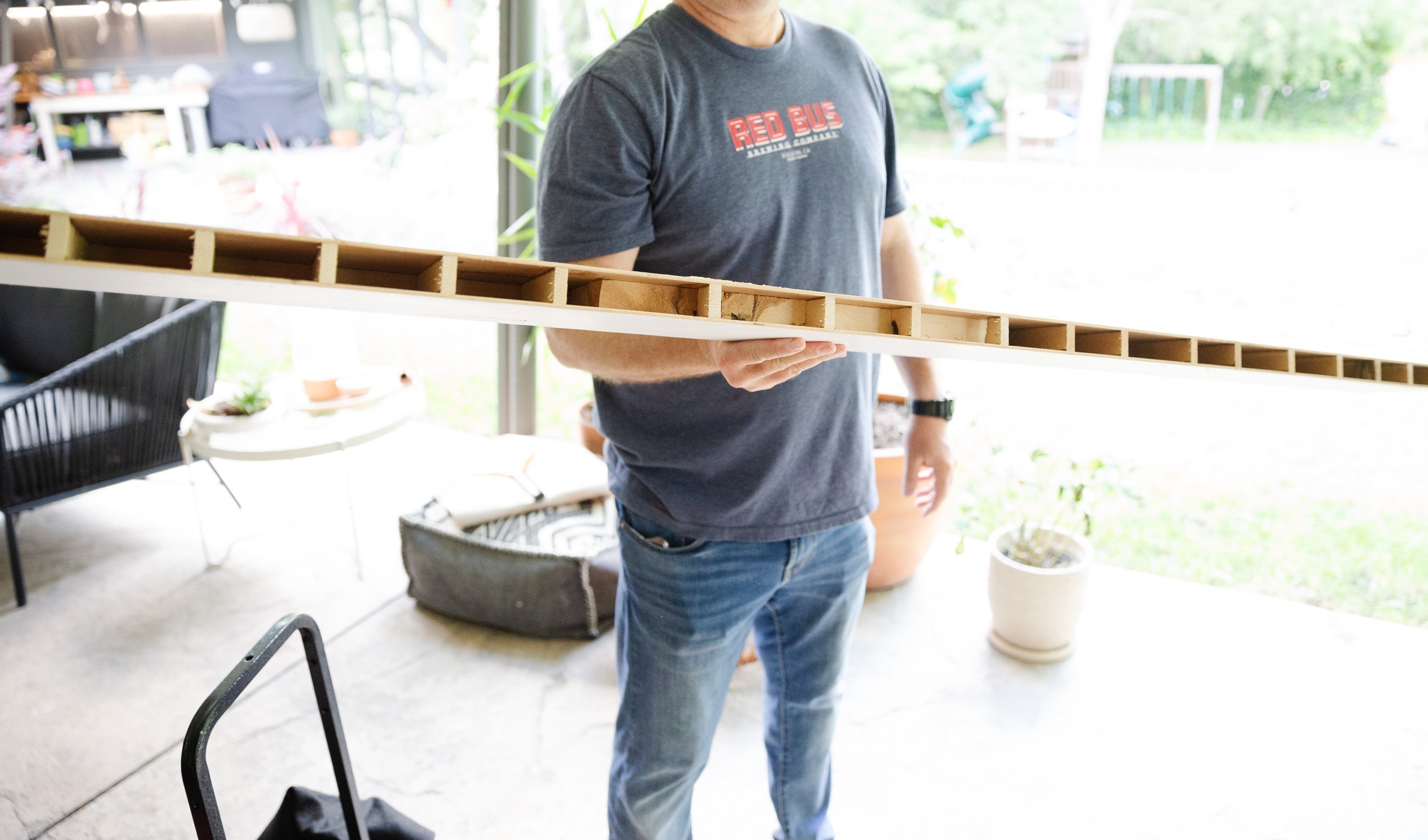
Here’s my dad installing the new track for the bifold doors. I went into detail on Stories but my dad figured out a way to cut down the existing doors and convert them to bifold. I really want these doors to feel nice and not fall off the tracks, I’m hoping this heavy-duty track will help with that. My dad is really jazzed about how smooth the mechanisms are. We also got lucky and found out the old doors were made with real wood (vs cardboard of modern doors) so they were easy to cut down and will hold up. Yay, upcycling!
What's Left
😬 😬 😬 😬 😬
Bedroom
- Wallpaper
- Build wall cabinets
- Figure out bedding
- Paint + trim entry door
- Install wall lighting
- Build + upholster bed
- Build bed wall + arch
- Paint
- Misc electrical
- Move alarm panel
- Rebecca's closet door
- Terry's closet doors
- Hang chandelier
- Install flooring
Bathroom
- Install vanity
- Install lighting
- Wallpaper
- Install lighted mirrors
- Install fan
- Living wall
- Install towel warmer
- Paint
- Bathroom door + hardware
- Style!
- Skylight installation
- Repair drywall
- Wiring sconces and mirror
- Ceiling electrical
- Remove window
A few folks have asked about my handy dad and how he knows everything so I sat down to interview him. Its in my IGTV but also posting here for posterity!
My previous One Room Challenges
Do yourself a favor and catch up with the rest of the Featured Designers, they are all so talented and will be turning out some incredible work.


