Hi! I’m Rebecca designer and founder of Studio Plumb. In January 2017 we became the second owners of the #plumbmidmod, a one-of-a-kind 1960 midcentury ranch on .8 of an acre outside of Sacramento, California. It has unique original architectural details, a creek running through the yard, and a perfect floorplan. It also needs a sh!#t ton of work. Bit by bit with the help of my dear old dad we’re bringing it back to its former glory with a modern spin.
And we’re back! Does it feel like we just finished Spring? Well, technically we kinda did due to Covid pushing the reveal date back to the end of June. I thought I would sit this round out but I just can’t stay away. I still can’t believe I was invited to be a Featured Designer in the Spring (see my final reveal here!), it was an incredible experience and I’m so grateful to One Room Challenge and Better Homes & Gardens for inviting me. This is my 5th consecutive challenge (!) and I’m hoping for a big visual impact without as much construction and stress we’ve gone through in the past. I’m excited to focus primarily on color and decor to completely transform our…Dining Room!
Thank you Linda and the team at One Room challenge™ for creating this fun and encouraging event twice a year. I live for the deadline and the supportive accountability I get from participating.
If you’re new here you can see our past projects: kitchen, backyard patio, MudBathLaundry room and our bedroom suite in the spring. I love that I’ve been able to transform our home in these quick bursts and push myself creatively.
This round I’m finally tackling our dining room. I say finally because its my favorite room in the house architecturally, but we’ve never had it set up as a proper dining room. Shall I take you on a tour of its various iterations?
Move In
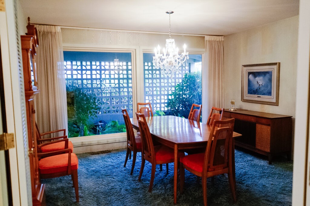
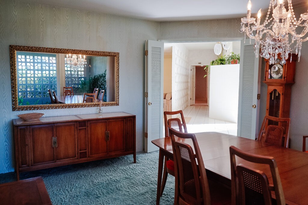
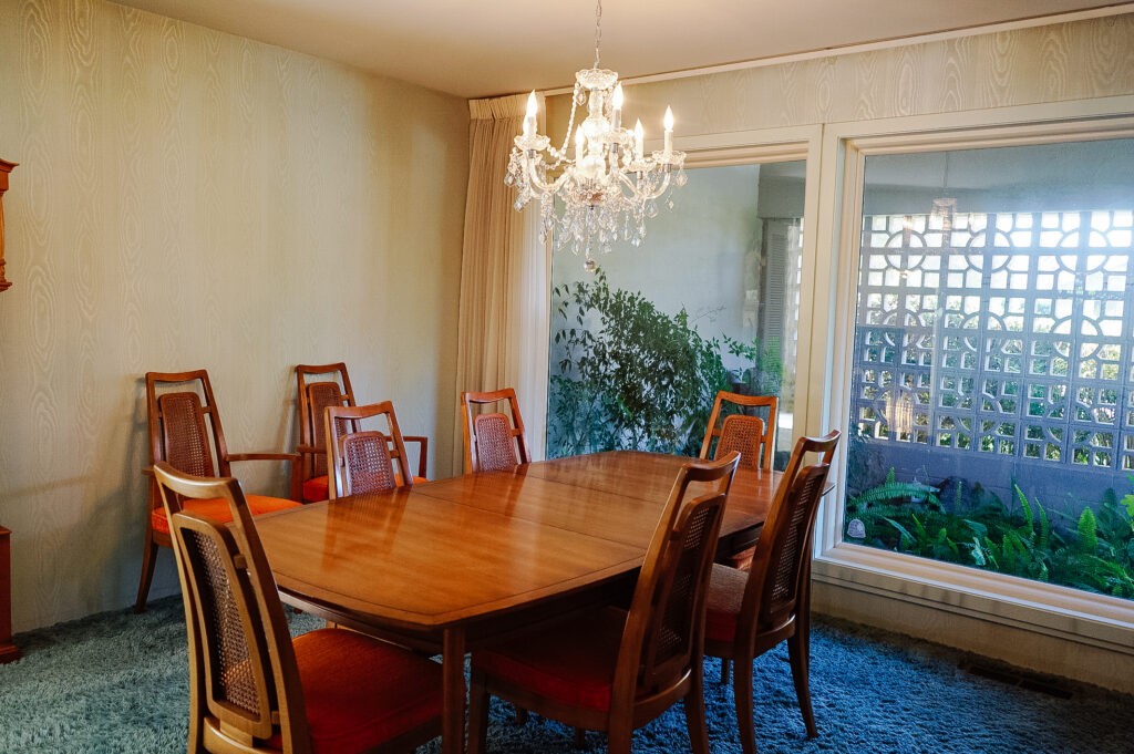
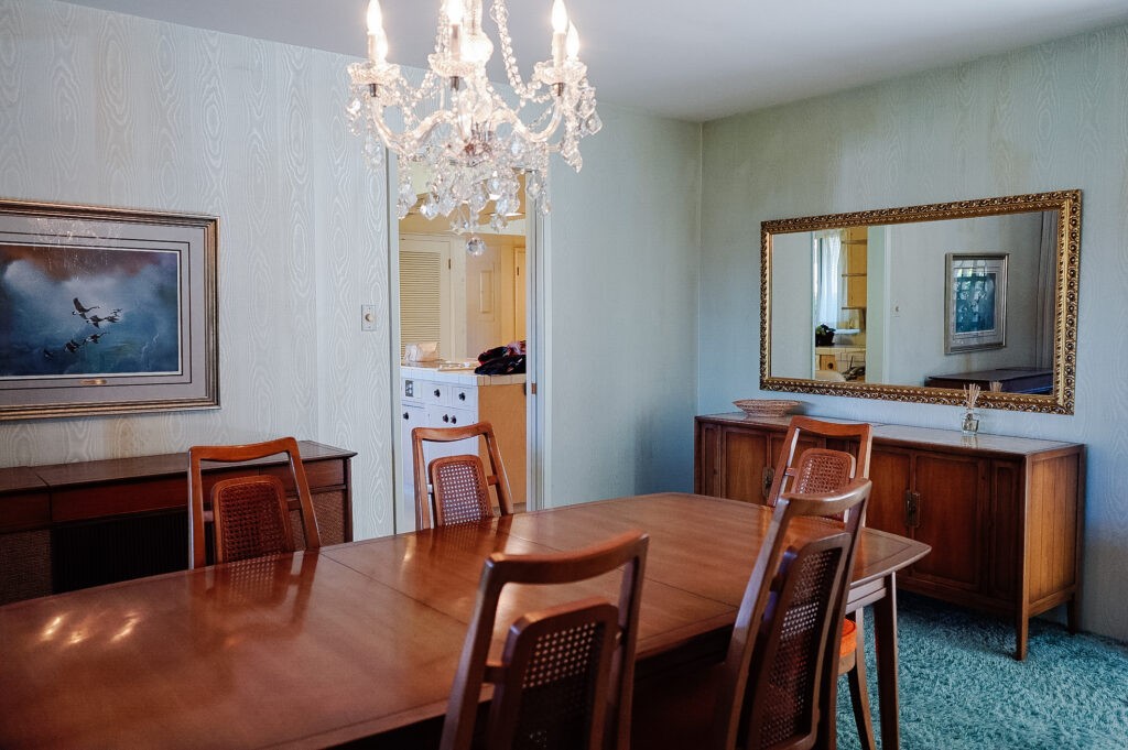
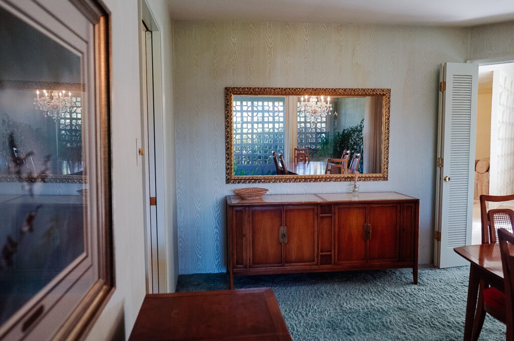
I love looking at the original photos of the house before we moved in. We are only the second owners and our home was built and lived in by one family since 1960. They took great care of it but it hadn’t seen many updates aesthetically since. Here are a few look backs at how it was: baby blue shag carpet, stained wallpaper and all.
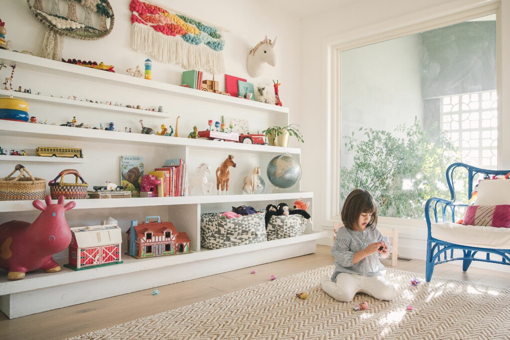
The Playroom
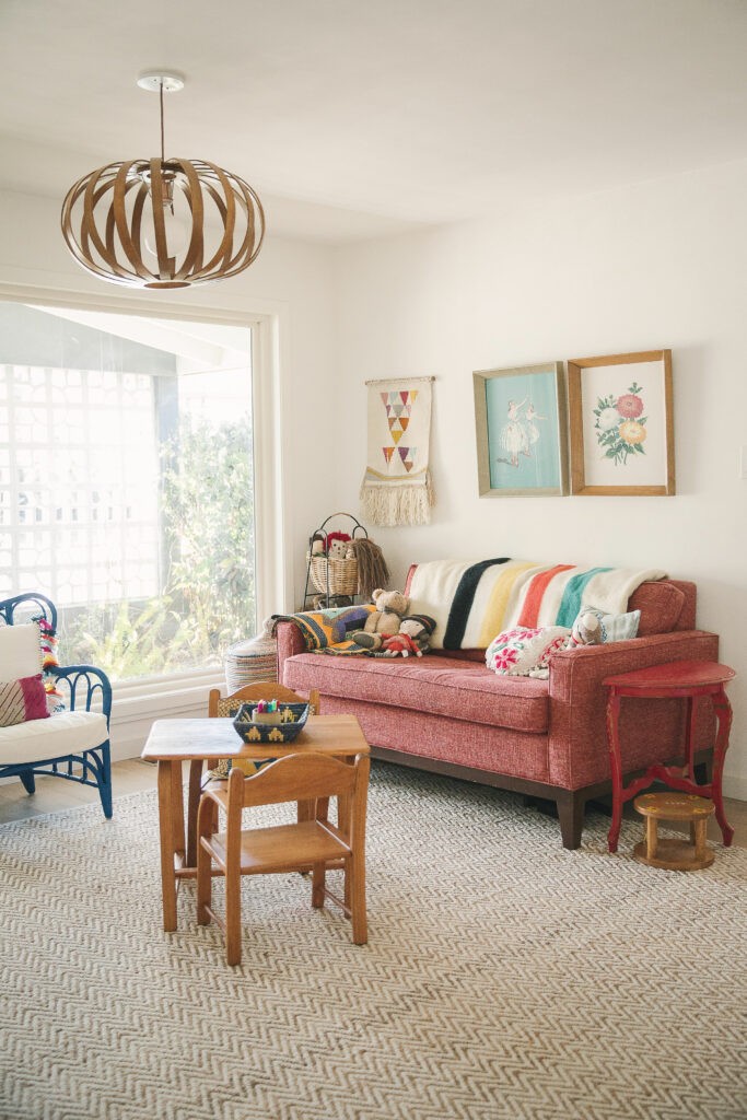
When we moved in in early 2017, our daughter was only 2 😥, and not ready to play independently on the other side of the house. The beauty of this room is its right in the center of the home with a view into the kitchen and family room so it made the perfect playroom for her. It was adorable, but always a mess so about a year ago I made the decision to simultaneously shuffle 4 rooms around to create a larger office space (read about that here), and voila, the dining room was back where it belonged. (Playroom photos below shot by Create & Gather for Sacramento Magazine in 2019)
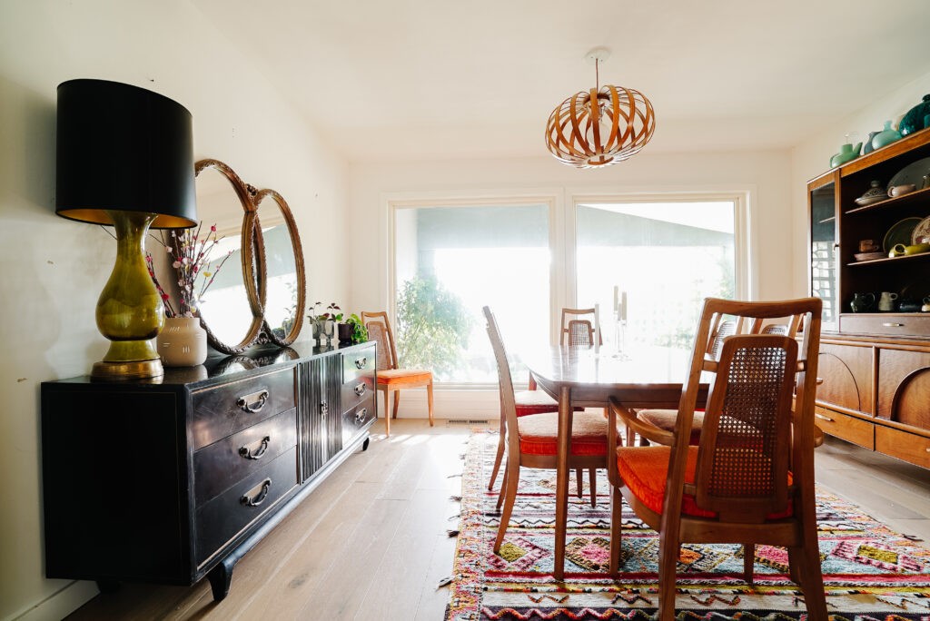
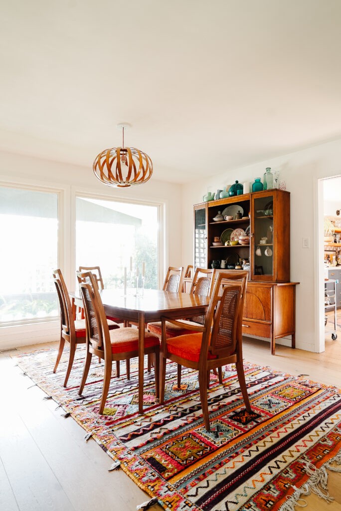
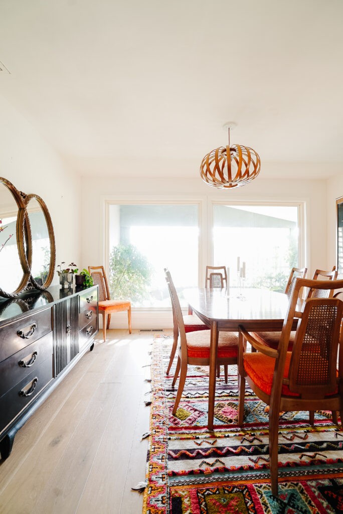
Currently
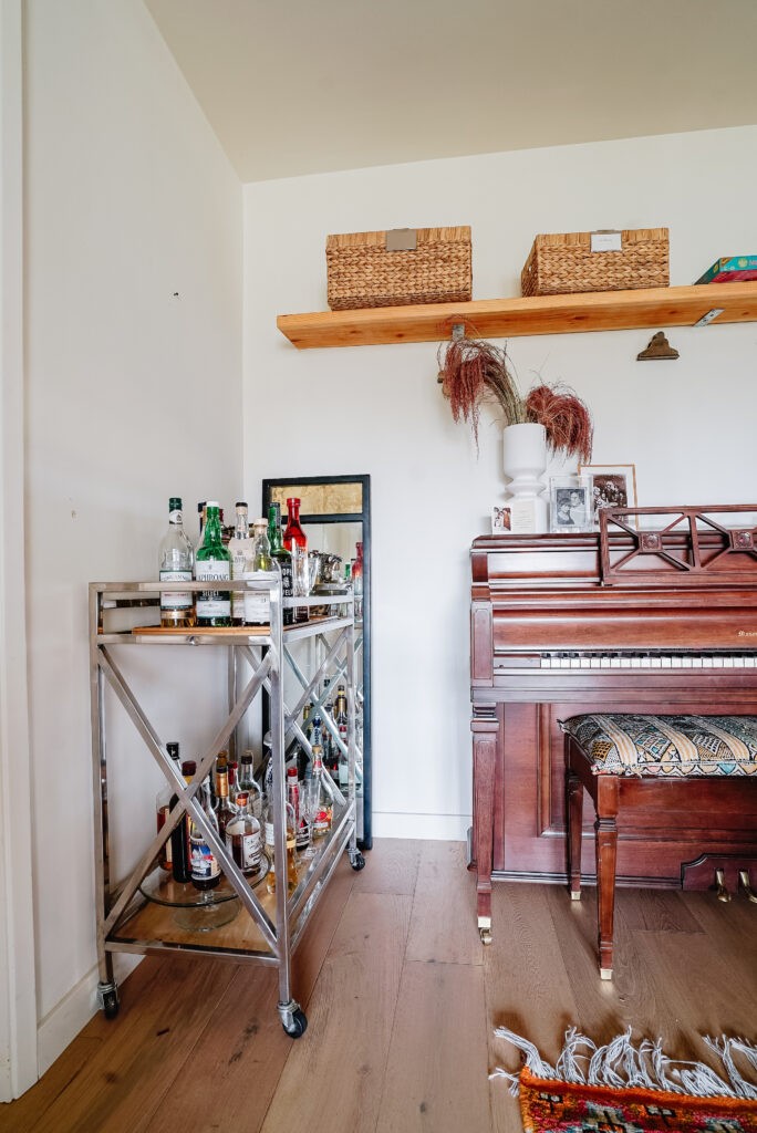
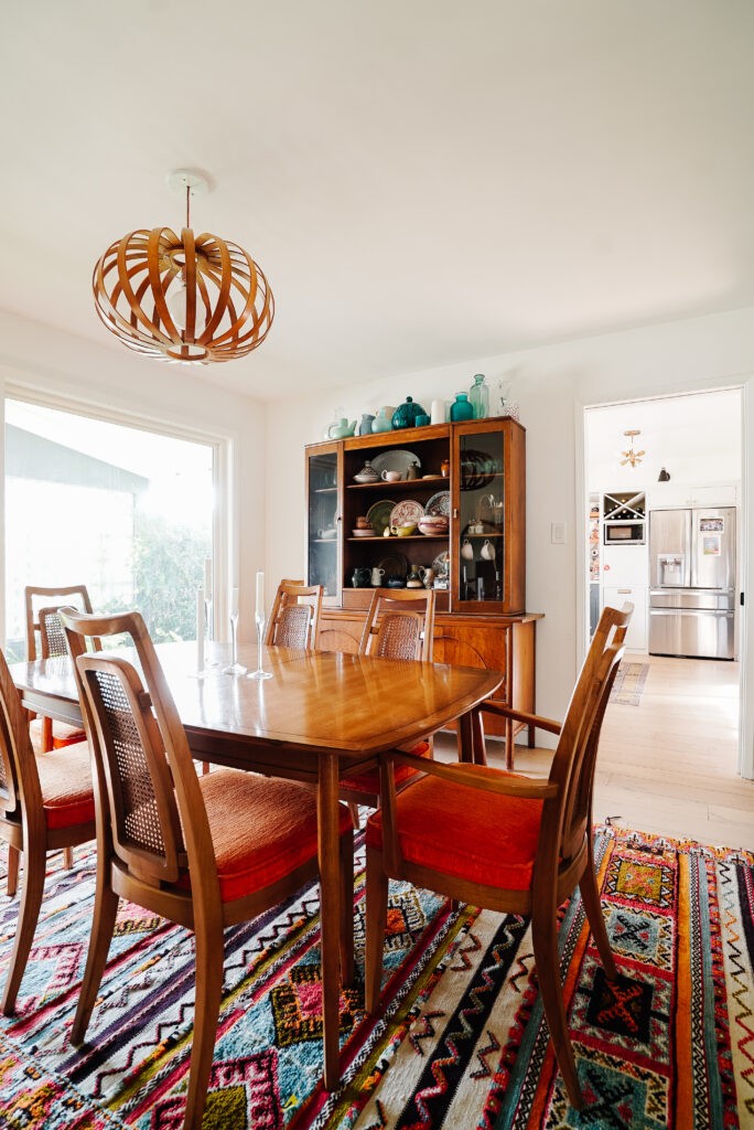
So when I did the Great Room Shuffle, I moved in all the furniture we had that was dining room related, and that’s about it. You can see that we kept the original dining set that came with the house and it will stay (with new cushions). Same with the piano and black buffet. Everything else will go! This current color scheme came together accidently and may have cured me of loving orange for life. The wood tones, the fabric, and the rug is just way too much and I need a break from that color.
The Atrium
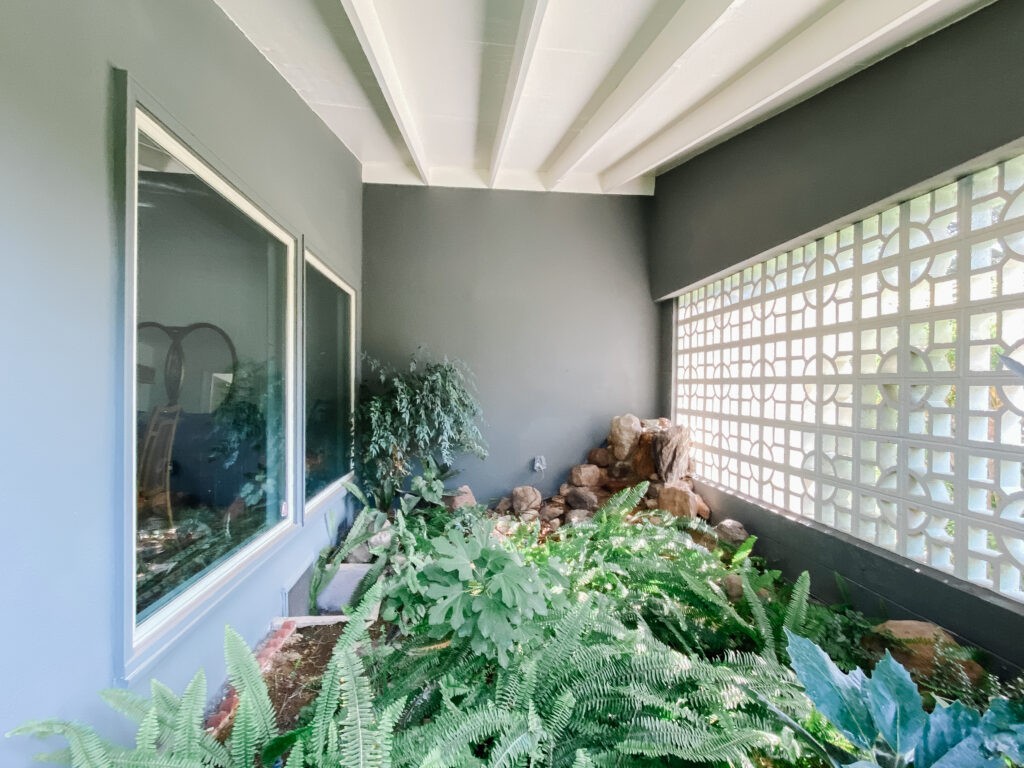
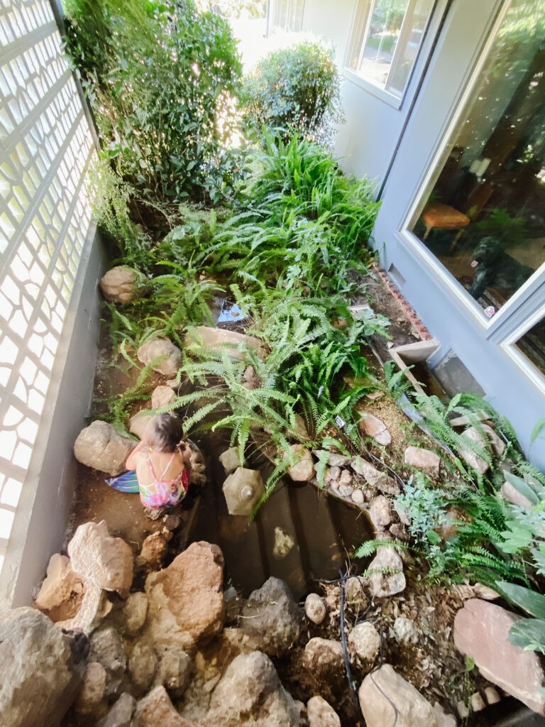
And now for the bonus room (because I’m a rebel and never stick with the “One” part of “One Room Challenge.” The reason I love the dining room so much is because it looks out to this little covered atrium that we’ve nicknamed the Fairy Garden. When I revealed the room on Instagram, most folks are most excited to see what we do out here. No pressure! We’re working with a pretty good foundation although its impossible to see it right now. There’s a lava rock fountain/waterfall that trickles into a good-sized little pond. We’ve had some issues with the sprinkler system in the past but we finally got it fixed and as you can see the ferns are really happy and now they’re taking over the entire space.
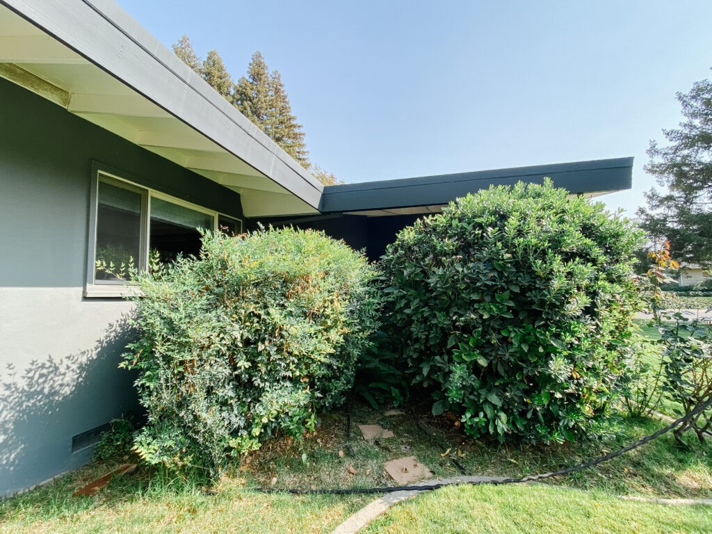
I’m trying not to play “When You Give a Mouse a Cookie” with this project but the entrance to the atrium is covered by these overgrown hedges that I absolutely hate. The heavenly bamboo on the left is also blocking a lot of light into our kitchen. We have them hacked down every year but I’m hoping we can get them dug out and rethink this area slightly to allow more light in.
Here’s a terrible photo I snapped from the top of the fountain but you can see that there are a lot of rocks, a little bridge and a a stone pathway. Of course I love this great breeze block wall that filters light and gives the dining room privacy. Basically the foundation is set but needs a more intentional plant scheme and some major cleanup. My husband has agreed to take on this area once I get him a plan, so that will be a big help!
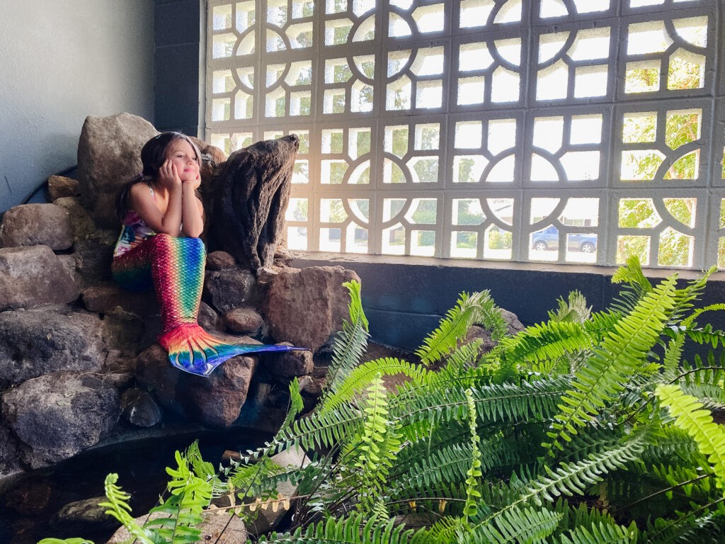
I’ll dedicate a whole post to this space but for now I’ll leave you with this wistful mermaid who incorrectly thinks she’ll be able to splash in here soon.
The Plan
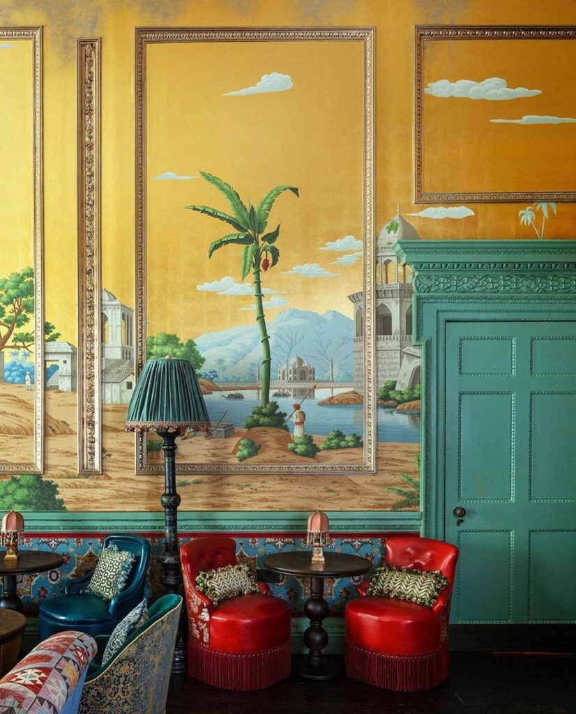
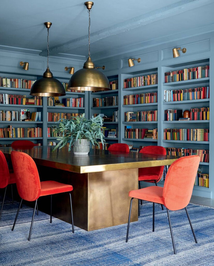
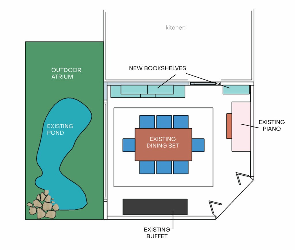
I’ll be back with details of the materials and design plan next week but let’s go over my intentions and inspiration. Here is the floorplan-you can see almost all of the main furniture pieces are staying put but I plan on making it all look completely different. Do you trust me?!
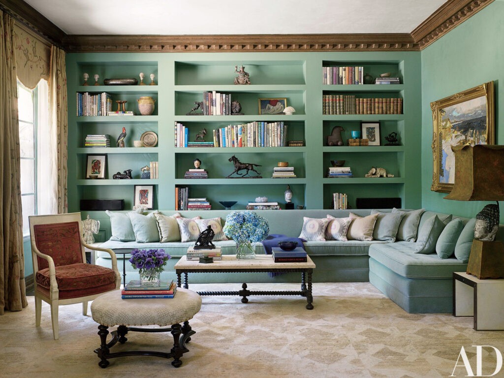
I want the room to be true to its midcentury roots but not necessarily modern. I want it to feel rich and lived in, representing a variety of interests. I’m not a historical preservationist and although I love and respect those who do it, I’m not trying to make this a time capsule to the 60s. But don’t worry, there will be plenty of vintage! Ultimately it will be a mix of eras, styles and textures with a huge dose of color. I hope I can pull it off.
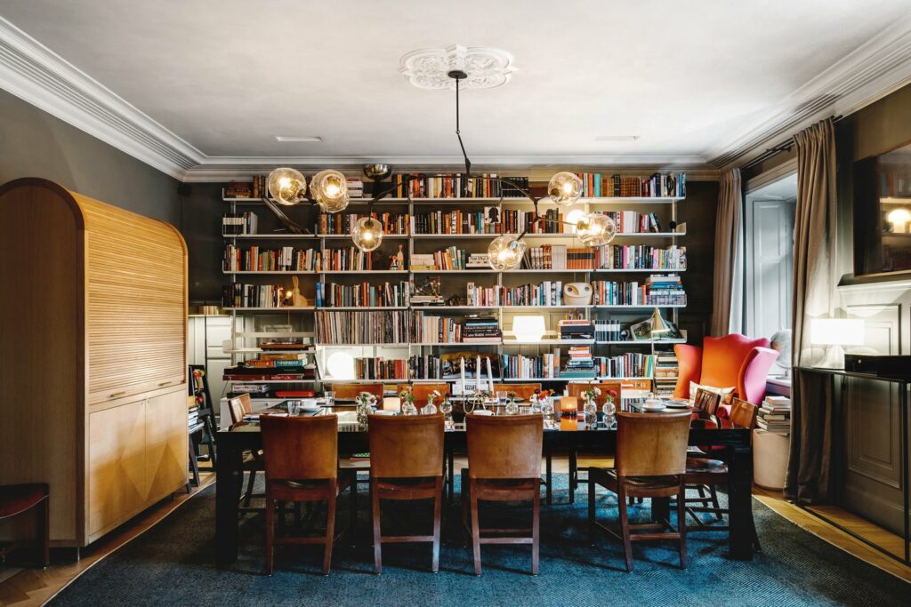
Via
Come back next week for all the materials, moodboard and a comprehensive design plan. I’ll also explain what’s happening with that fabric Desmond is sitting on up top. Have a great week!


