Confession: until recently, I’ve always been a little afraid of committing to pattern in my own home. My tastes can be fickle, adjust with my moods and change over time. When we were able to gut-renovate our master bathroom (pictured below) I knew I really wanted to do something patterned on the floor tile and let everything else remain simple and serene. But this was a big investment and I was nervous about pulling the trigger. When its your own home and money, it can be super scary to go bold on the permanent surfaces and fixtures. What if I hate it in 10 years? What if we need to sell and potential buyers aren’t into it? Well, those are valid questions but…
A. I’m most likely going to hate anything/everything 10 years from now
B. If I love it, someone else will too, or be willing to rip it out on their own dime
C. Life’s short, get the damn tile.

Two years later, I still love it and wouldn’t change any of the major pieces. I’ll probably switch around accessories and art soon but that’s no biggie.
When it was time to do our kitchen last fall I found myself in a similar situation but had now grown more comfortable with tile commitment. The one thing I knew for sure was that I am just not a white kitchen kind of girl. Don’t get me wrong, I think an all-white kitchen is beautiful and nothing will look as clean and sparkly. They will stand the test of time and a smart idea for resale. But I crave color, contrast and texture in my own home and since I was the client, I was going to get it!

When we were planning the renovation, I knew I was removing the upper cabinets and replacing with open shelving, painting the cabinets, but was stymied on the tile. It needed to be midmod-friendly, interesting, and neutral in color. I decided to get off Pinterest and make a trip to the best tile showroom in Sacramento, Natural Stone Design Gallery. Natural Stone literally has hundreds of the most beautiful tile made in the world and their staff is incredibly knowledgable. Being able to touch and feel the product was incredibly helpful.
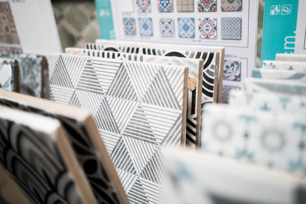
I told the team helping me what I was looking for and they looked at eachother and took me right to the back. They wanted to show me this new product that had just arrived and when I spied the Seamless Decor line, it was love at first sight. The pattern hints at midmod geometrics while having a soft organic texture that brought warmth and a relaxed style.
That pattern was going to be a bold move so I chose the 1×1 mosaic from the same line to be used behind the open shelving and limit the patterned tiles. I’m so happy with how the tile is a focal point but doesn’t completely steal the show.
If you’re looking for a tile to make a statement, there are so many styles to choose from at Natural Stone. From handmade cement to artisan glass, the choices are basically endless and I love that you can see, touch and feel what they have right there.
If you’re in the market for new tile and you want to get a little brave with pattern, here are my tips:
My tips on going bold
- If you’re going for a strong pattern with color, let it be the star of the show. Keep the rest of the materials neutral in color and mix wood, whites and metals.
- If tile is geometric or graphic, balance with natural textures and soft surfaces to keep the space looking warm.
- Choose a timeless pattern. I gravitate toward simple or classic patterns that aren’t overly ornate, scrolly or reminiscent of bad clip art (once a graphic designer, always a graphic designer 😂)
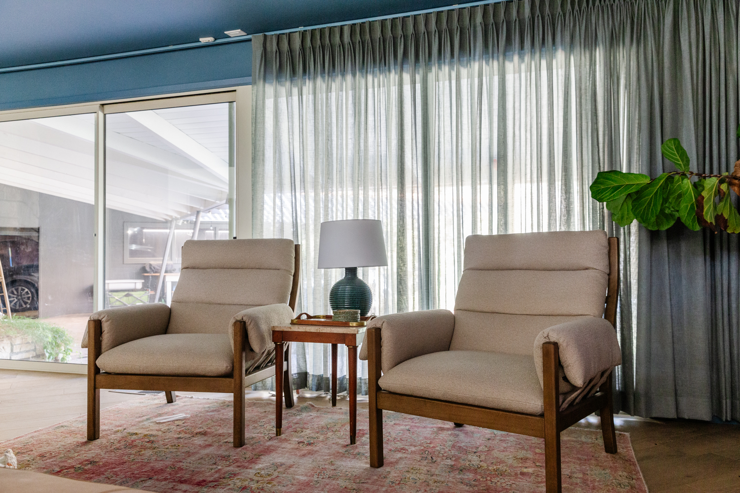
- You can mix patterns, just consider scale and keep a tight color palette. For example, in my kitchen I love the way our vintage oriental rug (below) complements the room because its a completely different scale and type of pattern–all over detail vs bold graphic–and the blue and grays connect with the cabinet and tile color.

More inspiration
Here are a few more inspirational photos I found and liked on the interwebs after my tour of Natural Stone Design Gallery.

Although this space is not quite right for my midcentury modern style house, it does work in modern farmhouse or traditional homes. Its bright and just a little bit sweet, but the tile pattern is timeless and can adjust to new furniture, wallpaper and accessories over time.

Inspired by Moroccan patterns, this hand-painted tile adds a little age and soul to this remodeled kitchen. The soft blues and warm grays keep the busy pattern approachable.
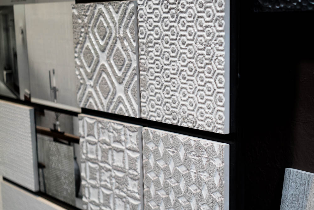
I’m obsessed with this tile line. Photos don’t do it justice but in person it shimmers, its organic, its modern, I just love it. It comes in this white and gray colorway but also in rich peacock blues as well as black with flecks of metallic. I think this tile could be the perfect way to add texture and pattern without committing to strong color.

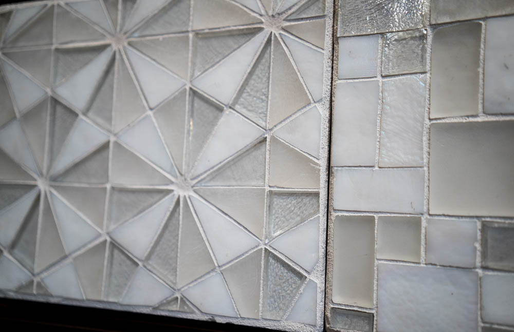
Glass tile can be hit or miss for me. I love how they look like shimmering jewels up close but can get dated quickly if you’re not careful. I was drawn to this mix of iridescent and matte tiles that play off each other to create a subtle, but interesting geometric pattern.

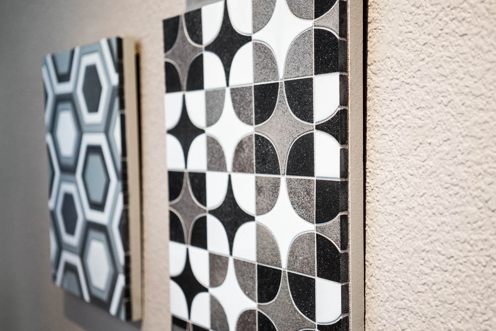
“An homage to David Bowie’s Ziggy Stardust character, the Stardust Collection is inspired by ’70s interior design, early new wave, space exploration and the textural surface of the moon.” Ya, with a description like that I couldn’t not include the Walter Zanger Stardust collection. This collection makes a big statement but I would argue that the shapes are classic and if done right will look amazing for years to come.
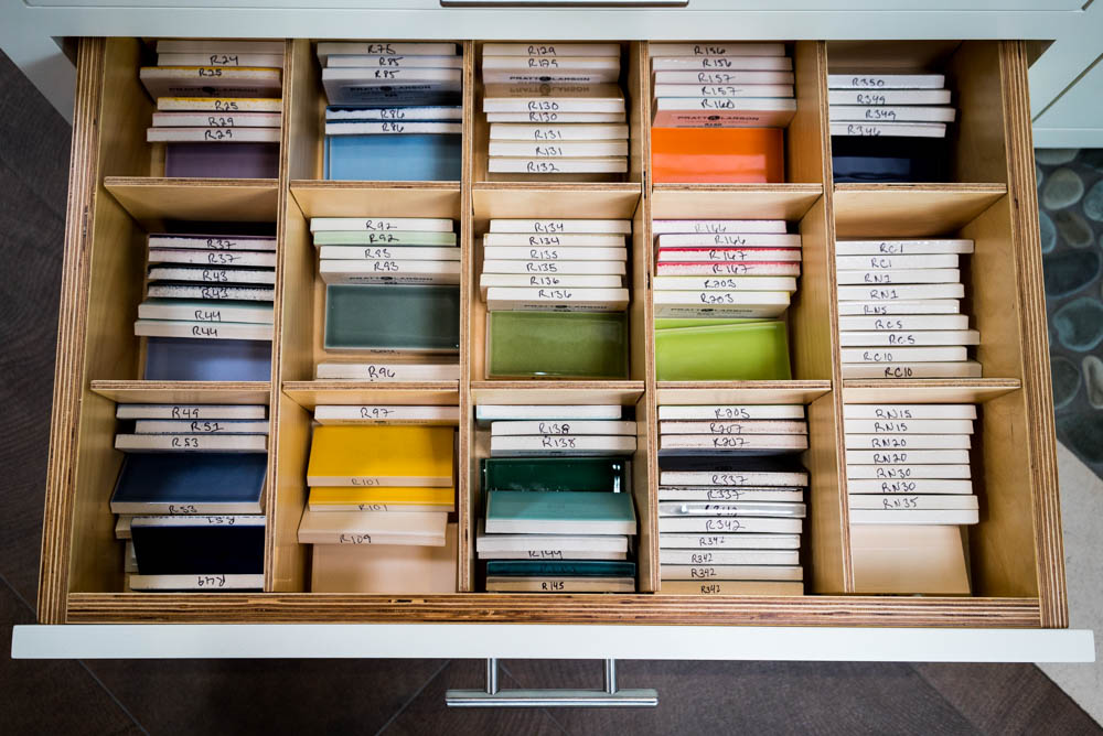
For over 25 years Natural Stone Design Gallery has provided exclusive, high-end brands and excellent customer service to homeowners, designers, architects, and contractors in a friendly, welcoming atmosphere. Their gallery showcases a wide selection of beautiful, quality stones and tiles with hundreds of styles to chose from! Thank you Natural Stone!!
*This post is in partnership with Natural Stone Design Gallery, all words, designs and opionions are my own.






5 thoughts on “How to Make a Statement with Tile”
“Get the damn tile.” I’m going to remember this when I do my kitchen.
Put it on a post-it. 😂
It’s perfect time to make some plans for the future and it’s time to be happy.
I’ve read this post and if I could I desire to suggest
you some interesting things or suggestions. Maybe you could write next
articles referring to this article. I wish to read more things about it!
I am not positive where you’re getting your info, however good topic.
I must spend some time studying much more or figuring out more.
Thank you for fantastic information I used to be looking for this information for my mission.
Way cool! Some extremely valid points! I appreciate
you penning this post and the rest of the site is very good.