Hi! I’m Rebecca designer and founder of Studio Plumb. In January 2017 we became the second owners of the #plumbmidmod, a one-of-a-kind 1960 midcentury ranch on .8 of an acre outside of Sacramento, California. It has unique original architectural details, a creek running through the yard, and a perfect floorplan. It also needs a sh!#t ton of work. Bit by bit with the help of my dear old dad we’re bringing it back to its former glory with a modern spin.
Cue Etta James––aaaat laaaaast!! The dining room of my dreams is complete! This was our 5th One Room Challenge and in typical famous last words, I chose the dining room because it “would be easy.” No walls moving, no plumbing, just a little electrical, all the furniture /floorplan stayed the same and everything else was cosmetic. But we almost killed my dad in the process, our house is a disaster and I have been covered in green paint for weeks but everyone and my marriage survived.
Before we dig in I just have to thank Linda Weinstein and the team at One Room Challenge for keeping this event going this year. I was in the Featured Designer class of Spring 2020 when COVID-19 first hit, and saw first hand how supportive she truly is and all the work that goes in behind-the-scenes. The intention of the ORC is to be motivating and community-building, which is why I keep coming back for more. Thank you Linda!! And the media sponsor, Better Homes & Gardens who legitimizes everything we do and makes this all possible!
Now let’s take a quick peek at where we started.
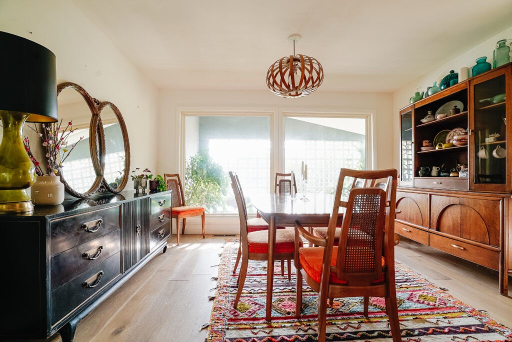
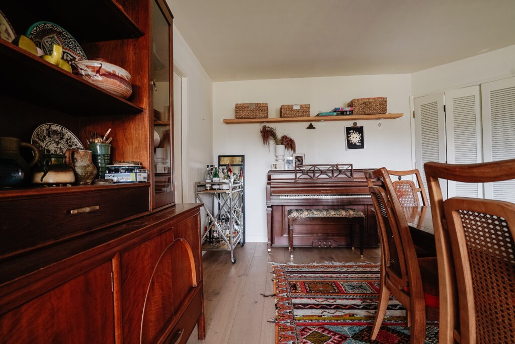
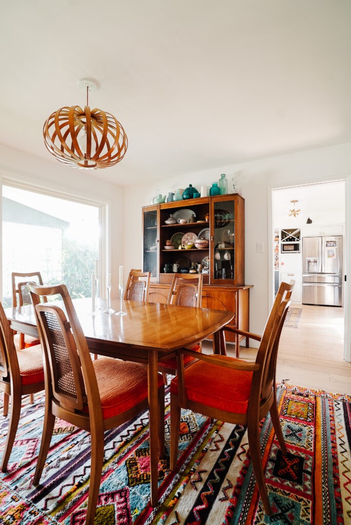
This room has seen several transitions starting as a dining room when we purchased it, we turned it into a playroom, and last year back to a half-assed dining room but without intention and there were still remnants of the playroom hanging on the walls. It opens into the kitchen and the front entry hall so she’s been begging to live up to her full potential. Friends, I think we did it:
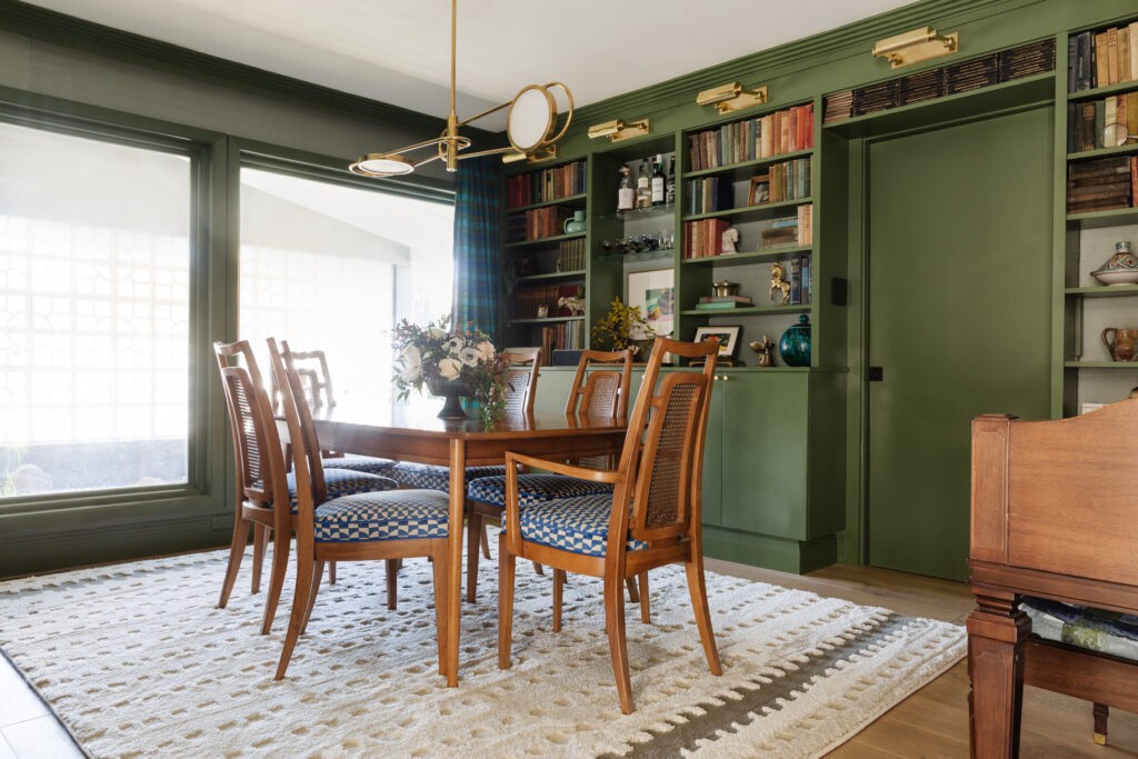
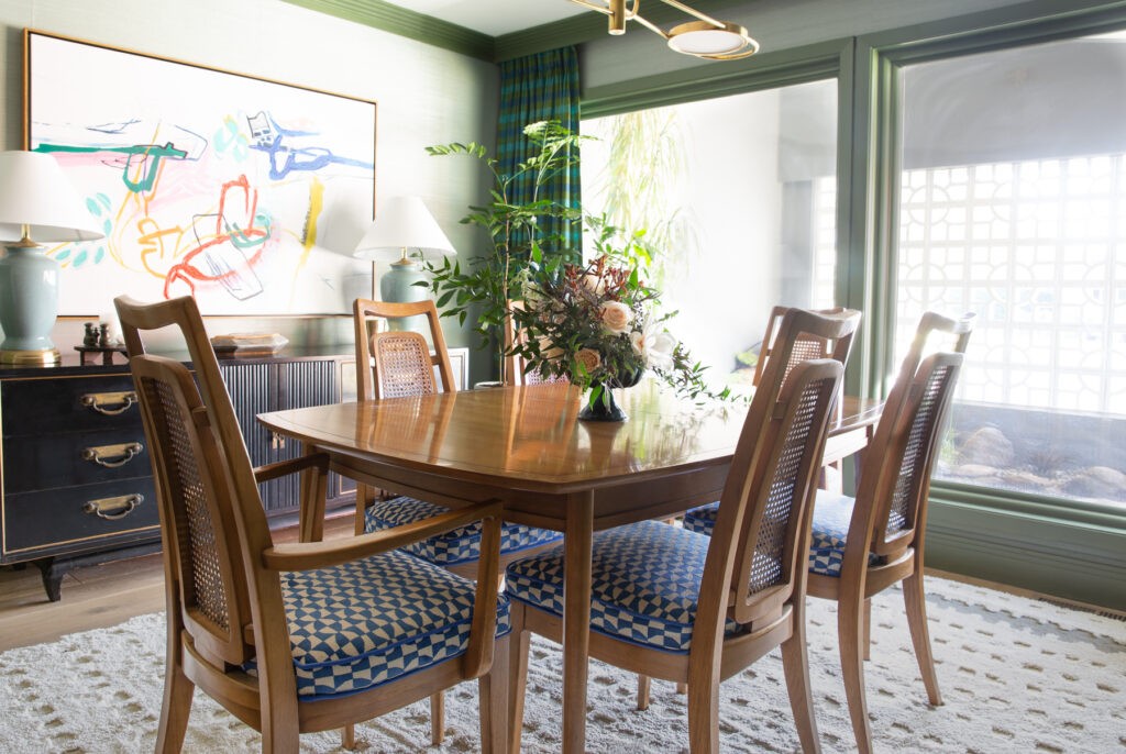
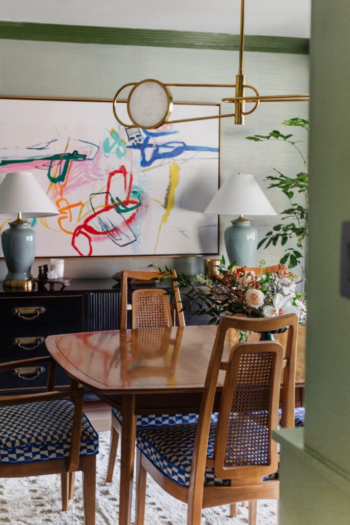
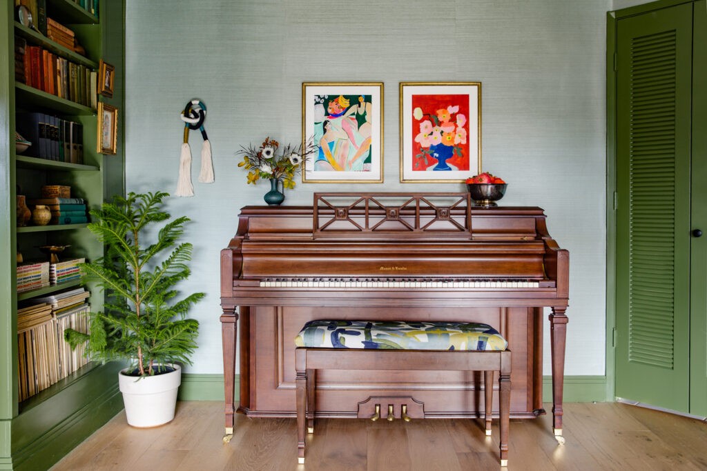
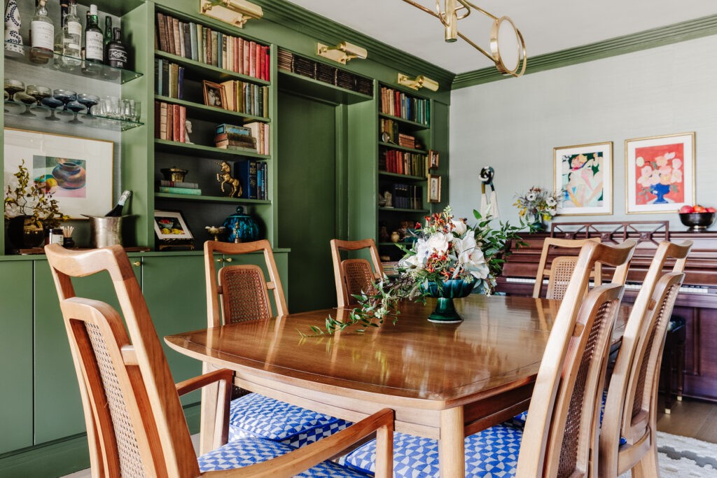
The biggest impact of course comes from paint and those grasscloth covered walls. If you follow me on Instagram you know I hit some snafus getting the right adhesive, but I figured it out and am proud to say I got it all done. The texture adds so much subtle warmth, reduces noise and has a subtle shimmer that I am obsessed with. Thank you York Wall Coverings for your generosity!
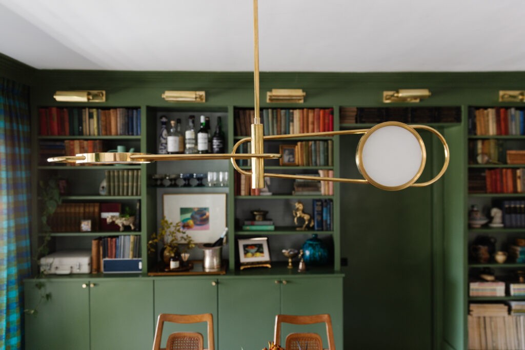
What’s kind of amazing that literally all the furniture is exactly the same and lives in the same place. Except of course for the hutch which turned into a full built-in. So about those. Would you believe the entire wall is a $500 Ikea Hack?
You can see the framework better below, but the whole thing is made up of two short Billy bookcases, one tall Billy bookcase, two Sektion upper kitchen cabinets (36w x 15d x 30h) and one smaller Sektion in the middle (18w x 15d x 30h). All the Billys are hung upside down so we could cover their original bases with trim. My dad is really proud of how this came together and wants to take full credit for engineering it.
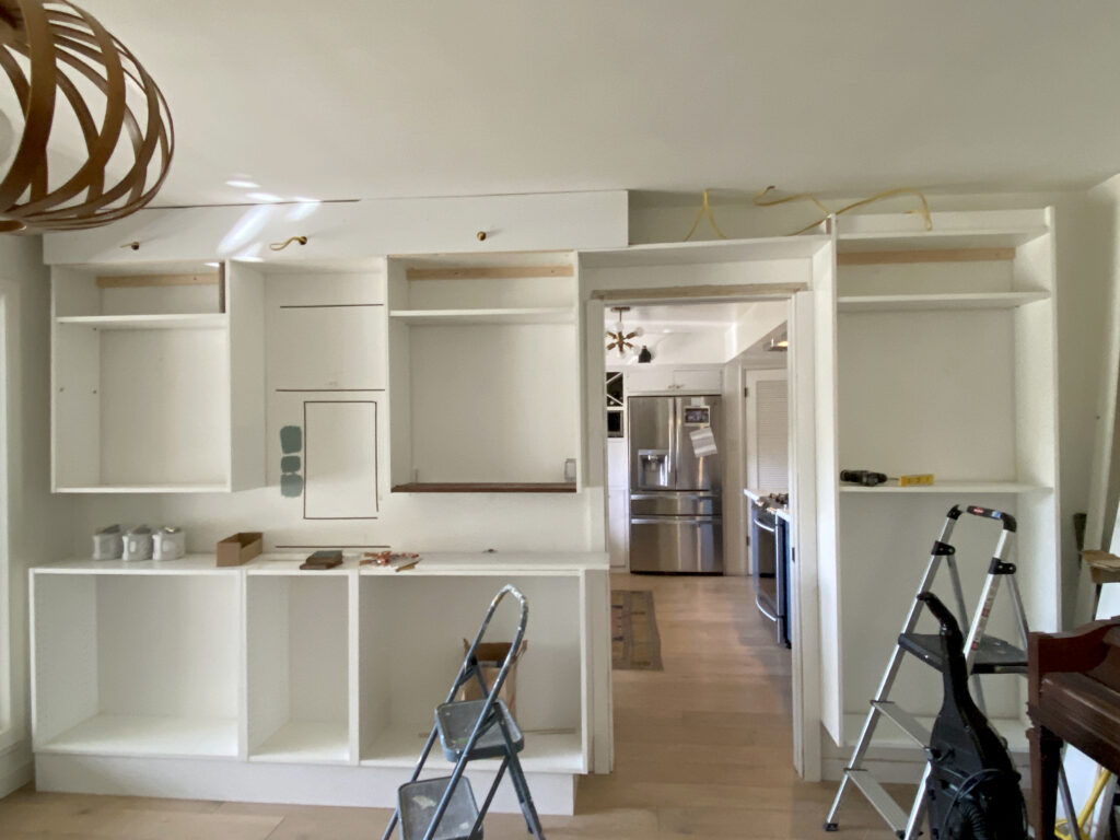
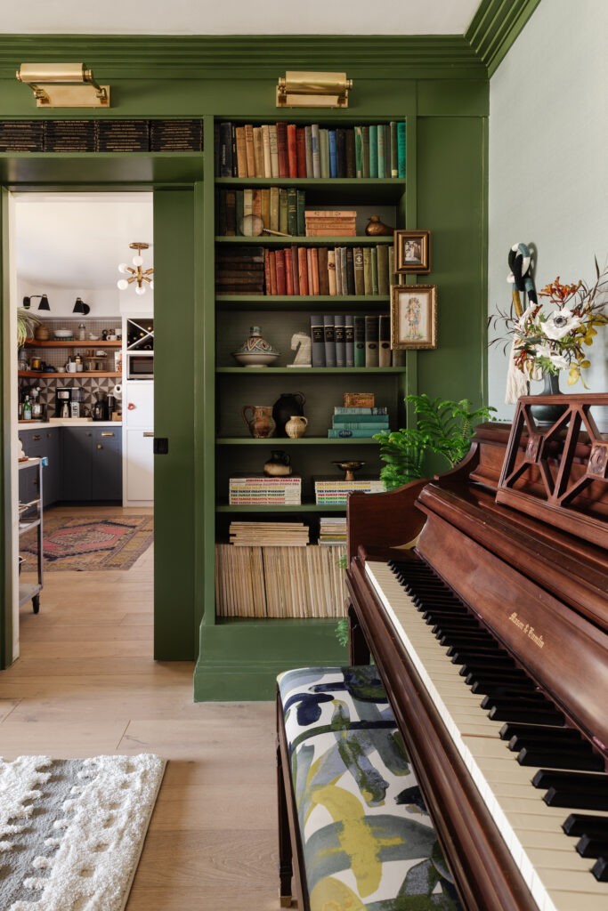
That and a whole bunch of trim became this! The crown moulding and baseboards were donated by Ornamental Moulding, who I worked with on my bedroom in the Spring. This sawtooth design is both modern and traditional and love how it elevates the sophistication while also making the ceilings feel much taller.
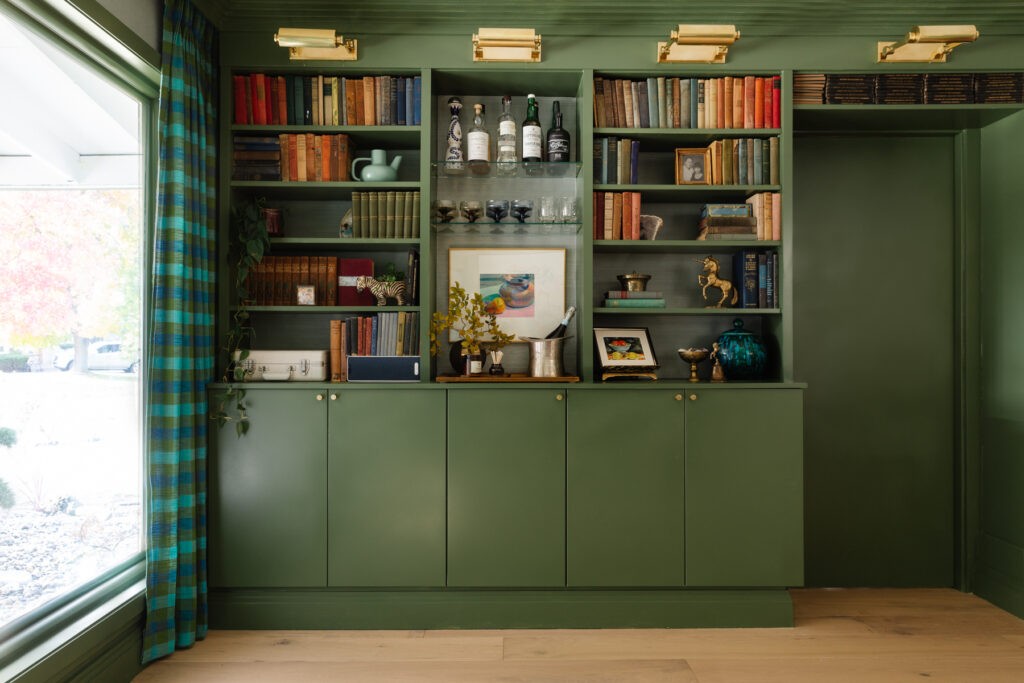
After all the paint hemming and hawing, I’m thrilled with the green. It’s Sherwin Williams Oakmoss and somehow manages to be serious and playful at the same time.
We ended up with an awkward space between the Billy bookcases so I decided to treat this area differently and had glass shelves cut to fit. It was such a simple solution but gives us a dedicated bar area while creating a focal point on the wall of shelves.
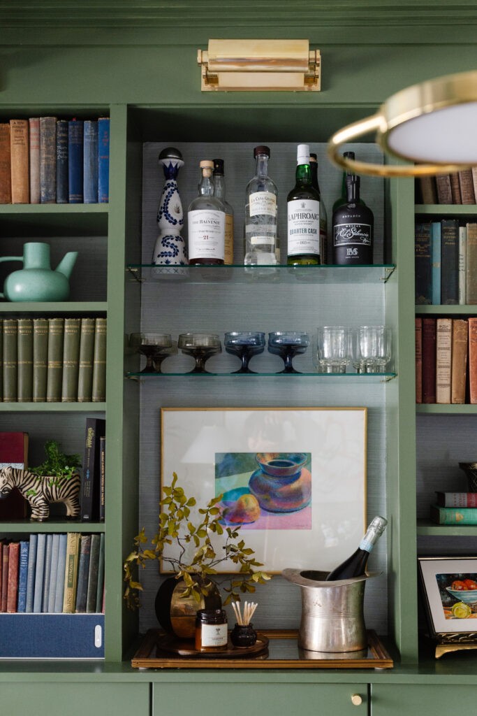
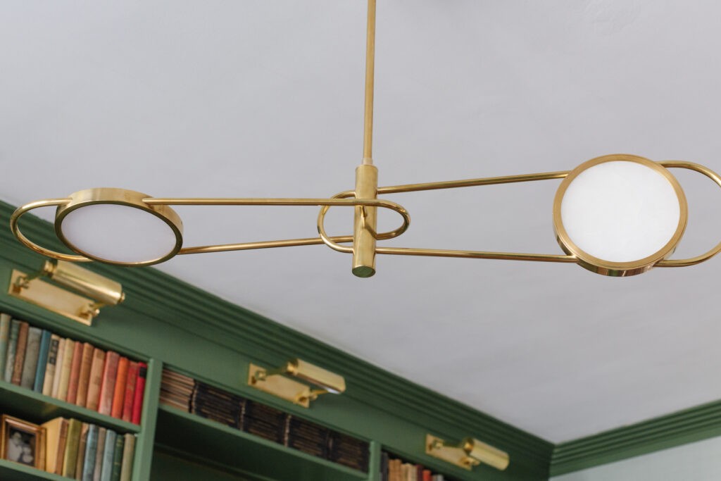
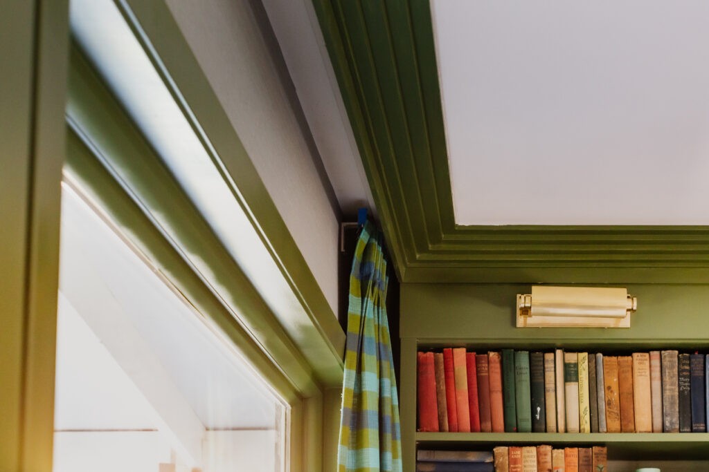
As for the lighting, I knew I wanted picture lights over the shelves. I’ve always loved the glow they cast and these, gifted by Hudson Valley Lighting, are solid brass and GORGEOUS. If you know me, you know I like to decorate with a mix of high/low items. The shelving may be an inexpensive hack, but the rich paint color and finish of the brass takes it all up a major notch.
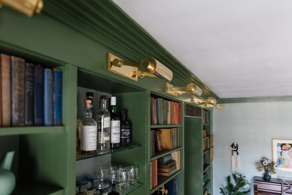
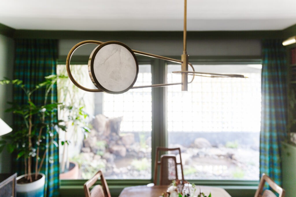
The chandelier, also generously donated by Hudson Valley, is so incredibly cool. It is modern and glam, and space-aged but the LED shades are made of alabaster plates (like I have in our bathroom). Quality lighting is legit, folks.
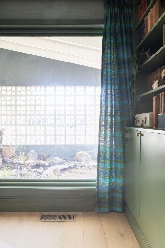
I was asked what the main inspiration piece that jumpstarted the concept was, and I have to say these drapes. I knew I wanted a formal pinch pleat but also knew I didn’t have the time or budget to have them made so I started hunting for vintage curtains on eBay to see what was there. And then I found them! Pristine barkcloth panels from the 1960s in the colors I was looking for and a pattern that felt like me. The only problem was that they were 8″ too short and there wasn’t enough to cover the window width either. The width was ok since we didn’t plan on closing them for privacy, but I had to bring the big guns (my mom) to help piece the panels together to increase length. She cut up part of one panel to add to the length and then we hid the short curtain behind the built in. It’s there to add dimension to the top, but the bit that lies behind the cabinet is about 30″ too short. Ha!
We also hung 2 short Ikea tracks behind the crown moulding to give it a custom look and save money on hardware we didn’t need to be operational.
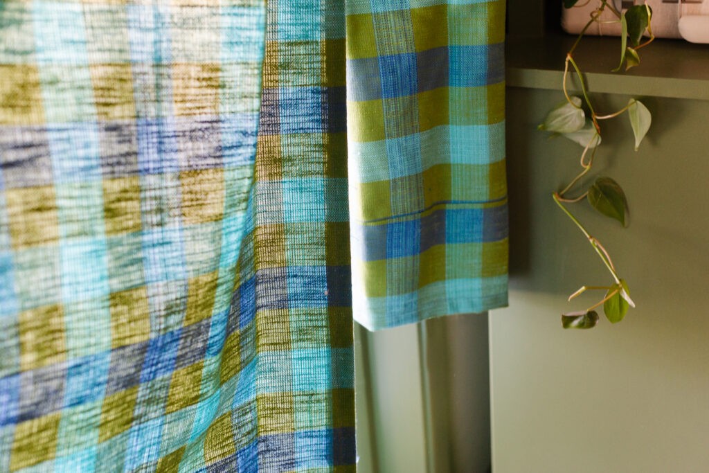
Speaking of funky fabrics, how about those chair cushions?! I took a risk with these and was nervous all the way into the moment I brought them in to photograph. I.LOVE.THEM.SO.MUCH. I worked with Fabricut on the upholstery fabric for the chairs and the piano bench and it just adds so much drama. The original seat cushions were pretty tired, and the orange made the wood of the dining set look really warm and its beauty was lost. I have fallen in love with this set all over again seeing it with the cool tones of the new colors.
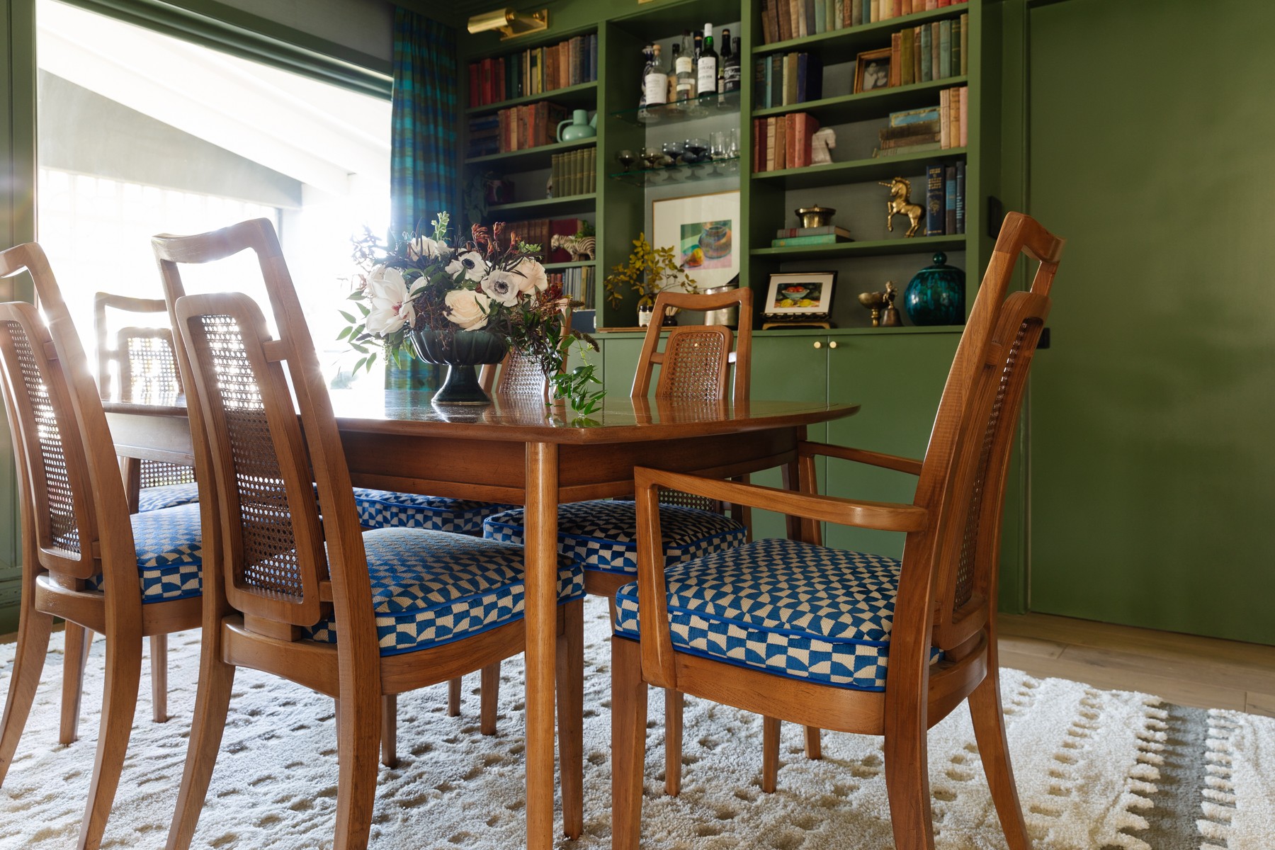
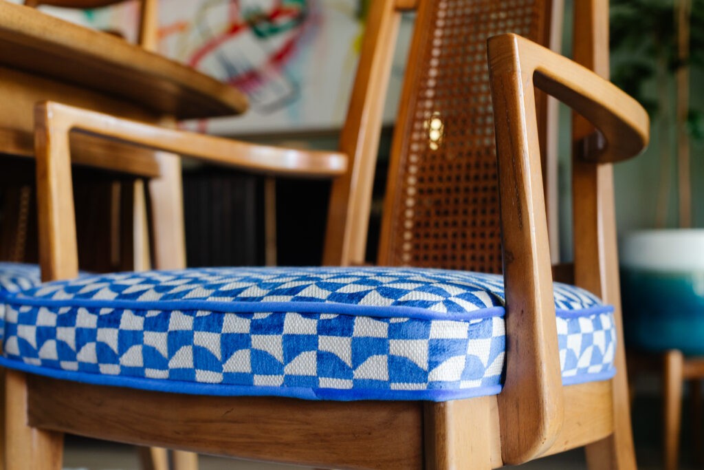
I had my upholsterer replace the foam so they’re super comfy, and we found a cobalt velvet for the welt to give it some definition. Bonus they are a soft chenille in an Alta Performance fabric so they’re easy to clean, and liquids bead up on the surface.
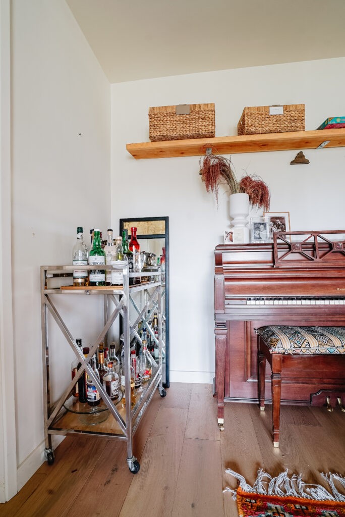
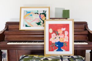
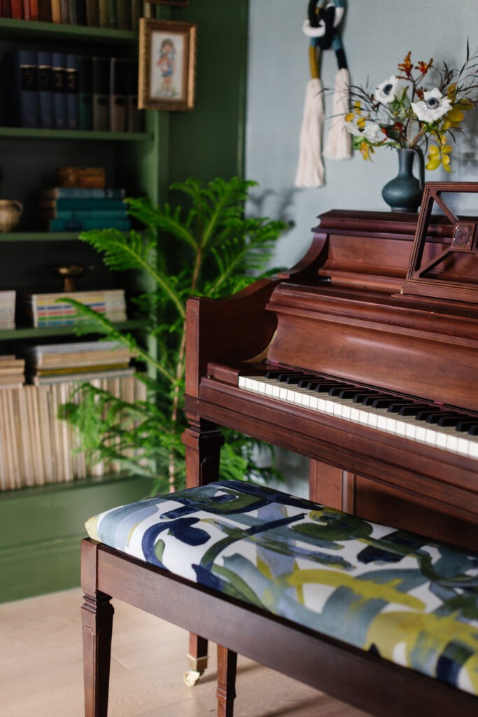
I wrapped the piano bench in this fun, sketchy fabric which gives the whole piano new energy. If you have a piano, swapping out the bench fabric is the easiest project ever. Just wrap the foam in batting and use a staple gun to fasten it. Or, if like me, both of your staple guns don’t work and you’re shooting in 20 minutes, get out your trusty roll of duct tape.
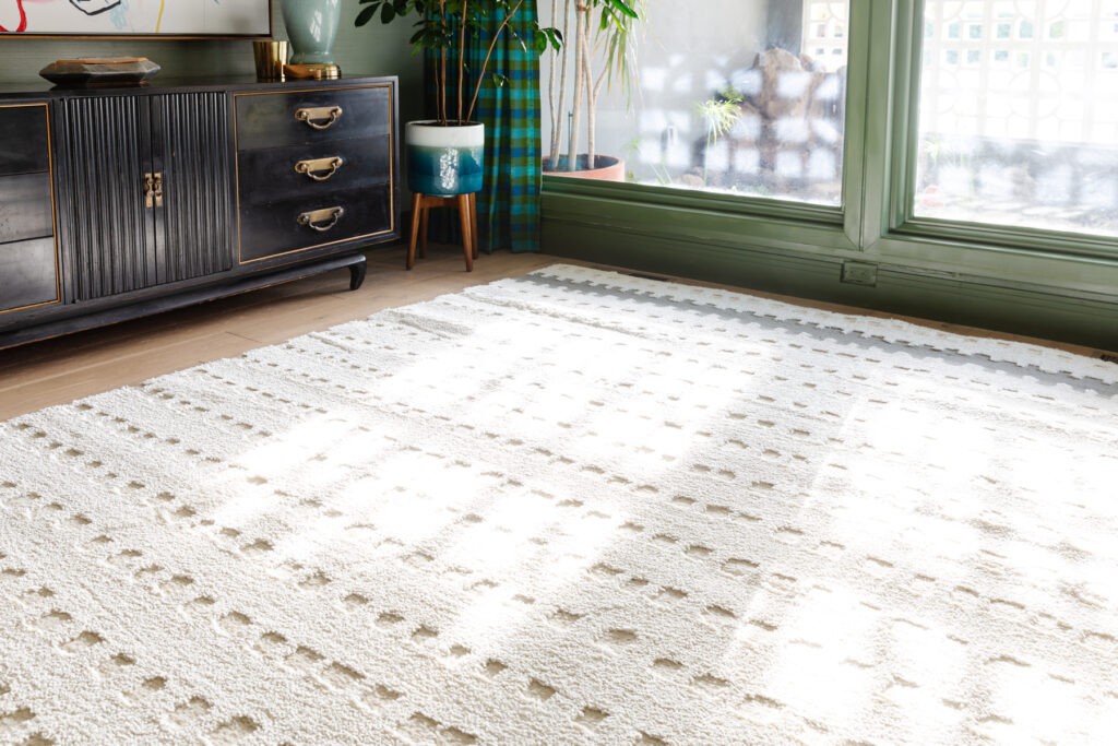
With so much going on with the fabric patterns and wild paint color, I wanted a rug that was light, bright, and simple. I worked with Mohawk Home who provided this super cozy rug and rug pad. The rug is pretty cream color made from an eco-friendly yarn created from recycled plastic water bottles. It’s so soft, my husband took his shoes off for dinner so he could feel it underfoot. That and the thick rug pad underneath has made it Desmond’s favorite new hangout.
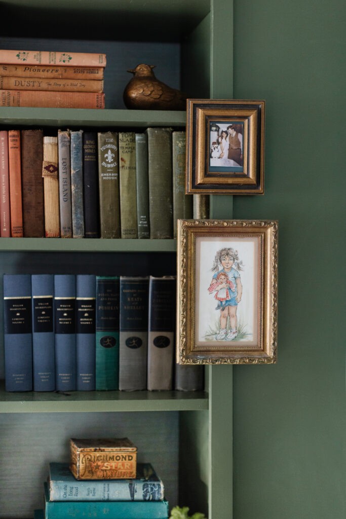
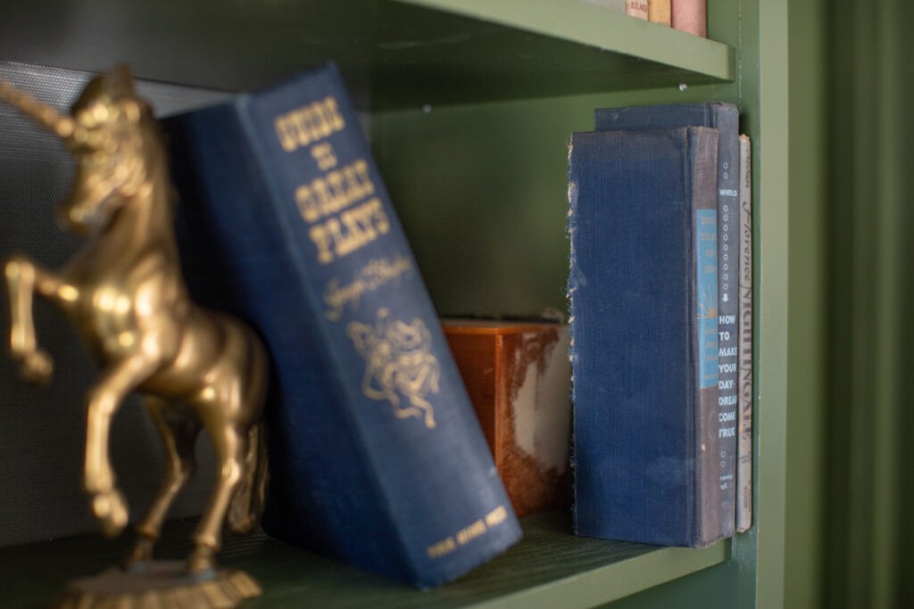
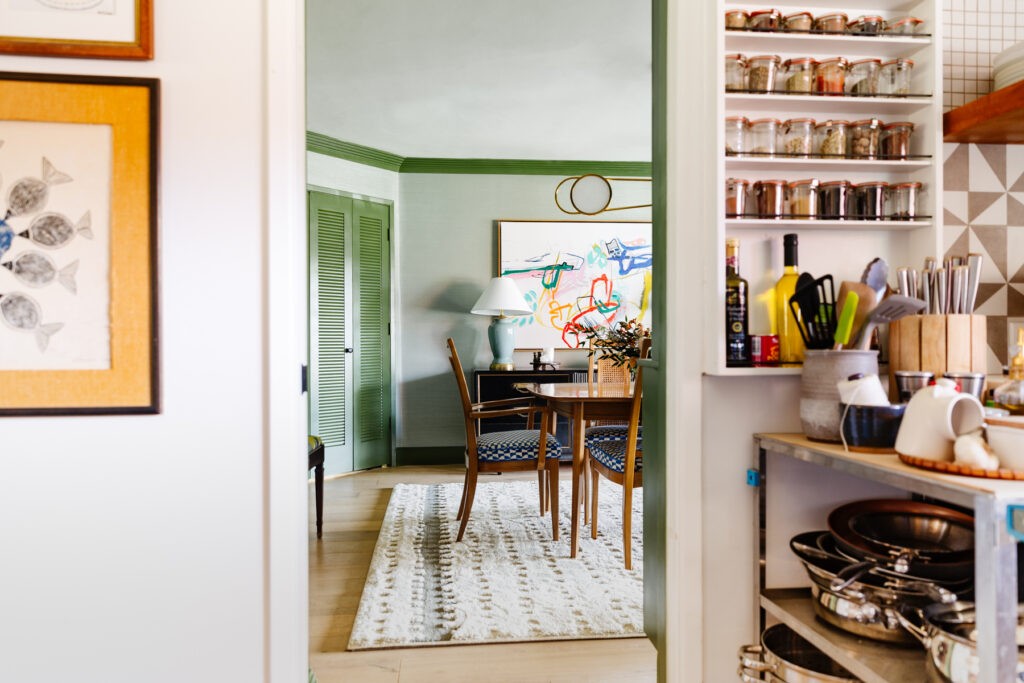
Let’s take a peek at a few details before we head outside! The old books are from a crazy, scary, fun Facebook Marketplace score–they’re pretty dusty but the muted covers are my favorite thing and I got them for $1 ea which was amazing considering I needed atleast 200 of them.
You may have caught this on Instagram but my dad built a little box to cover some wiring and then chopped some books in half to cover it up. My mom called them “short stories.” 🤣
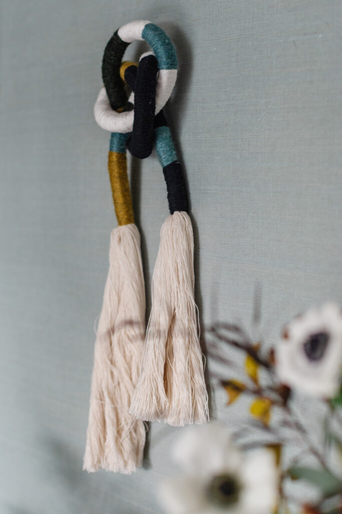
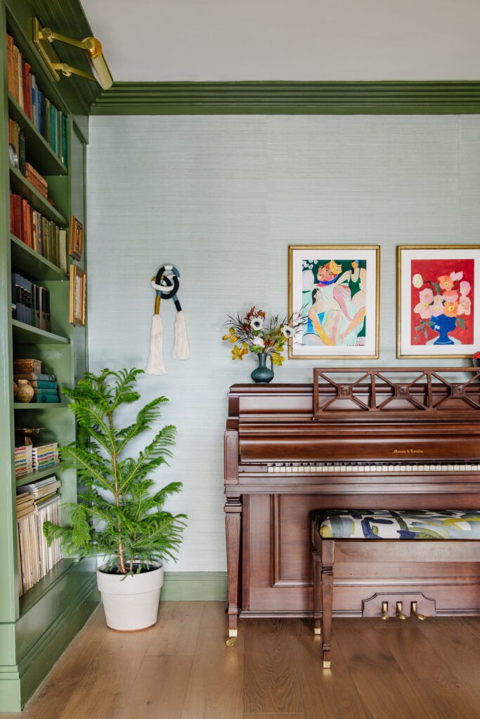
The knotted tassel was made by my friend (and eyebrow whisperer) Kristene at Paper & Pom. These pieces are so cute and perfectly giftable.
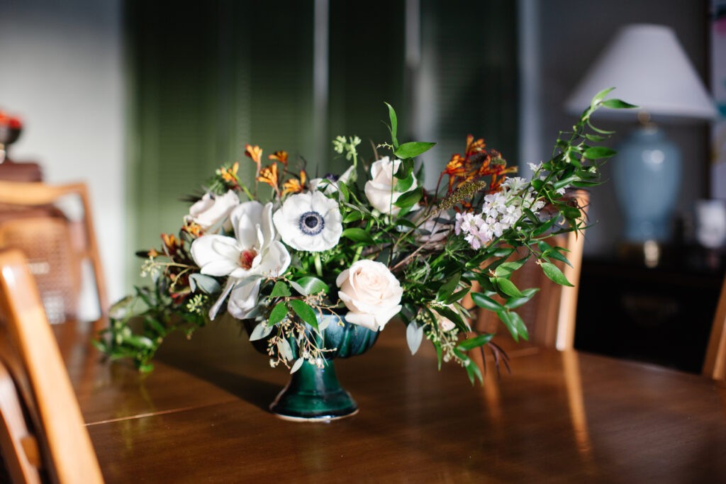
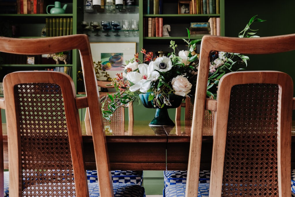
This centerpiece!! Total show stopper by Kari of Olimar Studios. I gave her some direction (including the requirement of anemones) and she killed it.
I wanted the art to be oversized, energetic, vibrant and modern. I looked for what felt like forever for the right artwork that would pair well with the vintage sideboard, but add contrast, and not feel like another older piece. This one was made-to-order from Leftbank Art, a trade resource for designers, but you can see more of the artist’s work on his website. And if you were following my Great Lamp Hunt, I really lucked out with these that my friend found thrifting ($8 ea!) I had to get new lampshades, but the color could not be more perfect.
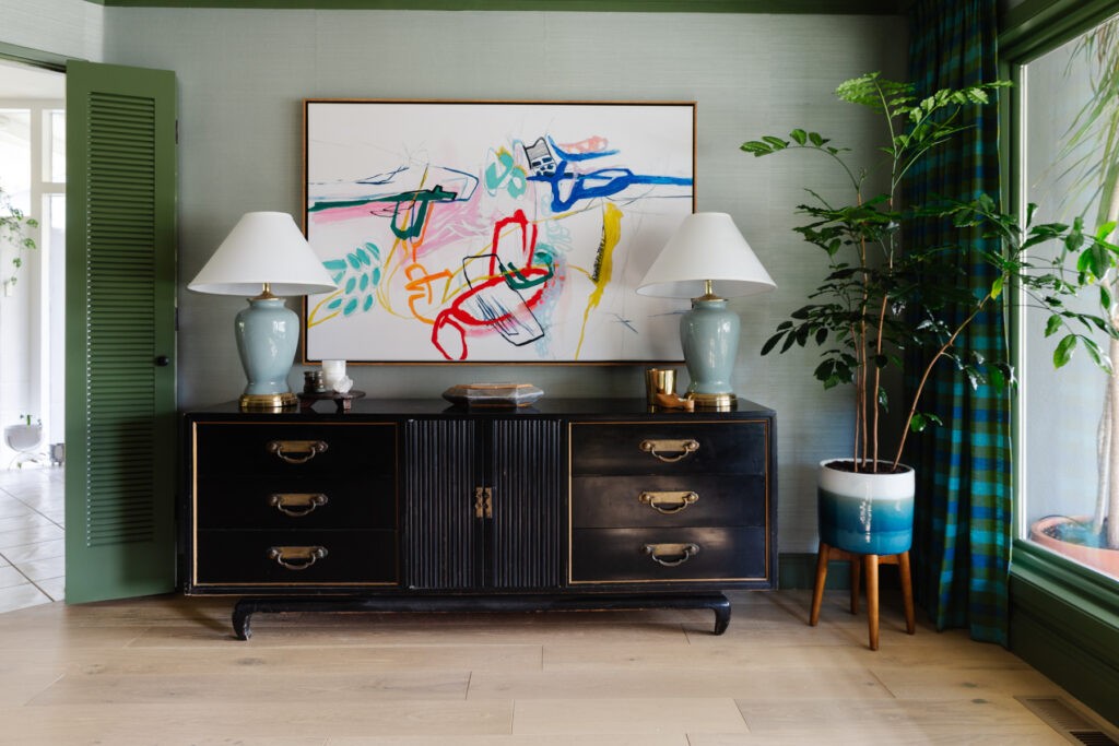
Of course, no space is complete without some living, breathing plant babies so I picked up a couple trees from my friends at Green Acres Nursery & Supply. This little Norfolk Pine is giving some apropos holiday energy, but I’ll love her year round. I picked up the art from Artfully Walls and framed them myself inexpensively.
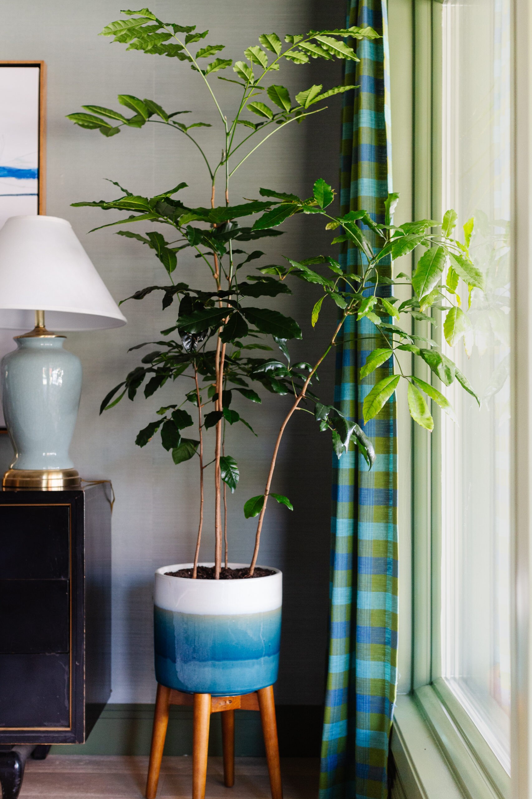
This one is a Natal Mahogany and I love her wispy stems and lacy foliage in this corner.
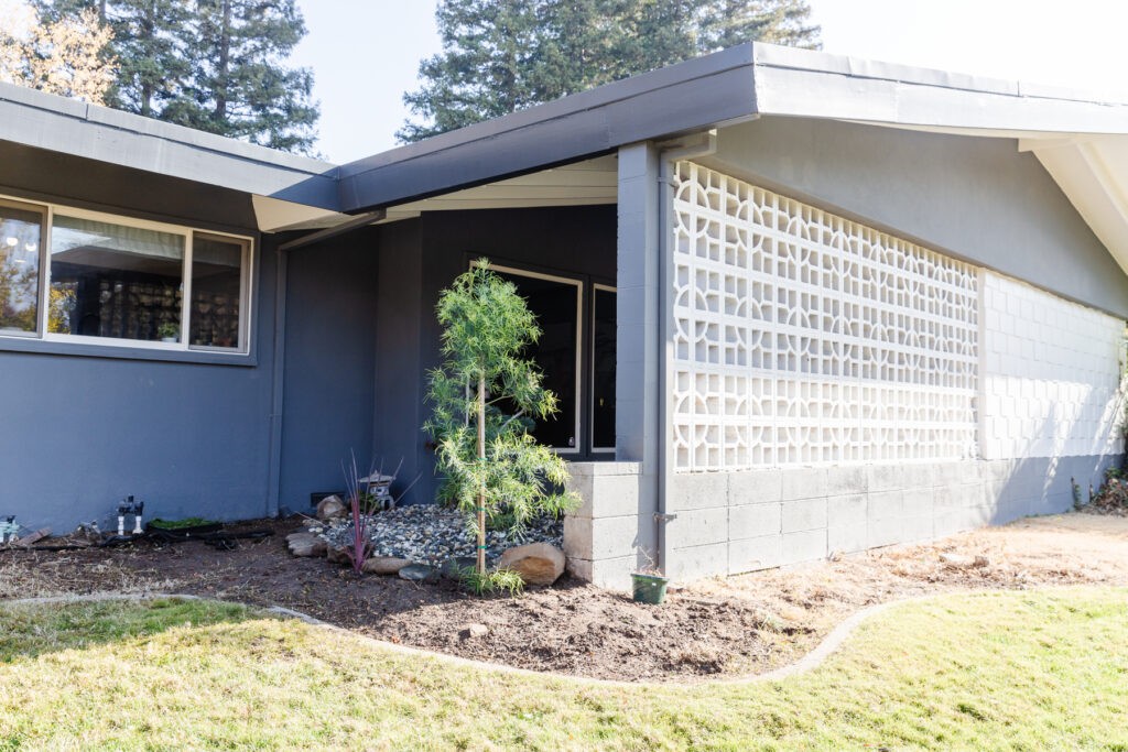
Speaking of things that grow, shall we take a peek at the revamped atrium? Here’s how it started. The pond was hiding under a bunch of overgrown ferns and random volunteers and we had really heavy shrubs blocking much of the light.
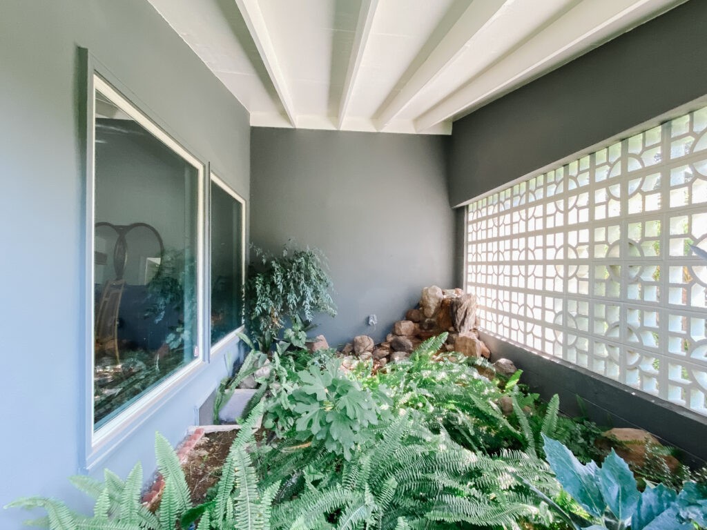
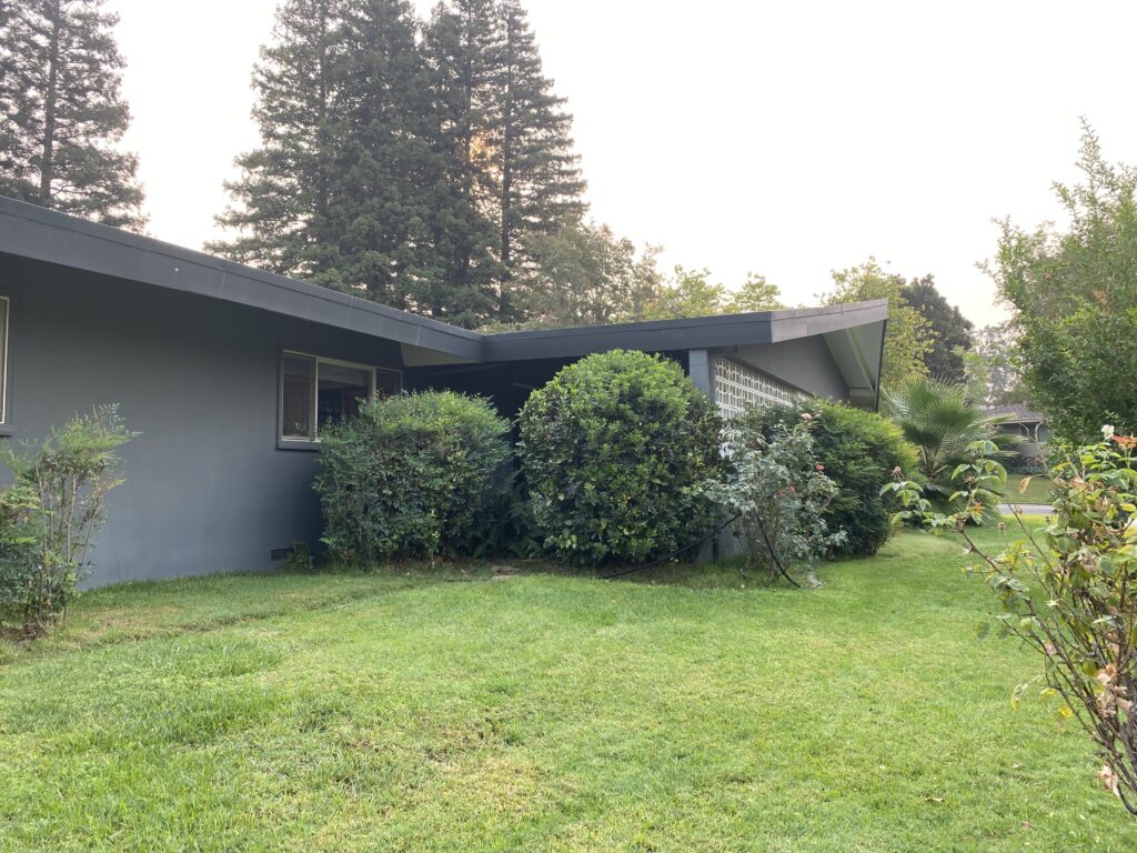
Now you can see what’s happening! Thanks to Green Acres Nursery & Supply (and my husband), we have a beautiful start on the zen rock garden I was dreaming of.
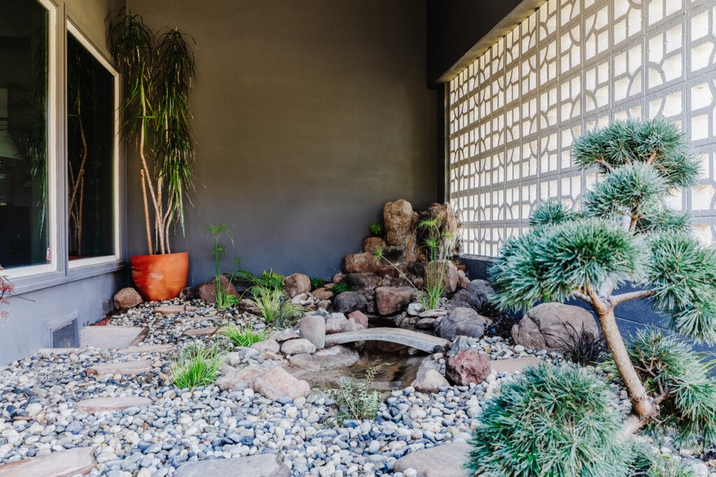
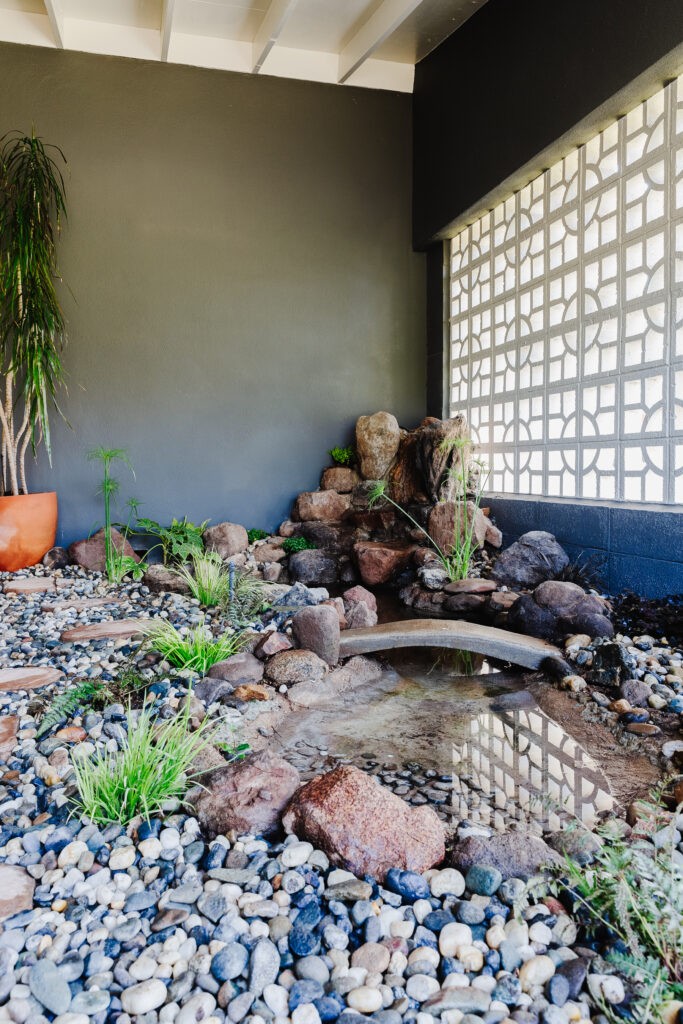
I love this scotch pine topiary. It makes such a fun shape and a pretty focal point from inside. Around the pond we alternated ferns and grasses that will do well in the low light.
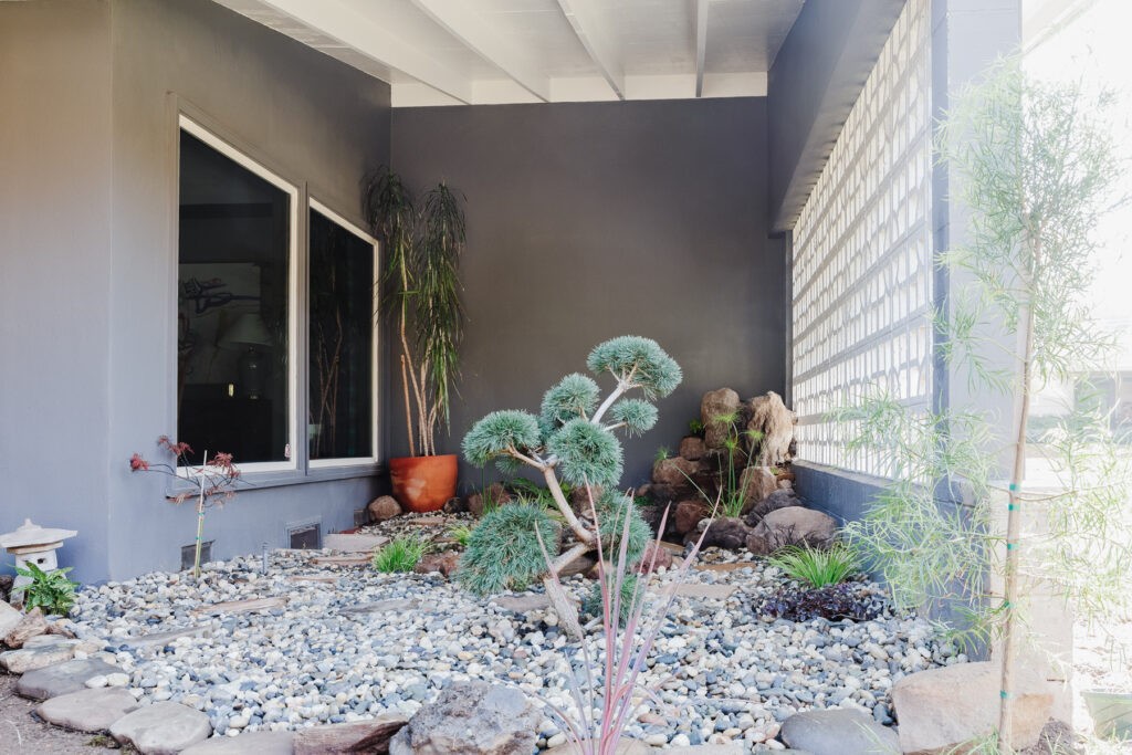
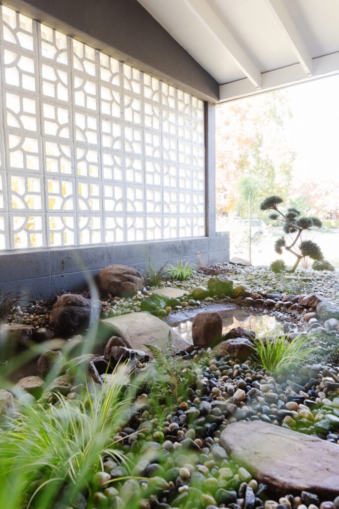
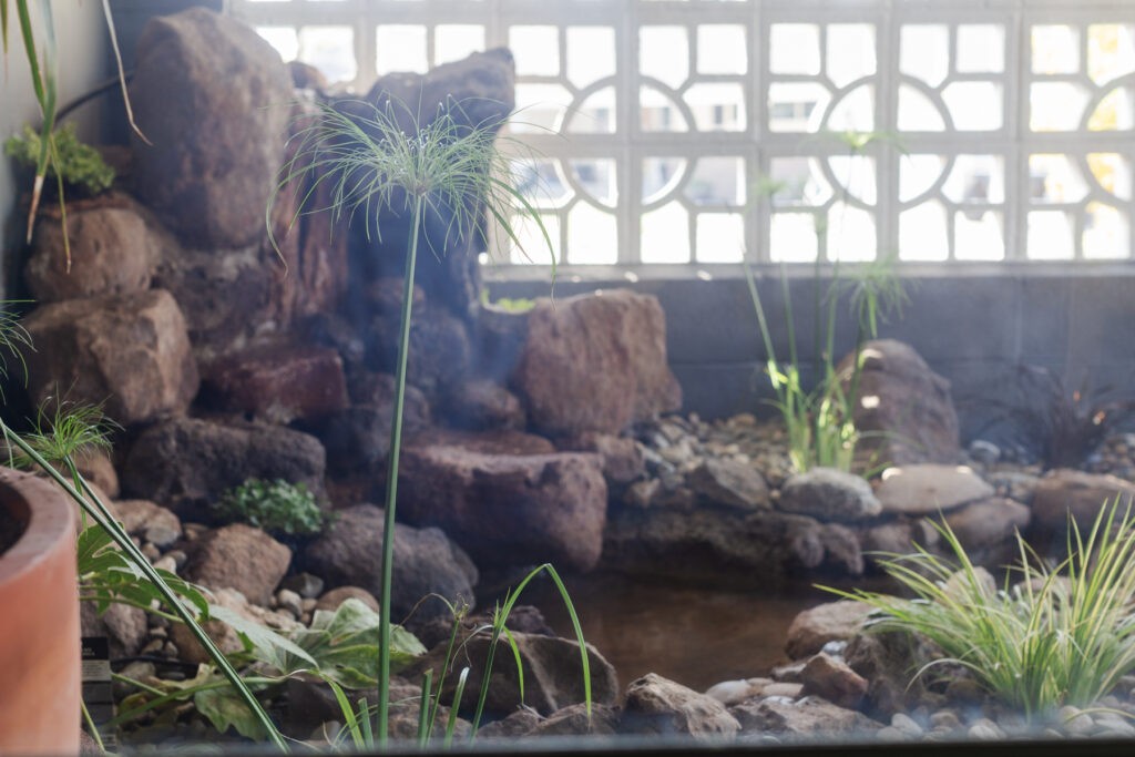
Eventually the plants will fill in and look more lush, but in the meantime we added a half yard of 1-1/2″ salt and pepper pebbles. It feels so much cleaner out here and removing the dense hedges brought light into the house as well. We’ll be planting the beds and using the rock for ground cover at some point but that’s another project for another day/year. We also still need to add lighting to the atrium which is going to be such a game changer in the dining room at night.
If you’re still reading this far, THANK YOU for being here. I can’t express how grateful I am for everyone who interacts and cheers me on through these. Its an exhausting but exhilarating process that I get so much joy and creativity out of. I’d love to answer any questions and hear your thoughts!
Sources
LIGHTING
Library picture lights* | Chandelier* | Table lamps, thrifted | Table lamp shades
WALLS & FLOORS
FABRIC
ART + ACCESSORIES
Guest Participants are all working so hard to wrap up their projects this week. Give them some support!
Thank you to everyone who helped make this happen! My dad for engineering the build and guiding me through the tricky parts, my mom for magically doubling the size of the drapes, Blake from Scouted Interiors for learning how to wallpaper with me and being the extra hands I needed to button up the details! And my design husband Shaun, who pushed me to go bolder, told me ‘no, that’s too much,’ and agonized over the details with me. Most importantly to Terry, who held it together through another whole-house disruption, put all the plants in dirt and shoveled a half ton of rocks into the atrium. You’re MY rock!
A GIGANTIC thank you to my generous sponsors:
Ornamental Decorative Millwork


