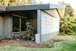
Hi! I’m Rebecca designer and founder of Studio Plumb. In January 2017 we became the second owners of the #plumbmidmod, a one-of-a-kind 1960 midcentury ranch on .8 of an acre outside of Sacramento, California. It has unique original architectural details, a creek running through the yard, and a perfect floorplan. It also needs a sh!#t ton of work. Bit by bit with the help of my dear old dad we’re bringing it back to its former glory with a modern spin.
Catch up on the past 4 weeks
In case it’s not obvious, I’m super behind on our project. Like painfully. We were already moving slow and then my dad had a stroke while working here Saturday. He had just stepped off the ladder and went down. HE’S OK! But he did spend a few days in the hospital and obviously scared us all pretty badly. He was treated very quickly which reversed any symptoms and he’s basically like it never happened. So strange, so scary, and SO puts things in perspective. Dad, next time you want to get out of ORC, find another way of telling me. But actually, he’s still back working on it anyway with some help from our handyman because he can’t stay away.
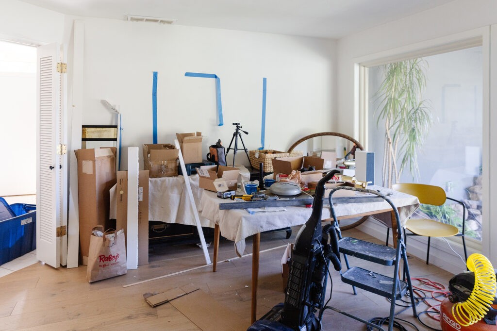
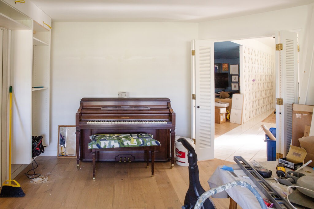
But I do really want to finish this project because as usual it’s taking over the house and driving us crazy. Plus it would be great to have a beautiful dining room to enjoy on Thanksgiving, because despite the dumpster fire we live in, I still have a lot to be grateful for. So here’s how it currently looks:
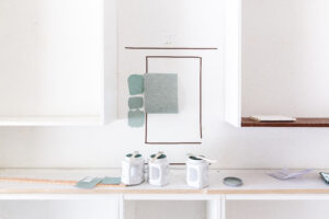
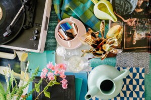
Yaaaa…. Ok, on to paint color. I talked about my concept in Week 3 with the paint options I was considering. I still stand by the concept and love all the colors but it just wasn’t giving me the mix of sophistication-meets-quirk I’m looking for. I was looking for that balance between blue and green and it was getting too sweet or too dull and nothing was just right for this space. So I abandoned the plan and decided to pivot. I started by going back to my chosen fabrics to find new inspiration. Here’s my original moodboard. Everything is the same except for that top paint swatch.
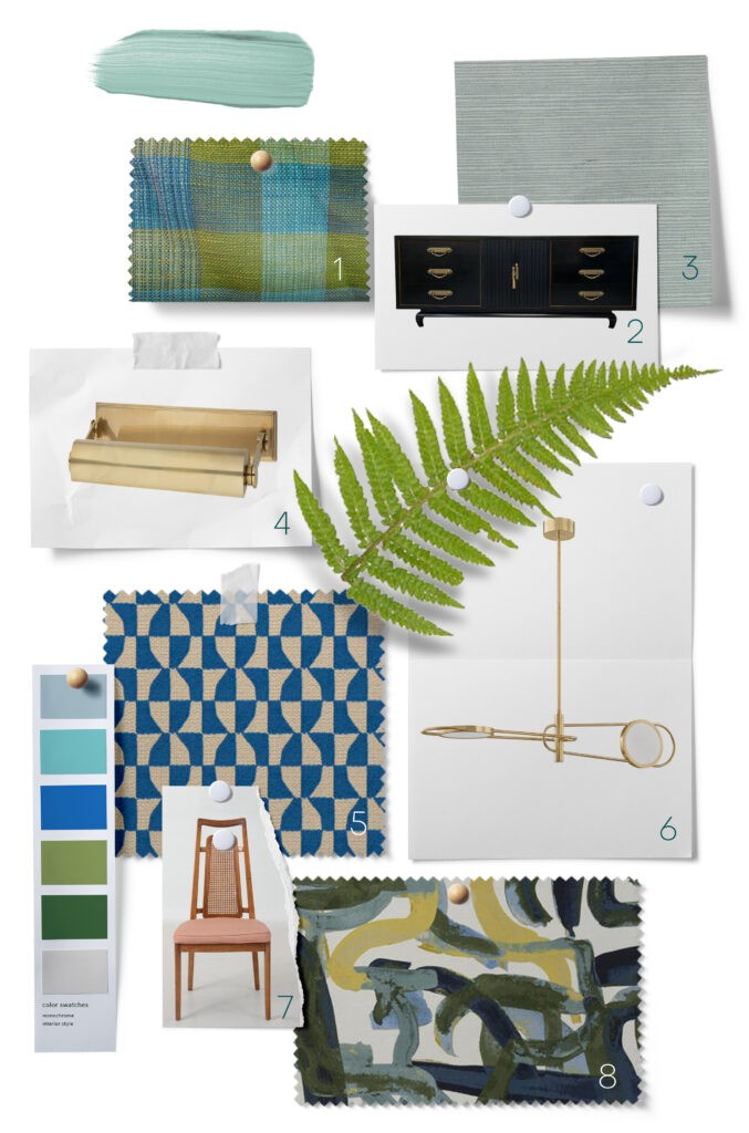
There are some blues that I considered–both cobalt and navy, but this room sits between my family room (Behr Blueprint) and kitchen (Benjamin Moore Nocturnal Gray but reads blue) and I just didn’t need another deep blue thrown in to compete.
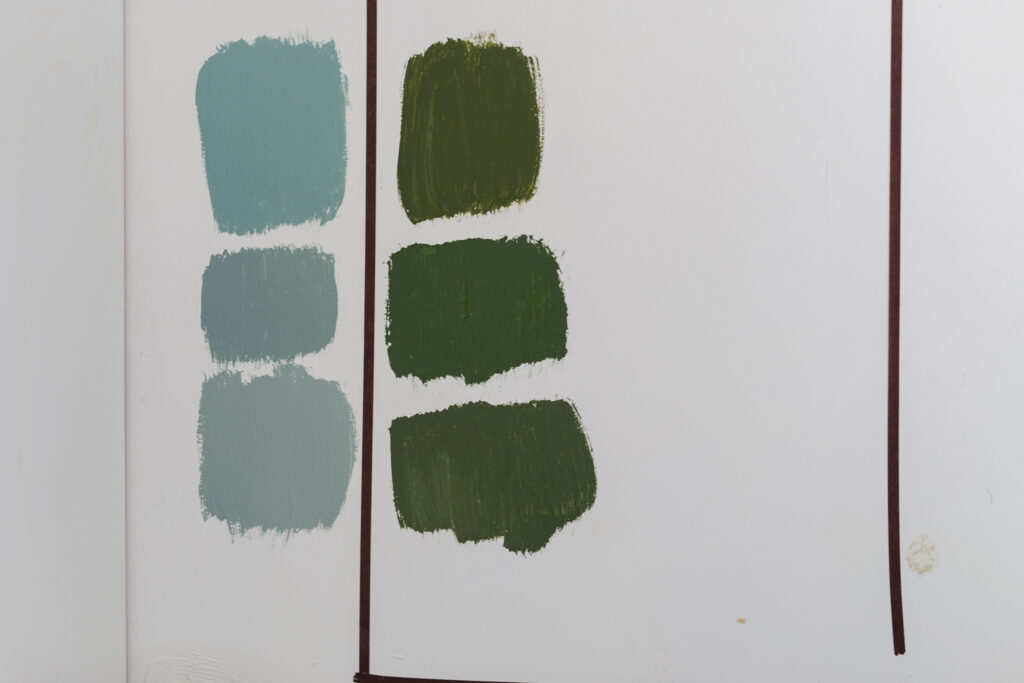
So what about green? There are also lots of warm greens in the fabrics that range from lime to olive, and that idea started to tingle. The right green can feel like a neutral like army green khakis do. I started pulling samples that were a punchy olive which feels a little retro and a refined . I will have a lot of color in the books and art, and this felt like both a color and not a color, you know? It also sits well in my house palette next to the blue rooms:
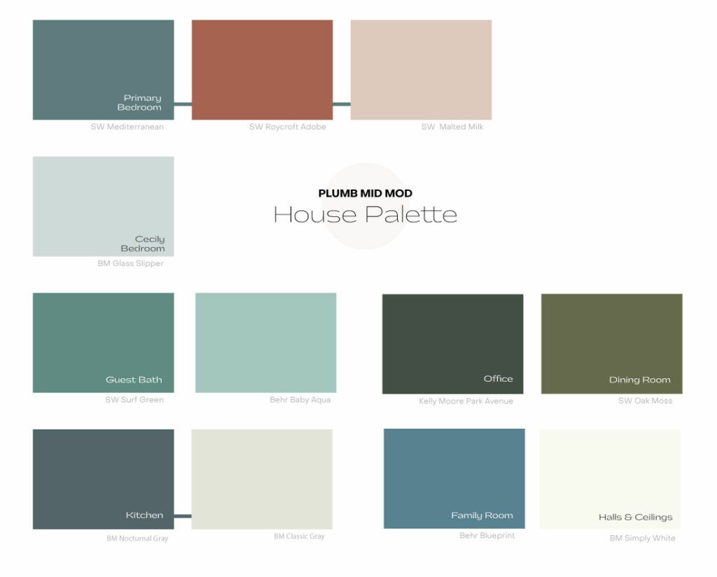
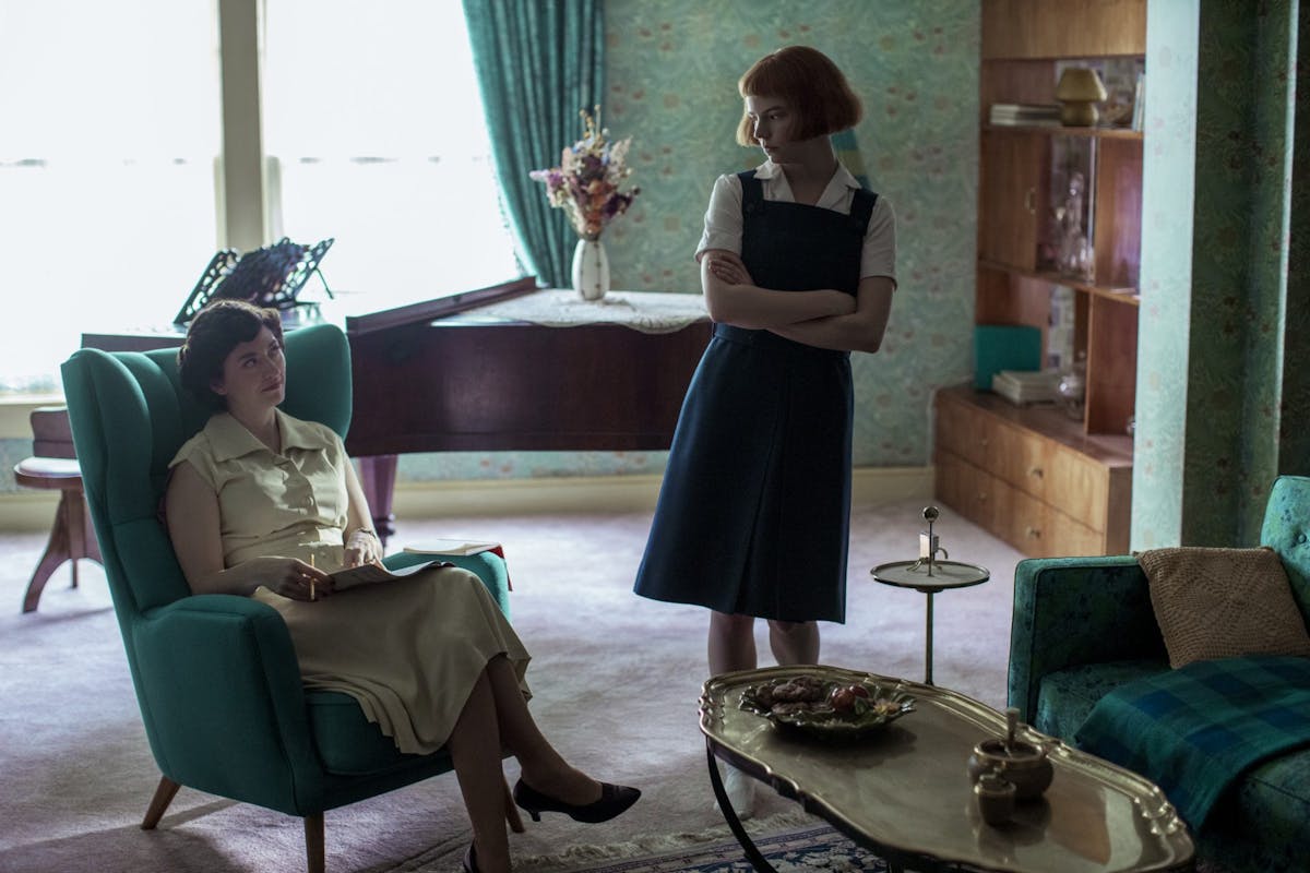
I was messaging with my designer friend Lauren and she said it gave her The Queen’s Gambit vibes which totally clinched it for me. I hadn’t seen the series yet when I designed it, but this is exactly the formal-midcentury-colorful-quirkiness I was going for. I also think the line of green shelving will lead your eye out to the atrium which will make the room feel larger.
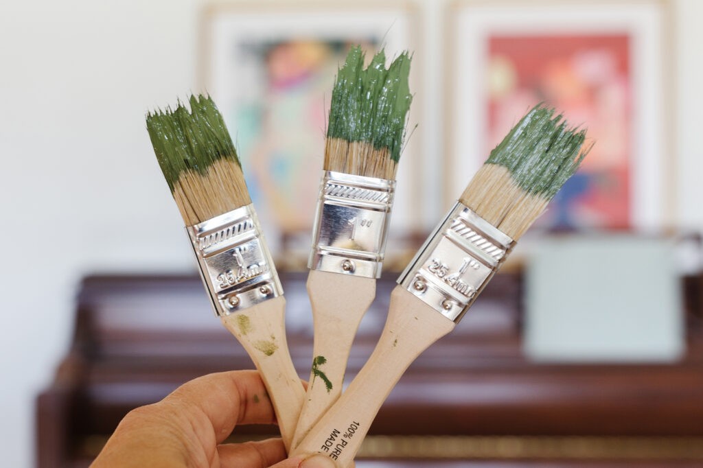
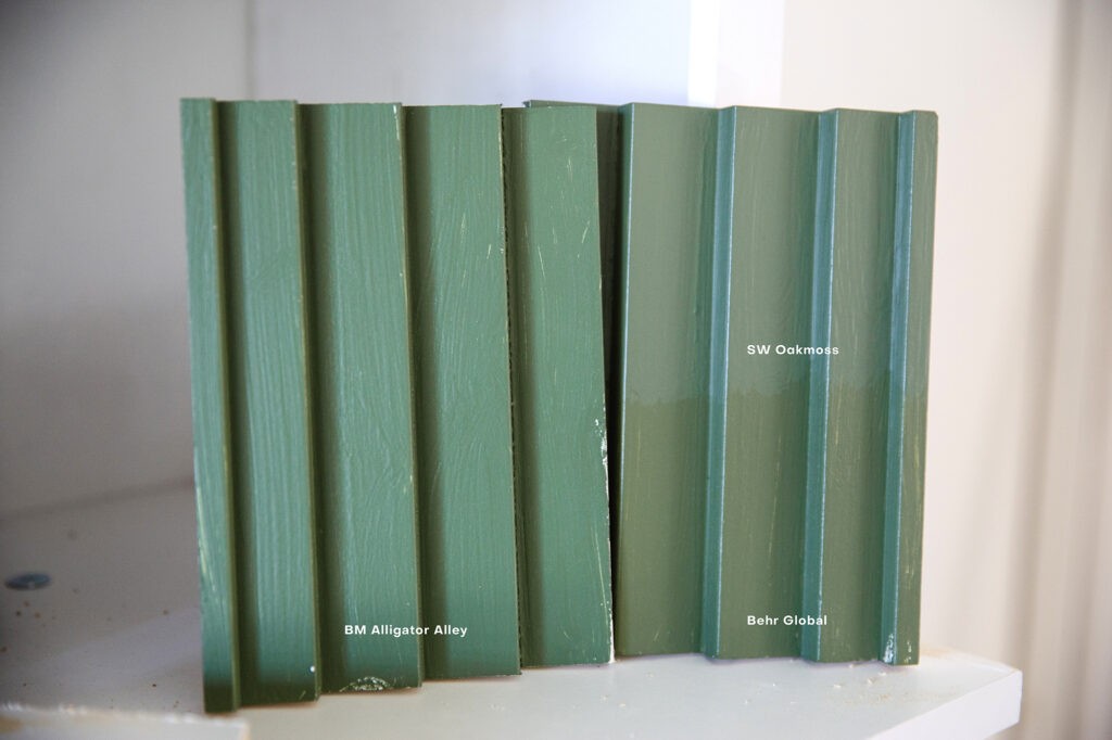
I’m 80% decided on Sherwin Williams Oakmoss (right). I can’t wait to see how it looks not only on the shelves but on the sawtooth crown moulding next to the wallpaper.
I also swatched Behr Global Green and Benjamin Moore Alligator Alley (best name) but they were both a little too yellow. I think.
The Art
All the free standing furniture in the room is vintage, so I’m going abstract modern for the art. I wanted something energetic with pops of colors that felt fresh. I have HUGE piece coming in to go over the buffet but here were some of the options I considered from my trade resources (one is the winner but I’m keeping it a surprise).

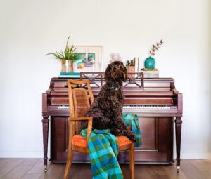
For the piano area I also wanted to bring in more vibrant color and chose a pair of matching frames with complementary art. Since the piano is a fairly traditional mahogany I chose pieces that added some whimsy from Artfully Walls. None of the art is sponsored btw, but I had a lot of fun creating different pairings on their website. The prints arrived quickly and I love the quality.
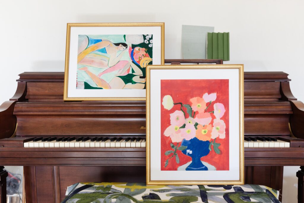
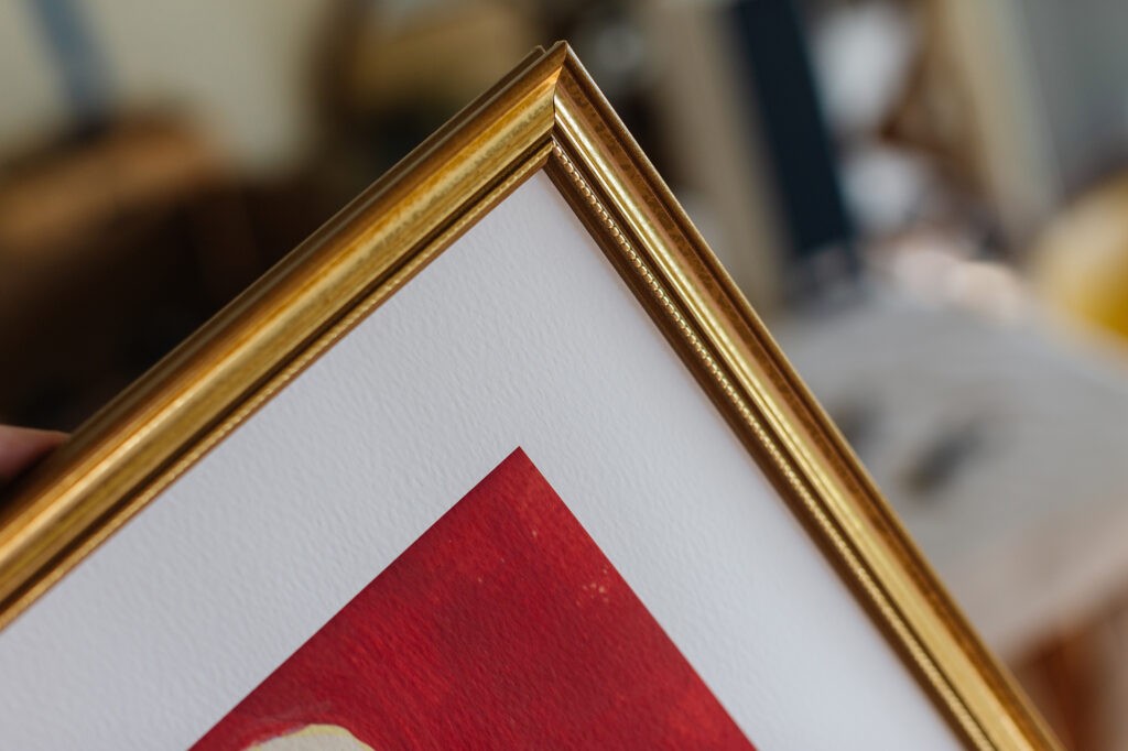
I chose to do the framing myself for this project and plan on sprucing up these cheap gold frames and adding mat board. The pieces are printed on fine art paper, which looks like watercolor paper and adds a really lovely texture.
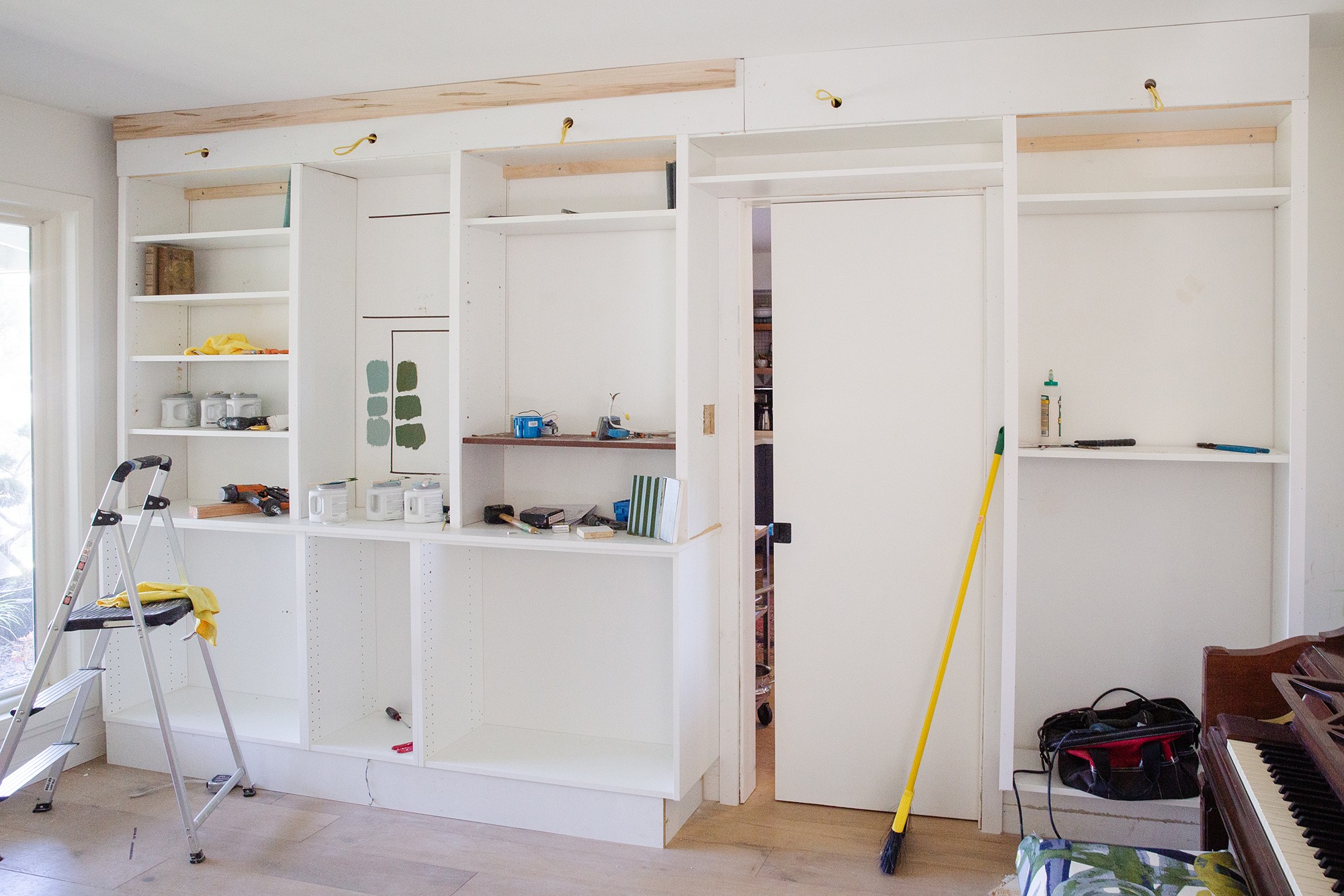
As far as the install of the room I’m waiting for my dad to get help installing the rest of the cabinet trim and all the crown and base. It ‘should’ move quickly since it’s not a huge room, but I’m just playing the one thing at a time game. From there the big tasks will be paint and wallpaper, which I’m doing myself, sooo, ya. I’m definitely not hitting next week’s reveal start but One Room Challenge is urging us to take our time to do it right. So that’s what I’ll do.
Hope you all are hanging in there!
Dining Room
- Install bookcases
- Choose paint
- Paint everything
- Caulk everything
- Install crown and base
- Install bookcase trim
- Move some electrical
- Install lighting
- Hang grasscloth
- Hang art
- Rework drapery panels
- Recover dining chairs
- Recover piano bench
- Style!
Atrium
- Install atrium lighting
- Clear atrium
- Select plants
- Plant atrium
- Fix/replace pond pump
- Add gravel rocks
- Add river rocks to pond bed
- Remove bamboo hedges
Are you following the Featured Designers to see what they’re up to? Also don’t forget to find new follows with my fellow Guest Participants. There are so many doing cool things this round!!
A huge thank you to my generous sponsors:


