This official announcement is 2 months overdue (let’s just blame COVID) but I am so excited to officially announce my brand refresh! When I started Studio Plumb in January 2018 I was not only pivoting into a new industry but making a huge personal identity shift. I was moving from graphic design to interior design and was full of fear, uncertainty and vulnerability about starting a new business. Knowing my tendencies, I didn’t allow myself to dwell on my branding when I needed to focus on building a company. And honestly didn’t know what Studio Plumb would feel yet as a brand so made something “good enough” and got on with things.
A couple years into it, I have learned so much about myself, the kind of business I want and the type of projects I love to work on. To get some distance from it I hired my dear friend Grady Fike (wwwGrafikDesignCo.com/) to help me accurately depict what Studio Plumb was all about. Grady and I worked together for years and have a shorthand when it comes to this type of thing, so I knew he would nail it. And listen to how smart he is:
Logo + Tagline
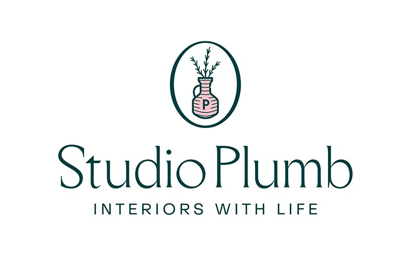
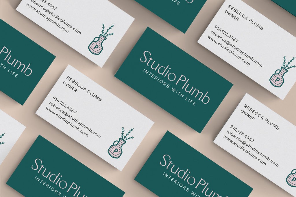
Knowing how much I enjoy vintage pottery he incorporated a vase into the original concept. If you look closely at the urn shape you can see a tiny chip in the neck. The older I get, the more I embrace my imperfections and can even see them as gifts at times. I asked Grady to add this to the mark in the spirit of the Japanese concept of wabi-sabi (there are similar practices by artisans from many cultures). I wanted this small reminder that a beautiful life isn’t perfect, but it is interesting and ever-changing. The modern typography and vintage vessel perfectly sum up my design style and the bits of greenery tie in the idea of life and growth.
In addition to residential design clients I’ve started doing more and more home design content creation and share bits of my day-to-day on social media. I love that aspect of my work as well so wanted the new branding to encompass both sides of business
Grady and I brainstormed new tagline ideas until we landed on “Interiors With Life” which works on a couple of levels. For client projects I try to inject energy and character into spaces that are a little lackluster giving them life. When I’m working on home content I’m sharing bits of my life and lifestyle. Get it? It’s not that deep but it says it all.
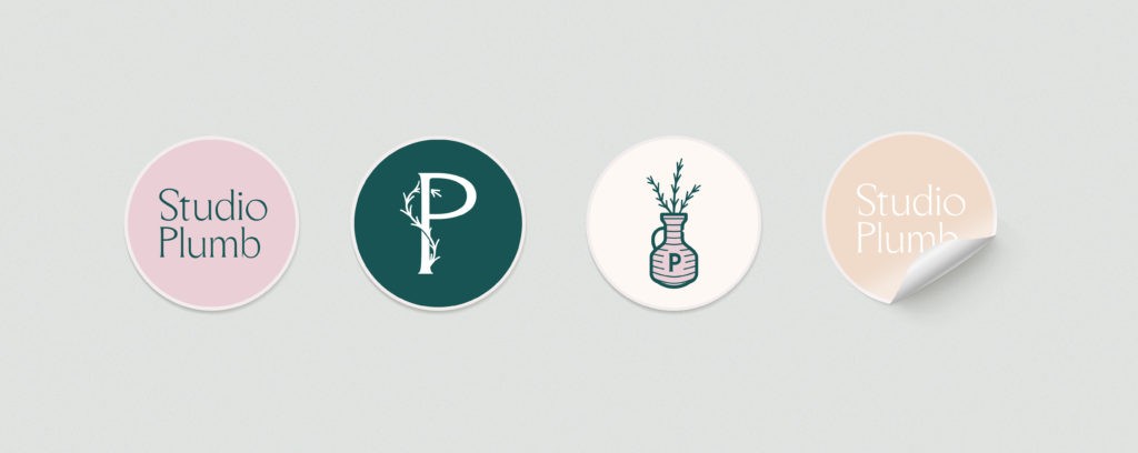
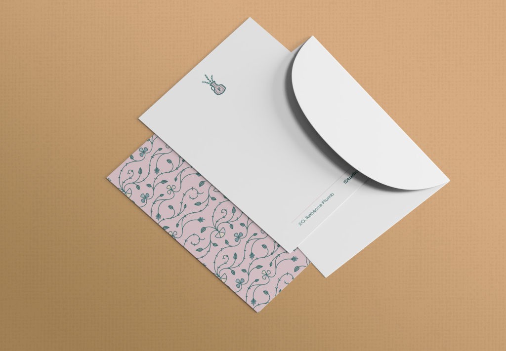
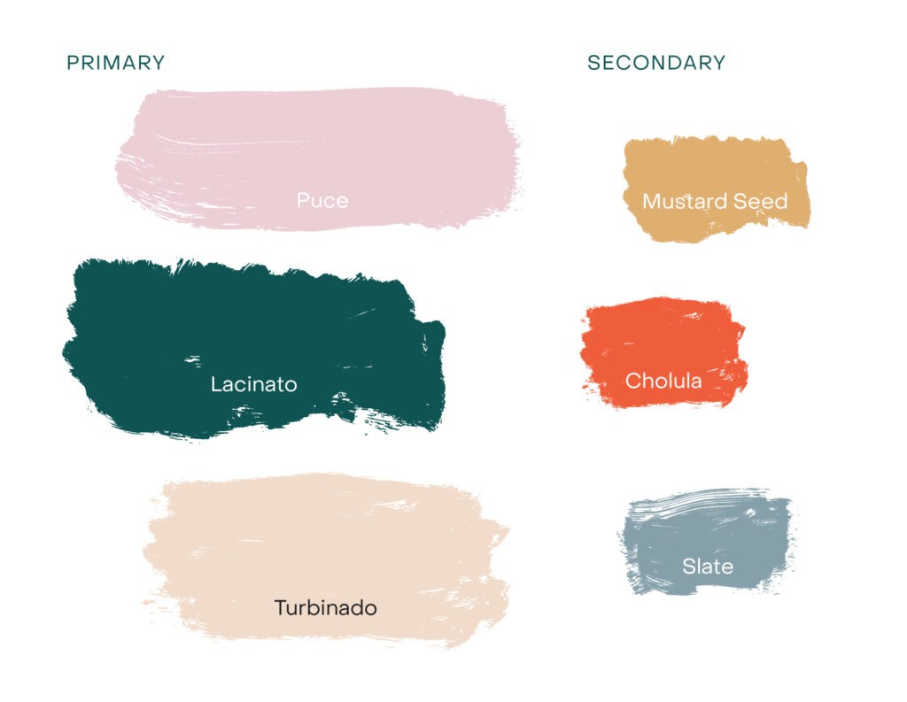
A variety of logomarks, a vivid color palette and playful textures gives me a ton of flexibility to support my work and tell the story of my company visually. I asked for a vivid color palette with lots of contrast and Grady proves to be the reining king of naming swatches. Ha!
Thanks for following along! The website is an ongoing work in progress but I’d love for you to take a peek!


