Hi! This week zoomed by but feels like progress went a bit slow. But today I’m really excited to show you all the ideas that have been brewing for months behind-the-scenes! We did make some headway although it doesn’t all make for interesting photos. We figured out some annoying electrical and planned out our feature wall which I’m MOST excited about. The electrical is sorted out in the bathroom for the most part and my husband crawled in the attic for hopefully the last time today to get our fancy Bluetooth shower fan hooked up. But today I’m revealing what you’ve been waiting for, the actual Design Plan!
If you’re new here, I’m Rebecca designer and founder of Studio Plumb. In January 2017 we became the second owners of the #plumbmidmod, a one-of-a-kind 1960 midcentury ranch on .8 of an acre outside of Sacramento, California. It has cool original architectural details, a creek running through the yard, and a perfect floorplan. It also needs a sh!#t ton of work. Bit by bit with the help of my dear old dad we’re bringing it back to its former glory with a modern spin.
For more updates follow along on Instagram and all you design entrepreneurs check out our new podcast the Hot Young Designers Club.
Master Bedroom
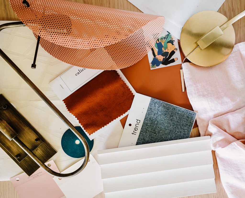
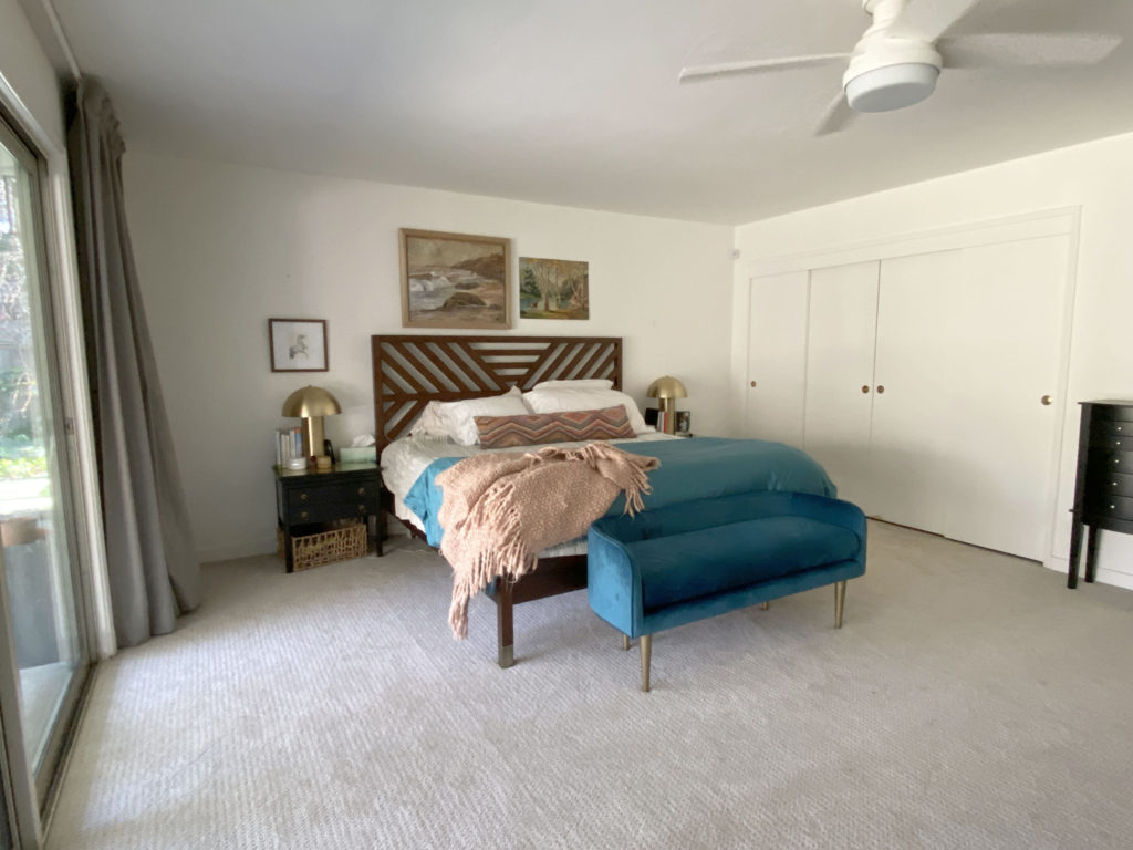
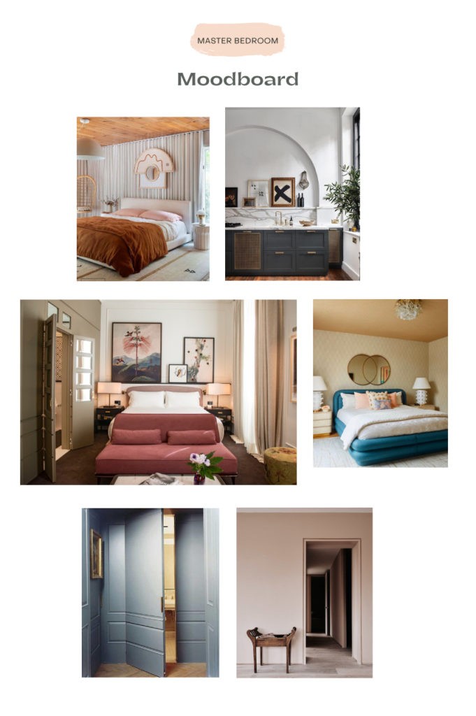
The master bedroom, as you can see in this before, was just a plain white box. Clearly, as shown in this pile of materials above, that’s all about to change. There was nothing interesting about the architecture, the room had no focal point, and there wasn’t nearly enough color or texture for my taste. I’m bringing in deep, rich rusty tones, peacock blues of course, pastels, and lots of warm brass to give it some glam status.
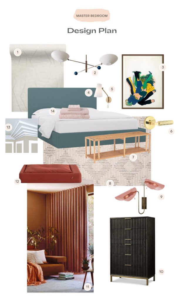
- Gorgeous textured wallcovering from Pacific Designs*
- A custom-designed chandelier from Blueprint Lighting*
- Original art inspired the color palette
- DIY upholstered bed with fabric from Trend*
- Reading sconce by Hudson Valley Lighting*
- Brass lever door hardware by Emtek*
- Wood slat bench
- Neutral wool rug from Loloi*
- Double arm wall sconce from Blueprint*
- Tall storage dresser from Apt2B*
- Custom ripplefold drapery from Calico*
- Dog bed from Tuft & Needle*
- Sawtooth crown/base moulding from Novo*
- Linen bedding from Tuft & Needle*
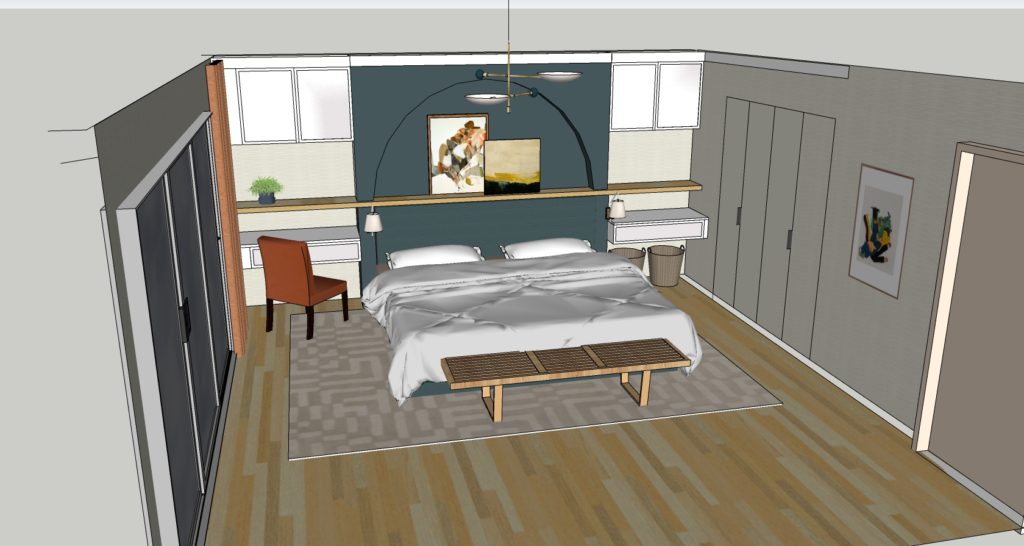
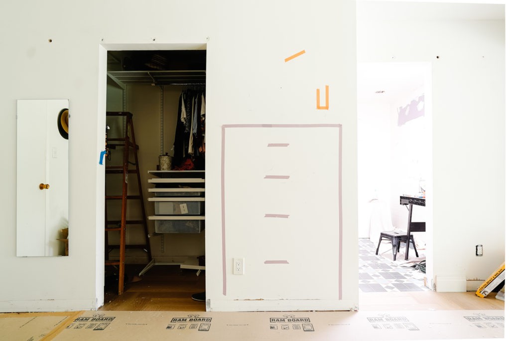
Figuring out this bed wall has been the biggest challenge for some reason. I’ve gone through atleast 10 different versions of it and although I liked most of them they were never quite right. I knew I wanted to add cabinetry for storage and to give this big wall feel substantial in the room while keeping our budget in mind. Our king bed just looked kind of dinky on the wall and regular nightstands weren’t enough to help balance it. I had plans to bump the wall out behind the bed and add a shelf to lean art on, but it was all still feeling flat and square. Then the other day I was drooling over this kitchen for the 100th time and the solution popped in my head. An arch, of course! Its hard to see here but we’ll be building an upholstered bed and headboard and it will fit snugly under the shelf.
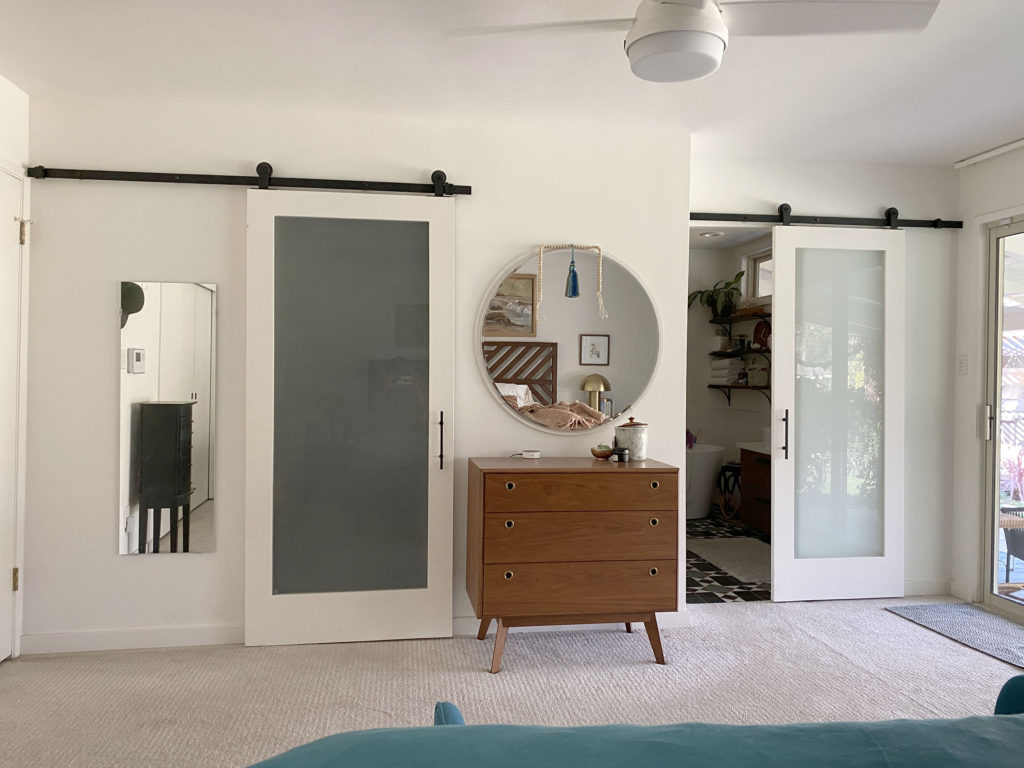
The builtins will be a combination floating writing desk /nightstand and cabinets above will add extra storage. This rendering is pretty rough but you can see that we’re attempting to disappear the closet doors by running the wallpaper right on top of them and installing them flush without trim, hidden hinges and minimal hardware. The doors are a major part of the work in the room and I’ll go into more detail in a later post (when I figure out what exactly we’re doing).
After drawing the design in Sketchup I really wanted to get a sense of the actual scale so I marked it all out with painters tape and now I’m really in love with the concept. Also kind of just want to turn this into a mural, as-is, haha. Isn’t it cute? But really, it feels so good and appropriately important in here. Oh ya, and we installed the chandelier!! I worked with Blueprint Lighting* to customize one of their designs to make a big impact without hanging too low on our 8′ ceilings. Its soooo pretty.
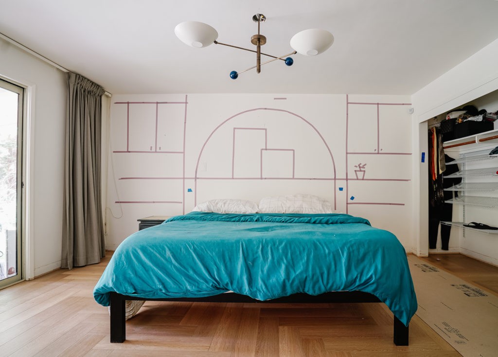
While we were at it I marked out the new dresser that’s coming in so we can place the electrical for a sconce going above it. It makes it feel so real! Also, can you get a load of the light coming in from the skylight!!!!! ✨✨✨
Master Bathroom
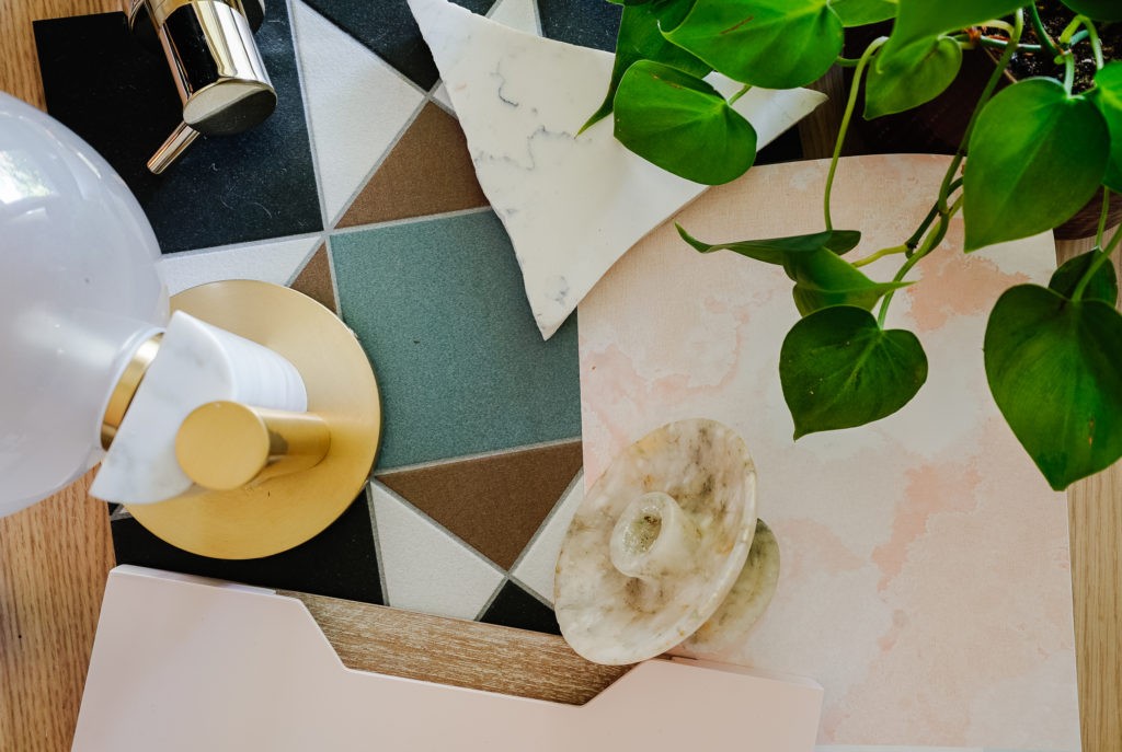
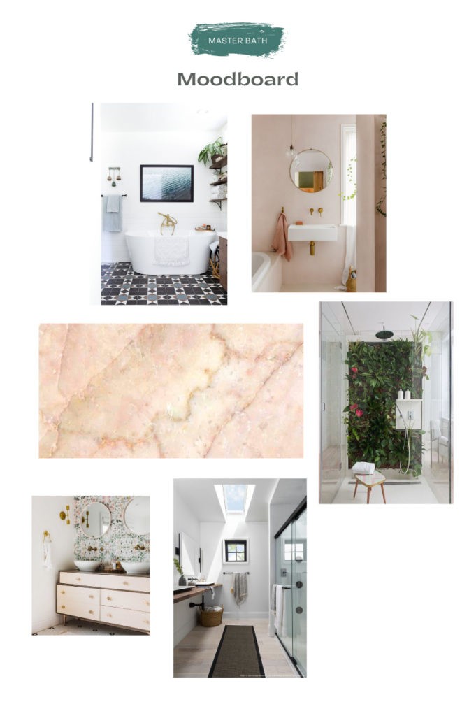
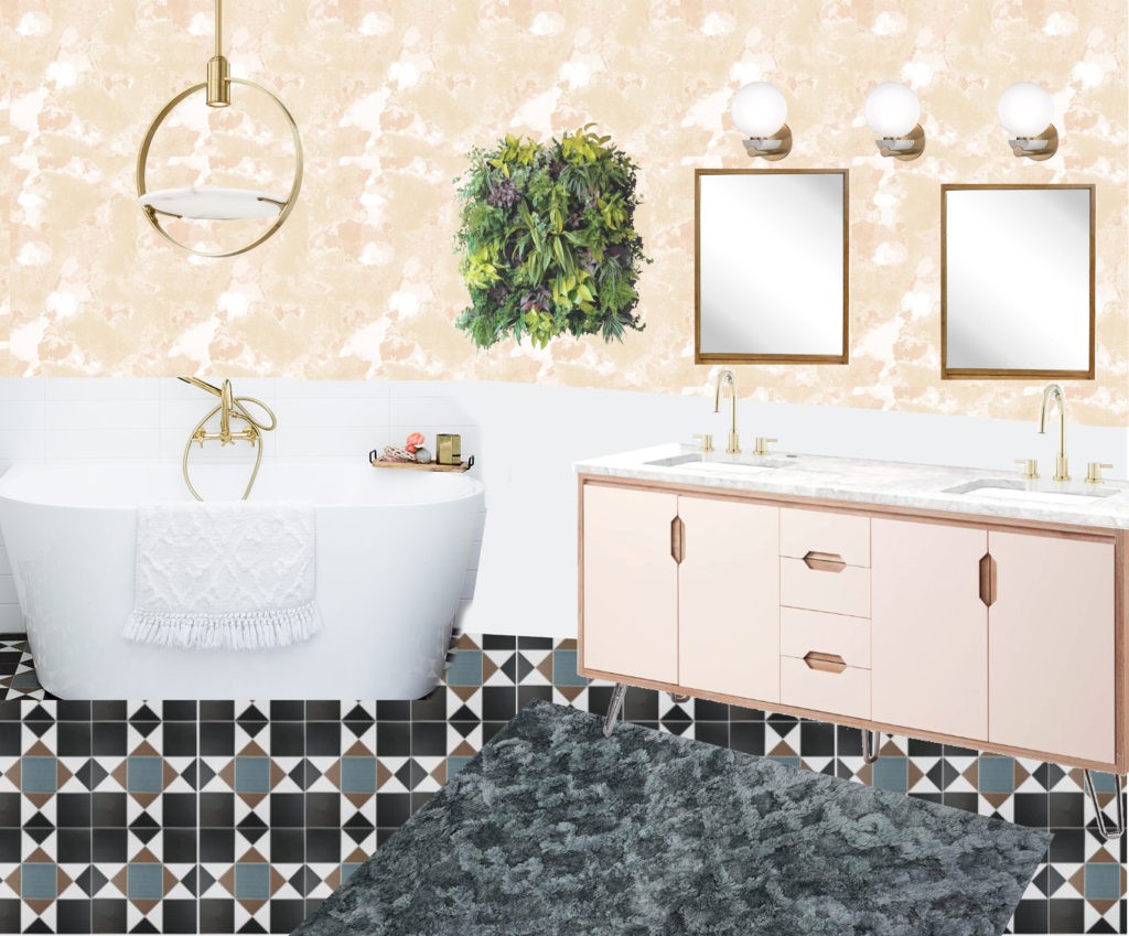
You may remember that the master bath was renovated fairly recently so we’re refreshing it with wallpaper, new lighting and a new vanity while leaving existing tile and major fixtures as-is. To take full advantage of the amazing newly installed fresh air skylight, (don’t worry, lots more to say about that,) I’m hoping to bring in lots and lots of plants and keep the room feeling bright and fresh.
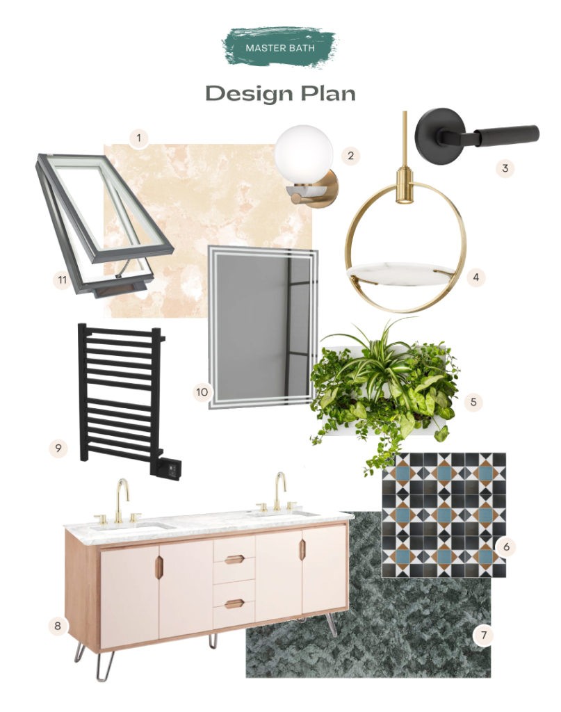
- Shibori Wallpaper from Milton & King *
- Marble/brass sconces by Hudson Valley Lighting*
- Lever door hardware by Emtek*
- Alabaster pendant by Hudson Valley Lighting*
- Living wall
- Existing floor tile
- Cozy rug from Loloi*
- Blush modern vanity from Build.com*
- Towel warmer from Build.com*
- Signature Hardware Lighted mirrors from Build.com*
- VELUX No Leak Solar Powered “Fresh Air” Skylights*
Ok, that’s a peek into everything and I can’t wait to walk you through it all in more detail. Be sure to check in on Instagram tomorrow afternoon when I publish my weekly video walkthrough on IGTV!
* Gifted by our generous sponsors in exchange for promotion. All opinions are my own.
Do yourself a favor and catch up with the rest of the Featured Designers, they are all so talented and will be turning out some incredible work.
