
I’m so happy I can finally say that our master bath is done and ready for proper documentation! Next month it will be a year since we moved into this house and I can honestly say that I still love this bathroom and all the decisions we made. Having a proper master bathroom has been on the wish/fantasy list my whole life and it took 41 years to make it come true. My husband is a ‘bathroom person’ (he’s going to kill me) but he showers multiple times a day, loves a soak in the tub and has more products than I do in the shower.
So if you remember the ‘before,’ (Head over to this post for all the details) you know that the room was a cool time capsule (original vanity from 1960), but not a place either of us wanted to get clean in. There was old carpet throughout (not that new carpet would have been much better), the toilet was open to the bedroom, and unless we wanted to sit on the floor to open a cabinet, the vanity was just not going to work for us.
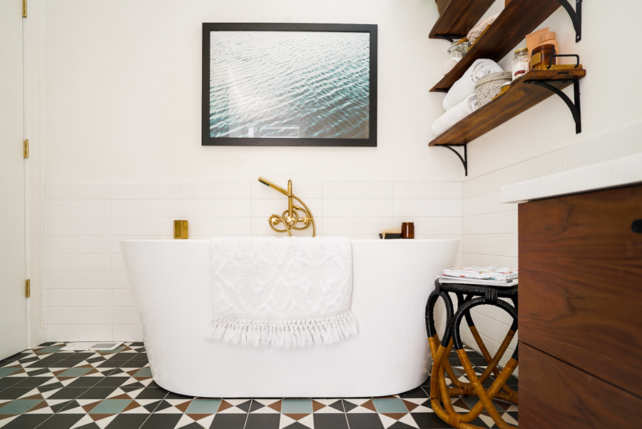
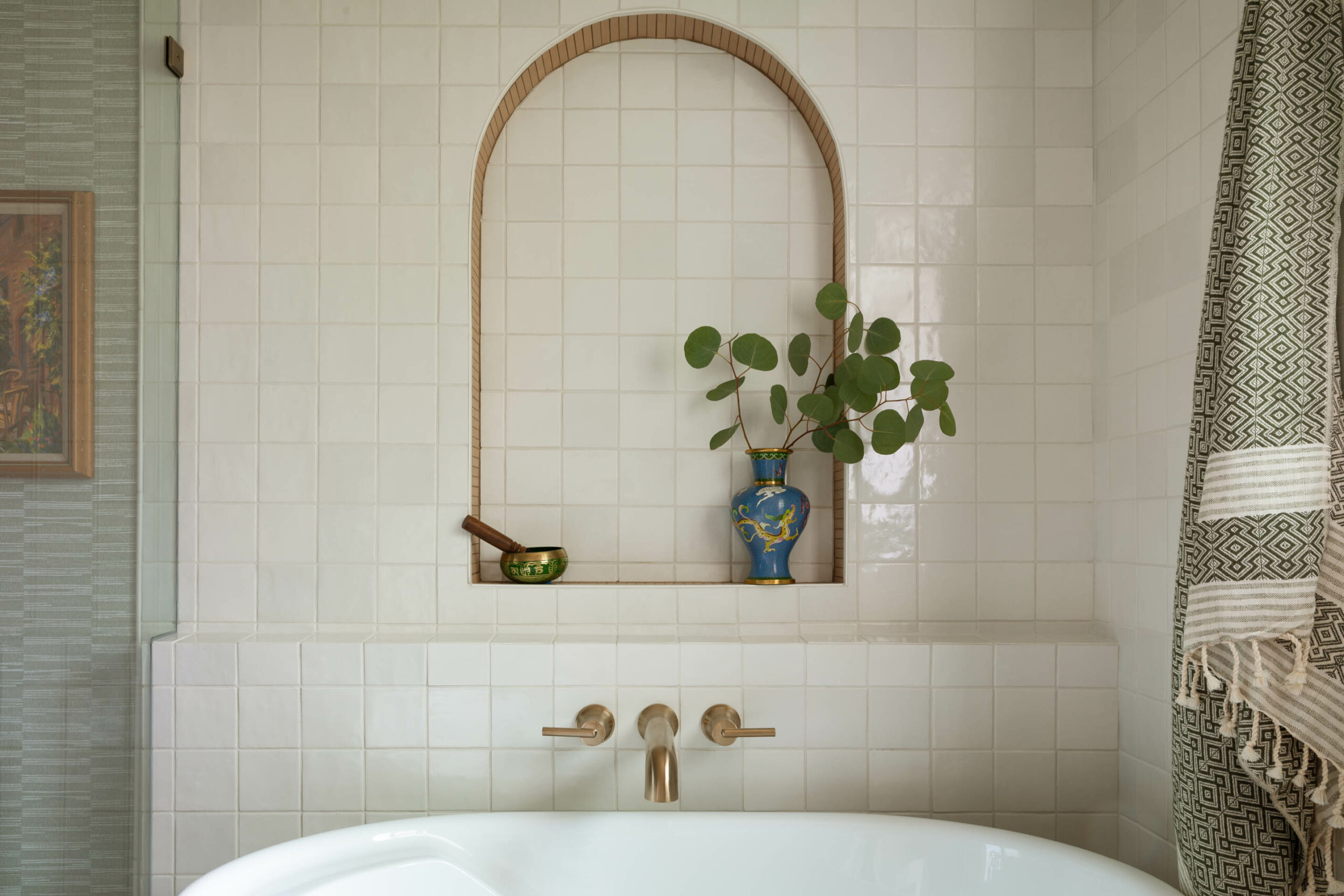
So let’s start with the star of the room, the bathtub. I’ve never been much of a bath person, but now I realize its because I never had THIS tub. Its deep, comfortable and insulated so it stays hot much longer than is good for your skin. You can literally sit in there for an hour (if you’re not the parent of a toddler) and the water stays hot. I wanted freestanding but there was no way to make it fit, and then I found this guy with the flush back. It saves a ton of room, plus it gives us corner ledges to hold stuff and we don’t have to worry about creepy areas that are impossible-to-clean-behind.
The vanity is a little smaller than I would have liked, but it was worth the sacrifice of counter space to get a tub to fit. The base and sinks are actually from Ikea, and we ordered the drawer fronts from Semihandmade. I love how they elevate the space, add warmth, and made a custom look super affordable. I splurged on some Rejuvenation drawer pulls which I think really helps the whole piece feel more upscale, plus your cords don’t catch on them (a huge pet peeve of mine, I know, weird). We had the contractor custom-fit a piece of quartz for the counter, and the vanity was wall-mounted to make the room feel more spacious and show off the floor tile.
The drawers are so functional, Ikea sells different insert options so they actually stay fairly organized and there is no wasted space that cabinets always have. Since everything is right there in the drawer, I really don’t use the counter for much so it doesn’t become a makeup and appliance catchall.
I knew I wanted to mix matte black and brass finishes so the Orbit sconces were a great solution with a mix of both. They’re modern and slightly industrial and bring a little quirkiness to the room.
The sinks, also Ikea are designed to fit with the vanity drawer frames so we made things easy on ourselves (maybe not the contractor) and you can’t beat the price. I found these affordable faucets (why are modern fixtures SOOO expensive) so everything wasn’t standard-issue Ikea. Plus, I was hell-bent on brass fixtures (more on that below).
To keep things clean and modern we used an oversized subway tile in the shower and around the room as a backsplash. We stacked the tiles to give a midmod feeling and used a light gray grout. I got the idea to do a shower shelf instead of niche which, IMHO, was a moment of brilliance. A niche just isn’t going to cut it for us (I did some product editing for the photos, the shelf is typically full of various potions). Matte black penny tiles finish off the shower floor and double as a non-slip surface.
And if you’re paying attention you’ll notice that the rest of our faucets are polished brass and this one is brushed “champagne bronze.” I could not for the life of me get all of the fixtures in the same brass finish. I didn’t care if it was polished or brushed, I just wanted brass and modern and had to be in the contractor’s hands to install with the plumbing. I needed a wall-mounted tub filler, single sink faucets and separate shower trim and this just did not exist as a matching set. I was even ready to throw money at the problem but I stumped the helpful woman at Ferguson’s. So just pretend I didn’t mention it. 😂
And yes, that floor tile. I looked FOREVER to find a tile that felt fresh, had a little color but not too much, within budget, worked with the style of our home but didn’t feel dated and I hadn’t seen a million times. This was not an easy task but I’m still loving it and that’s saying a lot because I tire of patterns fairly quickly.
I think its a blogger no-no to show the toilet but having a separate, enclosed toilet room was on the must-have list. We recently added the upper cabinets to add some much-needed storage to the bathroom.

My main excuse for taking so long to officially reveal the bathroom renovation was the artwork over the tub. The photo that was there wasn’t doing it for me and I couldn’t find the perfect piece. Then I won free downloads from Jenny’s Print Shop on Instagram and framed this Water print. It brings in some much needed blue to balance the floor, and is also just says “calm.” The open shelving over the tub holds extra towels, and keeps the bubble bath and candle matches out of a 3-year-old’s reach. I know it doesn’t seem like it in these photos, but this room actually gets pretty meager natural light. We have deep patio awnings running along the back of our house, so until I can knock some skylights into them, I can only get a few plants to grow on this top shelf. I’d love to fill the room with more because but they bring so much life into the space.

That’s it! I linked up the sources below, I’m happy to answer any questions if you have any!

SOURCE LIST:
Vanity // Sinks // Semihandmade drawer fronts in Flatsawn Walnut // Countertop is Pure White quartz // Drawer pulls // Sink Faucets // Shower Trim // Tub (get the insulation!) // Tub Faucet // Toilet // Floor tile // Shower floor tile // Shower/wall tile // Barn door // Vanity Sconces // Mirror // Water print // Paint: Benjamin Moore Simply White.
SaveSave
SaveSaveSaveSave
SaveSave
SaveSave
SaveSave
SaveSave
SaveSave
SaveSave
SaveSave
SaveSave
SaveSave




5 thoughts on “Master Bath -AFTER-”
It’s gorgeous! I love the matte black + brass accents and wow, that floor!! I have a tiny vintage pink tile bathroom that needs some love and the tub is a big issue. Where did you find yours?
Thank you!! I do love a vintage pink bathroom, but ya, sometimes you just need something fresh. I linked all the sources at the end of the post!
How did I miss that?! Thank you!
Hi there, I enjoy reading all of your post. I wanted to write a little comment to support you.
Please let me know if you’re looking for a writer for your weblog.
You have some really great posts and I think I would be a good asset.
If you ever want to take some of the load off, I’d really like to write some content for your blog in exchange for a link back to mine.
Please blast me an e-mail if interested. Regards!