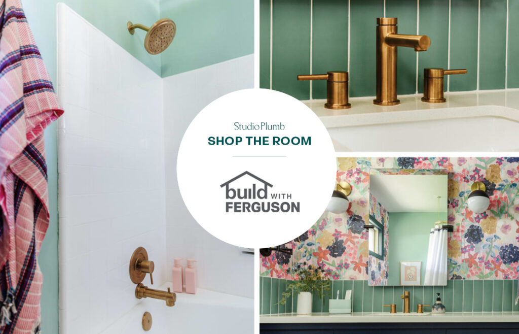
This project is sponsored by Build with Ferguson showroom. All products linked below at the end of the post. Thank you for supporting the companies that support me!
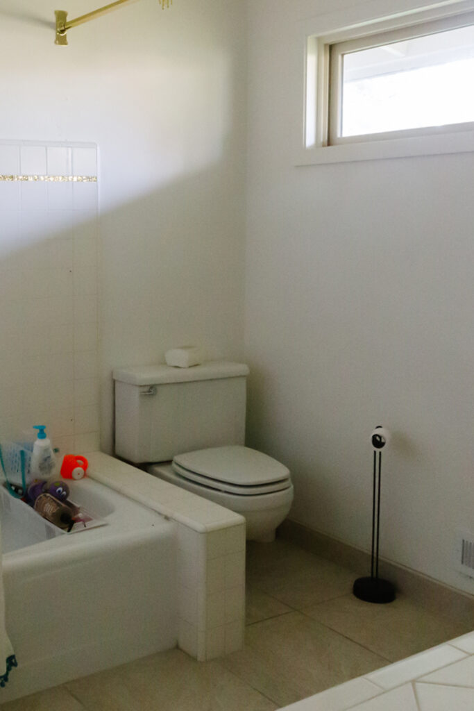
Welp, this took a teensy bit longer than it should have, but hey, we’re still in a global pandemic and I could barely breathe. So regardless of the timing, I’m feeling pretty dang good about it being done and Cecily is loving it, but most importantly USING it. We we went from this…
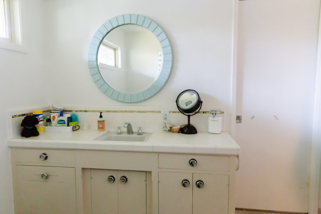
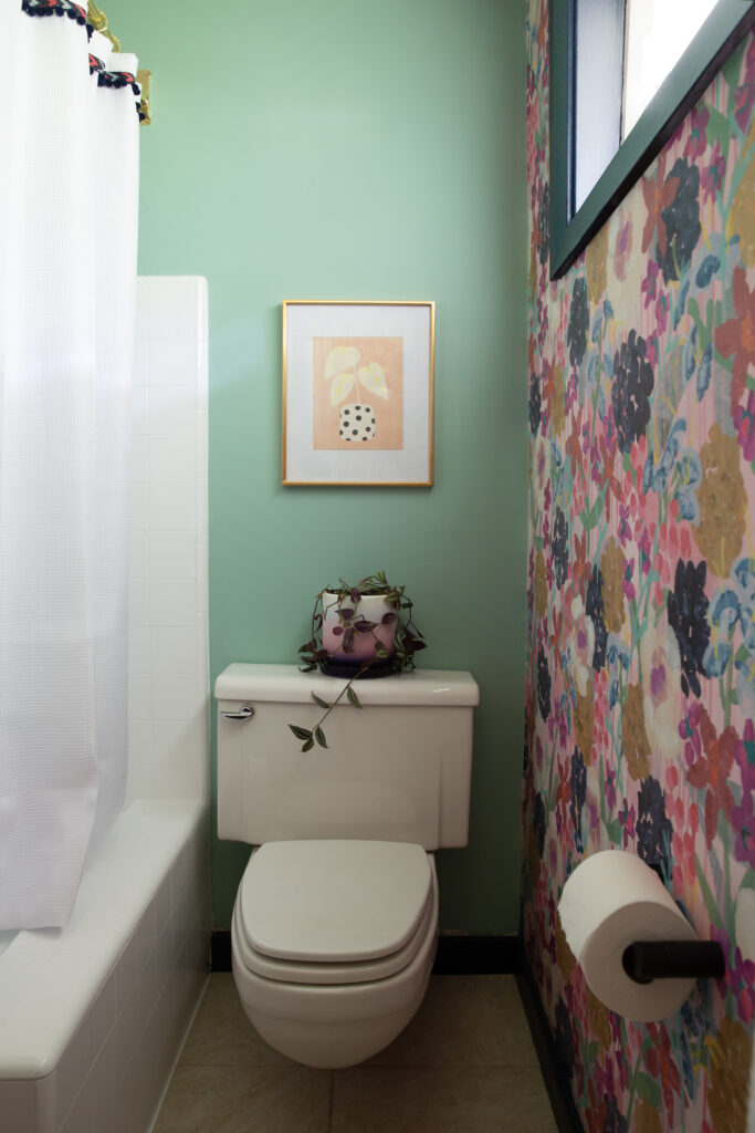
to this!!!
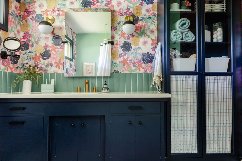
BEHOLD THE POWER OF WALLPAPER. AND PAINT… and new plumbing fixtures, electrical, an Ikea hack and a tiny bit of tiling. But really, it was mostly sweat equity and a willingness to be bold that led us here.
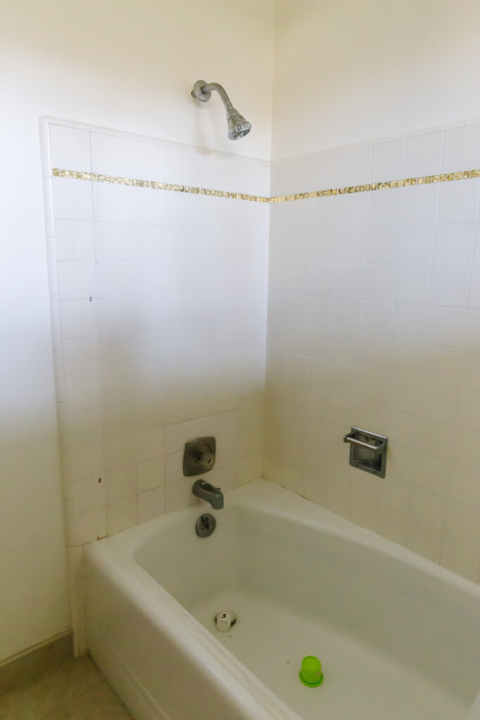
Everytime I walk by this room I can’t get over how transformed it is. As a reminder, we didn’t change any of the major pieces: the tub and shower tile were reglazed, we painted the original vanity and added a new countertop, sink and faucet, and didn’t touch the flooring.
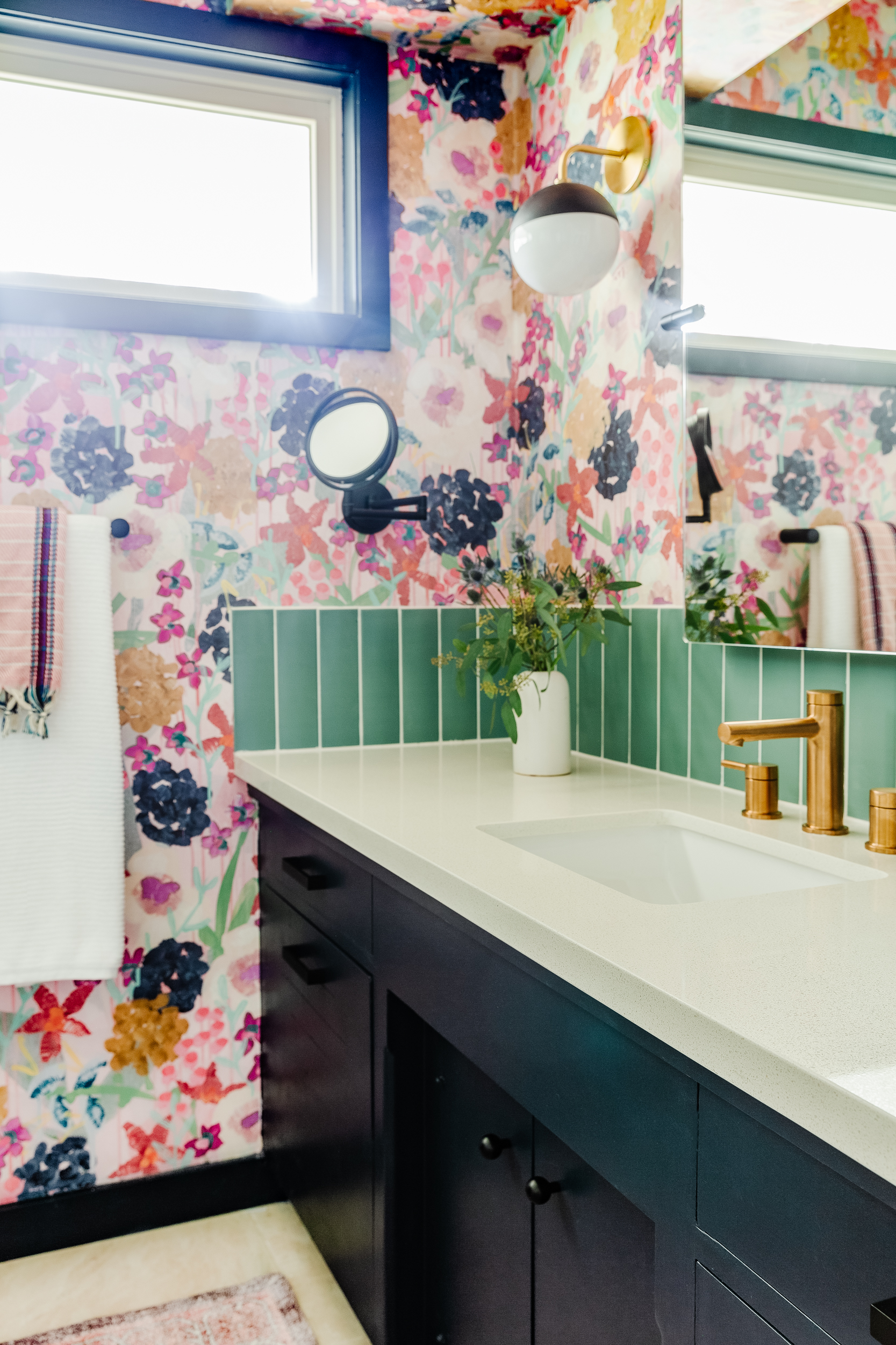
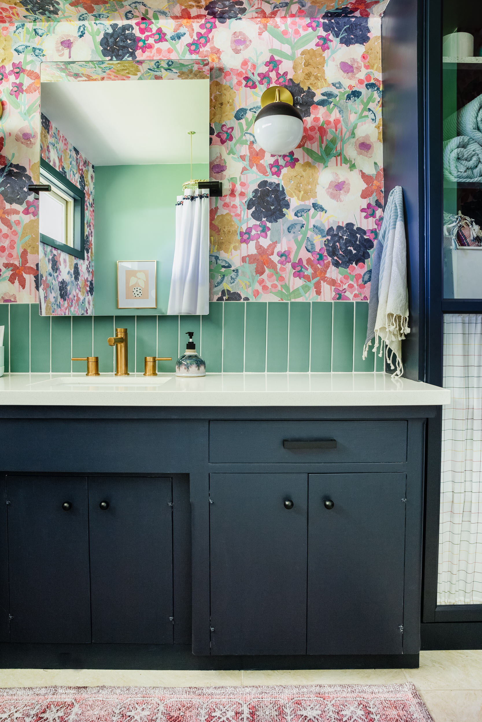
My dad and I tackled the tile job on the backsplash. Don’t look too closely at our install job, but even though it’s not perfect, it’s PERFECT. I’ll share more tile details in a future post, but this one little strip made such a difference.
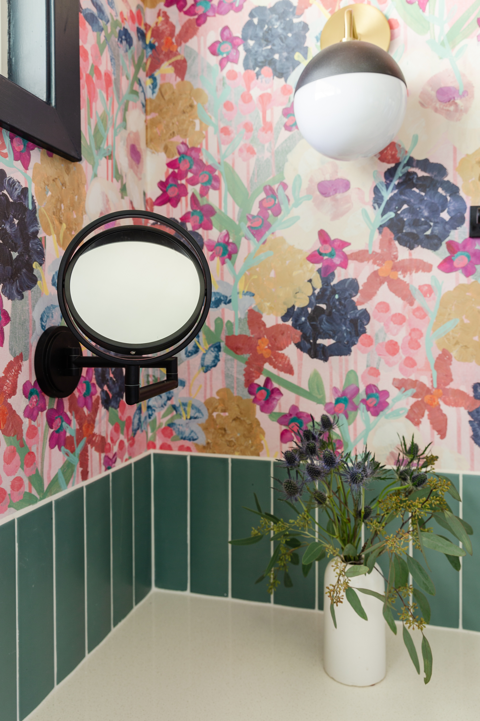
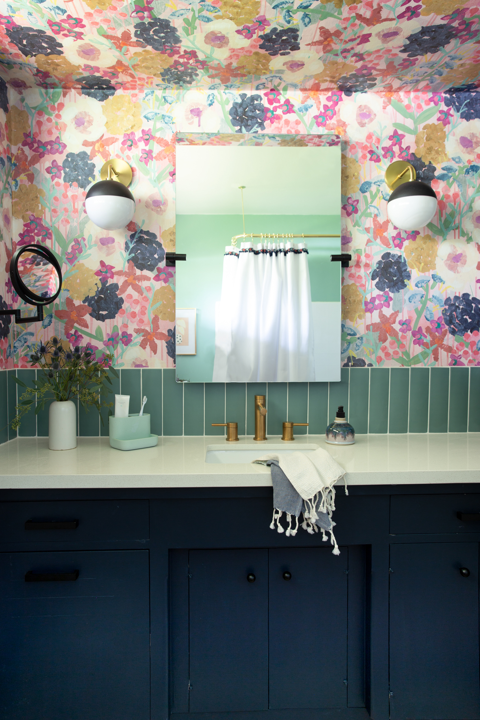
Both of the mirrors are from Moen via Build with Ferguson and they’re even better in person. The frameless vanity mirror is huge and pivots, so Cecily can not only see her face, but basically it acts as a full-length mirror. I love the frameless edge, in a room with a lot going on, we didn’t need anymore stars trying to take the stage in here. I added the extending makeup mirror for her, because even though she doesn’t need it now, it adds a little glam moment for her (she loves it).
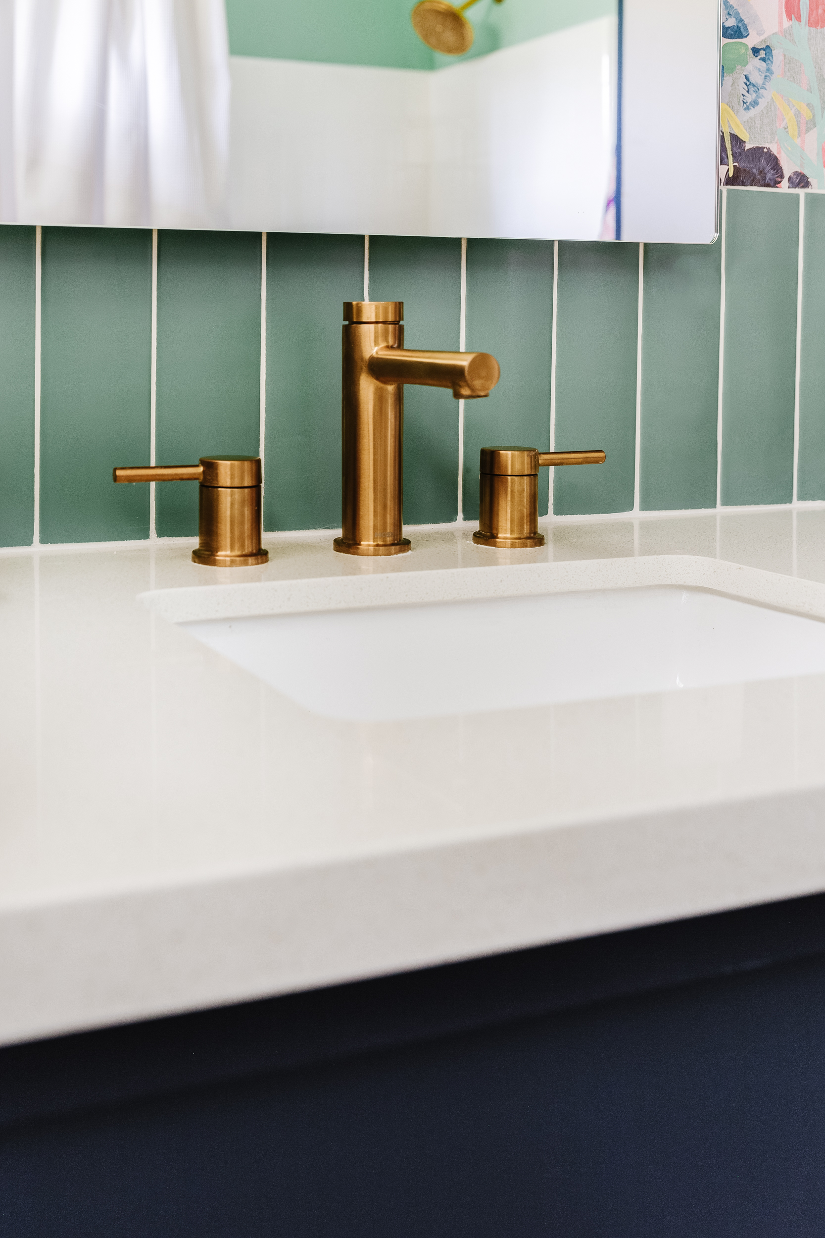
The original plumbing fixtures had seen much better days (or not), and upgrading them was my biggest priority. Functionally, they are a huge improvement, but the faucet is just so pretty. I love the drama of a widespread, especially on a long counter like this. And how good is it against the green tile!!
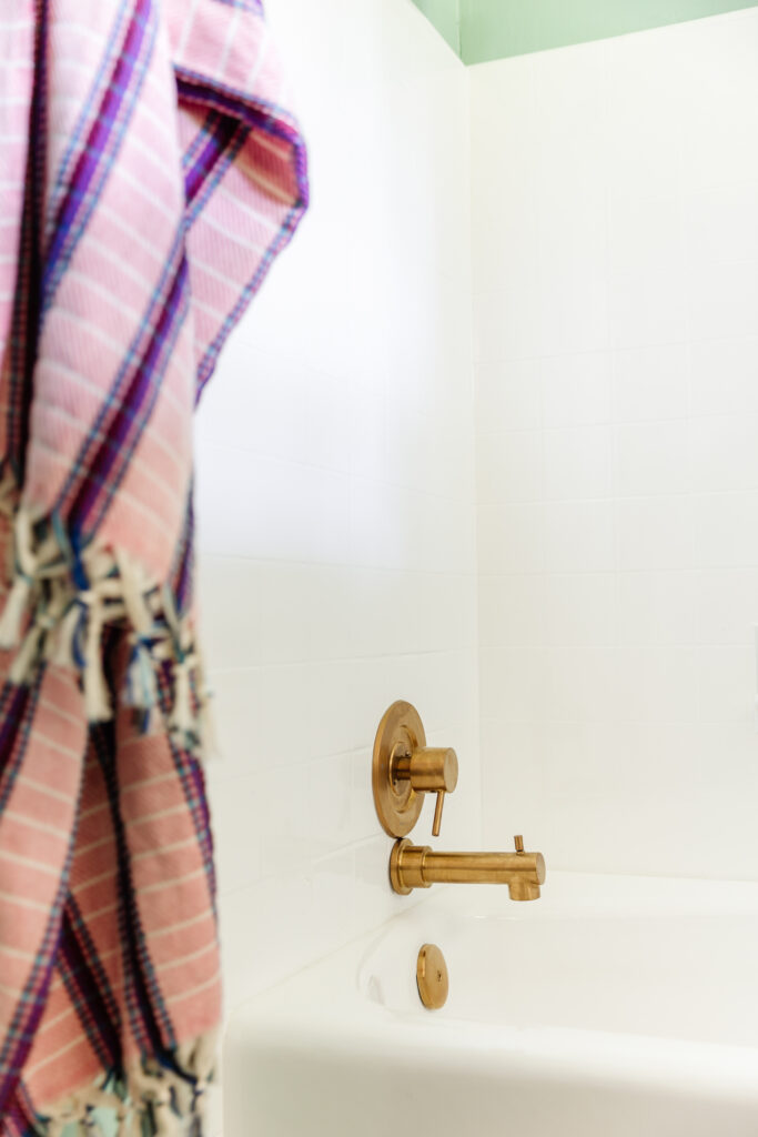
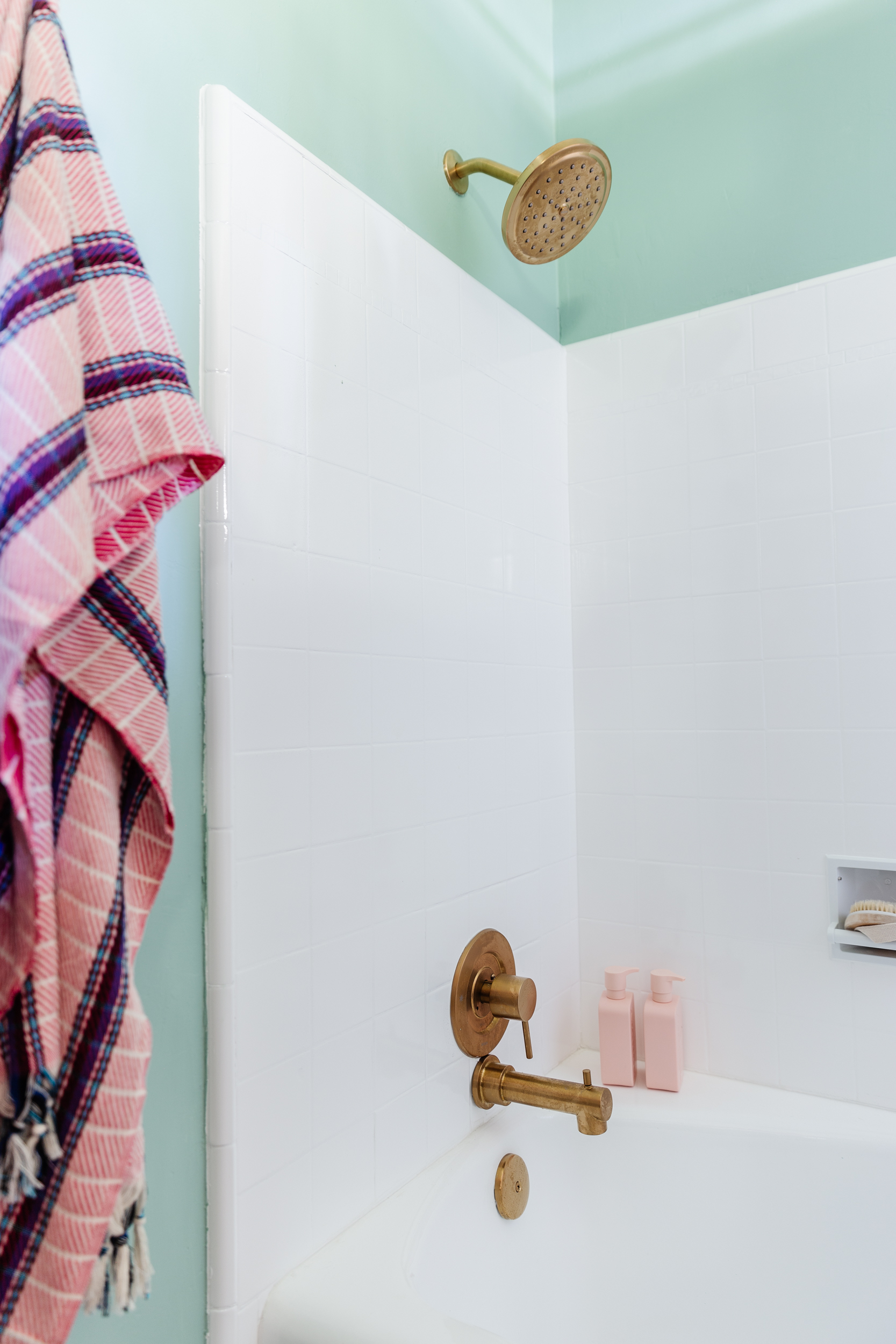
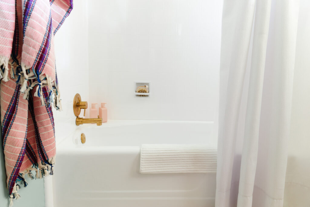
The brass shower fixtures do so much to elevate the modest shower and bath. Updating these without tearing out any tile was a major challenge that almost didn’t happen (read all about it here), but we got lucky and now the valve operates smoothly, and Cecily can run her own baths.
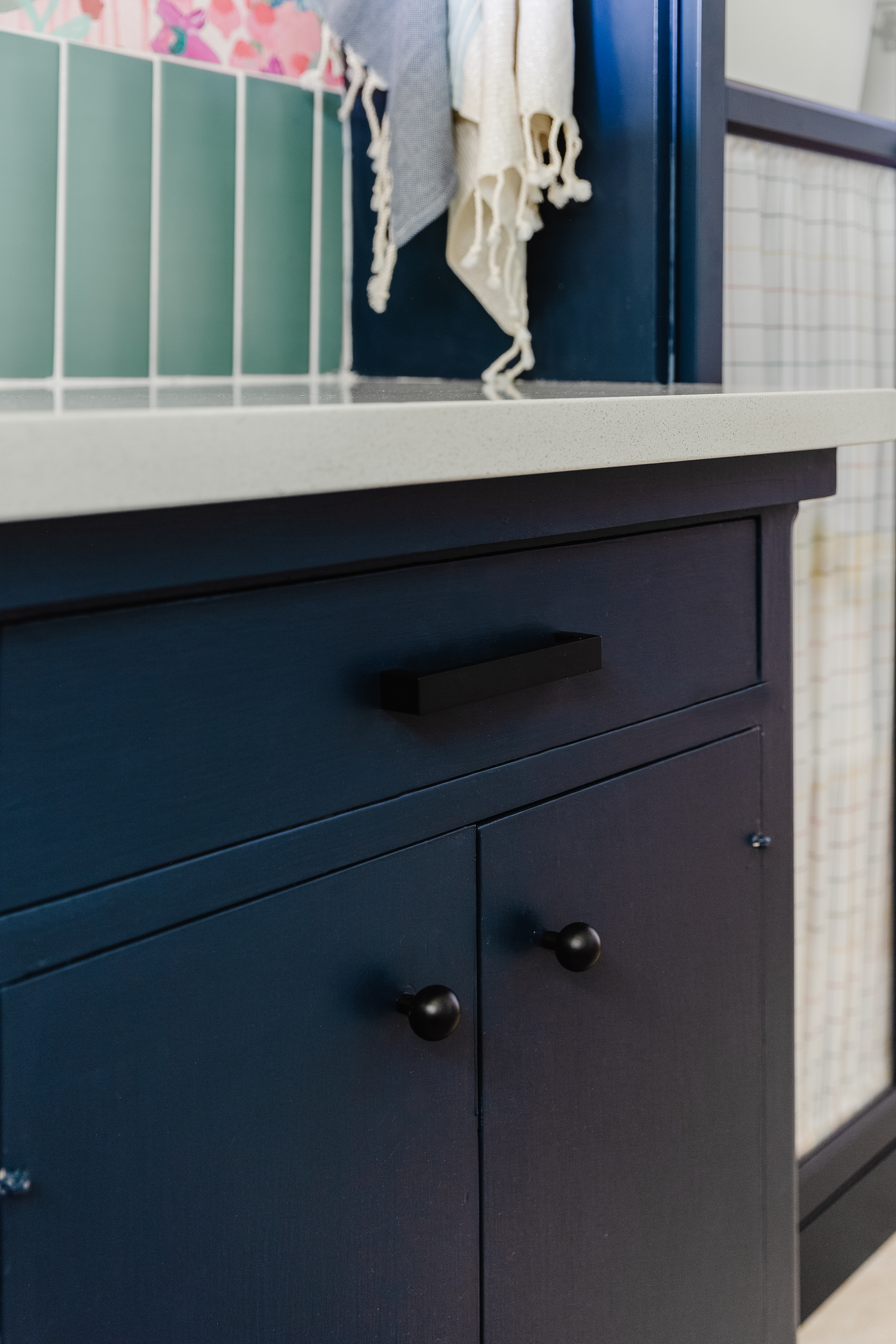
I also can’t get over how cute the vanity is. Our whole house has flat plywood inset cabinets, which I love the look of, but just adding a coat of paint makes them sing.
As for hardware–I know brass pulls would have looked so pretty on the blue, but I went matte black because I wanted to tie in the black on the other bath hardware. I always like to use two metal finishes in bathrooms and choose the same finish on all the plumbing, and mix the second metal around the room evenly. I also have a weird thing that I love low-contrast minimal pulls. Again, with so much going on in here, I like that they’re chunky, but chill.
And last, but certainly not least, the wallpaper. More on this coming, but friends, wallpaper covers a multitude of sins and brings so much energy to a room. Cecily helped me choose this pattern and it is my perfect mix of playful and sophisticated.
SOURCES
A huge thanks to Build with Ferguson who supported this project and I couldn’t have done it without them. They created a handy Shop the Room page with links to all the products I used, plus some similar substitutes to items available on their website. I use them for all of my personal and client projects because of how large their selection is, fast shipping and easy-to-use website. I love the My Projects function, I use it all the time in my design process and collaborating with clients. You can click the graphic below and create one of your own!
- Shower head*
- Shower arm*
- Shower arm flange*
- Tub spout*
- Robe hook*
- Toilet paper holder*
- Towel bar*
- Cabinet knobs*
- Cabinet pulls *
- Faucet*
- Sink*
- Makeup mirror*
- Wall mirror*
- Sconces
- Toilet (our is original)
- Tub (ours is original)
* Gifted by our generous sponsors in exchange for promotion. All opinions are my own
To DO LIST
- Reglaze shower & tub
- Demo vanity counter & backsplash
- Bath & shower plumbing
- Paint vanity
- Install countertop
- Replace sink
- Replace sink faucet
- Hang wallpaper
- New lighting
- Install tall storage & trim
- Wall mirror
- Modify shower curtain
- Replace cabinet hardware
- Replace bath hardware
- Style & accessories


