Some homes just get you at first sight, and this was one of them. Built in the 1960s on a breathtaking property, this ranch-style home had adobe walls, warm wood details, and incredible outdoor views, but the interiors weren’t quite living up to their potential. The homeowners loved the character of their home, but they needed it to feel more functional, welcoming, and refined.
Instead of a full renovation, we took a thoughtful approach, embracing the home’s midcentury roots while adding layers, softness, and a touch of ‘70s cool. One of the biggest challenges? Filling the large, open spaces with furniture that felt both useful and inviting—ensuring every piece had a purpose while maintaining the home’s flow.
Below, I’ll take you through the before-and-after journey, sharing the updates that made the biggest impact. Let’s start the tour!
ENTRY
Before
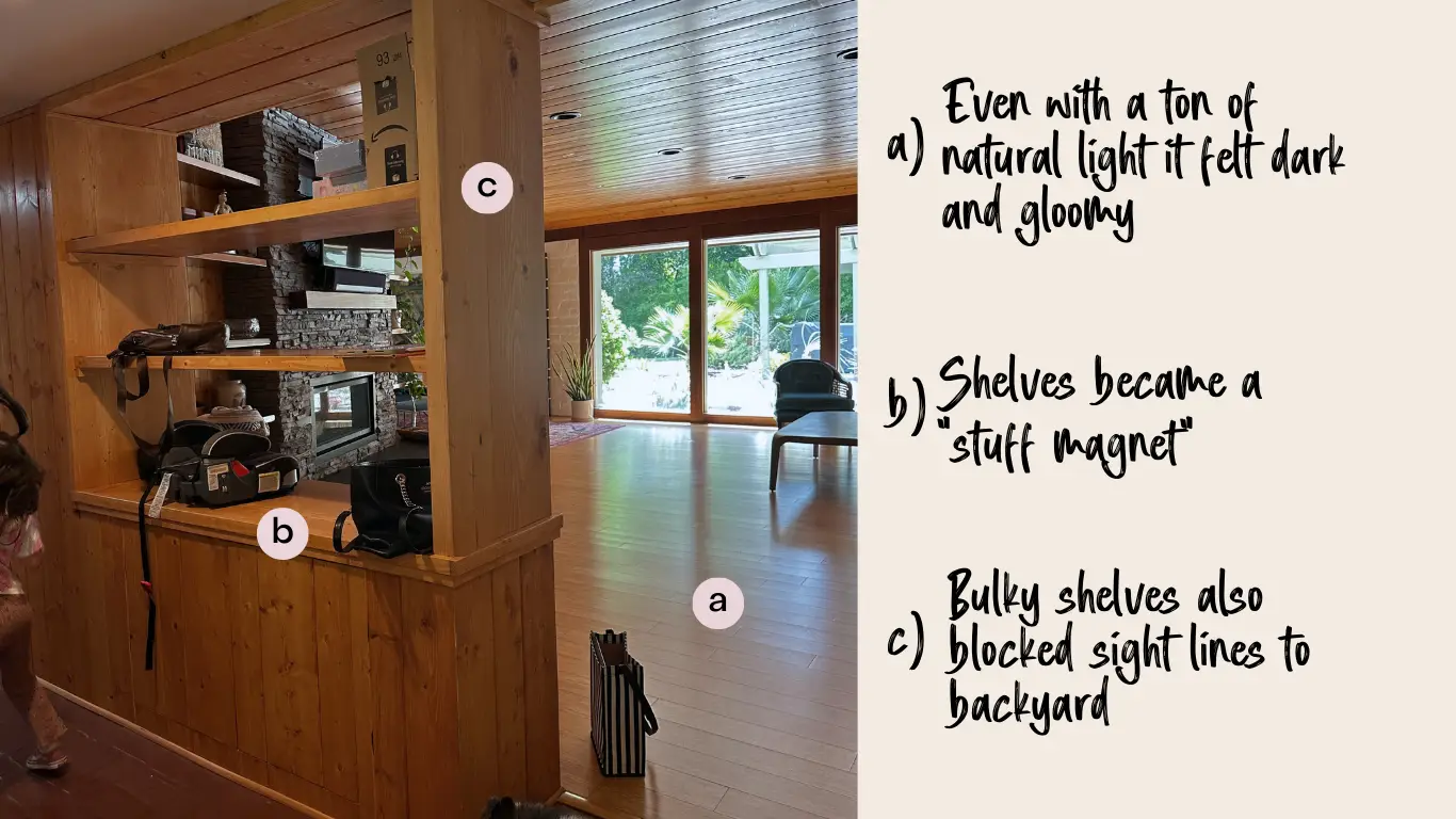
The original entry felt dark, cluttered, and disconnected from the rest of the home. Bulky shelving blocked sightlines to the beautiful outdoors and quickly became a magnet for things that didn’t belong. We set out to create a space that felt open, intentional, and aligned with the home’s midcentury character, while subtly discouraging it from turning into a catch-all for clutter.
After
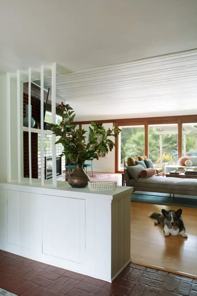
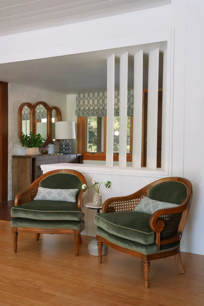
We replaced the open shelving with a vertical angled slat wall, allowing light to pass through while adding a subtle architectural moment. To freshen it all up, the built-ins and ceiling got a fresh coat of crisp white paint that brightened the space.
Before
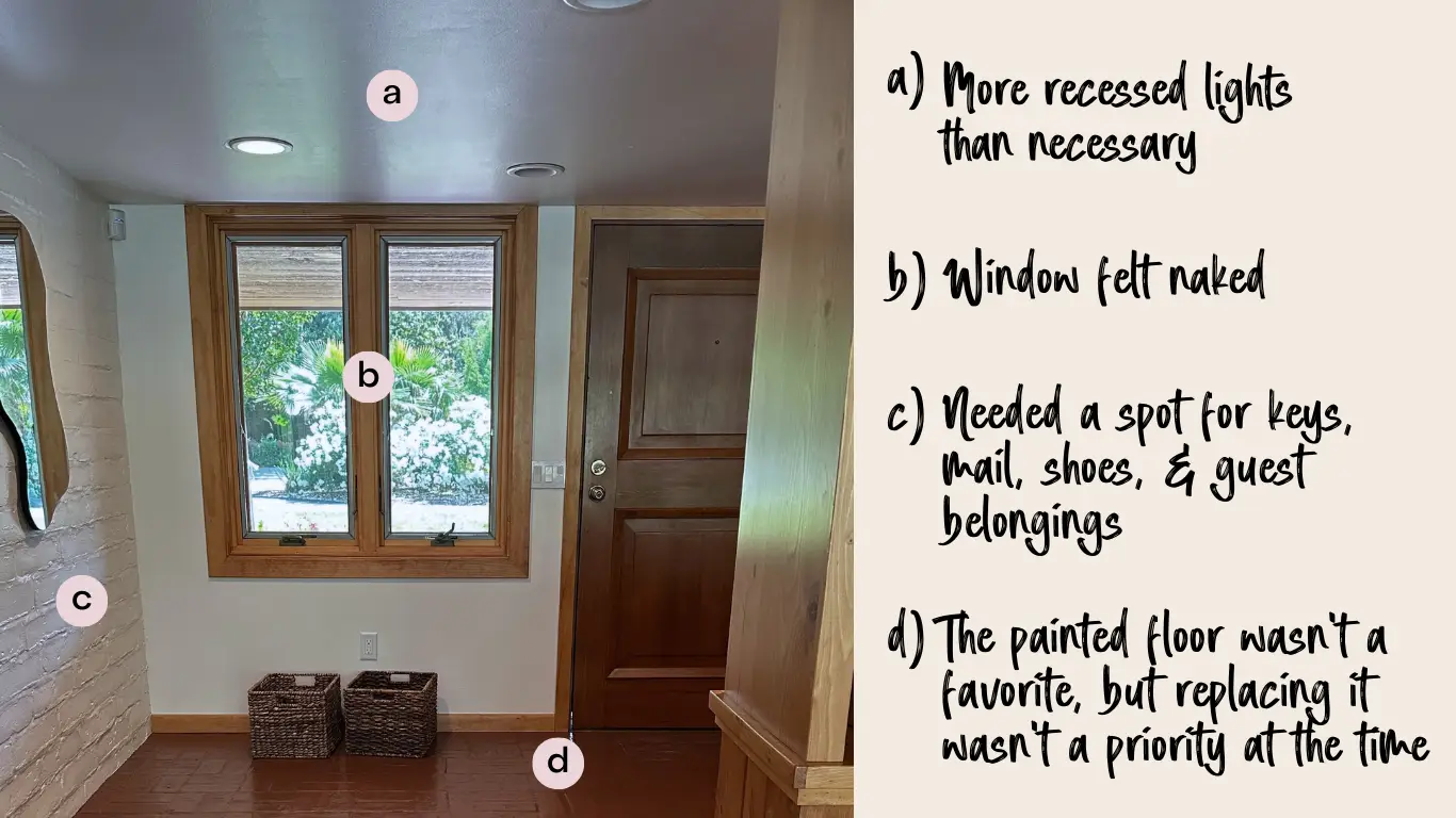
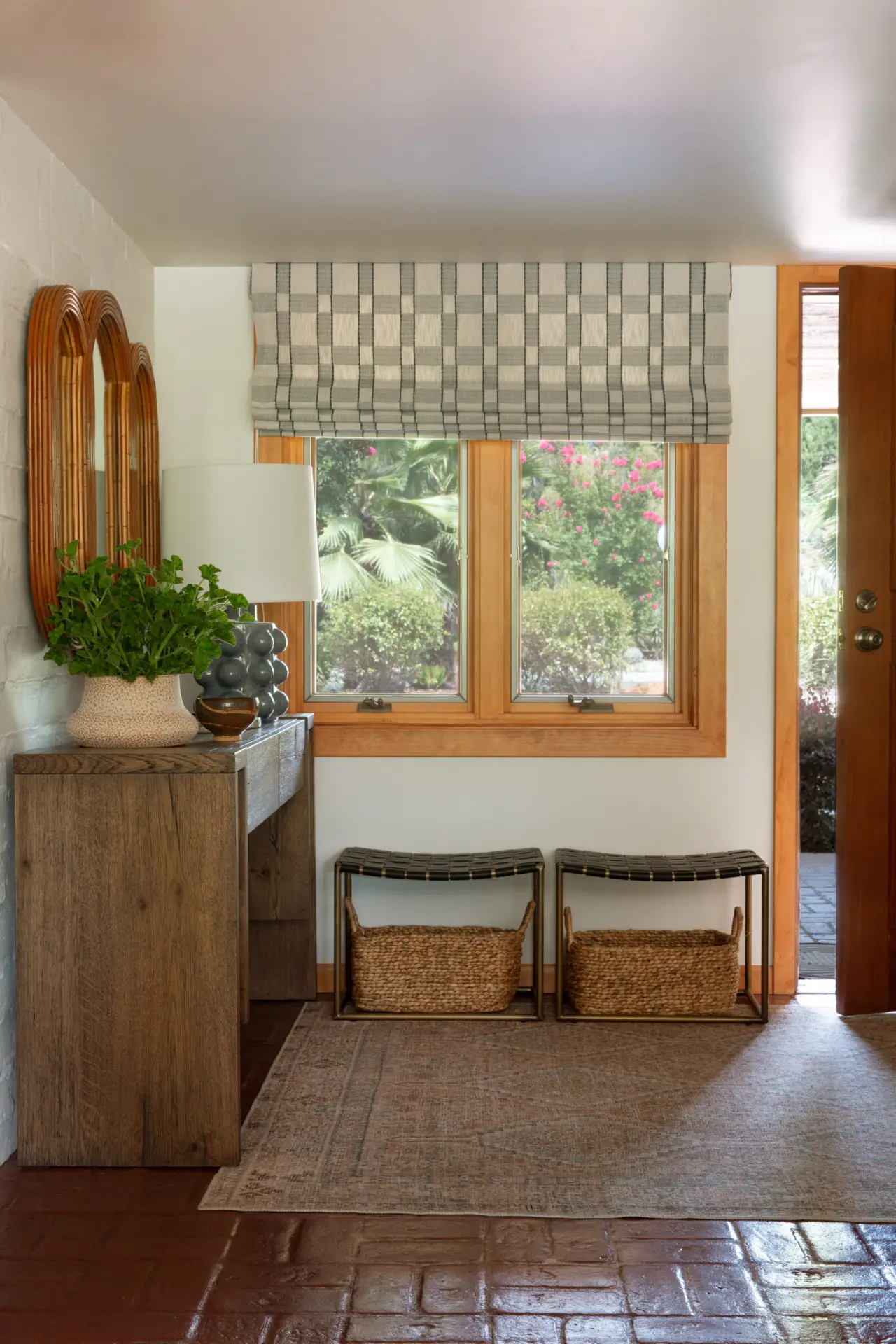
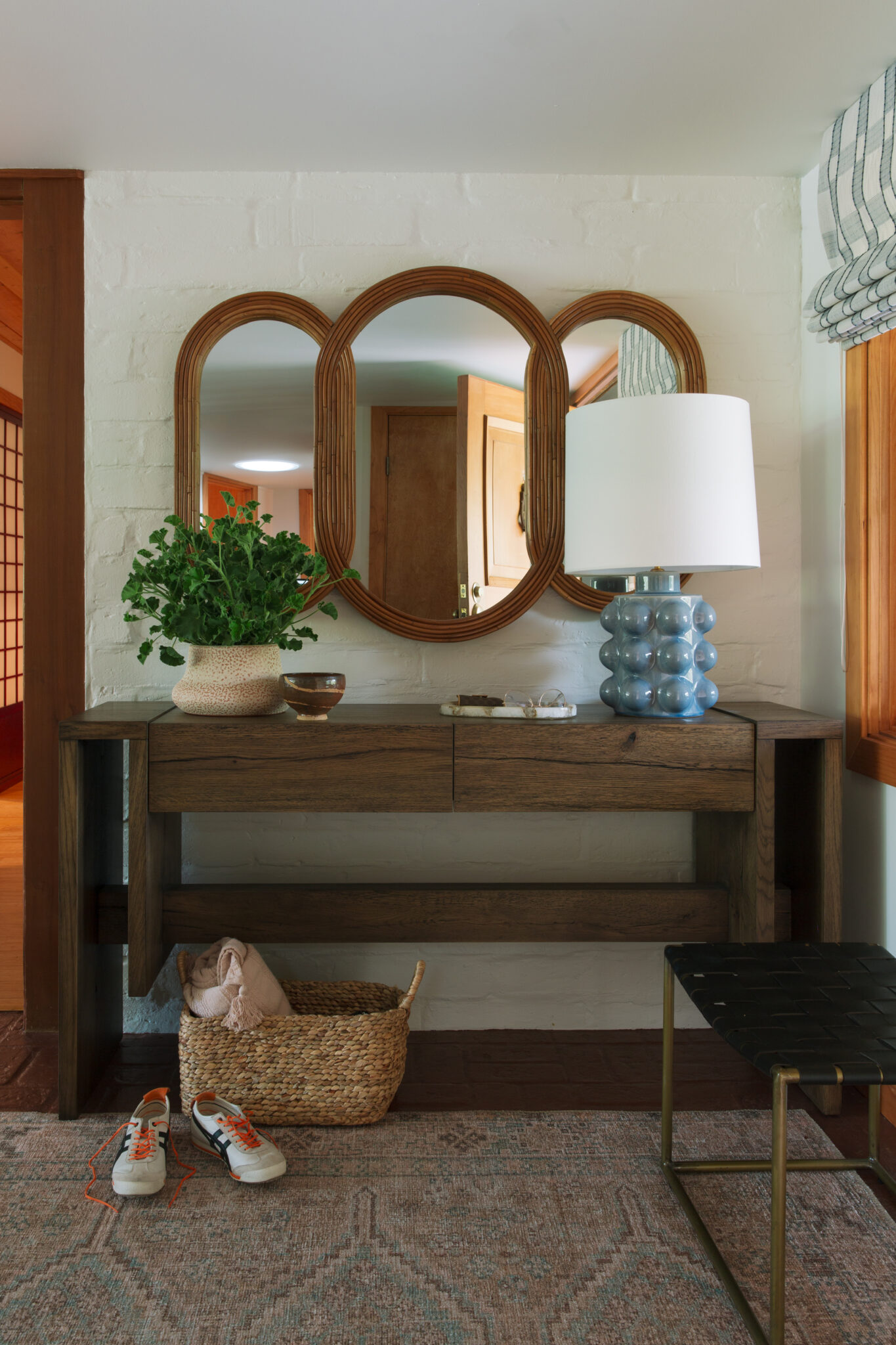
The original foyer had great potential, but it needed functional furniture to ground the entry. The window felt bare, lacking interest, and there was no designated drop zone for keys, shoes, or everyday essentials. The painted brick floors weren’t ideal, but replacing them wasn’t a priority, so we needed a solution that would minimize their impact. On top of it all, excess recessed lighting made the low ceilings feel overly busy and distracting.
After
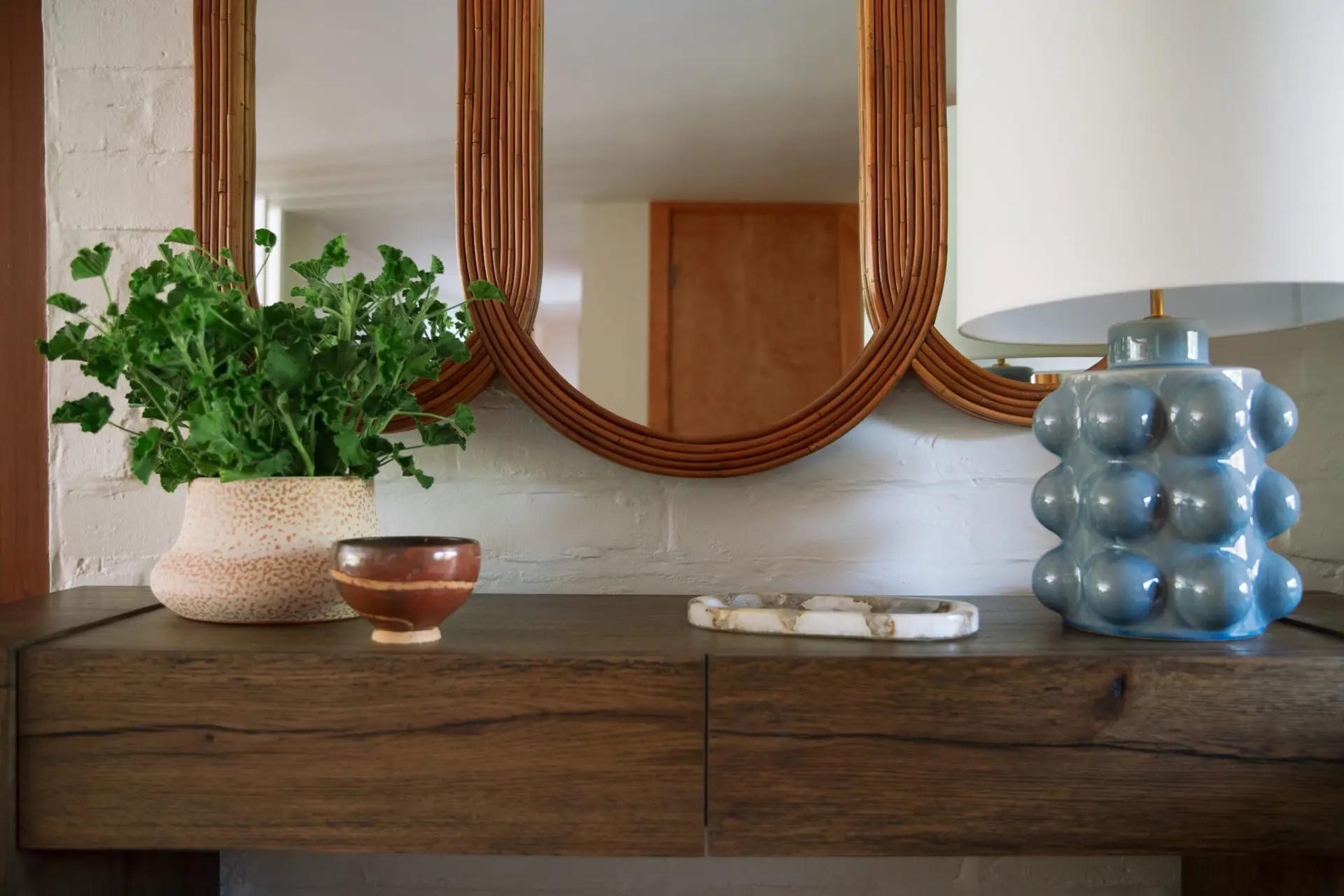
Functionality was just as important as style in this transformation. We installed a custom fabric Roman shade on the window in a woven check, providing privacy while adding texture and pattern. A wood console table now serves as a practical drop zone for everyday essentials, while woven baskets underneath provide a place for shoes. To layer in personality, we added a statement mirror that brings movement and a sculptural element to the space. A craqueled bubble lamp in soft blue introduces a pop of color and a touch of playfulness, while a vintage-inspired rug ties everything together, minimizing the prominence of the painted brick floor.
AFTER
Primary Bedroom
Before
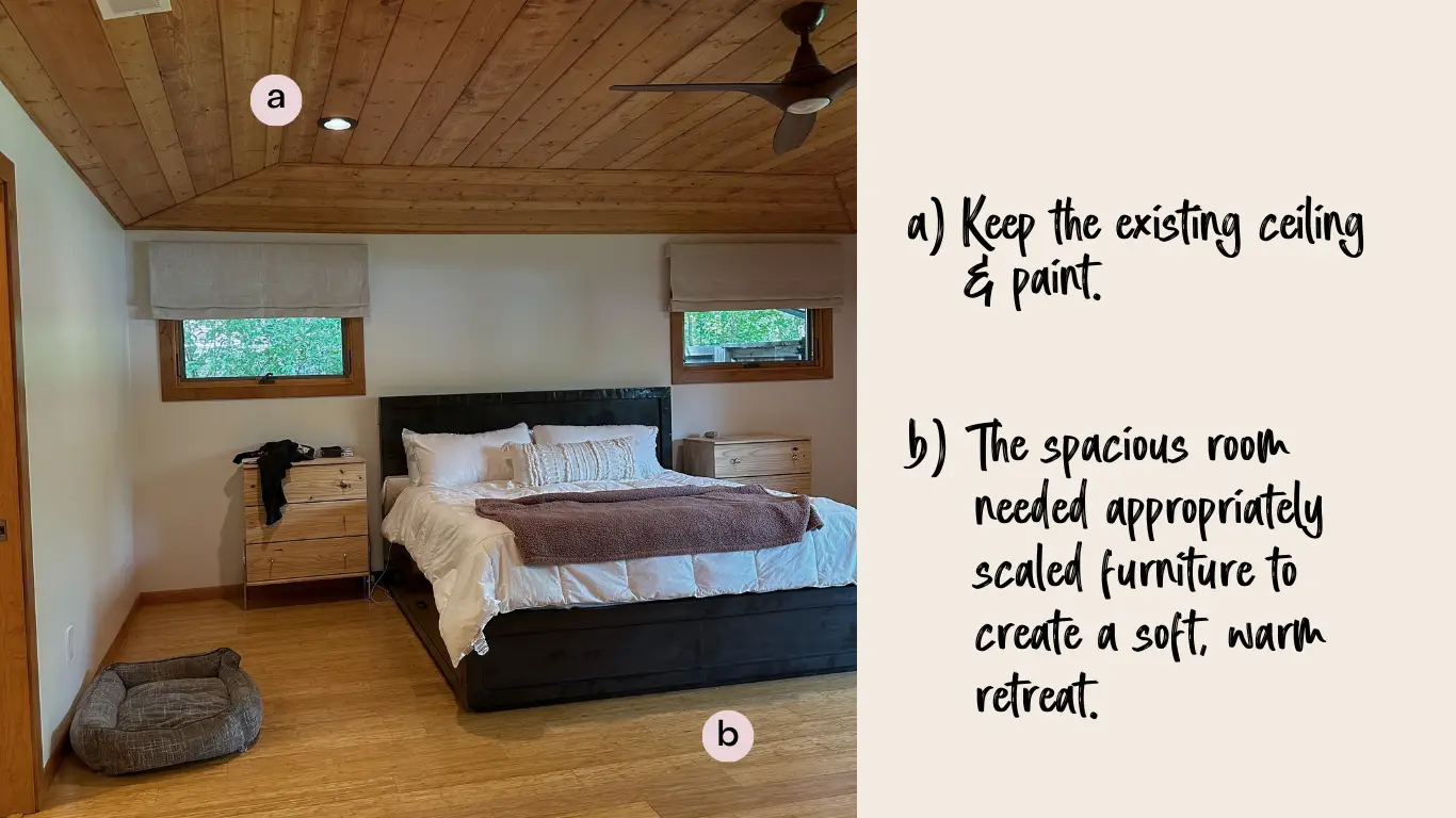
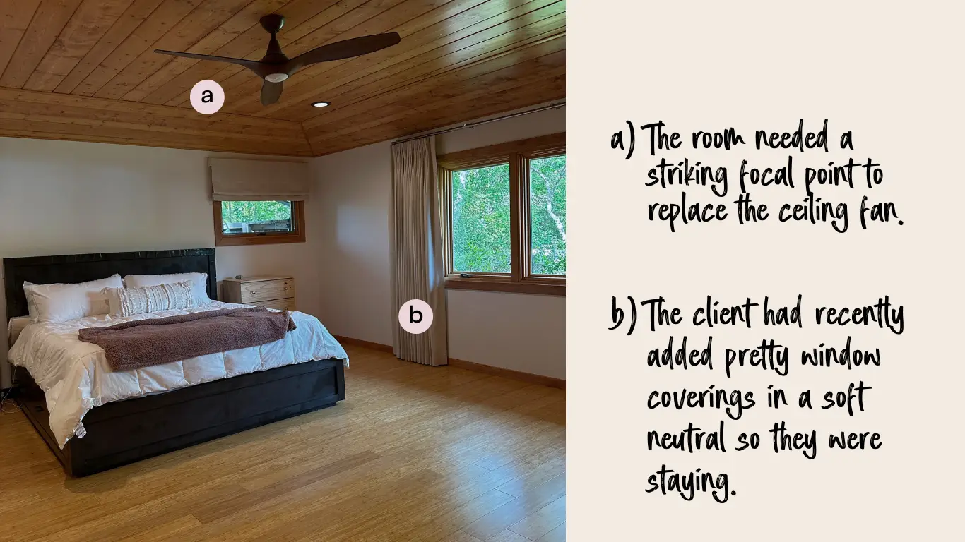
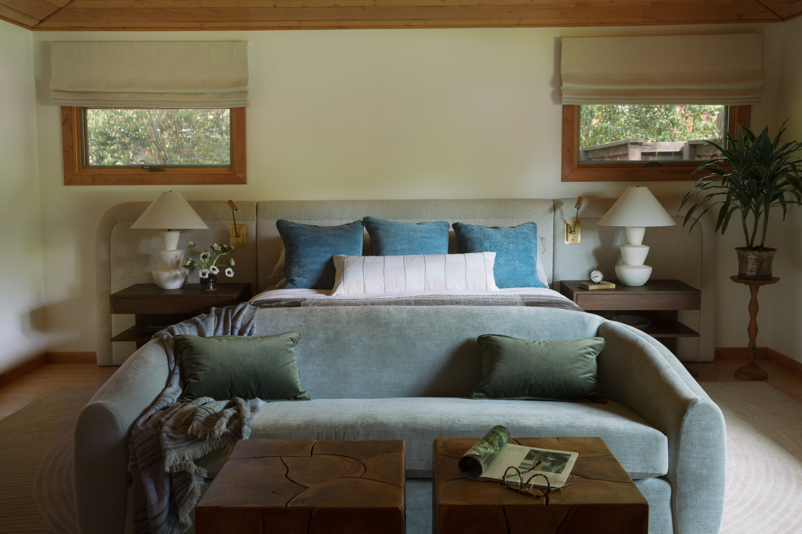
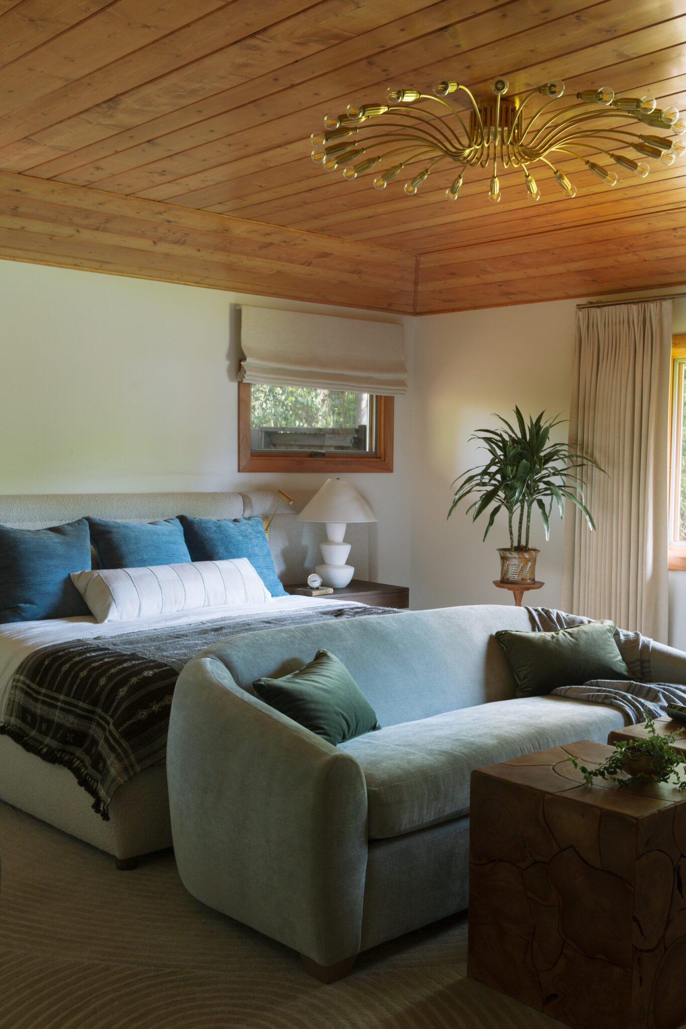
The original primary bedroom had great bones but felt flat andthe existing furniture was kind of floating in the room. To make the space feel more inviting and layered, we introduced texture, dimension, and appropriately scaled furniture that better suited the room’s generous proportions. The ceiling also needed a dramatic fixture to balance the interesting ceiling detail.
Before
After
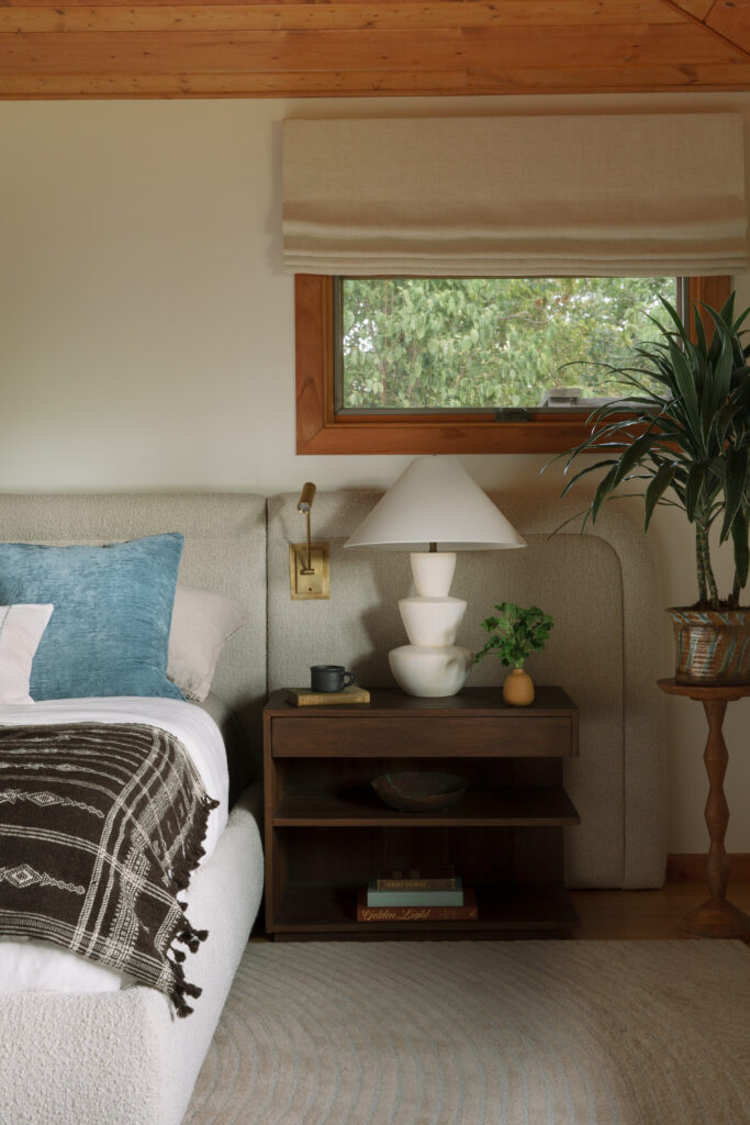
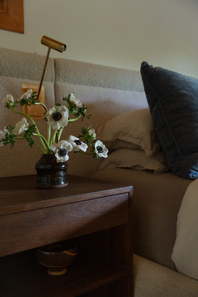
To bring warmth and balance to the expansive bedroom, we started by anchoring the space with an extra-wide custom headboard in a textured neutral, adding softness and filling the large wall behind the bed. A curvy sofa at the foot of the bed created a cozy sitting area, making the large room feel more intimate. We replaced the existing ceiling fan and introduced sculptural, dramatic lighting, bringing both interest and form to the space.
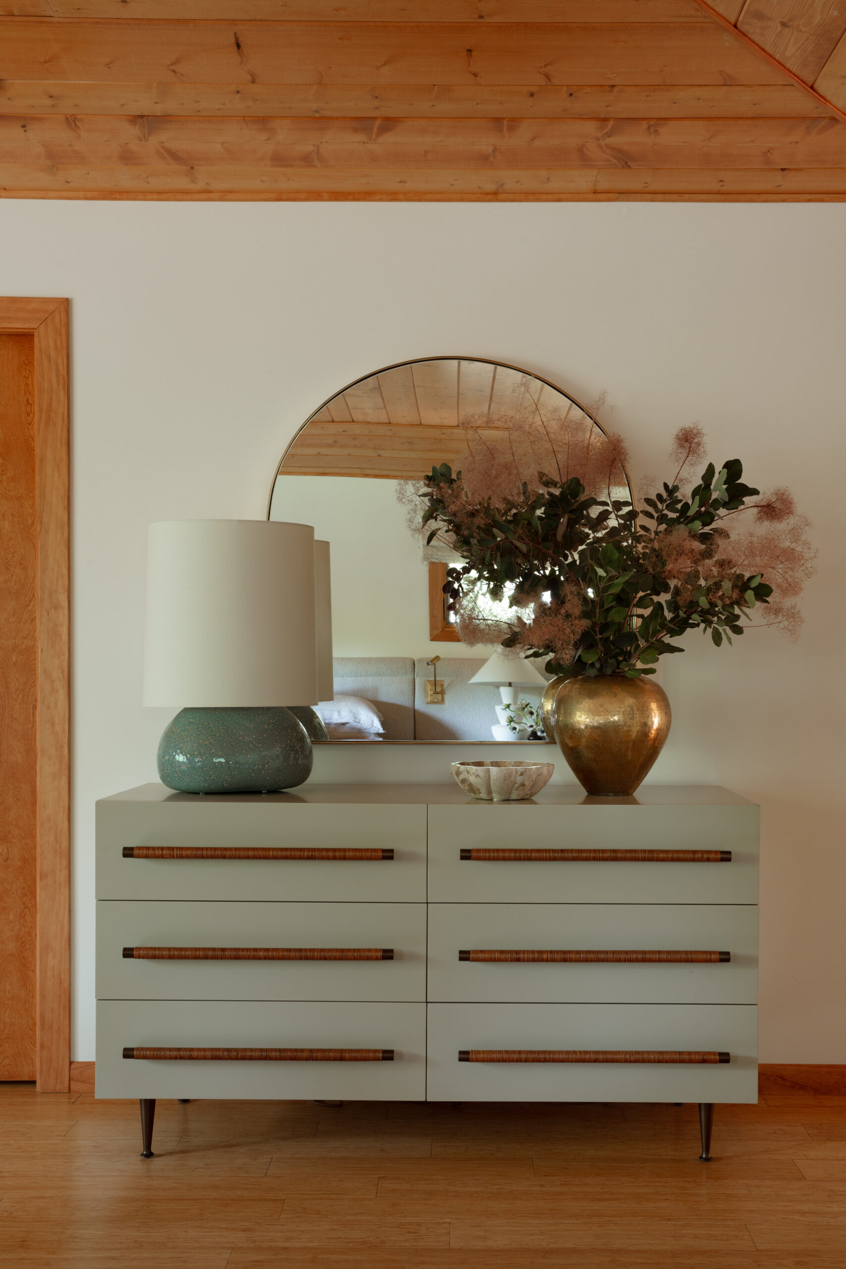
Before
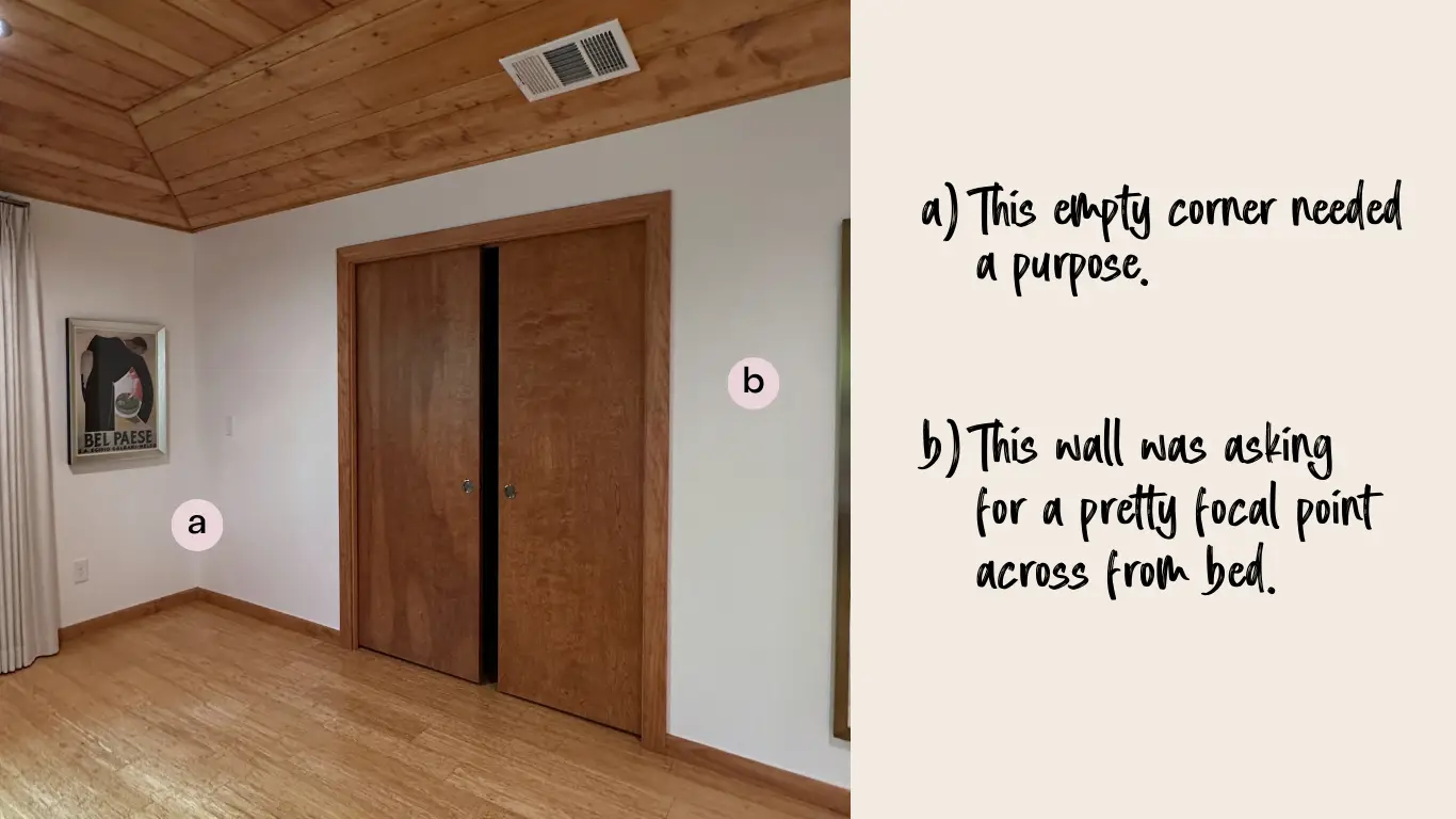
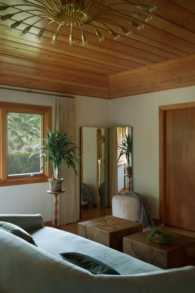
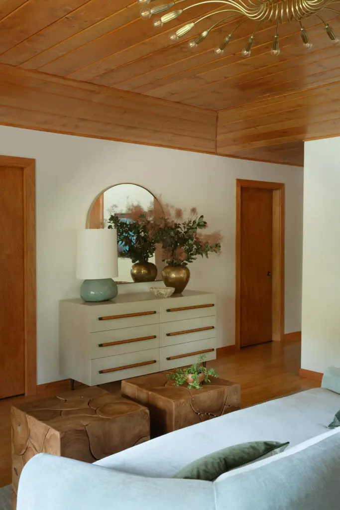
The opposite side of the room needed a lot of work to be a functional space. The corner was feeling especially empty and lacking purpose while the wall opposite the bed was begging for a focal point to draw it all together. We ended up turning the empty corner into a classic dressing area and added a dresser to the wall next to it. This added much needed storage while keeping the space neutral with added texture instead of more wood tones.
After
Living Room
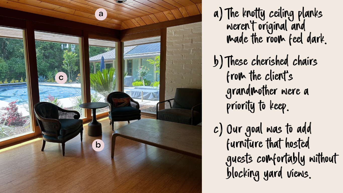
Before
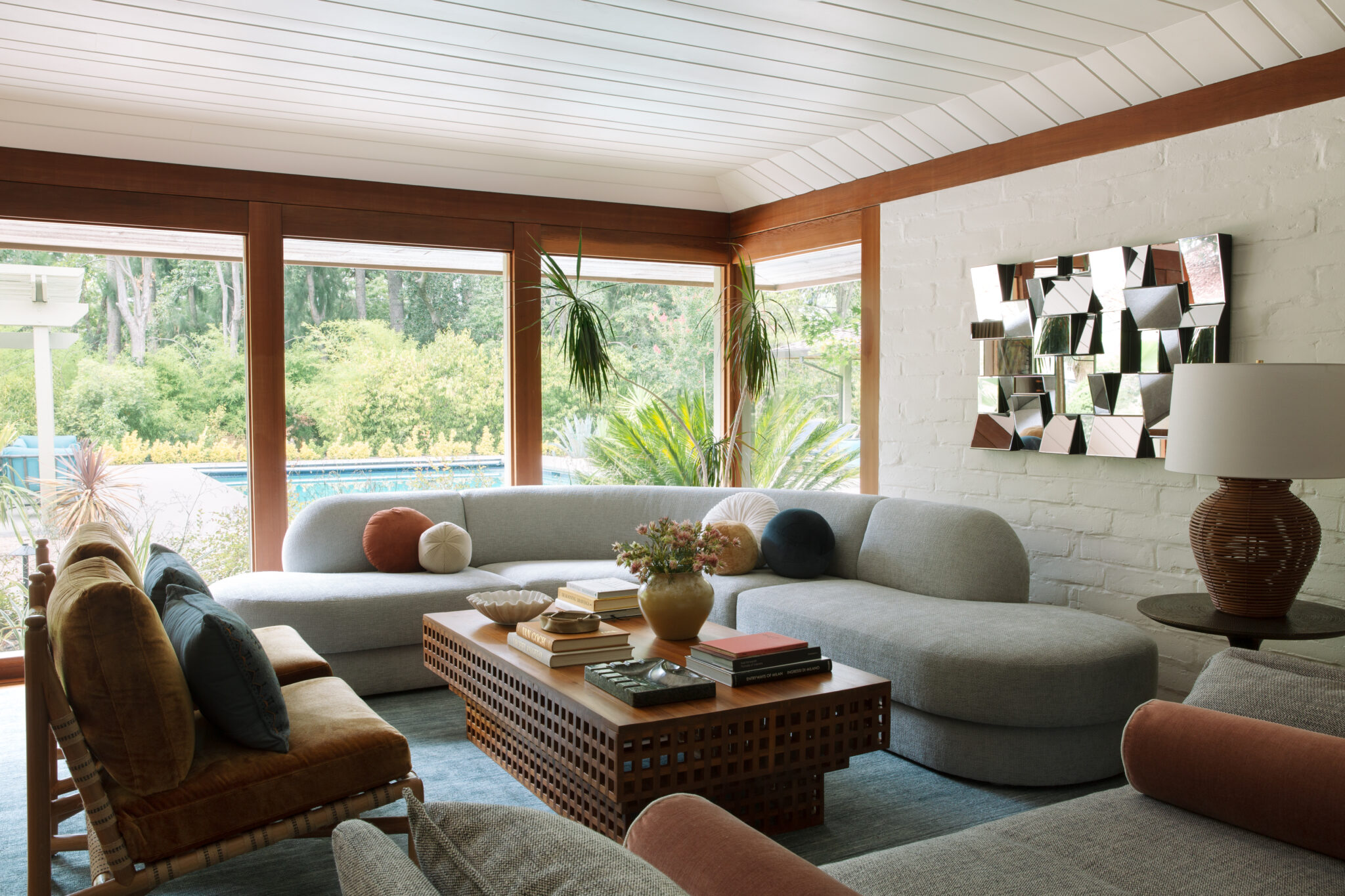
The original living room had great potential with amazing natural light, adobe walls and floor-to-ceiling windows, but the client needed furniture to fit the space and and be fit for entertaining. Our goal was to create a cohesive layout that invited guests to get comfortable without blocking the views to the lush outdoors.
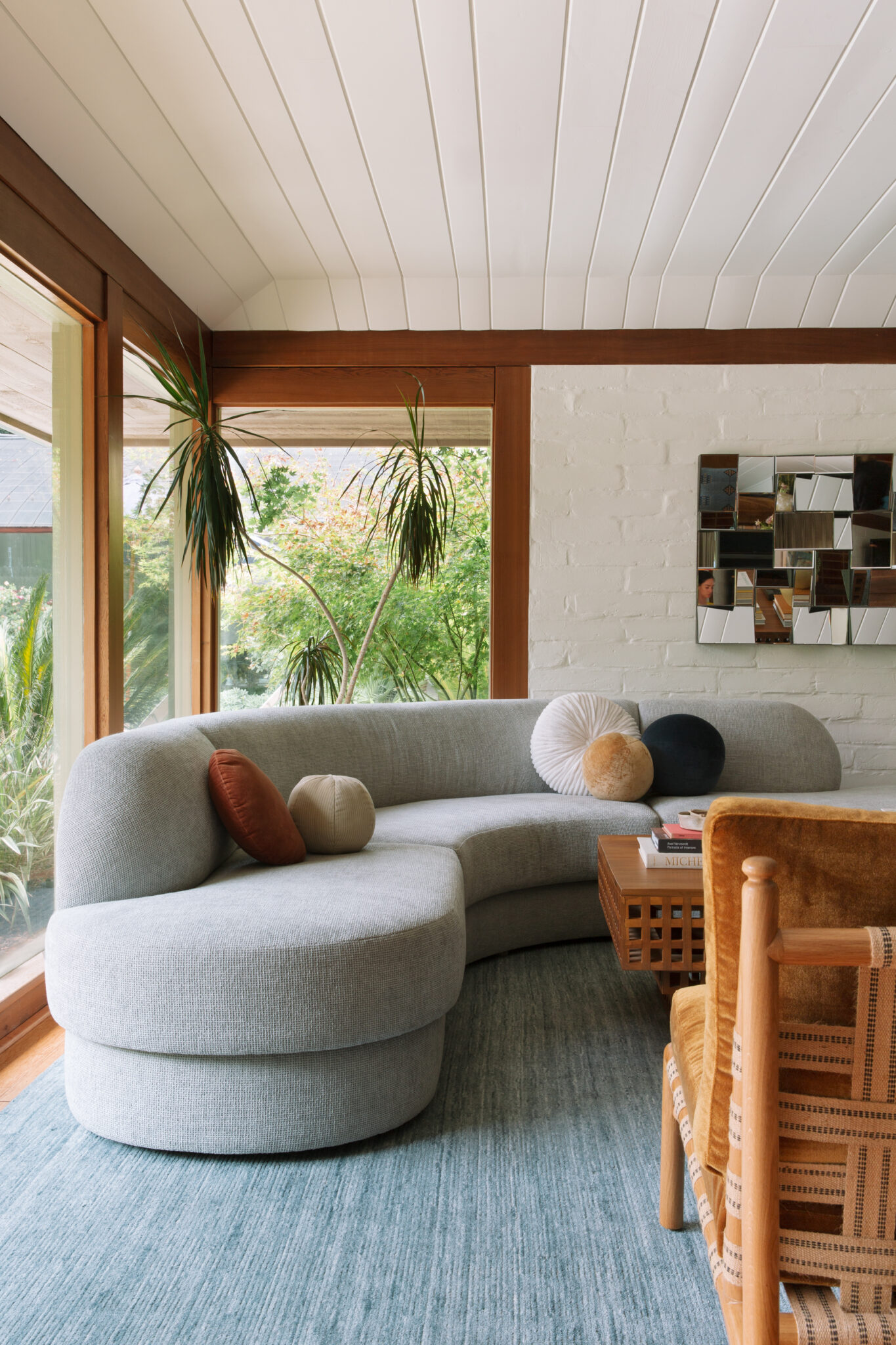
After
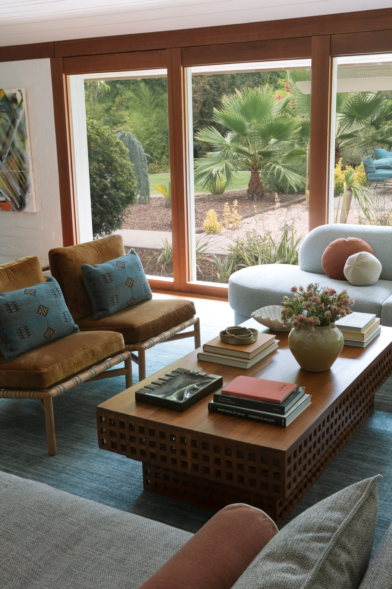
We designed a custom low-slung sectional that provides ample seating and takes advantage of the corner without covering too much of the windows. We paired it with a unique teak coffee table and a pair of custom chairs to bring the seating area together and encourage conversation. We finished the arrangement with an open-back chaise lounge that is a cozy place to read a book or converse from either side. The armless design and round corners of the pieces helps the furniture feels lighter and less visually bulky, making the space feel more open and expansive.
A mix of different elements and textures adds balance and natural warmth. We painted the ceiling white to create a clean backdrop that showcases the earthy finishes and textures of the furniture. Finishing touches included the perfect vintage mirrored piece that adds dimension and a unique twist to the space and a huge tree to fill the corner behind the couch.
Before
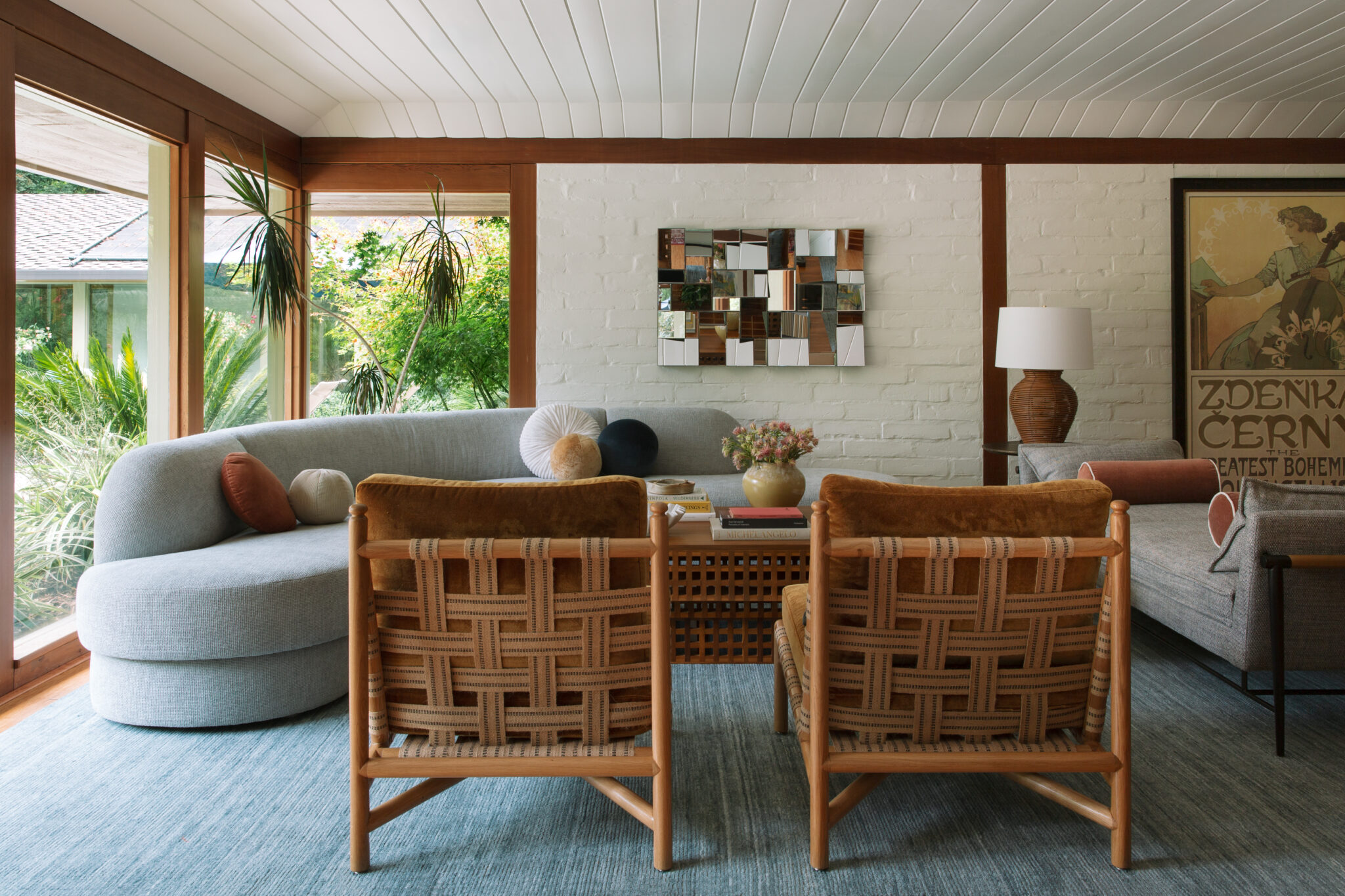
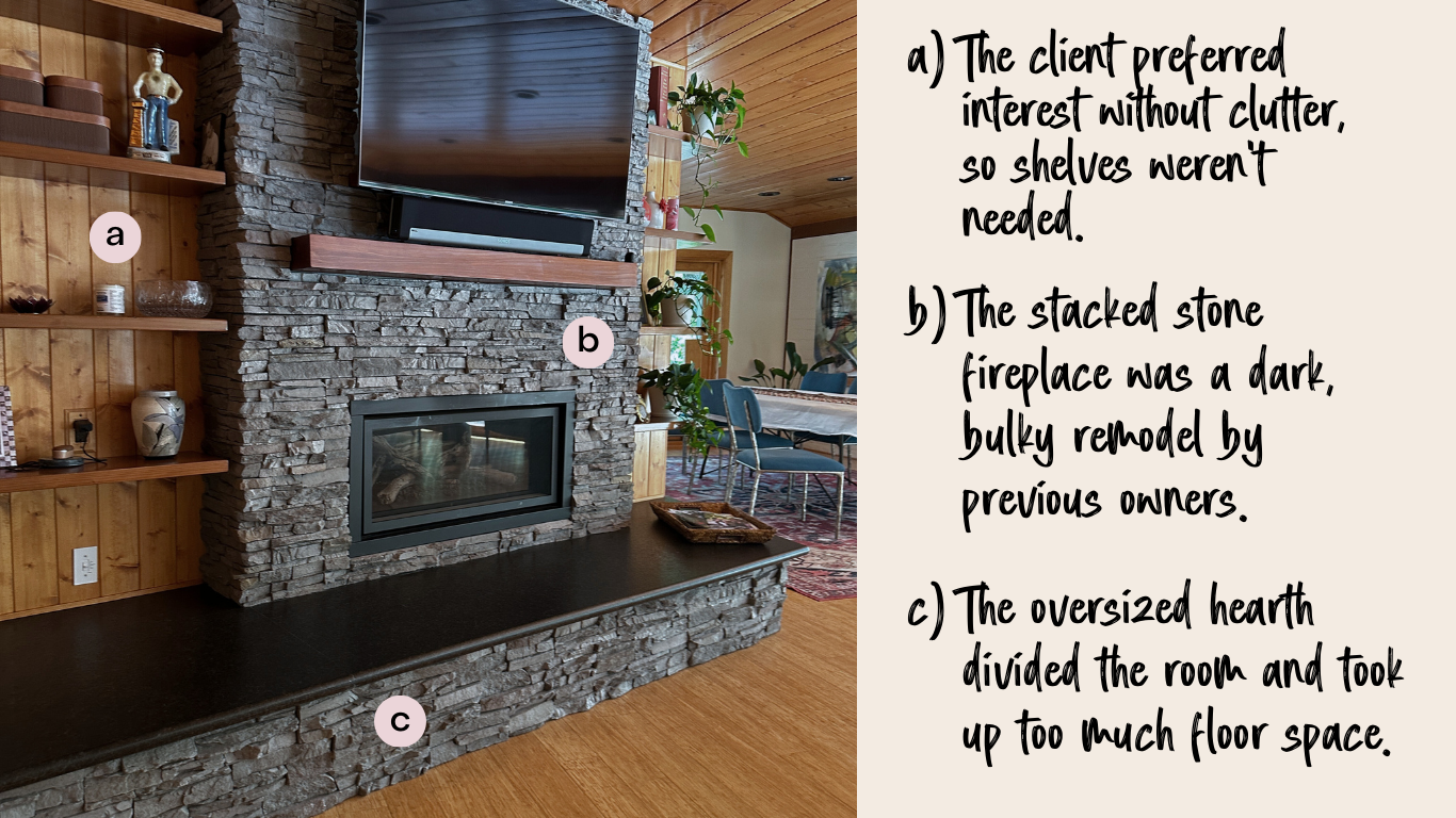
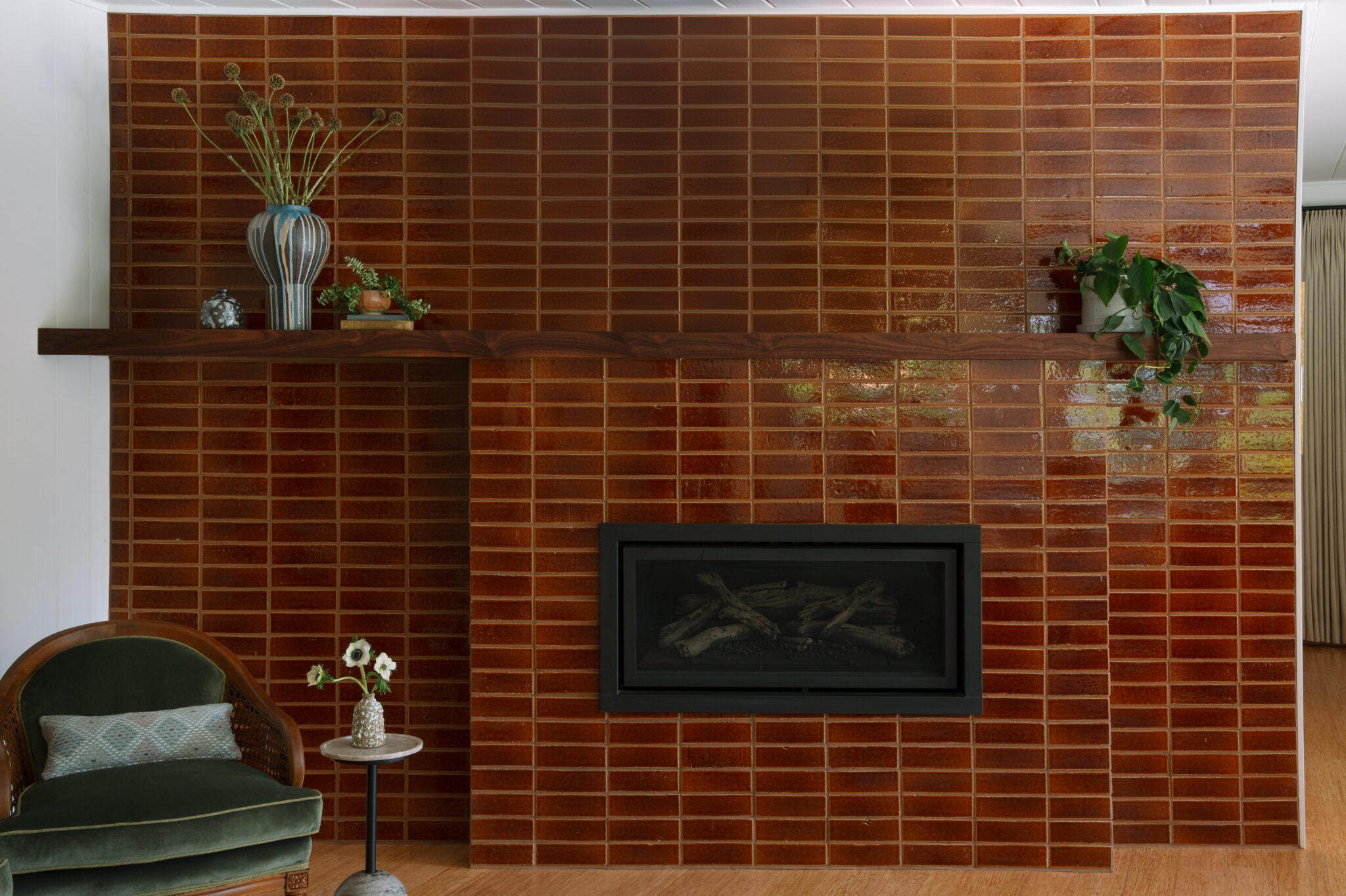
On the opposite side of the room, the stacked stone fireplace—a bulky, dark addition from a previous remodel—felt too heavy and mismatched stylistically. The oversized hearth extended deep into the room, disrupting flow and making furniture placement tricky. Flanking built-in shelving added to the clutter, while the client envisioned a cleaner, more streamlined look. To create a cohesive, intentional focal point, we reimagined the entire fireplace area—integrating it with the home’s earthy midcentury character.
After
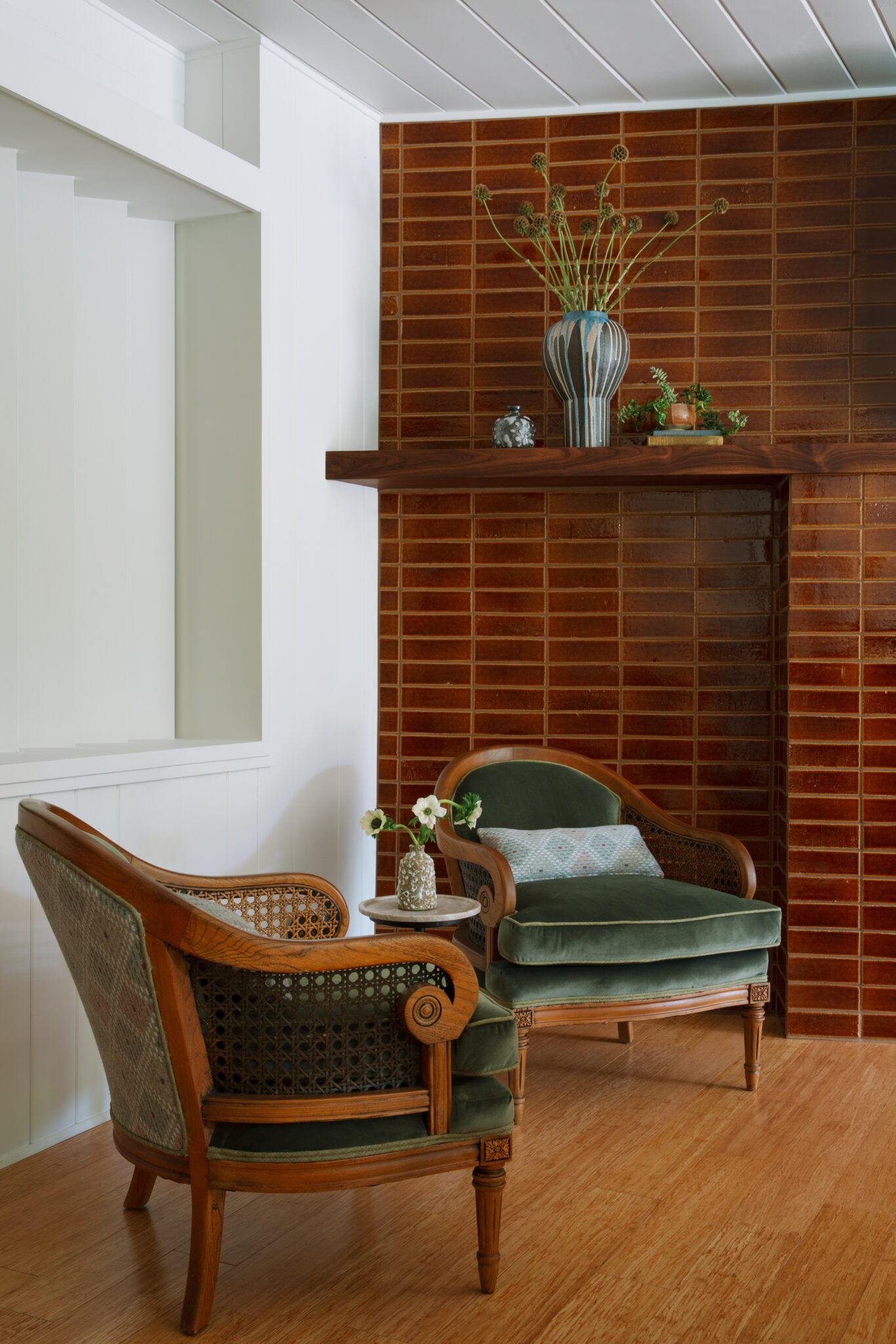
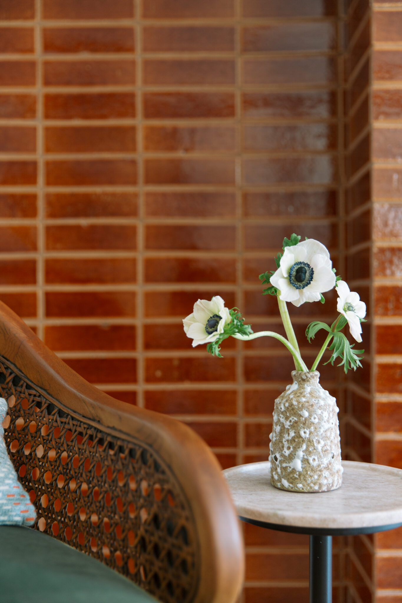
Revamping the fireplace completely transformed the space, introducing rich texture and an organic, timeworn feel with the glossy brick. Its earthy, sunbaked tones add depth and character, complementing the home’s midcentury adobe aesthetic. The client’s vintage heirloom chairs, newly reupholstered, bring a color contrast and are the perfect fit for this inviting fireside seating area. Removing the bulky built-ins streamlined the look, creating a cleaner, more open statement while keeping the focus on the exterior view.
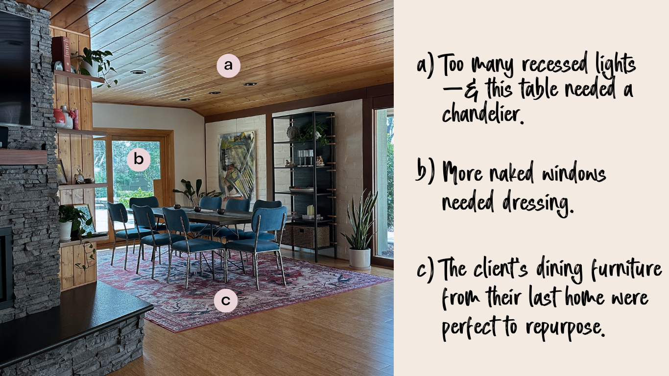
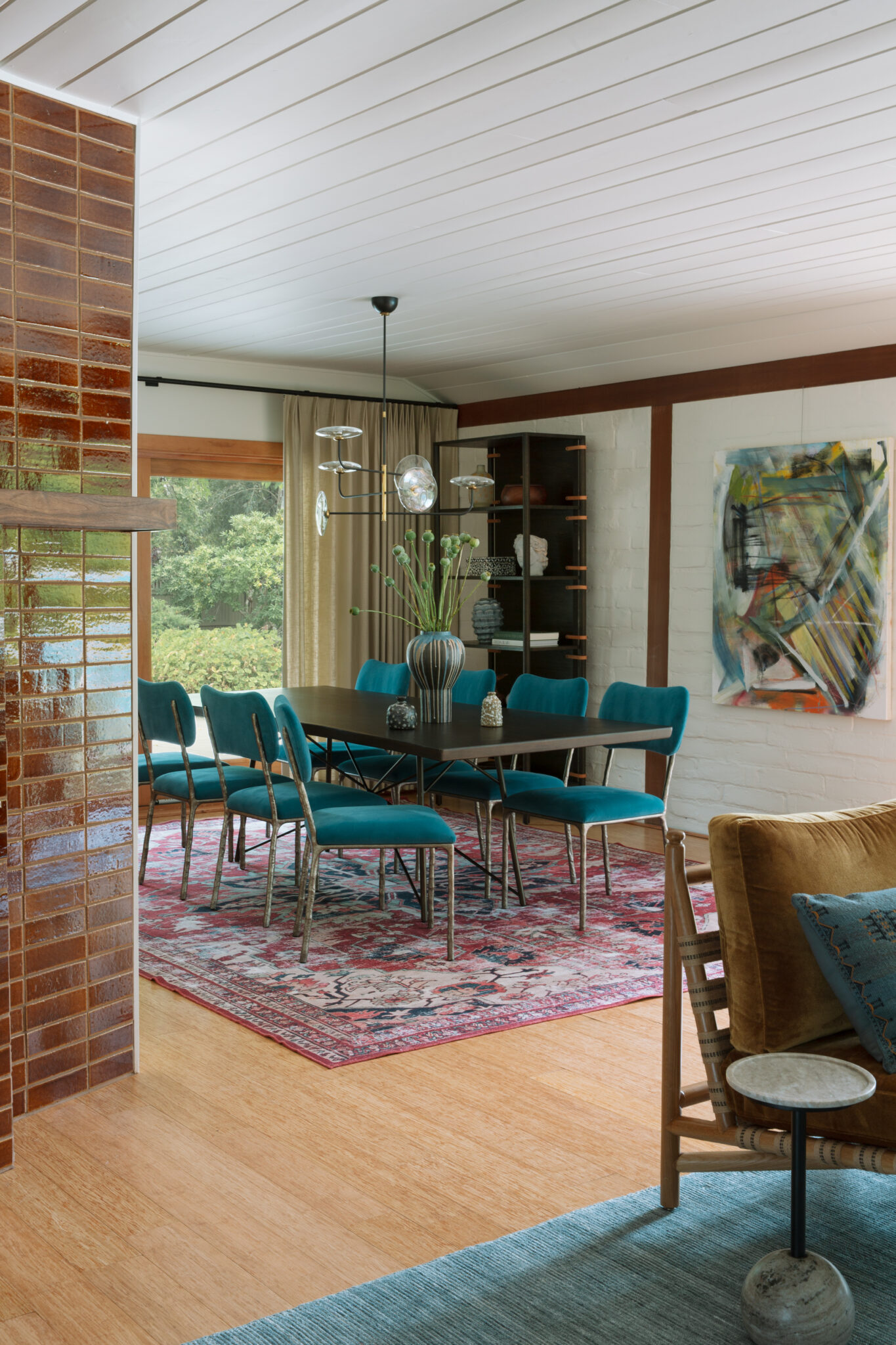
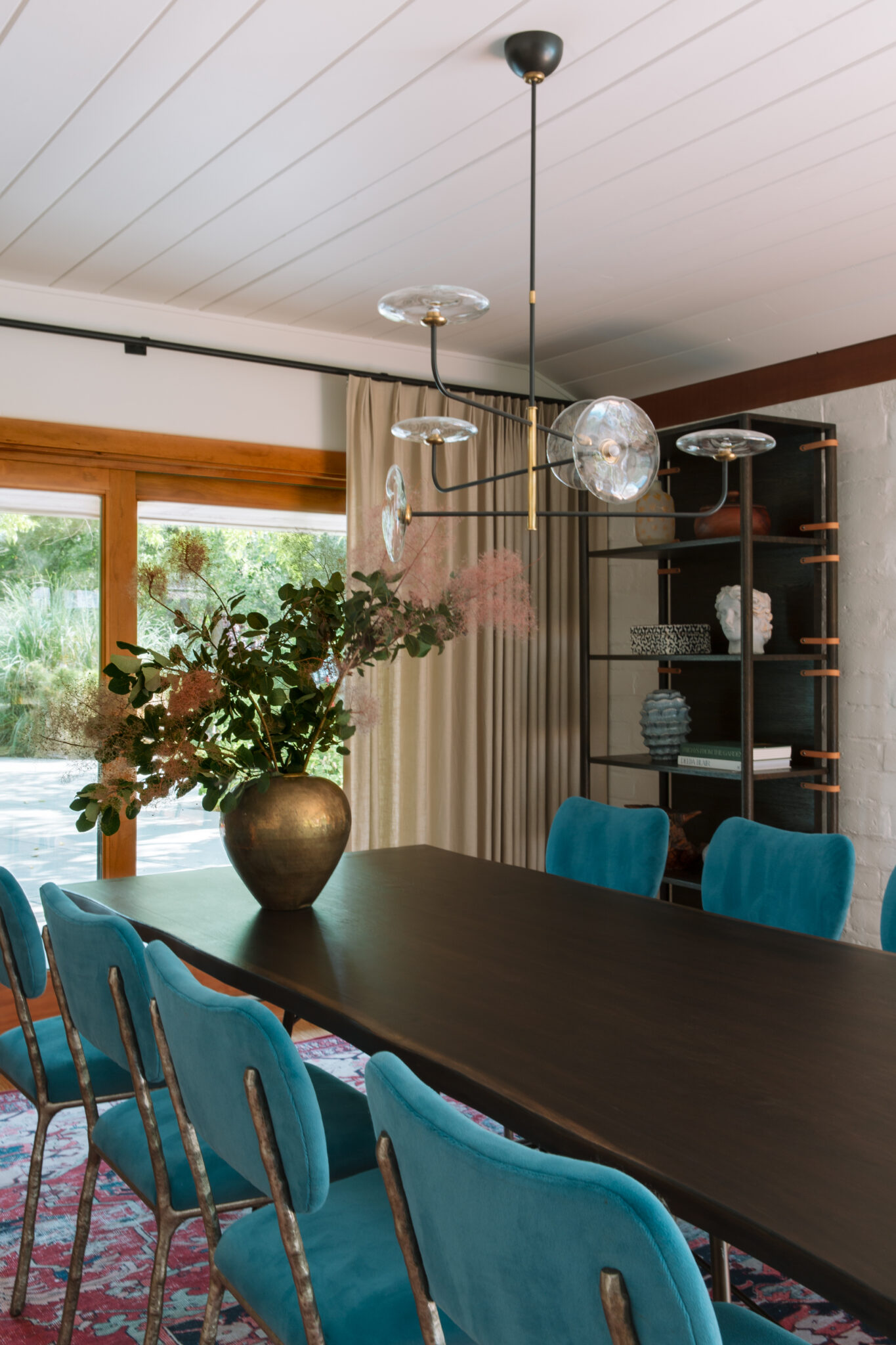
Right off the living room, the dining area had most of the compenents in place but needed some finishing touches. The client’s existing dining set from their last home was a perfect fit, but the space still felt a little cold and flat.
Before
Before, the bare windows left the space feeling unfinished, and an overload of recessed lighting made it feel stark and uninviting. Without a chandelier, the dining table lacked definition, blending into the room instead of standing out. Now, drapery adds softness and depth, filtering the light beautifully, while a statement chandelier anchors the space, creating a warm, intentional focal point.
After
This Midcentury Meets Adobe project was all about embracing what made this home special while making it work better for this family’s modern lifestyle. With thoughtful updates, layered textures, and a mix of vintage and custom pieces, we gave it a fresh, lived-in feel without losing its original character.
Every update was about making the home feel more connected, functional, and effortlessly stylish—without a full renovation.