Midcentury Meets Adobe
Situated on a large property with serene views, this 1960s ranch-meets-midcentury home was reimagined to feel brighter and more livable for this family who frequently entertains. With a focus on furnishings and minimal construction, the design embraces the scale of the expansive rooms through open, functional layouts that blend midcentury style with adobe-ranch elements. The result is a space that honors the home’s original charm while introducing a fresh, airy feel for modern living.
LOCATION Sacramento, CA
PHOTOGRAPHY Whitney Dianne Photo
STYLING Emily Vierra
Project Scope: Entry, Living Room, Primary Bedroom
ENTRY FOYER
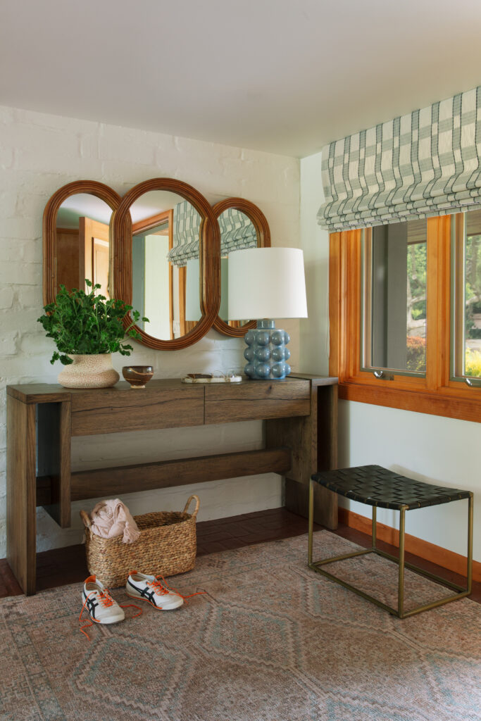
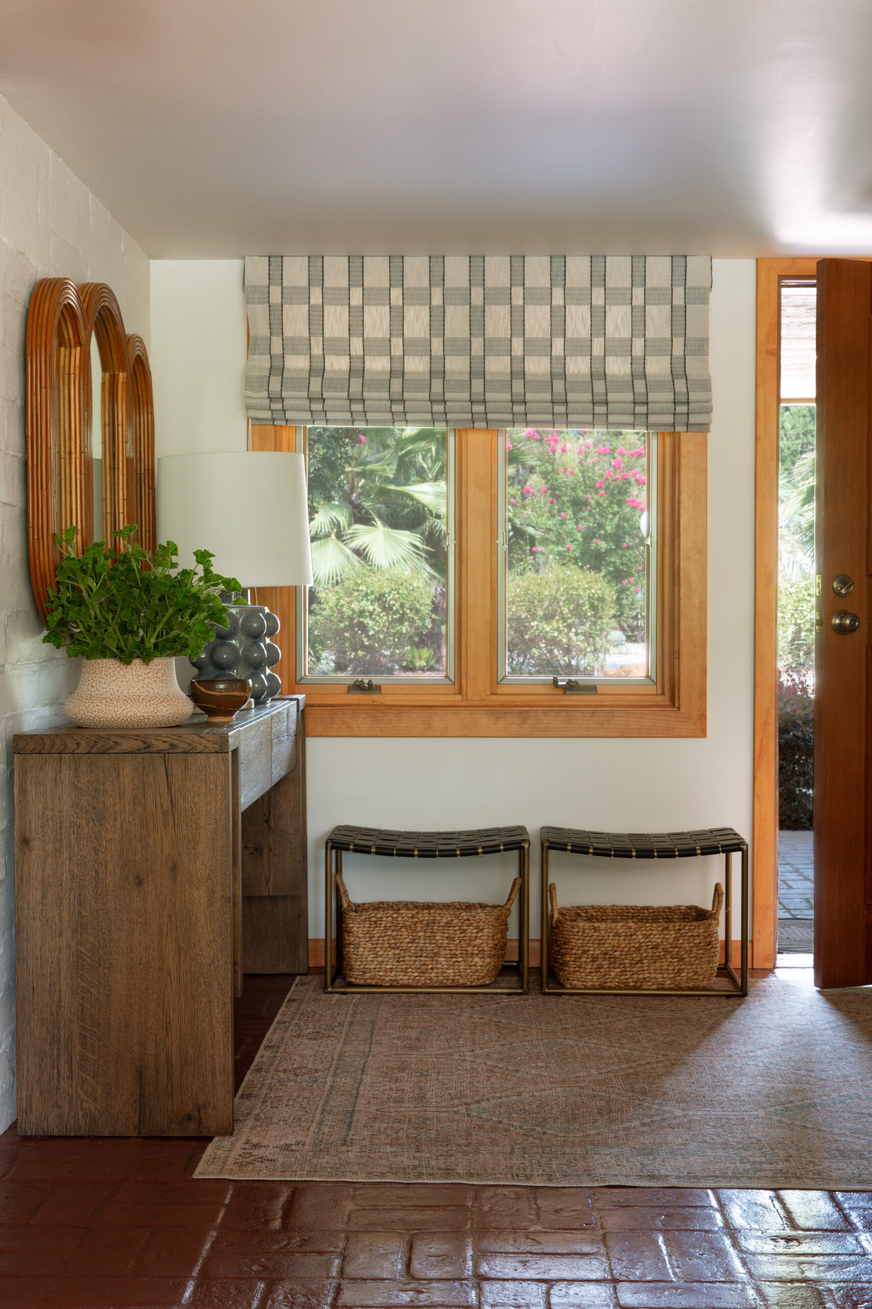
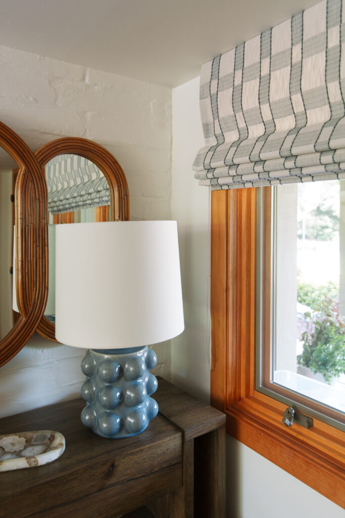
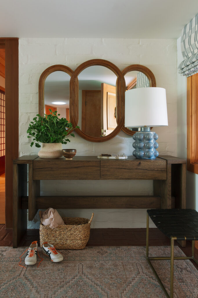
We transformed the entryway into a welcoming space that adds style and function. A console provides storage and a warm focal point, while small benches and baskets create a convenient drop zone for shoes and bags. A custom window treatment adds just the right touch of color and texture, making the space feel complete and inviting.
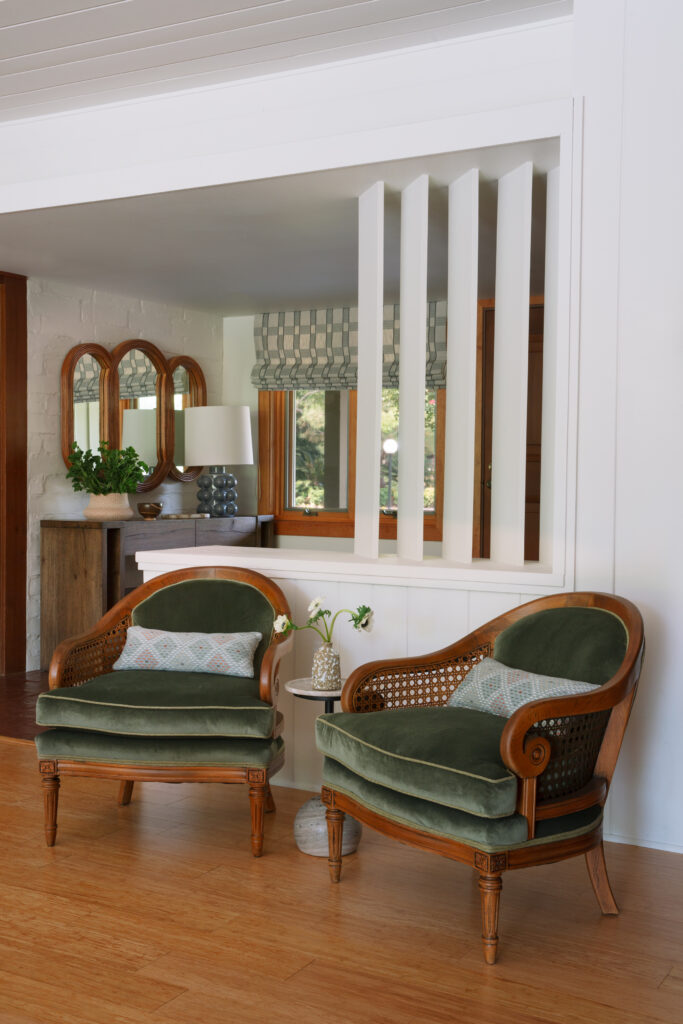
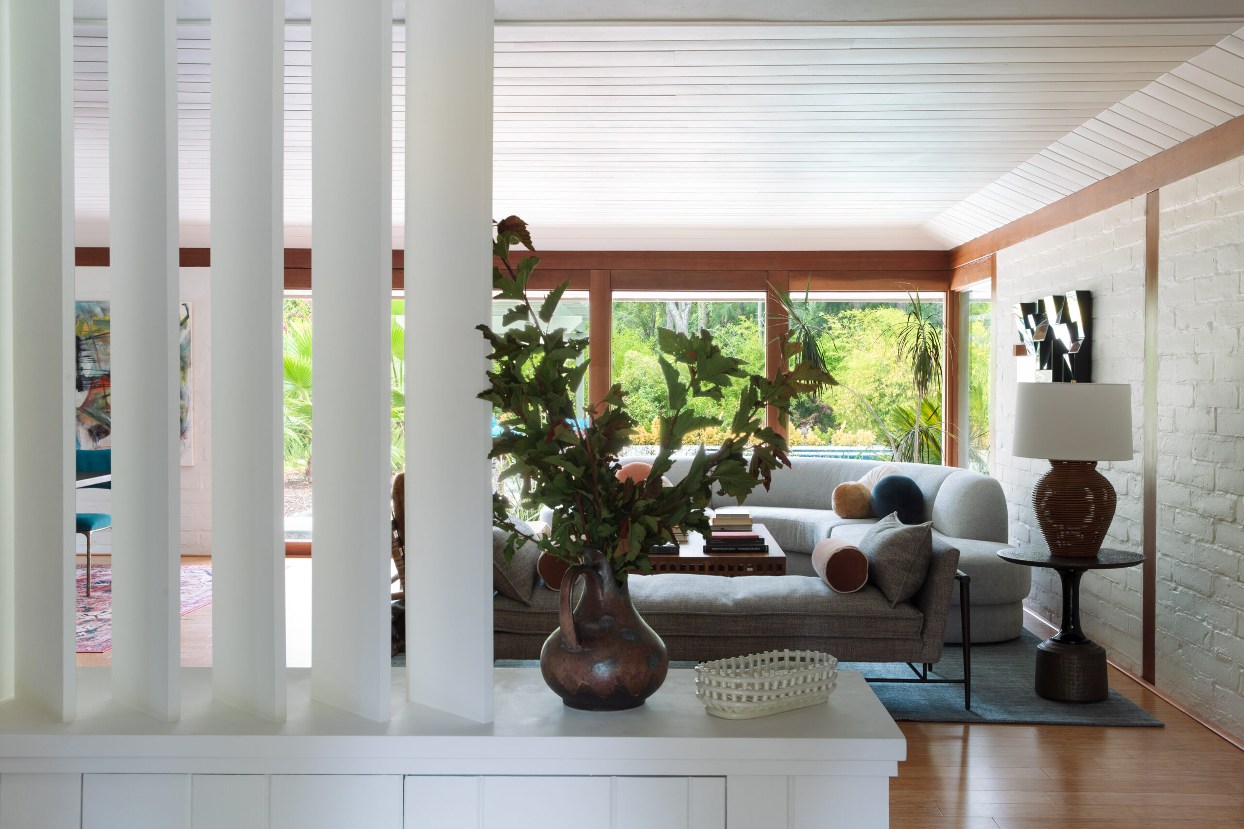
The original built-in featured bulky shelving that obstructed views to the yard and tended to invite clutter. We reimagined this piece by giving it a fresh coat of paint and incorporating angled wood slats, introducing a touch of midcentury style while allowing natural light to filter through. The result is a streamlined, functional feature that enhances the room’s connection to the outdoors.
LIVING ROOM
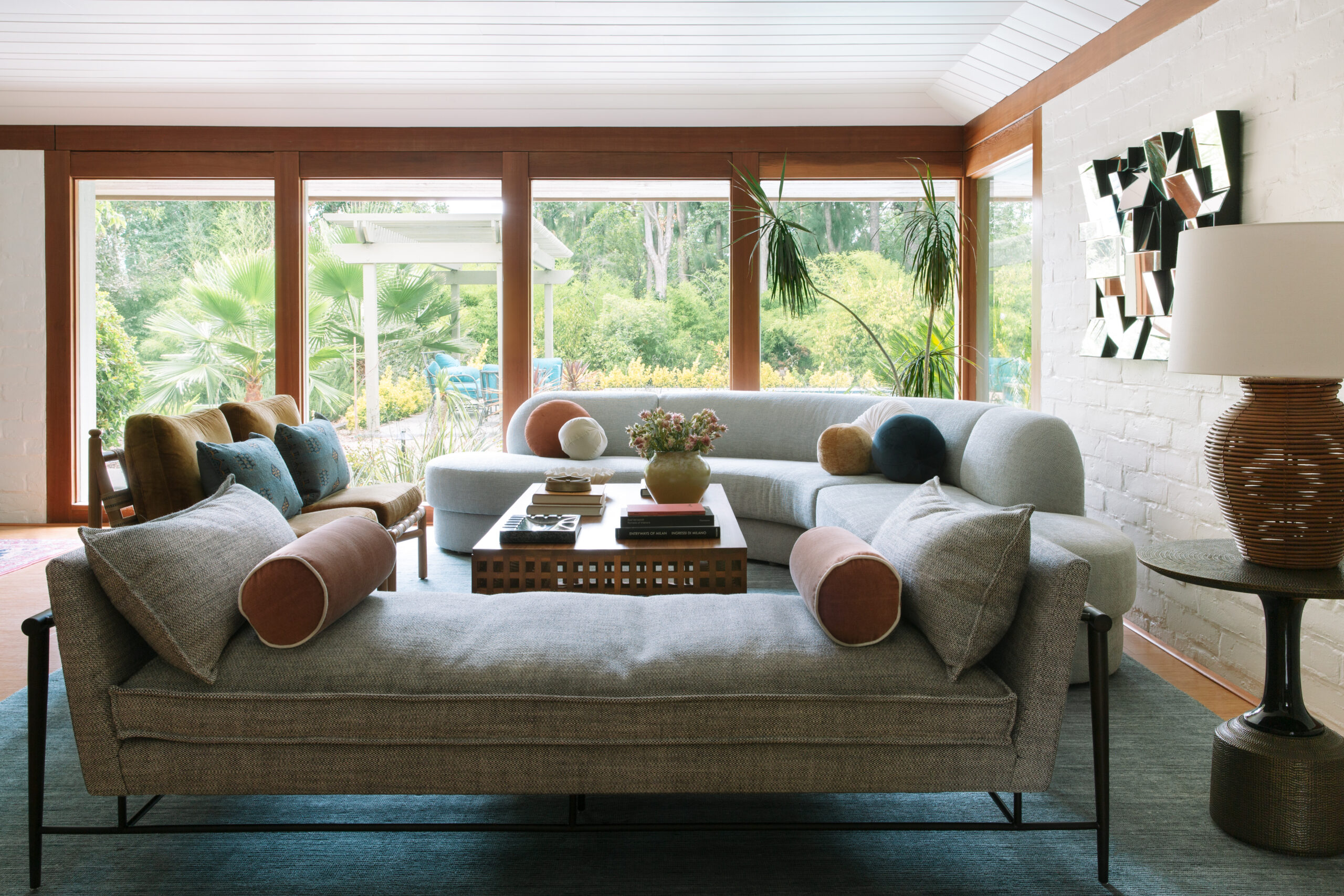
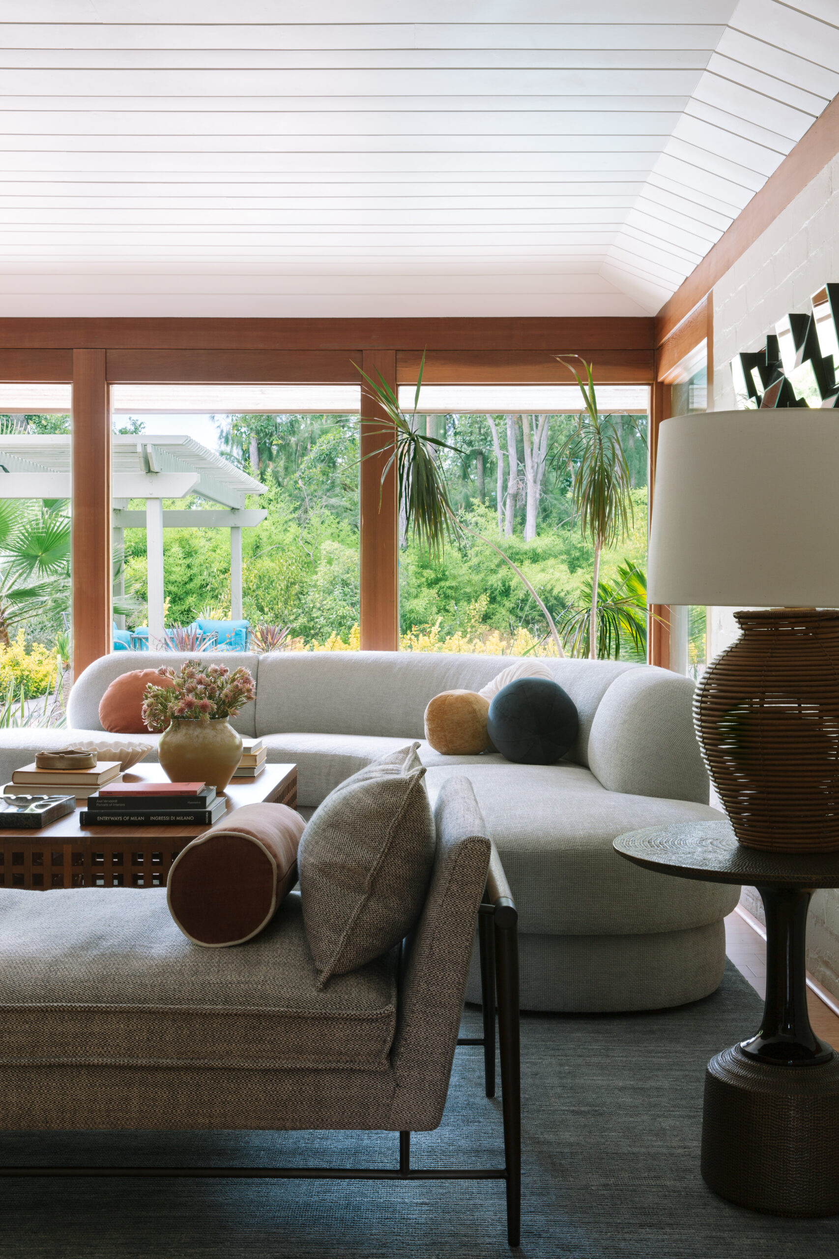
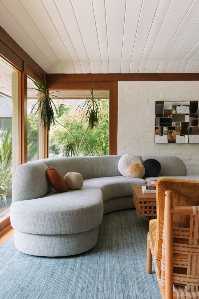
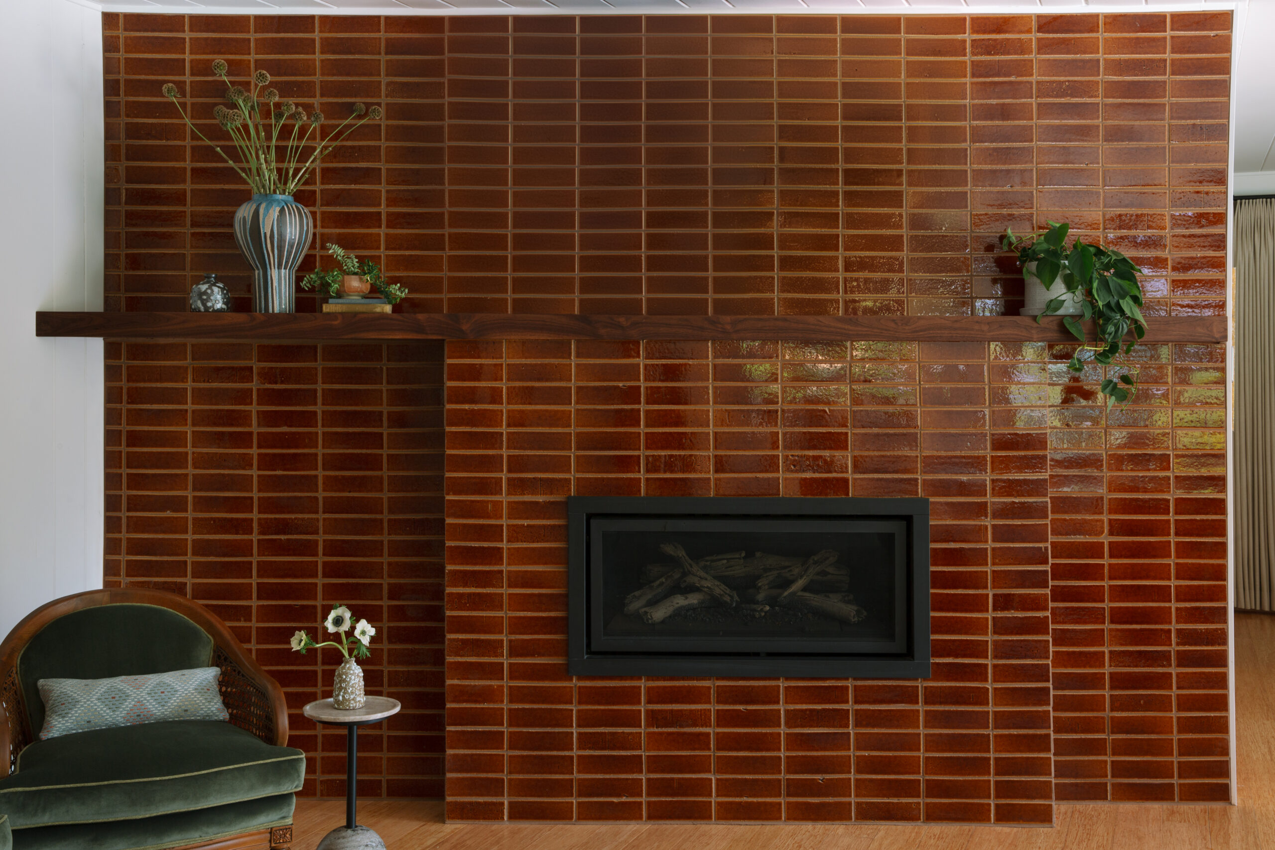
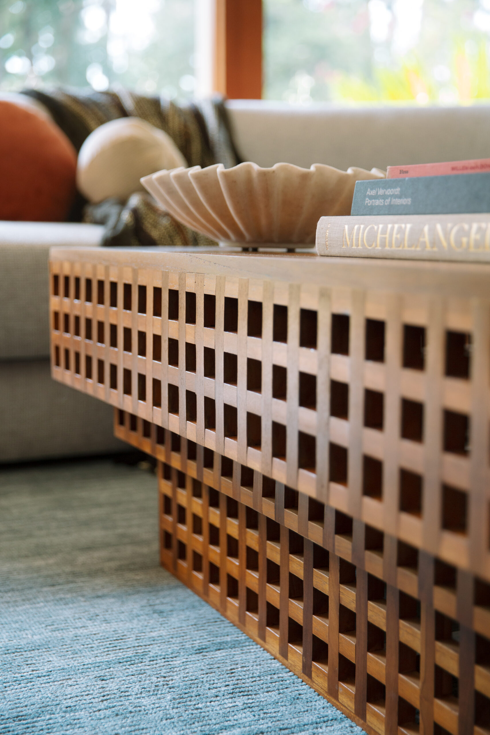
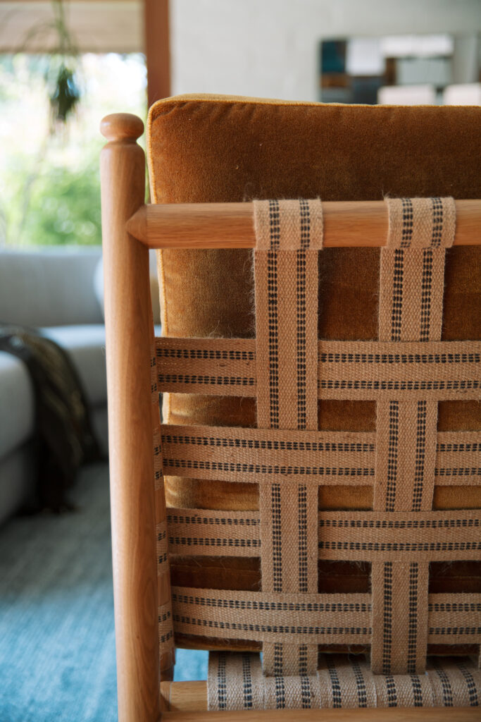
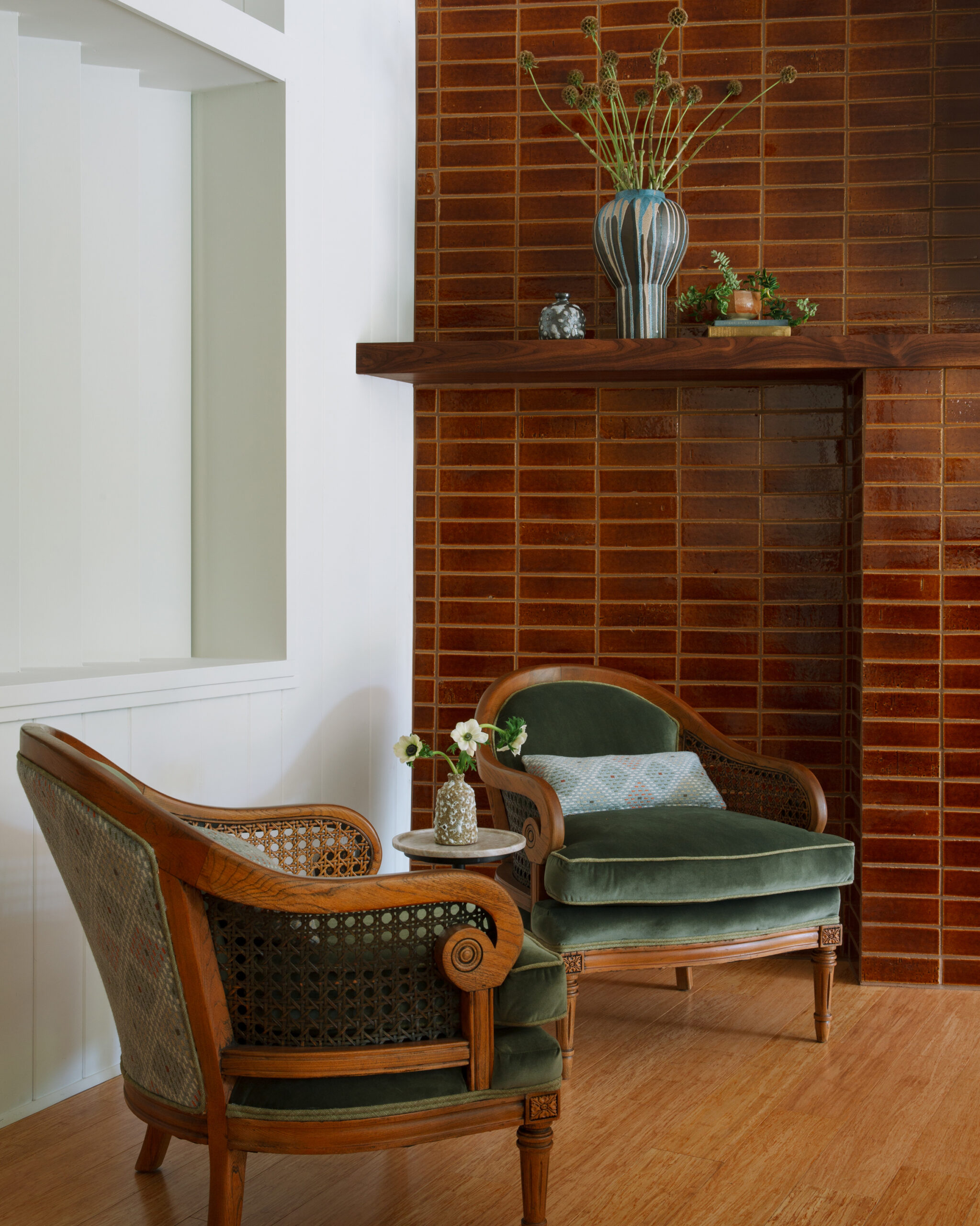
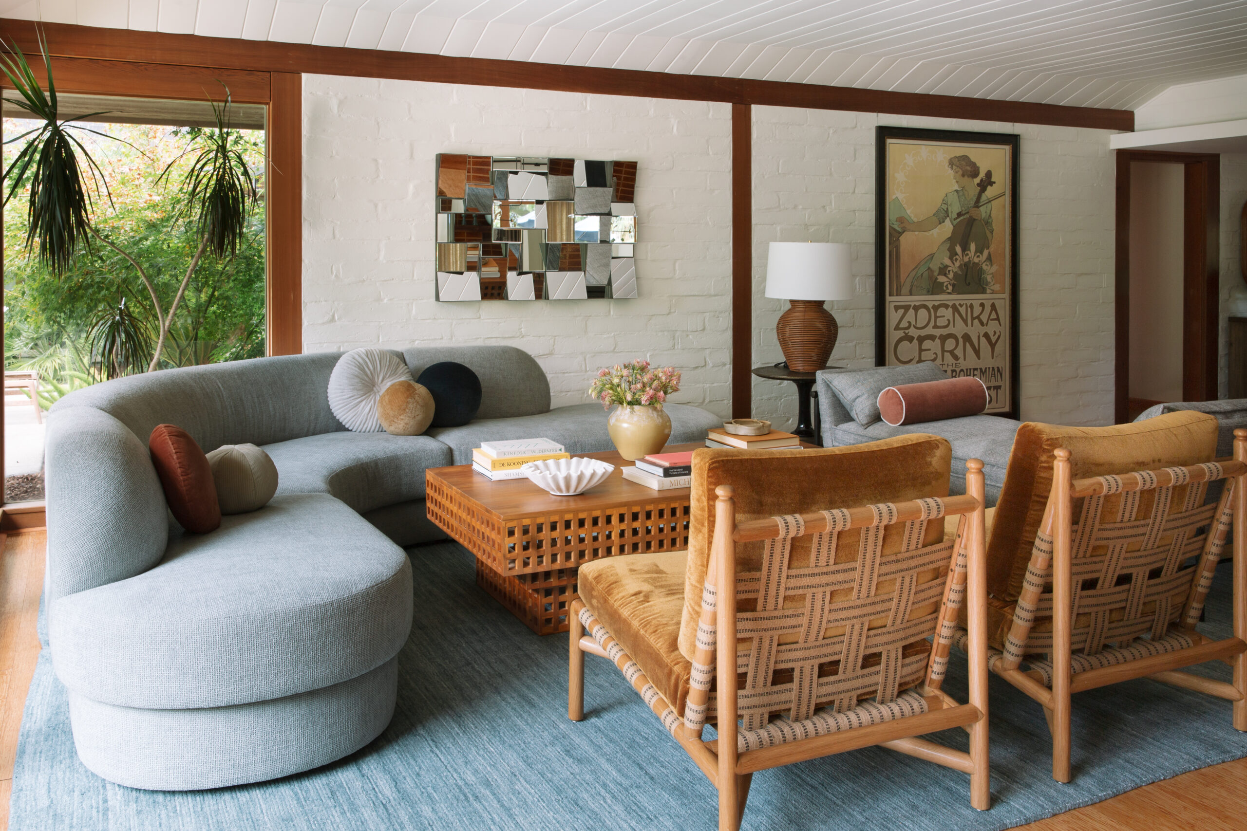
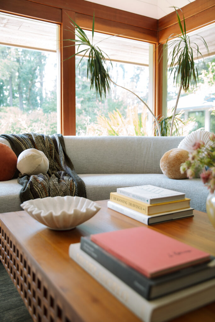
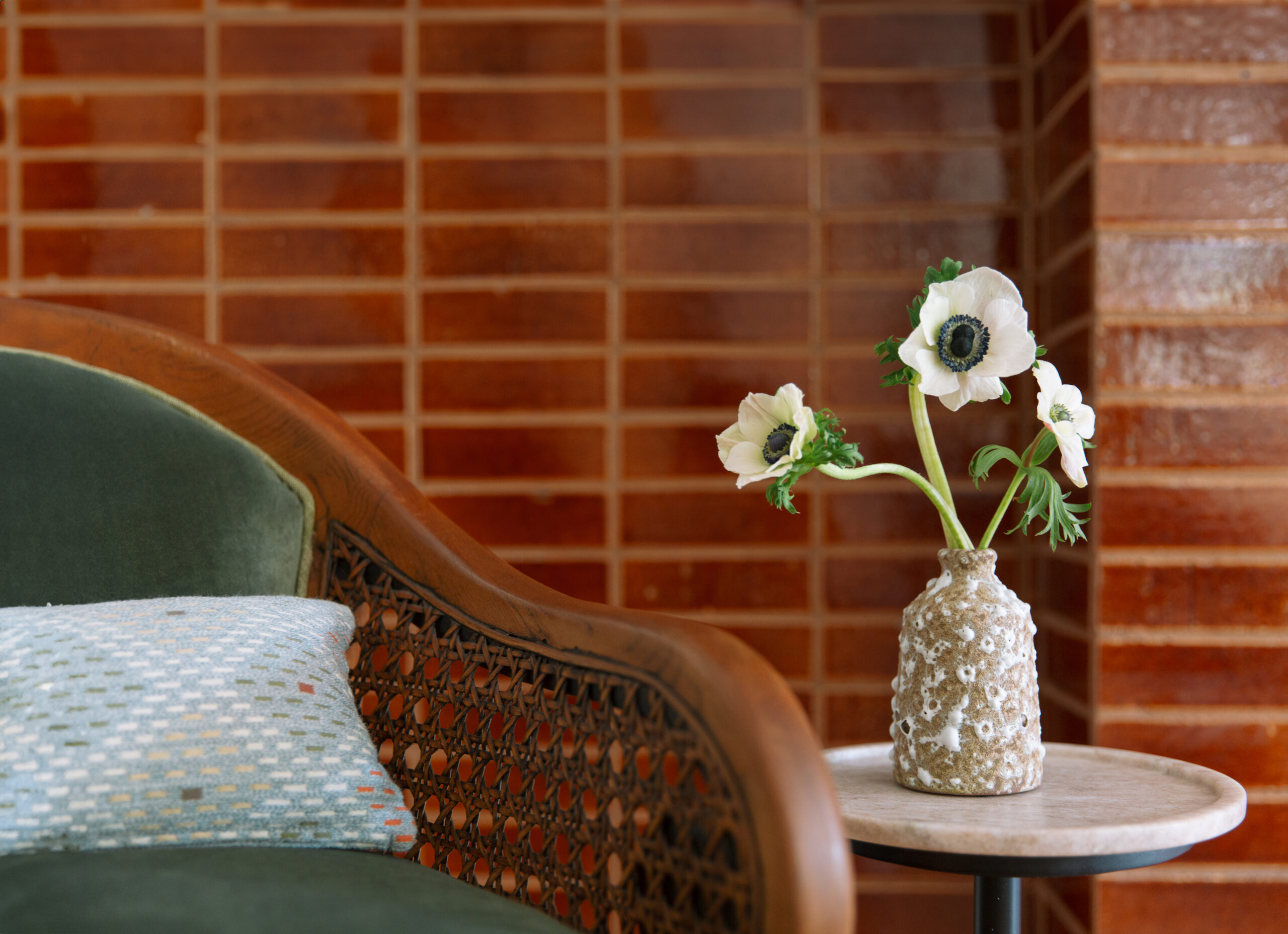
Infused with a rich palette inspired by Laurel Canyon in the 1970’s, the living room brings together vintage-inspired furnishings with natural elements. A bright coat of white paint lightens the planked ceilings, while the fireplace, redesigned with cinnamon-colored brick, texture and a grounding element to the open floor plan.The custom serpentine sofa and open-backed chaise provides ample seating for guests without blocking the expansive windows and their scenic views.
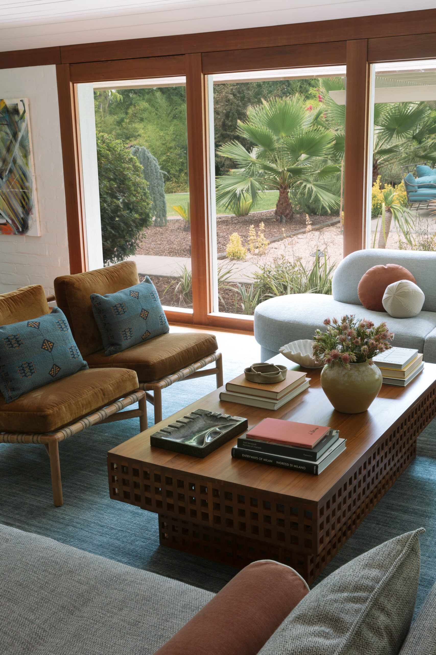
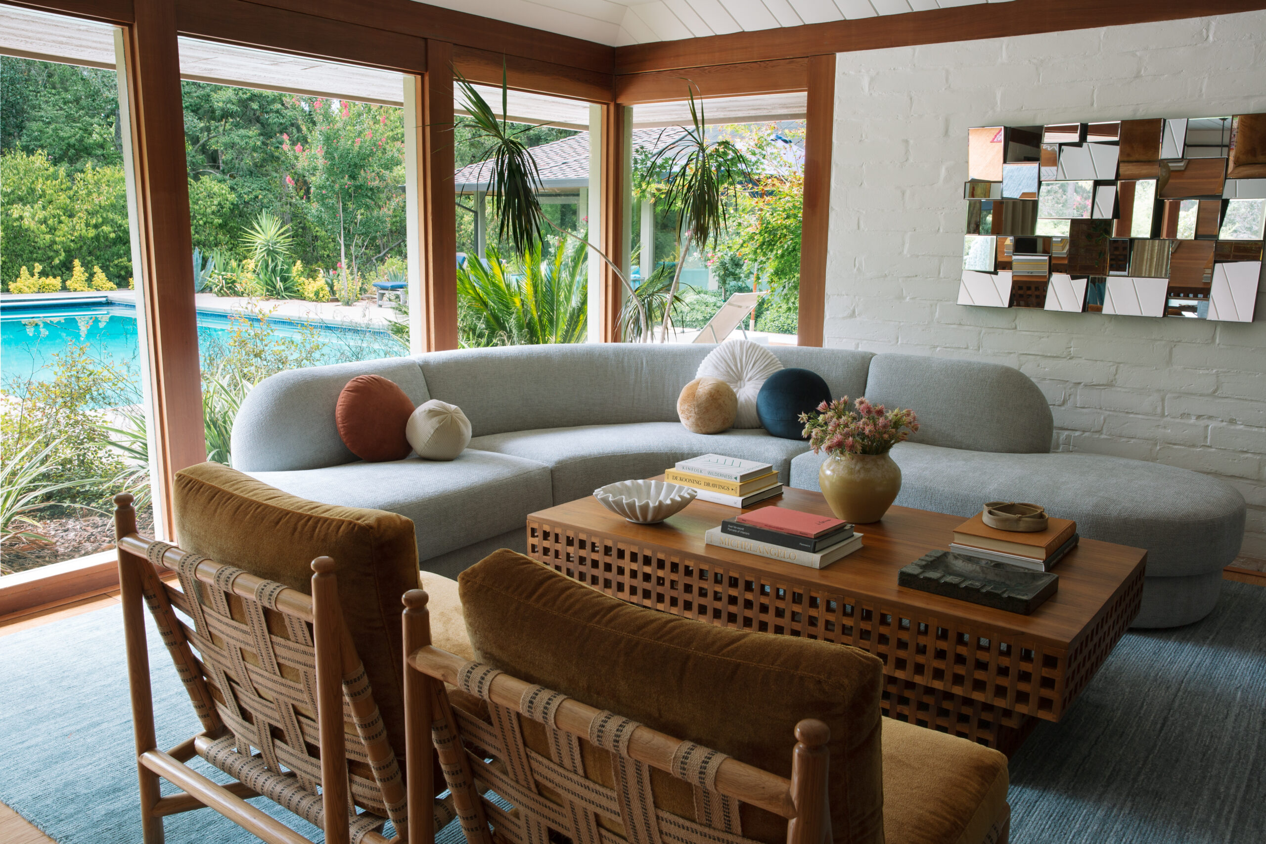
We reupholstered the client’s grandmother’s chairs in loden green velvet with contrast piping, while a woven fabric on the back of the barrel chairs adds an unexpected modern twist.

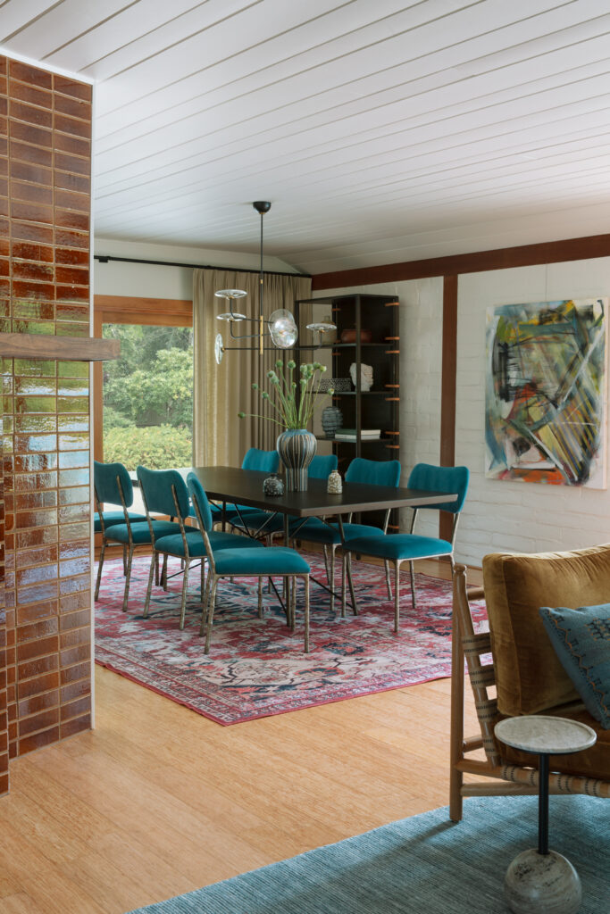
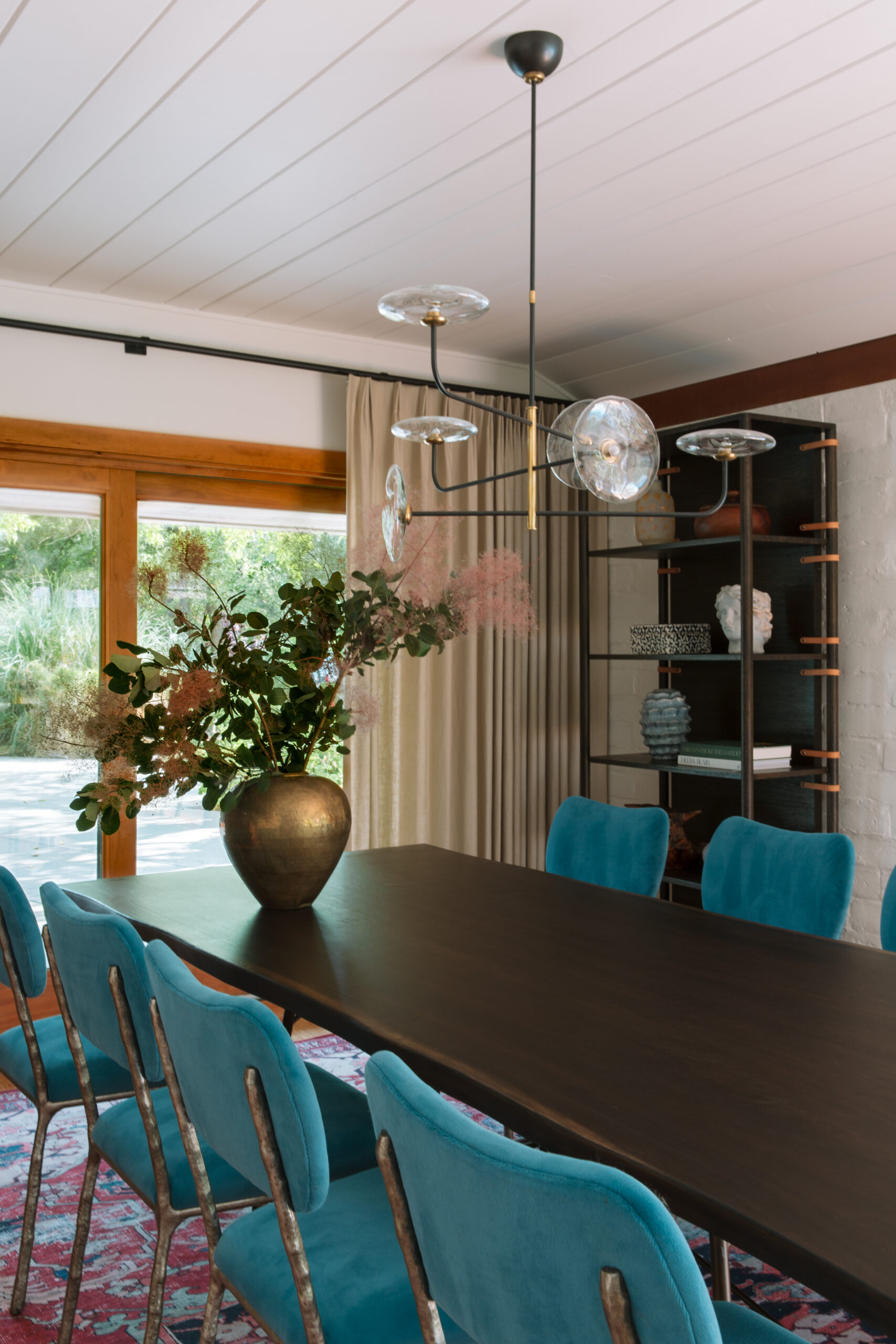
Repurposing the client’s existing dining room furniture, we removed unnecessary recessed ceiling lights and added a sculptural light fixture to anchor the area. Adding custom drapery in a neutral linen was all that was needed to bring softness and frame the backyard view.
PRIMARY BEDROOM
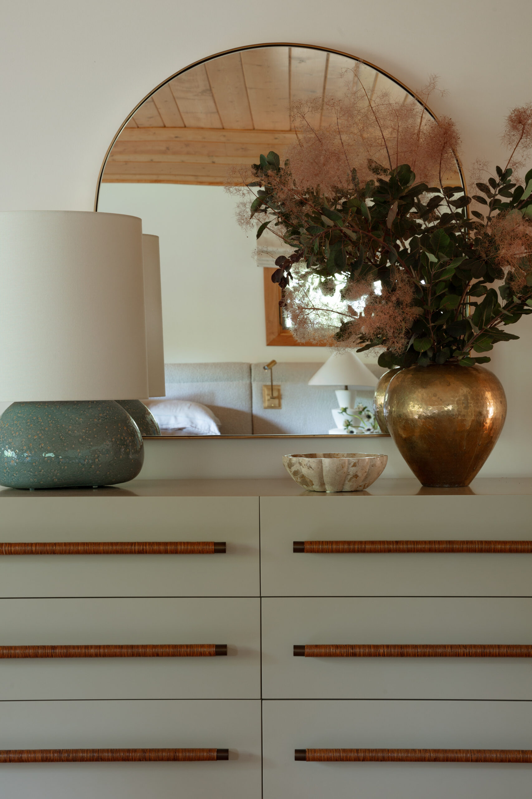
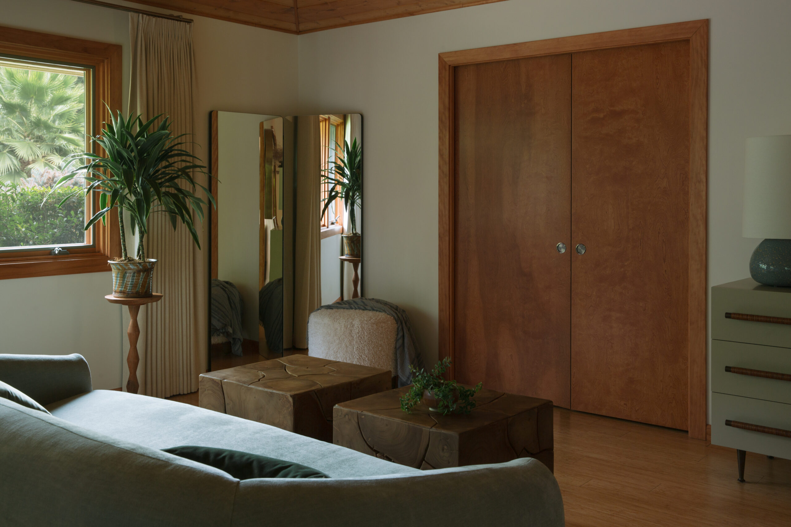
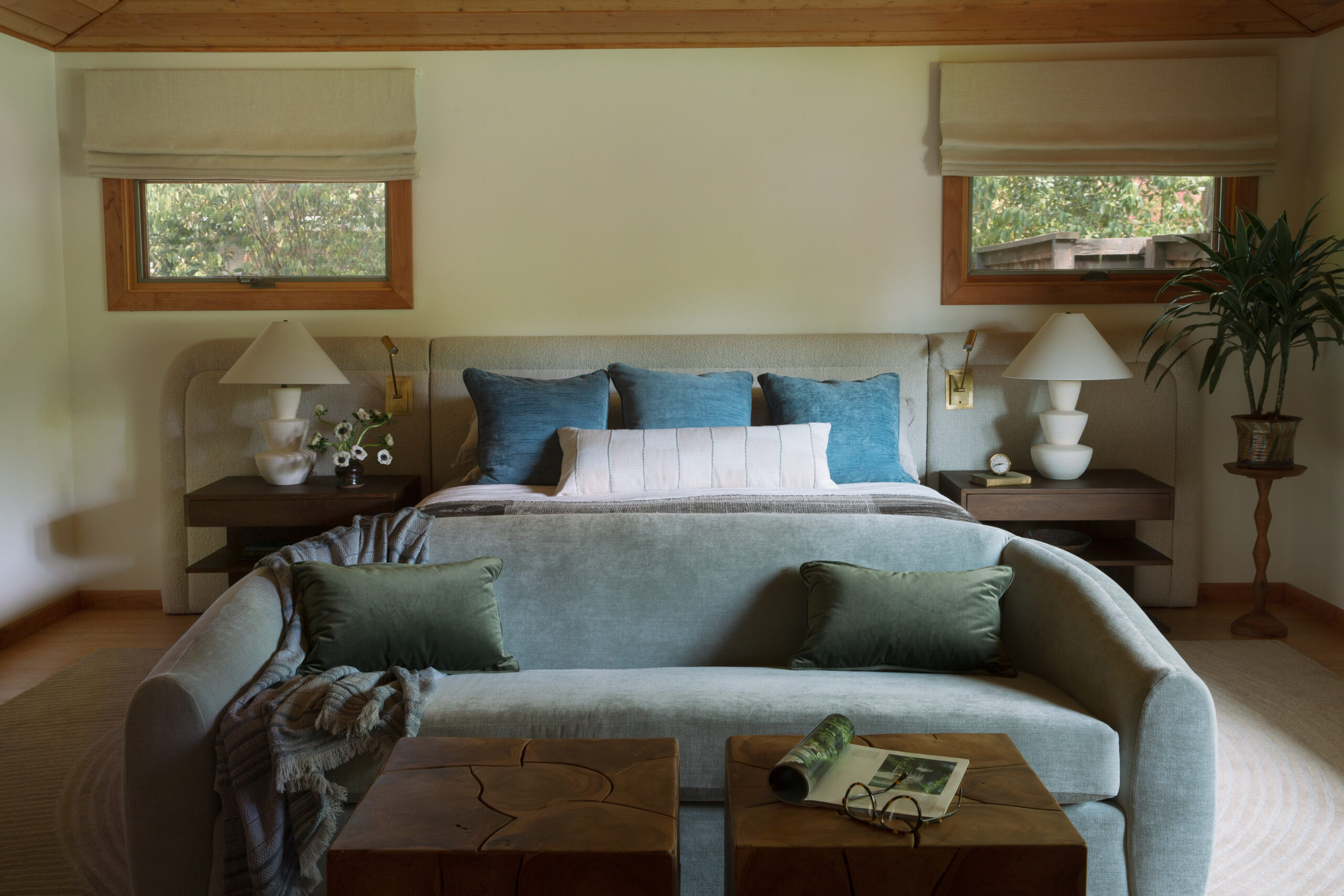
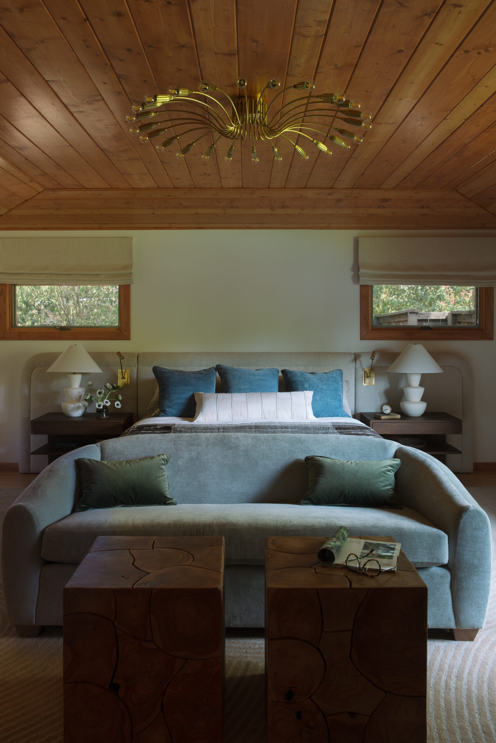
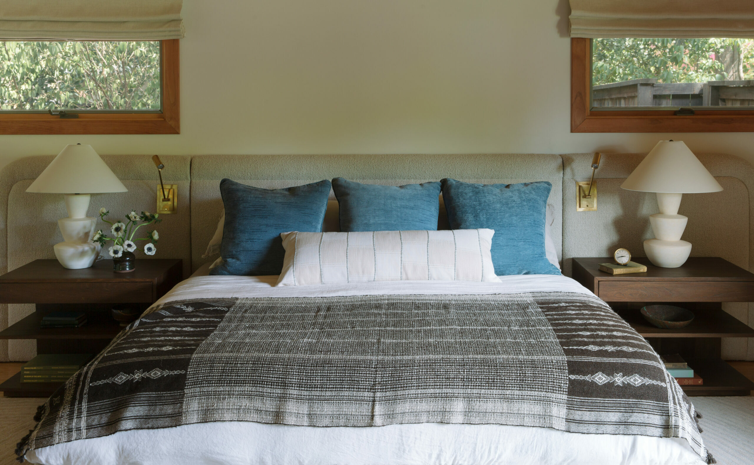
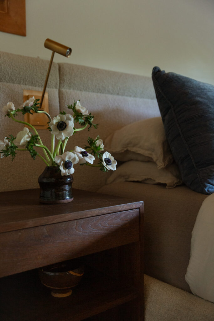
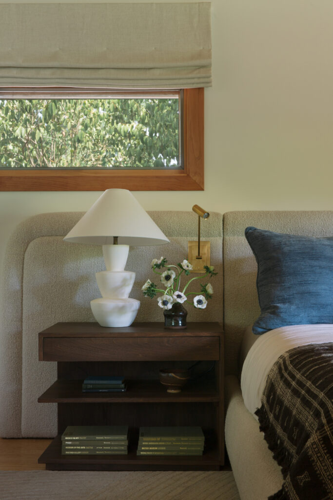
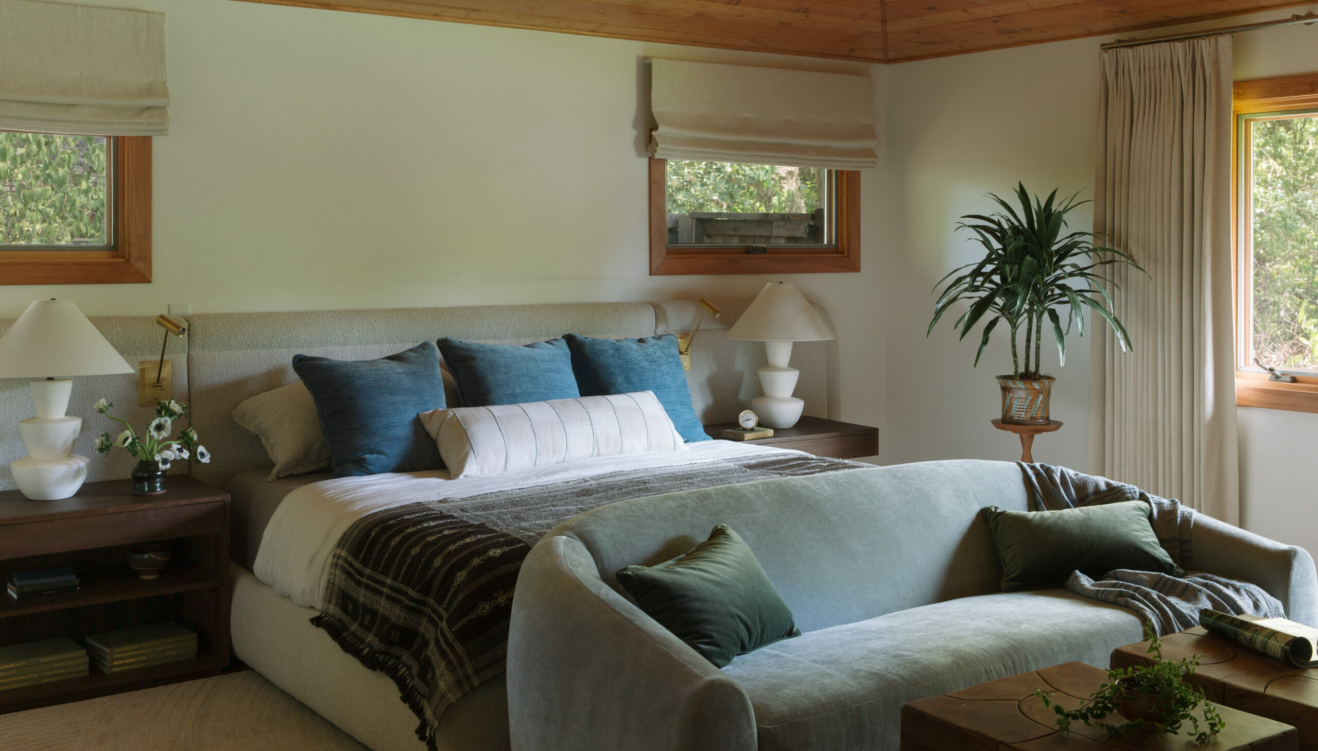
The spacious primary bedroom called for furniture that matched its scale while creating a serene, spa-like parent’s retreat. The room’s focal point is the custom 14-foot-wide headboard and platform bed we designed, bringing softness and weight to the space. To keep the muted palette of blues, creams, and warm woods interesting, we incorporated a variety of natural textures, which balance with the existing wood tray ceiling.
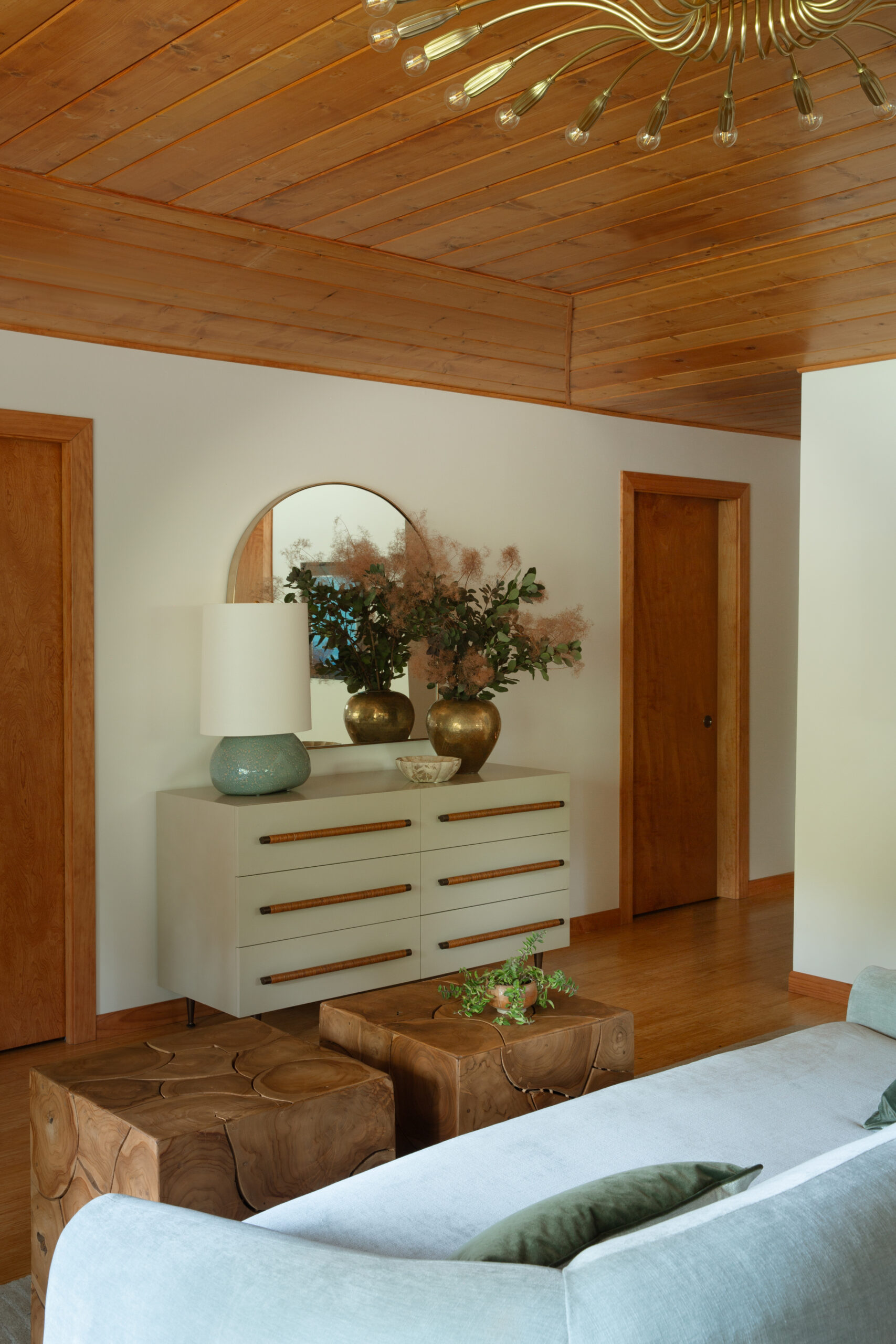
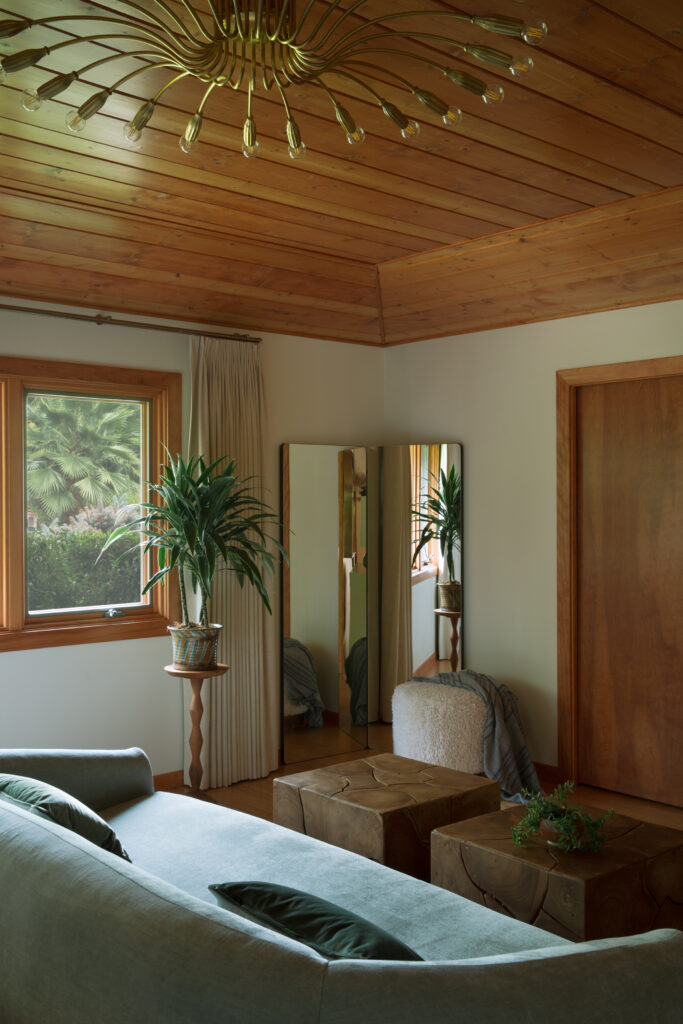
The oversized flushmount light fixture adds sparkle and a little glamour to the room. We turned an empty corner into a dressing area with a mirror and a woolen ottoman.
