Hi! I’m Rebecca designer and founder of Studio Plumb. In January 2017 we became the second owners of the #plumbmidmod, a one-of-a-kind 1960 midcentury ranch on .8 of an acre outside of Sacramento, California. It has unique original architectural details, a creek running through the yard, and a perfect floorplan. It also needs a sh!#t ton of work. Bit by bit with the help of my dear old dad we’re bringing it back to its former glory with a modern spin.
Hi! Its Week 2 and I basically haven’t physically touched my room. BUT things are progressing even though it doesn’t look like it. I mentioned last week that this is mostly a decorative installation so there’s been a lot of sourcing and coordinating with vendors. As of today it looks like I have a super solid plan!
The Feels
When I’m working with clients, I always ask how they want a room to feel. This has nothing to do with style or specific selections. Its the energy that the room will inspire when you’re in it. Since our dining room is set up to be a formal space, I want to bring a bit of elevation in here without being stuffy. Its a place that we will entertain ourselves or family and friends so most of all I want it to be happy and welcoming.
I want the room to feel:
evolved midcentury
collected
unexpected
welcominghappy
To break that down and translate it to decor, here’s what I mean.
Evolved midcentury: Yes, we live in a 1960 midcentury modern ranch. But I am not a preservationist. I want to honor the style of the architecture but bring in touches of other eras. Its not a time capsule, its a living, breathing family home.
Collected: If you know me, you know this is my thing. I’m a treasure hunter, I love interesting objects and have collections of pottery, books and art. I want a place to feature and display these items in a way that will bring some coziness to the room.
Unexpected: I’m combining bold patterns and fabrics together and think I’m going to get bold with some paint colors.
Welcoming: This room gets incredible afternoon and evening light and I want it to be a place that we gather as a family to eat, listen to music and play games. Its not a “special occasion” only room.
Happy: I can’t wait to hear clinking of glasses, laugh with my kid playing board games and watching the sun set in the evenings. Its a room that I forsee many happy times had and will encourage that with color and pattern.
The Needs
Obviously all rooms need a function and purpose and its always helpful to think it through to make sure everything is addressed in the design plan.
I need the room to:
seat 8 at the table
store china and glassware
cocktail station
look pretty from outside
hold the piano
be family friendly
Seat 8: I think I mentioned but we purchased the dining set with the house and it has 8 chairs and 2 leaves. It gets a little tight in the room so I want to make some adjustments so its a little more comfortable when extended.
Store china: My husband inherited his grandmother’s china and its a huge set of I think 12 place settings. Its currently stored in our hutch so want to be sure we have room for it in the new design.
Cocktail Station: My husband also has really gotten into his cocktails this year (ahem, Covid), and although we have a bar cart, it doesn’t allow for all the mixology he’s wanting to do. I’m hoping to entice him to keep his setup in here instead of dragging bottles into the kitchen and cluttering our counters.
Look pretty from outside: The room is kind of open to the street with just the breeze block wall in the atrium for privacy. I want beautiful lighting and an evening glow to be seen from the front yard, and not the random mess that’s there now.
Hold the piano: When I took over the front room for my office I displace the piano. It would be nice to not have it in the dining room but there is literally no where else in the entire house to put it. So now it will double as a music room. As soon as I remember how to play.
Be family friendly: As mentioned I want us to use this room several days a week to eat or play games. I’m putting some beautiful fabrics in here but they are all performance-grade and will hold up to many a spaghetti dinner.
The Mood
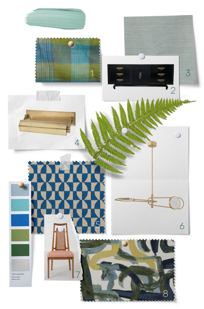
Here’s the moodboard of the materials I’m working with! I have a couple key items left to sort out, mainly art and the rug but I’m really excited with where its all landing. I’m going for an analgous color palette this round. If you’re not familiar, this means I’m using the 3 colors next to each other on the color wheel. Versus complementary colors, my usual go-to, which are colors on the opposite sides of the wheel. This article has some great room examples.
This is a dining room, but its going to triple as a music room and library with floor to ceiling shelving units and house our piano. Overall I’m going for a healthy mix of vintage and modern with a lot of pattern play. I’m nervous but excited!
- If you’ve been following me on Instagram you may have seen my secret eBay purchase a couple weeks ago. I bought vintage drapes! They’re in mint condition, never used original barkcloth from the 1960s. I’m in love.
- I’ve found this vintage dresser on Craigslist a few years ago and can’t let it go so its staying.
- I’m bringing in major luxe texture with a muted aqua grasscloth from York Wallcoverings. I love the midcentury feel it brings and will connect with the natural views in the atrium.
- What are library shelves without picture lights? These brass beauties from Hudson Valley Lighting are the perfect mix of modern and traditional and can’t wait for the sparkle they’ll add.
- Our dining chairs are in desperate need of a recovering, so I’m going for it with this pop of graphic cobalt fabric from Fabricut. Its a performance fabric so it will also work with my messy eater. Also my 6 year old. Ha.
- I new I wanted a statement pendant but wanted to break the midcentury mold and go a little more modern and glam. This cantilevered fixture from Hudson Valley Lighting Group is doing just that for me. I’m obsessed with the alabaster shades that reference the incredible fixture over our bathtub.
- The tall caned-back chairs and table that are original to the house and just need a recover. I can’t wait to see them come to live with the fabric in No. 5.
- This fabric is a really fun, large scale pattern from Fabricut that I’ll be recovering the piano bench with. I’m loving the energy and texture and its really going to modernize the piano view.
Not pictured: I’m bringing in some killer crown and base moulding from Ornamental Decorative Millwork to add detail and height to the walls. It will be similar to what we did in our bedroom and its going to be beautiful.
I’m also partnering with my friends at the locally owned Green Acres Nursery & Supply again. They’ll be providing plants and accessories for the atrium which I know so many of you are here for!!
Putting it all together
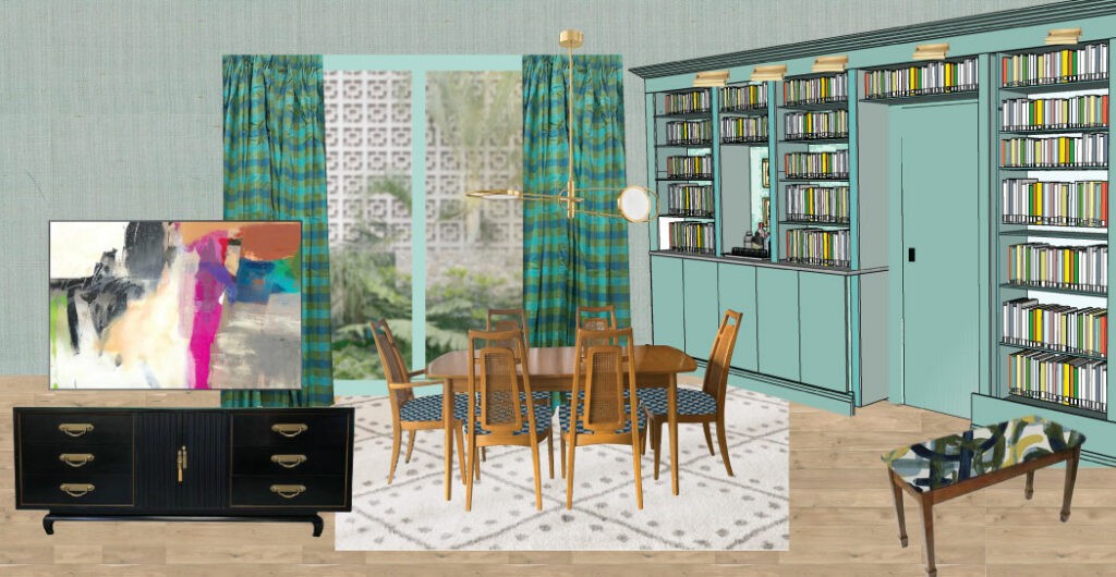
And now, here is my current design plan! You can see how the different patterns are coming together and hopefully you don’t think my eBay curtains are too crazy. I’m going for an oversized, modern piece of art to add a shock of warm color but its still in the works. We’re doing an epic Ikea hack for the builtins and I love the thought of them wrapping around the door to the kitchen.
And now, its time to actually start making some headway in the space. There will be a lot more action this week. I’d love to hear your thoughts and questions!
Now please go follow the Featured Designers to see what they’re doing with Highpoint and all my fellow Guest Participants. There are so many doing cool things this round!!
A huge thank you to my generous sponsors:
Now please go follow the Featured Designers to see what they’re doing with Highpoint and all my fellow Guest Participants. There are so many doing cool things this round!!


