I’ve been rolling out sneaky peeks on IG but here is the entire look at my folks’ new kitchen, dining and living room!
Kitchen
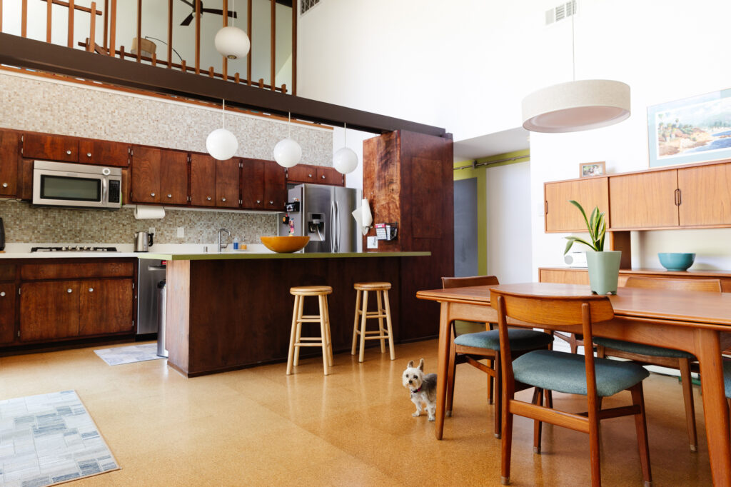
As a reminder: here’s where we started this project. The original cabinets were charming, but not in great shape and just weren’t functional for them. You can read more details on the Before here.
KITCHEN BEFORE
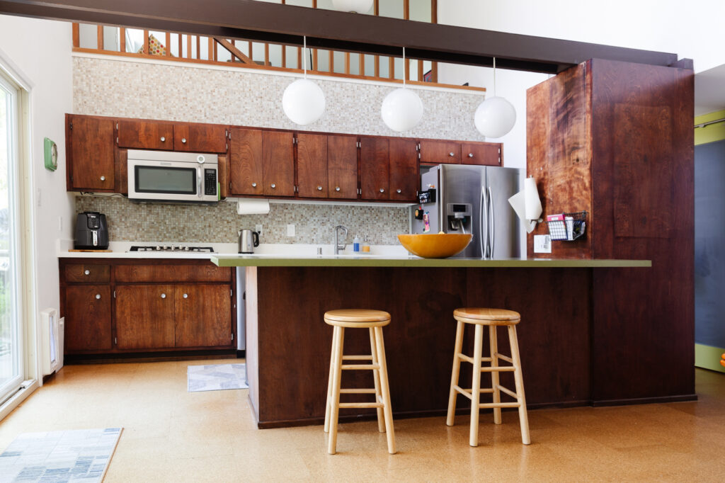
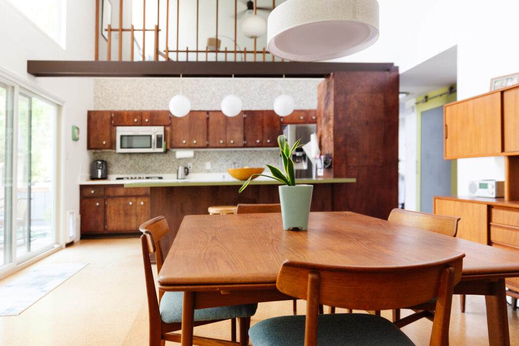
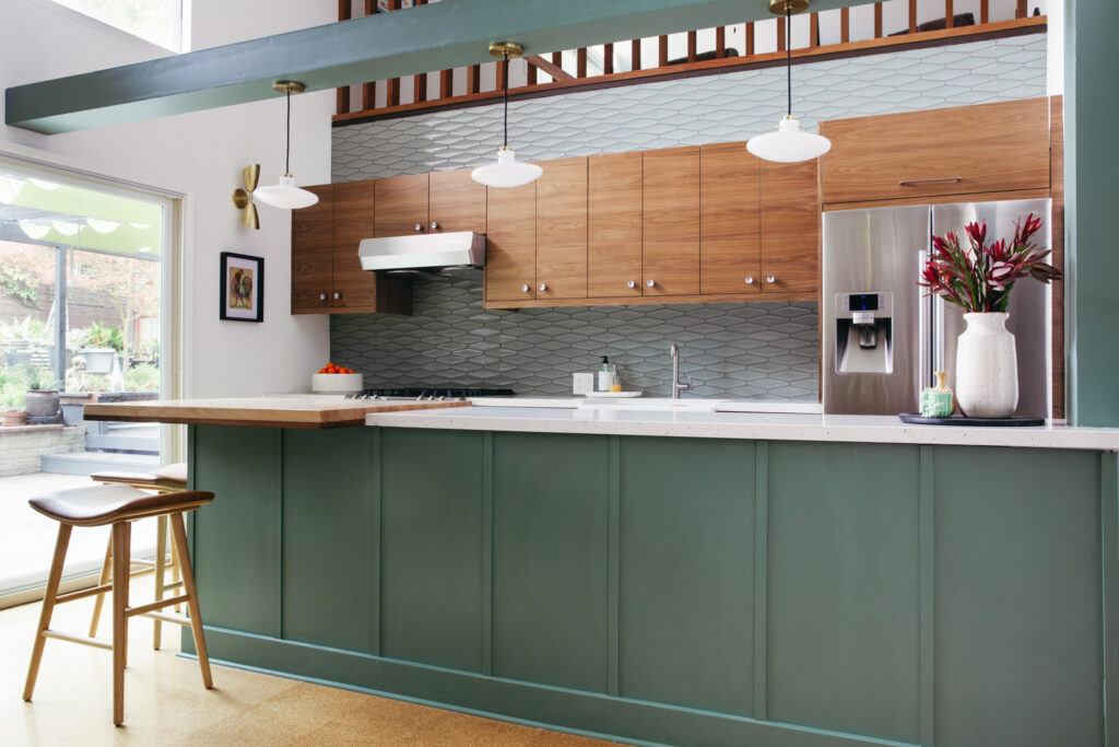
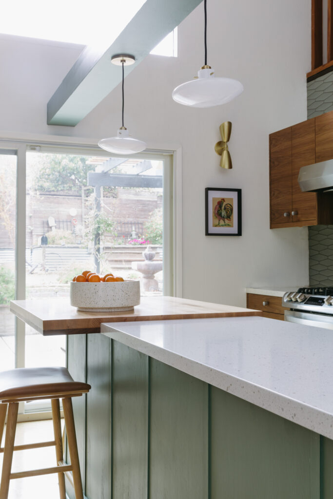
Without changing the footprint or original cork flooring, we replaced the cabinets, backsplash, and lighting to completely transform the way it looks and functions. Removing the large appliance tower improved the sight lines throughout the downstairs, especially from the front entry, and makes the whole area feel lighter and brighter. The vaulted ceilings in this area are open to the upstairs loft and go up to 20′ so the beam originally had upper cabinets hanging from it. In a phase 1 refresh, the clients removed the overhead cabinets there and used the beam as an electrical channel to bring in much needed lighting. We kept this idea, but painting it and the back of the island a desaturated teal brought some much needed color to the area while also framing out the kitchen in the open floorplan.
KITCHEN AFTER
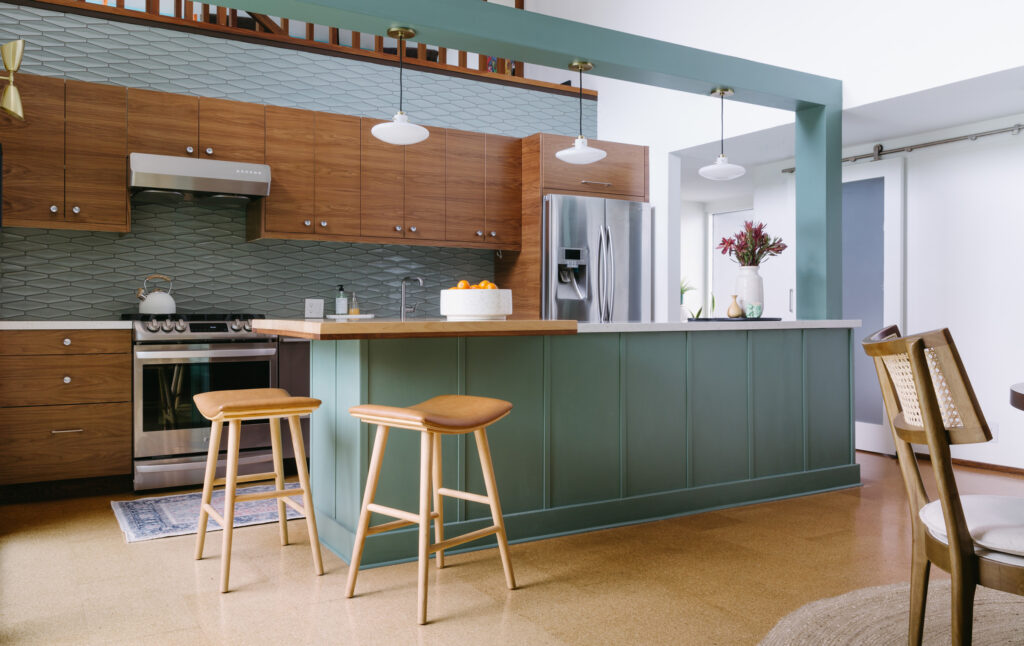

The previous countertop on the island had an overhang for stools and a termination point at the appliance cabinets. We had to get a little creative once we removed the cabinet tower in order to allow for some seating, but it couldn’t run the length of the island or it would encroach too far into the walkway. Random cutouts and angles weren’t an option so I came up with a solution to give them room for seating, and delineate a separate prep area. Our friend George crafted a white oak and walnut slab that cantilevers off the end of the island which was the perfect size for two counter stools.

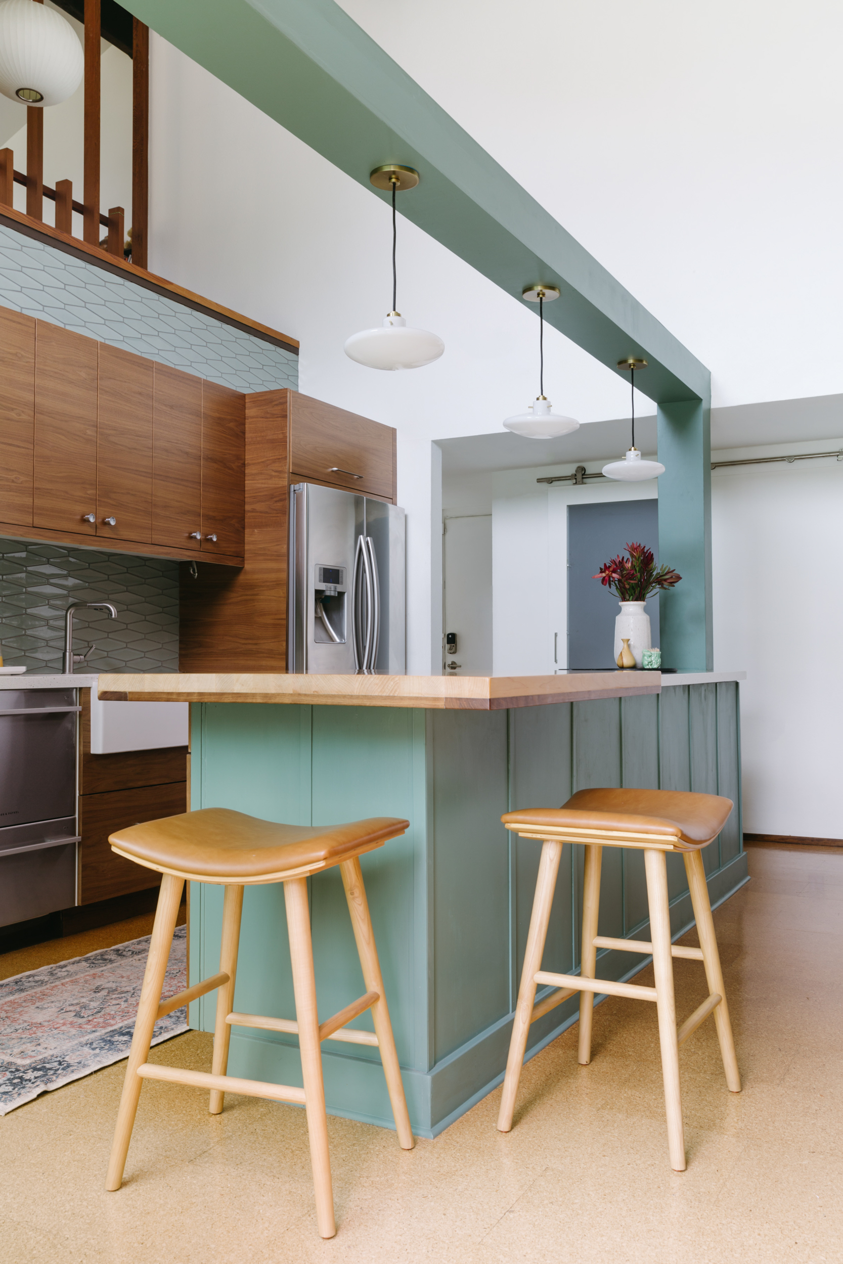
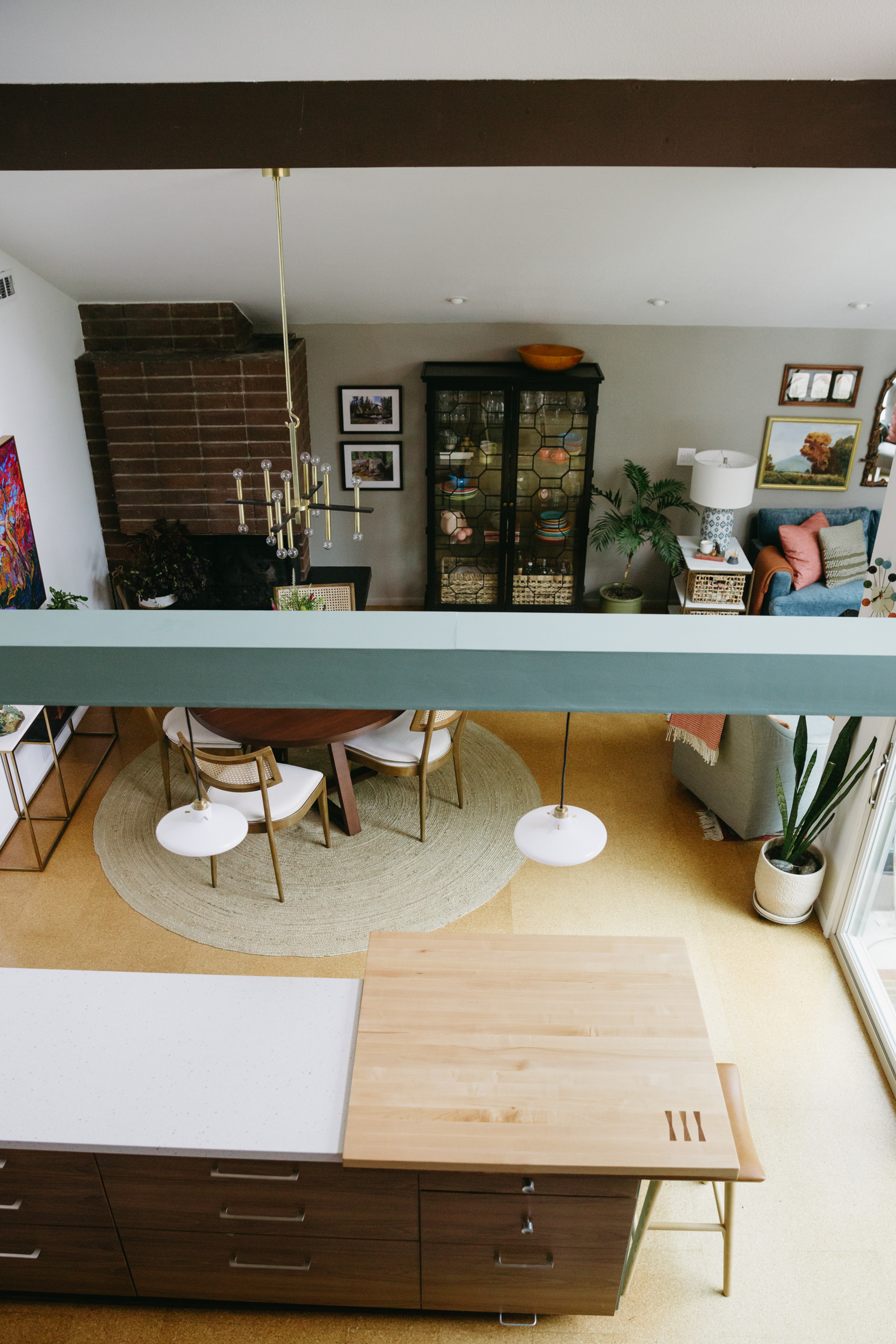
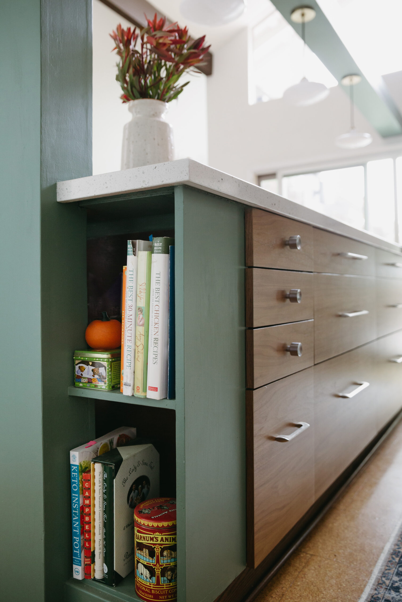
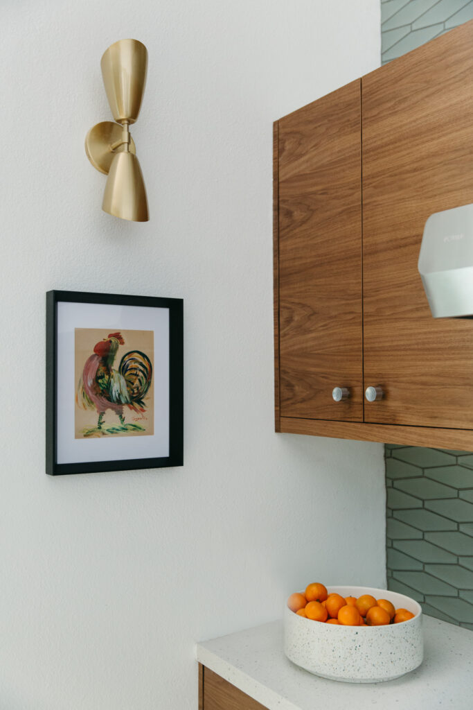
At the end of the island we had some awkward space to fill because of that beam so we turned it into a little open bookshelf moment. For the hardware, we repurposed the original knobs as much as possible, and added new drawer pulls where needed in a midcentury style .
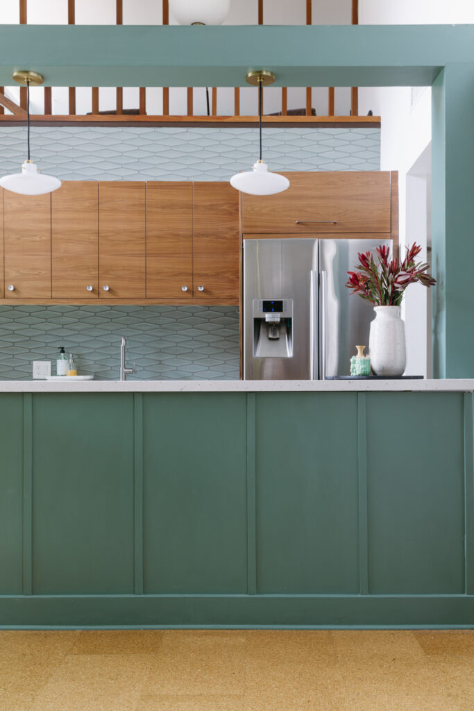
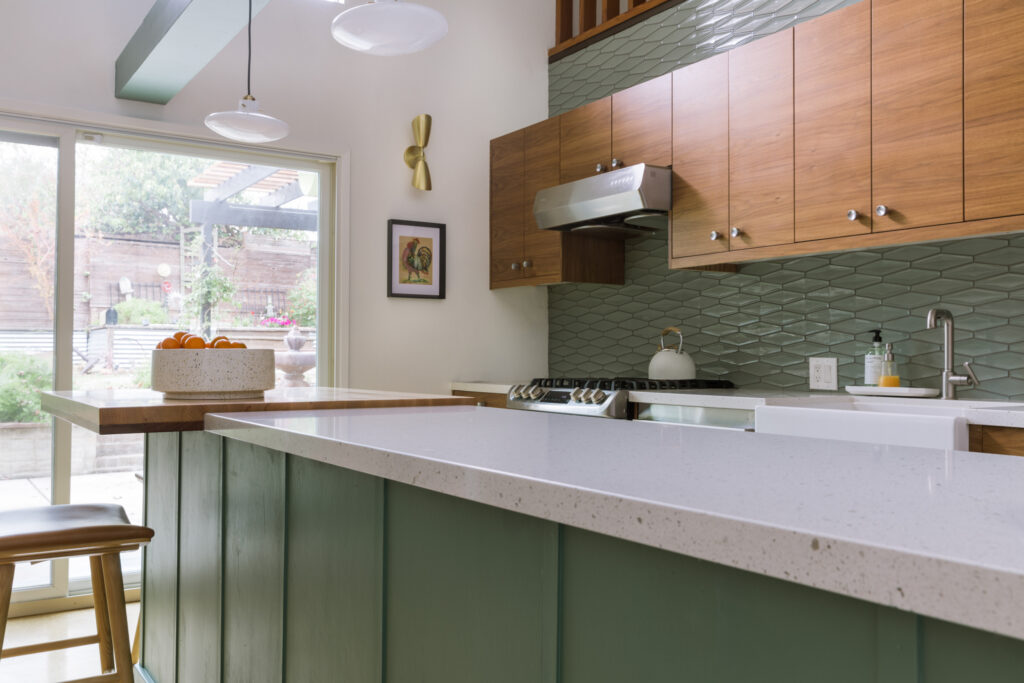
To me, lighting really makes or breaks a room and these pendants have a fun, atomic shape and pair well with the up/down sconce we added to the wall.
DIning Room
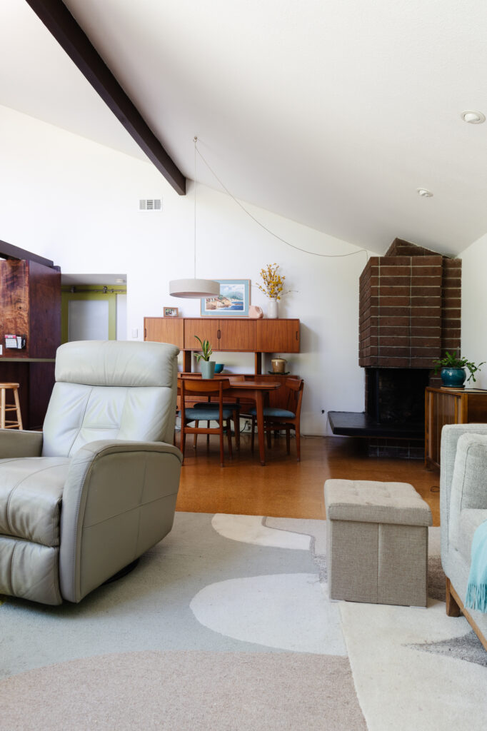
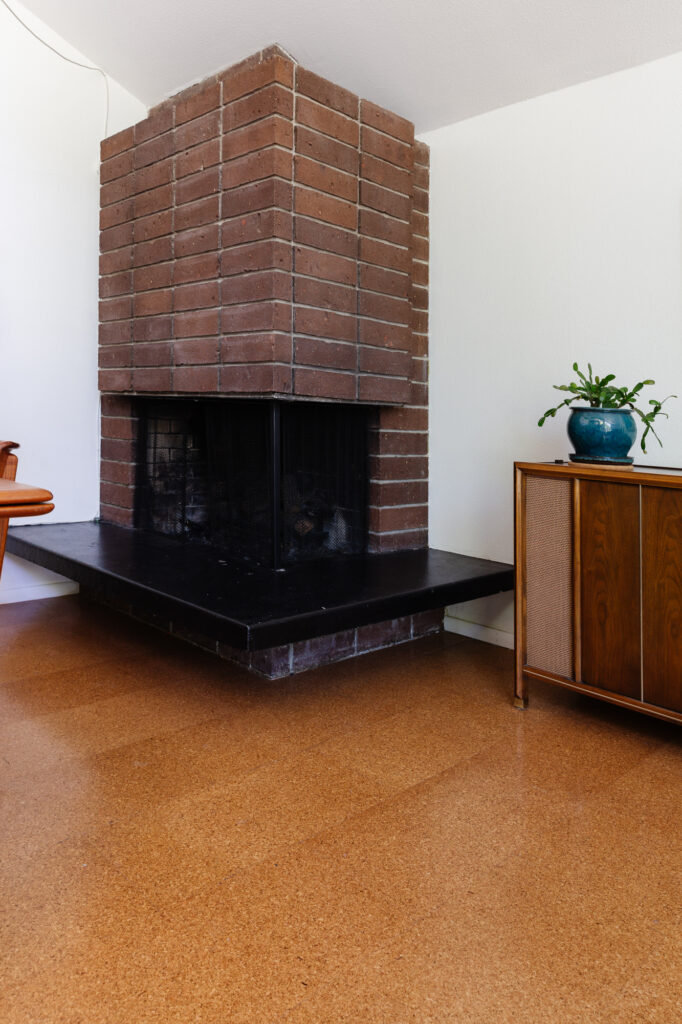
The dining room is directly in front of the kitchen and opens to the living room that was an addition put on a couple years ago. One of the key features in Streng homes is the fireplace which I love the modern shape of, but it does was like Baby in the Corner with the old setup. It wasn’t serving as a focal point, and the rectangular shape of the table was too close to the hearth.
DINING ROOM BEFORE
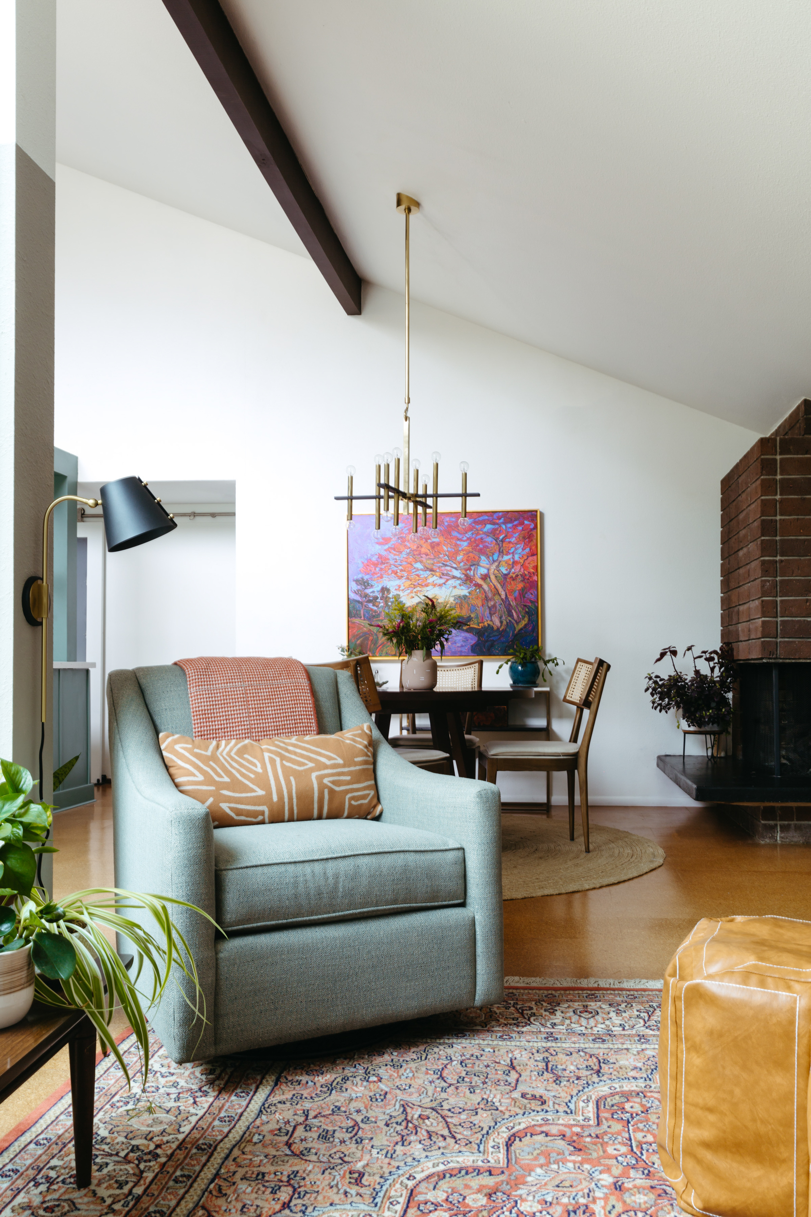
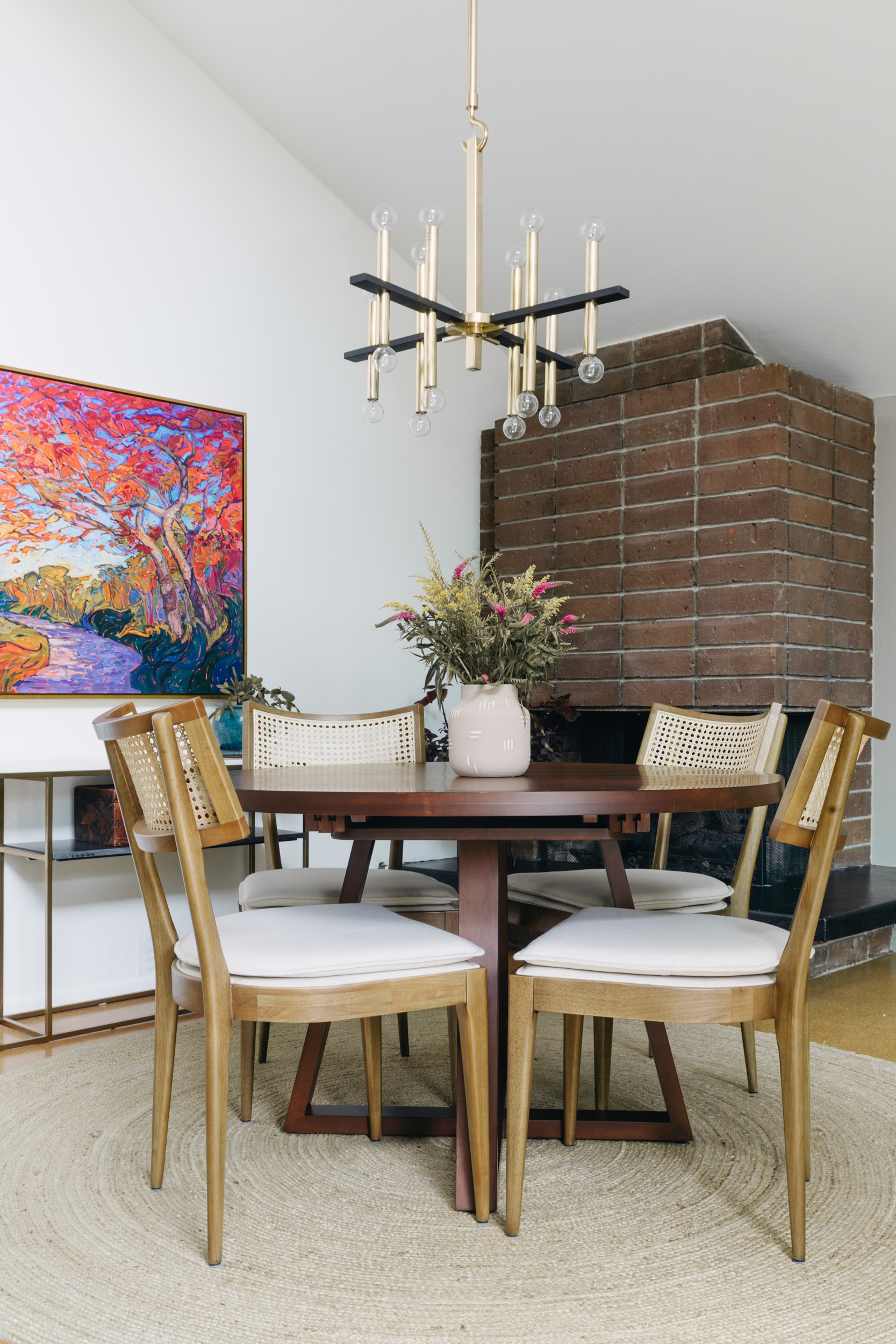
DINING ROOM AFTER
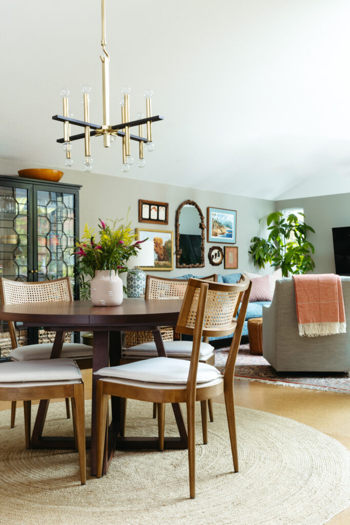
We replaced the dining furniture with a round walnut table and a narrow console that really opened the space up visually and functionally. The round shapes soften the hard corners of the fireplace and allow for walking around and pulling chairs out as needed.
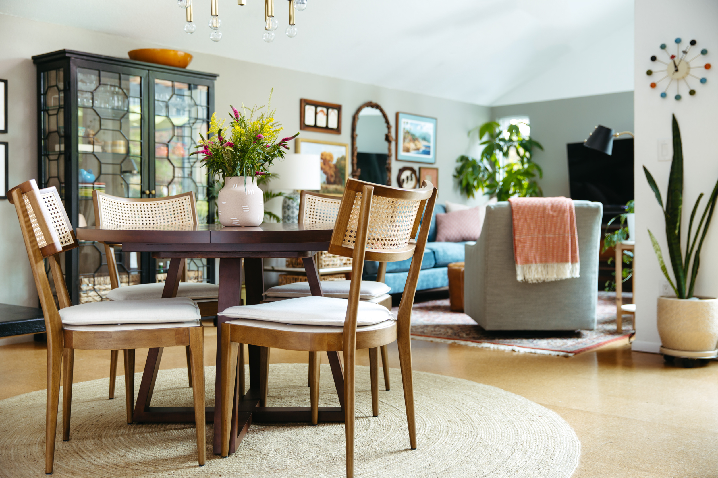
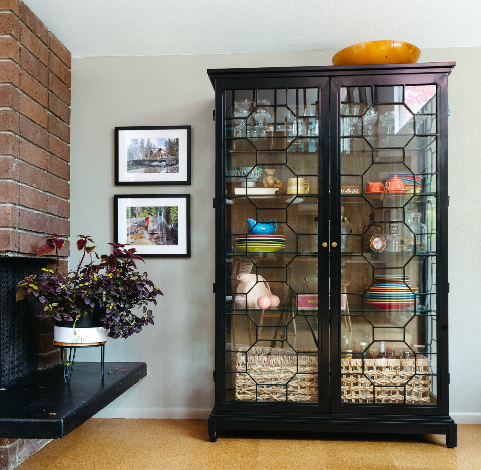
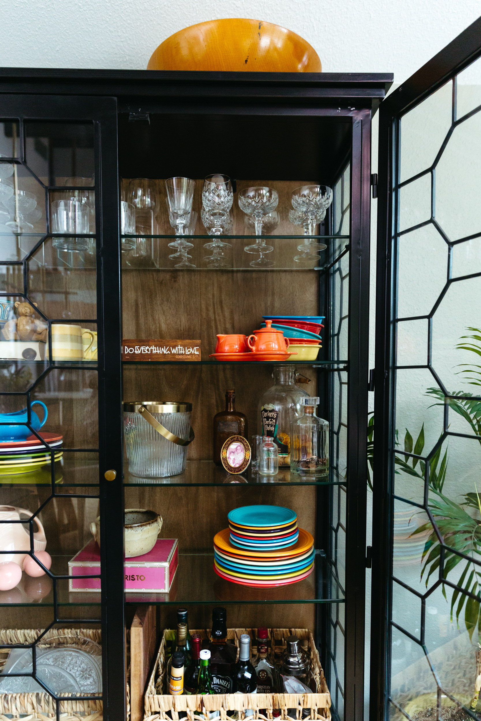
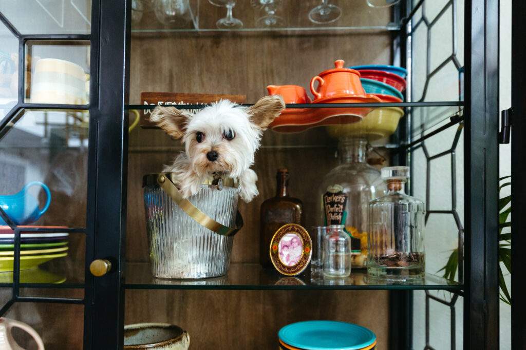
We added a tall china cabinet to break up the long wall and define the two spaces. It also gives my mom a chance to display some collections and store glass and serveware.
Living Room
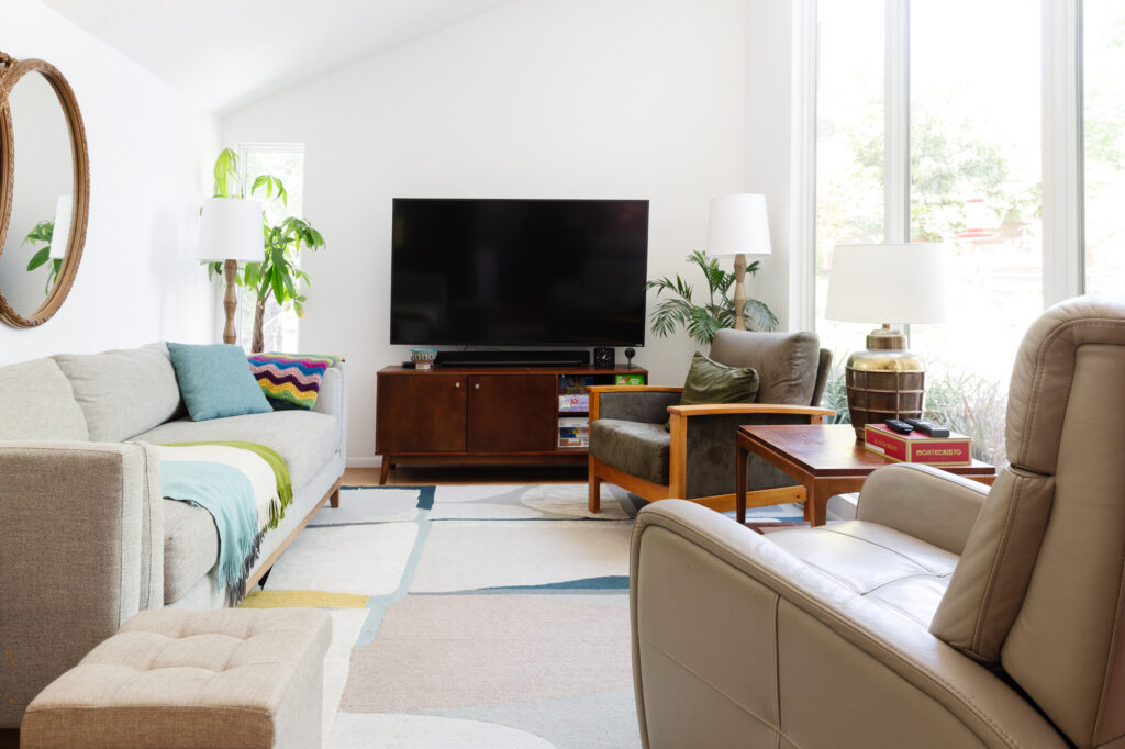
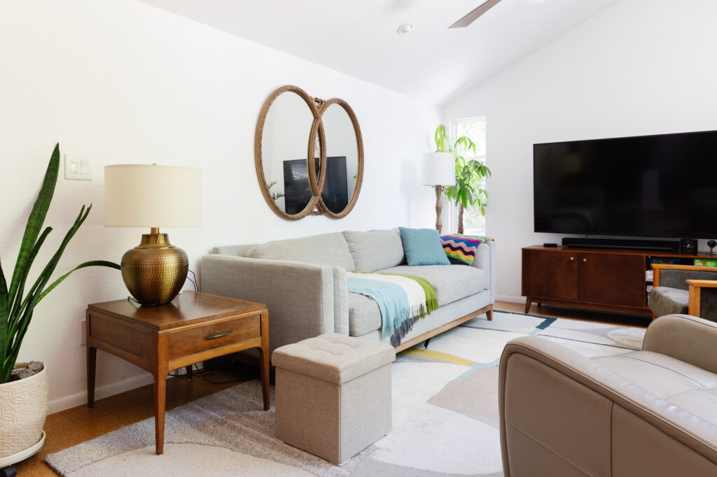
The living room was an addition added a couple years ago and really brought more use to the downstairs and with the full-height windows a ton of natural light. It lacked color and depth, and my dad always wanted to break up the white walls with color, but in the open plan with vaulted ceilings, it was a little tricky.
LIVING ROOM BEFORE
LIVING ROOM AFTER
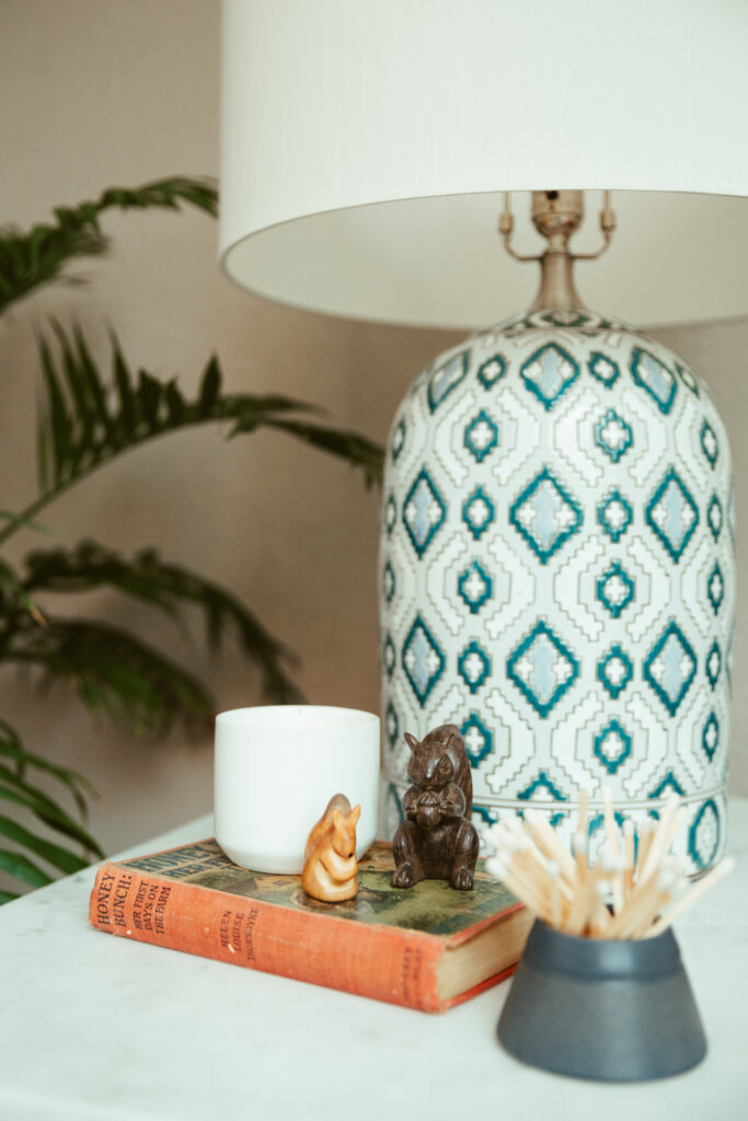
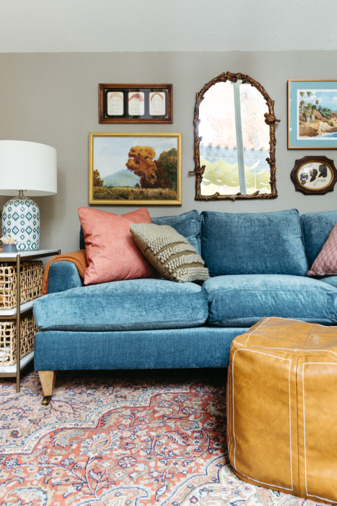
Mixing midcentury antiques with new furniture pieces, this room is now cozy, layered and feels more like them. To bring some color to the walls without going all the way up to the ceiling, we landed on a putty color that follows the height of the long back wall. I love how it turns into a clean tide line on the TV wall and wraps the room without overwhelming.
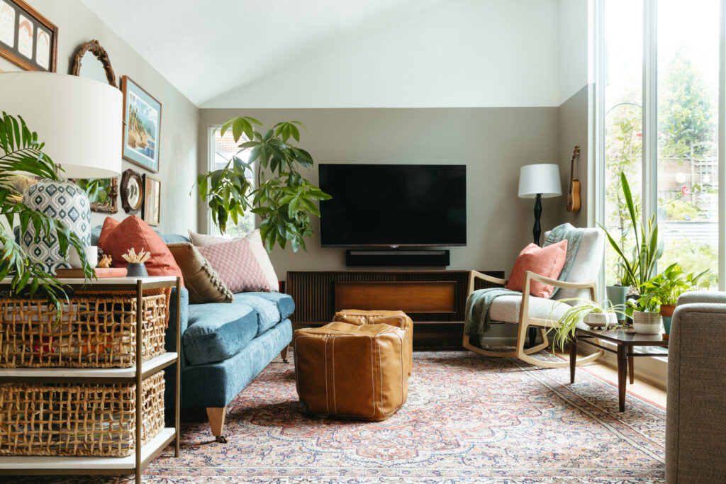
My mom loves listening to old records so we found this refurbished record console at Midcentury Sacramento.
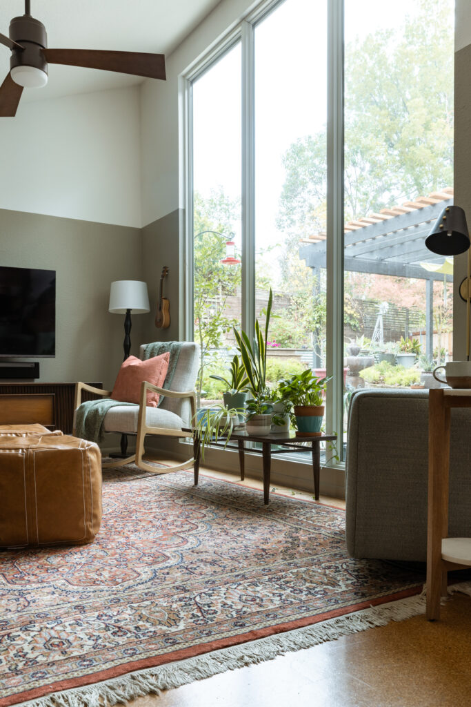
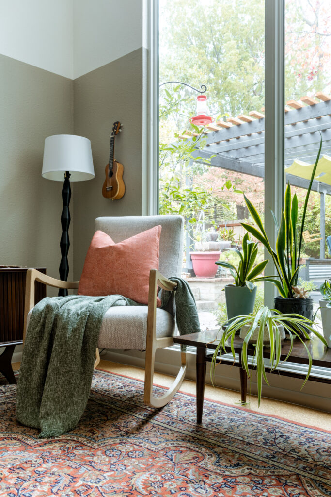
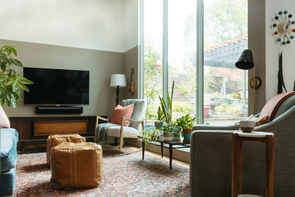
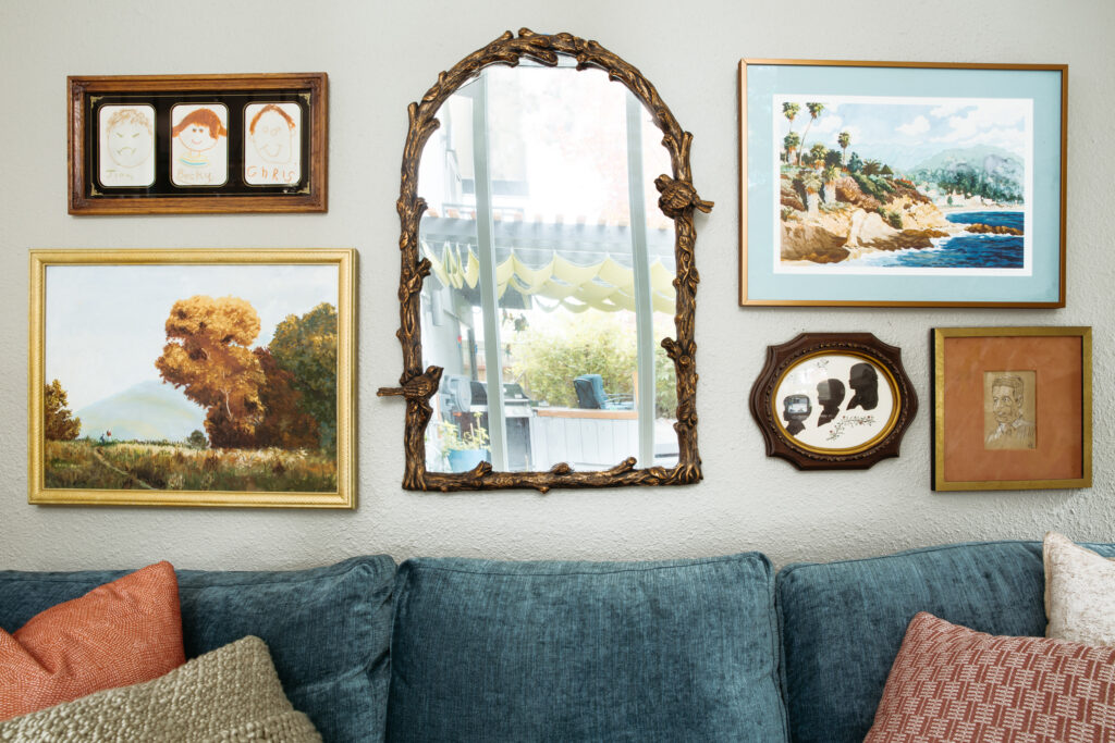
The sofa was custom made and the pop of blue brings a pop of color and texture that grounds the neutrals everywhere else. My mom and I pulled together a gallery wall with some vintage art and some meaningful family pieces they’ve had without a place to display.
I’m so grateful they let me partner with them on this and I could help them create a space that is comfortable and will last them for years.
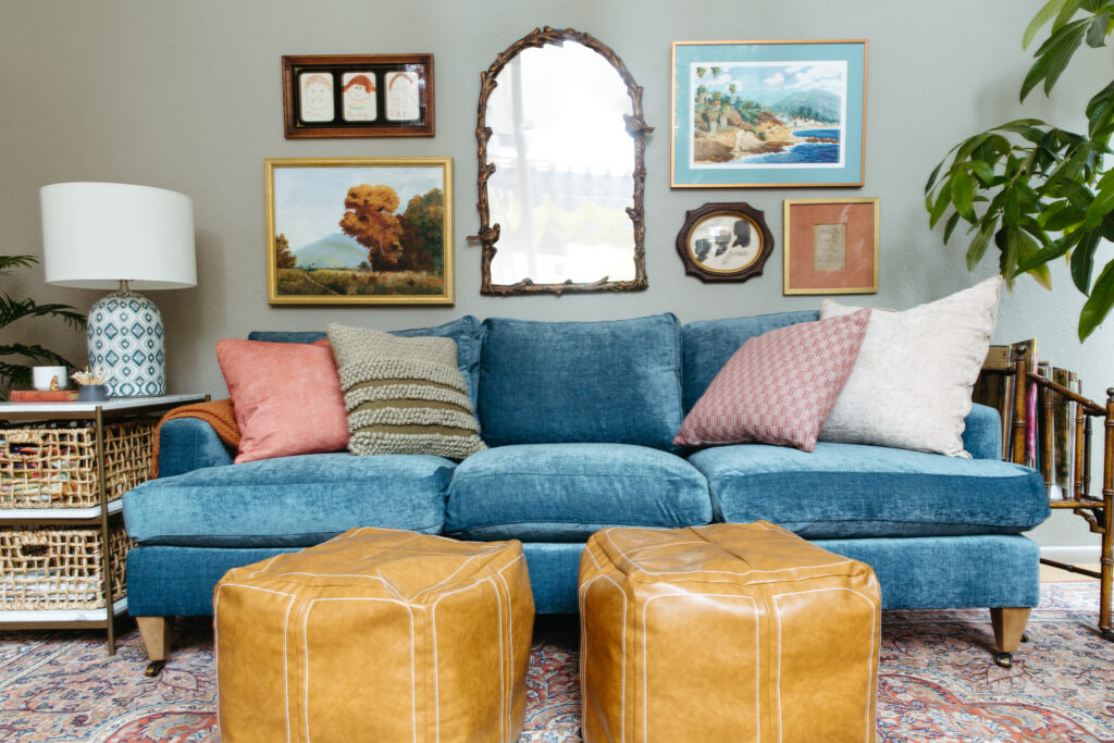
All photos by Whitney Dianne Photography


