To kick off this project I was just going to do a little IG tour but ended up taking decent photos and thought it was worthy of dusting off the blog. Backstory: My parents moved across the state to be in Sacramento with us when I was a few months pregnant and I wouldn’t have survived the last 7 years of home ownership and parenthood without them. If you’ve been here awhile you know my dad has been my accomplice in my past One Room Challenges, and my mom has done a ton too.
They bought this 1967 two-story midcentury built by the Streng Bros. (more here) in a neighborhood a few miles from us. They are chronic renovators (wonder where I get it?) and in between Nana/Papa duties they’ve been renovating various elements, including an addition, but now they want to make some changes that will keep them comfortable and provide more function long-term. And this time, they’re letting me help!
Like me, my mom loves vintage shopping and hasn’t always invested in furniture preferring to treasure hunt (I get it from my mama!). Raising 3 kids, a messy granddaughter, dogs and a husband over the years has made that a fair choice, but I think she finally deserves to invest in quality pieces she loves. We’ve agreed to mix in some new and custom pieces and leaving a few items open-ended for her to vintage shop. I think it’s the best of both worlds and is going to bring extra character and livability to the space when it’s done.
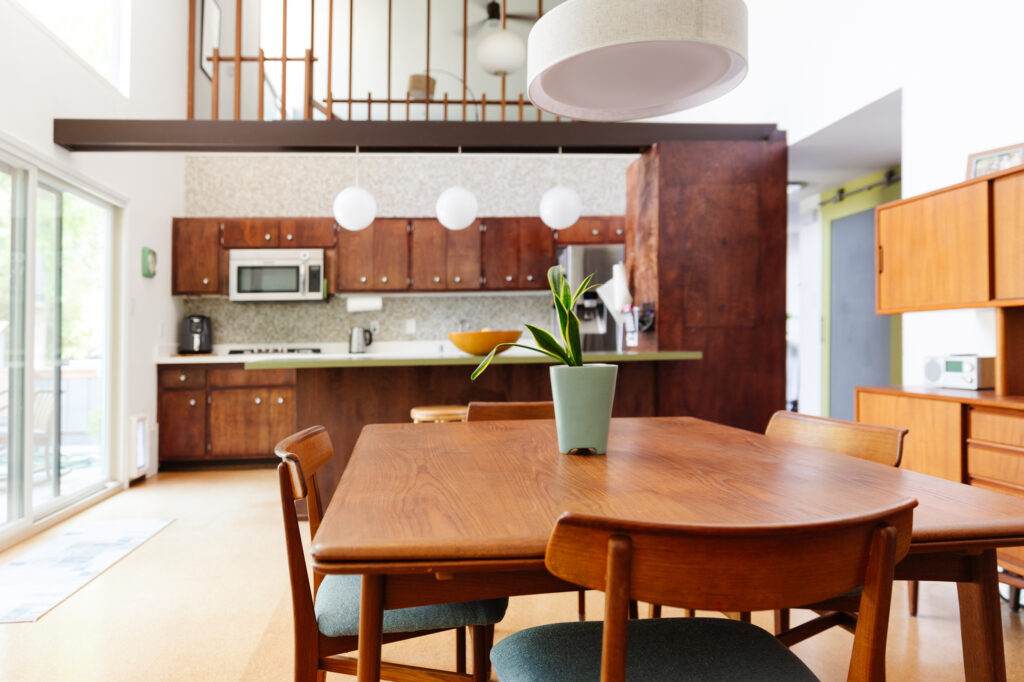
First off and foremost, their house is adorable and looks great as-is. But… what you can’t see are some floorplan issues and storage that doesn’t function well. I also want to say that we are not historical preservationists and I know that there are many midcentury enthusiasts that think it’s blasphemous to touch any original details. My mom being one of them, but she’s also ready to have a space that works for them. My philosophy is to preserve the character of the space, while bringing it up to 2021 living standards. We aren’t changing most of the bones, but if you think 60-year-old modest cabinets should be saved at all costs you may want to skip this post. 🤪
Kitchen
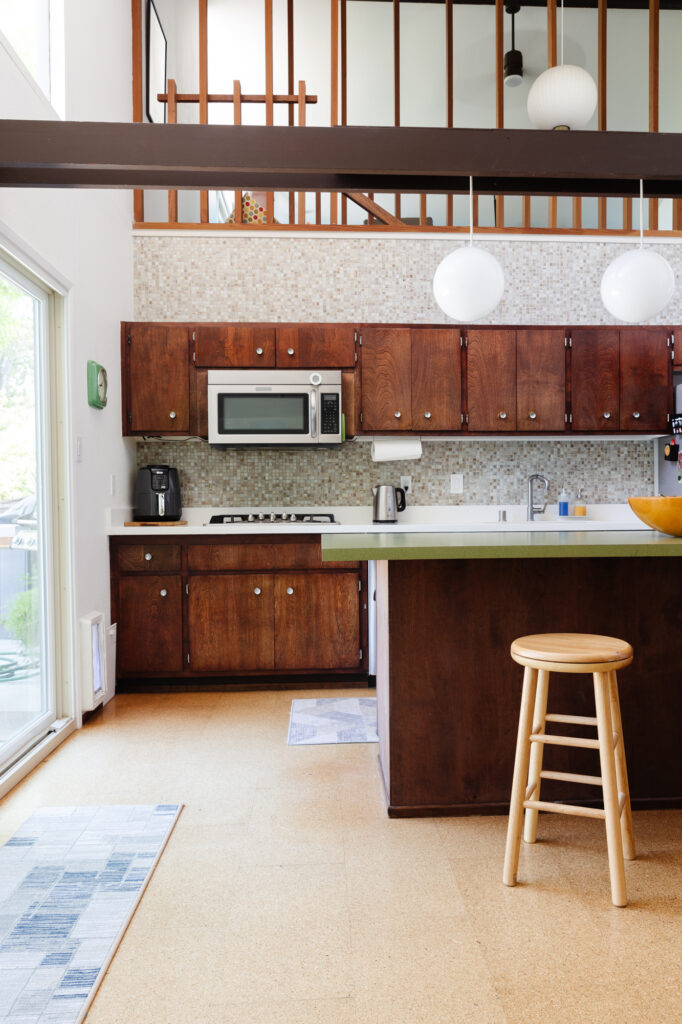
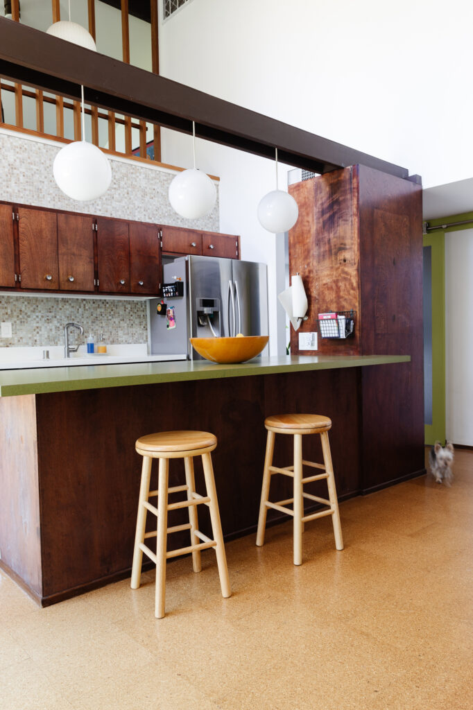
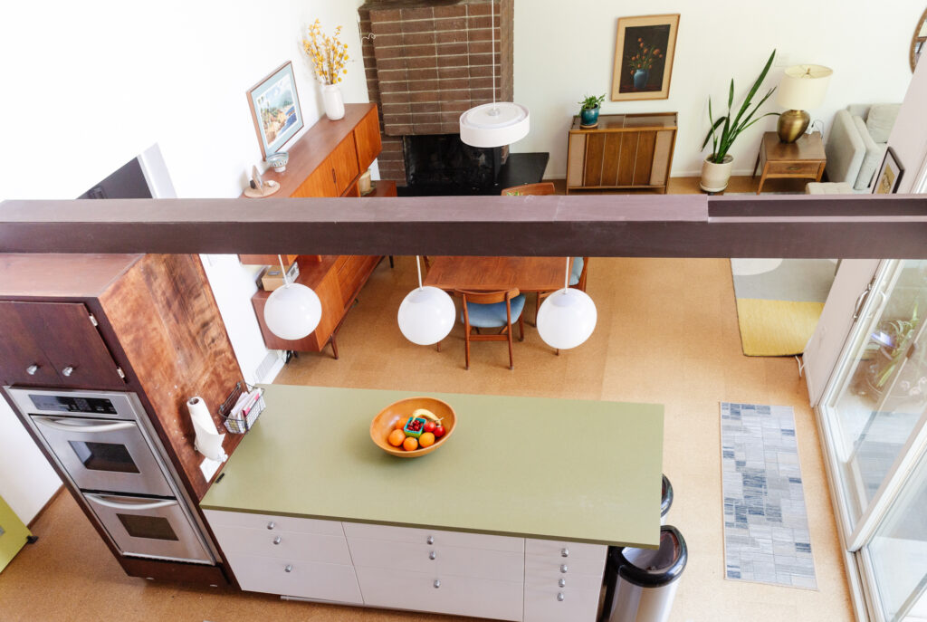
Let’s start with the kitchen. The way the kitchen is placed in the hub of the house with 20′ ceilings and views to the upstairs loft, is definitely a wow design moment. The architect, Carter Sparks wanted to merge the living, dining room and kitchen into one space.
You can see in the old photo below, from when they first bought the house, the island was table height, meant to do double duty as the eating area. Their first pass at updating the kitchen included raising up the island to counter height, removing the island overhead cabinets, replacing the sink, adding quartz to the back counter and bringing in a gas line for a new cooktop
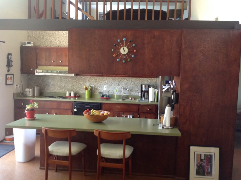
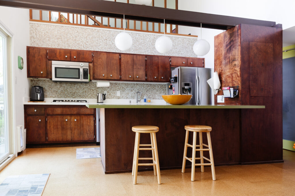
They used Ikea Sektion cabinets to raise the island but repurposed the Formica countertop and walnut panelling to keep the look as cohesive as possible from the living area.
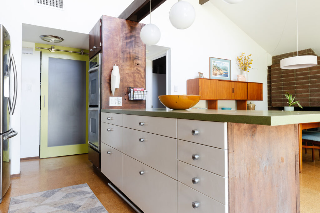
Now that they’ve lived with this version for several years they realized a few things:
- They love the oversized drawer storage the Ikea units provide
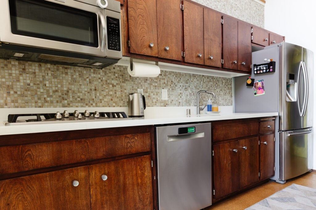
- They don’t like the mismatched look of the cabinets and countertops
- The old cabinets are tiny and hard to access
- The big oven tower is intrusive and blocks sightlines
- They really don’t like the stainless steel sink
- They want to hide the trash cans (I hid them for photos but they live at the end of the island)
- Having the oven cross from the refrigerator is tight and they’d prefer a slide-in range
My mom loves the rich color of the cabinets and wants to retain as much of the look and feel as possible. We are replacing cabinetry but they will have a walnut finish and use the original hardware to preserve the vintage look. And since we we’re doing the cabinets, they need to do the counters, and if you give a mouse a cookie, the designer talks you into replacing the tile backsplash. I think the current tile is fine, but I wanted to add a little more color in to balance out the wood tones and cork flooring and I finally pestered my mom into agreeing. The new tile (see moodboard above) has midcentury influences, adds color, and will allow the tile to hit the counter top.
Kitchen Project Scope
- Replace/move ovens to a slide-in range under current cooktop
- Remove oven tower cabinetry
- Reconfigure island cabinets to integrate trash
- Replace sink
- Replace back cabinets with new Ikea drawers and taller uppers
- Replace countertops and add a built-in butcher block cutting board to island
- Retile backsplash
- New light fixture
Living & DIning Room
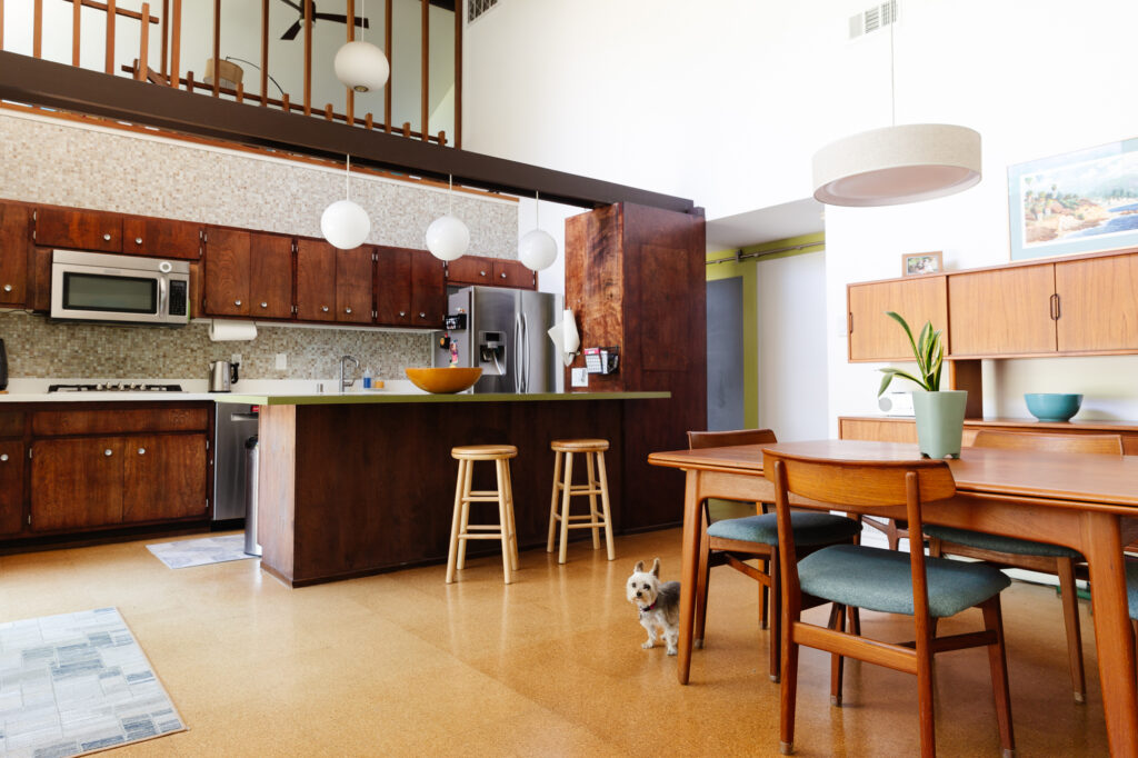
The first thing I should mention about this room is that they added a small seating area addition a few years back which completely changed the whole space.
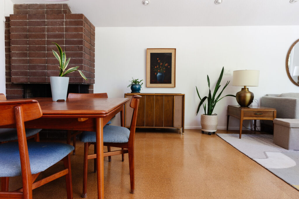
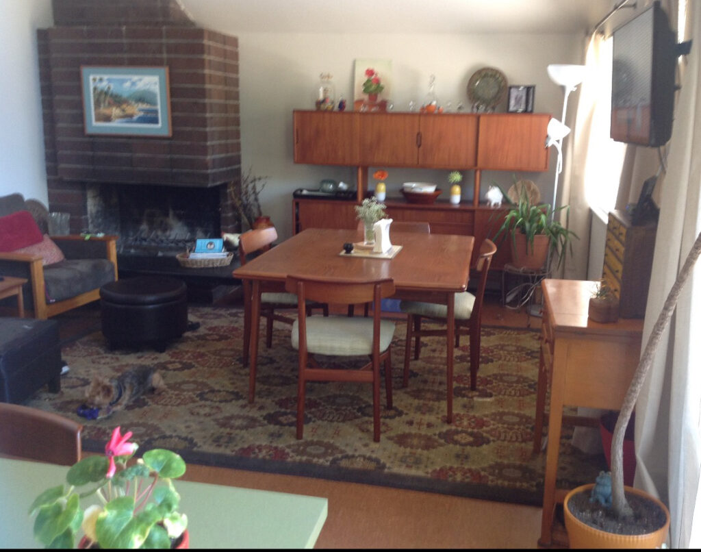
Below is a shot of the same view and as you can see it was crammed. The living room was designed to be in the upstairs loft, but they really wanted a place to hang out and entertain without asking people to go upstairs. It makes sense.
By pushing out the section on the right they carved out a small area that works perfectly for their needs. The full-height windows bring in amazing light and my mom and Cecily have named all the squirrels that hang out in the backyard.
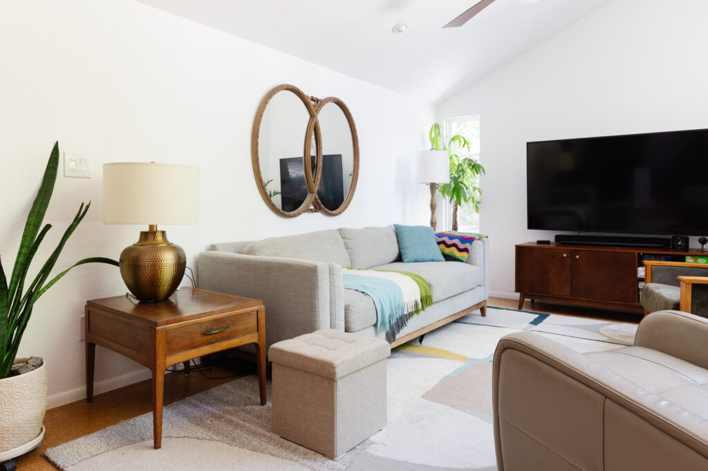
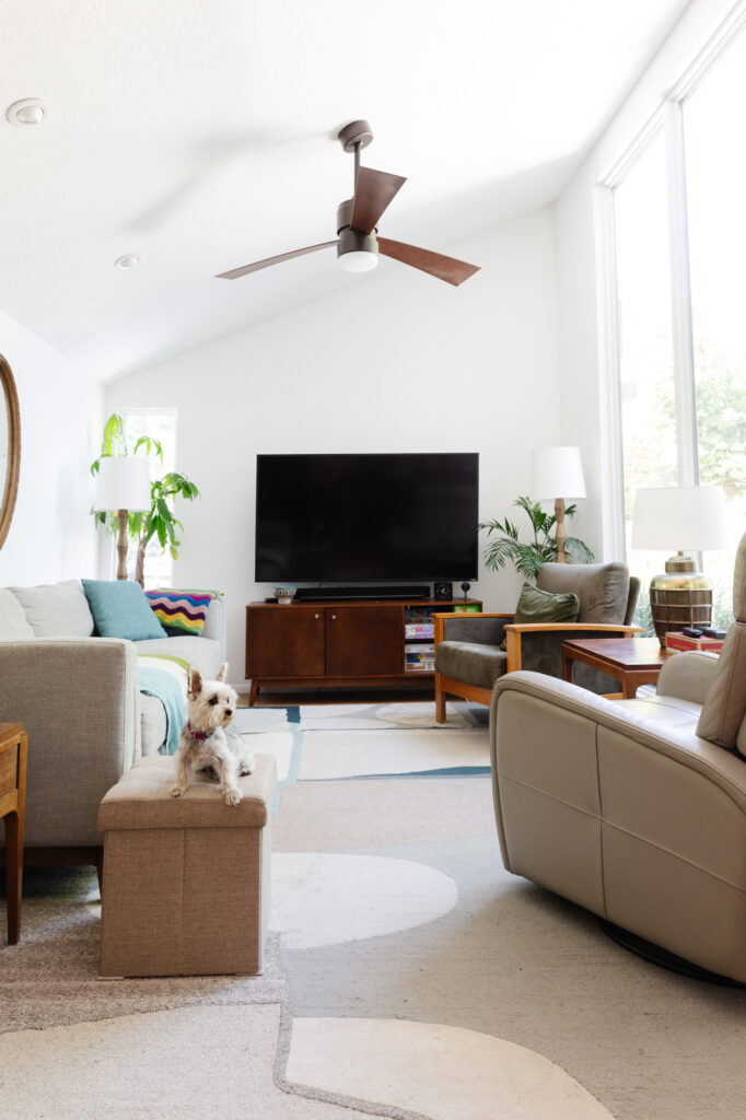
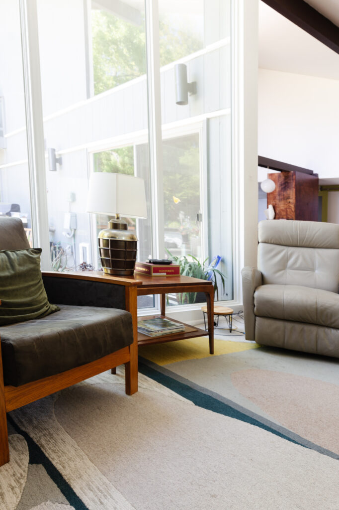
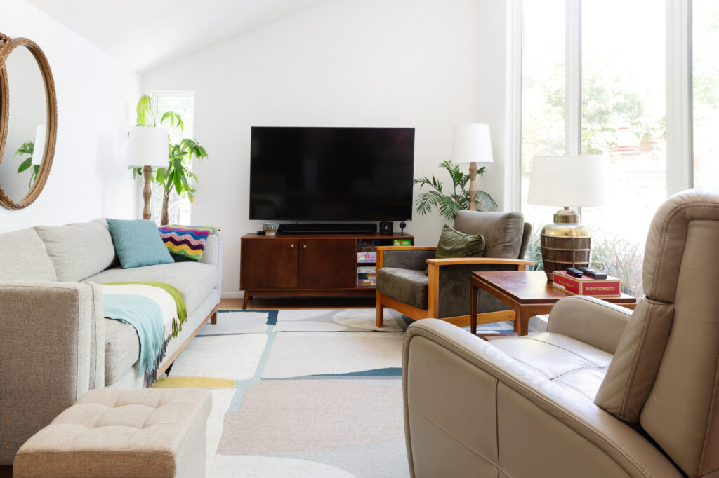
The only changes we’re making here are in the decor. We have a custom sofa on order, my dad’s recliner is getting the boot, and we’re layering in color and quality vintage pieces. The floorplan is essentially staying the same but it’s going to look completely different. I can’t wait to see it all come together.
As for the dining room, the vintage set they have is Dansk, and everyone loves it, it just doesn’t fit the space well.

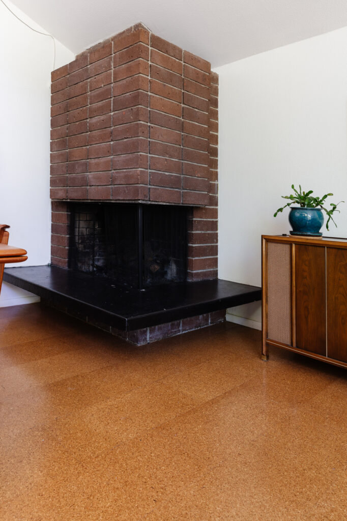
You can see here the fireplace hearth juts into the room quite a bit and what is meant to be a feature feels like an afterthought.
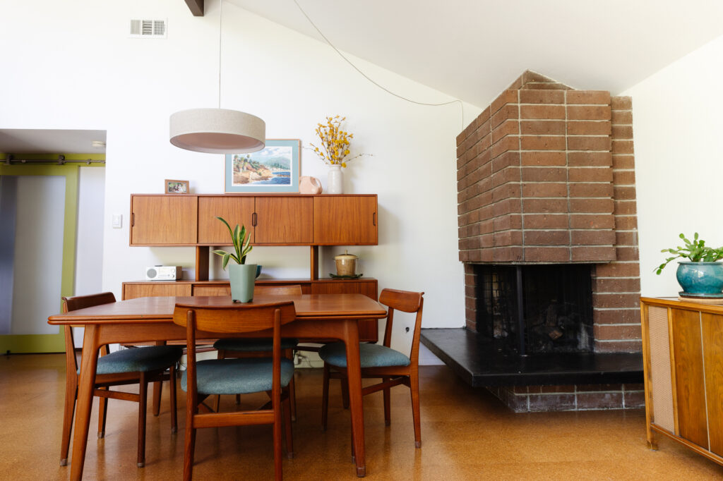
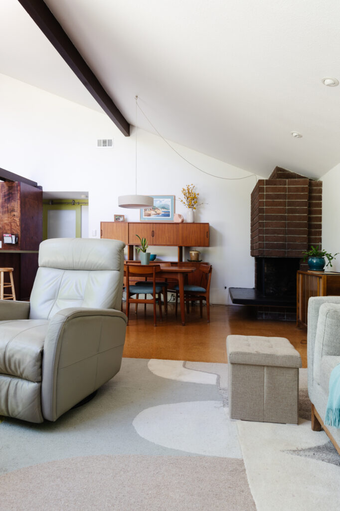
We’re replacing the record console with a taller china cabinet for storage, selling the table set and floating credenza, and replacing it with a round table. There won’t be furniture on the current credenza wall to give everything breathing room and allow for chairs to pull out comfortably. I also want to see more variation between the furniture and floor colors. A new rug, dramatic lighting and eye-catching art will be all this room needs to feel complete!
Thanks Mom & Dad for trusting me to help you with this project! XO


