Hey friends! Spring Highpoint Market came and went and it was jam-packed with friends, information and most importantly, inspiration. I spent two days with fellow design enthusiasts on the Design Influencer’s Tour which included touring 15 showrooms and getting inside information from the brands themselves, all so I could share what I saw with you!
A huge thank you to High Point Market and Esteem Media for inviting me on this trip. I met some incredible creatives and we had such a fun time learning together. Being with designers from all over the country taught me so much, and I’m so grateful for everyone’s willingness to be supportive and share their knowledge with me! Also can we talk about how nice it was spending time with people who understand your need to document EVERYTHING?!🤣
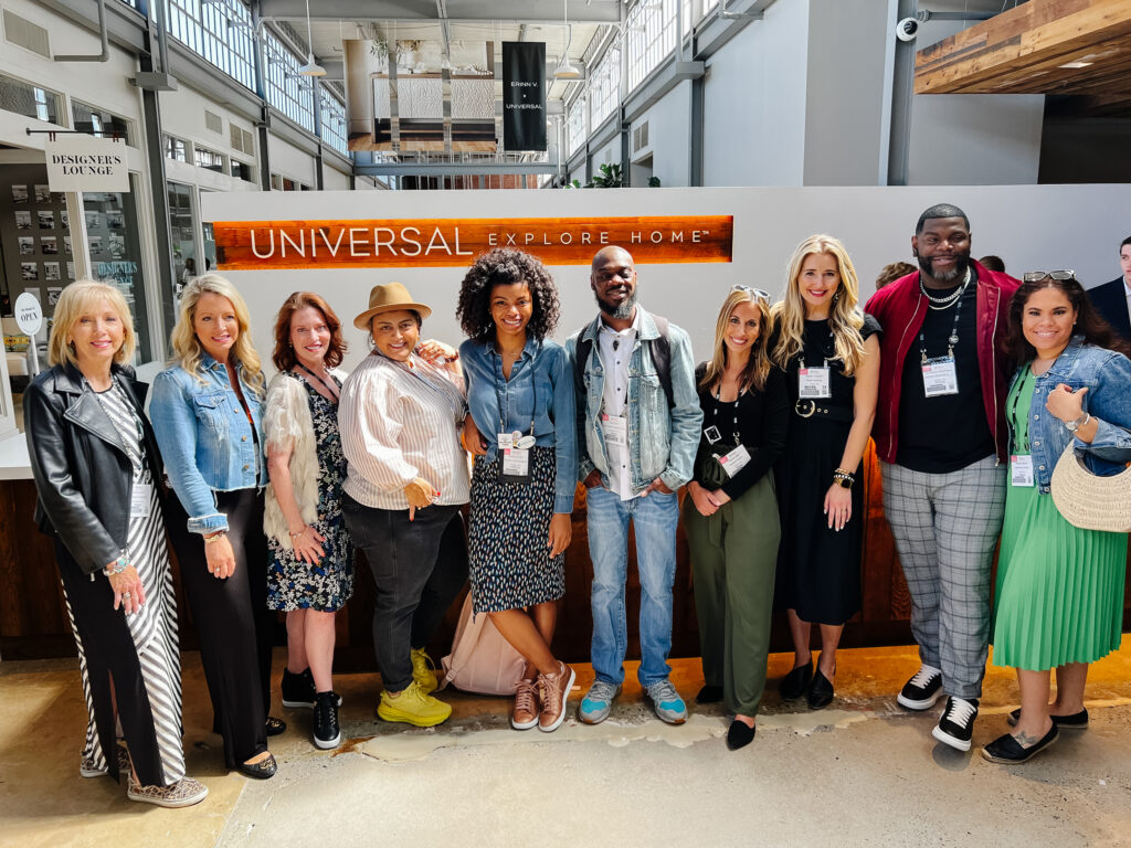
My new friends: Rhoda Vickers Hendrix, Jennifer Maune, Pamela O’Brien, Me, Amber Guyton, Tariq for Rasheeda Gray, Haneen Matt, Heather Fujikawa, Don Ricardo Massenburg, Marissa Nelums
One of the most frequent questions I get when I come back from Market is “What trends did you see?” For my Highpoint recap series from the Design Influencer’s Tour, I’ll be going through the different trends that caught my eye, starting with my favorite element, COLOR.
CITRON
Citron is one of those shape-shifter colors and I’m really into it. It’s not green, it’s not yellow, it’s both (grellow?) . She’s definitely has main character syndrome so best to use her in small doses but I love the happiness it brings to a space.
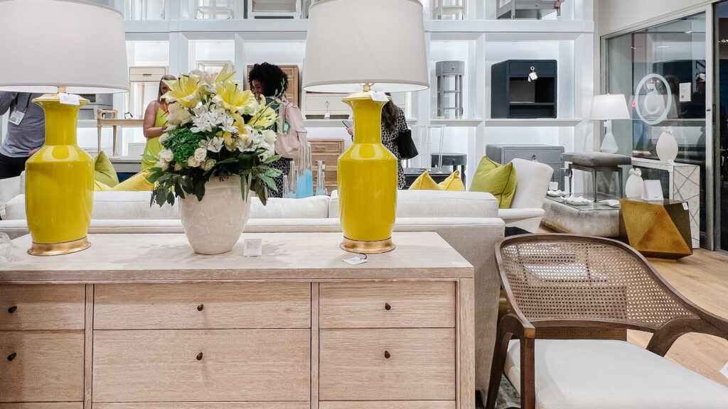
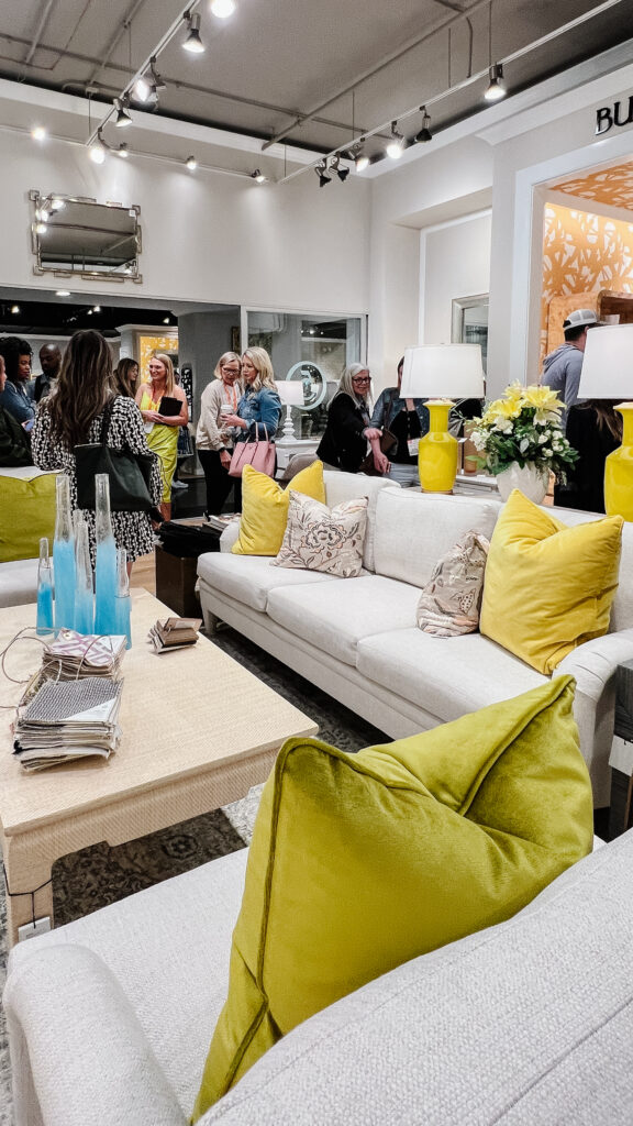
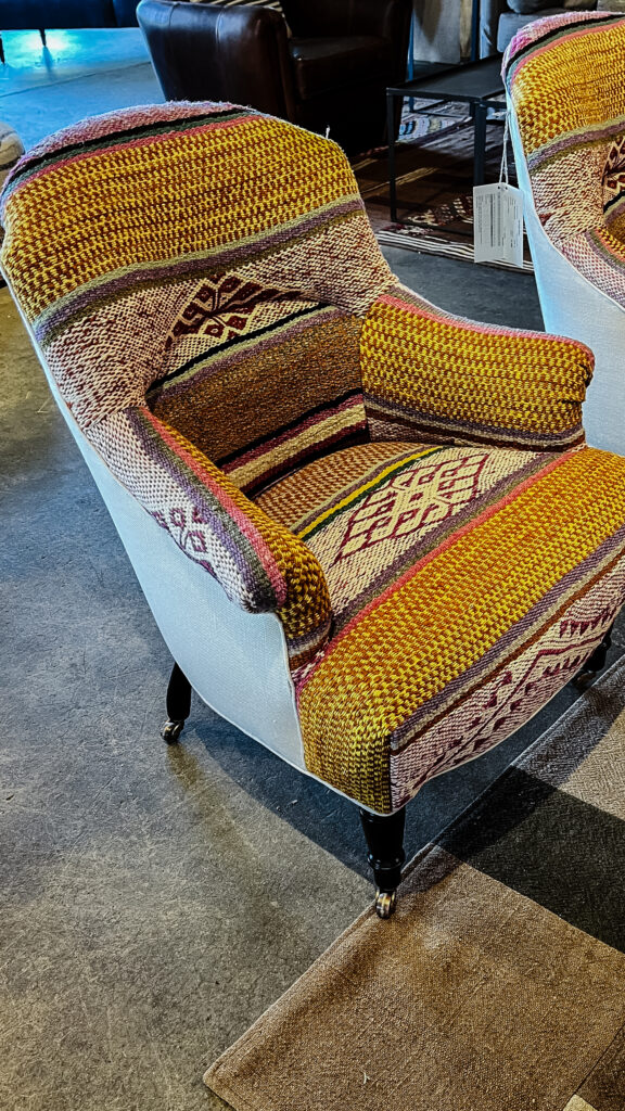
Above Left: Pops of citron in the accessories makes a strong statement at Bungalow 5 while all the main “investment” pieces are kept neutral. Above Right: I absolutely love the way citron pairs with berry tones and dusty eggplant colors in this chair at Cisco Home. This unexpected color combination in a traditional chair silhouette balances the playfulness of the pattern.
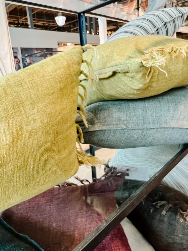
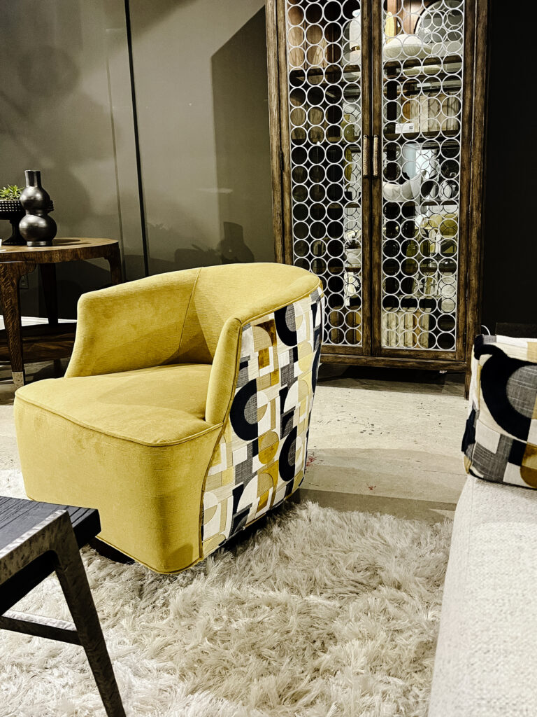
Above Left: Throw pillows are such an easy way to play with color trends. These linen cushions from Jaipur Living bring in an earthier texture that works well in less contemporary designs. Again paired with that berry color its so rich and pretty. Above Right: This two-tones swivel chair from Hooker Furniture in a citron velvet has a fun surprise when it spins around. Using two different fabrics and a bold pattern adds so much charm to what would otherwise be a simple little chair.
Cobalt
A scene stealer like citron, cobalt is Navy Blue’s vivacious friend. Cobalt is saturated and bold, and will not go unnoticed, so it’s also a color I like to use it in smaller sprinkles. Think accessories and art, maybe not entire walls and surfaces.
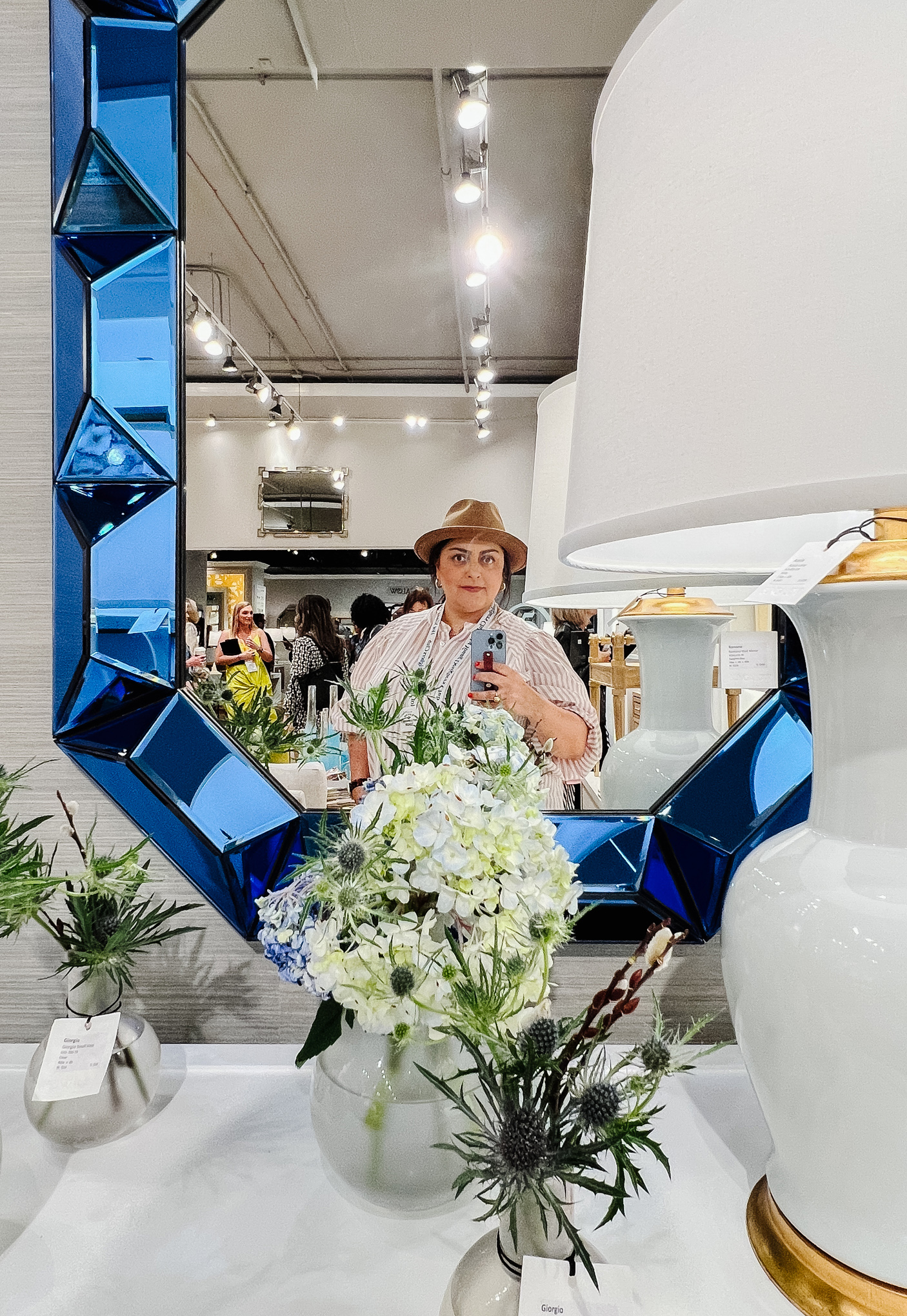
Above: This faceted mirror at Bungalow 5 is like an actual sapphire you can hang on your wall. I loved the way it works here with the neutral grasscloth and even the tan colors in my wool hat. Mix in some clean whites and brass, it still feels light and airy.
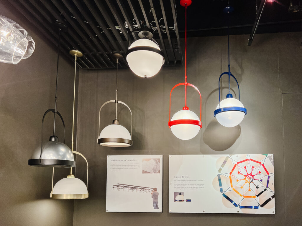
Above: Lighting is one of my favorite ways to add bold colors into a space. They are somewhat easy to replace and really are the jewelry of a room, so why not make things interesting? Every product at Hubbardton Forge is made to order in the US so you can customize the metal finishes in any color. I really love the way that cobalt stands out against the gray wall.
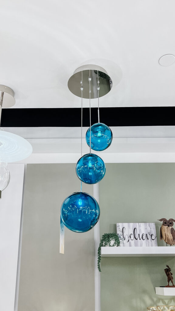
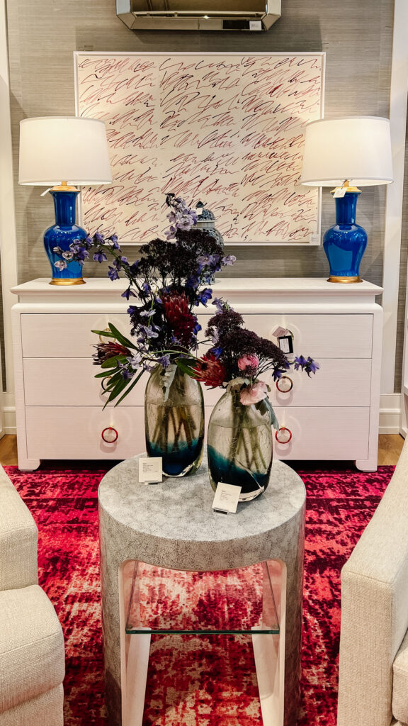
Above Left: A trend within a trend, I saw the use of colored glass in lighting pop up frequently. This tiered pendant at Kalco would bring such a moody mid-mod vibe to a corner at night. Above Right: In contrast, adding electric blue to this more traditional lamp form at Bungalow 5, communicates a playfulness that adds so much energy to a vignette.
GREEN
We heard it over and over again on our tour–green is having her moment. Several vendors had been to Maison & Objet prior to Highpoint and every one of them mentioned that green was the biggest overall trend there. Since it’s a color I frequently use, I was surprised to see it as a ‘trend,’ but seeing it in more manufactured upholstery and accent pieces was refreshing, because its just classic and gorgeous.
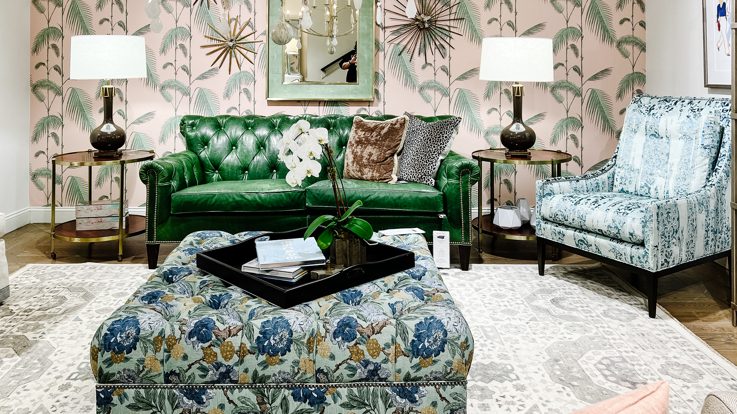
Above: This whole vignette at Wesley Hall has so many fun pieces (the ottoman! the wallpaper! the brass side tables!), but there’s no doubt that green leather sofa is the shining star. Leather has so many practical applications so its great to see it available in more colors than brown and black.
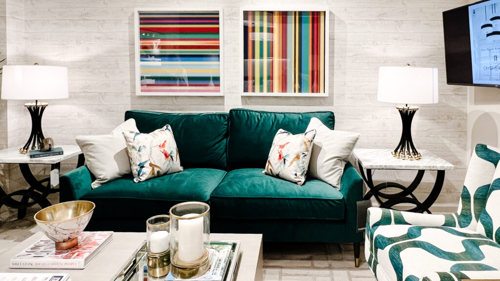
Above: Another green sofa, this time in an emerald velvet at Fairfield Chair, I love how classy it looks with those little brass capped legs, and narrow arms. Green is basically a neutral to me, and paired with this artwork it illustrates that it can go with literally any and every color in the rainbow.
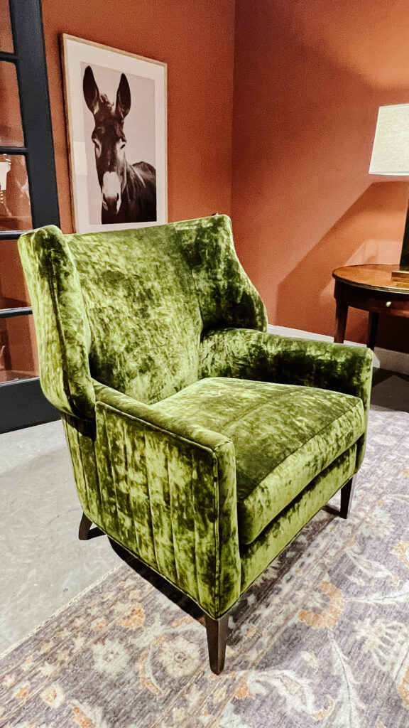
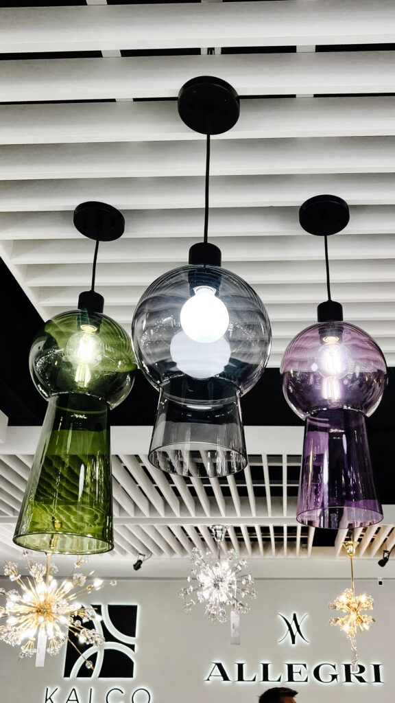
Above Left: Within the trend of green, I saw lots of 70s avocado tones, which of course I’m here for. This crushed velvet wingback at Wesley Hall was a perfect meld of traditional and retro and a super cozy place to curl up. Above Right: Remember that colored glass trend I mentioned? I love this pendant from Kalco, its such a pretty bottle green and would be a fun way to add a pop of color to a kitchen.
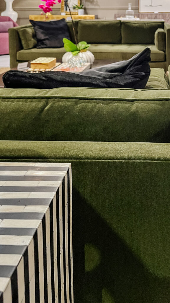
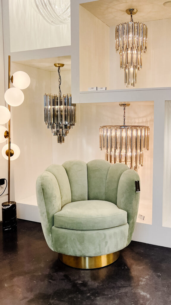
Above Left: More of that modern avocado, but this time in Hooker Furniture‘s MARQ line. Applying it to this clean-lined tuxedo sofa, it was such a chic look and gorgeous in this formal living room vignette. Above Right: The soft mint green of this shell swivel chair at Eichholtz would add softness to any corner. I love the oversized scallop detail that looks good from all angles.
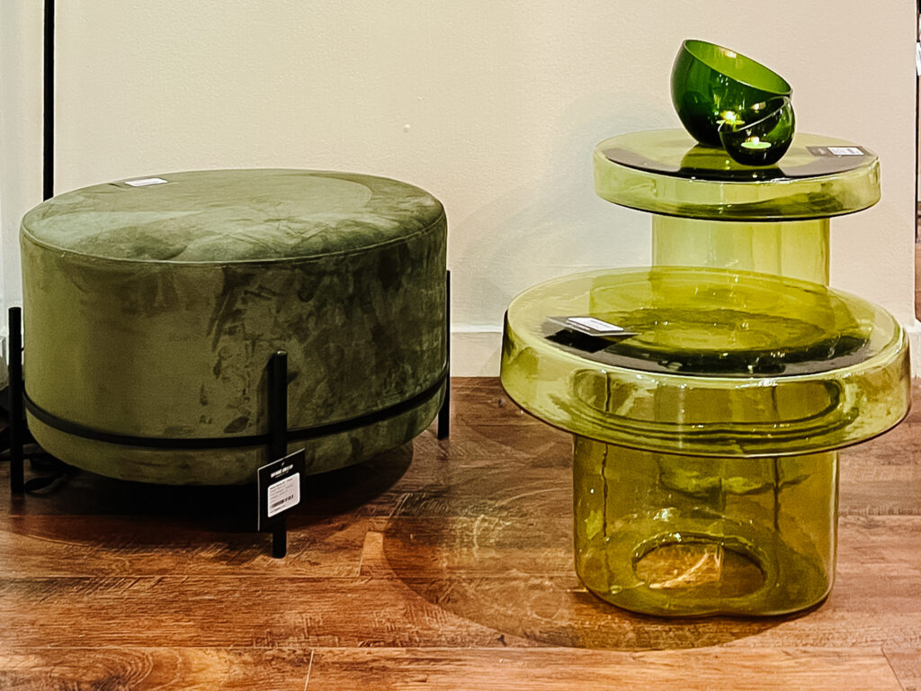
Above: Maybe you don’t want to commit to using green in a large piece of furniture, but there are lots of ways to accent with it besides throw pillows. When I posted these blown glass mushroom tables from Dome Deco on my Stories you all went crazy for them. They are so unique and cool and are like functional little art sculptures. The mossy ottoman is another way to bring in color and add texture and function to a room.
RUSSET
You’ve probably noticed that red and brown has fallen out of favor the last couple decades but I’m here to tell you they’re coming back. Warm undertones in general have been trending in paint colors (warmer mushroom colors have overtaken cool grays for instance), but I’m seeing more and more in the mid-tones and darker as well. Going beyond natural wood, I saw lots of chocolate and sepia tones in fabrics and finishes, bringing in some 70’s influences. My favorite version is that place where brown and red come together, russet.
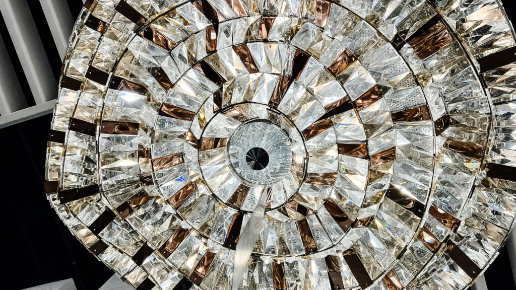
Above: These rich crystals were an unexpected addition to this statement chandelier at Kalco and I loved the combination. The asymmetrical geometric shapes rendered in an organic pattern was a cool way to bring glam into a modern space.
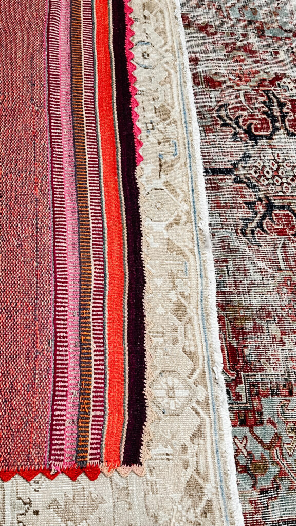
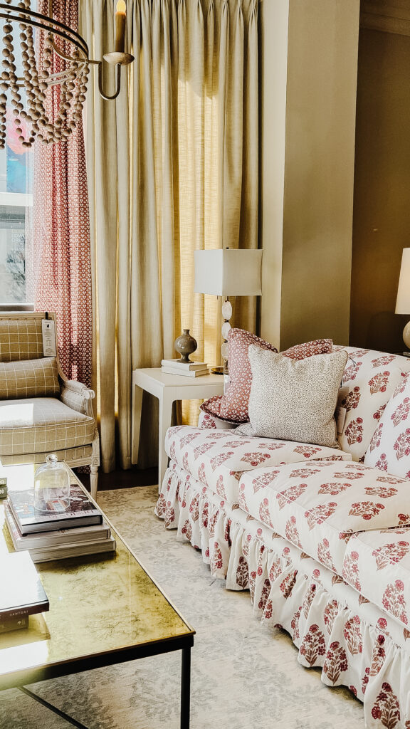
Above Left: I was first drawn to the pops of tomato red and Pepto pink in the striped rug at Jaipur Living, but then I saw that russet and pale turquoise vintage number. It’s the perfect way to add this trend into a room since the rich tones will anchor any seating area. I love it. Above Right: If you wanted to argue that the color in this sofa from Wesley Hall are more red than russet, I’d let you win, but overall I think its showing this trend toward warmth and I love it. And don’t worry, I’ll be talking about that little ruffled skirt in a future post.
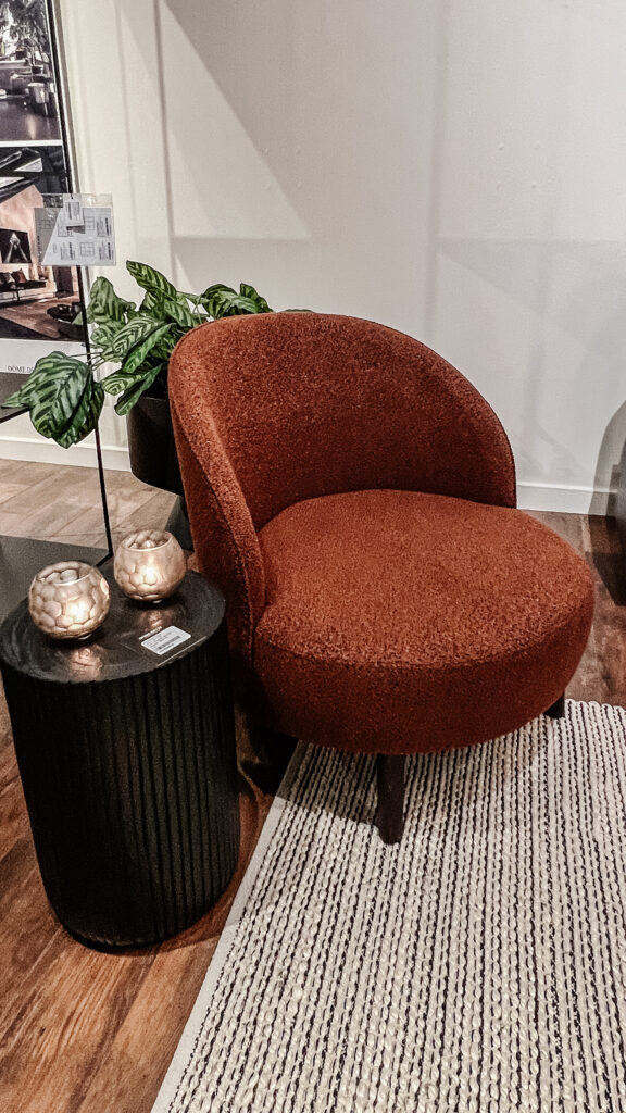
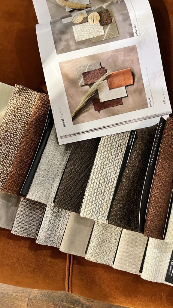
Above Left: I love love love this little russet boucle chair from Dome Deco. The shape is playful but the color is all sophistication, and the texture is cozy. She’s got it all! Above Right: These swatches were also from Dome Deco. They clearly got the memo on this trend with their fabric offerings.

2022 tour sponsors
Sponsors participating in the spring 2022 tour include:
- Cisco Home, ciscohome.net
- Crypton Home Fabric, www.crypton.com
- Eichholtz, www.eichholtzusa.com
- Fairfield Chair, www.fairfieldchair.com
- Hooker Furniture, www.hookerfurniture.com
- Hubbardton Forge, www.hubbardtonforge.com
- InterHall, www.imchighpointmarket.com/interhall
- Jaipur Living, www.jaipurliving.com
- Kalco Lighting, www.kalco.com
- Stickley, www.stickley.com
- Theodore Alexander, www.theodorealexander.com
- Universal Furniture, www.universalfurniture.com
- Wesley Hall, www.wesleyhall.co


