I’m a firm believer that the smaller the space, the bolder it should be. Luckily, these clients contacted me knowing they wanted lots of saturated color and pattern to make a statement in their apartment’s only bathroom. They live in a building in a historic neighborhood in Washington D.C., which made remodeling a challenge, but we made it work and I think the results were worth it!
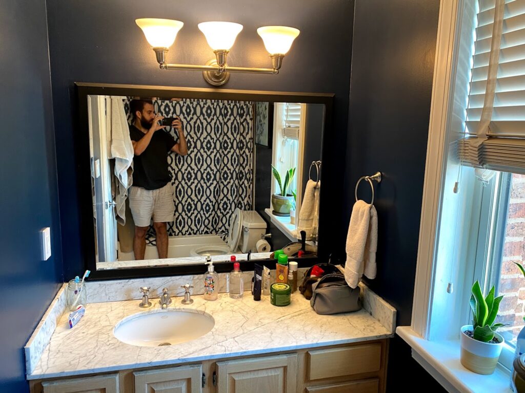
Before
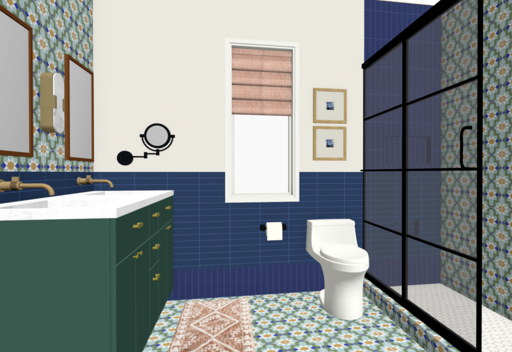
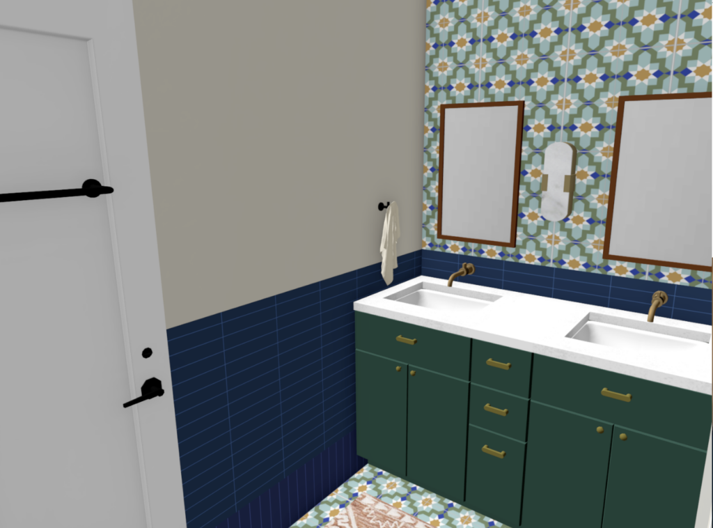
PLAN & MATERIALS
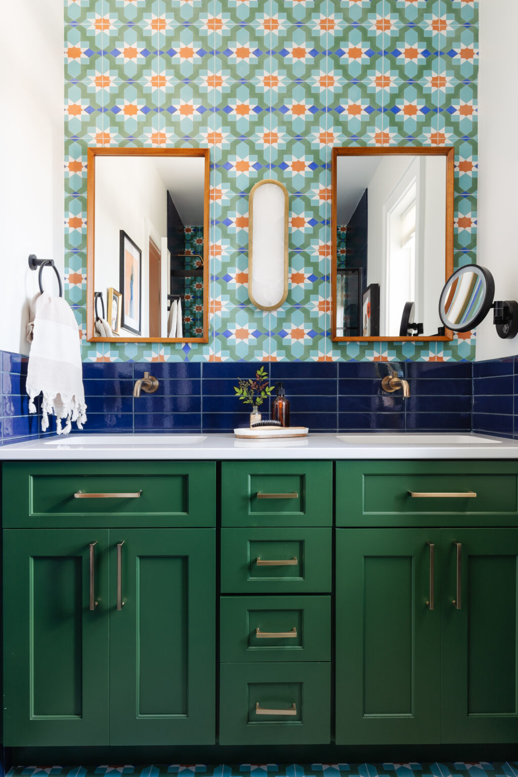
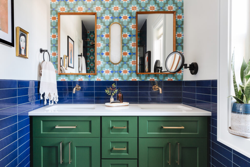
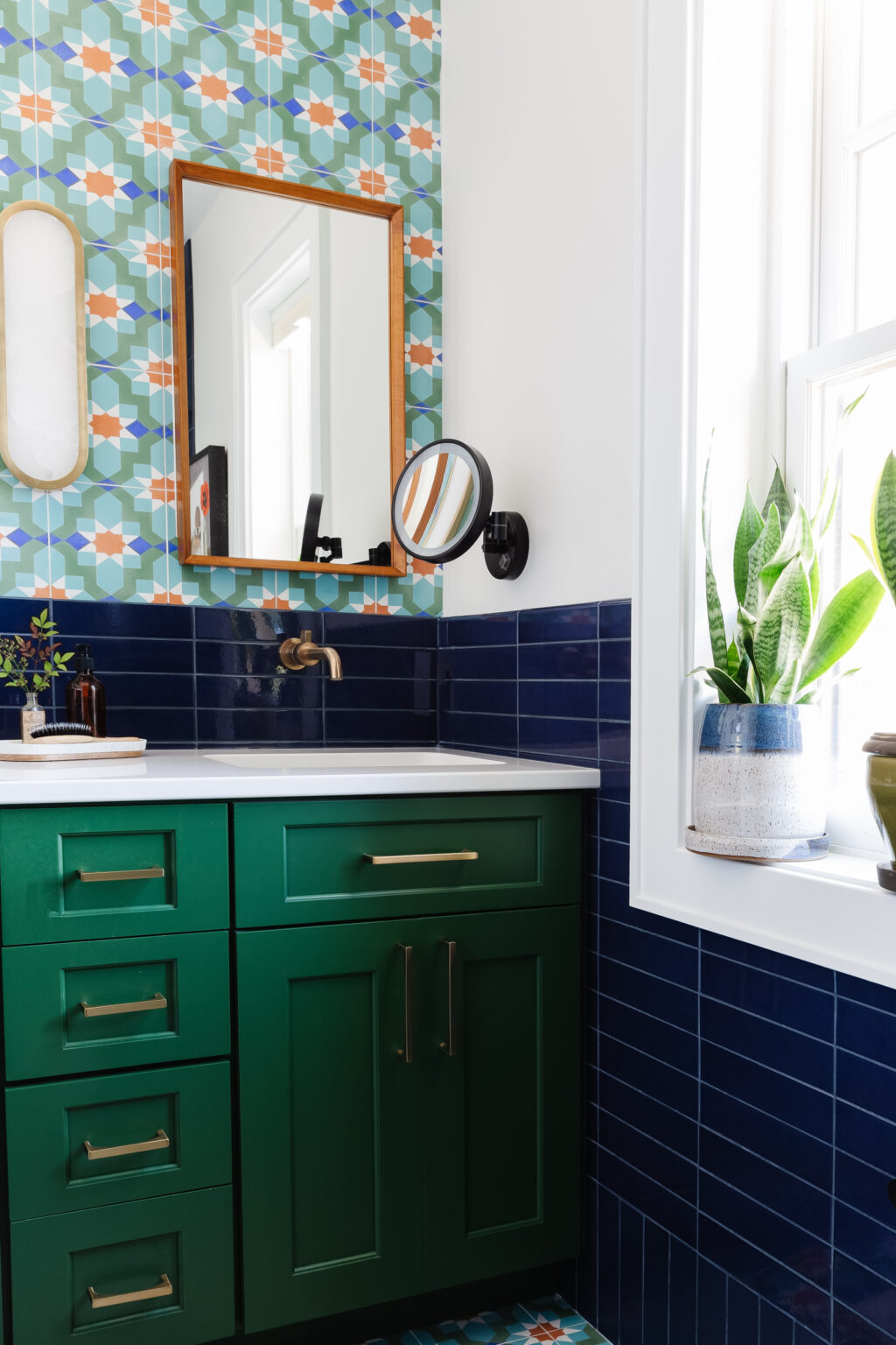
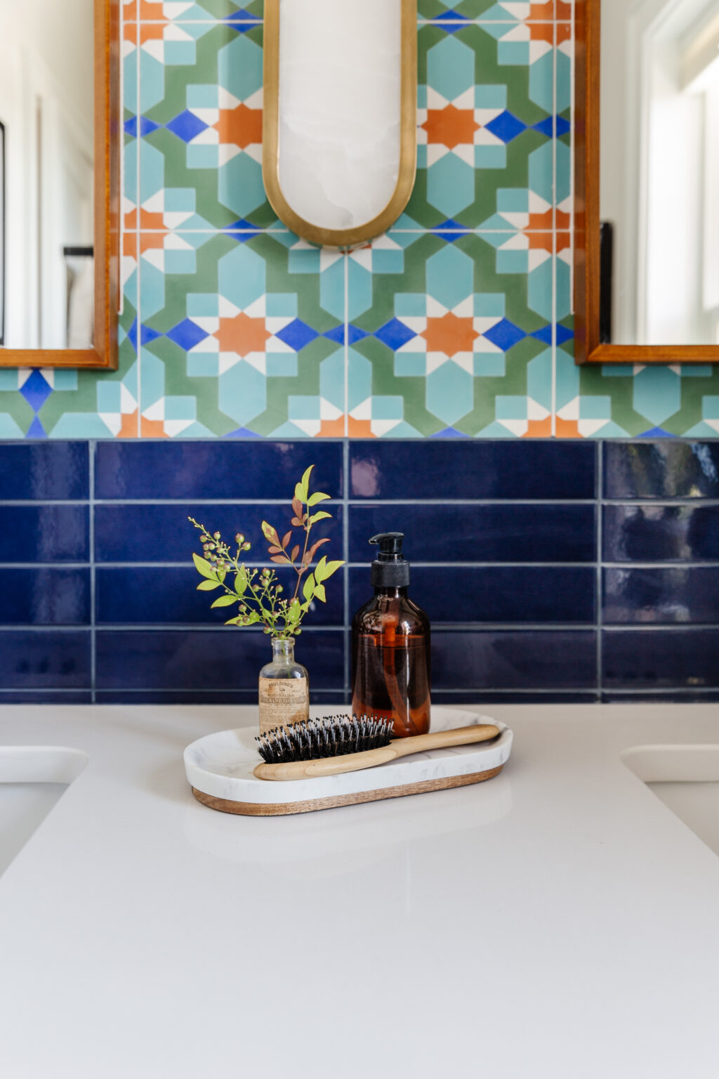
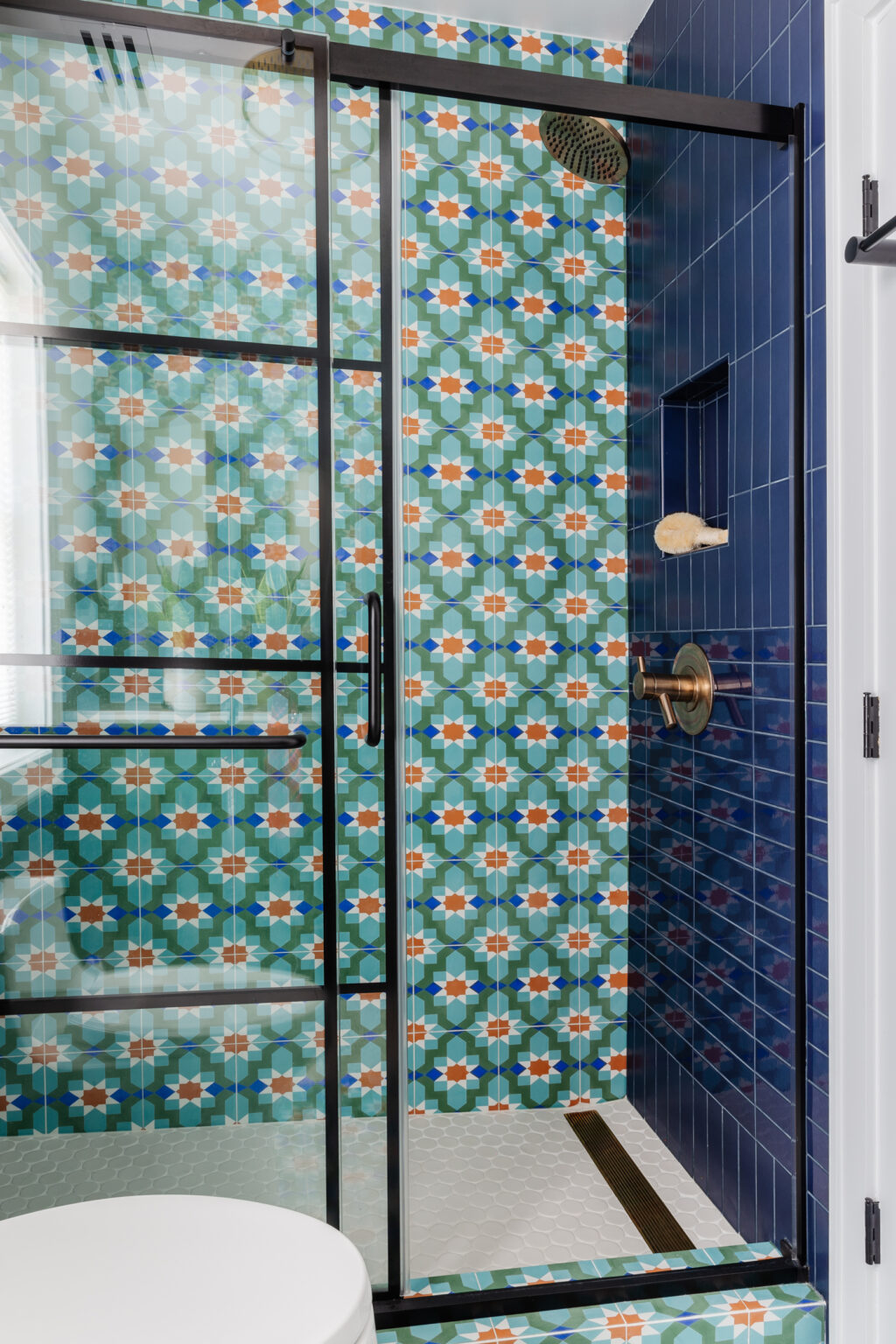
We originally wanted to bring in pattern through wallpaper, but I pivoted to a cement tile in a customized palette. We wrapped them from the back of the shower, onto the floor, to behind the vanity. This gives the illusion of more space as your eye follows the pattern. We used a deep cobalt tile in two finishes, matte and gloss, and alternated their stack to create a subtle contrast.

After
In the summer of 2022 I was traveling to the east coast for a conference and decided to take a side trip to Washington D.C. to meet the clients in person and photograph the space. It was even more beautiful in person, and totally worth the trip to meet the couple in real life.
Photography: Studio Plumb
Designer: Studio Plumb


