When asked to design a bathroom that felt like spa with vintage and global inspiration we jumped at the chance. The client is an artist, yoga instructor and genuine kind soul, and had never had a bathroom that she could unwind and relax in.
Before
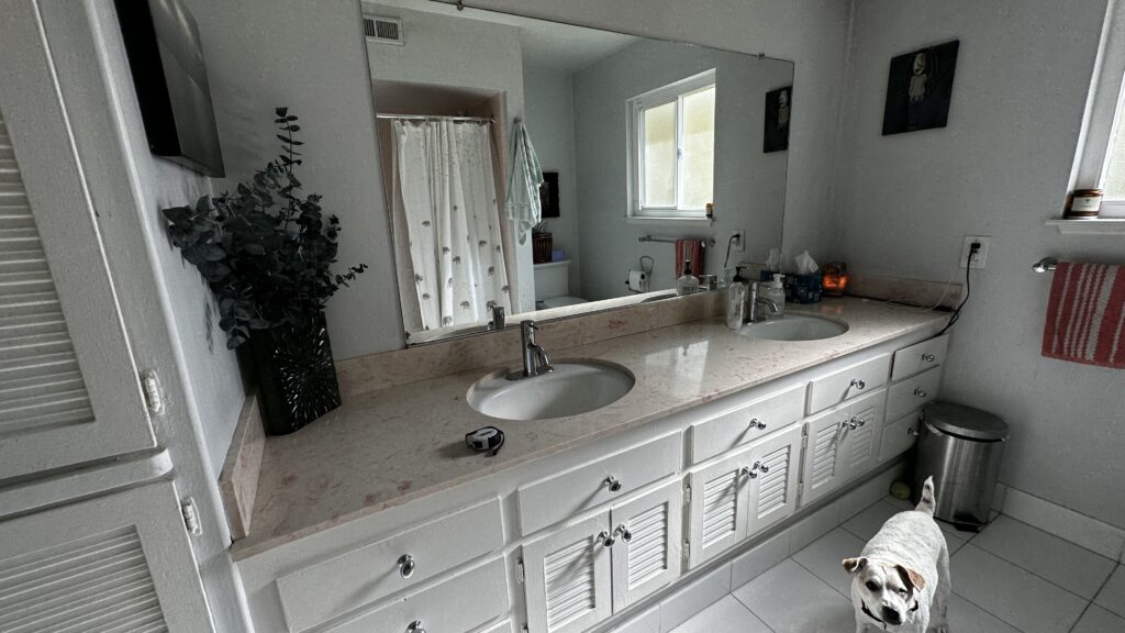
This original 1960’s bathroom needed a complete revival to match the client’s vision of a bathroom sanctuary full of texture and warmth. The client requested a bright and airy feel for the new bathroom, with touches of travel-inspired details, complete with a soaking tub for maximum relaxation.
PLAN & MATERIALS
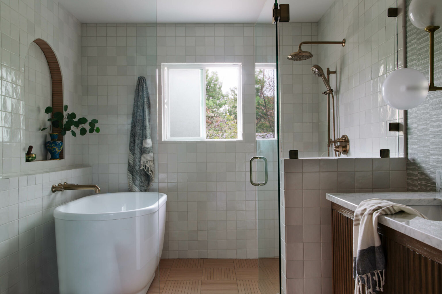
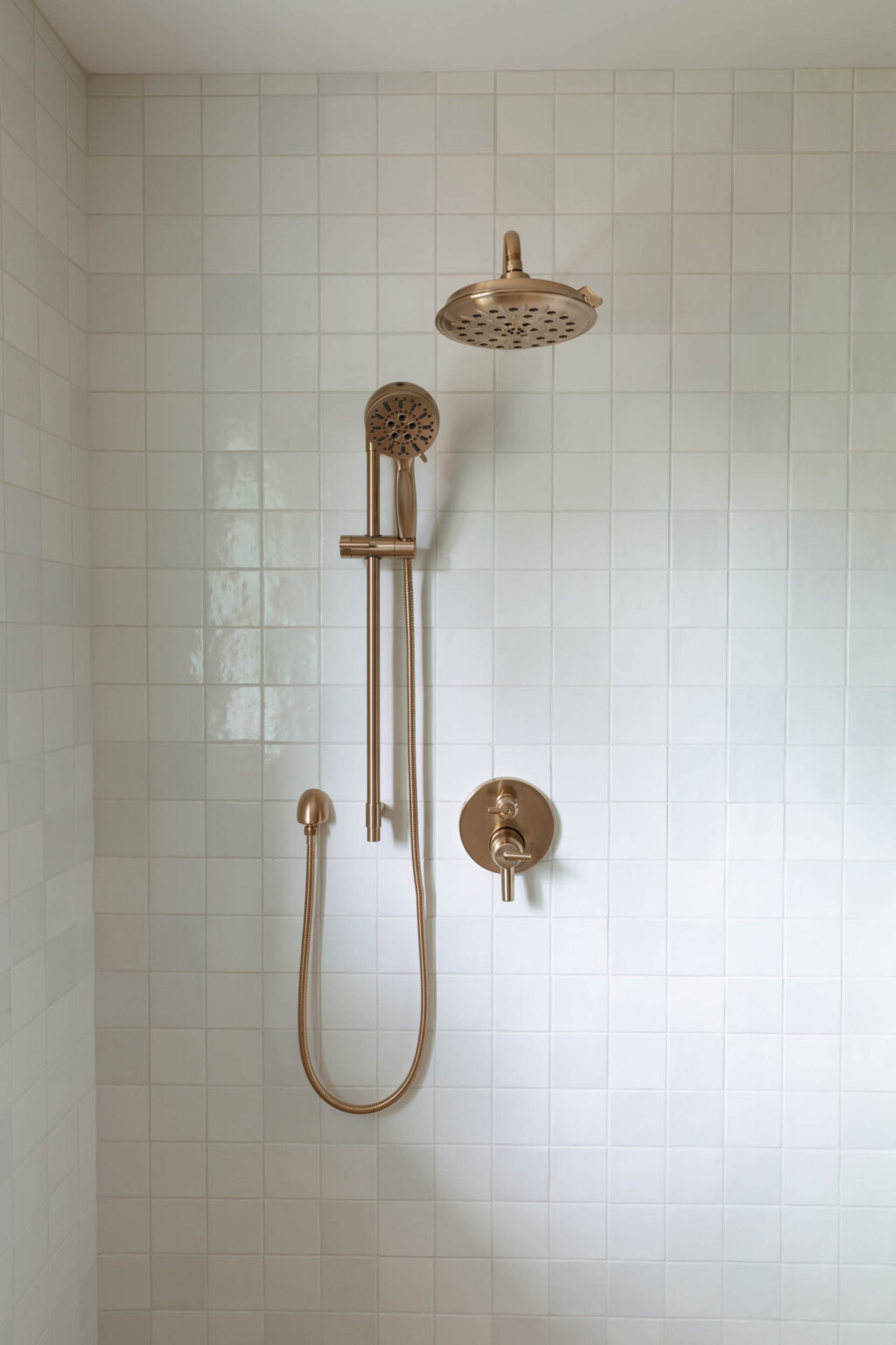
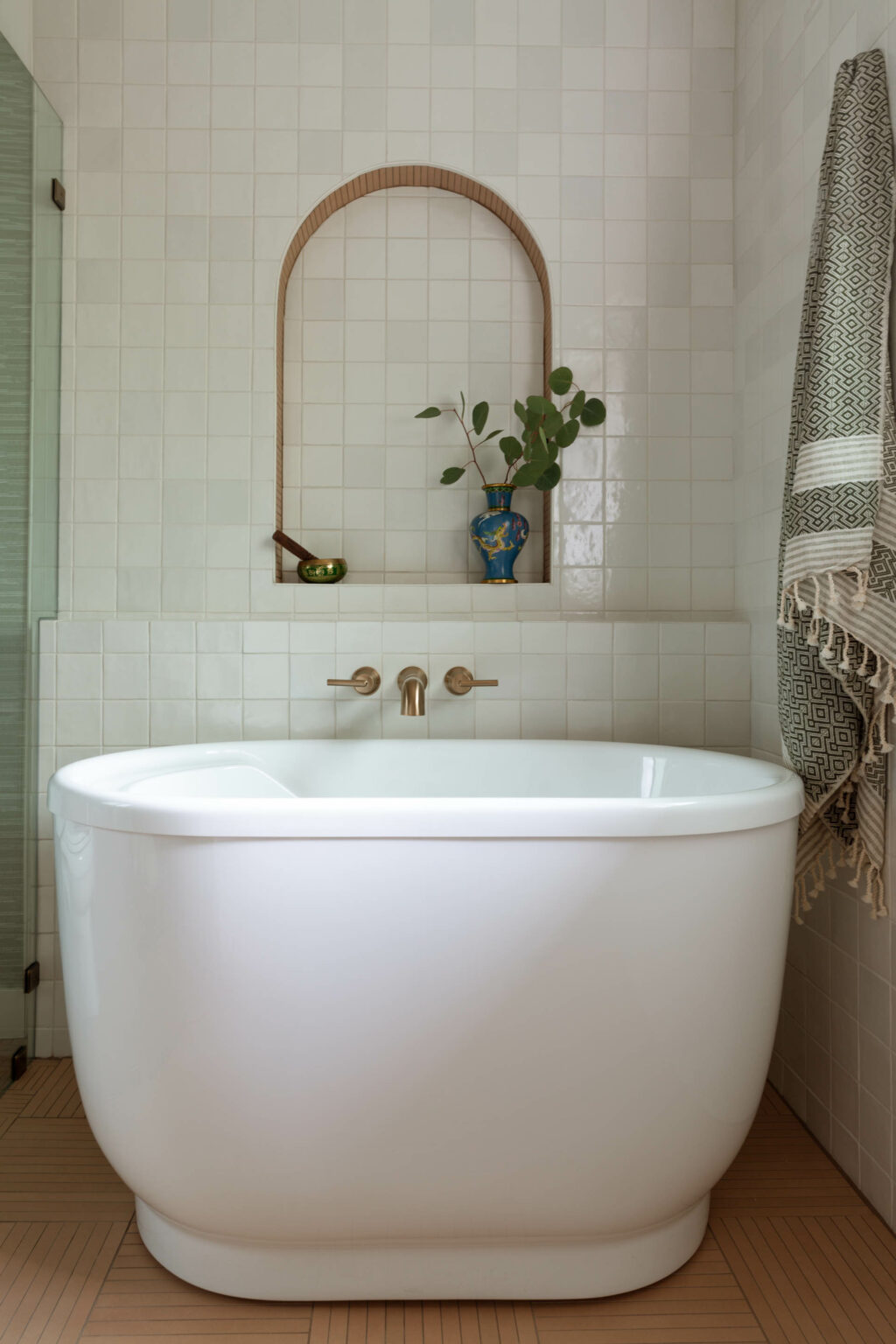
To stay true to the client’s vision of a “bright and airy” space, I designed the shower and bathtub area with a clear glass wall , opening up the space and making the room feel larger. The only way to fit a soaking tub in the space was to use a small but deep tub, and put it in a combined shower/tub wet room. The arch behind the large soaking tub speaks the clients love of Moroccan details, while the gold hardware brings together the look of a sophisticated bathroom retreat.
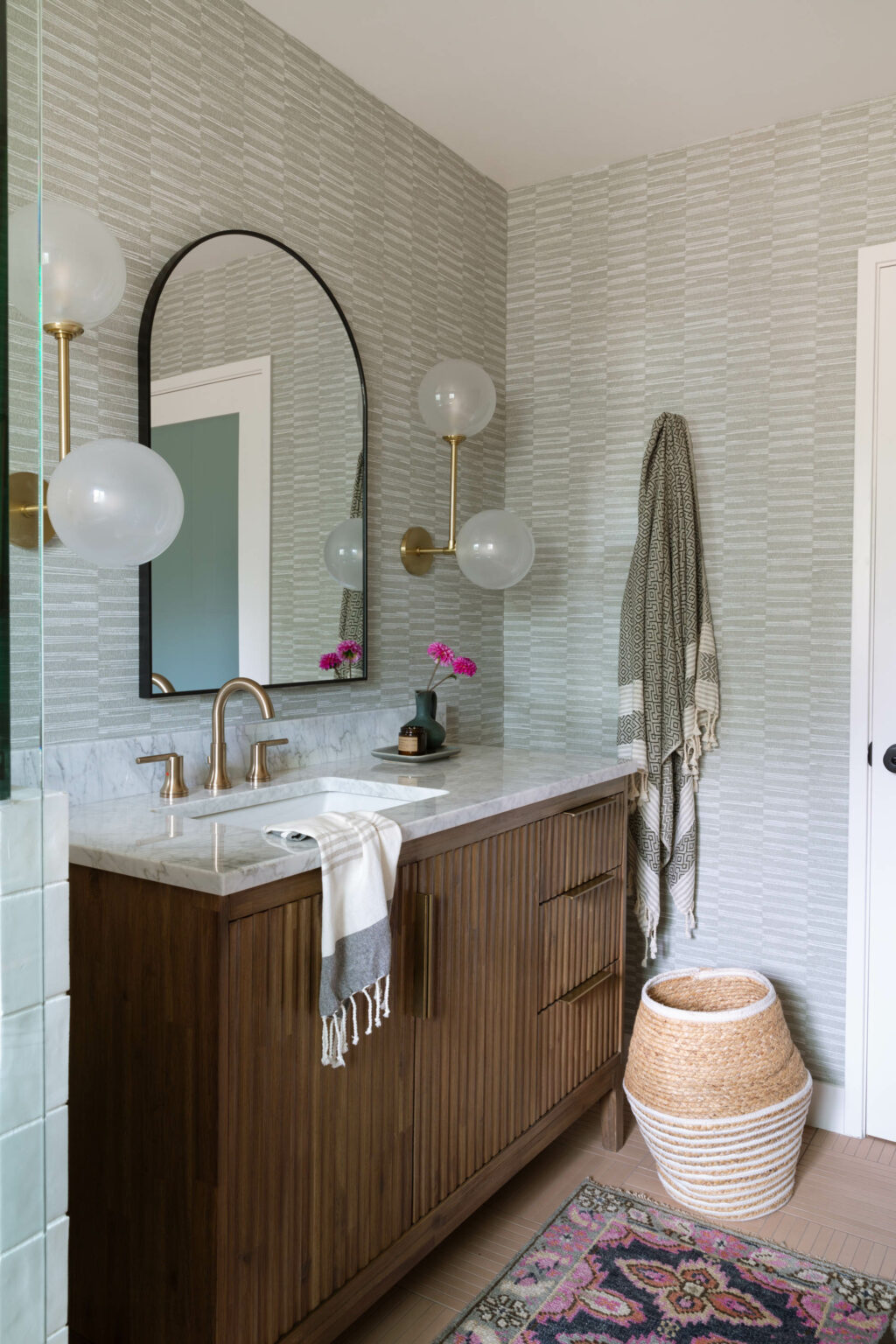
A clean, white tile was used on the walls of the shower and tub area to lend to the “zen” aspect of the space, while a straight stack installation of the 4×4 kept it modern and relevant to the midcentury era of the home. To match this theme and bring another sleek color in to the mix, a hatchwork mat tile was used for the flooring. We worked with the installer to have a barrier-free entry to the shower for any future accessibility needs, but it also makes the room feel even bigger without any curbs disrupting the sight lines. Because the client does love color, we added a eucalyptus-colored vinyl grasscloth wall covering to thewalls. The vinyl means it can hold up to steam and water, but its hard to tell its not the real thing while adding soft texture and color.
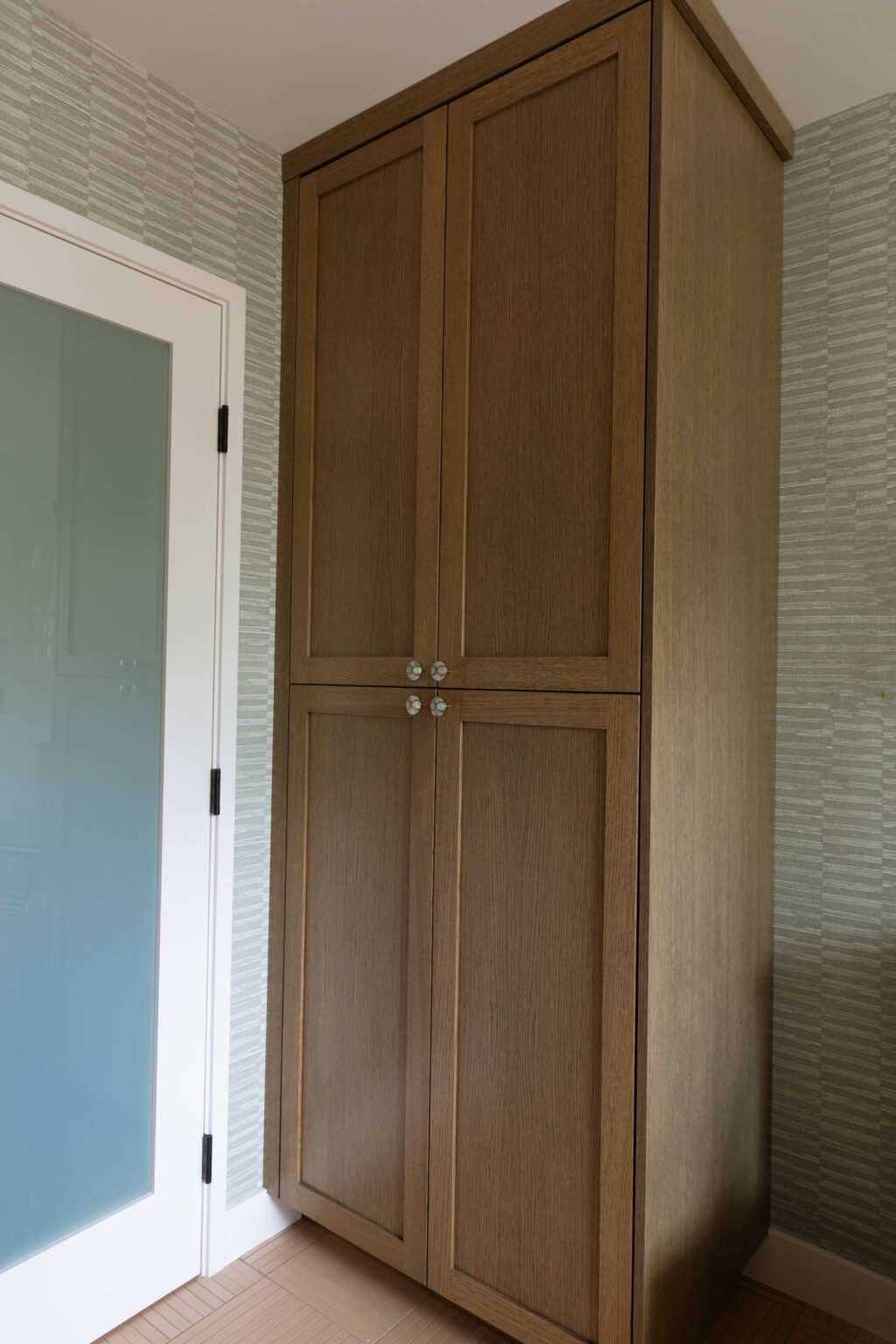
The while marble countertop and wood vanity was chosen to add more texture and old-world style. Buying the vanity pre-made from a manufacturer extended the client’s budget but also gives the look of a piece of furniture. We did design a custom cabinet near the door for additional storage and stained it to match the vanity.
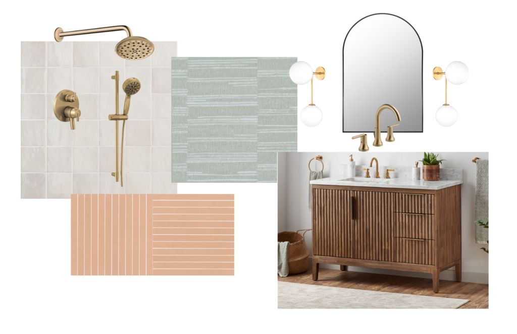
We had the 3D rendering below created to give the client and contractor the vision.
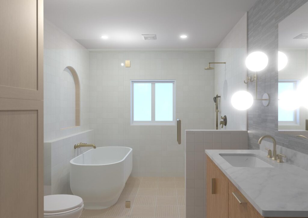
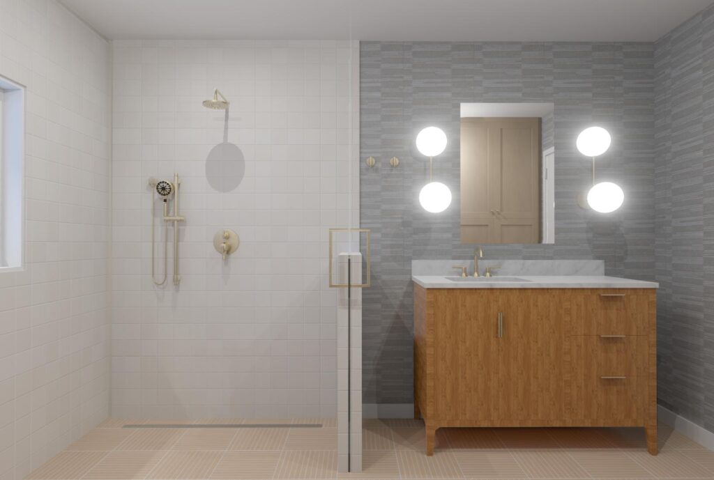
After
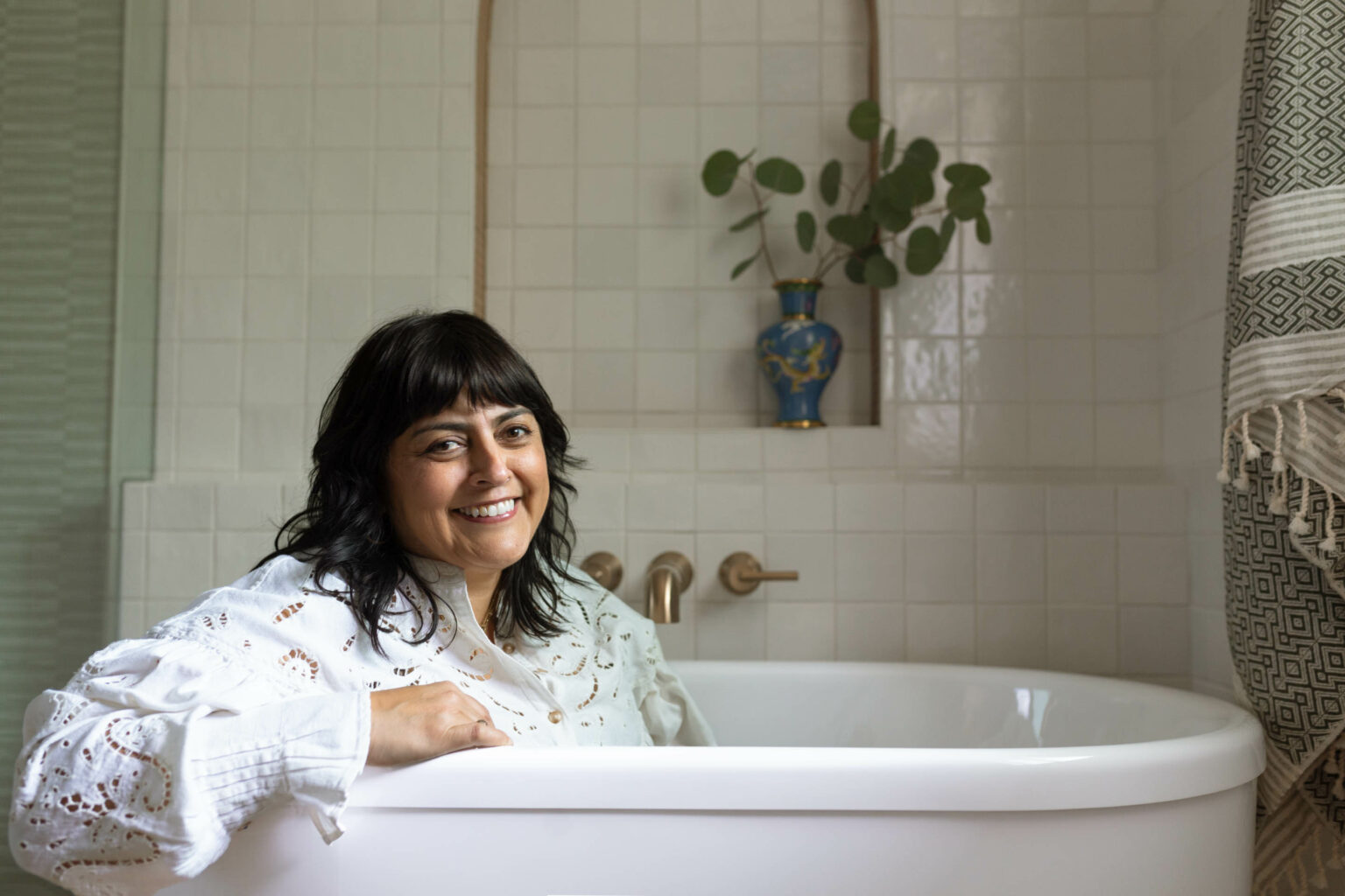
The renderings were pretty close but nothing beats the real thing with real photos. We brought in towels imported from Turkey and a vintage rug I picked up at a flea market to bring in color and even more texture. Along with some of the client’s personal mementos, the finishing touches brought it all together as the ultimate relaxation zone. I couldn’t resist crawling into the bathtub to see how it sat and had Whitney snap a few of my new favorite portraits.
Photography: Whitney Dianne
Designer: Studio Plumb

